
CSS3
CSS3 introduces a variety of new styling options that you can use to make your pages more visually appealing. Best of all, it can be done without loading any external images, which makes pages load faster and reduces the strain on your server.
However, this functionality is not completely free from a performance perspective. These properties require more work from the renderer, which can slow down processing. On desktop computers, this is mostly negligible, but mobile devices can be more underpowered.
It really depends on the device. iPhones (even older models like the 3G) have enough power to handle just about any CSS3. On the other hand, Android devices, which vary from manufacturer to manufacturer, can start to show performance problems. These typically occur with the more expensive properties such as gradients or transitions, but I have even seen performance problems with relatively “simple” properties like border-radius.
Thus, it is important to thoroughly test your app on a variety of devices. Then, if you encounter any issues, you will have to be prepared to gracefully degrade the design in favor of better performance. After all, good design matters only insofar as it provides a better user experience, and painfully slow performance will scare away users.
Most web app performance problems stem from JavaScript, so don’t get too worried about CSS3 optimization. As you learned in Chapter 12, it is important to pick your battles when it comes to performance tuning.
Box shadow
Box shadow adds drop shadows to DOM elements, which can be a great way to add emphasis and visual flair to your pages.
The box-shadow property accepts a variety of information about the drop shadow, everything from its color to blurriness. For example:
box-shadow: 1px 2px 8px #000;
This sets a variety of options for the box shadow:
• The first two values are the x and y coordinates by which you want to offset your box shadow. In this example, the shadow is rendered one pixel to the right and two pixels below the element.
• The next value is the blur radius; in this case, the shadow is blurred by eight pixels. Here you can use a higher number for a blurrier shadow, or a lower number for a sharper one.
Finally, you set the color of your shadow; in this case, the drop shadow is black.
This styling attaches a drop shadow to the element as you can see in Figure A-1:

Figure A-1: A basic box shadow has been applied to this element.
RGBA transparency
You might notice that the drop shadow looks a bit harsh in this example. That’s because it uses an entirely opaque color.
For more subtlety, set an RGBA color instead:
box-shadow: 1px 2px 8px rgba(0,0,0,0.5);
RGBA colors are just like RGB colors except they also include alpha transparency, which makes them somewhat transparent. In this example, you set a black shadow (R: 0, G: 0, B: 0), which is only 50% opaque (0.5).
This produces a less jarring effect, as you can see in Figure A-2:

Figure A-2: This box shadow uses an RGBA color for more transparency.
There’s no need to provide a fallback to RGB in box shadows—all browsers that support box shadows also support RGBA colors.
Vendor prefixes
Although this box shadow will work in iOS 5, it won’t work in any currently released version of Android or older iOS versions. For these, you must add a vendor prefix:
-webkit-box-shadow: 1px 2px 8px rgba(0,0,0,0.5);
Make sure to also add the non-prefixed version for newer iOS users, other browsers, and also to future-proof for whenever Android supports it:
-webkit-box-shadow: 1px 2px 8px rgba(0,0,0,0.5);
box-shadow: 1px 2px 8px rgba(0,0,0,0.5);
It’s important that the non-prefixed box-shadow comes last in your style sheets to make sure it overwrites the incompletely supported version.
You may want to add -moz-box-shadow for Firefox, but that prefix is becoming less necessary because Firefox has fully supported box-shadow since version 4.0.
Why vendor prefixes?
You may be wondering why the browsers bother with vendor prefixes, because they make front end development more difficult.
Vendor prefixes exist because the CSS3 spec is still relatively new, and it took browsers some time to catch up to speed (after all, the spec is still evolving).
When the browser reaches a point where it supports most of a new spec, it makes sense to release that feature for developers to use. However, there still may be bugs with the functionality (for example, problems interacting with other experimental styles). Additionally, there may be parts of the spec the browser doesn’t support, such as more complex features.
In these cases, the style is called with a vendor prefix, to differentiate it from the fully supported property, and avoid potential conflicts whenever the browser gets fully up to speed.
Multiple box shadows
You can also add multiple box shadows to your element simply by separating them with a comma:
-webkit-box-shadow: 0px 0px 2px rgba(0,0,0,0.3), 1px 2px 8px rgba(0,0,0,0.5);
box-shadow: 0px 0px 2px rgba(0,0,0,0.3), 1px 2px 8px rgba(0,0,0,0.5);
Two shadows have been applied to this element, as you can see in Figure A-3:

Figure A-3: This element has two box shadows. Notice the harder shadow close to the edges of the element.
Multiple box shadows get layered beneath one another, which means the first shadow is on top.
You can even use multiple box shadows to create a handy 3D effect. Simply set a number of box shadows with no blur:
-webkit-box-shadow: 1px 1px 0px rgba(0,0,0,0.9), 2px 2px 0px rgba(0,0,0,0.9), 3px
3px 0px rgba(0,0,0,0.9), 4px 4px 0px rgba(0,0,0,0.9), 5px 5px 0px rgba(0,0,0,0.9),
6px 6px 0px rgba(0,0,0,0.9), 7px 7px 0px rgba(0,0,0,0.9);
box-shadow: 1px 1px 0px rgba(0,0,0,0.9), 2px 2px 0px rgba(0,0,0,0.9), 3px 3px 0px
rgba(0,0,0,0.9), 4px 4px 0px rgba(0,0,0,0.9), 5px 5px 0px rgba(0,0,0,0.9), 6px 6px
0px rgba(0,0,0,0.9), 7px 7px 0px rgba(0,0,0,0.9);
This code attaches seven drop shadows, each offset by another pixel. As you can see in Figure A-4, this makes the element look like it is protruding from the page.

Figure A-4: This 3D effect was created using box shadows.
You can also use the same technique with text-shadow for 3D lettering.
Gradients
Gradients are an easy way to infuse flat-colored layouts with visually appealing depth. The CSS gradient spec is very versatile, providing a number of useful options at your disposal. Additionally, handling gradients in CSS means fewer images and less download times for your users.
Furthermore, traditional image-based approaches often produce gradients that don’t stretch naturally across the element. If the element’s dimensions never vary, you can cut an image at the right size, but you will have problems if the content ever expands. CSS gradients, on the other hand, stretch dynamically with the element’s dimensions.
Linear gradients
First, set a background color for your element. This ensures that something shows up in non-supportive browsers, and also if the browser is taking too long to render the gradient:
background-color: #999;
You can also set a background image as a fallback; just make sure it falls before the CSS gradients.
Next, apply a linear gradient:
background-image: -webkit-gradient(linear, left top, left bottom, from(#CCC), to(#555));
background-image: -webkit-linear-gradient(top, #CCC, #555);
background-image: linear-gradient(to bottom, #CCC, #555);
This snippet creates a linear gradient from a light gray (#CCC) to a darker gray (#555), going from top to bottom, as you can see in Figure A-5.

Figure A-5: This element has a basic linear gradient.
You might notice a whole slew of different formats here. Unfortunately, you need them all for backward compatibility:
• The first, -webkit-gradient is the older syntax for WebKit, which you’ll need for older versions of iOS and Android.
• The next, -webkit-linear-gradient is the accepted standard, but it won’t work on older devices.
• Finally the prefix-less linear-gradient is for newer browsers and future-proofing for iOS and Android.
You may also want to add -moz-linear-gradient and -o-linear-gradient for older versions of Firefox and Opera, respectively, although the current releases of both support the standard linear-gradient.
Also, if you want to support IE 9 and earlier, you can create a fallback using an IE filter. But be warned: IE filters are notoriously buggy.
You may have seen -ms-linear-gradient, but there’s no need to include this vendor prefix. The prefixed property was used in the IE 10 developer preview, but the release version of IE 10 supports the standard linear-gradient. Thus, there is no fully released version of IE that supports the transitional syntax.
Angled gradients
You can use linear gradients to create vertical, horizontal, and even diagonal gradients at any angle.
The gradient created earlier is vertical, but you can switch it to horizontal by adjusting the position settings:
background-image: -webkit-gradient(linear, left top, right top, from(#CCC), to(#555));
background-image: -webkit-linear-gradient(left, #CCC, #555);
background-image: linear-gradient(to right, #CCC, #555);
It’s a bit of a hassle, but each syntax must be changed differently:
• The older -webkit-gradient syntax uses left top and right top.
• The newer -webkit-linear-gradient uses the point only at which the gradient starts: left.
• The W3C standard uses the point at which it ends: to right.
As you can see in Figure A-6, this creates a horizontal gradient.

Figure A-6: This horizontal gradient was created by manipulating thegradient position.
You can even create diagonal gradients:
background-image: -webkit-gradient(linear, left top, right bottom, from(#CCC), to(#000));
background-image: -webkit-linear-gradient(-45deg, #CCC, #000);
background-image: linear-gradient(135deg, #CCC, #000);
Again, each syntax must be changed a bit differently:
• The older -webkit-gradient syntax uses the position settings you adjusted earlier: left top and right bottom.
• The newer -webkit-linear-gradient uses a negative degree measurement.
• Although the W3C-compliant browsers can handle the negative degree measurement, the accepted standard is to use a positive angle over 90º. In this case, 135deg is the same as -45deg.
As you can see in Figure A-7, this creates a diagonal gradient from the top-left corner to the bottom-right corner.

Figure A-7: This diagonal gradient was created with CSS3.
The IE filter fallback can be used to create horizontal and vertical gradients, but not diagonal ones.
Finally, if you want to use something other than a 45º angle, the definition is basically the same, with one key difference in the older syntax:
background-image: -webkit-gradient(linear, left 20% top 100%, right 20% bottom 100%, from(#CCC), to(#000));
background-image: -webkit-linear-gradient(-60deg, #CCC, #000);
background-image: linear-gradient(120deg, #CCC, #000);
Here, the newer syntaxes are both fairly straightforward; the only difference is that you add percentages to the stop points in the older -webkit-gradient. These can be a bit difficult to work with, but play around with them until you find a setting that works for your gradient.
As you can see in Figure A-8, this creates a more softly angled gradient.

Figure A-8: This 60º gradient was created with CSS3.
Gradient tools
Before you go memorizing three different syntaxes for each directional gradient, think about using something to automate this tedious process instead. For instance, I like using a CSS preprocessor like Sass or LESS to handle the different formats.
But if you don’t want to use a preprocessor, a number of tools out there can generate this code for you. For instance, check out the Ultimate CSS Gradient Generator from Colorzilla at www.colorzilla.com/gradient-editor/.
As you can see in Figure A-9, this editor provides an intuitive UI for generating gradients graphically.
Even if you are using Sass, this tool can be a useful way to visualize your gradient. Additionally, it can output SCSS format for Compass mix-ins.
CSS preprocessors are especially handy for CSS3 specs that are still in flux. That’s because you can use them to quickly add new syntaxes to all the gradients in your style sheet if a new standard arises.
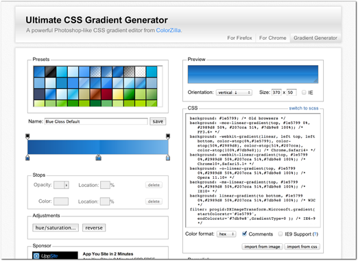
Figure A-9: This tool allows you to generate gradient styling more easily.
Color stops
Beyond basic two-color gradients, you can add color stops to create a more complex gradient. Color stops indicate additional color points along the gradient. You can add as many as you want to the definitions you created earlier:
background: -webkit-gradient(linear, left top, left bottom, from(#b4ddb4), color-stop(50%, #008a00), to(#002400));
background: -webkit-linear-gradient(top, #b4ddb4, #008a00 50%, #002400);
background: linear-gradient(to bottom, #b4ddb4, #008a00 50%, #002400);
Here, a color stop has been created 50% of the way through the gradient, which you can see in Figure A-10.

Figure A-10: This gradient uses a color stop.
You can declare the first and last colors as color stops as well. In the old -webkit-gradient syntax, simply replace each with color-stop(0%, #b4ddb4) and color-stop(100%, #002400). Then in the newer syntax, add 0% and 100% to each, respectively.
You can use color stops to render richer gradients and even simulate 3D effects. For instance, you can create a button with a shadow at the base and a highlight near the top:
background: -webkit-gradient(linear, left top, left bottom, from(#52b152), color-stop(25%, #83c783), color-stop(66%, #008a00), to(#002400));
background: -webkit-linear-gradient(top, #52b152, #83c783 25%, #008a00 66%, #002400);
background: linear-gradient(to bottom, #52b152, #83c783 25%, #008a00 66%, #002400);
This snippet builds a gradient with two additional color stops, which creates a three-dimensional appearance, as shown in Figure A-11.

Figure A-11: These color stops create a 3D effect for this button.
The IE filter fallback does not support color stops.
Radial gradients
Beyond linear gradients you can also create radial or circular gradients using CSS3. Similarly, the settings are very versatile, allowing you to create a wide variety of gradients to suit your individual needs.
First, you can declare a basic radial gradient:
background: -webkit-gradient(radial, center center, 0px, center center, 100%, from(#CCC), to(#555));
background: -webkit-radial-gradient(center, ellipse cover, #CCC, #555);
background: radial-gradient(ellipse at center, #CCC, #555);
As you can see, the definition is a bit different. Although you set color stops similarly to linear gradients, the positioning settings have changed. That’s because you need to set the center point and radius of the gradient:
• In the older -webkit-gradient syntax, you first set the center location along with a radius of 0. Then you define the end point as still being centered, but at the edges of the element (100%).
• In the newer -webkit-radial-gradient syntax, you first set the position to center, then set it to cover the entire element using ellipse cover.
• Finally in the W3C standard syntax, you simply set it to ellipse at center.
As you can see in Figure A-12, this creates a radial gradient that stretches to the bounds of the element.

Figure A-12: This radial gradient was created in CSS3.
Repeating gradients
Finally, the CSS spec also provides repeating gradients, which are an easy way to make striped backgrounds.
Repeating gradients are a little different than other gradients because they do not stretch across the element; rather, they repeat across it. That’s why you set a hard pixel measurement for each of the color stops in the gradient, as opposed to a percentage to stretch along:
background-image: -webkit-repeating-linear-gradient(
top,
blue,
green 10px,
white 20px
);
background-image: repeating-linear-gradient(
to bottom,
blue,
green 10px,
white 20px
);
As you can see, three color stops have been added to this gradient. This means the gradient will start with blue, then fade to green at 10px, then fade to white at 20px. At that point the gradient starts over again at blue, repeating across the dimensions of the element, as you can see in Figure A-13.
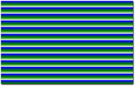
Figure A-13: This element has a repeating gradient. Notice how it fades smoothly between blue and green and white, then makes a hard change back to blue when it repeats.
You can also manipulate the color stops in a repeating gradient to create hard stripes:
background-image: -webkit-repeating-linear-gradient(
top,
red,
red 10px,
white 10px,
white 20px
);
background-image: repeating-linear-gradient(
to bottom,
red,
red 10px,
white 10px,
white 20px
);
Here, the gradient “fades” from red to red at 10px. Then it switches to white at 10px and “fades” again to white at 20px, at which point it repeats. See Figure A-14.
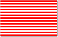
Figure A-14: This repeating gradient uses a color stop trick to create block-colored stripes.
This stripe technique is useful, particularly if you are okay with reverting to a block color in non-supportive browsers (or using an image fallback).
CSS animation
CSS transitions and keyframe animations are an easy way to add simple animations to your pages. They are particularly important for mobile devices since they tend to outperform JavaScript alternatives, such as jQuery’s animate() API. That’s because the animation occurs directly in the renderer, which can optimize for this behavior
In many mobile devices, CSS animations are even hardware accelerated. That means the device uses the GPU (graphics card) instead of the CPU (general processor) to render the frames of the animation. This rendering is considerably faster, because the GPU is specifically tailored for this type of task and because it frees up the CPU for other tasks.
Better performance is particularly noticeable in animation. The faster the device can render each frame of the animation, the more frames it can show. That makes the animation appear smoother to your users.
Transitions
Transitions are an easy way to make pages more interactive and create a more polished user experience.
CSS transitions apply animations between style changes on your elements. For instance, you might change a button’s color on hover:
.button {
background-color: red;
}
.button:hover {
background-color: purple;
}
Normally this element would change color immediately, but with transitions you can add a smooth animated color change:
.button {
transition: background-color 200ms ease;
}
Here you define three aspects of the transition:
• First, you set which properties to animate. In this case, you are animating only background-color, but you can set this to most other properties or even all to animate all properties.
• Next, you set the duration of the transition—in this case, 200 milliseconds.
• Finally, you set a timing function for the transition—in this case, you use ease. Rather than animate evenly across the duration of this transition, ease causes the browser to first animate slowly, and then ease into a faster animation. This produces more natural motion.
You learn more about timing functions later in this section.
Multiple transitions on one element
You can also define multiple transitions on your element. This is handy for animating different properties at different speeds. However, you can’t use the shorthand property any more:
.button {
transition-property: opacity, background-color;
transition-duration: 200ms, 500ms;
transition-timing-function: ease;
}
Now two elements will be animated, opacity and background-color, at 200ms and 500ms, respectively. Note that only one timing function is used here, which causes it to be applied to both transitions. You can use the same technique for any aspect of the transition you want to use across the board.
If you want to animate all the properties of the element along the same transition, simply define one transition with the property set to all.
Vendor prefixes
Just like with other experimental CSS3 features, it is important to use the appropriate vendor prefixes for transitions:
.button {
-webkit-transition: background-color 200ms ease;
-moz-transition: background-color 200ms ease;
-o-transition: background-color 200ms ease;
transition: background-color 200ms ease;
}
This snippet defines the transition for a variety of different browsers. However, you can omit the -moz-transition and -o-transition, depending on which mobile browsers you want to support.
You may have seen -ms-transition elsewhere, but there is no need to include it anymore. Although -ms-transition was used earlier in the IE 10 developer preview, the release version fully supports transition. Because no actual release of IE needs this prefix, you can safely omit it.
Finally, if you are defining multiple transitions on the same element, simply attach each vendor prefix to transition-property, transition-duration, and transition-timing-function. The CSS rule might get a little long, but it’s important if you want deeper browser penetration.
You learned why browsers use prefixes in the Box Shadow section of this chapter.
Triggering transitions with JavaScript
Transitions are commonly used in the CSS to provide animations on :hover, :focus, or with other CSS pseudo-elements.
But you can also trigger these changes using JavaScript. That’s because the transition will occur whenever a CSS property of the element changes, regardless of how that change arises.
For instance, in the button example, you could add a class definition with a different background styling:
.button.inactive {
background-color: gray;
}
Next apply the class name using JavaScript or jQuery—for instance, whenever the button should be inactive:
$(‘.button’).addClass(‘inactive’);
When this class is added to the element, the background-color transitions smoothly just like it does on :hover. Likewise, if you remove the class, it transitions back to its original color.
Transition end event
The DOM even provides a special event handler you can use to fire a callback when the transition completes. That means you can trigger additional JavaScript after the animation finishes.
For instance, you might set up a transition to fade out and hide the button whenever a particular class is added:
.button {
transition-property: opacity, background-color;
transition-duration: 200ms, 500ms;
transition-timing-function: ease;
}
.button.hidden {
opacity: 0;
}
Next apply the class using jQuery:
$(‘.button’).addClass(‘hidden’);
While this transition hides the element effectively, you still see a space on the page where the button existed previously. That’s because it is transparent; if you want to remove the element altogether, you need to set display: none.
However, if you set display: none in the CSS, it happens immediately and you don’t see the element fade out smoothly. After all, transition does not support the display property.
That’s where the transition end event comes in:
function hideButton(e) {
$(this).css(‘display’, ‘none’);
}
$(‘.button’)[0].addEventListener(‘webkitTransitionEnd’, hideButton);
This callback hides the button once the transition animation completes. Note that you use $(‘.button’)[0] to get at the DOM reference of the button as opposed to the jQuery reference.
It is a good idea to future-proof your code with a non-prefixed transitionEnd event as well, and a mozTransitionEnd and oTransitionEnd if you want to support those mobile browsers.
Problems with the transition end event
However, this event isn’t as straightforward as it seems. First, add a console.log to your callback:
function hideButton(e) {
$(this).css(‘display’, ‘none’);
console.log(‘transition end event’);
}
$(‘.button’)[0].addEventListener(‘webkitTransitionEnd’, hideButton);
As you can see in Figure A-15, this callback fires twice.
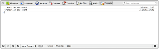
Figure A-15: The console shows the transition end callback firing twice.
The reason for this strange behavior is that the transitionEnd callback fires any time a transition occurs on the element. Because you are attaching two transitions here, one for opacity and another for background-color, the event fires twice.
It isn’t a huge problem in this example, because adding display: none a second time doesn’t change anything. However, what if the background-color change was faster than the opacity change? Then the element would first hide before the opacity change completed (and then hide again).
Or even worse, what happens on hover? Because you are still applying a color change, this transition fires, hiding the element.
As you can see, the transition end event can be difficult to work with. It does not relay any useful information for which property has changed. Instead you have to rely on hacks to determine if and when you’ve applied a transition that needs a callback.
When working with transition end events, it is a good idea to avoid transition-property: all. It can lead to a variety of unexpected events, whenever any property of the element changes (even those properties you don’t intend to animate).
Pros and cons of transitions with JavaScript
This technique is handy, but it can be a bit of an engineering disaster because you are using JavaScript to apply an animation. However, the animation exists in the CSS, not the JavaScript. Although animation could be considered a styling task, it makes much more sense to include in the scripting layer, not the styling layer.
This problem is exacerbated using the transitionEnd event. Not only is the event implementation a bit counterintuitive, but it also leads to further segmentation of the animation code. Instead of using an intuitive callback in jQuery’s animate() API, you have to set up an extra event listener, which fires whenever a transition occurs on this element. That means the same transitionEnd event fires even if you apply different animations.
All things being equal, we recommend you avoid this pattern and use jQuery’s animate() API to achieve the animation. However, all things are not equal from a performance perspective: CSS transitions tend to outperform JavaScript alternatives by a substantial margin because browsers can optimize for CSS styling directly.
This optimization is particularly important for underpowered mobile devices. Most devices tend to choke on JavaScript animations and render a very choppy motion. CSS transitions, on the other hand, render much more smoothly. Thus, the architecture of your app will have to take a hit in order to provide a better user experience.
Keyframes
While transitions are great for simple animations between two different styles, keyframes are ideal whenever you need more complex animation. Keyframes allow you to define multi-step animations that are attached to different CSS selectors.
The first step is defining a custom keyframe animation:
@-webkit-keyframes my-animation {
from {
opacity: 0;
}
to {
opacity: 1;
}
}
Using the from and to tags indicates the start and end points of the animation, which is called my-animation. In this case, it is a basic fade-in, but you could attach any number of styles in here.
Next, attach this to your element using -webkit-animation:
.my-element {
-webkit-animation: my-animation 2s infinite;
}
This snippet applies your custom animation to the element. It animates over the course of 2 seconds, and loops infinitely.
Keyframe animations are very versatile, and you aren’t limited to just two-part animations. In fact, you can use percentages to attach as many parts to the animation as you want:
@-webkit-keyframes my-animation {
0% {
opacity: 0;
}
50% {
opacity: 1;
}
100% {
opacity: 0;
}
}
You can also use commas to consolidate any parts of the animation that are the same. For instance, the following produces the same result as the preceding animation:
@-webkit-keyframes my-animation {
0%, 100% {
opacity: 0;
}
50% {
opacity: 1;
}
}
Furthermore, you can attach a variety of additional options in your animation declaration. For instance, say you want to use a timing function:
-webkit-animation: my-animation 2s infinite ease;
Or you can attach a delay so that the animation pauses a bit before starting:
-webkit-animation-delay: 3s;
This snippet starts the animation after 3 seconds have elapsed.
By default, the animation starts back from the top whenever it loops, but you can also set it to alternate directions:
-webkit-animation-direction: alternate;
Finally, if you want to attach more than one keyframe animation to an element, simply separate them with a comma:
-webkit-animation: first-animation 2s infinite,
second-animation 5s infinite;
As you can see, the plethora of options makes keyframe animations extremely versatile.
You should also include an @keyframes definition with a corresponding animation for deeper browser penetration.
Custom timing functions
Timing functions make the motion of your animations appear much more natural. In the real world, motions rarely start and stop immediately, and our eyes are finely tuned to pick up this kind of motion. Without easing functions, animations tend to appear quite fake and computerized.
Besides ease, there are a couple of predefined timing functions you can use in your transitions: ease-in, ease-out, and ease-in-out all achieve slightly different animation speeds.
You can also define your own timing function if none of the predefined options suit your needs. To do so, you can leverage Cubic Bezier functions:
transition-timing-function: cubic-bezier(.35, .15 , .3, 1);
Cubic Bezier functions essentially define all the points you need to trace a complex curve. But before your head starts spinning with math overload, look Lea Verou’s tool on www.cubic-bezier.com, shown in Figure A-16.
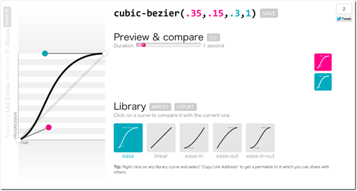
Figure A-16: This tool from www.cubic-bezier.com provides an intuitive GUI for defining Cubic Bezier functions.
Using this tool, you can adjust the control points of the curve, and preview the changes in your browser. You can even compare it against the default timing functions (all of which can also be recreated using Cubic Beziers).
Custom timing functions can be applied to transitions and keyframe animations.