
3 Modeling Process Quality
CHAPTER OUTLINE
3.1.3 Numerical Summary of Data
3.1.5 Probability Distributions
3.2 IMPORTANT DISCRETE DISTRIBUTIONS
3.2.1 The Hypergeometric Distribution
3.2.2 The Binomial Distribution
3.2.3 The Poisson Distribution
3.2.4 The Negative Binomial and Geometric Distributions
3.3 IMPORTANT CONTINUOUS DISTRIBUTIONS
3.3.2 The Lognormal Distribution
3.3.3 The Exponential Distribution
3.3.5 The Weibull Distribution
3.4.1 Normal Probability Plots
3.5 SOME USEFUL APPROXIMATIONS
3.5.1 The Binomial Approximation to the Hypergeometric
3.5.2 The Poisson Approximation to the Binomial
3.5.3 The Normal Approximation to the Binomial
3.5.4 Comments on Approximations
Supplemental Material for Chapter 3
S3.1 Independent Random Variables
S3.2 Development of the Poisson Distribution
S3.3 The Mean and Variance of the Normal Distribution
S3.4 More about the Lognormal Distribution
S3.5 More about the Gamma Distribution
S3.6 The Failure Rate for the Exponential Distribution
S3.7 The Failure Rate for the Weibull Distribution
The supplemental material is on the textbook Website, www.wiley.com/college/montgomery.
CHAPTER OVERVIEW AND LEARNING OBJECTIVES
This textbook is about the use of statistical methodology in quality control and improvement. This chapter has two objectives. First, we show how simple tools of descriptive statistics can be used to express variation quantitatively in a quality characteristic when a sample of data on this characteristic is available. Generally, the sample is just a subset of data taken from some larger population or process. The second objective is to introduce probability distributions and show how they provide a tool for modeling or describing the quality characteristics of a process.
After careful study of this chapter, you should be able to do the following:
- Construct and interpret visual data displays, including the stem-and-leaf plot, the histogram, and the box plot
- Compute and interpret the sample mean, the sample variance, the sample standard deviation, and the sample range
- Explain the concepts of a random variable and a probability distribution
- Understand and interpret the mean, variance, and standard deviation of a probability distribution
- Determine probabilities from probability distributions
- Understand the assumptions for each of the discrete probability distributions presented
- Understand the assumptions for each of the continuous probability distributions presented
- Select an appropriate probability distribution for use in specific applications
- Use probability plots
- Use approximations for some hypergeometric and binomial distributions
3.1 Describing Variation
3.1.1 The Stem-and-Leaf Plot
No two units of product produced by a process are identical. Some variation is inevitable. As examples, the net content of a can of soft drink varies slightly from can to can, and the output voltage of a power supply is not exactly the same from one unit to the next. Similarly, no two service activities are ever identical. There will be differences in performance from customer to customer, and variability in important characteristics that are important to the customer over time. Statistics is the science of analyzing data and drawing conclusions, taking variation in the data into account.
There are several graphical methods that are very useful for summarizing and presenting data. One of the most useful graphical techniques is the stem-and-leaf display.
Suppose that the data are represented by x1, x2, …, xn and that each number xi consists of at least two digits. To construct a stem-and-leaf plot, we divide each number xi into two parts: a stem, consisting of one or more of the leading digits; and a leaf, consisting of the remaining digits. For example, if the data consists of percent defective information between 0 and 100 on lots of semiconductor wafers, then we can divide the value 76 into the stem 7 and the leaf 6. In general, we should choose relatively few stems in comparison with the number of observations. It is usually best to choose between 5 and 20 stems. Once a set of stems has been chosen, they are listed along the left-hand margin of the display, and beside each stem all leaves corresponding to the observed data values are listed in the order in which they are encountered in the data set.
The version of the stem-and-leaf plot produced by Minitab is sometimes called an ordered stem-and-leaf plot, because the leaves are arranged by magnitude. This version of the display makes it very easy to find percentiles of the data. Generally, the 100 kth percentile is a value such that at least 100 k% of the data values are at or below this value and at least 100 (1 – k)% of the data values are at or above this value.
EXAMPLE 3.1 Health Insurance Claims
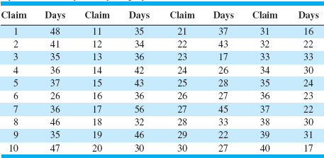
The data in Table 3.1 provides a sample of the cycle time in days to process and pay employee health insurance claims in a large company. Construct a stem-and-leaf plot for the data.
SOLUTION
To construct the stem-and-leaf plot, we could select the values 1, 2, 3, 4, and 5 as the stems. However, this would result in all 40 data values being compacted into only five stems, the minimum number that is usually recommended. An alternative would be to split each stem into a lower and an upper half, with the leaves 0–4 being assigned to the lower portion of the stem and the leaves 5–9 being assigned to the upper portion. Figure 3.1 is the stem-and-leaf plot generated by Minitab, and it uses the stem-splitting strategy. The column to the left of the stems gives a cumulative count of the number of observations that are at or below that stem for the smaller stems, and at or above that stem for the larger stems. For the middle stem, the number in parentheses indicates the number of observations included in that stem. Inspection of the plot reveals that the distribution of the number of days to process and pay an employee health insurance claim has an approximately symmetric shape, with a single peak. The stem-and-leaf display allows us to quickly determine some important features of the data that are not obvious from the data table. For example, Figure 3.1 gives a visual impression of shape, spread or variability, and the central tendency or middle of the data (which is close to 35).
![]() TABLE 3.1
TABLE 3.1
Cycle Time in Days to Pay Employee Health Insurance Claims
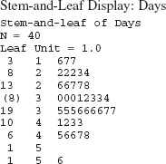
![]() FIGURE 3.1 Stem-and-left plot for the health insurance claim data.
FIGURE 3.1 Stem-and-left plot for the health insurance claim data.
The fiftieth percentile of the data distribution is called the sample median ![]() . The median can be thought of as the data value that exactly divides the sample in half, with half of the observations smaller than the median and half of them larger.
. The median can be thought of as the data value that exactly divides the sample in half, with half of the observations smaller than the median and half of them larger.
If n, the number of observations, is odd, finding the median is easy. First, sort the observations in ascending order (or rank the data from smallest observation to largest observation). Then the median will be the observation in rank position [(n − 1)/2 + 1] on this list. If n is even, the median is the average of the (n/2)st and (n/2 + 1)st ranked observations. Since in our example n = 40 is an even number, the median is the average of the two observations with rank 20 and 21, or
![]()
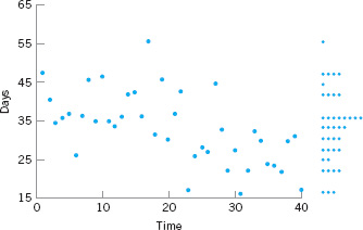
![]() FIGURE 3.2 A time series plot of the health insurance datain Table 3.1.
FIGURE 3.2 A time series plot of the health insurance datain Table 3.1.
The tenth percentile is the observation with rank (0.1)(40) + 0.5 = 4.5 (halfway between the fourth and fifth observations), or (22 + 22)/2 = 22. The first quartile is the observation with rank (0.25)(40) + 0.5 = 10.5 (halfway between the tenth and eleventh observation) or (26 + 27)/2 = 26.5, and the third quartile is the observation with rank (0.75)(40) + 0.5 = 30.5 (halfway between the thirtieth and thirty-first observation), or (37 + 41) = 39. The first and third quartiles are occasionally denoted by the symbols Q1 and Q3, respectively, and the interquartile range IQR = Q3 − Q1 is occasionally used as a measure of variability. For the insurance claim data, the interquartile range is IQR = Q3 − Q1 = 39 − 26.5 = 12.5.
Finally, although the stem-and-leaf display is an excellent way to visually show the variability in data, it does not take the time order of the observations into account. Time is often a very important factor that contributes to variability in quality improvement problems. We could, of course, simply plot the data values versus time; such a graph is called a time series plot or a run chart.
Suppose that the cycle time to process and pay employee health insurance claims in Table 3.1 are shown in time sequence. Figure 3.2 shows the time series plot of the data. We used Minitab to construct this plot (called a marginal plot) and requested a dot plot of the data to be constructed in the y-axis margin. This display clearly indicates that time is an important source of variability in this process. More specifically, the processing cycle time for the first 20 claims is substantially longer than the cycle time for the last 20 claims. Something may have changed in the process (or have been deliberately changed by operating personnel) that is responsible for the apparant cycle time improvement. Later in this book we formally introduce the control chart as a graphical technique for monitoring processes such as this one, and for producing a statistically based signal when a process change occurs.
3.1.2 The Histogram
A histogram is a more compact summary of data than a stem-and-leaf plot. To construct a histogram for continuous data, we must divide the range of the data into intervals, which are usually called class intervals, cells, or bins. If possible, the bins should be of equal width to enhance the visual information in the histogram. Some judgment must be used in selecting the number of bins so that a reasonable display can be developed. The number of bins depends on the number of observations and the amount of scatter or dispersion in the data. A histogram that uses either too few or too many bins will not be informative. We usually find that between 5 and 20 bins is satisfactory in most cases and that the number of bins should increase with n. Choosing the number of bins approximately equal to the bsquare root of the number of observations often works well in practice.1
Once the number of bins and the lower and upper boundaries or each bin has been determined, the data are sorted into the bins and a count is made of the number of observations in each bin. To construct the histogram, use the horizontal axis to represent the measurement scale for the data and the vertical scale to represent the counts, or frequencies. Sometimes the frequencies in each bin are divided by the total number of observations (n), and then the vertical scale of the histogram represents relative frequencies. Rectangles are drawn over each bin, and the height of each rectangle is proportional to frequency (or relative frequency). Most statistics packages construct histograms.
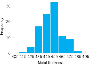
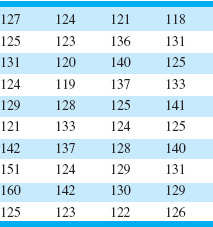
EXAMPLE 3.2. Meatal Thickness in Silicon Wafers
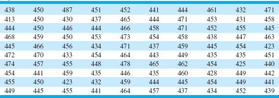
Table 3.2 presents the thickness of a metal layer on 100 silicon wafers resulting from a chemical vapor deposition (CVD) process in a semiconductor plant. Construct a histogram for these data.
![]() TABLE 3.2
TABLE 3.2
Layer Thickness (Å) on Semiconductor Wafers
SOLUTION
Because the data set contains 100 observations and ![]() , we suspect that about 10 bins will provide a satisfactory histogram. We constructed the histogram using the Minitab option that allows the user to specify the number of bins. The resulting Minitab histogram is shown in Figure 3.3. Notice that the midpoint of the first bin is 415Å, and that the histogram only has eight bins that contain a nonzero frequency. A histogram, like a stem-and-leaf plot, gives a visual impression of the shape of the distribution of the measurements, as well as some information about the inherent variability in the data. Note the reasonably symmetric or bell-shaped distribution of the metal thickness data.
, we suspect that about 10 bins will provide a satisfactory histogram. We constructed the histogram using the Minitab option that allows the user to specify the number of bins. The resulting Minitab histogram is shown in Figure 3.3. Notice that the midpoint of the first bin is 415Å, and that the histogram only has eight bins that contain a nonzero frequency. A histogram, like a stem-and-leaf plot, gives a visual impression of the shape of the distribution of the measurements, as well as some information about the inherent variability in the data. Note the reasonably symmetric or bell-shaped distribution of the metal thickness data.
![]() FIGURE 3.3 Minitab histogram for the metal layer thickness data in Table 3.2.
FIGURE 3.3 Minitab histogram for the metal layer thickness data in Table 3.2.
Most computer packages have a default setting for the number of bins. Figure 3.4 is the Minitab histogram obtained with the default setting, which leads to a histogram with 15 bins. Histograms can be relatively sensitive to the choice of the number and width of the bins. For small data sets, histograms may change dramatically in appearance if the number and/or width of the bins changes. For this reason, we prefer to think of the histogram as a technique best suited for larger data sets containing, say, 75 to 100 or more observations. Because the number of observations on layer thickness is moderately large (n = 100), the choice of the number of bins is not especially important, and the histograms in Figures 3.3 and 3.4 convey very similar information.
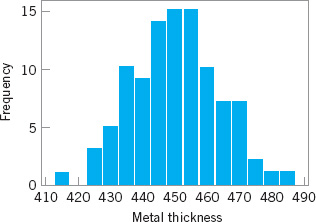
![]() FIGURE 3.4 Minitab histogram with 15 bins for the metal layer thickness data.
FIGURE 3.4 Minitab histogram with 15 bins for the metal layer thickness data.
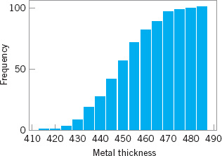
![]() FIGURE 3.5 A cumulative frequency plot of the metal thickness data from Minitab.
FIGURE 3.5 A cumulative frequency plot of the metal thickness data from Minitab.
Notice that in passing from the original data or a stem-and-leaf plot to a histogram, we have in a sense lost some information because the original observations are not preserved on the display. However, this loss in information is usually small compared with the conciseness and ease of interpretation of the histogram, particularly in large samples.
Histograms are always easier to interpret if the bins are of equal width. If the bins are of unequal width, it is customary to draw rectangles whose areas (as opposed to heights) are proportional to the number of observations in the bins.
Figure 3.5 shows a variation of the histogram available in Minitab (i.e., the cumulative frequency plot). In this plot, the height of each bar represents the number of observations that are less than or equal to the upper limit of the bin. Cumulative frequencies are often very useful in data interpretation. For example, we can read directly from Figure 3.5 that about 75 of the 100 wafers have a metal layer thickness that is less than 460Å.
Frequency distributions and histograms can also be used with qualitative, categorical, or count (discrete) data. In some applications, there will be a natural ordering of the categories (such as freshman, sophomore, junior, and senior), whereas in others the order of the categories will be arbitrary (such as male and female). When using categorical data, the bars should be drawn to have equal width.
To construct a histogram for discrete or count data, first determine the frequency (or relative frequency) for each value of x. Each of the x values corresponds to a bin. The histogram is drawn by plotting the frequencies (or relative frequencies) on the vertical scale and the values of x on the horizontal scale. Then above each value of x, draw a rectangle whose height is the frequency (or relative frequency) corresponding to that value.
EXAMPLE 3.3 Defects in Automobile Hoods
Table 3.3 presents the number of surface finish defects in the that were painted by a new experimental painting process. primer paint found by visual inspection of automobile hoods Construct a histogram for these data.
![]() TABLE 3.3
TABLE 3.3
Surface Finish Defects in Painted Automobile Hoods
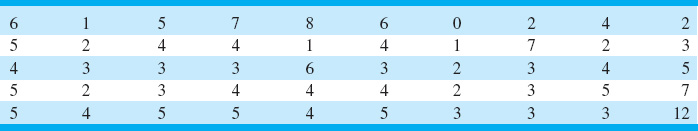
Figure 3.6 is the histogram of the defects. Notice that the number of defects is a discrete variable. From either the histogram or the tabulated data we can determine
Proportions of hoods with at least ![]()
and
Proportions of hoods with between 0 and
![]()
These proportions are examples of relative frequencies.

![]() FIGURE 3.6 Histogram of the number of defects in painted automoblie hoods (Table 3.3)
FIGURE 3.6 Histogram of the number of defects in painted automoblie hoods (Table 3.3)
3.1.3 Numerical Summary of Data
The stem-and-leaf plot and the histogram provide a visual display of three properties of sample data: the shape of the distribution of the data, the central tendency in the data, and the scatter or variability in the data. It is also helpful to use numerical measures of central tendency and scatter.
Suppose that x1, x2, …, xn are the observations in a sample. The most important measure of central tendency in the sample is the sample average,

Note that the sample average ![]() is simply the arithmetic mean of the n observations. The sample average for the metal thickness data in Table 3.2 is
is simply the arithmetic mean of the n observations. The sample average for the metal thickness data in Table 3.2 is

Refer to Figure 3.3 and note that the sample average is the point at which the histogram exactly “balances.” Thus, the sample average represents the center of mass of the sample data.
The variability in the sample data is measured by the sample variance:

Note that the sample variance is simply the sum of the bsquared deviations of each observation from the sample average ![]() , divided by the sample size minus 1. If there is no variability in the sample, then each sample observation xi =
, divided by the sample size minus 1. If there is no variability in the sample, then each sample observation xi = ![]() , and the sample variance s2 = 0. Generally, the larger the sample variance s2 is, the greater is the variability in the sample data.
, and the sample variance s2 = 0. Generally, the larger the sample variance s2 is, the greater is the variability in the sample data.
The units of the sample variance s2 are the bsquare of the original units of the data. This is often inconvenient and awkward to interpret, and so we usually prefer to use the bsquare root of s2, called the sample standard deviation s, as a measure of variability.
It follows that

The primary advantage of the sample standard deviation is that it is expressed in the original units of measurement. For the metal thickness data, we find that
s2 = 180.2928Å2
and
s = 13.43Å
To more easily see how the standard deviation describes variability, consider the two samples shown here:
| Sample 1 | Sample 2 |
| x1 = 1 | x1 = 1 |
| x2 = 3 | x2 = 5 |
| x3 = 5 | x3 = 9 |
Obviously, sample 2 has greater variability than sample 1. This is reflected in the standard deviation, which for sample 1 is
and for sample 2 is
Thus, the larger variability in sample 2 is reflected by its larger standard deviation. Now consider a third sample, say
| Sample 3 |
| x1 = 101 |
| x2 = 103 |
| x3 = 105 |
Notice that sample 3 was obtained from sample 1 by adding 100 to each observation. The standard deviation for this third sample is s = 2, which is identical to the standard deviation of sample 1. Comparing the two samples, we see that both samples have identical variability or scatter about the average, and this is why they have the same standard deviations. This leads to an important point: The standard deviation does not reflect the magnitude of the sample data, only the scatter about the average.
Handheld calculators are frequently used for calculating the sample average and standard deviation. Note that equations 3.2 and 3.3 are not very efficient computationally, because every number must be entered into the calculator twice. A more efficient formula is

In using equation 3.4, each number would only have to be entered once, provided that ![]() could be simultaneously accumulated in the calculator. Many inexpensive handheld calculators perform this function and provide automatic calculation of
could be simultaneously accumulated in the calculator. Many inexpensive handheld calculators perform this function and provide automatic calculation of ![]() and s.
and s.
3.1.4 The Box Plot
The stem-and-leaf display and the histogram provide a visual impression about a data set, whereas the sample average and standard deviation provide quantitative information about specific features of the data. The box plot is a graphical display that simultaneously displays several important features of the data, such as location or central tendency, spread or variability, departure from symmetry, and identification of observations that lie unusually far from the bulk of the data (these observations are often called “outliers”).
A box plot displays the three quartiles, the minimum, and the maximum of the data on a rectangular box, aligned either horizontally or vertically. The box encloses the interquartile range with the left (or lower) line at the first quartile Q1 and the right (or upper) line at the third quartile Q3. A line is drawn through the box at the second quartile (which is the fiftieth percentile or the median) Q2 = ![]() . A line at either end extends to the extreme values. These lines are usually called whiskers. Some authors refer to the box plot as the box and whisker plot. In some computer programs, the whiskers only extend a distance of 1.5 (Q3 – Q1) from the ends of the box, at most, and observations beyond these limits are flagged as potential outliers. This variation of the basic procedure is called a modified box plot.
. A line at either end extends to the extreme values. These lines are usually called whiskers. Some authors refer to the box plot as the box and whisker plot. In some computer programs, the whiskers only extend a distance of 1.5 (Q3 – Q1) from the ends of the box, at most, and observations beyond these limits are flagged as potential outliers. This variation of the basic procedure is called a modified box plot.
The data in Table 3.4 are diameters (in mm) of holes in a group of 12 wing leading edge ribs for a commercial transport airpalne. Construct and interpret a box plot of those data.
![]() TABLE 3.4
TABLE 3.4
Hole Diameters (in mm) in Wing Leading Edge Ribs
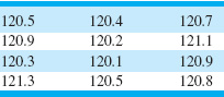
The box plot is shown in Figure 3.7. Note that the median of the sample is halfway between the sixth and seventh rank-ordered observation, or (120.5 + 120.7)/2 = 120.6, and that the quartiles are Q1 = 120.35 and Q3 = 120.9. The box plot indicates that the hole diameter distribution is not exactly symmetric around a central value, because the left and right whiskers and the left and right boxes around the median are not the same lengths.
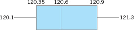
![]() FIGURE 3.7 Box plot for the aircraft wing leading edge hole diameter data in Table 3.4.
FIGURE 3.7 Box plot for the aircraft wing leading edge hole diameter data in Table 3.4.
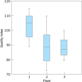
Box plots are very useful in graphical comparisons among data sets, because they have visual impact and are easy to understand. For example, Figure 3.8 shows the comparative box plots for a manufacturing quality index on products at three manufacturing plants. Inspection of this display reveals that there is too much variability at plant 2, and that plants 2 and 3 need to raise their quality index performance.
3.1.5 Probability Distributions
The histogram (or stem-and-leaf plot, or box plot) is used to describe sample data. A sample is a collection of measurements selected from some larger source or population. For example, the measurements on layer thickness in Table 3.2 are obtained from a sample of wafers selected from the manufacturing process. The population in this example is the collection of all layer thicknesses produced by that process. By using statistical methods, we may be able to analyze the sample layer thickness data and draw certain conclusions about the process that manufactures the wafers.
A probability distribution is a mathematical model that relates the value of the variable with the probability of occurrence of that value in the population. In other words, we might visualize layer thickness as a random variable because it takes on different values in the population according to some random mechanism, and then the probability distribution of layer thickness describes the probability of occurrence of any value of layer thickness in the population. There are two types of probability distributions.
![]() FIGURE 3.8 Comparative box plots of a quality index for products produced at three plants.
FIGURE 3.8 Comparative box plots of a quality index for products produced at three plants.
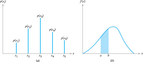
![]() FIGURE 3.9 Probability distributions. (a) Discrete case. (b) Continuous case.
FIGURE 3.9 Probability distributions. (a) Discrete case. (b) Continuous case.
Definition
1. Continuous distributions. When the variable being measured is expressed on a continuous scale, its probability distribution is called a continuous distribution. The probability distribution of metal layer thickness is continuous.
2. Discrete distributions. When the parameter being measured can only take on certain values, such as the integers 0, 1, 2, …, the probability distribution is called a discrete distribution. For example, the distribution of the number of nonconformities or defects in printed circuit boards would be a discrete distribution.
Examples of discrete and continuous probability distributions are shown in Figures 3.9a and 3.9b, respectively. The appearance of a discrete distribution is that of a series of vertical “spikes,” with the height of each spike proportional to the probability. We write the probability that the random variable x takes on the specific value xi as
![]()
The appearance of a continuous distribution is that of a smooth curve, with the area under the curve equal to probability, so that the probability that x lies in the interval from a to b is written as
![]()
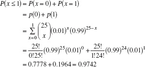
EXAMPLE 3.5 A Discrete Distribution
A manufacturing process produces thousands of semiconductor chips per day. On the average, 1% of these chips do not conform to specifications. Every hour, an inspector selects a random sample of 25 chips and classifies each chip in the sample as conforming or nonconforming. If we let x be the random variable representing the number of nonconforming chips in the sample, then the probability distribution of x is
![]()
where ![]() . This is a discrete distribution, since the observed number of nonconformances is x = 0, 1, 2, …, 25, and is called the binomial distribution. We may calculate the probability of finding one or fewer nonconforming parts in the sample as
. This is a discrete distribution, since the observed number of nonconformances is x = 0, 1, 2, …, 25, and is called the binomial distribution. We may calculate the probability of finding one or fewer nonconforming parts in the sample as
EXAMPLE 3.6 A Continuous Distribution
Suppose that x is a random variable that represents the actual contents in ounces of a 1-pound bag of coffee beans. The probability distribution of x is assumed to be
![]()
This is a continuous distribution, since the range of x is the interval [15.5, 17.0]. This distribution is called the uniform distribution, and it is shown graphically in Figure 3.10. Note that the area under the function f (x) corresponds to probability, so that the probability of a bag containing less than 16.0 oz is
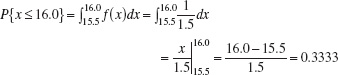
This follows intuitively from inspection of Figure 3.9.
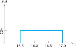
![]() FIGURE 3.10 The uniform distribution for Example 3.6.
FIGURE 3.10 The uniform distribution for Example 3.6.
In Sections 3.2 and 3.3 we present several useful discrete and continuous distributions.
The mean μ of a probability distribution is a measure of the central tendency in the distribution, or its location. The mean is defined as

For the case of a discrete random variable with exactly N equally likely values [that is, p(xi) = 1/N], then equation 3.5b reduces to

Note the similarity of this last expression to the sample average ![]() defined in equation 3.1. The mean is the point at which the distribution exactly “balances” (see Fig. 3.11). Thus, the mean is simply the center of mass of the probability distribution. Note from Figure 3.11b that the mean is not necessarily the fiftieth percentile of the distribution (which is the median), and from Figure 3.11c that it is not necessarily the most likely value of the variable (which is called the mode). The mean simply determines the location of the distribution, as shown in Figure 3.12.
defined in equation 3.1. The mean is the point at which the distribution exactly “balances” (see Fig. 3.11). Thus, the mean is simply the center of mass of the probability distribution. Note from Figure 3.11b that the mean is not necessarily the fiftieth percentile of the distribution (which is the median), and from Figure 3.11c that it is not necessarily the most likely value of the variable (which is called the mode). The mean simply determines the location of the distribution, as shown in Figure 3.12.

![]() FIGURE 3.11 The mean of a distribution.
FIGURE 3.11 The mean of a distribution.
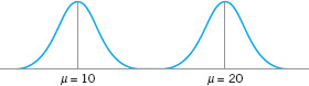
![]() FIGURE 3.12 Two probability distributions with different means.
FIGURE 3.12 Two probability distributions with different means.
![]() FIGURE 3.13 Two probability distributions with the same mean but different standard deviations.
FIGURE 3.13 Two probability distributions with the same mean but different standard deviations.
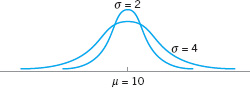
The scatter, spread, or variability in a distribution is expressed by the variance σ2. The definition of the variance is

when the random variable is discrete with N equally likely values, then equation 3.6b becomes
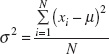
and we observe that in this case the variance is the average bsquared distance of each member of the population from the mean. Note the similarity to the sample variance s2, defined in equation 3.2. If σ2 = 0, there is no variability in the population. As the variability increases, the variance σ2 increases. The variance is expressed in the bsquare of the units of the original variable. For example, if we are measuring voltages, the units of the variance are (volts)2. Thus, it is customary to work with the bsquare root of the variance, called the standard deviation σ. It follows that

The standard deviation is a measure of spread or scatter in the population expressed in the original units. Two distributions with the same mean but different standard deviations are shown in Figure 3.13.
3.2 Important Discrete Distributions
Several discrete probability distributions arise frequently in statistical quality control. In this section, we discuss the hypergeometric distribution, the binomial distribution, the Poisson distribution, and the negative binomial and geometric distributions.
3.2.1 The Hypergeometric Distribution
Suppose that there is a finite population consisting of N items. Some number—say, D(D ≤ N)—of these items fall into a class of interest. A random sample of n items is selected from the population without replacement, and the number of items in the sample that fall into the class of interest—say, x—is observed. Then x is a hypergeometric random variable with the probability distribution defined as follows.
Definition
The hypergeometric probability distribution is

The mean and variance of the distribution are
and
In the above definition, the quantity
![]()
is the number of combinations of a items taken b at a time.
The hypergeometric distribution is the appropriate probability model for selecting a random sample of n items without replacement from a lot of N items of which D are nonconforming or defective. By a random sample, we mean a sample that has been selected in such a way that all possible samples have an equal chance of being chosen. In these applications, x usually represents the number of nonconforming items found in the sample. For example, suppose that a lot contains 100 items, 5 of which do not conform to requirements. If 10 items are selected at random without replacement, then the probability of finding one or fewer nonconforming items in the sample is
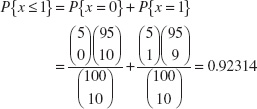
In Chapter 15, we show how probability models such as this can be used to design acceptance-sampling procedures.
Some computer programs can perform these calculations. The display below is the output from Minitab for calculating cumulative hypergeometric probabilities with N = 100, D = 5 (note that Minitab uses the symbol M instead of D and n = 10). Minitab will also calculate the individual probabilities for each value of x.
Cumulative Distribution Function
Hypergeometric with N = 100, M = 5, and n = 10
x |
P(X < = x) |
0 |
0.58375 |
1 |
0.92314 |
2 |
0.99336 |
3 |
0.99975 |
4 |
1.00000 |
5 |
1.00000 |
6 |
1.00000 |
7 |
1.00000 |
8 |
1.00000 |
9 |
1.00000 |
10 |
1.00000 |
3.2.2 The Binomial Distribution
Consider a process that consists of a sequence of n independent trials. By independent trials, we mean that the outcome of each trial does not depend in any way on the outcome of previous trials. When the outcome of each trial is either a “success” or a “failure,” the trials are called Bernoulli trials. If the probability of “success” on any trial—say, p—is constant, then the number of “successes” x in n Bernoulli trials has the binomial distribution with parameters n and p, defined as follows:
Definition
The binomial distribution with parameters n ≥ 0 and 0 < p < 1 is
The mean and variance of the binomial distribution are
and
The binomial distribution is used frequently in quality engineering. It is the appropriate probability model for sampling from an infinitely large population, where p represents the fraction of defective or nonconforming items in the population. In these applications, x usually represents the number of nonconforming items found in a random sample of n items. For example, if p = 0.10 and n = 15, then the probability of obtaining x nonconforming items is computed from equation 3.11 as follows:
Probability Density Function
Binomial with n = 15 and p = 0.1
x |
P (X = x) |
0 |
0.205891 |
1 |
0.343152 |
2 |
0.266896 |
3 |
0.128505 |
4 |
0.042835 |
5 |
0.010471 |
6 |
0.001939 |
7 |
0.000277 |
8 |
0.000031 |
9 |
0.000003 |
10 |
0.000000 |
Minitab was used to perform these calculations. Notice that for all values of x that lie between 10 ≤ x ≤ 15 the probability of finding x “successes” in 15 trials is zero.
Several binomial distributions are shown graphically in Figure 3.14. The shape of those examples is typical of all binomial distributions. For a fixed n, the distribution becomes more symmetric as p increases from 0 to 0.5 or decreases from 1 to 0.5. For a fixed p, the distribution becomes more symmetric as n increases.
A random variable that arises frequently in statistical quality control is
where x has a binomial distribution with parameters n and p. Often ![]() is the ratio of the observed number of defective or nonconforming items in a sample (x) to the sample size (n), and this is usually called the sample fraction defective or sample fraction nonconforming. The
is the ratio of the observed number of defective or nonconforming items in a sample (x) to the sample size (n), and this is usually called the sample fraction defective or sample fraction nonconforming. The ![]() symbol is used to indicate that
symbol is used to indicate that ![]() is an estimate of the true, unknown value of the binomial parameter p. The probability distribution of
is an estimate of the true, unknown value of the binomial parameter p. The probability distribution of ![]() is obtained from the binomial, since
is obtained from the binomial, since

![]() FIGURE 3.14 Binomial distributions for selected values of n and p.
FIGURE 3.14 Binomial distributions for selected values of n and p.
![]()
where [na] denotes the largest integer less than or equal to na. It is easy to show that the mean of ![]() is p and that the variance of
is p and that the variance of ![]() is
is
![]()
3.2.3 The Poisson Distribution
A useful discrete distribution in statistical quality control is the Poisson distribution, defined as follows:
Definition
The Poisson distribution is
where the parameter λ > 0. The mean and variance of the Poisson distribution are
and
Note that the mean and variance of the Poisson distribution are both equal to the parameter λ.
A typical application of the Poisson distribution in quality control is as a model of the number of defects or nonconformities that occur in a unit of product. In fact, any random phenomenon that occurs on a per unit (or per unit area, per unit volume, per unit time, etc.) basis is often well approximated by the Poisson distribution. As an example, suppose that the number of wire-bonding defects per unit that occur in a semiconductor device is Poisson distributed with parameter λ = 4. Then the probability that a randomly selected semiconductor device will contain two or fewer wire-bonding defects is
![]()
Minitab can perform these calculations. Using the Poisson distribution with the mean = 4 results in:
Probability Density Function
Poisson with mean = 4
x |
P (X = x) |
0 |
0.018316 |
1 |
0.073263 |
2 |
0.146525 |
Several Poisson distributions are shown in Figure 3.15. Note that the distribution is skewed; that is, it has a long tail to the right. As the parameter λ becomes larger, the Poisson distribution becomes symmetric in appearance.
It is possible to derive the Poisson distribution as a limiting form of the binomial distribution. That is, in a binomial distribution with parameters n and p, if we let n approach infinity and p approach zero in such a way that np = λ is a constant, then the Poisson distribution results. It is also possible to derive the Poisson distribution using a pure probability argument. [For more information about the Poisson distribution, see Hines, Montgomery, Goldsman, and Borror (2004); Montgomery and Runger (2011); and the supplemental text material.]
3.2.4 The Negative Binomial and Geometric Distributions
The negative binomial distribution, like the binomial distribution, has its basis in Bernoulli trials. Consider a sequence of independent trials, each with probability of success p, and let x denote the trial on which the r th success occurs. Then x is a negative binomial random variable with probability distribution defined as follows.

![]() FIGURE 3.15 Poisson probability distributions for selected values of λ.
FIGURE 3.15 Poisson probability distributions for selected values of λ.
The negative binomial distribution is
where r ≥ 1 is an integer. The mean and variance of the negative binomial distribution are
and
respectively.
The negative binomial distribution, like the Poisson distribution, is sometimes useful as the underlying statistical model for various types of “count” data, such as the occurrence of nonconformities in a unit of product (see Section 7.3.1). There is an important duality between the binomial and negative binomial distributions. In the binomial distribution, we fix the sample size (number of Bernoulli trials) and observe the number of successes; in the negative binomial distribution, we fix the number of successes and observe the sample size (number of Bernoulli trials) required to achieve them. This concept is particularly important in various kinds of sampling problems. The negative binomial distribution is also called the Pascal distribution (after Blaise Pascal, the 17th-century French mathematician and physicist. There is a variation of the negative binomial for real values of λ that is called the Polya distribution.
A useful special case of the negative binomial distribution is if r = 1, in which case we have the geometric distribution. It is the distribution of the number of Bernoulli trials until the first success. The geometric distribution is
p(x) = (1 − p)x − 1p, x = 1, 2,…
The mean and variance of the geometric distribution are
![]()
respectively. Because the sequence of Bernoulli trials are independent, the count of the number of trials until the next success can be started from anywhere without changing the probability distribution. For example, suppose we are examining a series of medical records searching for missing information. If, for example, 100 records have been examined, the probability that the frst error occurs on record number 105 is just the probability that the next five records are GGGGB, where G denotes good and B denotes an error. If the probability of finding a bad record is 0.05, the probability of finding a bad record on the fifth record examined is P{x = 5} = (0.95)4(0.05) = 0.0407. This is identical to the probability that the first bad record occurs on record 5. This is called the lack of memory property of the geometric distribution. This property implies that the system being modeled does not fail because it is wearing out due to fatigue or accumulated stress.
The negative binomial random variable can be defined as the sum of geometric random variables. That is, the sum of r geometric random variables each with parameter p is a negative binomial random variable with parameters p and r.
3.3 Important Continuous Distributions
In this section we discuss several continuous distributions that are important in statistical quality control. These include the normal distribution, the lognormal distribution, the exponential distribution, the gamma distribution, and the Weibull distribution.
3.3.1 The Normal Distribution
The normal distribution is probably the most important distribution in both the theory and application of statistics. If x is a normal random variable, then the probability distribution of x is defined as follows:
Definition
The normal distribution is
The mean of the normal distribution is μ (−∞ < μ < ∞) and the variance is σ2 > 0.
The normal distribution is used so much that we frequently employ a special notation, x − N(μ, σ2), to imply that x is normally distributed with mean μ and variance σ2. The visual appearance of the normal distribution is a symmetric, unimodal or bell-shaped curve and is shown in Figure 3.16.
There is a simple interpretation of the standard deviation σ of a normal distribution, which is illustrated in Figure 3.17. Note that 68.26% of the population values fall between the limits defined by the mean plus and minus one standard deviation (μ ± 1σ); 95.46% of the values fall between the limits defined by the mean plus and minus two standard deviations (μ ± 2σ); and 99.73% of the population values fall within the limits defined by the mean plus and minus three standard deviations (μ ± 3σ). Thus, the standard deviation measures the distance on the horizontal scale associated with the 68.26%, 95.46%, and 99.73% containment limits. It is common practice to round these percentages to 68%, 95%, and 99.7%.

![]() FIGURE 3.16 The normal distribution.
FIGURE 3.16 The normal distribution.

![]() FIGURE 3.17 Areas under the normal distribution.
FIGURE 3.17 Areas under the normal distribution.
The cumulative normal distribution is defined as the probability that the normal random variable x is less than or equal to some value a, or
This integral cannot be evaluated in closed form. However, by using the change of variable
the evaluation can be made independent of μ and σ2. That is,
![]()
where Φ (•) is the cumulative distribution function of the standard normal distribution (mean = 0, standard deviation = 1). A table of the cumulative standard normal distribution is given in Appendix Table II. The transformation (3.23) is usually called standardization, because it converts a N(μ, σ2) random variable into an N(0, 1) random variable.
EXAMPLE 3.7 Tensile Strength of Paper
The time to resolve customer complaints is a critical quality characteristic for many organizations. Suppose that this time in a financial organization, say, x—is normally distributed with mean μ = 40 hours and standard deviation σ = 2 hours denoted x ~ N(40, 22). What is the probability that a customer complaint will be resolved in less than 35 hours?
SOLUTION
The desired probability is
P{x ≤ 35}
To evaluate this probability from the standard normal tables, we standardize the point 35 and find
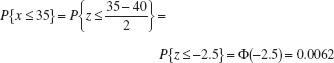
Consequently, the desired probability is
p{x ≥ 35} = 0.0062
Figure 3.18 shows the tabulated probability for both the N(40, 22) distribution and the standard normal distribution. Note that the shaded area to the left of 35 hr in Figure 3.18 represents the fraction of customer complaints resolved in less than or equal to 35 hours.
![]() FIGURE 3.18 Calculation of P{x ≤ 35} in Example 3.7.
FIGURE 3.18 Calculation of P{x ≤ 35} in Example 3.7.
In addition to the appendix table, many computer programs can calculate normal probabilities. Minitab has this capability.
Appendix Table II gives only probabilities to the left of positive values of z. We will need to utilize the symmetry property of the normal distribution to evaluate probabilities. Specifically, note that
and
It is helpful in problem solution to draw a graph of the distribution, as in Figure 3.18.
The diameter of a metal shaft used in a disk-drive unit is normally distributed with mean 0.2508 in. and standard deviation 0.0005 in. The specifications on the shaft have been established as 0.2500 ± 0.0015 in. What fraction of the shafts produced conform to specifications?
SOLUTION
The appropriate normal distribution is shown in Figure 3.19. Note that
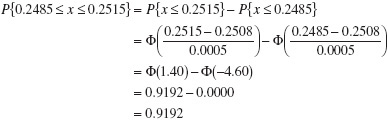

![]() FIGURE 3.19 Distribution of shaft diameters, Example 3.8.
FIGURE 3.19 Distribution of shaft diameters, Example 3.8.
Thus, we would expect the process yield to be approximately 91.92%; that is, about 91.92% of the shafts produced conform to specifications.
Note that almost all of the nonconforming shafts are too large, because the process mean is located very near to the upper specification limit. Suppose that we can recenter the manufacturing process, perhaps by adjusting the machine, so that the process mean is exactly equal to the nominal value of 0.2500. Then we have

By recentering the process we have increased the yield of the process to approximately 99.73%.
EXAMPLE 3.9 Another Use of the Standard Normal Tabel
Sometimes instead of finding the probability associated with a particular value of a normal random variable, we find it necessary to do the opposite—find a particular value of a normal random variable that results in a given probability. For example, suppose that x ~ N(10, 9). Find the value of x—say, a— such that P{x > a} = 0.05.
SOLUTION
From the problem statement, we have
![]()
or
![]()
From Appendix Table II, we have P{z ≤ 1.645} = 0.95, so
![]()
or
a = 10 + 3(1.645) = 14.935
The normal distribution has many useful properties. One of these is relative to linear combinations of normally and independently distributed random variables. If x1, x2 …, xn are normally and independently distributed random variables with means μ1, μ2, …, μn and variances ![]() , respectively, then the distribution of the linear combination
, respectively, then the distribution of the linear combination
y = a1x1 + a2x2 +…+ anxn
is normal with mean
and variance
where a1, a2, …, an are constants.
The Central Limit Theorem. The normal distribution is often assumed as the appropriate probability model for a random variable. Later on, we will discuss how to check the validity of this assumption; however, the central limit theorem is often a justification of approximate normality.
Definition
The Central Limit Theorem If x1, x2, …, xn are independent random variables with mean μi and variance ![]() , and if y = x1 + x2 + … + xn, then the distribution of
, and if y = x1 + x2 + … + xn, then the distribution of

approaches the N(0, 1) distribution as n approaches infinity.
The central limit theorem implies that the sum of n independently distributed random variables is approximately normal, regardless of the distributions of the individual variables. The approximation improves as n increases. In many cases the approximation will be good for small n—say, n < 10—whereas in some cases we may require very large n—say, n > 100—for the approximation to be satisfactory. In general, if the xi are identically distributed, and the distribution of each xi does not depart radically from the normal, then the central limit theorem works quite well for n ≥ 3 or 4. These conditions are met frequently in quality-engineering problems.
3.3.2 The Lognormal Distribution
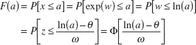
Variables in a system sometimes follow an exponential relationship, say x = exp(w). If the exponent w is a random variable, then x = exp(w) is a random variable and the distribution of x is of interest. An important special case occurs when w has a normal distribution. In that case, the distribution of x is called a lognormal distribution. The name follows from the transformation ln (x) = w. That is, the natural logarithm of x is normally distributed.
Probabilities for x are obtained from the transformation to w, but we need to recognize that the range of x is (0, ∞). Suppose that w is normally distributed with mean θ and variance ω2; then the cumulative distribution function for x is
for x > 0, where z is a standard normal random variable. Therefore, Appendix Table II can be used to determine the probability. Also, f(x) = 0, for x ≤ 0. The lognormal random variable is always nonnegative.
The lognormal distribution is defined as follows:
Definition
Let w have a normal distribution mean θ and variance ω2; then x = exp(w) is a lognormal random variable, and the lognormal distribution is
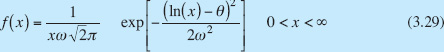
The mean and variance of x are
The parameters of a lognormal distribution are θ and ω2, but care is needed to interpret that these are the mean and variance of the normal random variable w. The mean and variance of x are the functions of these parameters shown in equation 3.30. Figure 3.20 illustrates lognormal distributions for selected values of the parameters.
The lifetime of a product that degrades over time is often modeled by a lognormal random variable. For example, this is a common distribution for the lifetime of a semiconductor laser. Other continuous distributions can also be used in this type of application. However, because the lognormal distribution is derived from a simple exponential function of a normal random variable, it is easy to understand and easy to evaluate probabilities.
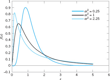
![]() FIGURE 3.20 Lognormal probability density functions with θ = 0 for selected values of ω2.
FIGURE 3.20 Lognormal probability density functions with θ = 0 for selected values of ω2.
EXAMPLE 3.10 Medical Laser Lifetime
The lifetime of a medical laser used in ophthalmic surgery has a lognormal distribution with θ = 6 and ω = 1.2 hours What is the probability that the lifetime exceeds 500 hours?
SOLUTION
From the cumulative distribution function for the lognormal random variable

What lifetime is exceeded by 99% of lasers? Now the question is to determine a such that P(x > a) = 0.99. Therefore,
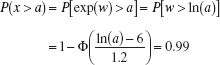
From Appendix Table II, 1 − Φ(a) = 0.99 when a = −2.33. Therefore,
![]()
Determine the mean and standard deviation of the lifetime. Now,

so the standard deviation of the lifetime is 1487.42 hours. Notice that the standard deviation of the lifetime is large relative to the mean.
3.3.3 The Exponential Distribution
The probability distribution of the exponential random variable is defined as follows:
Definition
The exponential distribution is
where λ > 0 is a constant. The mean and variance of the exponential distribution are
and
respectively.
Several exponential distributions are shown in Figure 3.21.
The cumulative exponential distribution is
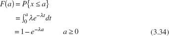
Figure 3.22 illustrates the exponential cumulative distribution function.
The exponential distribution is widely used in the field of reliability engineering as a model of the time to failure of a component or system. In these applications, the parameter λ is called the failure rate of the system, and the mean of the distribution 1/λ is called the mean time to failure.2 For example, suppose that an electronic component in an airborne radar system has a useful life described by an exponential distribution with failure rate 10−4/h; that is, λ = 10−4. The mean time to failure for this component is 1/λ = 104 = 10,000 h. If we wanted to determine the probability that this component would fail before its expected life, we would evaluate

![]() FIGURE 3.21 Exponential distributions for selected values of λ.
FIGURE 3.21 Exponential distributions for selected values of λ.

![]() FIGURE 3.22 The cumulative exponential distribution function.
FIGURE 3.22 The cumulative exponential distribution function.
This result holds regardless of the value of λ; that is, the probability that a value of an exponential random variable will be less than its mean is 0.63212. This happens, of course, because the distribution is not symmetric.
There is an important relationship between the exponential and Poisson distributions. If we consider the Poisson distribution as a model of the number of occurrences of some event in the interval (0, t], then from equation 3.15 we have
![]()
Now x = 0 implies that there are no occurrences of the event in (0, t], and P{x = 0} = p(0) = e−λt. We may think of p(0) as the probability that the interval to the first occurrence is greater than t, or
P{y > t} = p(0) = e−λt
where y is the random variable denoting the interval to the first occurrence. Since
F(t) = P{y ≤ t} = 1 − e−λt
and using the fact that f(y) = dF(y)/dy, we have
as the distribution of the interval to the first occurrence. We recognize equation 3.35 as an exponential distribution with parameter λ. Therefore, we see that if the number of occurrences of an event has a Poisson distribution with parameter λ, then the distribution of the interval between occurrences is exponential with parameter λ.
The exponential distribution has a lack of memory property. To illustrate, suppose that the exponential random variable x is used to model the time to the occurrence of some event. Consider two points in time t1 and t2 > t1. Then the probability that the event occurs at a time that is less than t1 + t2 but greater than time t2 is just the probability that the event occurs at time less than t1. This is the same lack of memory property that we observed earlier for the geometric distribution. The exponential distribution is the only continuous distribution that has this property.
3.3.4 The Gamma Distribution
The probability distribution of the gamma random variable is defined as follows:
The gamma distribution is
with shape parameter r > 0 and scale parameter λ > 0. The mean and variance of the gamma distribution are
and
respectively.3
Several gamma distributions are shown in Figure 3.23. Note that if r = 1, the gamma distribution reduces to the exponential distribution with parameter λ (Section 3.3.3). The gamma distribution can assume many different shapes, depending on the values chosen for r and λ. This makes it useful as a model for a wide variety of continuous random variables.
If the parameter r is an integer, then the gamma distribution is the sum of r independently and identically distributed exponential distributions, each with parameter λ. That is, if x1, x2, …, xr are exponential with parameter λ and independent, then
y = x1 + x2 +…+ xr
is distributed as gamma with parameters r and λ. There are a number of important applications of this result.

![]() FIGURE 3.23 Gamma distributions for selected values or r and λ = 1.
FIGURE 3.23 Gamma distributions for selected values or r and λ = 1.
EXAMPLE 3.11 A Stadby Redundant system
Consider the system shown in Figure 3.24. This is called a standby redundant system, because while component 1 is on, component 2 is off, and when component 1 fails, the switch automatically turns component 2 on. If each component has a life described by an exponential distribution with λ = 10−4/h, say, then the system life is gamma distributed with parameters r = 2 and λ = 10−4. Thus, the mean time to failure is μ = r/λ = 2/10−4 = 2 × 10⁴ h.

![]() FIGURE 3.24 The standby redundant system for Example 3.11.
FIGURE 3.24 The standby redundant system for Example 3.11.
The cumulative gamma distribution is
If r is an integer, then equation 3.39 becomes
Consequently, the cumulative gamma distribution can be evaluated as the sum of r Poisson terms with parameter λa. This result is not too surprising, if we consider the Poisson distribution as a model of the number of occurrences of an event in a fixed interval, and the gamma distribution as the model of the portion of the interval required to obtain a specific number of occurrences.
3.3.5 The Weibull Distribution
The Weibull distribution is defined as follows:
Definition
The Weibull distribution is
where θ > 0 is the scale parameter and β > 0 is the shape parameter. The mean and variance of the Weibull distribution are
and
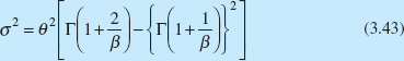
respectively.
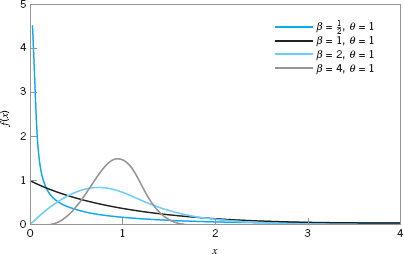
![]() FIGURE 3.25 Weibull distributions for selected values of the shape parameter ß and scale parameter θ = 1.
FIGURE 3.25 Weibull distributions for selected values of the shape parameter ß and scale parameter θ = 1.
The Weibull distribution is very flexible, and by appropriate selection of the parameters θ and β, the distribution can assume a wide variety of shapes. Several Weibull distributions are shown in Figure 3.25 for θ = 1 and β = 1/2, 1, 2, and 4. Note that when β = 1, the Weibull distribution reduces to the exponential distribution with mean 1/θ. The cumulative Weibull distribution is
The Weibull distribution has been used extensively in reliability engineering as a model of time to failure for electrical and mechanical components and systems. Examples of situations in which the Weibull distribution has been used include electronic devices such as memory elements, mechanical components such as bearings, and structural elements in aircraft and automobiles.4
EXAMPLE 3.12 Time to Failure for Electrionic Components
The time to failure for an electronic component used in a flat panel display unit is satisfactorily modeled by a Weibull distribution with ![]() and θ = 5000. Find the mean time to failure and the fraction of components that are expected to survive beyond 20,000 hours.
and θ = 5000. Find the mean time to failure and the fraction of components that are expected to survive beyond 20,000 hours.
SOLUTION
The mean time to failure is

The fraction of components expected to survive a = 20,000 hours is
![]()
or
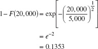
That is, all but about 13.53% of the subassemblies will fail by 20,000 hours.
3.4 Probability Plots
3.4.1 Normal Probability Plots
How do we know whether a particular probability distribution is a reasonable model for data? Probability plotting is a graphical method for determining whether sample data conform to a hypothesized distribution based on a subjective visual examination of the data. The general procedure is very simple and can be performed quickly. Probability plotting typically uses special graph paper, known as probability paper, that has been designed for the hypothesized distribution. Probability paper is widely available for the normal, lognormal, Weibull, and various chi-bsquare and gamma distributions. In this section we illustrate the normal probability plot. Section 3.4.2 discusses probability plots for some other continuous distributions.
To construct a probability plot, the observations in the sample are first ranked from smallest to largest. That is, the sample x1, x2, …, xn is arranged as x(1), x(2), …, x(n), where x(1) is the smallest observation, x(2) is the second smallest observation, and so forth, with x(n) the largest. The ordered observations x(j) are then plotted against their observed cumulative frequency (j − 0.5)/n [or 100 (j − 0.5)/n] on the appropriate probability paper. If the hypothesized distribution adequately describes the data, the plotted points will fall approximately along a straight line; if the plotted points deviate significantly and systematically from a straight line, the hypothesized model is not appropriate. Usually, the determination of whether or not the data plot as a straight line is subjective. The procedure is illustrated in the following example.
EXAMPLE 3.13 A Normal Probability Plot
Observations on the road octane number of ten gasoline blends are as follows: 88.9, 87.0, 90.0, 88.2, 87.2, 87.4, 87.8, 89.7, 86.0, and 89.6. We hypothesize that the octane number is adequately modeled by a normal distribution. Is this a reasonable assumption?
SOLUTION
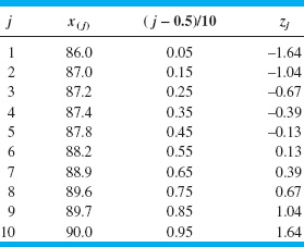
To use probability plotting to investigate this hypothesis, first arrange the observations in ascending order and calculate their cumulative frequencies (j − 0.5)/10 as shown in the following table.

The pairs of values x(j) and (j − 0.5)/10 are now plotted on normal probability paper. This plot is shown in Figure 3.26. Most normal probability paper plots 100(j − 0.5)/n on the left vertical scale (and some also plot 100[1 − (j − 0.5)/n] on the right vertical scale), with the variable value plotted on the horizontal scale. A straight line, chosen subjectively as a “best fit” line, has been drawn through the plotted points. In drawing the straight line, you should be influenced more by the points near the middle of the plot than by the extreme points. A good rule of thumb is to draw the line approximately between the twenty-fifth and seventy-fifth percentile points. This is how the line in Figure 3.26 was determined. In assessing the systematic deviation of the points from the straight line, imagine a fat pencil lying along the line. If all the points are covered by this imaginary pencil, a normal distribution adequately describes the data. Because the points in Figure 3.26 would pass the fat pencil test, we conclude that the normal distribution is an appropriate model for the road octane number data.
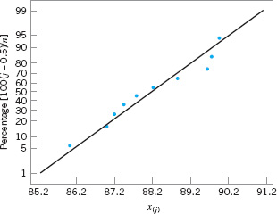
![]() FIGURE 3.26 Normal probability plot of the road octane number data.
FIGURE 3.26 Normal probability plot of the road octane number data.
A normal probability plot can also be constructed on ordinary graph paper by plotting the standardized normal scores zj against x(j), where the standardized normal scores satisfy
![]()
For example, if (j − 0.5)/n = 0.05, Φ(zj) = 0.05 implies that zj = −1.64. To illustrate, consider the data from the previous example. In the following table we show the standardized normal scores in the last column.
Figure 3.27 presents the plot of zj versus x(j). This normal probability plot is equivalent to the one in Figure 3.26. We can obtain an estimate of the mean and standard deviation directly from a normal probability plot. The mean is estimated as the fiftieth percentile. From Figure 3.25, we would estimate the mean road octane number as 88.2. The standard deviation is proportional to the slope of the straight line on the plot, and one standard deviation is the difference between the eighty-fourth and fiftieth percentiles. In Figure 3.26, the eighty-fourth percentile is about 90, and the estimate of the standard deviation is 90 − 88.2 = 1.8.
A very important application of normal probability plotting is in verification of assumptions when using statistical inference procedures that require the normality assumption. This will be illustrated subsequently.
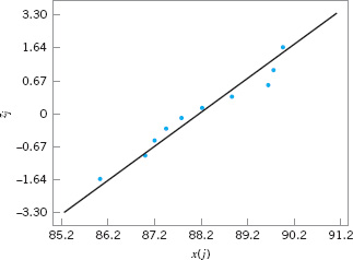
![]() FIGURE 3.27 Normal probability plot of the road octane number data with standardized scores.
FIGURE 3.27 Normal probability plot of the road octane number data with standardized scores.
![]() TABLE 3.5
TABLE 3.5
Aluminum Contamination (ppm)
3.4.2 Other Probability Plots
Probability plots are extremely useful and are often the first technique used when we need to determine which probability distribution is likely to provide a reasonable model for data. In using probability plots, usually the distribution is chosen by subjective assessment of the probability plot. More formal statistical goodness-of-fit tests can also be used in conjunction with probability plotting.
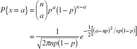
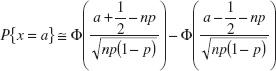
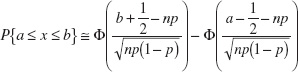
To illustrate how probability plotting can be useful in determining the appropriate distribution for data, consider the data on aluminum contamination (ppm) in plastic shown in Table 3.5. Figure 3.28 presents several probability plots of this data, constructed using Minitab. Figure 3.28a is a normal probability plot. Notice how the data in the tails of the plot bend away from the straight line; This is an indication that the normal distribution is not a good model for the data. Figure 3.28b is a lognormal probability plot of the data. The data fall much closer to the straight line in this plot, particularly the observations in the tails, suggesting that the lognormal distribution is more likely to provide a reasonable model for the data than is the normal distribution.
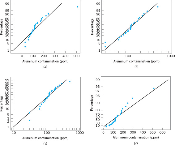
![]() FIGURE 3.28 Probability plots of the aluminum contamination data in Table 3.5. (a) Normal. (b) Lognormal. (c) Weibull. (d) Exponential.
FIGURE 3.28 Probability plots of the aluminum contamination data in Table 3.5. (a) Normal. (b) Lognormal. (c) Weibull. (d) Exponential.
Finally, Figures 3.28c and 3.28d are Weibull and exponential probability plots for the data. The observations in these plots are not very close to the straight line, suggesting that neither the Weibull nor the exponential is a very good model for the data. Therefore, based on the four probability plots that we have constructed, the lognormal distribution appears to be the most appropriate choice as a model for the aluminum contamination data.
3.5 Some Useful Approximations
In certain quality control problems, it is sometimes useful to approximate one probability distribution with another. This is particularly helpful in situations where the original distribution is difficult to manipulate analytically. In this section, we present three such approximations: (1) the binomial approximation to the hypergeometric, (2) the Poisson approximation to the binomial, and (3) the normal approximation to the binomial.
3.5.1 The Binomial Approximation to the Hypergeometric
Consider the hypergeometric distribution in equation 3.8. If the ratio n/N (often called the sampling fraction) is small—say, n/N ≤ 0.1—then the binomial distribution with parameters p = D/N and n is a good approximation to the hypergeometric. The approximation is better for small values of n/N.
This approximation is useful in the design of acceptance-sampling plans. Recall that the hypergeometric distribution is the appropriate model for the number of nonconforming items obtained in a random sample of n items from a lot of finite size N. Thus, if the sample size n is small relative to the lot size N, the binomial approximation may be employed, which usually simplifies the calculations considerably.
As an example, suppose that a group of 200 automobile loan applications contains 5 applications that have incomplete customer information. Those could be called nonconforming applications. The probability that a random sample of 10 applications will contain no nonconforming applications is, from equation 3.8,

Note that since n/N = 10/200 = 0.05 is relatively small, we could use the binomial approximation with p = D/N = 5/200 = 0.025 and n = 10 to calculate
![]()
3.5.2 The Poisson Approximation to the Binomial
It was noted in Section 3.2.3 that the Poisson distribution could be obtained as a limiting form of the binomial distribution for the case where p approaches zero and n approaches infinity with λ = np constant. This implies that, for small p and large n, the Poisson distribution with λ = np may be used to approximate the binomial distribution. The approximation is usually good for large n and if p < 0.1. The larger the value of n and the smaller the value of p, the better is the approximation.
3.5.3 The Normal Approximation to the Binomial
In Section 3.2.2 we defined the binomial distribution as the sum of a sequence of n Bernoulli trials, each with probability of success p. If the number of trials n is large, then we may use the central limit theorem to justify the normal distribution with mean np and variance np(1 − p) as an approximation to the binomial. That is,
Since the binomial distribution is discrete and the normal distribution is continuous, it is common practice to use continuity corrections in the approximation, so that
where Φ denotes the standard normal cumulative distribution function. Other types of probability statements are evaluated similarly, such as
The normal approximation to the binomial is known to be satisfactory for p of approximately 1/2 and n > 10. For other values of p, larger values of n are required. In general, the approximation is not adequate for p < 1/(n + 1) or p > n/(n + 1), or for values of the random variable outside an interval six standard deviations wide centered about the mean (i.e., the interval ![]() .
.
We may also use the normal approximation for the random variable ![]() —that is, the sample fraction defective of Section 3.2.2. The random variable
—that is, the sample fraction defective of Section 3.2.2. The random variable ![]() is approximately normally distributed with mean p and variance p(1 − p)/n, so that
is approximately normally distributed with mean p and variance p(1 − p)/n, so that
![]()
Since the normal will serve as an approximation to the binomial, and since the binomial and Poisson distributions are closely connected, it seems logical that the normal may serve to approximate the Poisson. This is indeed the case, and if the mean λ of the Poisson distribution is large—say, at least 15—then the normal distribution with μ = λ and σ2 = λ is a satisfactory approximation.
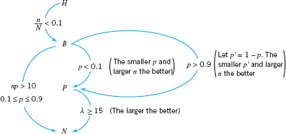
![]() FIGURE 3.29 Approximations of probability distributions.
FIGURE 3.29 Approximations of probability distributions.
3.5.4 Comments on Approximations
A summary of the approximations discussed above is presented in Figure 3.29. In this figure, H, B, P, and N represent the hypergeometric, binomial, Poisson, and normal distributions, respectively. The widespread availability of modern microcomputers, good statistics software packages, and handheld calculators has made reliance on these approximations largely unnecessary, but there are situations in which they are useful, particularly in the application of the popular three-sigma limit control charts.
Important Terms and Concepts
Approximations to probability distributions
Binomial distribution
Box plot
Central limit theorem
Continuous distribution
Control limit theorem
Descriptive statistics
Discrete distribution
Exponential distribution
Gamma distribution
Geometric distribution
Histogram
Hypergeometric probability distribution
Interquartile range
Lognormal distribution
Mean of a distribution
Median
Negative binomial distribution
Normal distribution
Normal probability plot
Pascal distribution
Percentile
Poisson distribution
Population
Probability distribution
Probability plotting
Quartile
Random variable
Run chart
Sample
Sample average
Sample standard deviation
Sample variance
Standard deviation
Standard normal distribution
Statistics
Stem-and-leaf display
Time series plot
Uniform distribution
Variance of a distribution
Weibull distribution
![]() The student Resource Manual presents comprehensive annotated solutions to the odd-numbered exercises included in the Answers to Selected Exercises section in the back of this book.
The student Resource Manual presents comprehensive annotated solutions to the odd-numbered exercises included in the Answers to Selected Exercises section in the back of this book.
3.1. The content of liquid detergent bottles is being analyzed. Twelve bottles, randomly selected from the process, are measured, and the results are as follows (in fluid ounces): 16.05, 16.3, 16.02, 16.04, 16.05, 16.01, 16.2, 16.02, 16.03, 16.01, 16.00, 16.07
(a) Calculate the sample average.
(b) Calculate the sample standard deviation.
3.2. The bore diameters of eight randomly selected bearings are shown here (in mm): 50.001, 50.002, 49.998, 50.006, 50.005, 49.996, 50.003, 50.004
(a) Calculate the sample average.
(b) Calculate the sample standard deviation.
3.3. The service time in minutes from admit to discharge for ten patients seeking care in a hospital emergency department are 21, 136, 185, 156, 3, 16, 48, 28, 100, and 12. Calculate the mean and standard deviation of the service time.
3.4. The Really Cool Clothing Company sells its products through a telephone ordering process. Since business is good, the company is interested in studying the way that sales agents interact with their customers. Calls are randomly selected and recorded, then reviewed with the sales agent to identify ways that better service could possibly be provided or that the customer could be directed to other items similar to those they plan to purchase that they might also find attractive. Call handling time (length) in minutes for 20 randomly selected customer calls handled by the same sales agent are as follows: 6, 26, 8, 2, 6, 3, 10, 14, 4, 5, 3, 17, 9, 8, 9, 5, 3, 28, 21, and 4. Calculate the mean and standard deviation of call handling time.
3.5. The nine measurements that follow are furnace temperatures recorded on successive batches in a semiconductor manufacturing process (units are °F): 953, 955, 948, 951, 957, 949, 954, 950, 959
(a) Calculate the sample average.
(b) Calculate the sample standard deviation.
3.6. Consider the furnace temperature data in Exercise 3.5.
(a) Find the sample median of these data.
(b) How much could the largest temperature measurement increase without changing the sample median?
3.7. Yield strengths of circular tubes with end caps are measured. The first yields (in kN) are as follows: 96, 102, 104, 108, 126, 128, 150, 156
(a) Calculate the sample average.
(b) Calculate the sample standard deviation.
![]() TABLE 3E.1
TABLE 3E.1
Electronic Component Failure Time
3.8. The time to failure in hours of an electronic component subjected to an accelerated life test is shown in Table 3E.1. To accelerate the failure test, the units were tested at an elevated temperature (read down, then across).
(a) Calculate the sample average and standard deviation.
(b) Construct a histogram.
(c) Construct a stem-and-leaf plot.
(d) Find the sample median and the lower and upper quartiles.
3.9. The data shown in Table 3E.2 are chemical process yield readings on successive days (read down, then across). Construct a histogram for these data.

Comment on the shape of the histogram. Does it resemble any of the distributions that we have discussed in this chapter?
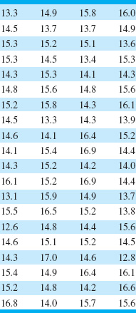
3.10. An article in Quality Engineering (Vol. 4, 1992, pp. 487–495) presents viscosity data from a batch chemical process. A sample of these data is presented in Table 3E.3 (read down, then across).
(a) Construct a stem-and-leaf display for the viscosity data.
(b) Construct a frequency distribution and histogram.
(c) Convert the stem-and-leaf plot in part (a) into an ordered stem-and-leaf plot. Use this graph to assist in locating the median and the upper and lower quartiles of the viscosity data.
(d) What are the tenth and ninetieth percentiles of viscosity?
3.11. Construct and interpret a normal probability plot of the volumes of the liquid detergent bottles in Exercise 3.1.
3.12. Construct and interpret a normal probability plot of the nine furnace temperature measurements in Exercise 3.5.
3.13. Construct a normal probability plot of the failure time data in Exercise 3.8. Does the assumption that failure time for this component is well modeled by a normal distribution seem reasonable?
![]() TABLE 3E.4
TABLE 3E.4
Cycles to Failure of Test Coupons

3.14. Construct a normal probability plot of the chemical process yield data in Exercise 3.9. Does the assumption that process yield is well modeled by a normal distribution seem reasonable?
3.15. Consider the viscosity data in Exercise 3.10. Construct a normal probability plot, a lognormal probability plot, and a Weibull probability plot for these data. Based on the plots, which distribution seems to be the best model for the viscosity data?
3.16. Table 3E.4 contains 20 observations on cycles to failure of aluminum test coupons subjected to repeated alternating stress of 15,000 psi at 20 cycles per second. Construct a normal probability plot, a lognormal probability plot, and a Weibull probability plot for these data. Based on the plots, which distribution seems to be the best model for the cycles to failure for this material?
3.17. An important quality characteristic of water is the concentration of suspended solid material (in ppm). Table 3E.5 contains 40 measurements on suspended solids for a certain lake. Construct a normal probability plot, a lognormal probability plot, and a Weibull probability plot for these data. Based on the plots, which distribution seems to be the best model for the concentration of suspended solids?
3.18. Consider the outpatient service times in Exercise 3.3. Construct a normal probability plot, an exponential probability plot, and a Weibull probability plot for these data. Do any of these distributions seem to be a reasonable probability model for the data? Based on the plots, which distribution is the best one to describe the outpatient service time?
![]() TABLE 3E.5
TABLE 3E.5
Concentration of Suspended Solids (ppm)
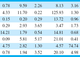
3.19. Consider the call handling times in Exercise 3.4. Construct a normal probability plot, an exponential probability plot, and a gamma probability plot for these data. Do any of these distributions seem to be a reasonable probability model for the data? Based on the plots, which distribution is the best one to describe the call handling time?
3.20. Consider the viscosity data in Exercise 3.10. Assume that reading down, then across, gives the data in time order. Construct and interpret a time-series plot.
3.21. Reconsider the yield data in Exercise 3.9. Construct a time-series plot for these data. Interpret the plot.
3.22. Consider the concentration of suspended solids from Exercise 3.17. Assume that reading across, then down, gives the data in time order. Construct and interpret a time-series plot.
3.23. Consider the chemical process yield data in Exercise 3.9. Calculate the sample average and standard deviation.
3.24. Consider the chemical process yield data in Exercise 3.9. Construct a stem-and-leaf plot for the data and compare it with the histogram from Exercise 3.9. Which display provides more information about the process?
3.25. Construct a box plot for the data in Exercise 3.1.
3.26. Construct a box plot for the data in Exercise 3.2.
3.27. Suppose that two fair dice are tossed and the random variable observed—say, x—is the sum of the two up faces. Describe the sample space of this experiment, and determine the probability distribution of x.
3.28. Find the mean and variance of the random variable in Exercise 3.27.
3.29. A mechatronic assembly is subjected to a final functional test. Suppose that defects occur at random in these assemblies, and that defects occur according to a Poisson distribution with parameter λ = 0.02.
(a) What is the probability that an assembly will have exactly one defect?
(b) What is the probability that an assembly will have one or more defects?
(c) Suppose that you improve the process so that the occurrence rate of defects is cut in half to λ = 0.01. What effect does this have on the probability that an assembly will have one or more defects?
3.30. The probability distribution of x is f(x) = ke−x, 0 ≤ x ≤ ∞. Find the appropriate value of k. Find the mean and variance of x.
3.31. The random variable x takes on the values 1, 2, or 3 with probabilities (1 + 3k)/3, (1 + 2k)/3, and (0.5 + 5k)/3, respectively.
(a) Find the appropriate value of k.
(b) Find the mean and variance of x.
(c) Find the cumulative distribution function.
3.32. The probability distribution of the discrete random variable x is p(x) = krx, 0 < r < 1. Find the appropriate value for k if x = 0, 1, ….
3.33. A manufacturer of electronic calculators offers a one-year warranty. If the calculator fails for any reason during this period, it is replaced. The time to failure is well modeled by the following probability distribution:
f(x) = 0.125e−0.125x x > 0
(a) What percentage of the calculators will fail within the warranty period?
(b) The manufacturing cost of a calculator is $50, and the profit per sale is $25. What is the effect of warranty replacement on profit?
3.34. The net contents in ounces of canned soup is a random variable with probability distribution
![]()
Find the probability that a can contains less than 12 ounces of product.
3.35. A production process operates with 1% nonconforming output. Every hour a sample of 25 units of product is taken, and the number of nonconforming units counted. If one or more nonconforming units are found, the process is stopped and the quality control technician must search for the cause of nonconforming production. Evaluate the performance of this decision rule.
3.36. Continuation of Exercise 3.35. Consider the decision rule described in Exercise 3.35. Suppose that the process suddenly deteriorates to 4% nonconforming output. How many samples, on average, will be required to detect this?
3.37. A random sample of 50 units is drawn from a production process every half hour. The fraction of non-conforming product manufactured is 0.02. What is the probability that ![]() ≤ 0.04 if the fraction nonconforming really is 0.02?
≤ 0.04 if the fraction nonconforming really is 0.02?
3.38. A sample of 100 units is selected from a production process that is 1% nonconforming. What is the probability that ![]() will exceed the true fraction nonconforming by k standard deviations, where k = 1, 2, and 3?
will exceed the true fraction nonconforming by k standard deviations, where k = 1, 2, and 3?
3.39. Suppose that 10% of the adult population has blood chemistry parameters consistent with a diagnosis of a pre-diabetic condition. Of four volunteer participants in a health screening study, what is the probability that one of them is pre-diabetic?
3.40. Patients arriving at an outpatient clinic are routinely screened for high blood pressure. Assume that this condition occurs in 15% of the population.
(a) What is the probability that the third patient of the day has high blood pressure?
(b) What is the average number of patients that must be seen to find the first patient with high blood pressure?
(c) If the clinic typically sees 50 patients each day, what is the probability of finding 10 patients with high blood pressure?
3.41. A stock brokerage has four computers that are used for making trades on the New York Stock Exchange. The probability that a computer fails on any single day is 0.005. Failures occur independently. Any failed computers are repaired after the exchange closes, so each day can be considered an independent trial.
(a) What is the probability that all four computers fail on one day?
(b) What is the probability that at least one computer fails on a day?
(c) What is the mean number of days until a specific computer fails?
3.42. A computer system uses passwords consisting of the lowercase letters (a–z) and the integers (0–9). There are 10,000 users with unique passwords. A hacker randomly selects (with replacement) passwords in an attempt to break into the system.
(a) Suppose that 8000 of the users have six-character passwords. What is the mean and standard deviation of the number of attempts required before the hacker selects a legitimate password?
(b) Suppose that 2000 of the users have three-character passwords. What is the mean and standard deviation of the number of attempts required before the hacker selects a legitimate password?
3.43. An electronic component for a medical X-ray unit is produced in lots of size N = 25. An acceptance testing procedure is used by the purchaser to protect against lots that contain too many nonconforming components. The procedure consists of selecting five components at random from the lot (without replacement) and testing them. If none of the components is nonconforming, the lot is accepted.
(a) If the lot contains two nonconforming components, what is the probability of lot acceptance?
(b) Calculate the desired probability in (a) using the binomial approximation. Is this approximation satisfactory? Why or why not?
(c) Suppose the lot size was N = 150. Would the binomial approximation be satisfactory in this case?
(d) Suppose that the purchaser will reject the lot with the decision rule of finding one or more nonconforming components in a sample of size n, and wants the lot to be rejected with probability at least 0.95 if the lot contains five or more nonconforming components. How large should the sample size n be?
3.44. A lot of size N = 30 contains three nonconforming units. What is the probability that a sample of five units selected at random contains exactly one nonconforming unit? What is the probability that it contains one or more nonconformances?
3.45. A textbook has 500 pages on which typographical errors could occur. Suppose that there are exactly 10 such errors randomly located on those pages. Find the probability that a random selection of 50 pages will contain no errors. Find the probability that 50 randomly selected pages will contain at least two errors.
3.46. Surface-finish defects in a small electric appliance occur at random with a mean rate of 0.1 defects per unit. Find the probability that a randomly selected unit will contain at least one surface-finish defect.
3.47. Glass bottles are formed by pouring molten glass into a mold. The molten glass is prepared in a furnace lined with firebrick. As the firebrick wears, small pieces of brick are mixed into the molten glass and finally appear as defects (called “stones”) in the bottle. If we can assume that stones occur randomly at the rate of 0.00001 per bottle, what is the probability that a bottle selected at random will contain at least one such defect?
3.48. The billing department of a major credit card company attempts to control errors (clerical, data transmission, etc.) on customers’ bills. Suppose that errors occur according to a Poisson distribution with parameter λ = 0.01. What is the probability that a customer’s bill selected at random will contain one error?
3.49. A production process operates in one of two states: the in-control state, in which most of the units produced conform to specifications, and an out-of-control state, in which most of the units produced are defective. The process will shift from the in-control to the out-of-control state at random. Every hour, a quality control technician checks the process, and if it is in the out-of-control state, the technician detects this with probability p. Assume that when the process shifts out of control it does so immediately following a check by the inspector, and once a shift has occurred, the process cannot automatically correct itself. If t denotes the number of periods the process remains out of control following a shift before detection, find the probability distribution of t. Find the mean number of periods the process will remain in the out-of-control state.
3.50. An inspector is looking for nonconforming welds in the gasoline pipeline between Phoenix and Tucson. The probability that any particular weld will be defective is 0.01. The inspector is determined to keep working until finding three defective welds. If the welds are located 100 feet apart, what is the probability that the inspector will have to walk 5000 feet? What is the probability that the inspector will have to walk more than 5000 feet?
3.51. The tensile strength of a metal part is normally distributed with mean 40 pounds and standard deviation 5 pounds. If 50,000 parts are produced, how many would you expect to fail to meet a minimum specification limit of 35-pounds tensile strength? How many would have a tensile strength in excess of 48 pounds?
3.52. The output voltage of a power supply is normally distributed with mean 5 V and standard deviation 0.02 V. If the lower and upper specifications for voltage are 4.95 V and 5.05 V, respectively, what is the probability that a power supply selected at random will conform to the specifications on voltage?
3.53. Continuation of Exercise 3.52. Reconsider the power supply manufacturing process in Exercise 3.52. Suppose we wanted to improve the process. Can shifting the mean reduce the number of nonconforming units produced? How much would the process variability need to be reduced in order to have all but one out of 1000 units conform to the specifications?
3.54. If x is normally distributed with mean μ and standard deviation σ = 4, and given that the probability that x is less than 32 is 0.0228, find the value of μ.
3.55. The life of an automotive battery is normally distributed with mean 900 days and standard deviation 35 days. What fraction of these batteries would be expected to survive beyond 1000 days?
3.56. A lightbulb has a normally distributed light output with mean 5000 end foot-candles and standard deviation of 50 end foot-candles. Find a lower specification limit such that only 0.5% of the bulbs will not exceed this limit.
3.57. The specifications on an electronic component in a target-acquisition system are that its life must be between 5000 and 10,000 h. The life is normally distributed with mean 7500 h. The manufacturer realizes a price of $10 per unit produced; however, defective units must be replaced at a cost of $5 to the manufacturer. Two different manufacturing processes can be used, both of which have the same mean life. However, the standard deviation of life for process 1 is 1000 h, whereas for process 2 it is only 500 h. Production costs for process 2 are twice those for process 1. What value of production costs will determine the selection between processes 1 and 2?
3.58. A quality characteristic of a product is normally distributed with mean μ and standard deviation σ = 1. Specifications on the characteristic are 6 ≤ x ≤ 8. A unit that falls within specifications on this quality characteristic results in a profit of C0. However, if x < 6, the profit is −C1, whereas if x > 8, the profit is –C2. Find the value of μ that maximizes the expected profit.
3.59. Derive the mean and variance of the binomial distribution.
3.60. Derive the mean and variance of the Poisson distribution.
3.61. Derive the mean and variance of the exponential distribution.
3.62. Derive the mean and variance of the geometric distribution.
1 There is no universal agreement about how to select the number of bins for a histogram. Some basic statistics textbooks suggest using Sturges’s rule, which sets the number of bins h = 1 + log2n, where n is the sample size. There are many variations of Sturges’s rule. Computer software packages use many different algorithms to determine the number and width of bins, and some of them may not be based on Sturges’s rule.
2See the supplemental text material for more information.
3Γ(r) in the denominator of equation 3.36 is the gamma function, defined as ![]() If r is a positive integer, then Γ(r) = (r − 1)!
If r is a positive integer, then Γ(r) = (r − 1)!