
11 Multivariate Process Monitoring and Control
CHAPTER OUTLINE
11.1 THE MULTIVARIATE QUALITY-CONTROL PROBLEM
11.2 DESCRIPTION OF MULTIVARIATE DATA
11.2.1 The Multivariate Normal Distribution
11.2.2 The Sample Mean Vector and Covariance Matrix
11.3 THE HOTELLING T2 CONTROL CHART
11.3.2 Individual Observations
11.4 THE MULTIVARIATE EWMA CONTROL CHART
11.6 CONTROL CHARTS FOR MONITORING VARIABILITY
Supplemental Material for Chapter 11
S11.1 Multivariate CUSUM Control Charts.
The supplemental material is on the textbook Website www.wiley.com/college/montgomery.
CHAPTER OVERVIEW AND LEARNING OBJECTIVES
In previous chapters we have addressed process monitoring and control primarily from the univariate perspective; that is, we have assumed that there is only one process output variable or quality characteristic of interest. In practice, however, many if not most process monitoring and control scenarios involve several related variables. Although applying univariate control charts to each individual variable is a possible solution, we will see that this is inefficient and can lead to erroneous conclusions. Multivariate methods that consider the variables jointly are required.
This chapter presents control charts that can be regarded as the multivariate extensions of some of the univariate charts of previous chapters. The Hotelling T2 chart is the analog of the Shewhart ![]() chart. We will also discuss a multivariate version of the EWMA control chart, and some methods for monitoring variability in the multivariate case. These multivariate control charts work well when the number of process variables is not too large—say, ten or fewer. As the number of variables grows, however, traditional multivariate control charts lose efficiency with regard to shift detection. A popular approach in these situations is to reduce the dimensionality of the problem. We show how this can be done with principal components.
chart. We will also discuss a multivariate version of the EWMA control chart, and some methods for monitoring variability in the multivariate case. These multivariate control charts work well when the number of process variables is not too large—say, ten or fewer. As the number of variables grows, however, traditional multivariate control charts lose efficiency with regard to shift detection. A popular approach in these situations is to reduce the dimensionality of the problem. We show how this can be done with principal components.
After careful study of this chapter, you should be able to do the following:
- Understand why applying several univariate control charts simultaneously to a set of related quality characteristics may be an unsatisfactory monitoring procedure
- Understand how the multivariate normal distribution is used as a model for multivariate process data
- Know how to estimate the mean vector and covariance matrix from a sample of multivariate observations
- Know how to set up and use a chi-square control chart
- Know how to set up and use the Hotelling T2 control chart
- Know how to set up and use the multivariate exponentially weighted moving average (MEWMA) control chart
- Know how to use multivariate control charts for individual observations
- Know how to find the phase I and phase II limits for multivariate control charts
- Use control charts for monitoring multivariate variability
- Understand the basis of the regression adjustment procedure and be able to apply regression adjustment in process monitoring
- Understand the basis of principal components and how to apply principal components in process monitoring
11.1 The Multivariate Quality-Control Problem
There are many situations in which the simultaneous monitoring or control of two or more related quality characteristics is necessary. For example, suppose that a bearing has both an inner diameter (x1) and an outer diameter (x2) that together determine the usefulness of the part. Suppose that x1 and x2 have independent normal distributions. Because both quality characteristics are measurements, they could be monitored by applying the usual ![]() chart to each characteristic, as illustrated in Figure 11.1. The process is considered to be in control only if the sample means
chart to each characteristic, as illustrated in Figure 11.1. The process is considered to be in control only if the sample means ![]() and
and ![]() fall within their respective control limits. This is equivalent to the pair of means
fall within their respective control limits. This is equivalent to the pair of means ![]() plotting within the shaded region in Figure 11.2.
plotting within the shaded region in Figure 11.2.
Monitoring these two quality characteristics independently can be very misleading. For example, note from Figure 11.2 that one observation appears somewhat unusual with respect to the others. That point would be inside the control limits on both of the univariate ![]() charts for x1 and x2, yet when we examine the two variables simultaneously, the unusual behavior of the point is fairly obvious. Furthermore, note that the probability that either
charts for x1 and x2, yet when we examine the two variables simultaneously, the unusual behavior of the point is fairly obvious. Furthermore, note that the probability that either ![]() or
or ![]() exceeds three-sigma control limits is 0.0027. However, the joint probability that both variables exceed their control limits simultaneously when they are both in control is (0.0027)(0.0027) = 0.00000729, which is considerably smaller than 0.0027. Furthermore, the probability that both
exceeds three-sigma control limits is 0.0027. However, the joint probability that both variables exceed their control limits simultaneously when they are both in control is (0.0027)(0.0027) = 0.00000729, which is considerably smaller than 0.0027. Furthermore, the probability that both ![]() and
and ![]() will simultaneously plot inside the control limits when the process is really in control is (0.9973)(0.9973) = 0.99460729. Therefore, the use of two independent
will simultaneously plot inside the control limits when the process is really in control is (0.9973)(0.9973) = 0.99460729. Therefore, the use of two independent ![]() charts has distorted the simultaneous monitoring of
charts has distorted the simultaneous monitoring of ![]() and
and ![]() , in that the type I error and the probability of a point correctly plotting in control are not equal to their advertised levels for the individual control charts. However, note that because the variables are independent the univariate control chart limits could be adjusted to account for this.
, in that the type I error and the probability of a point correctly plotting in control are not equal to their advertised levels for the individual control charts. However, note that because the variables are independent the univariate control chart limits could be adjusted to account for this.

![]() FIGURE 11.1 Control charts for inner (
FIGURE 11.1 Control charts for inner (![]() ) and outer (
) and outer (![]() ) bearing diameters.
) bearing diameters.
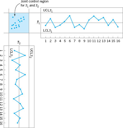
![]() FIGURE 11. 2 Control region using independent control limits for
FIGURE 11. 2 Control region using independent control limits for ![]() and
and ![]() .
.
This distortion in the process-monitoring procedure increases as the number of quality characteristics increases. In general, if there are p statistically independent quality characteristics for a particular product and if an ![]() chart with P{type I error} = α is maintained on each, then the true probability of type I error for the joint control procedure is
chart with P{type I error} = α is maintained on each, then the true probability of type I error for the joint control procedure is
and the probability that all p means will simultaneously plot inside their control limits when the process is in control is
Clearly, the distortion in the joint control procedure can be severe, even for moderate values of p. Furthermore, if the p quality characteristics are not independent, which usually would be the case if they relate to the same product, then equations 11.1 and 11.2 do not hold, and we have no easy way even to measure the distortion in the joint control procedure.
Process-monitoring problems in which several related variables are of interest are sometimes called multivariate quality-control (or process-monitoring) problems. The original work in multivariate quality control was done by Hotelling (1947), who applied his procedures to bombsight data during World War II. Subsequent papers dealing with control procedures for several related variables include Hicks (1955), Jackson (1956, 1959, 1985), Crosier (1988), Hawkins (1991, 1993b), Lowry et al. (1992), Lowry and Montgomery (1995), Pignatiello and Runger (1990), Tracy, Young, and Mason (1992), Montgomery and Wadsworth (1972), and Alt (1985). This subject is particularly important today, as automatic inspection procedures make it relatively easy to measure many parameters on each unit of product manufactured. For example, many chemical and process plants and semiconductor manufacturers routinely maintain manufacturing databases with process and quality data on hundreds of variables. Often the total size of these databases is measured in millions of individual records. Monitoring or analysis of these data with univariate SPC procedures is often ineffective. The use of multivariate methods has increased greatly in recent years for this reason.
11.2 Description of Multivariate Data
11.2.1 The Multivariate Normal Distribution
In univariate statistical quality control, we generally use the normal distribution to describe the behavior of a continuous quality characteristic. The univariate normal probability density function is
The mean of the normal distribution is μ and the variance is σ2. Note that (apart from the minus sign) the term in the exponent of the normal distribution can be written as follows:
This quantity measures the squared standardized distance from x to the mean μ, where by the term “standardized” we mean that the distance is expressed in standard deviation units.
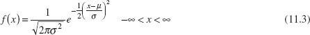
This same approach can be used in the multivariate normal distribution case. Suppose that we have p variables, given by x1, x2,. . ., xp. Arrange these variables in a p-component vector x′ = [x1, x2,. . ., xp]. Let μ′ = [μ1, μ2,. . ., μp] be the vector of the means of the x’s, and let the variances and covariances of the random variables in x be contained in a p × p covariance matrix Σ. The main diagonal elements of Σ are the variances of the x’s, and the off-diagonal elements are the covariances. Now the squared standardized (generalized) distance from x to μ is
![]() FIGURE 11. 3 A multivariate normal distribution with p = 2 variables (bivariate normal).
FIGURE 11. 3 A multivariate normal distribution with p = 2 variables (bivariate normal).
The multivariate normal density function is obtained simply by replacing the standardized distance in equation 11.4 by the multivariate generalized distance in equation 11.5 and changing the constant term ![]() to a more general form that makes the area under the probability density function unity regardless of the value of p. Therefore, the multivariate normal probability density function is
to a more general form that makes the area under the probability density function unity regardless of the value of p. Therefore, the multivariate normal probability density function is
where −∞ < xj < ∞, j = 1, 2,. . ., p.
A multivariate normal distribution for p = 2 variables (called a bivariate normal) is shown in Figure 11.3. Note that the density function is a surface. The correlation coefficient between the two variables in this example is 0.8, and this causes the probability to concentrate closely along a line.
11.2.2 The Sample Mean Vector and Covariance Matrix
Suppose that we have a random sample from a multivariate normal distribution—say,
x1, x2,...,xn
where the ith sample vector contains observations on each of the p variables xi1, xi2,. . ., xip. Then the sample mean vector is
and the sample covariance matrix is
That is, the sample variances on the main diagonal of the matrix S are computed as
and the sample covariances are
We can show that the sample mean vector and sample covariance matrix are unbiased estimators of the corresponding population quantities; that is,
E(![]() ) = μ and E(S) = Σ
) = μ and E(S) = Σ
11.3 The Hotelling T2 Control Chart
The most familiar multivariate process-monitoring and control procedure is the Hotelling T2 control chart for monitoring the mean vector of the process. It is a direct analog of the univariate Shewhart ![]() chart. We present two versions of the Hotelling T2 chart: one for subgrouped data, and another for individual observations.
chart. We present two versions of the Hotelling T2 chart: one for subgrouped data, and another for individual observations.
11.3.1 Subgrouped Data
Suppose that two quality characteristics x1 and x2 are jointly distributed according to the bivariate normal distribution (see Fig. 11.3). Let μ1 and μ2 be the mean values of the quality characteristics, and let σ1 and σ2 be the standard deviations of x1 and x2, respectively. The covariance between x1 and x2 is denoted by σ12. We assume that σ1, σ2, and σ12 are known. If ![]() and
and ![]() are the sample averages of the two quality characteristics computed from a sample of size n, then the statistic
are the sample averages of the two quality characteristics computed from a sample of size n, then the statistic

will have a chi-square distribution with 2 degrees of freedom. This equation can be used as the basis of a control chart for the process means μ1 and μ2. If the process means remain at the values μ1 and μ2, then values of ![]() should be less than the upper control limit UCL =
should be less than the upper control limit UCL = ![]() where
where ![]() is the upper α percentage point of the chi-square distribution with 2 degrees of freedom. If at least one of the means shifts to some new (out-of-control) value, then the probability that the statistic
is the upper α percentage point of the chi-square distribution with 2 degrees of freedom. If at least one of the means shifts to some new (out-of-control) value, then the probability that the statistic ![]() exceeds the upper control limit increases.
exceeds the upper control limit increases.
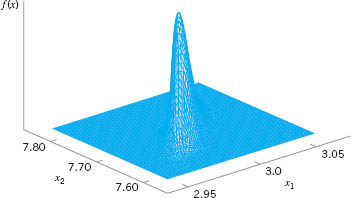
The process-monitoring procedure may be represented graphically. Consider the case in which the two random variables x1 and x2 are independent; that is, σ12 = 0. If σ12 = 0, then equation 11.11 defines an ellipse centered at (μ1, μ2) with principal axes parallel to the ![]() axes, as shown in Figure 11.4. Taking
axes, as shown in Figure 11.4. Taking ![]() in equation 11.11 equal to
in equation 11.11 equal to ![]() implies that a pair of sample averages
implies that a pair of sample averages ![]() yielding a value of
yielding a value of ![]() plotting inside the ellipse indicates that the process is in control, whereas if the corresponding value of
plotting inside the ellipse indicates that the process is in control, whereas if the corresponding value of ![]() plots outside the ellipse the process is out of control. Figure 11.4 is often called a control ellipse.
plots outside the ellipse the process is out of control. Figure 11.4 is often called a control ellipse.
In the case where the two quality characteristics are dependent, then σ12 ≠ 0, and the corresponding control ellipse is shown in Figure 11.5. When the two variables are dependent, the principal axes of the ellipse are no longer parallel to the ![]() axes. Also, note that sample point number 11 plots outside the control ellipse, indicating that an assignable cause is present, yet point 11 is inside the control limits on both of the individual control charts for
axes. Also, note that sample point number 11 plots outside the control ellipse, indicating that an assignable cause is present, yet point 11 is inside the control limits on both of the individual control charts for ![]() and
and ![]() . Thus there is nothing apparently unusual about point 11 when the variables are viewed individually, yet the customer who received that shipment of material would quite likely observe very different performance in the product. It is nearly impossible to detect an assignable cause resulting in a point such as this one by maintaining individual control charts.
. Thus there is nothing apparently unusual about point 11 when the variables are viewed individually, yet the customer who received that shipment of material would quite likely observe very different performance in the product. It is nearly impossible to detect an assignable cause resulting in a point such as this one by maintaining individual control charts.

![]() FIGURE 11. 4 A control ellipse for two independent variables.
FIGURE 11. 4 A control ellipse for two independent variables.
![]() FIGURE 11. 5 A control ellipse for two dependent variables.
FIGURE 11. 5 A control ellipse for two dependent variables.
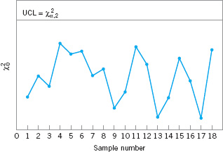
![]() FIGURE 11. 6 A chi-square control chart for p = 2 quality characteristics.
FIGURE 11. 6 A chi-square control chart for p = 2 quality characteristics.
Two disadvantages are associated with the control ellipse. The first is that the time sequence of the plotted points is lost. This could be overcome by numbering the plotted points or by using special plotting symbols to represent the most recent observations. The second and more serious disadvantage is that it is difficult to construct the ellipse for more than two quality characteristics. To avoid these difficulties, it is customary to plot the values of ![]() computed from equation 11.11 for each sample on a control chart with only an upper control limit at
computed from equation 11.11 for each sample on a control chart with only an upper control limit at ![]() , as shown in Figure 11.6. This control chart is usually called the chi-square control chart. Note that the time sequence of the data is preserved by this control chart, so that runs or other nonrandom patterns can be investigated. Furthermore, it has the additional advantage that the “state” of the process is characterized by a single number (the value of the statistic
, as shown in Figure 11.6. This control chart is usually called the chi-square control chart. Note that the time sequence of the data is preserved by this control chart, so that runs or other nonrandom patterns can be investigated. Furthermore, it has the additional advantage that the “state” of the process is characterized by a single number (the value of the statistic ![]() ). This is particularly helpful when there are two or more quality characteristics of interest.
). This is particularly helpful when there are two or more quality characteristics of interest.
It is possible to extend these results to the case where p-related quality characteristics are controlled jointly. It is assumed that the joint probability distribution of the p quality characteristics is the p-variate normal distribution. The procedure requires computing the sample mean for each of the p quality characteristics from a sample of size n. This set of quality characteristic means is represented by the p × 1 vector

The test statistic plotted on the chi-square control chart for each sample is

where μ′ = [μ1, μ2,. . ., μp] is the vector of in-control means for each quality characteristic and Σ is the covariance matrix. The upper limit on the control chart is

Estimating μ and Σ. In practice, it is usually necessary to estimate μ and Σ from the analysis of preliminary samples of size n, taken when the process is assumed to be in control. Suppose that m such samples are available. The sample means and variances are calculated from each sample as usual—that is,
where xijk is the ith observation on the jth quality characteristic in the kth sample. The covariance between quality characteristic j and quality characteristic h in the kth sample is
The statistics ![]() , and sjhk are then averaged over all m samples to obtain
, and sjhk are then averaged over all m samples to obtain
![]()
and
![]()
The ![]() are the elements of the vector
are the elements of the vector ![]() , and the p × p average of sample covariance matrices S is formed as
, and the p × p average of sample covariance matrices S is formed as
The average of the sample covariance matrices S is an unbiased estimate of Σ when the process is in control.
The T2 Control Chart. Now suppose that S from equation 11.18 is used to estimate Σ and that the vector ![]() is taken as the in-control value of the mean vector of the process. If we replace μ with
is taken as the in-control value of the mean vector of the process. If we replace μ with ![]() and Σ with S in equation 11.12, the test statistic now becomes
and Σ with S in equation 11.12, the test statistic now becomes

In this form, the procedure is usually called the Hotelling T2 control chart. This is a directionally invariant control chart; that is, its ability to detect a shift in the mean vector only depends on the magnitude of the shift, and not in its direction.
Alt (1985) has pointed out that in multivariate quality-control applications one must be careful to select the control limits for Hotelling’s T2 statistic (equation 11.19) based on how the chart is being used. Recall that there are two distinct phases of control chart usage. Phase I is the use of the charts for establishing control—that is, testing whether the process was in control when the m preliminary subgroups were drawn and the sample statistics ![]() and S computed. The objective in phase I is to obtain an in-control set of observations so that control limits can be established for phase II, which is the monitoring of future production. Phase I analysis is sometimes called a retrospective analysis.
and S computed. The objective in phase I is to obtain an in-control set of observations so that control limits can be established for phase II, which is the monitoring of future production. Phase I analysis is sometimes called a retrospective analysis.
The phase I control limits for the T2 control chart are given by

In phase II, when the chart is used for monitoring future production, the control limits are as follows:

Note that the UCL in equation 11.21 is just the UCL in equation 11.20 multiplied by (m + 1)/(m − 1).
When μ and Σ are estimated from a large number of preliminary samples, it is customary to use UCL = ![]() as the upper control limit in both phase I and phase II. Retrospective analysis of the preliminary samples to test for statistical control and establish control limits also occurs in the univariate control chart setting. For the
as the upper control limit in both phase I and phase II. Retrospective analysis of the preliminary samples to test for statistical control and establish control limits also occurs in the univariate control chart setting. For the ![]() chart, it is typically assumed that if we use m ≥ 20 or 25 preliminary samples, the distinction between phase I and phase II limits is usually unnecessary, because the phase I and phase II limits will nearly coincide. In a recent review paper, Jensen et al. (2006) point out that even larger sample sizes are required to ensure that the phase II average run length (ARL) performance will actually be close to the anticipated values. They recommend using as many phase I samples as possible to estimate the phase II limits. With multivariate control charts, we must be very careful.
chart, it is typically assumed that if we use m ≥ 20 or 25 preliminary samples, the distinction between phase I and phase II limits is usually unnecessary, because the phase I and phase II limits will nearly coincide. In a recent review paper, Jensen et al. (2006) point out that even larger sample sizes are required to ensure that the phase II average run length (ARL) performance will actually be close to the anticipated values. They recommend using as many phase I samples as possible to estimate the phase II limits. With multivariate control charts, we must be very careful.
Lowry and Montgomery (1995) show that in many situations a large number of preliminary samples would be required before the exact phase II control limits are well approximated by the chi-square limits. These authors present tables indicating the recommended minimum value of m for sample sizes of n = 3, 5, and 10 and for p = 2, 3, 4, 5, 10, and 20 quality characteristics. The recommended values of m are always greater than 20 preliminary samples, and often more than 50 samples. Jensen et al. (2006) observe that these recommended sample sizes are probably too small. Sample sizes of at least 200 are desirable when estimating the phase II limits.
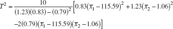
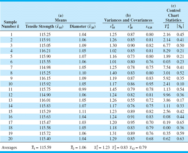
EXAMPLE 11.1 The T2 Control Chart
The tensile strength and diameter of a textile fiber are two important quality characteristics that are to be jointly controlled. The quality engineer has decided to use n = 10 fiber specimens in each sample. He has taken 20 preliminary samples, and on the basis of these data he concludes that ![]() = 115.59 psi,
= 115.59 psi, ![]() = 1.06 (× 10−2) inch,
= 1.06 (× 10−2) inch, ![]() = 1.23,
= 1.23, ![]() = 0.83, and
= 0.83, and ![]() = 0.79. Set up the T2 control chart.
= 0.79. Set up the T2 control chart.
The statistic he will use for process-control purposes is
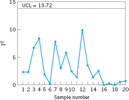
![]() FIGURE 11. 7 The Hotelling T2 control chart for tensile strength and diameter, Example 11.1.
FIGURE 11. 7 The Hotelling T2 control chart for tensile strength and diameter, Example 11.1.
The data used in this analysis and the summary statistics are in Table 11.1, panels (a) and (b).
Figure 11.7 presents the Hotelling T2 control chart for this example. We will consider this to be phase I, establishing statistical control in the preliminary samples, and calculate the upper control limit from equation 11.20. If α = 0.001, then the UCL is

This control limit is shown on the chart in Figure 11.7. Notice that no points exceed this limit, so we would conclude that the process is in control. Phase II control limits could be calculated from equation 11.21. If α = 0.001, the upper control limit is UCL = 15.16. If we had used the approximate chi-square control limit, we would have obtained ![]() = 13.816, which is reasonably close to the correct limit for phase I but somewhat too small for phase II. The amount of data used here to estimate the phase II limits is very small, and if subsequent samples continue to exhibit control, the new data should be used to revise the control limits.
= 13.816, which is reasonably close to the correct limit for phase I but somewhat too small for phase II. The amount of data used here to estimate the phase II limits is very small, and if subsequent samples continue to exhibit control, the new data should be used to revise the control limits.
![]() TABLE 11.1
TABLE 11.1
Data for Example 11.1
The widespread interest in multivariate quality control has led to including the Hotelling T2 control chart in some software packages. These programs should be used carefully, as they sometimes use an incorrect formula for calculating the control limit. Specifically, some packages use:
![]()
This control limit is obviously incorrect. This is the correct critical region to use in multivariate statistical hypothesis testing on the mean vector μ, where a sample of size m is taken at random from a p-dimensional normal distribution, but it is not directly applicable to the control chart for either phase I or phase II problems.
Interpretation of Out-of-Control Signals. One difficulty encountered with any multivariate control chart is practical interpretation of an out-of-control signal. Specifically, which of the p variables (or which subset of them) is responsible for the signal? This question is not always easy to answer. The standard practice is to plot univariate ![]() charts on the individual variables x1, x2,. . ., xp. However, this approach may not be successful, for reasons discussed previously. Alt (1985) suggests using
charts on the individual variables x1, x2,. . ., xp. However, this approach may not be successful, for reasons discussed previously. Alt (1985) suggests using ![]() charts with Bonferroni-type control limits [i.e., replace Zα/2 in the
charts with Bonferroni-type control limits [i.e., replace Zα/2 in the ![]() chart control limit calculation with Zα/(2p)]. This approach reduces the number of false alarms associated with using many simultaneous univariate control charts. Hayter and Tsui (1994) extend this idea by giving a procedure for exact simultaneous confidence intervals. Their procedure can also be used in situations where the normality assumption is not valid. Jackson (1980) recommends using control charts based on the p principal components (which are linear combinations of the original variables). Principal components are discussed in Section 11.7. The disadvantage of this approach is that the principal components do not always provide a clear interpretation of the situation with respect to the original variables. However, they are often effective in diagnosing an out-of-control signal, particularly in cases where the principal components do have an interpretation in terms of the original variables.
chart control limit calculation with Zα/(2p)]. This approach reduces the number of false alarms associated with using many simultaneous univariate control charts. Hayter and Tsui (1994) extend this idea by giving a procedure for exact simultaneous confidence intervals. Their procedure can also be used in situations where the normality assumption is not valid. Jackson (1980) recommends using control charts based on the p principal components (which are linear combinations of the original variables). Principal components are discussed in Section 11.7. The disadvantage of this approach is that the principal components do not always provide a clear interpretation of the situation with respect to the original variables. However, they are often effective in diagnosing an out-of-control signal, particularly in cases where the principal components do have an interpretation in terms of the original variables.
Another very useful approach to diagnosis of an out-of-control signal is to decompose the T2 statistic into components that reflect the contribution of each individual variable. If T2 is the current value of the statistic, and ![]() is the value of the statistic for all process variables except the ith one, then Runger, Alt, and Montgomery (1996b) show that
is the value of the statistic for all process variables except the ith one, then Runger, Alt, and Montgomery (1996b) show that

is an indicator of the relative contribution of the ith variable to the overall statistic. When an out-of-control signal is generated, we recommend computing the values of di (i = 1, 2,. . ., p) and focusing attention on the variables for which di are relatively large. This procedure has an additional advantage in that the calculations can be performed using standard software packages.
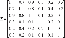
To illustrate this procedure, consider the following example from Runger, Alt, and Montgomery (1996a). There are p = 3 quality characteristics, and the covariance matrix is known. Assume that all three variables have been scaled as follows:
![]()
This scaling results in each process variable having mean zero and variance one. Therefore, the covariance matrix Σ is in correlation form; that is, the main diagonal elements are all one and the off-diagonal elements are the pairwise correlation between the process variables (the x’s). In our example,

The in-control value of the process mean is μ′ = [0, 0, 0]. Consider the following display:
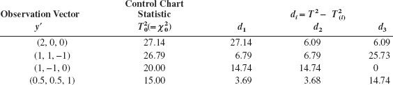
Since Σ is known, we can calculate the upper control limit for the chart from a chi-square distribution. We will choose ![]() = 12.84 as the upper control limit. Clearly all four observation vectors in the above display would generate an out-of-control signal. Runger, Alt, and Montgomery (1996b) suggest that an approximate cutoff for the magnitude of an individual di is
= 12.84 as the upper control limit. Clearly all four observation vectors in the above display would generate an out-of-control signal. Runger, Alt, and Montgomery (1996b) suggest that an approximate cutoff for the magnitude of an individual di is ![]() . Selecting α = 0.01, we would find
. Selecting α = 0.01, we would find ![]() = 6.63, so any di exceeding this value would be considered a large contributor. The decomposition statistics di computed above give clear guidance regarding which variables in the observation vector have shifted.
= 6.63, so any di exceeding this value would be considered a large contributor. The decomposition statistics di computed above give clear guidance regarding which variables in the observation vector have shifted.
Other diagnostics have been suggested in the literature. For example, Murphy (1987) and Chua and Montgomery (1992) have developed procedures based on discriminant analysis, a statistical procedure for classifying observations into groups. Tracy, Mason, and Young (1996) also use decompositions of T2 for diagnostic purposes, but their procedure requires more extensive computations and uses more elaborate decompositions than equation 11.22.
11.3.2 Individual Observations
In some industrial settings the subgroup size is naturally n = 1. This situation occurs frequently in the chemical and process industries. Since these industries frequently have multiple quality characteristics that must be monitored, multivariate control charts with n = 1 would be of interest there.
Suppose that m samples, each of size n = 1, are available and that p is the number of quality characteristics observed in each sample. Let ![]() and S be the sample mean vector and covariance matrix, respectively, of these observations. The Hotelling T2 statistic in equation 11.19 becomes
and S be the sample mean vector and covariance matrix, respectively, of these observations. The Hotelling T2 statistic in equation 11.19 becomes

The phase II control limits for this statistic are

When the number of preliminary samples m is large—say, m > 100—many practitioners use an approximate control limit, either
or
For m > 100, equation 11.25 is a reasonable approximation. The chi-square limit in equation 11.26 is only appropriate if the covariance matrix is known, but it is widely used as an approximation. Lowry and Montgomery (1995) show that the chi-square limit should be used with caution. If p is large—say, p ≥ 10—then at least 250 samples must be taken (m ≥ 250) before the chi-square upper control limit is a reasonable approximation to the correct value.
Tracy, Young, and Mason (1992) point out that if n = 1, the phase I limits should be based on a beta distribution. This would lead to phase I limits defined as

where βα,p/2,(m − p − 1)/2 is the upper α percentage point of a beta distribution with parameters p/2 and (m − p − 1)/2. Approximations to the phase I limits based on the F and chi-square distributions are likely to be inaccurate.
A significant issue in the case of individual observations is estimating the covariance matrix Σ. Sullivan and Woodall (1995) give an excellent discussion and analysis of this problem, and compare several estimators. Also see Vargas (2003) and Williams, Woodall, Birch, and Sullivan (2006). One of these is the “usual” estimator obtained by simply pooling all m observations—say,
![]()
Just as in the univariate case with n = 1, we would expect that S1 would be sensitive to outliers or out-of-control observations in the original sample of n observations. The second estimator [originally suggested by Holmes and Mergen (1993)] uses the difference between successive pairs of observations:
Now arrange these vectors into a matrix V, where

The estimator for Σ is one-half the sample covariance matrix of these differences:
[Sullivan and Woodall (1995) originally denoted this estimator S5.]
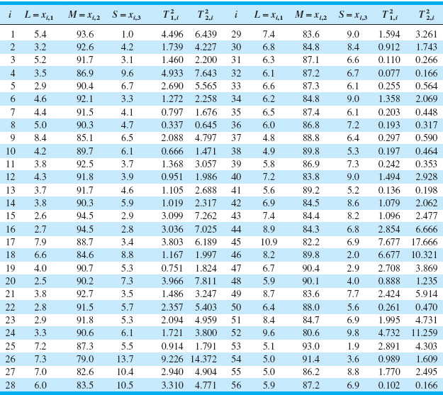
Table 11.2 shows the example from Sullivan and Woodall (1995), in which they apply the T2 chart procedure to the Holmes and Mergen (1993) data. There are 56 observations on the composition of “grit,” where L, M, and S denote the percentages classified as large, medium, and small, respectively. Only the first two components were used because all those percentages add to 100%. The mean vector for these data is ![]() = |5.682, 88.22|. The two sample covariance matrices are
= |5.682, 88.22|. The two sample covariance matrices are
![]()
![]() TABLE 11.2
TABLE 11.2
Example from Sullivan and Woodall (1995) Using the Data from Holmes and Mergen (1993) and the T2 Statistics Using Estimators S1 and S2
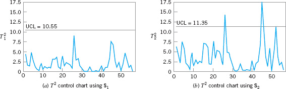
![]() FIGURE 11. 8 T2 control charts for the data in Table 11.2.
FIGURE 11. 8 T2 control charts for the data in Table 11.2.
Figure 11.8 shows the T2 control charts from this example. Sullivan and Woodall (1995) used simulation methods to find exact control limits for this data set (the false alarm probability is 0.155). Williams et al. (2006) observe that the asymptotic (large-sample) distribution of the T2 statistic using S2 is ![]() . They also discuss approximating distributions. However, using simulation to find control limits is a reasonable approach. Note that only the control chart in Figure 11.8b is based on S2 signals. It turns out that if we consider only samples 1–24, the sample mean vector is
. They also discuss approximating distributions. However, using simulation to find control limits is a reasonable approach. Note that only the control chart in Figure 11.8b is based on S2 signals. It turns out that if we consider only samples 1–24, the sample mean vector is
![]()
and if we consider only the last 32 observations the sample mean vector is
![]()
These are statistically significantly different, whereas the “within” covariance matrices are not significantly different. There is an apparent shift in the mean vector following sample 24, and this was correctly detected by the control chart based on S2.
11.4 The Multivariate EWMA Control Chart
The chi-square and T2 charts described in the previous section are Shewhart-type control charts. That is, they use information only from the current sample, so consequently they are relatively insensitive to small and moderate shifts in the mean vector. As we noted, the T2 chart can be used in both phase I and phase II situations. Cumulative sum (CUSUM) and EWMA control charts were developed to provide more sensitivity to small shifts in the univariate case, and they can be extended to multivariate quality control problems.1 As in the univariate case, the multivariate version of these charts are a phase II procedure.
Crosier (1988) and Pignatiello and Runger (1990) have proposed several multivariate CUSUM procedures. Lowry et al. (1992) have developed a multivariate EWMA (MEWMA) control chart. The MEWMA is a logical extension of the univariate EWMA and is defined as follows:

![]() TABLE 11.3
TABLE 11.3
Average Run Lengths (zero state) for the MEWMA Control Chart [from Prabhu and Runger (1997)]

where 0 ≤ λ ≤ 1 and Z0 = 0. The quantity plotted on the control chart is

where the covariance matrix is
which is analogous to the variance of the univariate EWMA.
Prabhu and Runger (1997) have provided a thorough analysis of the average run length performance of the MEWMA control chart, using a modification of the Brook and Evans (1972) Markov chain approach. They give tables and charts to guide selection of the upper control limit—say, UCL = H—for the MEWMA. Tables 11.3 and 11.4 contain this information. Table 11.3 contains ARL performance for MEWMA for various values of λ for p = 2, 4, 6, 10, and 15 quality characteristics. The control limit H was chosen to give an in-control ARL0 = 200. The ARLs in this table are all zero-state ARLs; that is, we assume that the process is in control when the chart is initiated. The shift size is reported in terms of a quantity
usually called the noncentrality parameter. Basically, large values of δ correspond to bigger shifts in the mean. The value δ = 0 is the in-control state (this is true because the control chart can be constructed using “standardized” data). Note that for a given shift size, ARLs generally tend to increase as λ increases, except for very large values of δ (or large shifts).
![]() TABLE 11.4
TABLE 11.4
Optimal MEWMA Control Charts [From Prabhu and Runger (1997)]

Since the MEWMA with λ = 1 is equivalent to the T2 (or chi-square) control chart, the MEWMA is more sensitive to smaller shifts. This is analogous to the univariate case. Because the MEWMA is a directionally invariant procedure, all that we need to characterize its performance for any shift in the mean vector is the corresponding value of δ.
Table 11.4 presents “optimum” MEWMA chart designs for various shifts (δ) and in-control target values of ARL0 of either 500 or 1,000. ARLmin is the minimum value of ARL1 achieved for the value of λ specified.
To illustrate the design of a MEWMA control chart, suppose that p = 6 and the covariance matrix is
Note that Σ is in correlation form. Suppose that we are interested in a process shift from μ′ = 0 to
μ′ = [1,1,1,1,1,1]
This is essentially a one-sigma upward shift in all p = 6 variables. For this shift, δ = (μ′Σ−1μ)½ = 1.86. Table 11.3 suggests that λ = 0.2 and H = 17.51 would give an in-control ARL0 = 200 and the ARL1 would be between 4.88 and 7.32. It turns out that if the mean shifts by any constant multiple—say, k—of the original vector μ, then δ changes to kδ. Therefore, ARL performance is easy to evaluate. For example, if k = 1.5, then the new δ is δ = 1.5(1.86) = 2.79, and the ARL1 would be between 3.03 and 4.88.
MEWMA control charts provide a very useful procedure. They are relatively easy to apply and design rules for the chart are well documented. Molnau, Runger, Montgomery, et al. (2001) give a computer program for calculating ARLs for the MEWMA. This could be a useful way to supplement the design information in the paper by Prabhu and Runger (1997). Scranton et al. (1996) show how the ARL performance of the MEWMA control chart can be further improved by applying it to only the important principal components of the monitored variables. (Principal components are discussed in Section 11.7.1.) Reynolds and Cho (2006) develop MEWMA procedures for simultaneous monitoring of the mean vector and covariance matrix. Economic models of the MEWMA are discussed by Linderman and Love (2000a, 2000b) and Molnau, Montgomery, and Runger (2001). MEWMA control charts, like their univariate counterparts, are robust to the assumption of normality, if properly designed. Stoumbos and Sullivan (2002) and Testik, Runger, and Borror (2003) report that small values of the parameter λ result in a MEWMA that is very insensitive to the form of the underlying multivariate distribution of the process data. Small values of λ also provide very good performance in detecting small shifts, and they would seem to be a good general choice for the MEWMA. A comprehensive discussion of design strategies for the MEWMA control chart is in Testik and Borror (2004).
Hawkins, Choi, and Lee (2007) have recently proposed a modification of the MEWMA control chart in which the use of a single smoothing constant λ is generalized to a smoothing matrix that has non-zero diagonal elements. The MEWMA scheme in equation 11.30 becomes
Zi = Rxi + (I − R)Zi−1
The authors restrict the elements of R so that the diagonal elements are equal, and they also suggest that the off-diagonals (say roff) be equal and smaller in magnitude than the diagonal elements (say ron). They propose choosing roff = cron, with |c| < 1. Then the full smoothing matrix MEWMA or FEWMA is characterized by the parameters λ and c with the diagonal and off-diagonal elements defined as
![]()
The FEWMA is not a directionally invariant procedure, as are the Hotelling T2 and MEWMA control charts. That is, they are more sensitive to shifts in certain directions than in others. The exact performance of the FEWMA depends on the covariance matrix of the process data and the direction of the shift in the mean vector. There is a computer program to assist in designing the FEWMA to obtain specific ARL performance (see www.stat.umn.edu/hawkins). The authors show that the FEWMA can improve MEWMA performance particularly in cases where the process starts up in an out-of-control state.
11.5 Regression Adjustment
The Hotelling T2 (and chi-square) control chart is based on the general idea of testing the hypothesis that the mean vector of a multivariate normal distribution is equal to a constant vector against the alternative hypothesis that the mean vector is not equal to that constant. In fact, it is an optimal test statistic for that hypothesis. However, it is not necessarily an optimal control-charting procedure for detecting mean shifts. The MEWMA can be designed to have faster detection capability (smaller values of the ARL1). Furthermore, the Hotelling T2 is not optimal for more structured shifts in the mean, such as shifts in only a few of the process variables. It also turns out that the Hotelling T2, and any method that uses the quadratic form structure of the Hotelling T2 test statistic (such as the MEWMA), will be sensitive to shifts in the variance as well as to shifts in the mean. Consequently, various researchers have developed methods to monitor multivariate processes that do not depend on the Hotelling T2 statistic.
Hawkins (1991) has developed a procedure called regression adjustment that is potentially very useful. The scheme essentially consists of plotting univariate control charts of the residuals from each variable obtained when that variable is regressed on all the others. Residual control charts are very applicable to individual measurements, which occurs frequently in practice with multivariate data. Implementation is straightforward, since it requires only a least squares regression computer program to process the data prior to constructing the control charts. Hawkins shows that the ARL performance of this scheme is very competitive with other methods, but depends on the types of control charts applied to the residuals.
A very important application of regression adjustment occurs when the process has a distinct hierarchy of variables, such as a set of input process variables (say, the x’s) and a set of output variables (say, the y’s). Sometimes we call this situation a cascade process [Hawkins (1993b)]. Table 11.5 shows 40 observations from a cascade process, where there are nine input variables and two output variables. We will demonstrate the regression adjustment approach using only one of the output variables, y1. Figure 11.9 is a control chart for individuals and a moving range control chart for the 40 observations on the output variable y1. Note that there are seven outof-control points on the individuals control chart. Using standard least squares regression techniques, we can fit the following regression model for y1 to the process variables x1, x2,…, x9:
![]()
![]() TABLE 11.5
TABLE 11.5
Cascade Process Data
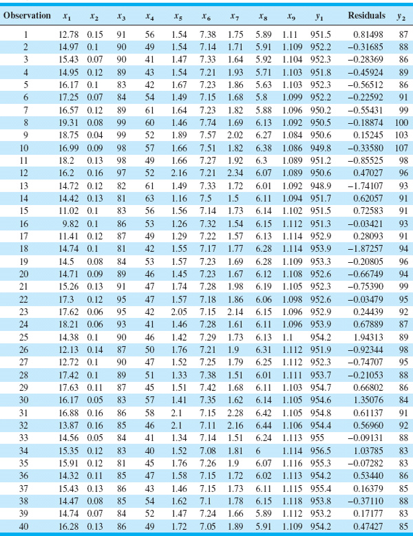
The residuals are found simply by subtracting the fitted value from this equation from each corresponding observation on y1. These residuals are shown in the next-to-last column of Table 11.5.
Figure 11.10 shows a control chart for individuals and a moving range control chart for the 40 residuals from this procedure. Note that there is now only one out-of-control point on the moving range chart, and the overall impression of process stability is rather different than was obtained from the control charts for y1 alone, without the effects of the process variables taken into account.

![]() FIGURE 11. 9 Individuals and moving range control charts for y1 from Table 11.5.
FIGURE 11. 9 Individuals and moving range control charts for y1 from Table 11.5.

![]() FIGURE 11. 10 Individuals and moving range control charts for the residuals of the regression on y1, Table 11.5.
FIGURE 11. 10 Individuals and moving range control charts for the residuals of the regression on y1, Table 11.5.
Regression adjustment has another nice feature. If the proper set of variables is included in the regression model, the residuals from the model will typically be uncorrelated, even though the original variable of interest y1 exhibited correlation. To illustrate, Figure 11.11 is the sample autocorrelation function for y1. Note that there is considerable autocorrelation at low lags in this variable. This is very typical behavior for data from a chemical or process plant. The sample autocorrelation function for the residuals is shown in Figure 11.12. There is no evidence of autocorrelation in the residuals. Because of this nice feature, the regression adjustment procedure has many possible applications in chemical and process plants where there are often cascade processes with several inputs but only a few outputs, and where many of the variables are highly autocorrelated.
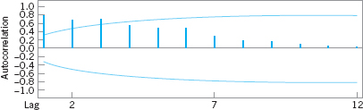
![]() FIGURE 11. 11 Sample autocorrelation function for y1 from Table 11.5.
FIGURE 11. 11 Sample autocorrelation function for y1 from Table 11.5.
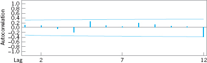
![]() FIGURE 11. 12 Sample autocorrelation function for the residuals from the regression on y1, Table 11.5.
FIGURE 11. 12 Sample autocorrelation function for the residuals from the regression on y1, Table 11.5.
11.6 Control Charts for Monitoring Variability
Monitoring multivariate processes requires attention on two levels. It is important to monitor the process mean vector μ, and it is important to monitor process variability. Process variability is summarized by the p × p covariance matrix Σ. The main diagonal elements of this matrix are the variances of the individual process variables, and the off-diagonal elements are the covariances. Alt (1985) gives a nice introduction to the problem and presents two useful procedures.
The first procedure is a direct extension of the univariate s2 control chart. The procedure is equivalent to repeated tests of significance of the hypothesis that the process covariance matrix is equal to a particular matrix of constants Σ. If this approach is used, the statistic plotted on the control chart for the ith sample is

where Ai = (n − 1)Si, Si is the sample covariance matrix for sample i, and tr is the trace operator. (The trace of a matrix is the sum of the main diagonal elements.) If the value of Wi plots above the upper control limit ![]() , the process is out of control.
, the process is out of control.
The second approach is based on the sample generalized variance, | S |. This statistic, which is the determinant of the sample covariance matrix, is a widely used measure of multivariate dispersion. Montgomery and Wadsworth (1972) used an asymptotic normal approximation to develop a control chart for | S |. Another method would be to use the mean and variance of | S |—that is, E(| S |) and V(| S |)—and the property that most of the probability distribution of | S | is contained in the interval ![]() . It can be shown that
. It can be shown that
and
V(|S|) = b2|Σ|2
where
![]()
![]()
Therefore, the parameters of the control chart for | S | would be

The lower control limit in equation 11.36 is replaced with zero if the calculated value is less than zero.
In practice, Σ usually will be estimated by a sample covariance matrix S, based on the analysis of preliminary samples. If this is the case, we should replace | Σ | in equation 11.36 by | S |/b1, since equation 11.35 has shown that | S |/b1 is an unbiased estimator of | Σ |.
EXAMPLE 11.2 Monitoring Variability
Use the data in Example 11.1 and construct a control chart for the generalized variance.
SOLUTION
Based on the 20 preliminary samples in Table 11.1, the sample covariance matrix is
![]()
so
|S| = 0.3968
The constants b1 and b2 are (recall that n = 10)

Therefore, replacing | Σ | in equation 11.36 by | S |/b1 = 0.3968/0.8889 = 0.4464, we find that the control chart parameters are

Figure 11.13 presents the control chart. The values of | Si | for each sample are shown in the last column of panel (c) of Table 11.1.

![]() FIGURE 11. 13 A control chart for the sample generalized variance, Example 11.2.
FIGURE 11. 13 A control chart for the sample generalized variance, Example 11.2.
Although the sample generalized variance is a widely used measure of multivariate dispersion, remember that it is a relatively simplistic scalar representation of a complex multivariable problem, and it is easy to be fooled if all we look at is | S |. For example, consider the three covariance matrices:
![]()
Now | S1 | = | S2 | = | S3 | = 1, yet the three matrices convey considerably different information about process variability and the correlation between the two variables. It is probably a good idea to use univariate control charts for variability in conjunction with the control chart for | S |.
11.7 Latent Structure Methods
Conventional multivariate control-charting procedures are reasonably effective as long as p (the number of process variables to be monitored) is not very large. However, as p increases, the average run-length performance to detect a specified shift in the mean of these variables for multivariate control charts also increases, because the shift is “diluted” in the p-dimensional space of the process variables. To illustrate this, consider the ARLs of the MEWMA control chart in Table 11.3. Suppose we choose λ = 0.1 and the magnitude of the shift is δ = 1.0. Now in this table ARL0 = 200 regardless of p, the number of parameters. However, note that as p increases, ARL1 also increases. For p = 2, ARL1 = 10.15; for p = 6, ARL1 = 13.66; and for p = 15, ARL1 = 18.28. Consequently, other methods are sometimes useful for process monitoring, particularly in situations where it is suspected that the variability in the process is not equally distributed among all p variables. That is, most of the “motion” of the process is in a relatively small subset of the original process variables.
Methods for discovering the subdimensions in which the process moves about are sometimes called latent structure methods because of the analogy with photographic film on which a hidden or latent image is stored as a result of light interacting with the chemical surface of the film. We will discuss two of these methods, devoting most of our attention to the first one, called the method of principal components. We will also briefly discuss a second method called partial least squares.
11.7.1 Principal Components
The principal components of a set of process variables x1, x2, …, xp are just a particular set of linear combinations of these variables—say,
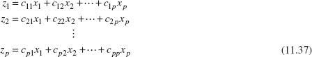
where the cij’s are constants to be determined. Geometrically, the principal component variables z1, z2, …, zp are the axes of a new coordinate system obtained by rotating the axes of the original system (the x’s). The new axes represent the directions of maximum variability.
To illustrate, consider the two situations shown in Figure 11.14. In Figure 11.14a, there are two original variables x1 and x2, and two principal components z1 and z2. Note that the first principal component z1 accounts for most of the variability in the two original variables. Figure 11.14b illustrates three original process variables. Most of the variability or “motion” in these two variables is in a plane, so only two principal components have been used to describe them. In this picture, once again z1 accounts for most of the variability, but a nontrivial amount is also accounted for by the second principal component z2. This is, in fact, the basic intent of principal components: Find the new set of orthogonal directions that define the maximum variability in the original data, and, hopefully, this will lead to a description of the process requiring considerably fewer than the original p variables. The information contained in the complete set of all p principal components is exactly equivalent to the information in the complete set of all original process variables, but hopefully we can use far fewer than p principal components to obtain a satisfactory description.
![]() FIGURE 11. 14 Principal components for p = 2 and p = 3 process variables.
FIGURE 11. 14 Principal components for p = 2 and p = 3 process variables.
It turns out that finding the cij’s that define the principal components is fairly easy. Let the random variables x1, x2, …, xp be represented by a vector x with covariance matrix Σ, and let the eigenvalues of Σ be λ1 ≥ λ2 ≥ ··· ≥ λp ≥ 0. Then the constants cij are simply the elements of the ith eigenvector associated with the eigenvalue λi. Basically, if we let C be the matrix whose columns are the eigenvectors, then
C′ΣC = Λ
where Λ is a p × p diagonal matrix with main diagonal elements equal to the eigenvalues λ1 ≥ λ2 ≥ ··· ≥ λp ≥ 0. Many software packages will compute eigenvalues and eigenvectors and perform the principal components analysis.
The variance of the ith principal component is the ith eigenvalue λi. Consequently, the proportion of variability in the original data explained by the ith principal component is given by the ratio
![]()
Therefore, one can easily see how much variability is explained by retaining just a few (say, r) of the p principal components simply by computing the sum of the eigenvalues for those r components and comparing that total to the sum of all p eigenvalues. It is a fairly typical practice to compute principal components using variables that have been standardized so that they have mean zero and unit variance. Then the covariance matrix Σ is in the form of a correlation matrix. The reason for this is that the original process variables are often expressed in different scales and as a result they can have very different magnitudes. Consequently, a variable may seem to contribute a lot to the total variability of the system just because its scale of measurement has larger magnitudes than the other variables. Standardization solves this problem nicely.
Once the principal components have been calculated and a subset of them selected, we can obtain new principal component observations zij simply by substituting the original observations xij into the set of retained principal components. This gives, for example,
where we have retained the first r of the original p principal components. The zij’s are sometimes called the principal component scores.
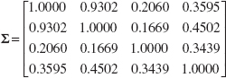
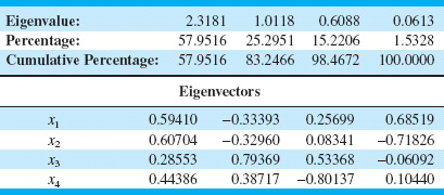
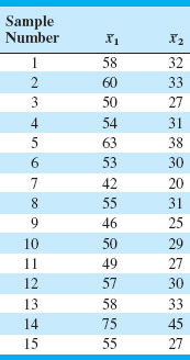
We will illustrate this procedure by performing a principal components analysis (PCA) using the data on the p = 4 variables x1, x2, x3, and x4 in Table 11.6, which are process variables from a chemical process. The first 20 observations in the upper panel of this table are first plotted against each other in a pairwise manner in Figure 11.15. This display is usually called a matrix of scatter plots, and it indicates that the first two variables are highly correlated, whereas the other two variables exhibit only moderate correlation. The ellipses in Figure 11.15 are approximate 95% confidence contours based on the assumption of a normal distribution. The sample covariance matrix of the first 20 observations on the x’s, in correlation form, is
![]() TABLE 11.6
TABLE 11.6
Chemical Process Data


![]() FIGURE 11. 15 Matrix of scatter plots for the first 20 observations on x1, x2, x3, and x4 from Table 11.6.
FIGURE 11. 15 Matrix of scatter plots for the first 20 observations on x1, x2, x3, and x4 from Table 11.6.
Note that the correlation coefficient between x1 and x2 is 0.9302, which confirms the visual impression obtained from the matrix of scatter plots.
Table 11.7 presents the results of a PCA (Minitab was used to perform the calculations) on the first 20 observations, showing the eigenvalues and eigenvectors, as well as the percentage and the cumulative percentage of the variability explained by each principal component. By using only the first two principal components, we can account for over 83% of the variability in the original four variables. Generally, we will want to retain enough components to explain a reasonable proportion of the total process variability, but there are no firm guidelines about how much variability needs to be explained in order to produce an effective process-monitoring procedure.
![]() TABLE 11.7
TABLE 11.7
PCA for the First 20 Observations on x1, x2, x3, and x4 from Table 11.6
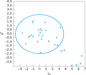
The last two columns in Table 11.6 contain the calculated values of the principal component scores zi1 and zi2 for the first 20 observations. Figure 11.16 is a scatter plot of these 20 principal component scores, along with the approximate 95% confidence contour. Note that all 20 scores for zi1 and zi2 are inside the ellipse. We typically regard this display as a monitoring device or control chart for the principal component variables, and the ellipse is an approximate control limit (obviously higher confidence level contours could be selected). Generally, we are using the scores as an empirical reference distribution to establish a control region for the process. When future values of the variables x1, x2, …, xp are observed, the scores would be computed for the two principal components z1 and z2 and these scores plotted on the graph in Figure 11.16. As long as the scores remain inside the ellipse, there is no evidence that the process mean has shifted. If subsequent scores plot outside the ellipse, then there is some evidence that the process is out of control.
The lower panel of Table 11.6 contains 10 new observations on the process variables x1, x2, …, xp that were not used in computing the principal components. The principal component scores for these new observations are also shown in the table, and the scores are plotted on the control chart in Figure 11.17. A different plotting symbol (×) has been used to assist in identifying the scores from the new points. Although the first few new scores are inside the ellipse, it is clear that beginning with observation 24 or 25, there has been a shift in the process. Control charts such as Figure 11.17 based on principal component scores are often called principal component trajectory plots. Mastrangelo, Runger, and Montgomery (1996) also give an example of this procedure.

![]() FIGURE 11. 16 Scatter plot of the first 20 principal component scores zi1 and zi2 from Table 11.6, with 95% confidence ellipse.
FIGURE 11. 16 Scatter plot of the first 20 principal component scores zi1 and zi2 from Table 11.6, with 95% confidence ellipse.
![]() FIGURE 11. 17 Principal components trajectory chart, showing the last 10 observations from Table 11.6.
FIGURE 11. 17 Principal components trajectory chart, showing the last 10 observations from Table 11.6.
If more than two principal components need to be retained, then pairwise scatter plots of the principal component scores would be used analogously to Figure 11.17. However, if more than r = 3 or 4 components are retained, interpretation and use of the charts becomes cumbersome. Furthermore, interpretation of the principal components can be difficult, because they are not the original set of process variables but instead linear combinations of them. Sometimes principal components have a relatively simple interpretation, and that can assist the analyst in using the trajectory chart. For instance, in our example the constants in the first principal component are all about the same size and have the same sign, so the first principal component can be thought of as an analog of the average of all p = 4 original variables. Similarly, the second component is roughly equivalent to the difference between the averages of the first two and the last two process variables. It’s not always that easy.
A potentially useful alternative to the trajectory plot is to collect the r retained principal component scores into a vector and apply the MEWMA control chart to them. Practical experience with this approach has been very promising, and the ARL of the MEWMA control chart to detect a shift will be much less using the set of retained principal components than it would have been if all p original process variables were used. Scranton et al. (1996) give more details of this technique.
Finally, note that control charts and trajectory plots based on PCA will be most effective in detecting shifts in the directions defined by the principal components. Shifts in other directions, particularly directions orthogonal to the retained principal component directions, may be very hard to detect. One possible solution to this would be to use a MEWMA control chart to monitor all the remaining principal components zr+1, zr+2, … zp.
11.7.2 Partial Least Squares
The method of partial least squares (PLS) is somewhat related to PCS, except that, like the regression adjustment procedure, it classifies the variables into x’s (or inputs) and y’s (or outputs). The goal is to create a set of weighted averages of the x’s and y’s that can be used for prediction of the y’s or linear combinations of the y’s. The procedure maximizes covariance in the same fashion that the principal component directions maximize variance. Minitab has some PLS capability.
The most common applications of partial least squares today are in the chemometrics field, where there are often many variables, both process and response. Frank and Friedman (1993) is a good survey of this field, written for statisticians and engineers. A potential concern about applying PLS is that there has not been any extensive performance comparison of PLS to other multivariate procedures. There is only anecdotal evidence about its performance and its ability to detect process upsets relative to other approaches.
Important Terms and Concepts
Average run length (ARL)
Cascade process
Chi-square control chart
Control ellipse
Covariance matrix
Hotelling T2 control chart
Hotelling T2 subgrouped data control chart
Hotelling T2 individuals control chart
Latent structure methods
Matrix of scatter plots
Monitoring multivariate variability
Multivariate EWMA control chart
Multivariate normal distribution
Multivariate quality control process monitoring
Partial least squares (PLS)
Phase I control limits
Phase II control limits
Principal component scores
Principal components
Principal components analysis (PCA)
Regression adjustment
Residual control chart
Sample covariance matrix
Sample mean vector
Trajectory plots
Exercises
![]() The Student Resource Manual presents comprehensive annotated solutions to the odd-numbered exercises included in the Answers to Selected Exercises section in the back of this book.
The Student Resource Manual presents comprehensive annotated solutions to the odd-numbered exercises included in the Answers to Selected Exercises section in the back of this book.
11.1. The data shown in Table 11E.1 come from a production process with two observable quality characteristics: x1 and x2. The data are sample means of each quality characteristic, based on samples of size n = 25. Assume that mean values of the quality characteristics and the covariance matrix were computed from 50 preliminary samples:![]()
Construct a T2 control chart using these data. Use the phase II limits.
11.2. A product has three quality characteristics. The nominal values of these quality characteristics and their sample covariance matrix have been determined from the analysis of 30 preliminary samples of size n = 10 as follows:

![]() TABLE 11E.1
TABLE 11E.1
Data for Exercise 11.1
![]() TABLE 11E.2
TABLE 11E.2
Data for Exercise 11.2

The sample means for each quality characteristic for 15 additional samples of size n = 10 are shown in Table 11E.2. Is the process in statistical control?
11.3. Reconsider the situation in Exercise 11.1. Suppose that the sample mean vector and sample covariance matrix provided were the actual population parameters. What control limit would be appropriate for phase II for the control chart? Apply this limit to the data and discuss any differences in results that you find in comparison to the original choice of control limit.
11.4. Reconsider the situation in Exercise 11.2. Suppose that the sample mean vector and sample covariance matrix provided were the actual population parameters. What control limit would be appropriate for phase II of the control chart? Apply this limit to the data and discuss any differences in results that you find in comparison to the original choice of control limit.
11.5. Consider a T2 control chart for monitoring p = 6 quality characteristics. Suppose that the subgroup size is n = 3 and there are 30 preliminary samples available to estimate the sample covariance matrix.
(a) Find the phase II control limits assuming that a α 0.005.
(b) Compare the control limits from part (a) to the chi-square control limit. What is the magnitude of the difference in the two control limits?
(c) How many preliminary samples would have to be taken to ensure that the exact phase II control limit is within 1% of the chi-square control limit?
11.6. Rework Exercise 11.5, assuming that the subgroup size is n = 5.
11.7. Consider a T2 control chart for monitoring p = 10 quality characteristics. Suppose that the subgroup size is n = 3 and there are 25 preliminary samples available to estimate the sample covariance matrix.
(a) Find the phase II control limits assuming that a α 0.005.
(b) Compare the control limits from part (a) to the chi-square control limit. What is the magnitude of the difference in the two control limits?
(c) How many preliminary samples would have to be taken to ensure that the chi-square control limit is within 1% of the exact phase II control limit?
11.8. Rework Exercise 11.7, assuming that the subgroup size is n = 5.
11.9. Consider a T2 control chart for monitoring p = 10 quality characteristics. Suppose that the subgroup size is n = 3 and there are 25 preliminary samples available to estimate the sample covariance matrix. Calculate both the phase I and the phase II control limits (use α = 0.01).
11.10. Suppose that we have p = 4 quality characteristics, and in correlation form all four variables have variance unity and all pairwise correlation coefficients are 0.7. The in-control value of the process mean vector is μ′ = [0, 0, 0, 0].
(a) Write out the covariance matrix Σ.
(b) What is the chi-square control limit for the chart, assuming that α = 0.01?
(c) Suppose that a sample of observations results in the standardized observation vector y′ = [3.5, 3.5, 3.5, 3.5]. Calculate the value of the T2 statistic. Is an out-of-control signal generated?
(d) Calculate the diagnostic quantities di, i = 1, 2, 3, 4 from equation 11.22. Does this information assist in identifying which process variables have shifted?
(e) Suppose that a sample of observations results in the standardized observation vector y′ = [2.5, 2, − 1, 0]. Calculate the value of the T2 statistic. Is an out-of-control signal generated?
(f) For the case in (e), calculate the diagnostic quantities di, i = 1, 2, 3, 4 from equation 11.22. Does this information assist in identifying which process variables have shifted?
11.11. Suppose that we have p = 3 quality characteristics, and in correlation form all three variables have variance unity and all pairwise correlation coefficients are 0.8. The in-control value of the process mean vector is μ′ = [0, 0, 0].
(a) Write out the covariance matrix Σ.
(b) What is the chi-square control limit for the chart, assuming that α = 0.05?
(c) Suppose that a sample of observations results in the standardized observation vector y′ = [1, 2, 0]. Calculate the value of the T2 statistic. Is an outof-control signal generated?
(d) Calculate the diagnostic quantities di, i = 1, 2, 3 from equation 11.22. Does this information assist in identifying which process variables have shifted?
(e) Suppose that a sample of observations results in the standardized observation vector y′ = [2, 2, 1]. Calculate the value of the T2 statistic. Is an outof-control signal generated?
(f) For the case in (e), calculate the diagnostic quantities di, i = 1, 2, 3 from equation 11.22. Does this information assist in identifying which process variables have shifted?
11.12. Consider the first two process variables in Table 11.5. Calculate an estimate of the sample covariance matrix using both estimators S1 and S2 discussed in Section 11.3.2.
11.13. Consider the first three process variables in Table 11.5. Calculate an estimate of the sample covariance matrix using both estimators S1 and S2 discussed in Section 11.3.2.
11.14. Consider all 30 observations on the first two process variables in Table 11.6. Calculate an estimate of the sample covariance matrix using both estimators S1 and S2 discussed in Section 11.3.2. Are the estimates very different? Discuss your findings.
11.15. Suppose that there are p = 4 quality characteristics, and in correlation form all four variables have variance unity and all pairwise correlation coefficients are 0.75. The in-control value of the process mean vector is μ′ = [0, 0, 0, 0], and we want to design a MEWMA control chart to provide good protection against a shift to a new mean vector of y′ = [1, 1, 1, 1]. If an in-control ARL0 of 200 is satisfactory, what value of λ and what upper control limit should be used? Approximately, what is the ARL1 for detecting the shift in the mean vector?
11.16. Suppose that there are p = 4 quality characteristics, and in correlation form all four variables have variance unity and that all pairwise correlation coefficients are 0.9. The in-control value of the process mean vector is μ′ = [0, 0, 0, 0], and we want to design a MEWMA control chart to provide good protection against a shift to a new mean vector of y′ = [1, 1, 1, 1]. Suppose that an in-control ARL0 of 500 is desired. What value of λ and what upper control limit would you recommend? Approximately, what is the ARL1 for detecting the shift in the mean vector?
11.17. Suppose that there are p = 2 quality characteristics, and in correlation form both variables have variance unity and the correlation coefficient is 0.8. The in-control value of the process mean vector is μ′ = [0, 0], and we want to design a MEWMA control chart to provide good protection against a shift to a new mean vector of y′ = [1, 1]. If an in-control ARL0 of 200 is satisfactory, what value of λ and what upper control limit should be used? Approximately, what is the ARL1 for detecting the shift in the mean vector?
11.18. Consider the cascade process data in Table 11.5.
(a) Set up an individuals control chart on y2.
(b) Fit a regression model to y2, and set up an individuals control chart on the residuals. Comment on the differences between this chart and the one in part (a).
(c) Calculate the sample autocorrelation functions on y2 and on the residuals from the regression model in part (b). Discuss your findings.
11.19. Consider the cascade process data in Table 11.5. In fitting regression models to both y1 and y2 you will find that not all of the process variables are required to obtain a satisfactory regression model for the output variables. Remove the nonsignificant variables from these equations and obtain subset regression models for both y1 and y2. Then construct individuals control charts for both sets of residuals. Compare them to the residual control charts in the text (Fig. 11.11) and from Exercise 11.18. Are there any substantial differences between the charts from the two different approaches to fitting the regression models?
11.20. Continuation of Exercise 11.19. Using the residuals from the regression models in Exercise 11.19, set up EWMA control charts. Compare these EWMA control charts to the Shewhart charts for individuals constructed previously. What are the potential advantages of the EWMA control chart in this situation?
11.21. Consider the p = 4 process variables in Table 11.6. After applying the PCA procedure to the first 20 observations data (see Table 11.7), suppose that the first three principal components are retained.
(a) Obtain the principal component scores. (Hint: Remember that you must work in standardized variables.)
(b) Construct an appropriate set of pairwise plots of the principal component scores.
(c) Calculate the principal component scores for the last 10 observations. Plot the scores on the charts from part (b) and interpret the results.
11.22. Consider the p = 9 process variables in Table 11.5.
(a) Perform a PCA on the first 30 observations. Be sure to work with the standardized variables.
(b) How much variability is explained if only the first r = 3 principal components are retained?
(c) Construct an appropriate set of pairwise plots of the first r = 3 principal component scores.
(d) Now consider the last 10 observations. Obtain the principal component scores and plot them on the chart in part (c). Does the process seem to be in control?
1The supplementary material for this chapter discusses the multivariate CUSUM control chart.