
5 Methods and Philosophy of Statistical Process Control
CHAPTER OUTLINE
5.2 CHANCE AND ASSIGNABLE CAUSES OF QUALITY VARIATION
5.3 STATISTICAL BASIS OF THE CONTROL CHART
5.3.2 Choice of Control Limits
5.3.3 Sample Size and Sampling Frequency
5.3.5 Analysis of Patterns on Control Charts
5.3.6 Discussion of Sensitizing Rules for Control Charts
5.3.7 Phase I and Phase II Control Chart Application
5.4 THE REST OF THE MAGNIFICENT SEVEN
5.5 IMPLEMENTING SPC IN A QUALITY IMPROVEMENT PROGRAM
Supplemental Material for Chapter 5
S5.1 A SIMPLE ALTERNATIVE TO RUNS RULES ON THE ![]() CHART
CHART
The supplemental material is on the textbook Website www.wiley.com/college/montgomery.
CHAPTER OVERVIEW AND LEARNING OBJECTIVES
This chapter has three objectives. The first is to present the basic statistical process control (SPC) problem-solving tools, called the magnificent seven, and to illustrate how these tools form a cohesive, practical framework for quality improvement. These tools form an important basic approach to both reducing variability and monitoring the performance of a process, and are widely used in both the Analyze and Control steps of DMAIC. The second objective is to describe the statistical basis of the Shewhart control chart. The reader will see how decisions about sample size, sampling interval, and placement of control limits affect the performance of a control chart. Other key concepts include the idea of rational subgroups, interpretation of control chart signals and patterns, and the average run length as a measure of control chart performance. The third objective is to discuss and illustrate some practical issues in the implementation of SPC.
After careful study of this chapter, you should be able to do the following:
1. Understand chance and assignable causes of variability in a process
2. Explain the statistical basis of the Shewhart control chart, including choice of sample size, control limits, and sampling interval
3. Explain the rational subgroup concept
4. Understand the basic tools of SPC: the histogram or stem-and-leaf plot, the check sheet, the Pareto chart, the cause-and-effect diagram, the defect concentration diagram, the scatter diagram, and the control chart
5. Explain phase I and phase II use of control charts
6. Explain how average run length is used as a performance measure for a control chart
7. Explain how sensitizing rules and pattern recognition are used in conjunction with control charts
5.1 Introduction
If a product is to meet or exceed customer expectations, generally it should be produced by a process that is stable or repeatable. More precisely, the process must be capable of operating with little variability around the target or nominal dimensions of the product’s quality characteristics. Statistical process control (SPC) is a powerful collection of problem-solving tools useful in achieving process stability and improving capability through the reduction of variability.
SPC is one of the greatest technological developments of the twentieth century because it is based on sound underlying principles, is easy to use, has significant impact, and can be applied to any process. Its seven major tools are these:
1. Histogram or stem-and-leaf plot
2. Check sheet
3. Pareto chart
4. Cause-and-effect diagram
5. Defect concentration diagram
6. Scatter diagram
7. Control chart
Although these tools—often called the magnificent seven—are an important part of SPC, they comprise only its technical aspects. The proper deployment of SPC helps create an environment in which all individuals in an organization seek continuous improvement in quality and productivity. This environment is best developed when management becomes involved in the process. Once this environment is established, routine application of the magnificent seven becomes part of the usual manner of doing business, and the organization is well on its way to achieving its business improvement objectives.
Of the seven tools, the Shewhart control chart is probably the most technically sophisticated. It was developed in the 1920s by Walter A. Shewhart of the Bell Telephone Laboratories. To understand the statistical concepts that form the basis of SPC, we must first describe Shewhart’s theory of variability.
5.2 Chance and Assignable Causes of Quality Variation
In any production process, regardless of how well designed or carefully maintained it is, a certain amount of inherent or natural variability will always exist. This natural variability or “background noise” is the cumulative effect of many small, essentially unavoidable causes. In the framework of statistical quality control, this natural variability is often called a “stable system of chance causes.” A process that is operating with only chance causes of variation present is said to be in statistical control. In other words, the chance causes are an inherent part of the process.
Other kinds of variability may occasionally be present in the output of a process. This variability in key quality characteristics usually arises from three sources: improperly adjusted or controlled machines, operator errors, or defective raw material. Such variability is generally large when compared to the background noise, and it usually represents an unacceptable level of process performance. We refer to these sources of variability that are not part of the chance cause pattern as assignable causes of variation. A process that is operating in the presence of assignable causes is said to be an out-of-control process.1
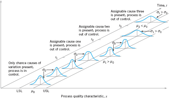
These chance and assignable causes of variation are illustrated in Figure 5.1. Until time t1 the process shown in this figure is in control; that is, only chance causes of variation are present. As a result, both the mean and standard deviation of the process are at their in-control values (say, µ0 and σ0). At time t1, an assignable cause occurs. As shown in Figure 5.1., the effect of this assignable cause is to shift the process mean to a new value µ1 > µ0. At time t2, another assignable cause occurs, resulting in µ = µ0, but now the process standard deviation has shifted to a larger value σ1 > σ0. At time t3 there is another assignable cause present, resulting in both the process mean and standard deviation taking on out-of-control values. From time t1 forward, the presence of assignable causes has resulted in an out-of-control process.
Processes will often operate in the in-control state for relatively long periods of time. However, no process is truly stable forever, and, eventually, assignable causes will occur, seemingly at random, resulting in a shift to an out-of-control state where a larger proportion of the process output does not conform to requirements. For example, note from Figure 5.1. that when the process is in control, most of the production will fall between the lower and upper specification limits (LSL and USL, respectively). When the process is out of control, a higher proportion of the process lies outside of these specifications.
A major objective of statistical process control is to quickly detect the occurrence of assignable causes of process shifts so that investigation of the process and corrective action may be undertaken before many nonconforming units are manufactured. The control chart is an on-line process-monitoring technique widely used for this purpose. Control charts may also be used to estimate the parameters of a production process, and, through this information, to determine process capability. The control chart may also provide information useful in improving the process. Finally, remember that the eventual goal of statistical process control is the elimination of variability in the process. It may not be possible to completely eliminate variability, but the control chart is an effective tool in reducing variability as much as possible.
We now present the statistical concepts that form the basis of control charts. Chapters 6 and 7 develop the details of construction and use of the standard types of control charts.
![]() FIGURE 5.1 Chance and assignable causes of variation.
FIGURE 5.1 Chance and assignable causes of variation.
5.3 Statistical Basis of the Control Chart
5.3.1 Basic Principles
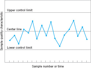
A typical control chart is shown in Figure 5.2. The control chart is a graphical display of a quality characteristic that has been measured or computed from a sample versus the sample number or time. The chart contains a center line that represents the average value of the quality characteristic corresponding to the in-control state. (That is, only chance causes are present.) Two other horizontal lines, called the upper control limit (UCL) and the lower control limit (LCL), are also shown on the chart. These control limits are chosen so that if the process is in control, nearly all of the sample points will fall between them. As long as the points plot within the control limits, the process is assumed to be in control, and no action is necessary. However, a point that plots outside of the control limits is interpreted as evidence that the process is out of control, and investigation and corrective action are required to find and eliminate the assignable cause or causes responsible for this behavior. It is customary to connect the sample points on the control chart with straight-line segments, so that it is easier to visualize how the sequence of points has evolved over time.
![]() FIGURE 5.2 A typical control chart.
FIGURE 5.2 A typical control chart.
Even if all the points plot inside the control limits, if they behave in a systematic or non-random manner, then this could be an indication that the process is out of control. For example, if 18 of the last 20 points plotted above the center line but below the upper control limit and only two of these points plotted below the center line but above the lower control limit, we would be very suspicious that something was wrong. If the process is in control, all the plotted points should have an essentially random pattern. Methods for looking for sequences or nonrandom patterns can be applied to control charts as an aid in detecting out-of-control conditions. Usually, there is a reason why a particular nonrandom pattern appears on a control chart, and if it can be found and eliminated, process performance can be improved. This topic is discussed further in Sections 5.3.5 and 6.2.4.
There is a close connection between control charts and hypothesis testing. To illustrate this connection, suppose that the vertical axis in Figure 5.2 is the sample average ![]() . Now, if the current value of
. Now, if the current value of ![]() plots between the control limits, we conclude that the process mean is in control; that is, it is equal to the value µ0. On the other hand, if
plots between the control limits, we conclude that the process mean is in control; that is, it is equal to the value µ0. On the other hand, if ![]() exceeds either control limit, we conclude that the process mean is out of control; that is, it is equal to some value µ1 ≠ µ0. In a sense, then, the control chart is a test of the hypothesis that the process is in a state of statistical control. A point plotting within the control limits is equivalent to failing to reject the hypothesis of statistical control, and a point plotting outside the control limits is equivalent to rejecting the hypothesis of statistical control.
exceeds either control limit, we conclude that the process mean is out of control; that is, it is equal to some value µ1 ≠ µ0. In a sense, then, the control chart is a test of the hypothesis that the process is in a state of statistical control. A point plotting within the control limits is equivalent to failing to reject the hypothesis of statistical control, and a point plotting outside the control limits is equivalent to rejecting the hypothesis of statistical control.
The hypothesis testing framework is useful in many ways, but there are some differences in viewpoint between control charts and hypothesis tests. For example, when testing statistical hypotheses, we usually check the validity of assumptions, whereas control charts are used to detect departures from an assumed state of statistical control. In general, we should not worry too much about assumptions such as the form of the distribution or independence when we are applying control charts to a process to reduce variability and achieve statistical control. Furthermore, an assignable cause can result in many different types of shifts in the process parameters. For example, the mean could shift instantaneously to a new value and remain there (this is sometimes called a sustained shift); or it could shift abruptly; but the assignable cause could be short-lived and the mean could then return to its nominal or in-control value; or the assignable cause could result in a steady drift or trend in the value of the mean. Only the sustained shift fits nicely within the usual statistical hypothesis testing model.
One place where the hypothesis testing framework is useful is in analyzing the performance of a control chart. For example, we may think of the probability of type I error of the control chart (concluding the process is out of control when it is really in control) and the probability of type II error of the control chart (concluding the process is in control when it is really out of control). It is occasionally helpful to use the operating-characteristic curve of a control chart to display its probability of type II error. This would be an indication of the ability of the control chart to detect process shifts of different magnitudes. This can be of value in determining which type of control chart to apply in certain situations. For more discussion of hypothesis testing, the role of statistical theory, and control charts, see Woodall (2000).
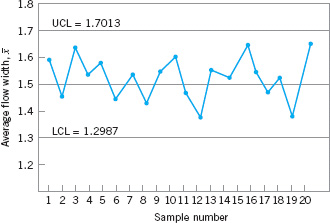
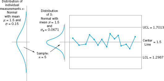
To illustrate the preceding ideas, we give an example of a control chart. In semiconductor manufacturing, an important fabrication step is photolithography, in which a light-sensitive photoresist material is applied to the silicon wafer, the circuit pattern is exposed on the resist typically through the use of high-intensity UV light, and the unwanted resist material is removed through a developing process. After the resist pattern is defined, the underlying material is removed by either wet chemical or plasma etching. It is fairly typical to follow development with a hard-bake process to increase resist adherence and etch resistance. An important quality characteristic in hard bake is the flow width of the resist, a measure of how much it expands due to the baking process. Suppose that flow width can be controlled at a mean of 1.5 microns, and it is known that the standard deviation of flow width is 0.15 microns. A control chart for the average flow width is shown in Figure 5.3. Every hour, a sample of five wafers is taken, the average flow width (![]() ) computed, and
) computed, and ![]() plotted on the chart. Because this control chart utilizes the sample average
plotted on the chart. Because this control chart utilizes the sample average ![]() to monitor the process mean, it is usually called an
to monitor the process mean, it is usually called an ![]() control chart. Note that all of the plotted points fall inside the control limits, so the chart indicates that the process is considered to be in statistical control.
control chart. Note that all of the plotted points fall inside the control limits, so the chart indicates that the process is considered to be in statistical control.
![]() FIGURE 5.3
FIGURE 5.3 ![]() control chart for flow width.
control chart for flow width.
To assist in understanding the statistical basis of this control chart, consider how the control limits were determined. The process mean is 1.5 microns, and the process standard deviation is σ = 0.15 microns. Now if samples of size n = 5 are taken, the standard deviation of the sample average ![]() is
is
![]()
Therefore, if the process is in control with a mean flow width of 1.5 microns, then by using the central limit theorem to assume that ![]() is approximately normally distributed, we would expect 100(1 − α)% of the sample means
is approximately normally distributed, we would expect 100(1 − α)% of the sample means ![]() to fall between 1.5 = Zα/2(0.0671) and 1.5 − Zα/2 (0.0671). We will arbitrarily choose the constant Zα/2 to be 3, so that the upper and lower control limits become
to fall between 1.5 = Zα/2(0.0671) and 1.5 − Zα/2 (0.0671). We will arbitrarily choose the constant Zα/2 to be 3, so that the upper and lower control limits become
UCL = 1.5+3(0.0671)= 1.7013
and
LCL = 1.5 − 3(0.0671)= 1.2987
as shown on the control chart. These are typically called three-sigma control limits.2 The width of the control limits is inversely proportional to the sample size n for a given multiple of sigma. Note that choosing the control limits is equivalent to setting up the critical region for testing the hypothesis
H0: μ = 1.5
H1: μ ≠ 1.5
where σ = 0.15 is known. Essentially, the control chart tests this hypothesis repeatedly at different points in time. The situation is illustrated graphically in Figure 5.4.
![]() FIGURE 5.4 How the control chart works.
FIGURE 5.4 How the control chart works.
We may give a general model for a control chart. Let w be a sample statistic that measures some quality characteristic of interest, and suppose that the mean of w is µw and the standard deviation of w is σw. Then the center line, the upper control limit, and the lower control limit become

where L is the “distance” of the control limits from the center line, expressed in standard deviation units. This general theory of control charts was first proposed by Walter A. Shewhart, and control charts developed according to these principles are often called Shewhart control charts.
The control chart is a device for describing in a precise manner exactly what is meant by statistical control; as such, it may be used in a variety of ways. In many applications, it is used for on-line process monitoring or surveillance. That is, sample data are collected and used to construct the control chart, and if the sample values of ![]() (say) fall within the control limits and do not exhibit any systematic pattern, we say the process is in control at the level indicated by the chart. Note that we may be interested here in determining both whether the past data came from a process that was in control and whether future samples from this process indicate statistical control.
(say) fall within the control limits and do not exhibit any systematic pattern, we say the process is in control at the level indicated by the chart. Note that we may be interested here in determining both whether the past data came from a process that was in control and whether future samples from this process indicate statistical control.
The most important use of a control chart is to improve the process. We have found that, generally,
1. Most processes do not operate in a state of statistical control, and
2. Consequently, the routine and attentive use of control charts will assist in identifying assignable causes. If these causes can be eliminated from the process, variability will be reduced and the process will be improved.
This process improvement activity using the control chart is illustrated in Figure 5.5. Note that
3. The control chart will only detect assignable causes. Management, operator, and engineering action will usually be necessary to eliminate the assignable causes.
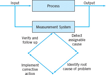
![]() FIGURE 5.5 Process improvement using the control chart.
FIGURE 5.5 Process improvement using the control chart.
In identifying and eliminating assignable causes, it is important to find the root cause of the problem and to attack it. A cosmetic solution will not result in any real, long-term process improvement. Developing an effective system for corrective action is an essential component of an effective SPC implementation.
A very important part of the corrective action process associated with control chart usage is the out-of-control-action plan (OCAP). An OCAP is a flowchart or text-based description of the sequence of activities that must take place following the occurrence of an activating event. These are usually out-of-control signals from the control chart. The OCAP consists of checkpoints, which are potential assignable causes, and terminators, which are actions taken to resolve the out-of-control condition, preferably by eliminating the assignable cause. It is very important that the OCAP specify as complete a set as possible of checkpoints and terminators, and that these be arranged in an order that facilitates process diagnostic activities. Often, analysis of prior failure modes of the process and/or product can be helpful in designing this aspect of the OCAP. Furthermore, an OCAP is a living document in the sense that it will be modified over time as more knowledge and understanding of the process are gained. Consequently, when a control chart is introduced, an initial OCAP should accompany it. Control charts without an OCAP are not likely to be useful as a process improvement tool.
The OCAP for the hard-bake process is shown in Figure 5.6. This process has two controllable variables: temperature and time. In this process, the mean flow width is monitored with an ![]() control chart, and the process variability is monitored with a control chart for the range, or an R chart. Notice that if the R chart exhibits an out-of-control signal, operating personnel are directed to contact process engineering immediately. If the
control chart, and the process variability is monitored with a control chart for the range, or an R chart. Notice that if the R chart exhibits an out-of-control signal, operating personnel are directed to contact process engineering immediately. If the ![]() control chart exhibits an out-of-control signal, operators are directed to check process settings and calibration and then make adjustments to temperature in an effort to bring the process back into a state of control. If these adjustments are unsuccessful, process engineering personnel are contacted.
control chart exhibits an out-of-control signal, operators are directed to check process settings and calibration and then make adjustments to temperature in an effort to bring the process back into a state of control. If these adjustments are unsuccessful, process engineering personnel are contacted.
We may also use the control chart as an estimating device. That is, from a control chart that exhibits statistical control, we may estimate certain process parameters, such as the mean, standard deviation, fraction nonconforming or fallout, and so forth. These estimates may then be used to determine the capability of the process to produce acceptable products. Such process-capability studies have considerable impact on many management decision problems that occur over the product cycle, including make or buy decisions, plant and process improvements that reduce process variability, and contractual agreements with customers or vendors regarding product quality.
Control charts may be classified into two general types. If the quality characteristic can be measured and expressed as a number on some continuous scale of measurement, it is usually called a variable. In such cases, it is convenient to describe the quality characteristic with a measure of central tendency and a measure of variability. Control charts for central tendency and variability are collectively called variables control charts. The ![]() chart is the most widely used chart for controlling central tendency, whereas charts based on either the sample range or the sample standard deviation are used to control process variability. Control charts for variables are discussed in Chapter 6. Many quality characteristics are not measured on a continuous scale or even a quantitative scale. In these cases, we may judge each unit of product as either conforming or nonconforming on the basis of whether or not it possesses certain attributes, or we may count the number of nonconformities (defects) appearing on a unit of product. Control charts for such quality characteristics are called attributes control charts and are discussed in Chapter 7.
chart is the most widely used chart for controlling central tendency, whereas charts based on either the sample range or the sample standard deviation are used to control process variability. Control charts for variables are discussed in Chapter 6. Many quality characteristics are not measured on a continuous scale or even a quantitative scale. In these cases, we may judge each unit of product as either conforming or nonconforming on the basis of whether or not it possesses certain attributes, or we may count the number of nonconformities (defects) appearing on a unit of product. Control charts for such quality characteristics are called attributes control charts and are discussed in Chapter 7.
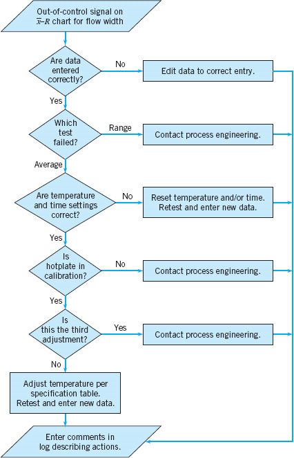
![]() FIGURE 5.6 The outof-control-action plan (OCAP) for the hard-bake process.
FIGURE 5.6 The outof-control-action plan (OCAP) for the hard-bake process.
An important factor in control chart use is the design of the control chart. By this we mean the selection of the sample size, control limits, and frequency of sampling. For example, in the chart ![]() of Figure 5.3, we specified a sample size of five measurements, three-sigma control limits, and the sampling frequency to be every hour. In most quality-control problems, it is customary to design the control chart using primarily statistical considerations. For example, we know that increasing the sample size will decrease the probability of type II error, thus enhancing the chart’s ability to detect an out-of-control state, and so forth. The use of statistical criteria such as these along with industrial experience have led to general guidelines and procedures for designing control charts. These procedures usually consider cost factors only in an implicit manner. Recently, however, we have begun to examine control chart design from an economic point of view, considering explicitly the cost of sampling, losses from allowing defective product to be produced, and the costs of investigating out-of-control signals that are really false alarms.
of Figure 5.3, we specified a sample size of five measurements, three-sigma control limits, and the sampling frequency to be every hour. In most quality-control problems, it is customary to design the control chart using primarily statistical considerations. For example, we know that increasing the sample size will decrease the probability of type II error, thus enhancing the chart’s ability to detect an out-of-control state, and so forth. The use of statistical criteria such as these along with industrial experience have led to general guidelines and procedures for designing control charts. These procedures usually consider cost factors only in an implicit manner. Recently, however, we have begun to examine control chart design from an economic point of view, considering explicitly the cost of sampling, losses from allowing defective product to be produced, and the costs of investigating out-of-control signals that are really false alarms.
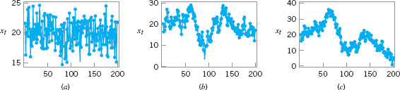
![]() FIGURE 5.7 Data from three different processes. (a) Stationary and uncorrelated (white noise). (b) Stationary and autocorrelated. (c) Nonstationary.
FIGURE 5.7 Data from three different processes. (a) Stationary and uncorrelated (white noise). (b) Stationary and autocorrelated. (c) Nonstationary.
Another important consideration in control chart usage is the type of variability exhibited by the process. Figure 5.7 presents data from three different processes. Figures 5.7a and 5.7b illustrate stationary behavior. By this we mean that the process data vary around a fixed mean in a stable or predictable manner. This is the type of behavior that Shewhart implied was produced by an in-control process.
Even a cursory examination of Figures 5.7a and 5.7b reveals some important differences. The data in Figure 5.7a are uncorrelated; that is, the observations give the appearance of having been drawn at random from a stable population, perhaps a normal distribution. This type of data is referred to by time series analysts as white noise. (Time-series analysis is a field of statistics devoted exclusively to studying and modeling time-oriented data.) In this type of process, the order in which the data occur does not tell us much that is useful to analyze the process. In other words, the past values of the data are of no help in predicting any of the future values.
Figure 5.7b illustrates stationary but autocorrelated process data. Notice that successive observations in these data are dependent; that is, a value above the mean tends to be followed by another value above the mean, whereas a value below the mean is usually followed by another such value. This produces a data series that has a tendency to move in moderately long “runs” on either side of the mean.
Figure 5.7c illustrates nonstationary variation. This type of process data occurs frequently in the chemical and process industries. Note that the process is very unstable in that it drifts or “wanders about” without any sense of a stable or fixed mean. In many industrial settings, we stabilize this type of behavior by using engineering process control (such as feedback control). This approach to process control is required when there are factors that affect the process that cannot be stabilized, such as environmental variables or properties of raw materials. When the control scheme is effective, the process output will not look like Figure 5.7c, but will resemble either Figure 5.7a or 5.7b.
Shewhart control charts are most effective when the in-control process data look like Figure 5.7a. By this we mean that the charts can be designed so that their performance is predictable and reasonable to the user, and that they are effective in reliably detecting out-of-control conditions. Most of our discussion of control charts in this chapter and in Chapters 6 and 7 will assume that the in-control process data are stationary and uncorrelated.
With some modifications, Shewhart control charts and other types of control charts can be applied to autocorrelated data. We discuss this in more detail in Part IV of the book. We also discuss feedback control and the use of SPC in systems where feedback control is employed in Part IV.
Control charts have had a long history of use in U.S. industries and in many offshore industries as well. There are at least five reasons for their popularity.
1. Control charts are a proven technique for improving productivity. A successful control chart program will reduce scrap and rework, which are the primary productivity killers in any operation. If you reduce scrap and rework, then productivity increases, cost decreases, and production capacity (measured in the number of good parts per hour) increases.
2. Control charts are effective in defect prevention. The control chart helps keep the process in control, which is consistent with the “Do it right the first time” philosophy. It is never cheaper to sort out “good” units from “bad” units later on than it is to build it right initially. If you do not have effective process control, you are paying someone to make a nonconforming product.
3. Control charts prevent unnecessary process adjustment. A control chart can distinguish between background noise and abnormal variation; no other device including a human operator is as effective in making this distinction. If process operators adjust the process based on periodic tests unrelated to a control chart program, they will often over-react to the background noise and make unneeded adjustments. Such unnecessary adjustments can actually result in a deterioration of process performance. In other words, the control chart is consistent with the “If it isn’t broken, don’t fix it” philosophy.
4. Control charts provide diagnostic information. Frequently, the pattern of points on the control chart will contain information of diagnostic value to an experienced operator or engineer. This information allows the implementation of a change in the process that improves its performance.
5. Control charts provide information about process capability. The control chart provides information about the value of important process parameters and their stability over time. This allows an estimate of process capability to be made. This information is of tremendous use to product and process designers.
Control charts are among the most important management control tools; they are as important as cost controls and material controls. Modern computer technology has made it easy to implement control charts in any type of process, as data collection and analysis can be performed on a microcomputer or a local area network terminal in real time on-line at the work center. Some additional guidelines for implementing a control chart program are given at the end of Chapter 7.
5.3.2 Choice of Control Limits
Specifying the control limits is one of the critical decisions that must be made in designing a control chart. By moving the control limits farther from the center line, we decrease the risk of a type I error—that is, the risk of a point falling beyond the control limits, indicating an out-of-control condition when no assignable cause is present. However, widening the control limits will also increase the risk of a type II error—that is, the risk of a point falling between the control limits when the process is really out of control. If we move the control limits closer to the center line, the opposite effect is obtained: The risk of type I error is increased, while the risk of type II error is decreased.
For the ![]() chart shown in Figure 5.3, where three-sigma control limits were used, if we assume that the flow width is normally distributed, we find from the standard normal table that the probability of type I error is 0.0027. That is, an incorrect out-of-control signal or false alarm will be generated in only 27 out of 10,000 points. Furthermore, the probability that a point taken when the process is in control will exceed the three-sigma limits in one direction only is 0.00135. Instead of specifying the control limit as a multiple of the standard deviation of
chart shown in Figure 5.3, where three-sigma control limits were used, if we assume that the flow width is normally distributed, we find from the standard normal table that the probability of type I error is 0.0027. That is, an incorrect out-of-control signal or false alarm will be generated in only 27 out of 10,000 points. Furthermore, the probability that a point taken when the process is in control will exceed the three-sigma limits in one direction only is 0.00135. Instead of specifying the control limit as a multiple of the standard deviation of ![]() , we could have directly chosen the type I error probability and calculated the corresponding control limit. For example, if we specified a 0.001 type I error probability in one direction, then the appropriate multiple of the standard deviation would be 3.09. The control limits for the
, we could have directly chosen the type I error probability and calculated the corresponding control limit. For example, if we specified a 0.001 type I error probability in one direction, then the appropriate multiple of the standard deviation would be 3.09. The control limits for the ![]() chart would then be
chart would then be
UCL = 1.5 + 3.09(0.0671) = 1.7073
UCL = 1.5 − 3.09(0.0671) = 1.2927
These control limits are usually called 0.001 probability limits, although they should logically be called 0.002 probability limits, because the total risk of making a type I error is 0.002. There is only a slight difference between the two limits.
Regardless of the distribution of the quality characteristic, it is standard practice in the United States to determine the control limits as a multiple of the standard deviation of the statistic plotted on the chart. The multiple usually chosen is three; hence, three-sigma limits are customarily employed on control charts, regardless of the type of chart employed. In the United Kingdom and parts of Western Europe, probability limits are often used, with the standard probability level in each direction being 0.001.
We typically justify the use of three-sigma control limits on the basis that they give good results in practice. Moreover, in many cases, the true distribution of the quality characteristic is not known well enough to compute exact probability limits. If the distribution of the quality characteristic is reasonably approximated by the normal distribution, then there will be little difference between three-sigma and 0.001 probability limits.
Two Limits on Control Charts. Some analysts suggest using two sets of limits on control charts, such as those shown in Figure 5.8. The outer limits—say, at three-sigma—are the usual action limits; that is, when a point plots outside of this limit, a search for an assignable cause is made and corrective action is taken if necessary. The inner limits, usually at two-sigma, are called warning limits. In Figure 5.8, we have shown the three-sigma upper and lower control limits for the ![]() chart for flow width. The upper and lower warning limits are located at
chart for flow width. The upper and lower warning limits are located at
UWL = 1.5 + 2(0.0671) = 1.6342
UCL = 1.5 − 2(0.0671) = 1.3658
When probability limits are used, the action limits are generally 0.001 limits and the warning limits are 0.025 limits.
If one or more points fall between the warning limits and the control limits, or very close to the warning limit, we should be suspicious that the process may not be operating properly. One possible action to take when this occurs is to increase the sampling frequency and/or the sample size so that more information about the process can be obtained quickly. Process control schemes that change the sample size and/or the sampling frequency depending on the position of the current sample value are called adaptive or variable sampling interval (or variable sample size, etc.) schemes. These techniques have been used in practice for many years and have recently been studied extensively by researchers in the field. We will discuss this technique again in Part IV of this book.
The use of warning limits can increase the sensitivity of the control chart; that is, it can allow the control chart to signal a shift in the process more quickly. One of the disadvantages of warning limits is that they may be confusing to operating personnel. This is not usually a serious objection, however, and many practitioners use them routinely on control charts. A more serious objection is that although the use of warning limits can improve the sensitivity of the chart, they also result in an increased risk of false alarms. We will discuss the use of sensitizing rules (such as warning limits) more thoroughly in Section 5.3.6.

![]() FIGURE 5.8 An
FIGURE 5.8 An ![]() chart with two-sigma and three-sigma warning limits.
chart with two-sigma and three-sigma warning limits.
![]() FIGURE 5.9 Operating-characteristic curves for an
FIGURE 5.9 Operating-characteristic curves for an ![]() chart.
chart.
5.3.3 Sample Size and Sampling Frequency
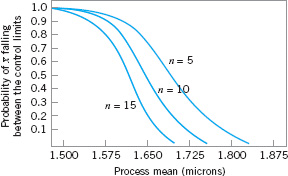
In designing a control chart, we must specify both the sample size and the frequency of sampling. In general, larger samples will make it easier to detect small shifts in the process. This is demonstrated in Figure 5.9, where we have plotted the operating-characteristic curve for the ![]() chart in Figure 5.3 for various sample sizes. Note that the probability of detecting a shift from 1.500 microns to 1.650 microns (for example) increases as the sample size n increases. When choosing the sample size, we must keep in mind the size of the shift that we are trying to detect. If the process shift is relatively large, then we use smaller sample sizes than those that would be employed if the shift of interest were relatively small.
chart in Figure 5.3 for various sample sizes. Note that the probability of detecting a shift from 1.500 microns to 1.650 microns (for example) increases as the sample size n increases. When choosing the sample size, we must keep in mind the size of the shift that we are trying to detect. If the process shift is relatively large, then we use smaller sample sizes than those that would be employed if the shift of interest were relatively small.
We must also determine the frequency of sampling. The most desirable situation from the point of view of detecting shifts would be to take large samples very frequently; however, this is usually not economically feasible. The general problem is one of allocating sampling effort. That is, either we take small samples at short intervals or larger samples at longer intervals. Current industry practice tends to favor smaller, more frequent samples, particularly in high-volume manufacturing processes, or where a great many types of assignable causes can occur. Furthermore, as automatic sensing and measurement technology develops, it is becoming possible to greatly increase sampling frequencies. Ultimately, every unit can be tested as it is manufactured. Automatic measurement systems and microcomputers with SPC software applied at the work center for real-time, on-line process control is an effective way to apply statistical process control.
Another way to evaluate the decisions regarding sample size and sampling frequency is through the average run length (ARL) of the control chart. Essentially, the ARL is the average number of points that must be plotted before a point indicates an out-of-control condition. If the process observations are uncorrelated, then for any Shewhart control chart, the ARL can be calculated easily from

where p is the probability that any point exceeds the control limits. This equation can be used to evaluate the performance of the control chart.
To illustrate, for the ![]() chart with three-sigma limits, p = 0.0027 is the probability that a single point falls outside the limits when the process is in control. Therefore, the average run length of the
chart with three-sigma limits, p = 0.0027 is the probability that a single point falls outside the limits when the process is in control. Therefore, the average run length of the ![]() chart when the process is in control (called ARL0) is
chart when the process is in control (called ARL0) is
![]()
That is, even if the process remains in control, an out-of-control signal will be generated every 370 samples, on the average.
The use of average run lengths to describe the performance of control charts has been subjected to criticism in recent years. The reasons for this arise because the distribution of run length for a Shewhart control chart is a geometric distribution (refer to Section 3.2.4). Consequently, there are two concerns with ARL: (1) the standard deviation of the run length is very large, and (2) the geometric distribution is very skewed, so the mean of the distribution (the ARL) is not necessarily a very typical value of the run length.
For example, consider the Shewhart ![]() control chart with three-sigma limits. When the process is in control, we have noted that p = 0.0027 and the in-control ARL0 is ARL0 = 1/p = 1/0.0027 = 370. This is the mean of the geometric distribution. Now the standard deviation of the geometric distribution is
control chart with three-sigma limits. When the process is in control, we have noted that p = 0.0027 and the in-control ARL0 is ARL0 = 1/p = 1/0.0027 = 370. This is the mean of the geometric distribution. Now the standard deviation of the geometric distribution is
![]()
That is, the standard deviation of the geometric distribution in this case is approximately equal to its mean. As a result, the actual ARL0 observed in practice for the Shewhart ![]() control chart will likely vary considerably. Furthermore, for the geometric distribution with p = 0.0027, the tenth and fiftieth percentiles of the distribution are 38 and 256, respectively. This means that approximately 10% of the time the in-control run length will be less than or equal to 38 samples and 50% of the time it will be less than or equal to 256 samples. This occurs because the geometric distribution with p = 0.0027 is quite skewed to the right. For this reason, some analysts like to report percentiles of the run-length distribution instead of just the ARL.
control chart will likely vary considerably. Furthermore, for the geometric distribution with p = 0.0027, the tenth and fiftieth percentiles of the distribution are 38 and 256, respectively. This means that approximately 10% of the time the in-control run length will be less than or equal to 38 samples and 50% of the time it will be less than or equal to 256 samples. This occurs because the geometric distribution with p = 0.0027 is quite skewed to the right. For this reason, some analysts like to report percentiles of the run-length distribution instead of just the ARL.
It is also occasionally convenient to express the performance of the control chart in terms of its average time to signal (ATS). If samples are taken at fixed intervals of time that are h hours apart, then
Consider the hard-bake process discussed earlier, and suppose we are sampling every hour. Equation 5.3 indicates that we will have a false alarm about every 370 hours on the average.
Now consider how the control chart performs in detecting shifts in the mean. Suppose we are using a sample size of n = 5 and that when the process goes out of control the mean shifts to 1.725 microns. From the operating characteristic curve in Figure 5.9 we find that if the process mean is 1.725 microns, the probability of ![]() falling between the control limits is approximately 0.35. Therefore, p in equation 5.2 is 0.35, and the out-of-control ARL (called ARL1) is
falling between the control limits is approximately 0.35. Therefore, p in equation 5.2 is 0.35, and the out-of-control ARL (called ARL1) is
![]()
That is, the control chart will require 2.86 samples to detect the process shift, on the average, and since the time interval between samples is h = 1 hour, the average time required to detect this shift is
ATS = ARL1h = 2.86(1) = 2.86 hours
Suppose that this is unacceptable, because production of wafers with mean flow width of 1.725 microns results in excessive scrap costs and can result in further upstream manufacturing problems. How can we reduce the time needed to detect the out-of-control condition? One method is to sample more frequently. For example, if we sample every half hour, then the average time to signal for this scheme is ATS = ARL1 h = 2.86(![]() ) = 1.43; that is, only 1.43 hours will elapse (on the average) between the shift and its detection. The second possibility is to increase the sample size. For example, if we use n = 10, then Figure 5.9 shows that the probability of
) = 1.43; that is, only 1.43 hours will elapse (on the average) between the shift and its detection. The second possibility is to increase the sample size. For example, if we use n = 10, then Figure 5.9 shows that the probability of ![]() falling between the control limits when the process mean is 1.725 microns is approximately 0.1, so that p = 0.9, and from equation 5.2 the out-of-control ARL or ARL1 is
falling between the control limits when the process mean is 1.725 microns is approximately 0.1, so that p = 0.9, and from equation 5.2 the out-of-control ARL or ARL1 is
![]()
and, if we sample every hour, the average time to signal is
ATS = ARL1h = 1.11(1) = 1.11 hours
Thus, the larger sample size would allow the shift to be detected more quickly than with the smaller one.
To answer the question of sampling frequency more precisely, we must take several factors into account, including the cost of sampling, the losses associated with allowing the process to operate out of control, the rate of production, and the probabilities with which various types of process shifts occur. We discuss various methods for selecting an appropriate sample size and sampling frequency for a control chart in the next four chapters.
5.3.4 Rational Subgroups
A fundamental idea in the use of control charts is the collection of sample data according to what Shewhart called the rational subgroup concept. To illustrate this concept, suppose that we are using an ![]() control chart to detect changes in the process mean. Then the rational subgroup concept means that subgroups or samples should be selected so that if assignable causes are present, the chance for differences between subgroups will be maximized, while the chance for differences due to these assignable causes within a subgroup will be minimized.
control chart to detect changes in the process mean. Then the rational subgroup concept means that subgroups or samples should be selected so that if assignable causes are present, the chance for differences between subgroups will be maximized, while the chance for differences due to these assignable causes within a subgroup will be minimized.
When control charts are applied to production processes, the time order of production is a logical basis for rational subgrouping. Even though time order is preserved, it is still possible to form subgroups erroneously. If some of the observations in the sample are taken at the end of one shift and the remaining observations are taken at the start of the next shift, then any differences between shifts might not be detected. Time order is frequently a good basis for forming subgroups because it allows us to detect assignable causes that occur over time.
Two general approaches to constructing rational subgroups are used. In the first approach, each sample consists of units that were produced at the same time (or as closely together as possible). Ideally, we would like to take consecutive units of production. This approach is used when the primary purpose of the control chart is to detect process shifts. It minimizes the chance of variability due to assignable causes within a sample, and it maximizes the chance of variability between samples if assignable causes are present. It also provides a better estimate of the standard deviation of the process in the case of variables control charts. This approach to rational subgrouping essentially gives a snapshot of the process at each point in time where a sample is collected.
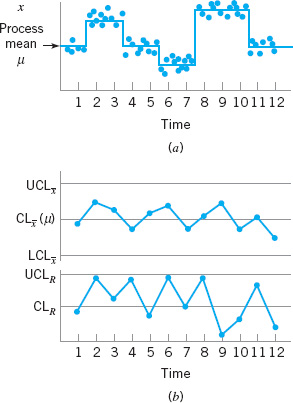
Figure 5.10 illustrates this type of sampling strategy. In Figure 5.10a we show a process for which the mean experiences a series of sustained shifts, and the corresponding observations obtained from this process at the points in time along the horizontal axis, assuming that five consecutive units are selected. Figure 5.10b shows the ![]() control chart and an R chart (or range chart) for these data. The center line and control limits on the R chart are constructed using the range of each sample in the upper part of the figure (details will be given in Chapter 6). Note that although the process mean is shifting, the process variability is stable. Furthermore, the within-sample measure of variability is used to construct the control limits on the
control chart and an R chart (or range chart) for these data. The center line and control limits on the R chart are constructed using the range of each sample in the upper part of the figure (details will be given in Chapter 6). Note that although the process mean is shifting, the process variability is stable. Furthermore, the within-sample measure of variability is used to construct the control limits on the ![]() chart. Note that the
chart. Note that the ![]() chart in Figure 5.10b has points out of control corresponding to the shifts in the process mean.
chart in Figure 5.10b has points out of control corresponding to the shifts in the process mean.

![]() FIGURE 5.10 The snapshot approach to rational subgroups. (a) Behavior of the process mean. (b) Corresponding
FIGURE 5.10 The snapshot approach to rational subgroups. (a) Behavior of the process mean. (b) Corresponding ![]() and R control charts.
and R control charts.
![]() FIGURE 5.11 The random sample approach to rational subgroups. (a) Behavior of the process mean. (b) Corresponding
FIGURE 5.11 The random sample approach to rational subgroups. (a) Behavior of the process mean. (b) Corresponding ![]() and R control charts.
and R control charts.
In the second approach, each sample consists of units of product that are representative of all units that have been produced since the last sample was taken. Essentially, each subgroup is a random sample of all process output over the sampling interval. This method of rational subgrouping is often used when the control chart is employed to make decisions about the acceptance of all units of product that have been produced since the last sample. In fact, if the process shifts to an out-of-control state and then back in control again between samples, it is sometimes argued that the snapshot method of rational subgrouping will be ineffective against these types of shifts, and so the random sample method must be used.
When the rational subgroup is a random sample of all units produced over the sampling interval, considerable care must be taken in interpreting the control charts. If the process mean drifts between several levels during the interval between samples, this may cause the range of the observations within the sample to be relatively large, resulting in wider limits on the ![]() chart. This scenario is illustrated in Figure 5.11. In fact, we can often make any process appear to be in statistical control just by stretching out the interval between observations in the sample. It is also possible for shifts in the process average to cause points on a control chart for the range or standard deviation to plot out of control, even though there has been no shift in process variability.
chart. This scenario is illustrated in Figure 5.11. In fact, we can often make any process appear to be in statistical control just by stretching out the interval between observations in the sample. It is also possible for shifts in the process average to cause points on a control chart for the range or standard deviation to plot out of control, even though there has been no shift in process variability.
There are other bases for forming rational subgroups. For example, suppose a process consists of several machines that pool their output into a common stream. If we sample from this common stream of output, it will be very difficult to detect whether any of the machines are out of control. A logical approach to rational subgrouping here is to apply control chart techniques to the output for each individual machine. Sometimes this concept needs to be applied to different heads on the same machine, different work stations, different operators, and so forth. In many situations, the rational subgroup will consist of a single observation. This situation occurs frequently in the chemical and process industries where the quality characteristic of the product changes relatively slowly and samples taken very close together in time are virtually identical, apart from measurement or analytical error.
The rational subgroup concept is very important. The proper selection of samples requires careful consideration of the process, with the objective of obtaining as much useful information as possible from the control chart analysis.
5.3.5 Analysis of Patterns on Control Charts
Patterns on control charts must be assessed. A control chart may indicate an out-of-control condition when one or more points fall beyond the control limits or when the plotted points exhibit some nonrandom pattern of behavior. For example, consider the ![]() chart shown in Figure 5.12. Although all 25 points fall within the control limits, the points do not indicate statistical control because their pattern is very nonrandom in appearance. Specifically, we note that 19 of 25 points plot below the center line, while only 6 of them plot above. If the points truly are random, we should expect a more even distribution above and below the center line. We also observe that following the fourth point, five points in a row increase in magnitude. This arrangement of points is called a run. Since the observations are increasing, we could call this a run up. Similarly, a sequence of decreasing points is called a run down. This control chart has an unusually long run up (beginning with the fourth point) and an unusually long run down (beginning with the eighteenth point).
chart shown in Figure 5.12. Although all 25 points fall within the control limits, the points do not indicate statistical control because their pattern is very nonrandom in appearance. Specifically, we note that 19 of 25 points plot below the center line, while only 6 of them plot above. If the points truly are random, we should expect a more even distribution above and below the center line. We also observe that following the fourth point, five points in a row increase in magnitude. This arrangement of points is called a run. Since the observations are increasing, we could call this a run up. Similarly, a sequence of decreasing points is called a run down. This control chart has an unusually long run up (beginning with the fourth point) and an unusually long run down (beginning with the eighteenth point).
In general, we define a run as a sequence of observations of the same type. In addition to runs up and runs down, we could define the types of observations as those above and below the center line, respectively, so that two points in a row above the center line would be a run of length 2.
A run of length 8 or more points has a very low probability of occurrence in a random sample of points. Consequently, any type of run of length 8 or more is often taken as a signal of an out-of-control condition. For example, eight consecutive points on one side of the center line may indicate that the process is out of control.
Although runs are an important measure of nonrandom behavior on a control chart, other types of patterns may also indicate an out-of-control condition. For example, consider the ![]() chart in Figure 5.13. Note that the plotted sample averages exhibit a cyclic behavior, yet they all fall within the control limits. Such a pattern may indicate a problem with the process such as operator fatigue, raw material deliveries, heat or stress buildup, and so forth. Although the process is not really out of control, the yield may be improved by elimination or reduction of the sources of variability causing this cyclic behavior (see Fig. 5.14).
chart in Figure 5.13. Note that the plotted sample averages exhibit a cyclic behavior, yet they all fall within the control limits. Such a pattern may indicate a problem with the process such as operator fatigue, raw material deliveries, heat or stress buildup, and so forth. Although the process is not really out of control, the yield may be improved by elimination or reduction of the sources of variability causing this cyclic behavior (see Fig. 5.14).
The problem is one of pattern recognition—that is, recognizing systematic or nonrandom patterns on the control chart and identifying the reason for this behavior. The ability to interpret a particular pattern in terms of assignable causes requires experience and knowledge of the process. That is, we must not only know the statistical principles of control charts, but we must also have a good understanding of the process. We discuss the interpretation of patterns on control charts in more detail in Chapter 6.
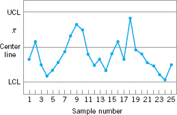
![]() FIGURE 5.12 An
FIGURE 5.12 An ![]() control chart.
control chart.
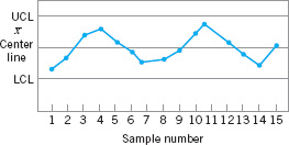
![]() FIGURE 5.13 An
FIGURE 5.13 An ![]() chart with a cyclic pattern.
chart with a cyclic pattern.

![]() FIGURE 5.14 (a) Variability with the cyclic pattern. (b) Variability with the cyclic pattern eliminated.
FIGURE 5.14 (a) Variability with the cyclic pattern. (b) Variability with the cyclic pattern eliminated.
The Western Electric Statistical Quality Control Handbook (1956) suggests a set of decision rules for detecting nonrandom patterns on control charts. Specifically, it suggests concluding that the process is out of control if either
1. one point plots outside the three-sigma control limits,
2. two out of three consecutive points plot beyond the two-sigma warning limits,
3. four out of five consecutive points plot at a distance of one-sigma or beyond from the center line, or
4. eight consecutive points plot on one side of the center line.
Those rules apply to one side of the center line at a time. Therefore, a point above the upper warning limit followed immediately by a point below the lower warning limit would not signal an out-of-control alarm. These are often used in practice for enhancing the sensitivity of control charts. That is, the use of these rules can allow smaller process shifts to be detected more quickly than would be the case if our only criterion was the usual three-sigma control limit violation.
Figure 5.15 shows an ![]() control chart with the one-sigma, two-sigma, and three-sigma limits used in the Western Electric procedure. Note that these limits partition the control chart into three zones (A, B, and C) on each side of the center line. Consequently, the Western Electric rules are sometimes called the zone rules for control charts. Note that the last four points fall in zone B or beyond. Thus, since four of five consecutive points exceed the one-sigma limit, the Western Electric procedure will conclude that the pattern is nonrandom and the process is out of control.
control chart with the one-sigma, two-sigma, and three-sigma limits used in the Western Electric procedure. Note that these limits partition the control chart into three zones (A, B, and C) on each side of the center line. Consequently, the Western Electric rules are sometimes called the zone rules for control charts. Note that the last four points fall in zone B or beyond. Thus, since four of five consecutive points exceed the one-sigma limit, the Western Electric procedure will conclude that the pattern is nonrandom and the process is out of control.
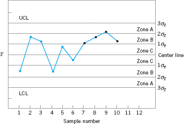
![]() FIGURE 5.15 The Western Electric or zone rules, with the last four points showing a violation of rule 3.
FIGURE 5.15 The Western Electric or zone rules, with the last four points showing a violation of rule 3.
![]() TABLE 5.1
TABLE 5.1
Some Sensitizing Rules for Shewhart Control Charts
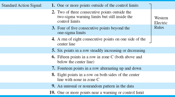
5.3.6 Discussion of Sensitizing Rules for Control Charts
As may be gathered from earlier sections, several criteria may be applied simultaneously to a control chart to determine whether the process is out of control. The basic criterion is one or more points outside of the control limits. The supplementary criteria are sometimes used to increase the sensitivity of the control charts to a small process shift so that we may respond more quickly to the assignable cause. Some of the sensitizing rules for control charts that are widely used in practice are shown in Table 5.1. For a good discussion of some of these rules, see Nelson (1984). Frequently, we will inspect the control chart and conclude that the process is out of control if any one or more of the criteria in Table 5.1 are met.
When several of these sensitizing rules are applied simultaneously, we often use a graduated response to out-of-control signals. For example, if a point exceeded a control limit, we would immediately begin to search for the assignable cause, but if one or two consecutive points exceeded only the two-sigma warning limit, we might increase the frequency of sampling from every hour to say, every ten minutes. This adaptive sampling response might not be as severe as a complete search for an assignable cause, but if the process were really out of control, it would give us a high probability of detecting this situation more quickly than we would by maintaining the longer sampling interval.
In general, care should be exercised when using several decision rules simultaneously. Suppose that the analyst uses k decision rules and that criterion i has type I error probability αi. Then the overall type I error or false alarm probability for the decision based on all k tests is provided that all k decision rules are independent. However, the independence assumption is not valid with the usual sensitizing rules. Furthermore, the value of αi is not always clearly defined for the sensitizing rules, because these rules involve several observations.

Champ and Woodall (1987) investigated the average run length performance for the Shewhart control chart with various sensitizing rules. They found that the use of these rules does improve the ability of the control chart to detect smaller shifts, but the in-control average run length can be substantially degraded. For example, assuming independent process data and using a Shewhart control chart with the Western Electric rules results in an in-control ARL of 91.25, in contrast to 370 for the Shewhart control chart alone.
Some of the individual Western Electric rules are particularly troublesome. An illustration is the rule of several (usually seven or eight) consecutive points that either increase or decrease. This rule is very ineffective in detecting a trend, the situation for which it was designed. It does, however, greatly increase the false alarm rate. See Davis and Woodall (1988) for more details.
5.3.7 Phase I and Phase II of Control Chart Application
Standard control chart usage involves phase I and phase II applications, with two different and distinct objectives. In phase I, a set of process data is gathered and analyzed all at once in a retrospective analysis, constructing trial control limits to determine if the process has been in control over the period of time during which the data were collected, and to see if reliable control limits can be established to monitor future production. This is typically the first thing that is done when control charts are applied to any process. Control charts in phase I primarily assist operating personnel in bringing the process into a state of statistical control. Phase II begins after we have a “clean” set of process data gathered under stable conditions and representative of in-control process performance. In phase II, we use the control chart to monitor the process by comparing the sample statistic for each successive sample as it is drawn from the process to the control limits.
Thus, in phase I we are comparing a collection of, say, m points to a set of control limits computed from those points. Typically m = 20 or 25 subgroups are used in phase I. It is fairly typical in phase I to assume that the process is initially out of control, so the objective of the analyst is to bring the process into a state of statistical control. Control limits are calculated based on the m subgroups and the data plotted on the control charts. Points that are outside the control limits are investigated, looking for potential assignable causes. Any assignable causes that are identified are worked on by engineering and operating personnel in an effort to eliminate them. Points outside the control limits are then excluded and a new set of revised control limits are calculated. Then new data are collected and compared to these revised limits. Sometimes this type of analysis will require several cycles in which the control chart is employed, assignable causes are detected and corrected, revised control limits are calculated, and the out-of-control action plan is updated and expanded. Eventually the process is stabilized, and a clean set of data that represents in-control process performance is obtained for use in phase II.
Generally, Shewhart control charts are very effective in phase I because they are easy to construct and interpret, and because they are effective in detecting both large, sustained shifts in the process parameters and outliers (single excursions that may have resulted from assignable causes of short duration), measurement errors, data recording and/or transmission errors, and the like. Furthermore, patterns on Shewhart control charts often are easy to interpret and have direct physical meaning. The sensitizing rules discussed in the previous sections are also easy to apply to Shewhart charts. (This is an optional feature in most SPC software.) The types of assignable causes that usually occur in phase I result in fairly large process shifts—exactly the scenario in which the Shewhart control chart is most effective. Average run length is not usually a reasonable performance measure for phase I; we are typically more interested in the probability that an assignable cause will be detected than in the occurrence of false alarms. For good discussions of phase I control chart usage and related matters, see the papers by Woodall (2000), Borror and Champ (2001), Boyles (2000), and Champ and Chou (2003), and the standard ANSI/ASQC B1–133–1996 Quality Control Chart Methodologies.
In phase II, we usually assume that the process is reasonably stable. Often, the assignable causes that occur in phase II result in smaller process shifts, because (it is hoped) most of the really ugly sources of variability have been systematically removed during phase I. Our emphasis is now on process monitoring, not on bringing an unruly process under control. Average run length is a valid basis for evaluating the performance of a control chart in phase II. Shewhart control charts are much less likely to be effective in phase II because they are not very sensitive to small to moderate size process shifts; that is, their ARL performance is relatively poor. Attempts to solve this problem by employing sensitizing rules such as those discussed in the previous section are likely to be unsatisfactory, because the use of these supplemental sensitizing rules increases the false alarm rate of the Shewhart control chart. [Recall the discussion of the Champ and Woodall (1987) paper in the previous section.] The routine use of sensitizing rules to detect small shifts or to react more quickly to assignable causes in phase II should be discouraged. The cumulative sum and EWMA control charts discussed in Chapter 9 are much more likely to be effective in phase II.
5.4 The Rest of the Magnificent Seven
Although the control chart is a very powerful problem-solving and process-improvement tool, it is most effective when its use is fully integrated into a comprehensive SPC program. The seven major SPC problem-solving tools should be widely taught throughout the organization and used routinely to identify improvement opportunities and to assist in reducing variability and eliminating waste. They can be used in several ways throughout the DMAIC problem-solving process. The magnificent seven, introduced in Section 5.1, are listed again here for convenience:
1. Histogram or stem-and-leaf plot
2. Check sheet
3. Pareto chart
4. Cause-and-effect diagram
5. Defect concentration diagram
6. Scatter diagram
7. Control chart
We introduced the histogram and the stem-and-leaf plot in Chapter 3 and discussed the control chart in Section 5.3. In this section, we illustrate the rest of the tools.
Check Sheet. In the early stages of process improvement, it will often become necessary to collect either historical or current operating data about the process under investigation. This is a common activity in the measure step of DMAIC. A check sheet can be very useful in this data collection activity. The check sheet shown in Figure 5.16 was developed by an aerospace firm engineer who was investigating defects that occurred on one of the firm’s tanks. The engineer designed the check sheet to help summarize all the historical defect data available on the tanks. Because only a few tanks were manufactured each month, it seemed appropriate to summarize the data monthly and to identify as many different types of defects as possible. The time-oriented summary is particularly valuable in looking for trends or other meaningful patterns. For example, if many defects occur during the summer, one possible cause might be the use of temporary workers during a heavy vacation period.

![]() FIGURE 5.16 A check sheet to record defects on a tank used in an aerospace application.
FIGURE 5.16 A check sheet to record defects on a tank used in an aerospace application.
When designing a check sheet, it is important to clearly specify the type of data to be collected, the part or operation number, the date, the analyst, and any other information useful in diagnosing the cause of poor performance. If the check sheet is the basis for performing further calculations or is used as a worksheet for data entry into a computer, then it is important to be sure that the check sheet will be adequate for this purpose. In some cases, a trial run to validate the check sheet layout and design may be helpful.
Pareto Chart. The Pareto chart is simply a frequency distribution (or histogram) of attribute data arranged by category. Pareto charts are often used in both the Measure and Analyze steps of DMAIC. To illustrate a Pareto chart, consider the tank defect data presented in Figure 5.16. Plotting the total frequency of occurrence of each defect type (the last column of the table in Fig. 5.16) against the various defect types will produce Figure 5.17, which is called a Pareto chart.3 Through this chart, the user can quickly and visually identify the most frequently occurring types of defects. For example, Figure 5.17 indicates that incorrect dimensions, parts damaged, and machining are the most commonly encountered defects. Thus the causes of these defect types probably should be identified and attacked first.

![]() FIGURE 5.17 Pareto chart of the tank defect data.
FIGURE 5.17 Pareto chart of the tank defect data.
Note that the Pareto chart does not automatically identify the most important defects, but only the most frequent. For example, in Figure 5.17 casting voids occur very infrequently (2 of 166 defects, or 1.2%). However, voids could result in scrapping the tank, a potentially large cost exposure—perhaps so large that casting voids should be elevated to a major defect category. When the list of defects contains a mixture of defects that might have extremely serious consequences and others of much less importance, one of two methods can be used:
1. Use a weighting scheme to modify the frequency counts. Weighting schemes for defects are discussed in Chapter 7.
2. Accompany the frequency Pareto chart analysis with a cost or exposure Pareto chart.
There are many variations of the basic Pareto chart. Figure 5.18a shows a Pareto chart applied to an electronics assembly process using surface-mount components. The vertical axis is the percentage of components incorrectly located, and the horizontal axis is the component number, a code that locates the device on the printed circuit board. Note that locations 27 and 39 account for 70% of the errors. This may be the result of the type or size of components at these locations, or of where these locations are on the board layout. Figure 5.18b presents another Pareto chart from the electronics industry. The vertical axis is the number of defective components, and the horizontal axis is the component number. Note that each vertical bar has been broken down by supplier to produce a stacked Pareto chart. This analysis clearly indicates that supplier A provides a disproportionately large share of the defective components.
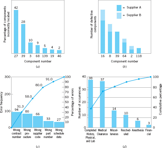
![]() FIGURE 5.18 Examples of Pareto charts.
FIGURE 5.18 Examples of Pareto charts.
Pareto charts are widely used in nonmanufacturing applications of quality improvement methods. A Pareto chart used by a quality improvement team in a procurement organization is shown in Figure 5.18c. The team was investigating errors on purchase orders in an effort to reduce the organization’s number of purchase order changes. (Each change typically cost between $100 and $500, and the organization issued several hundred purchase order changes each month.) This Pareto chart has two scales: one for the actual error frequency and another for the percentage of errors. Figure 5.18d presents a Pareto chart constructed by a quality improvement team in a hospital to reflect the reasons for cancellation of scheduled outpatient surgery.
In general, the Pareto chart is one of the most useful of the magnificent seven. Its applications to quality improvement are limited only by the ingenuity of the analyst.
Cause-and-Effect Diagram. Once a defect, error, or problem has been identified and isolated for further study, we must begin to analyze potential causes of this undesirable effect. In situations where causes are not obvious (sometimes they are), the cause-and-effect diagram is a formal tool frequently useful in unlayering potential causes. The cause-and-effect diagram is very useful in the Analyze and Improve steps of DMAIC. The cause-and-effect diagram constructed by a quality improvement team assigned to identify potential problem areas in the tank manufacturing process mentioned earlier is shown in Figure 5.19. The steps in constructing the cause-and-effect diagram are as follows:
How to Construct a Cause-and-Effect Diagram
1. Define the problem or effect to be analyzed.
2. Form the team to perform the analysis. Often the team will uncover potential causes through brainstorming.
3. Draw the effect box and the center line.
4. Specify the major potential cause categories and join them as boxes connected to the center line.
5. Identify the possible causes and classify them into the categories in step 4. Create new categories, if necessary.
6. Rank order the causes to identify those that seem most likely to impact the problem.
7. Take corrective action.
In analyzing the tank defect problem, the team elected to lay out the major categories of tank defects as machines, materials, methods, personnel, measurement, and environment. A brainstorming session ensued to identify the various subcauses in each of these major categories and to prepare the diagram in Figure 5.19. Then through discussion and the process of elimination, the group decided that materials and methods contained the most likely cause categories.

![]() FIGURE 5.19 Cause-and-effect diagram for the tank defect problem.
FIGURE 5.19 Cause-and-effect diagram for the tank defect problem.
Cause-and-effect analysis is an extremely powerful tool. A highly detailed cause-and-effect diagram can serve as an effective troubleshooting aid. Furthermore, the construction of a cause-and-effect diagram as a team experience tends to get people involved in attacking a problem rather than in affixing blame.
Defect Concentration Diagram. A defect concentration diagram is a picture of the unit, showing all relevant views. Then the various types of defects are drawn on the picture, and the diagram is analyzed to determine whether the location of the defects on the unit conveys any useful information about the potential causes of the defects. Defect concentration diagrams are very useful in the analyze step of DMAIC.
Figure 5.20 presents a defect concentration diagram for the final assembly stage of a refrigerator manufacturing process. Surface-finish defects are identified by the dark shaded areas on the refrigerator. From inspection of the diagram it seems clear that materials handling is responsible for the majority of these defects. The unit is being moved by securing a belt around the middle, and this belt is either too loose or tight, worn out, made of abrasive material, or too narrow. Furthermore, when the unit is moved the corners are being damaged. It is possible that worker fatigue is a factor. In any event, proper work methods and improved materials handling will likely improve this process dramatically.
Figure 5.21 shows the defect concentration diagram for the tank problem mentioned earlier. Note that this diagram shows several different broad categories of defects, each identified with a specific code. Often different colors are used to indicate different types of defects.
When defect data are portrayed on a defect concentration diagram over a sufficient number of units, patterns frequently emerge, and the location of these patterns often contains much information about the causes of the defects. We have found defect concentration diagrams to be important problem-solving tools in many industries, including plating, painting and coating, casting and foundry operations, machining, and electronics assembly.
Scatter Diagram. The scatter diagram is a useful plot for identifying a potential relationship between two variables. Data are collected in pairs on the two variables—say, (yi, xi)—for i = 1, 2,. . ., n. Then yi is plotted against the corresponding xi. The shape of the scatter diagram often indicates what type of relationship may exist between the two variables. Scatter diagrams are very useful in regression modeling, introduced in Chapter 3. Regression is a very useful technique in the analyze step of DMAIC.
Figure 5.22 shows a scatter diagram relating metal recovery (in percent) from a magnathermic smelting process for magnesium against corresponding values of the amount of reclaim flux added to the crucible. The scatter diagram indicates a strong positive correlation between metal recovery and flux amount; that is, as the amount of flux added is increased, the metal recovery also increases. It is tempting to conclude that the relationship is one based on cause and effect: By increasing the amount of reclaim flux used, we can always ensure high metal recovery. This thinking is potentially dangerous, because correlation does not necessarily imply causality. This apparent relationship could be caused by something quite different. For example, both variables could be related to a third one, such as the temperature of the metal prior to the reclaim pouring operation, and this relationship could be responsible for what we see in Figure 5.22. If higher temperatures lead to higher metal recovery and the practice is to add reclaim flux in proportion to temperature, adding more flux when the process is running at low temperature will do nothing to enhance yield. The scatter diagram is useful for identifying potential relationships. Designed experiments [see Montgomery (2009)] must be used to verify causality.
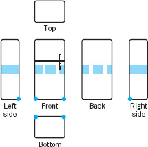
![]() FIGURE 5.20 Surface-finish defects on a refrigerator.
FIGURE 5.20 Surface-finish defects on a refrigerator.

![]() FIGURE 5.21 Defect concentration diagram for the tank.
FIGURE 5.21 Defect concentration diagram for the tank.

![]() FIGURE 5.22 A scatter diagram.
FIGURE 5.22 A scatter diagram.
5.5 Implementing SPC in a Quality Improvement Program
The methods of statistical process control can provide significant payback to those companies that can successfully implement them. Although SPC seems to be a collection of statistically based problem-solving tools, there is more to the successful use of SPC than learning and using these tools. SPC is most effective when it is integrated into an overall, companywide quality improvement program. It can be implemented using the DMAIC approach. Indeed, the basic SPC tools are an integral part of DMAIC. Management involvement and commitment to the quality improvement process are the most vital components of SPC’s potential success. Management is a role model, and others in the organization look to management for guidance and as an example. A team approach is also important, as it is usually difficult for one person alone to introduce process improvements. Many of the magnificent seven are helpful in building an improvement team, including cause-and-effect diagrams, Pareto charts, and defect concentration diagrams. This team approach also fits well with DMAIC. The basic SPC problem-solving tools must become widely known and widely used throughout the organization. Ongoing education of personnel about SPC and other methods for reducing variability are necessary to achieve this widespread knowledge of the tools.
The objective of an SPC-based variability reduction program is continuous improvement on a weekly, quarterly, and annual basis. SPC is not a one-time program to be applied when the business is in trouble and later abandoned. Quality improvement that is focused on reduction of variability must become part of the culture of the organization.
The control chart is an important tool for process improvement. Processes do not naturally operate in an in-control state, and the use of control charts is an important step that must be taken early in an SPC program to eliminate assignable causes, reduce process variability, and stabilize process performance. To improve quality and productivity, we must begin to manage with facts and data, and not simply rely on judgment. Control charts are an important part of this change in management approach.
In implementing a companywide effort to reduce variability and improve quality, we have found that several elements are usually present in all successful efforts. These elements are as follows:
Elements of a Successful SPC Program
1. Management leadership
2. A team approach, focusing on project-oriented applications
3. Education of employees at all levels
4. Emphasis on reducing variability
5. Measuring success in quantitative (economic) terms
6. A mechanism for communicating successful results throughout the organization
We cannot overemphasize the importance of management leadership and the team/project approach. Successful quality improvement is a “top-down” management-driven activity. It is also important to measure progress and success in quantitative (economic) terms and to spread knowledge of this success throughout the organization. When successful improvements are communicated throughout the company, this can provide motivation and incentive to improve other processes and to make continuous improvement a usual part of the way of doing business.
5.6 An Application of SPC
In this section, we give an account of how SPC methods were used to improve quality and productivity in a copper plating operation at a printed circuit board fabrication facility. This process was characterized by high levels of defects such as brittle copper and copper voids and by long cycle time. The long cycle time was particularly troublesome, as it had led to an extensive work backlog and was a major contributor to poor conformance to the factory production schedule.
Management chose this process area for an initial implementation of SPC. The DMAIC approach was used. An improvement team was formed, consisting of the plating tank operator, the manufacturing engineer responsible for the process, and a quality engineer. All members of the team had been exposed to DMAIC and the magnificent seven in a company-sponsored seminar. During the define step, it was decided to concentrate on reducing the flow time through the process, as the missed delivery targets were considered to be the most serious obstacle to improving productivity. The team quickly determined (during the Measure step) that excessive downtime on the controller that regulated the copper concentration in the plating tank was a major factor in the excessive flow time; controller downtime translated directly into lost production.
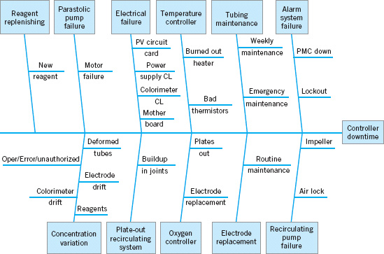
![]() FIGURE 5.23 Cause-and-effect diagram for controller downtime.
FIGURE 5.23 Cause-and-effect diagram for controller downtime.
As part of the Analyze step, the team decided to use a cause-and-effect analysis to begin to isolate the potential causes of controller downtime. Figure 5.23 shows the cause-and-effect diagram that was produced during a brainstorming session. The team was able to quickly identify 11 major potential causes of controller downtime. However, when they examined the equipment logbook to make a more definitive diagnosis of the causes of downtime based on actual process performance, the results were disappointing. The logbook contained little useful information about causes of downtime; instead, it contained only a chronological record of when the machine was up and when it was down.
The team then decided that it would be necessary to collect valid data about the causes of controller downtime. They designed the check sheet shown in Figure 5.24 as a supplemental page for the logbook. The team agreed that whenever the equipment was down, one team member would assume responsibility for filling out the check sheet. Note that the major causes of controller downtime identified on the cause-and-effect diagram were used to structure the headings and subheadings on the check sheet. The team agreed that data would be collected over a four- to six-week period.
As more reliable data concerning the causes of controller downtime became available, the team was able to analyze it using other SPC techniques. Figure 5.25 presents the Pareto analysis of the controller failure data produced during the six-week study of the process. Note that concentration variation is a major cause of downtime. Actually, the situation is probably more complex than it appears. The third largest category of downtime causes is reagent replenishment. Frequently, the reagent in the colorimeter on the controller is replenished because concentration has varied so far outside the process specifications that reagent replenishment and colorimeter recalibration constitute the only step that can be used to bring the process back on-line. Therefore, it is possible that up to 50% of the downtime associated with controller failures can be attributed to concentration variation. Figure 5.26 presents a Pareto analysis of only the concentration variation data. From this diagram we know that colorimeter drift and problems with reagents are major causes of concentration variation. This information led the manufacturing engineer on the team to conclude that rebuilding the colorimeter would be an important step in improving the process.
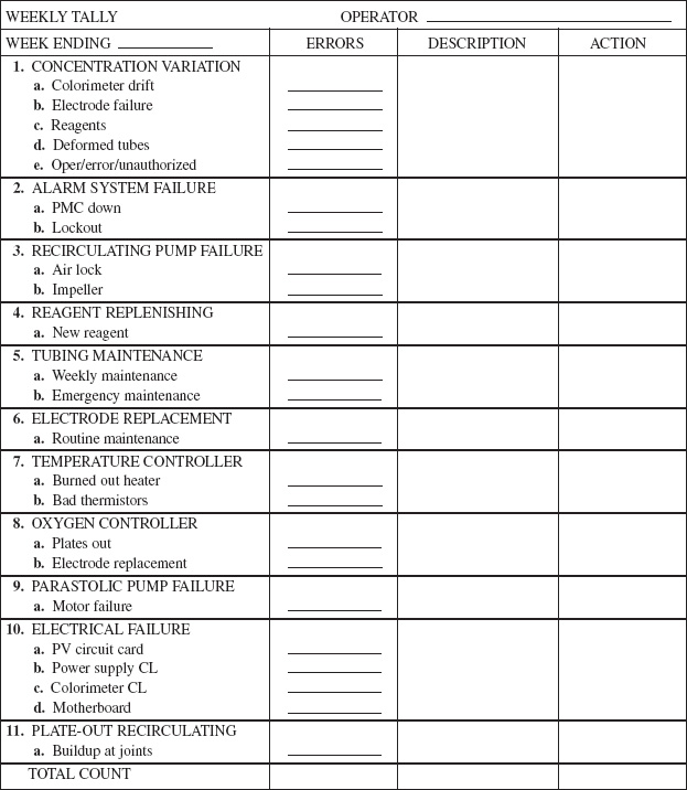
![]() FIGURE 5.24 Check sheet for logbook.
FIGURE 5.24 Check sheet for logbook.
During the time that these process data were collected, the team decided to set up statistical control charts on the process. The information collected to this point about process performance was the basis for constructing the initial OCAPs (out-of-control-action plans) for these control charts. These control charts and their OCAP would also be useful in the Control step of DMAIC. Copper concentration is measured in this process manually three times per day. Figure 5.27 presents the ![]() control chart for average daily copper concentration; that is, each point plotted in the figure is a daily average. The chart shows the center line and three-sigma statistical control limits. (We will discuss the construction of these limits in more detail in the next few chapters.) Note that there are a number of points outside the control limits, indicating that assignable causes are present in the process. Figure 5.28 presents the range or R chart for daily copper concentration. On this chart, R represents the difference between the maximum and minimum copper concentration readings in a day. Note that the R chart also exhibits a lack of statistical control. In particular, the second half of the R chart appears much more unstable than the first half. Examining the dates along the horizontal axis, the team noted that severe variation in average daily copper concentration only appeared after January 3. The last observations on copper concentration had been taken on November 22. From November 23 until January 3, the process had been in a shutdown mode because of holidays. Apparently, when the process was restarted, substantial deterioration in controller/colorimeter performance had occurred. This hastened engineering’s decision to rebuild the colorimeter.
control chart for average daily copper concentration; that is, each point plotted in the figure is a daily average. The chart shows the center line and three-sigma statistical control limits. (We will discuss the construction of these limits in more detail in the next few chapters.) Note that there are a number of points outside the control limits, indicating that assignable causes are present in the process. Figure 5.28 presents the range or R chart for daily copper concentration. On this chart, R represents the difference between the maximum and minimum copper concentration readings in a day. Note that the R chart also exhibits a lack of statistical control. In particular, the second half of the R chart appears much more unstable than the first half. Examining the dates along the horizontal axis, the team noted that severe variation in average daily copper concentration only appeared after January 3. The last observations on copper concentration had been taken on November 22. From November 23 until January 3, the process had been in a shutdown mode because of holidays. Apparently, when the process was restarted, substantial deterioration in controller/colorimeter performance had occurred. This hastened engineering’s decision to rebuild the colorimeter.

![]() FIGURE 5.25 Pareto analysis of controller failures.
FIGURE 5.25 Pareto analysis of controller failures.
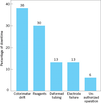
![]() FIGURE 5.26 Pareto analysis of concentration variation.
FIGURE 5.26 Pareto analysis of concentration variation.
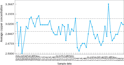
![]() FIGURE 5.27
FIGURE 5.27 ![]() chart for the average daily copper concentration.
chart for the average daily copper concentration.

![]() FIGURE 5.28 R chart for daily copper concentration.
FIGURE 5.28 R chart for daily copper concentration.
Figure 5.29 presents a tolerance diagram of daily copper concentration readings. In this figure, each day’s copper concentration readings are plotted, and the extremes are connected with a vertical line. In some cases, more than one observation is plotted at a single position, so a numeral is used to indicate the number of observations plotted at each particular point. The center line on this chart is the process average over the time period studied, and the upper and lower limits are the specification limits on copper concentration. Every instance in which a point is outside the specification limits would correspond to nonscheduled downtime on the process. Several things are evident from examining the tolerance diagram. First, the process average is significantly different from the nominal specification on copper concentration (the midpoint of the upper and lower tolerance band). This implies that the calibration of the colorimeter may be inadequate. That is, we are literally aiming at the wrong target. Second, we note that there is considerably more variation in the daily copper concentration readings after January 3 than there was prior to shutdown. Finally, if we could reduce variation in the process to a level roughly consistent with that observed prior to shutdown and correct the process centering, many of the points outside specifications would not have occurred, and downtime on the process should be reduced.
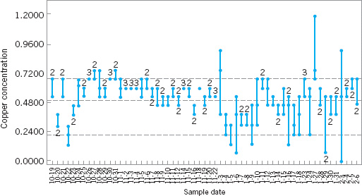
![]() FIGURE 5.29 Tolerance diagram of daily copper concentration.
FIGURE 5.29 Tolerance diagram of daily copper concentration.
To initiate the Improve step, the team first decided to rebuild the colorimeter and controller. This was done in early February. The result of this maintenance activity was to restore the variability in daily copper concentration readings to the pre-shutdown level. The rebuilt colorimeter was recalibrated and subsequently was able to hold the correct target. This recentering and recalibration of the process reduced the downtime on the controller from approximately 60% to less than 20%. At this point, the process was capable of meeting the required production rate.
Once this aspect of process performance was improved, the team directed its efforts to reducing the number of defective units produced by the process. Generally, as noted earlier, defects fell into two major categories: brittle copper and copper voids. The team decided that, although control charts and statistical process-control techniques could be applied to this problem, the use of a designed experiment might lead to a more rapid solution. As noted in Chapter 1, the objective of a designed experiment is to generate information that will allow us to understand and model the relationship between the process variables and measures of the process performance.
The designed experiment for the plating process is shown in Table 5.2 and Figure 5.30. The objective of this experiment was to provide information that would be useful in minimizing plating defects. The process variables considered in the experiment were copper concentration, sodium hydroxide concentration, formaldehyde concentration, temperature, and oxygen. A low level and high level, represented symbolically by the minus and plus signs in Table 5.2, were chosen for each process variable. The team initially considered a factorial experiment—that is, an experimental design in which all possible combinations of these factor levels would be run. This design would have required 32 runs—that is, a run at each of the 32 corners of the cubes in Figure 5.30. Since this is too many runs, a fractional factorial design that used only 16 runs was ultimately selected. This fractional factorial design is shown in the bottom half of Table 5.2 and geometrically in Figure 5.30. In this experimental design, each row of the table is a run on the process. The combination of minus and plus signs in each column of that row determines the low and high levels of the five process variables to be used during that run. For example, in run 1 copper concentration, sodium hydroxide concentration, formaldehyde concentration, and temperature are run at the low level and oxygen is run at the high level. The process would be run at each of the 16 sets of conditions described by the design (for reasons to be discussed later, the runs would not be made in the order shown in Table 5.2), and a response variable—an observed number of plating defects— would be recorded for each run. Then these data could be analyzed using simple statistical techniques to determine which factors have a significant influence on plating defects, whether or not any of the factors jointly influence the occurrence of defects, and whether it is possible to adjust these variables to new levels that will reduce plating defects below their current level. Although a complete discussion of design of experiments is beyond the scope of this text, we will present examples of designed experiments for improving process performance in Part V.
![]() TABLE 5.2
TABLE 5.2
A Designed Experiment for the Plating Process
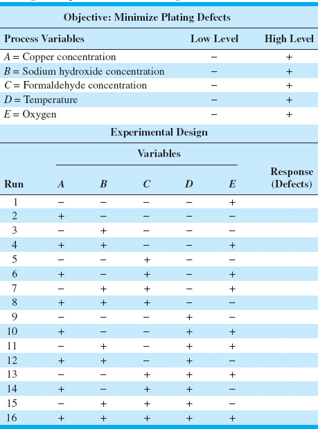
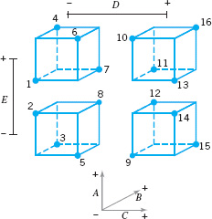
![]() FIGURE 5.30 A geometric view of the fractional factorial design for the plating process experiment.
FIGURE 5.30 A geometric view of the fractional factorial design for the plating process experiment.
After the team conducted the experiment shown in Table 5.2 and analyzed the resulting process data, they determined that several of the process variables that they identified for the study were important and had significant impact on the occurrence of plating defects. They were able to adjust these factors to new levels, and as a result, plating defects were reduced by approximately a factor of 10. Therefore, at the conclusion of the team’s initial effort at applying SPC to the plating process, it had made substantial improvements in product cycle time through the process and had taken a major step in improving the process capability.
5.7 Applications of Statistical Process Control and Quality Improvement Tools in Transactional and Service Businesses
This book presents the underlying principles of SPC. Many of the examples used to reinforce these principles are in an industrial, product-oriented framework. There have been many successful applications of SPC methods in the manufacturing environment. However, the principles themselves are general; there are many applications of SPC techniques and other quality engineering and statistical tools in nonmanufacturing settings, including transactional and service businesses.
These nonmanufacturing applications do not differ substantially from the more usual industrial applications. As an example, the control chart for fraction nonconforming (which is discussed in Chapter 7) could be applied to reducing billing errors in a bank credit card operation as easily as it could be used to reduce the fraction of nonconforming printed circuit boards produced in an electronics plant. The ![]() and R charts discussed in this chapter and applied to the hard-bake process could be used to monitor and control the flow time of accounts payable through a finance function. Transactional and service industry applications of SPC and related methodology sometimes require ingenuity beyond that normally required for the more typical manufacturing applications. There seem to be three primary reasons for this difference:
and R charts discussed in this chapter and applied to the hard-bake process could be used to monitor and control the flow time of accounts payable through a finance function. Transactional and service industry applications of SPC and related methodology sometimes require ingenuity beyond that normally required for the more typical manufacturing applications. There seem to be three primary reasons for this difference:
1. Most transactional and service businesses do not have a natural measurement system that allows the analyst to easily define quality.
2. The system that is to be improved is usually fairly obvious in a manufacturing setting, whereas the observability of the process in a nonmanufacturing setting may be fairly low.
3. Many service processes involve people to a high degree, and people are often highly variable in their work activities. Service systems often have to deal with customers that have unusual and very different requirements.
For example, if we are trying to improve the performance of a personal computer assembly line, then it is likely that the line will be contained within one facility and the activities of the system will be readily observable. However, if we are trying to improve the business performance of a financial services organization, then the observability of the process may be low. The actual activities of the process may be performed by a group of people who work in different locations, and the operation steps or workflow sequence may be difficult to observe. Furthermore, the lack of a quantitative and objective measurement system in most nonmanufacturing processes complicates the problem.
The key to applying statistical process-control and other related methods in service systems and transactional business environments is to focus initial efforts on resolving these three issues. We have found that once the system is adequately defined and a valid measurement system has been developed, most of the SPC tools discussed in this chapter can easily be applied to a wide variety of nonmanufacturing operations including finance, marketing, material and procurement, customer support, field service, engineering development and design, and software development and programming.
Flowcharts, operation process charts, and value stream mapping are particularly useful in developing process definition and process understanding. A flowchart is simply a chronological sequence of process steps or work flow. Sometimes flowcharting is called process mapping. Flowcharts or process maps must be constructed in sufficient detail to identify value-added versus non-value-added work activity in the process.
Most nonmanufacturing processes have scrap, rework, and other non-value-added operations, such as unnecessary work steps and choke points or bottlenecks. A systematic analysis of these processes can often eliminate many of these non-value-added activities. The flowchart is helpful in visualizing and defining the process so that non-value-added activities can be identified. Some ways to remove non-value-added activities and simplify the process are summarized in the following box.
Ways to Eliminate Non-Value-Added Activities
1. Rearrange the sequence of worksteps.
2. Rearrange the physical location of the operator in the system.
3. Change work methods.
4. Change the type of equipment used in the process.
5. Redesign forms and documents for more efficient use.
6. Improve operator training.
7. Improve supervision.
8. Identify more clearly the function of the process to all employees.
9. Try to eliminate unnecessary steps.
10. Try to consolidate process steps.
Figure 5.31 is an example of a flowchart for a process in a service industry. It was constructed by a process improvement team in an accounting firm that was studying the process of preparing Form 1040 income tax returns; this particular flowchart documents only one particular subprocess: that of assembling final tax documents. This flowchart was constructed as part of the Define step of DMAIC. Note the high level of detail in the flowchart to assist the team find waste or non-value-added activities. In this example, the team used special symbols in their flowchart. Specifically, they used the operation process chart symbols shown as follows:
Operation Process Chart Symbols
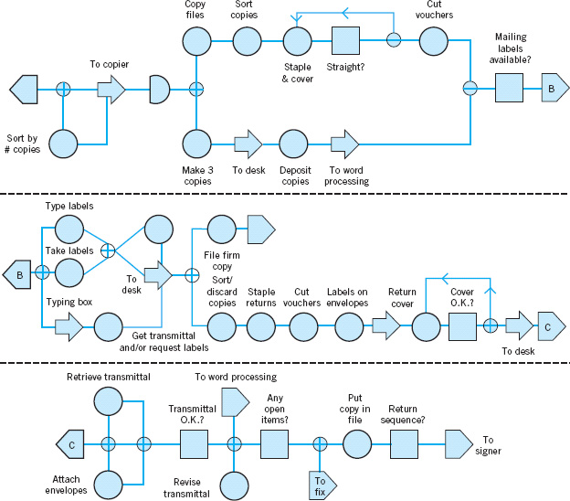
![]() FIGURE 5.31 Flowchart of the assembly portion of the Form 1040 tax return process.
FIGURE 5.31 Flowchart of the assembly portion of the Form 1040 tax return process.
We have found that these symbols are very useful in helping team members identify improvement opportunities. For example, delays, most inspections, and many movements usually represent non-value-added activities. The accounting firm was able to use quality improvement methods and the DMAIC approach successfully in their Form 1040 process, reducing the tax document preparation cycle time (and work content) by about 25%, and reducing the cycle time for preparing the client bill from over 60 days to zero (that’s right, zero!). The client’s bill is now included with his or her tax return.
As another illustration, consider an example of applying quality improvement methods in a planning organization. This planning organization, part of a large aerospace manufacturing concern, produces the plans and documents that accompany each job to the factory floor. The plans are quite extensive, often several hundred pages long. Errors in the planning process can have a major impact on the factory floor, contributing to scrap and rework, lost production time, overtime, missed delivery schedules, and many other problems.
Figure 5.32 presents a high-level flowchart of this planning process. After plans are produced, they are sent to a checker who tries to identify obvious errors and defects in the plans. The plans are also reviewed by a quality-assurance organization to ensure that process specifications are being met and that the final product will conform to engineering standards. Then the plans are sent to the shop, where a liaison engineering organization deals with any errors in the plan encountered by manufacturing. This flowchart is useful in presenting an overall picture of the planning system, but it is not particularly helpful in uncovering non-value-added activities, as there is insufficient detail in each of the major blocks. However, each block, such as the planner, checker, and quality-assurance block, could be broken down into a more detailed sequence of work activities and steps. The step-down approach is frequently helpful in constructing flowcharts for complex processes. However, even at the relatively high level shown, it is possible to identify at least three areas in which SPC methods could be usefully applied in the planning process.
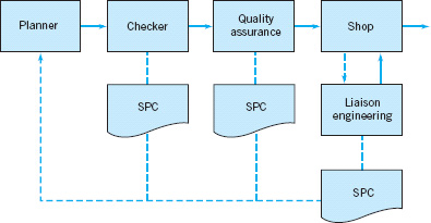
![]() FIGURE 5.32 A high-level flowchart of the planning process.
FIGURE 5.32 A high-level flowchart of the planning process.
The managers of the planning organization decided to use the reduction of planning errors as a quality improvement project for their organization. A team of managers, planners, and checkers was chosen to begin this implementation. During the Measure step, the team decided that each week three plans would be selected at random from the week’s output of plans to be analyzed extensively to record all planning errors that could be found. The check sheet shown in Figure 5.33 was used to record the errors found in each plan. These weekly data were summarized monthly, using the summary check sheet presented in Figure 5.34. After several weeks, the team was able to summarize the planning error data obtained using the Pareto analysis in Figure 5.35. The Pareto chart implies that errors in the operations section of the plan are predominant, with 65% of the planning errors in the operations section. Figure 5.36 presents a further Pareto analysis of the operations section errors, showing that omitted operations and process specifications are the major contributors to the problem.
The team decided that many of the operations errors were occurring because planners were not sufficiently familiar with the manufacturing operations and the process specifications that were currently in place. To improve the process, a program was undertaken to refamiliarize planners with the details of factory floor operations and to provide more feedback on the type of planning errors actually experienced. Figure 5.37 presents a run chart of the planning errors per operation for 25 consecutive weeks. Note that there is a general tendency for the planning errors per operation to decline over the first half of the study period. This decline may be due partly to the increased training and supervision activities for the planners and partly to the additional feedback given regarding the types of planning errors that were occurring. The team also recommended that substantial changes be made in the work methods used to prepare plans. Rather than having an individual planner with overall responsibility for the operations section, it recommended that this task become a team activity so that knowledge and experience regarding the interface between factor and planning operations could be shared in an effort to further improve the process.
The planning organization began to use other SPC tools as part of their quality improvement effort. For example, note that the run chart in Figure 5.37 could be converted to a Shewhart control chart with the addition of a center line and appropriate control limits. Once the planners were exposed to the concepts of SPC, control charts came into use in the organization and proved effective in identifying assignable causes; that is, periods of time in which the error rates produced by the system were higher than those that could be justified by chance cause alone. It is its ability to differentiate between assignable and chance causes that makes the control chart so indispensable. Management must react differently to an assignable cause than it does to a chance or random cause. Assignable causes are due to phenomena external to the system, and they must be tracked down and their root causes eliminated. Chance or random causes are part of the system itself. They can only be reduced or eliminated by making changes in how the system operates. This may mean changes in work methods and procedures, improved levels of operator training, different types of equipment and facilities, or improved input materials, all of which are the responsibility of management. In the planning process, many of the common causes identified were related to the experience, training, and supervision of the individual planners, as well as poor input information from design and development engineering. These common causes were systematically removed from the process, and the long-term impact of the SPC implementation in this organization was to reduce planning errors to a level of less than one planning error per 1,000 operations.
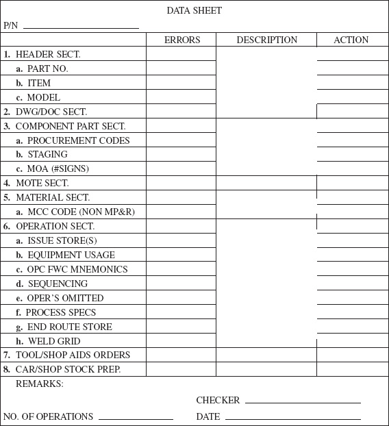
![]() FIGURE 5.33 The check sheet for the planning example.
FIGURE 5.33 The check sheet for the planning example.

![]() FIGURE 5.34 The summary check sheet.
FIGURE 5.34 The summary check sheet.
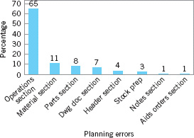
![]() FIGURE 5.35 Pareto analysis of planning errors.
FIGURE 5.35 Pareto analysis of planning errors.
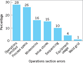
![]() FIGURE 5.36 Pareto analysis of operations section errors.
FIGURE 5.36 Pareto analysis of operations section errors.

![]() FIGURE 5.37 A run chart of planning errors.
FIGURE 5.37 A run chart of planning errors.
Value stream mapping is another way to see the flow of material and information in a process. A value stream map is much like a flowchart, but it usually incorporates other information about the activities that are occurring at each step in the process and the information that is required or generated. It is a big picture tool that helps an improvement team focus on optimizing the entire process, without focusing too narrowly on only one process activity or step, which could lead to suboptimal solutions.
Like a flowchart or operations process chart, a value stream map usually is constructed using special symbols. The box below presents the symbols usually employed on value stream maps.
A Value Stream Map
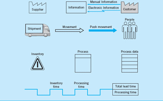
The value stream map presents a picture of the value stream from the product’s viewpoint: It is not a flowchart of what people do, but what actually happens to the product. It is necessary to collect process data to construct a value stream map. Some of the data typically collected includes:
1. Lead time (LT)—the elapsed time it takes one unit of product to move through the entire value stream from beginning to end.
2. Processing time (PT)—the elapsed time from the time the product enters a process until it leaves that process.
3. Cycle time (CT)—how often a product is completed by a process. Cycle time is a rate, calculated by dividing the processing time by the number of people or machines doing the work.
4. Setup time (ST)—these are activities such as loading/unloading, machine preparation, testing, and trial runs. In other words, all activities that take place between completing a good product until starting to work on the next unit or batch of product.
5. Available time (AT)—the time each day that the value stream can operate if there is product to work on.
6. Uptime (UT)—the percentage of time the process actually operates as compared to the available time or planned operating time.
7. Pack size—the quantity of product required by the customer for shipment.
8. Batch size—the quantity of product worked on and moved at one time.
9. Queue time—the time a product spends waiting for processing.
10. Work-in-process (WIP)—product that is being processed but is not yet complete.
11. Information flows—schedules, forecasts, and other information that tells each process what to do next.
Figure 5.38 shows an example of a value stream map that could be almost anything from a manufactured product (receive parts, preprocess parts, assemble the product, pack and ship the product to the customer) to a transaction (receive information, preprocess information, make calculations and decision, inform customer of decision or results). Notice that in the example we have allocated the setup time on a per-piece basis and included that in the timeline. This is an example of a current-state value stream map. That is, it shows what is happening in the process as it is now defined. The DMAIC process can be useful in eliminating waste and inefficiencies in the process, eliminating defects and rework, reducing delays, eliminating non-value-added activities, reducing inventory (WIP, unnecessary backlogs), reducing inspections, and reducing unnecessary product movement. There is a lot of opportunity for improvement in this process, because the process cycle efficiency isn’t very good. Specifically,
![]()
Reducing the amount of work-in-process inventory is one approach that would improve the process cycle efficiency. As a team works on improving a process, often a future-state value stream map is constructed to show what a redefined process should look like.
Finally, there are often questions about how the technical quality improvement tools in this book can be applied in service and transactional businesses. In practice, almost all of the techniques translate directly to these types of businesses. For example, designed experiments have been applied in banking, finance, marketing, health care, and many other service/transactional businesses. Designed experiments can be used in any application where we can manipulate the decision variables in the process. Sometimes we will use a simulation model of the process to facilitate conducting the experiment. Similarly, control charts have many applications in the service economy, as will be illustrated in this book. It is a big mistake to assume that these techniques are not applicable just because you are not working in a manufacturing environment.
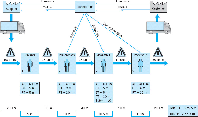
![]() FIGURE 5.38 A value stream map.
FIGURE 5.38 A value stream map.
Still, one difference in the service economy is that you are more likely to encounter attribute data. Manufacturing often has lots of continuous measurement data, and it is often safe to assume that these data are at least approximately normally distributed. However, in service and transactional processes, more of the data that you will use in quality improvement projects is either proportion defective, percentage good, or counts of errors or defects. In Chapter 7, we discuss control charting procedures for dealing with attribute data. These control charts have many applications in the service economy. However, even some of the continuous data encountered in service and transactional businesses, such as cycle time, may not be normally distributed.
Let’s talk about the normality assumption. It turns out that many statistical procedures (such as the t-tests and ANOVA from Chapter 4) are very insensitive to the normality assumption. That is, moderate departures from normality have little impact on their effectiveness. There are some procedures that are fairly sensitive to normality, such as tests on variances, and this book carefully identifies such procedures. One alternative to dealing with moderate to severe non-normality is to transform the original data (say, by taking logarithms) to produce a new set of data whose distribution is closer to normal. A disadvantage of this is that nontechnical people often don’t understand data transformation and are not comfortable with data presented in an unfamiliar scale. One way to deal with this is to perform the statistical analysis using the transformed data, but to present results (graphs, for example) with the data in the original units.
In extreme cases, there are nonparametric statistical procedures that don’t have an underlying assumption of normality and can be used as alternatives to procedures such as t-tests and ANOVA. Refer to Montgomery and Runger (2011) for an introduction to many of these techniques. Many computer software packages such as Minitab have nonparametric methods included in their libraries of procedures. There are also special statistical tests for binomial parameters and Poisson parameters. (Some of these tests were discussed in Chapter 4; Minitab, for example, incorporates many of these procedures.) It also is important to be clear about to what the normality assumption applies. For example, suppose that you are fitting a linear regression model to cycle time to process a claim in an insurance company. The cycle time is y, and the predictors are different descriptors of the customer and what type of claim is being processed. The model is
y = β0 + β1x1 + β2x2 + β3x3 + ε
The data on y, the cycle time, isn’t normally distributed. Part of the reason for this is that the observations on y are impacted by the values of the predictor variables, x1, x2, and x3. It is the errors in this model that need to be approximately normal, not the observations on y. That is why we analyze the residuals from regression and ANOVA models. If the residuals are approximately normal, there are no problems. Transformations are a standard procedure that can often be used successfully when the residuals indicate moderate to severe departures from normality.
There are situations in transactional and service businesses where we are using regression and ANOVA and the response variable y may be an attribute. For example, a bank may want to predict the proportion of mortgage applications that are actually funded. This is a measure of yield in their process. Yield probably follows a binomial distribution. Most likely, yield isn’t well approximated by a normal distribution, and a standard linear regression model wouldn’t be satisfactory. However, there are modeling techniques based on generalized linear models that handle many of these cases. For example, logistic regression can be used with binomial data and Poisson regression can be used with many kinds of count data. Montgomery, Peck, and Vining (2006) contains information on applying these techniques. Logistic regression is available in Minitab, and JMP software provides routines for both logistic and Poisson regressions.
Important Terms and Concepts
Action limits
Assignable causes of variation
Average run length (ARL)
Average time to signal
Cause-and-effect diagram
Chance causes of variation
Check sheet
Control chart
Control limits
Defect concentration diagram
Designed experiments
Flowcharts, operations process charts, and value stream mapping
Factorial experiment
In-control process
Magnificent seven
Out-of-control-action plan (OCAP)
Out-of-control process
Pareto chart
Patterns on control charts
Phase I and phase II applications Rational subgroups
Sample size for control charts
Sampling frequency for control charts
Scatter diagram
Sensitizing rules for control charts
Shewhart control charts
Statistical control of a process
Statistical process control (SPC)
Three-sigma control limits
Warning limits
![]() The Student Resource Manual presents comprehensive annotated solutions to the odd-numbered exercises included in the Answers to Selected Exercises section in the back of this book.
The Student Resource Manual presents comprehensive annotated solutions to the odd-numbered exercises included in the Answers to Selected Exercises section in the back of this book.
5.1. What are chance and assignable causes of variability? What part do they play in the operation and interpretation of a Shewhart control chart?
5.2. Discuss the relationship between a control chart and statistical hypothesis testing.
5.3. Discuss type I and type II errors relative to the control chart. What practical implication in terms of process operation do these two types of errors have?
5.4. What is meant by a process that is in a state of statistical control?
5.5. If a process is in a state of statistical control, does it necessarily follow that all or nearly all of the units of product produced will be within the specification limits?
5.6. Discuss the logic underlying the use of three-sigma limits on Shewhart control charts. How will the chart respond if narrower limits are chosen? How will it respond if wider limits are chosen?
5.7. What are warning limits on a control chart? How can they be used?
5.8. Discuss the rational subgroup concept. What part does it play in control chart analysis?
5.9. When taking samples or subgroups from a process, do you want assignable causes occurring within the subgroups or between them? Fully explain your answer.
5.10. A molding process uses a five-cavity mold for a part used in an automotive assembly. The wall thickness of the part is the critical quality characteristic. It has been suggested to use ![]() and R charts to monitor this process, and to use as the subgroup or sample all five parts that result from a single “shot” of the machine. What do you think of this sampling strategy? What impact does it have on the ability of the charts to detect assignable causes?
and R charts to monitor this process, and to use as the subgroup or sample all five parts that result from a single “shot” of the machine. What do you think of this sampling strategy? What impact does it have on the ability of the charts to detect assignable causes?
5.11. A manufacturing process produces 500 parts per hour. A sample part is selected about every half hour, and after five parts are obtained, the average of these five measurements is plotted on an control chart.
(a) Is this an appropriate sampling scheme if the assignable cause in the process results in an instantaneous upward shift in the mean that is of very short duration?
(b) If your answer is no, propose an alternative procedure.
5.12. Consider the sampling scheme proposed in Exercise 5.11. Is this scheme appropriate if the assignable cause results in a slow, prolonged upward drift in the mean? If your answer is no, propose an alternative procedure.
5.13. If the time order of production has not been recorded in a set of data from a process, is it possible to detect the presence of assignable causes?
5.14. What information is provided by the operating characteristic curve of a control chart?
5.15. How do the costs of sampling, the costs of producing an excessive number of defective units, and the costs of searching for assignable causes impact on the choice of parameters of a control chart?
5.16. Is the average run length performance of a control chart a more meaningful measure of performance than the type I and type II error probabilities? What information does ARL convey that the statistical error probabilities do not?
5.17. Consider the control chart shown here. Does the pattern appear random?
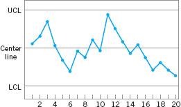
5.18. Consider the control chart shown here. Does the pattern appear random?
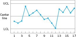
5.19. Consider the control chart shown here. Does the pattern appear random?

5.20. Consider the control chart shown in Exercise 5.17. Would the use of warning limits reveal any potential out-of-control conditions?
5.21. Apply the Western Electric rules to the control chart in Exercise 5.17. Are any of the criteria for declaring the process out of control satisfied?
5.22. Sketch warning limits on the control chart in Exercise 5.19. Do these limits indicate any potential out-of-control conditions?
5.23. Apply the Western Electric rules to the control chart presented in Exercise 5.19. Would these rules result in any out-of-control signals?
5.24. Consider the time-varying process behavior shown below and on the next page. Match each of these several patterns of process performance to the corresponding ![]() and R charts shown in figures (a) to (e) below.
and R charts shown in figures (a) to (e) below.
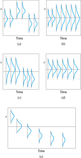
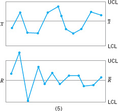
5.25. You consistently arrive at your office about one-half hour later than you would like. Develop a cause-and-effect diagram that identifies and outlines the possible causes of this event.
5.26. A car has gone out of control during a snowstorm and struck a tree. Construct a cause-and-effect diagram that identifies and outlines the possible causes of the accident.
5.27. Laboratory glassware shipped from the manufacturer to your plant via an overnight package service has arrived damaged. Develop a cause-and-effect diagram that identifies and outlines the possible causes of this event.
5.28. Construct a cause-and-effect diagram that identifies the possible causes of consistently bad coffee from a large-capacity office coffee pot.
5.29. Develop a flowchart for the process that you follow every morning from the time you awake until you arrive at your workplace (or school). Identify the value-added and non-value-added activities.
5.30. Develop a flowchart for the pre-registration process at your university. Identify the value-added and non-value-added activities.
5.31. The magnificent seven can be used in our personal lives. Develop a check sheet to record “defects” you have in your personal life (such as overeating, being rude, not meeting commitments, missing class, etc.). Use the check sheet to keep a record of these “defects” for one month. Use a Pareto chart to analyze these data. What are the underlying causes of these “defects”?
5.32. A process is normally distributed and in control, with known mean and variance, and the usual three-sigma limits are used on the ![]() control chart, so that the probability of a single point plotting outside the control limits when the process is in control is 0.0027. Suppose that this chart is being used in phase I and the averages from a set of m samples or subgroups from this process are plotted on this chart. What is the probability that at least one of the averages will plot outside the control limits when m = 5? Repeat these calculations for the cases where m = 10, m = 20, m = 30, and m = 50. Discuss the results that you have obtained.
control chart, so that the probability of a single point plotting outside the control limits when the process is in control is 0.0027. Suppose that this chart is being used in phase I and the averages from a set of m samples or subgroups from this process are plotted on this chart. What is the probability that at least one of the averages will plot outside the control limits when m = 5? Repeat these calculations for the cases where m = 10, m = 20, m = 30, and m = 50. Discuss the results that you have obtained.
5.33. Reconsider the situation in Exercise 5.32. Suppose that the process mean and variance were unknown and had to be estimated from the data available from the m subgroups. What complications would this introduce in the calculations that you performed in Exercise 5.32?
____________
1The terminology chance and assignable causes was developed by Shewhart. Today, some writers use the terminology common cause instead of chance cause and special cause instead of assignable cause.
2Note that “sigma” refers to the standard deviation of the statistic plotted on the chart (i.e., σ![]() ), not the standard deviation of the quality characteristic.
), not the standard deviation of the quality characteristic.
3The name Pareto chart is derived from Italian economist Vilfredo Pareto (1848–1923), who theorized that in certain economies the majority of the wealth was held by a disproportionately small segment of the population. Quality engineers have observed that defects usually follow a similar Pareto distribution.