What is composition?
Composition is commonly defined as arranging all the visual elements in the frame in a way that makes the image a satisfactory and complete whole. Integration of the image is obtained by the positioning of line, mass, colour and light in the most pleasing arrangement.
This definition is a start in the examination of composition but it does prompt further questions. What counts as ‘satisfactory and complete’ and is ‘pleasing arrangement’ an objective or subjective judgement?
Many television camera operators know, through many years of experience, exactly how to position the lens in space or choose a different lens angle in order to improve the appearance of the shot. They are either working to inherited craft values of what is good composition or they are repositioning and juggling with the camera until they intuitively feel that they have solved that particular visual problem.
Frequently there is no time to analyse a situation and the only thing to fall back on is experience. Compositional experience is the result of many years of solving visual problems. Good visual communication is not a gift from heaven but is learnt from finding out in practice what does and does not work.
Visual communication
Effective communication can be carried out in many languages. The very basic requirement for communication between individuals is their need to speak in the same language. Using a visual medium is choosing to communicate through pictures and ultimately the visual language used must be compatible with human perception. Although aesthetic fashion influences composition, good visual communication rests on an understanding of the psychology of perception.
Man has specific ways of visually understanding the world. If a composition is arranged to work in accord with those underlying visual principles, then there is more chance of the visual information being understood and enjoyed. If the composition conflicts with the pattern of visual expectation, then confusion and rejection of the message may occur.
These perceptual phenomena have been intuitively understood and employed by painters of great works of art for centuries. Their work engages our attention and is visually satisfying. These masterpieces still communicate and satisfy because they are structured for visual understanding and their viewers respond intuitively to the underlying reinforcement of the visual system.
Visual coherence is related to the inherent characteristics of perception. Seeing is not simply a mechanical recording by the eye. Understanding the nature of an image is initially accomplished by the perceptual grouping of significant structural patterns. One of the aims of good composition is to find and emphasize structural patterns that the mind/eye can easily grasp.
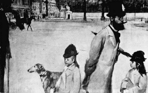
Place de la Concorde (Vicomte Ludovic Lepic and his Daughters) (1875) Degas.
For many centuries the aim of composition in Western painting was to weld all the elements of the painting into a pictorial unity – to achieve balance. The concept of dissonance – to deliberately offset compositional elements in order to create visual tension – only entered composition technique to any extent in the nineteenth century.
Seeing an image as the camera sees it requires training the eye and brain. Understanding how we see is the first step in controlling visual communication.
How the mind responds to visual information
Much of the theory of perceptual characteristics has been influenced by Gestalt psychologists. Gestalt is the German word for ‘form’ and these psychologists held the view that it is the overall form of an image that we respond to and not the isolated visual elements it contains. In general, we do not attempt to perceive accurately every detail of the shapes and objects perceived but select only as much as will enable us to identify what we see.
Characteristics of perception
There have been many experiments and many theories about perception, some of which appear to be contradictory. Most agree that perception is instantaneous and not subject to extended judgement. It is an active exploration rather than a passive recording of the visual elements in the field of view and is selective and personal.
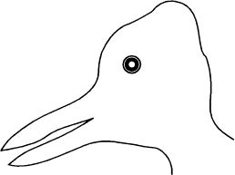
The mind makes sense of visual elements by grouping elements into patterns. Any stimulus pattern tends to be seen in such a way that the resulting structure is as simple as the given conditions permit. Making sense of visual stimuli involves testing by hypothesis. An unfamiliar or ambiguous image may be assigned a tentative definition until further information becomes available (see opposite ‘duck or rabbit?’).
In searching for the best interpretation of the available visual data we utilize a number of perceptual shorthand techniques which include organization of similar shapes and similar size. Shapes that are similar are grouped and form a pattern that creates eye motion. A ‘good’ form to be striking and easy to perceive is simple, regular, symmetrical and may have continuity in time. A ‘bad’ form without these qualities is modified by the perceiver to conform to ‘good’ form qualities.
Good composition reinforces the manner in which the mind organizes information. It emphasizes those elements such as grouping, pattern, shape and form that provide the viewer with the best method of ‘reading’ the image smoothly and efficiently. If there is friction in visual movement of the eye across the frame, if there are areas of the image which stop the eye dead, then an unsatisfactory feeling is unconsciously experienced and in an extreme form will end the attention of the viewer. There is a fine dividing line between teasing the eye with visual ambiguities and losing the interest of the audience.
Summary
The mind tends to group objects together into one single comprehensive image. The mind sees patterns; composition can enhance or facilitate this tendency or it can prevent it. A knowledge of how the mind groups visual elements is therefore a valuable tool for good communication.
Perception is making sense of an image – searching for the best interpretation of the available data. The mind sees patterns and searches for the best interpretation. A perceived object is therefore an hypothesis to be tested against previous experience. If it looks like a duck then it is a duck. That is, until we see it as a rabbit.
Control of composition
Control of composition is achieved by the ability to choose the appropriate camera technique such as viewpoint, focal length of lens, lighting and exposure in addition to employing a range of visual design elements such as balance, colour contrast, perspective of mass/line, etc.
A well-designed composition is one in which the visual elements have either been selectively included or excluded. The visual components of the composition must be organized to engage the viewer’s attention. A starting point is often to follow the old advice to simplify by elimination, and to reduce to essentials in order to create an image that has strength and clarity.
Emphasizing the most important element
Composition involves drawing attention to the main subject and then making it meaningful, but often a shot can be selected on a visual decision which ignores all but one part of the image. The poor compositional relationship between this area and the total frame may only become apparent after the event has been recorded. One of the more obvious mistakes therefore is not to see the whole picture but only that part which has initially attracted interest.
There is a puzzling piece of advice about camerawork that urges all students to ‘Look before you see’. In essence this simply means to look at the overall image and at its underlying pattern before concentrating too much on the main subject. Developing a photographic eye is giving attention to all visual elements within the field of view and not simply selecting those elements that initially attract attention. With experience comes the ability to visualize the appearance of a shot wherever the lens is positioned, without the need to continually move the camera in order to look through the viewfinder to find out what the shot will look like.
Before deciding camera position, lens angle, framing, etc., it is worth considering the following questions.
![]() What is the purpose of the shot?
What is the purpose of the shot?
![]() Is the shot fact or feeling? Will the image attempt to be factual and objective and allow the viewers to draw their own conclusions or is it the intention to persuade or create an atmosphere by careful selection?
Is the shot fact or feeling? Will the image attempt to be factual and objective and allow the viewers to draw their own conclusions or is it the intention to persuade or create an atmosphere by careful selection?
![]() In what context will the shot be seen? What precedes, what follows?
In what context will the shot be seen? What precedes, what follows?
![]() What will be the most important visual element in the shot?
What will be the most important visual element in the shot?
The best viewpoint is that lens position in space which emphasizes the main subject. Make certain that the eye is attracted to the part of the frame that is significant and avoid conflict with other elements in the frame.
The aim of a balanced composition is to integrate all the visual factors such as shape, colour and location so that no change seems possible. The image achieves unity as a result of all its essential elements.
An unbalanced composition appears accidental and transitory. There is no organizational pattern and any part of the frame could be masked with no loss of communication. There is insufficient arrangement of shapes to assist in grasping the reason for the image. It is ambiguous and unable to hold any visual attention beyond the initial search for understanding.
Emphasis
To emphasize the most important element, use subject size, position, selective focus, colour, brightness and relationship to background to focus attention. Use either contrast of tone, colour and form to stress the differences between visual elements in the shot and to balance out active relationships between opposed elements.
Check the following:
![]() The purpose of the shot is understood.
The purpose of the shot is understood.
![]() The main subject is identified.
The main subject is identified.
![]() Arrange the camera parameters (lens position, angle, height, etc.) to emphasize the principal interest.
Arrange the camera parameters (lens position, angle, height, etc.) to emphasize the principal interest.
![]() Use leading lines to point to the main subject.
Use leading lines to point to the main subject.
![]() Examine supporting visual interest within the frame and use framing and lens position to maximize their support for the main subject and to eliminate or subdue competing areas of interest. Offset the dominant interest and balance this with a less important element.
Examine supporting visual interest within the frame and use framing and lens position to maximize their support for the main subject and to eliminate or subdue competing areas of interest. Offset the dominant interest and balance this with a less important element.
![]() Avoid corners for principal information and keep the attention within the picture space.
Avoid corners for principal information and keep the attention within the picture space.
![]() Simplify the image if possible by reducing to essentials.
Simplify the image if possible by reducing to essentials.
Taking the eye for a walk
Although perceptually we have an awareness of a large field of view, only a small segment can receive our full attention. It is necessary for the eye to make small eye movements continuously called ‘saccades’ in order to scan an object. It is similar to the eye movement necessary to examine each word of text on a page.
In the West, a page of text has a structure to allow the information to be read out in the correct sequence. Starting from the top left of the page to bottom right there is no misunderstanding the path the eye must traverse. There is no similar learnt procedure for scanning an object or image unless a deliberate perceptual route is built in which channels the eye movement along a pre-planned path.
Emphasizing the main subject involves control of the eye movement across the frame. The eye travels the line of least resistance and in its movement around the frame it is similar to a pin-ball bouncing off different obstacles before being forced by the designer of the composition to end up at the main subject of interest. An interesting composition allows the eye movement moments of repose and this stop/start journey creates visual rhythm. The strongest rhythms occur in patterns. Organization of the image requires the eye to be shown new unsuspected spatial relationships between similar shapes, similar tone, texture or colour.
Fill the frame if possible with interest and avoid large plain areas that are there simply because of the aspect ratio of the screen. If necessary, mask off part of the frame with a feature in the shot to give a more interesting composition and to emphasize the most important element in the frame.
The normal scanning of an image from left to right appears to give less weight to an object on the left than if it is placed on the right of the frame.
Scale
A great deal of our understanding of the physical nature of the world around us is achieved by comparison of size. We often achieve recognition of an object by its proportions and its normal size relationship with other objects. A 3 m high shirt button would require a moment to categorize before we had established a new frame of reference, whereas it would be instantly recognized as a button if it was at a normal size.
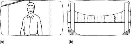
The human figure is the most easily recognised and most often used in size comparisons. An over-used technique is the familiar zoom out from a presenter to reveal that he or she is located at the top of an enormous bridge, building or natural feature. This shows scale but requires a great deal of ‘dead’ visual between the start and the end of the shot, the only two images that are being compared. This is shown in the bottom figure opposite.
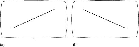
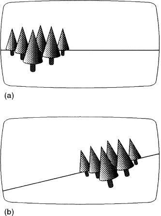
Reading an image left to right
Because of the Western tradition of scanning text from left to right, the movement of the line in (a) appears to be travelling uphill whereas the movement of the line in (b) appears to be going downhill.
The proximity of one subject to another allows a frame of reference to be established and associations and comparisons to be made. The same factors are at work with adjacent shots allowing development of new information or continuity in story telling. Proximity of subject allows judgements of scale and connections. Proximity in time allows continuity and the relationship between visual references which constructs an argument.
A frame around an image seals off most of its frame of reference and can cause problems in recognition unless it is a very familiar object such as the human face or figure. Most people have been visually tricked by a close shot of a model replica when the camera pulls back to reveal it is as a fraction of the size of the original. Some objects need to be set in context in order to communicate clearly without any confusion of their identity.
A composition can achieve an impact by introducing an indication of scale or size comparison. It may be simply contrasting one subject with another – a small child in a large space or an ocean liner being pulled by a small tug. Viewers unfamiliar with the subject depicted may need some indication of size by comparison with a known object.
Perceptual response
There is a perceptual tendency to group and organize items together to form a cluster of shapes to make up a total image that can be fully comprehended in one attentive act. Some elements are grouped together because they are close to each other. Others are bound together because they are similar in size, direction or shape. Composition must therefore aim to create a unifying relationship between the visual elements of an image in order to feed the perceptual system with patterns that can be easily assimilated by the viewer.
Similarity by proximity
Grouping objects together because they are near to each other in the frame is the simplest method of visual organization. One of mankind’s oldest examples of perceptual grouping is probably the patterns imposed on isolated and unconnected stars to form the signs of the Zodiac. Grouping a foreground and a background object by proximity can achieve a coherent design in a composition.
Proximity of objects in the frame can also create relationships that are unwanted (e.g. the example of objects behind people’s heads which appear on the screen as head-wear).
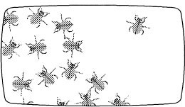
Similarity of size
Same size objects in a frame will be grouped together to form one shape or pattern. The most common example of this principle is the grouping and staging of crowd scenes.
This grouping by size and proximity can be used in a reverse way to emphasize one person in a crowd scene by isolating the individual so that they cannot be visually grouped with the crowd (see opposite).
Because of the assumed similarity of size between individual people, staging people in the foreground and in the background of a shot allows visual unity in the perception of similar shapes and also an effective impression of depth indicated by the diminished image size of the background figure.
Similarity by closure
Searching for coherent shapes in a complex image, human perception will look for, and if necessary, create simple shapes. The more consistent the shape of a group of visual elements, the more easily it can be detached from a confusing background. Straight lines will be continued by visual projection, curved lines that almost form a circle will be mentally completed.
A popular use of this principle is the high angle shot looking down on a seething crowd moving in one direction while the principal figure makes a desperate journey through the crowd in the opposite direction. We are able to keep our attention on the figure because of the opposing movements and also because we mentally project their straight-line movement through the crowd. The principal figure would soon be absorbed within the crowd if they frequently changed direction.
Similarity of colour
Objects grouped by colour is another effective method of compositional organization. Uniforms and team sports wear are linked together even if they are scattered across the frame. Identically coloured dance costumes for the chorus in musicals are used to structure movement and to emphasize the principals dressed in a contrasting colour scheme.
The eye is instantly attracted to the ‘odd one out’
Spatial organization
Sp ati l org anizati on isthe vit alfacto rin a noptic alm essage
Spatial organization is the vital factor in an optical message
![]() Understanding the nature of an image is initially accomplished by the perceptual grouping of significant structural patterns.
Understanding the nature of an image is initially accomplished by the perceptual grouping of significant structural patterns.
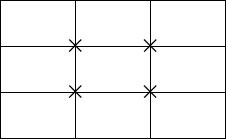
![]() Grouping objects together because they are near to each other in the frame is the simplest method of visual organization.
Grouping objects together because they are near to each other in the frame is the simplest method of visual organization.
![]() Same size objects in a frame will be grouped together to form one shape or pattern.
Same size objects in a frame will be grouped together to form one shape or pattern.
![]() Searching for coherent shapes in a complex image, human perception will look for, and if necessary, create simple shapes.
Searching for coherent shapes in a complex image, human perception will look for, and if necessary, create simple shapes.
![]() Objects grouped by colour is another effective method of compositional organization.
Objects grouped by colour is another effective method of compositional organization.
Frame – an invisible focus of power
At the same moment that we perceive the identity of an object within a frame, we are also aware of the spatial relationship between the object and the frame. Perceptual psychologists have established that observers unconsciously imply potential motion to a static object depending on its position within the frame. A single object will either be ‘pulling’ towards the centre or to the corners and/or edge of the frame. The edge of the frame and also the shape of the frame have therefore a strong influence on composition.
The pattern of a shot is more than the relationship between size, shape, brightness differences and colour contrast of the visual elements; there is also a hidden structural pattern created by the frame. An image contains more than the visible elements that make up the shot, and these ‘unseen’ aspects can exert a powerful influence on the composition.
The frame’s ‘field of forces’ exerts pressure on the objects contained within the frame and any adjustment to the composition of a group of visual elements will be arranged with reference to these pressures. This strong perceptual awareness of the invisible reference points of the frame can be demonstrated by examining a simple medium close-up shot framed with normal headroom. If the camera is panned up, a point is reached, with a large amount of headroom, where the subject appears to be slipping out of the bottom of the frame. Panning down to create a shot with no headroom produces the feeling that the subject is leaving through the top of the frame.
Different placement of the subject within the frame’s field of forces can therefore induce a perceptual feeling of equilibrium, of motion or of ambiguity.
Viewfinder as an editing tool
The viewfinder is selective – it excludes as well as includes visual material. The frame of a shot creates an ‘enclosure’, a fence that separates the image from its environment – a bright rectangle surrounded by blackness. A video viewfinder image is seen by the camera operator in very different conditions to the television viewer. Viewfinders display images that deviate in significant ways to our normal experience of perception (see Monochrome viewfinders, page 250).
Static viewpoint
Human perception is unable to be static and as continuously focused and attentive on a selected portion of a field of view as a camera (see bottom figure on page 217). Attention, after a short period of time, will inevitably be captured by movement or noise from visual subjects outside the selected zone of view. The camera can continue its static unblinking gaze until altered by the camera operator.
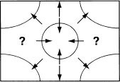
A field of forces can be plotted to show the position of rest or balance (centre and midpoint on the diagonal between corner and centre) and positions of ambiguity where the observer cannot predict the potential motion of the object and therefore an element of perceptual unease is created. Whether the object is passively attracted by centre or edge or whether the object actively moved on its own volition depends on content.
The awareness of motion of a static visual element with relation to the frame is an intrinsic part of perception. It is not an intellectual judgement tacked on to the content of an image based on previous experience, but an integral part of perception.
There is a strong perceptual awareness of the invisible reference points of the frame. (a) If the camera is panned up, a point is reached, with a large amount of headroom, where the subject appears to be slipping out of the bottom of the frame. (b) Panning down to create a shot with no headroom produces the feeling that the subject is leaving through the top of the frame. (c) There is a point of equilibrium where the subject is balanced against the invisible forces of the frame.
The aspect ratio of the frame and the relationship of the subject to the edge of frame has a considerable impact on the composition of a shot. Historically, in print photography, there have been two preferred aspect ratios – the landscape format, which has a predominantly horizontal shape, and the portrait format, which has the shortest side of the rectangle as the base.
Standard TV aspect ratio is 4:3 which is gradually being replaced by a 16:9 shape (see Aspect ratio, page 224) which retains the same frame shape whatever the subject. One simple way of breaking up the repetition of the same projected shape and of adjusting the aspect ratio to suit the content is to create compositions that involve frames within frames. The simplest device is to frame a shot through a doorway or arch which emphasizes the enclosed view and plays down the enclosing frame and wall. Another popular convention is to include in the top of the frame of a wide shot a bit of ‘dingle dangle’ – a tree branch often supported out of vision by a gallows arm or a similar wooden structure.
By using foreground masking, an irregular ‘new’ frame can be created which gives variety to the constant repetition of the screen shape. A frame within a frame breaks the monotony and also provides the opportunity for compositional diversity. The familiar over-the-shoulder two shot is in effect a frame within a frame image as the back of the foreground head is redundant information and is there to allow greater attention on the speaker and the curve of the head into the shoulder gives a more visually attractive shape to the side of the frame.
A second frame
A frame within a frame emphasizes the principal subject by enclosing it with a secondary frame and often gives added depth to the shot. There are a number of ways of creating a secondary frame including the use of semisilhouette foreground objects, or windows or mirrors that divide the frame into a smaller rectangle. If this is badly done, there is the risk of creating a divided frame with equal and competing areas of interest. Strong vertical and horizontal elements can create two images which are unconnected and provide no visual direction and allow ambiguity in the viewer’s mind as to which image is dominant.
The other compositional problem occurs with the relationship between the edge of frame and the frame within a frame shape. If these are similar and the inside shape follows the frame line then there is simply a contraction of the screen size. Divided interest in a frame can be created by the over-emphasis of visual elements that are not the principal subject or there may be indecision as to what is the principal subject.
The ‘over-the-shoulder two shot’ was in use as early as 1914 and still appears in most narrative films. The back of the artiste is redundant information and is there to allow greater attention to be focused on the speaker. The curve of the foreground head gives a more visually attractive shape to the side of the frame.
Divided interest
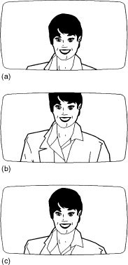
The most common example of divided interest is the newsreader/presenter shot framed in one half of the shot and ‘balanced’ by a logo or generic graphic enclosed in a ‘window’ in the other half of the shot. The two images are usually not visually integrated and fight each other for attention. Often the newsreader appears to be uncomfortably near one edge of the frame being pushed out by the dominant position of the graphic.
It is almost impossible to achieve visual unity with a combination of presenter plus a strong graphic ‘window’ unless the presenter occupies at least three quarters of the frame and can overlap the graphics window. A 50/50 split in the frame is often seen in news bulletins reflecting journalistic preferences formed by experiences of text page newspaper layouts.
Electronic graphics have a generous surround of ‘non-action’ area which was once required because some domestic television sets were overscanned and the margins of the transmitted picture were not seen. Essential information such as text (name supers, telephone numbers, etc.) was automatically kept out of this border. Pictures derived from cameras have no such automatic control and can and do produce images that overlap the action area boundary. Consequently many factual programmes allow electronic graphic material to push presenters off the screen or squeeze them to the edge of the frame in composite shots.
Closed frame
One of the early Hollywood conventions was to compose the shot so that it contained the action within the frame and then, by cutting, followed the action in distinct, complete shots. Each shot is self-contained and refers only to what is seen and shuts out or excludes anything outside of the frame. This is the closed frame technique and it is structured to keep the attention only on the information that is contained in the shot. If there is any significant reference to a subject outside of the frame, then there is a cut or a camera move to bring the referred subject into frame.
This convention is still followed in many different types of programme format. For example, in a television cooking demonstration, the demonstrator in medium close-up (MCU) may refer to some ingredient they are about to use which is outside the frame. Either the MCU is immediately loosened to reveal the ingredient or there is a cutaway to a close-up of the ingredient.
Open frame
The open frame convention allows action to move in and out of the frame. An example would be a character in a hallway who would be held on screen while in dialogue with someone who is moving in and out of frame entering and leaving various rooms which are unseen. Their movement while they are out of frame is implied and not cut to as separate shots. The open frame does not disguise the fact that the shot is only a partial viewpoint of a much larger environment. This technique considers that it is not necessary for the audience to see the reality beyond the shot in order to be convinced that it exists.
Limited depth and perspective indicators
The viewfinder image has limited depth indicators of overlap, size changed by movement, mass and line perspective and aerial perspective. Human perception with binocular vision allows depth and size judgements to be made by head and body movement. The perspective of the viewfinder picture can be entirely different from the impression of depth experienced by an observer beside the camera.
Frame and subject size
Filling the frame with the principal subject appears to be, at first sight, an efficient way of eliminating irrelevant detail. A close shot concentrates the attention and avoids the complications of integrating other visual elements into a cohesive composition. The closer you get to the main subject, the easier it is for the viewer to understand the priorities of the shot and the quicker it is for the camera operator to find the optimum framing. The close shot is efficient in communication and often, because it only requires a small area to be designed and lit, economical in production.
Levelling up the head
The edge of frame as a reference
Because of the strong influence of the frame edges, they tend to act as an immediate perceptual reference point to horizontal and vertical lines in the image. The camera needs to be levelled to produce horizon or equivalent lines parallel to the bottom of the frame and vertical lines parallel to the side of the frame unless a canted picture is required (a Dutch tilt). If this does not happen, any camera movement will produce greater or lesser distortion of the vertical and horizontal elements.
A tripod and camera can be set up on uneven ground so that it appears in the viewfinder as if the horizon is level but a canted horizon may be produced if the camera is panned left or right. When first setting up the camera on a tripod always level up using the spirit level in the pan/tilt head as a reference.
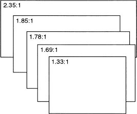
The ratio of the longest side of a rectangle to the shortest side is called the aspect ratio of the image. The aspect ratio of the frame and the relationship of the subject to the edge of frame has a considerable impact on the composition of a shot. Historically, as film progressed from the Academy aspect ratio of 1.33:1 (a 4:3 rectangle) to the advent of digital production and reception, the opportunity was taken to convert to a TV widescreen ratio of 1.78:1 (a 16:9 rectangle).
Screen size and resolution
Dr Takashi Fujio at the NHK research laboratories carried out research on viewers’ preference for screen size and aspect ratio and his findings largely formed the justification for the NHK HDTV parameters. The research suggests that the majority of viewers preferred a wider aspect ratio than 4:3 plus a larger screen with a corresponding increase in resolution, brightness and colour rendition. His conclusion was that maximum involvement by the viewer was achieved with a 5:3 aspect ratio viewed at 3 to 4 picture height distance. Normal viewing distance (in Japan) was 2 to 2.5 m, which suggested an ideal screen size of between 1 m × 60 cm and 1.5 m × 90 cm. Sitting closer to a smaller screen did not involve the viewer in the action in the same way.
Screen size
Someone sitting in a front-row cinema seat may have as much as 58° of their field of view taken up by the screen image where the viewing distance is 0.9 times the picture height. This can be reduced to as little as 9.5° when the same screen is viewed from the back row of the cinema at a viewing distance of 6.0 times the picture height. The average television viewer typically sees a picture on a 51 cm diagonal tube (21 inches) no wider than 9.2° at a viewing distance of 6.3 times the picture height. Human vision is aware of about 200° in the horizontal plane (although only fully concentrating on a small proportion of this) and therefore the proportion of the visual area of a 51 cm screen in the home occupies only 0.4% of the maximum field of view of the viewer.
TV or cinema pictures with rapid movement produce no visual fatigue if viewed at a distance equal to about 4 times picture height although the resolution of the viewed image should be good enough to allow a viewing distance of 3 times the picture height. As the screen image and resolution is increased, most people prefer a 5:3 aspect ratio, although when viewing landscapes and sport many people favoured a 2:1 ratio.
Film and TV aspect ratios
There are compositional advantages and disadvantages in using different aspect ratios. Widescreen is good at showing relationships between people and location. Sports coverage benefits from the extra width in following live events. Composing closer shots of faces is usually easier in the 4:3 aspect ratio but, as in film during the transition to widescreen framing during the 1950s, new framing conventions are being developed and old 4:3 compositional conventions that do not work are abandoned. The shared priority in working in any aspect ratio is knowing under what conditions the audience will view the image. The current mixture of formats is transmitted and viewed with a variety of smaller or larger black bands around the image depending on the format of the receiver.
Aspect ratios of film and television frames
Transfer between film and television
Many television productions are shot on film and there is a continuous search for a worldwide video standard to allow a transparent transfer of film to video and video to film. There have also been many proposals for a high definition television format and international pressure for agreement on a standard HDTV system. One solution suggested is to have a HDTV acquisition format of 24 frame, 1080 line, progressive scanning video system that would allow high definition video productions suitable for transfer to film for cinema presentation. It would be the video equivalent of 35 mm film and allow a seamless translation to all other standard definition (SD) video formats.
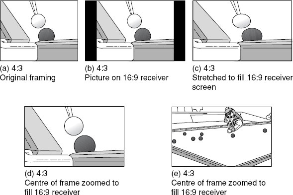
The worldwide changeover period from mass viewing on 4:3 analogue sets to mass viewing on 16:9 digital monitors, and therefore mass programme production for 16:9 television, will take many years. The transition period will require a compromise composition (see Widescreen composition, page 230) and many broadcasters are adopting an interim format of 14:9 to smooth the transition from 4:3 to full 16:9. But the compositional problems do not end there. The back library of 4:3 programmes and films is enormous and valuable and will continue to be transmitted across a wide range of channels in the future. The complete image can be viewed on a 16:9 screen if black bars are displayed either side of the frame. They can be viewed by filling the full width of the 16:9 display at the cost of cutting part of the top and bottom of the frame or, at the viewer’s discretion, they can be viewed by a non-linear expansion of picture width, progressively distorting the edges of the frame to fill the screen.
The same size camera viewfinder used for 4:3 aspect ratio is often switched to a 16:9 display. This in effect gives a smaller picture area if the 14:9 ‘shoot and protect’ centre of frame framing is used and makes focusing and following distant action more difficult. Also, the majority of video camera operators are probably the only viewers still watching colour TV pictures in monochrome. Colour is not only essential to pick up individuals in sports events such as football, where opposing team shirts may look identical in monochrome, but in all forms of programme production colour plays a dominant role in composition.
Compromise composition
From a camera operator’s point of view, the biggest difficulty during the transition period is attempting to find a compositional compromise between the two aspect ratios. If a 16:9 image is transmitted in a letter-box format (i.e. a black band at the top and bottom of the frame when viewed on a 4:3 TV set) then all shots can be framed with respect to the 16:9 border. Some companies, however, have adopted a half-way stage of transmitting the 16:9 format in a cropped format of 14:9 in an effort to make the letter-box effect less intrusive for 4:3 viewers. This technique loses a portion of the left and right hand edge of the frame and may destroy the balance of a 16:9 image. It is an experience that viewers, watching widescreen films shown on TV, have been subject to for many years, modified by the limited remedial efforts of the widescreen image being panned and reframed via telecine on transmission. There is very little satisfactory compromise that can be made in an attempt to compose for both formats at the same time if they are viewed full screen on different aspect ratio screens.
Composition problems will continue while 16:9 and 4:3 simultaneous productions are being shot during the analogue/digital changeover. They neither take full advantage of the width of 16:9 nor do they fit comfortably with the old 4:3 shape. Possibly ten years of dual format compromise production will then join the back library and be transmitted from then on. The only safe solution is the ‘protect and save’ advice (see page 231) of putting essential information in the centre of frame, but that is a sad limitation on the compositional potential of the widescreen shape.
Dual format CCDs
The transition between 4:3 aspect ratio television and the conversion to 16:9 has produced an interim generation of dual format cameras. Different techniques are employed to use the same CCD for both formats. If a CCD block design is optimized for the 4:3 shape and is then switched to the 16:9 format, lines are discarded at the top and bottom of the frame in order to convert the image area to a 16:9 shape (a). As 4:3 working occupies the same area of the CCD as a standard 4:3 camera there is no change in angle of view or resolution. When switched to 16:9, however, there is a reduction in resolution and a decrease in vertical angle of view. If the CCD block is optimized for 16:9 format working (b), and is then switched to a 4:3 aspect ratio, the image area now occupies a smaller area than a standard 4:3 CCD image (a), and therefore has a reduced resolution and a reduction in horizontal lens angle. Some dual format camera manufacturers claim that it is not possible to satisfy the competing demands of both formats; one of the formats will be compromised in resolution or change in lens angle. Other camera manufacturers claim that they can offer a switchable camera that retains the same number of pixels in both formats.
Viewers will be watching a mixture of aspect ratios on different aspect ratio receivers for the foreseeable future. 16:9 programme material could be transmitted to fill the screen of a 16:9 receiver and presented in a ‘letterbox’ format (black bands top and bottom of frame) on a 4:3 receiver. 4:3 programmes could be transmitted to fill the 4:3 screen of receivers and presented with black bands left and right of the frame on a 16:9 receiver. In the UK, however, there is a great deal of audience resistance to watching pictures with black borders. To avoid this, Cinemascope films for many years have been panned and scanned so that although the vertical information fits the 4:3 screen, the horizontal information is reframed to include any vital aspects of the composition. French TV viewers accept Cinemascope films transmitted in their original aspect ratio with the corresponding large black borders at top and bottom of the frame.
Electronically, a picture could be cropped or expanded to fit any shape, but this would lead to loss of information, loss of resolution and possibly picture distortion when images are stretched to fit a different shape to their production aspect ratio.
Some type of aspect ratio conversion has to be employed either before the programme is transmitted or at the receiver. Several countries utilize a compromise aspect ratio of 14:9 to bridge the gap between 16:9 production demands and 4:3 receivers. The ratio converter chops out portions of the left and right of the frame for 4:3 viewers who watch with a small black border top and bottom of the frame.
16:9 set-top aspect ratio conversion is under the control of the viewer who can select full frame with black side curtains left and right of the image when watching a 4:3 transmission or partial expansion of the 4:3 frame to a 14:9 shape when information is equally lost at top and bottom of frame. Another set-top aspect ratio conversion option is for the viewer to ‘zoom’ in on a portion of the 4:3 frame so that it fills the 16:9 frame. Part of the 4:3 picture will now be lost at the top or bottom of the screen or the picture can be positioned to distribute the lost parts of the image. Note that essential parts of the 4:3 image will vary depending on shot content. Picture content of course changes with each shot. Some set-top aspect ratio converters also provide for non-linear distortion of the horizontal part of the 4:3 frame to fit a 16:9 TV set.
This mixture of aspect ratio formats will always need conversion unless the unlikely step is taken to scrap all 4:3 programme material when everyone has converted to 16:9 reception. Black and white movies continue to be popular forty years after the introduction of colour television. The decision to change the TV aspect ratio was not simply a technological change, it has and will have continuous programme making and programme watching implications.
Aspect ratio conversion at the receiver
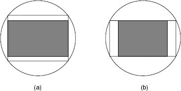
It is a paradox that in some countries, viewers actively dislike the black band side curtains (b) when watching a 4:3 picture on a 16:9 receiver and appear to prefer either the distortion introduced when stretching the 4:3 picture to fit the 16:9 screen (c) or to crop the top and bottom of the transmitted image (d). Unless the viewer constantly monitors and adjusts this last option (zooming), subsequent shots may suffer loss of essential information (e).
Some 16:9 TV receivers have a progressive distortion (anamorphic) facility to stretch a 4:3 transmitted image. This progressive rate of expansion across the screen results in the snooker example above of the shape of the ball changing as it travels across the frame. It is ironic that decades of research and development expended on producing perfect electronic images that are free from geometric distortion can be negated by the touch of a button on a channel changer. Weather presenters change shape from fat to thin as they walk across the frame, or shoot out their arm to double its apparent length when this aspect ratio conversion option is selected.
Aspect ratio conversion decisions are taken out of the viewer’s control when 4:3 material is integrated into 16:9 productions. The director of the programme then has the choice either to show the inserted 4:3 material with black side curtains or force the 4:3 image to fit the 16:9 format by stretching or cropping the original framing.
The intention is that eventually there will only be 16:9 receivers, but the back library of 4:3 programmes and films is enormous and valuable and will continue to be transmitted across a wide range of channels in the future. Aspect ratio conversion problems are now built into the television industry.
The growth of the cinema widescreen format in the 1950s provoked discussion on what changes were required in the standard 4:3 visual framing conventions that had developed in cinema since its beginnings. The initial concern was that the decrease in frame height meant that shots had to be looser and therefore had less dramatic tension. Another problem was that if artistes were staged at either side of the screen, the intervening setting became more prominent. Compositional solutions were found but the same learning curve is being experienced in television as the move is made to widescreen images. If anything, television is more of a ‘talking heads’ medium than cinema but the advent of the large, wider aspect screen has tended to emphasize the improvement in depicting place and setting.
One of the main compositional conventions with 4:3 television framing is the search for ways of tightening up the overall composition. This is partly due to fashion but also because viewing a TV picture occupies a much smaller zone of the human field of view compared to cinema viewing. Wide shots on television with small detail are not easily perceived on an average size receiver. Tight compositions eliminating all but the essential information have traditionally been preferred.
If people are split at either end of the frame, either they are restaged or the camera is repositioned to ‘lose’ the space between them. Cinema widescreen compositions relied less on the previous fashion for tight, diagonal, dynamic groupings in favour of seeing the participants in a setting. Initially, Cinemascope directors lined the actors up across the frame but this was quickly abandoned in favour of masking off portions of the frame with unimportant bland areas in order to emphasize the main subject. Others simply grouped the participants in the centre of the frame and allowed the edges to look after themselves – in effect ‘protect and save’ (see opposite). There were other directors who balanced an off-centre artiste with a small area of colour or highlight on the opposite side of the frame. This type of widescreen composition is destroyed if the whole frame is not seen.
Many film directors exploited the compositional potential of the new shape. They made big bold compositional widescreen designs knowing that they would be seen in the cinema as they were framed. Their adventurous widescreen compositions were later massacred on TV with pan and scan or simply being shown in 4:3 with the sides chopped off. The problem with the video compositional transition to widescreen is the inhibition to use the full potential of 16:9 shape because the composition has to be all things to all viewers. It must fit the 14:9 shape but also satisfy the 4:3 viewer. It is difficult to know when the full potential of the widescreen shape can be utilized because even if the majority of countries switch off analogue transmissions at some time in the first decades of the century, there will probably be billions of TV sets worldwide that will still be analogue.
A conventional TV single can cause problems in staging and bits of people tend to intrude into the edge of frame. Headroom has tended to be smaller than 4:3 framing and there are some problems in editing, particularly if the cut is motivated by action on the edge of a 16:9 frame which may not be visible to 14:9 viewers.
Protect and save

As many broadcast organizations have adopted the 14:9 aspect ratio as an interim standard, camera operators shooting in 16:9 follow a ‘shoot and protect’ framing policy. The viewfinder is set to display the full 16:9 picture with a graticule superimposed showing the border of a 14:9 frame and a 4:3 frame. Significant subject matter is kept within the 14:9 border or, if there is a likelihood of the production being transmitted in 4:3, within the smaller 4:3 frame. The area between 16:9 and 14:9 must be still usable for future full digital transmissions and therefore must be kept clear of unwanted subject matter. Feature film productions that were shot in 4:3 but were intended to be projected in the cinema with a hard matte in widescreen can sometimes be seen in a TV transmission with booms etc., in the top of the frame that would not have been seen in the cinema. ‘Shoot and protect’ attempts to avoid the hazards of multi-aspect viewing by centring most of the essential information. This does of course negate the claimed advantages of the widescreen shape because for the transitional period the full widescreen potential cannot be used.
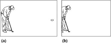
If the ‘protect and save’ viewfinder indicators are ignored when framing, for example, a golf shot in 16:9 aspect ratio (a), viewers watching a 4:3 picture will have a poorly composed picture (b) and no indication when the ball exits right on their viewed picture if the ball has entered the hole. With this framing, it is likely that even if the programme is transmitted in 14:9 aspect ratio, many viewers (with over-scanned TV receivers) will not be able to see the hole on the right of the frame present in the original 16:9 framing.
Greek and Renaissance ideals
The concept of proportion and ratio in composition played an important part in Greek/Roman art and architecture and reappears in some contemporary discussion in the ‘format’ war concerning the ‘ideal’ shape of a television frame.
The ancient Greeks were also interested in the ideal proportions of rectangles and discovered that a ratio where the value of the longest side divided by the shortest side equalled 1.618, had remarkable arithmetic, algebraic and geometric properties. Renaissance scholars and painters rediscovered this ratio and Leonardo dubbed it ‘the divine proportion’. It subsequently became known as the golden section. Television widescreen ratio of 16:9 comes close to this preferred ratio.
Compositional balance using this ratio revolves around positioning the main visual elements on the subdivisions obtained by dividing the golden section according to a prescribed formula.
The rule of thirds
The academic emphasis on proportion and ratio was probably the precursor to a popular compositional convention called the rule of thirds. This ‘rule’ proposes that a useful starting point for any compositional grouping is to place the main subject of interest on any one of the four intersections made by two equally spaced horizontal and vertical lines.
The ratio of dividing the frame into areas of one third and two thirds is close to the approximation of a golden section division. These ratios occur so often in Western art, architecture and design that they became almost a visual convention.
The influence of photography
In the latter part of the nineteenth century, the evolution of faster film allowed snapshot street scenes to be captured. People were captured on the move, entering and leaving frame, which resulted in quite different images from the carefully posed groups of the long exposure film. The accidental quality of these snapshot compositions was considered by many to be more realistic and lifelike than the immobile studio set-ups. Painters were attracted by the sense of movement that could be suggested by allowing subjects to hover on the edge of frame (see Dissonance, page 238).
When the frame cuts a figure there is the implication that the frame position is arbitrary, that the scene is endless and a portion of the event just happened to be cut by the frame at that point by chance. The accidental character of the boundary was indeed arbitrary in many snapshots, but as a conscious compositional device it had been used for centuries.
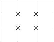
Rule of thirds 4:3 aspect ratio
Golden rectangle: 16:9 aspect ratio
The rule of thirds proposes that a useful starting point for any compositional grouping is to place the main subject on any one of the four intersections made by two equally spaced horizontal and vertical lines.
In an outside broadcast event the viewer may be aware that they are being shown selected ‘portions’ of the event and that the frame can be instantly adjusted by zooming in, to provide more detailed information, or by zooming out, to include more of the televised event.
Line
Line is a powerful picture making design component and can be used to structure the attention of the observer. Within the frame, any visual elements that can be perceptually grouped into lines can be used to direct the eye around the image from one part of the picture to another to end, preferably, on the main subject of interest. Attention is attracted to where two lines cross or one line abruptly changes direction. The eye is attracted to the point of convergence of lines or the implied point of crossing. In practice, a line need not be visible to act as a strong compositional element, but it can be implied, such as the line of a person’s gaze.
The vertical line: An isolated vertical subject such as a tree or a tower has directness and rigidity. It is immediately seen and takes visual precedence over any horizontal or other lines in the frame. The human figure in a landscape immediately attracts attention not only because of its psychological importance but because of this vertical aspect.
The leaning line: Diagonal arrangements of lines in a composition produce a greater impression of vitality than either vertical or horizontal lines. A line is most active when it runs from corner to corner. Compositions with a strong diagonal element imply movement or vitality.
Convergence of lines: As we have discussed, the distance from lens to subject, lens angle and camera height are a decisive influence on the convergence of lines within a frame. Lines of convergence can be placed to have as their focus the dominant subject in the frame. Strong pictorial lines can be controlled by lens position to lead to and emphasize the main subject.
Curves: One of the useful compositional uses of curved lines in an image is to guide the eye to the main point of interest. A straight line takes the eye immediately from point A to point B. A curve can move the eye around the frame in a less direct movement and knit disparate elements together on the way. A curve has the advantage of being a progressive change of direction, which allows a softer visual movement around an image compared to the zigzag pinball movement of straight lines. Also, unlike straight lines, curves do not interact with the edge of frame either in direction or by comparison.
Shape: The outside boundary, the shape of an object, plays a significant part in visual composition because of the ease and speed of grasping its simple pattern and relationships. Shape is a simple, visually easily ‘digestible’ element in a composition and, when setting up a shot, a few similar shapes should be looked for which can be grouped to reinforce the overall impact of the image.
Triangle: The triangle is a very flexible shape as a design element in a composition. The camera operator can control the shape and impact of a triangle by choice of lens angle, camera distance and height. The line convergence forming the boundary of a triangle within a composition can be altered and arranged to provide the precise control of the compositional elements.
Using shapes: The ability to analyse shapes in an image rather than simply seeing the content is an essential step in developing an eye for composition. If there appears to be a lack of unity in the image, if the main subject appears to be fighting the background then it is more than likely that an overall leading shape line around the frame is missing. Search for background shapes or relight for background shapes that will connect and relate to foreground.
A curved lead-in line to the main subject of interest has always been one of the most common techniques to get the observer into the frame and then out again. There is often an inclination to try to avoid such a clichéd technique but the perceptual experience is that it is effective, that it holds and guides the attention of the viewer and that alternative ‘lead-in’ devices can just as quickly become visually devalued and stale.
Light/dark relationships: Every element in an image has a specific brightness. One area will be seen as bright, another will be perceived as dark. The visual ‘weight’ of different brightness levels will depend on proximity, area and contrast. The eye is naturally attracted to the highlight areas in a frame but the contrast and impact of an object’s brightness in the frame will depend on the adjacent brightness levels. A shot of a polar bear against snow will require different compositional treatment than a polar bear in a zoo enclosure. A small bright object against a dark background will have as much visual weight in attracting the eye as a large bright object against a bright background. The relationship between different brightness levels in the frame plays an important part in balancing the composition.
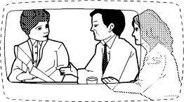
Figure and ground: The relationship between figure and ground is fundamental to an understanding of perception and composition. Figure describes the shape that is immediately observable whilst ground defines that shape by giving it a context in which to exist. Figure is the prime visual element that is being communicated but can only be transmitted in a relationship with a ground. Any visual element in the frame that stands out and achieves prominence will be considered by the observer as figure, even if this object has been assessed as being of no visual importance by the camera operator. Hence the infamous background object that sits neatly on a subject’s head totally ignored by the snapshotter whose concentration is wholly centred on what he/she considers is the only ‘figure’ in frame. When two or more objects are grouped together they are perceived as one ‘figure’ even though the camera operator may have mentally marked out one of them as ‘background’.
Control: Controlling figure/ground relationship requires emphasizing the importance of the selected figure by light, brightness, colour, differential focus, texture, position etc. whilst removing sufficient visual detail from the ground to avoid it competing with the figure. It is easy to overestimate the psychological or narrative importance of one element when setting up a shot and underestimate its actual visual dominance within the frame. It may well have strong narrative importance but does it look visually significant? Many snapshots fail because the attention, when the photograph was taken, was wholly concentrated on the one element in the frame that had strong personal significance.
Visual reorganization
Due to the effect of perceptual ‘reorganization’, no visual element can exist in isolation within the frame. Within the act of perception, the eye/mind groups and forms relationships of the shapes it has organized.
One relationship is balance: the relative visual weight of one clump of visual elements compared to another and their individual relationships to the whole.
A technological definition of balance is the state of a body in which the forces that act upon it compensate each other. Camera operators will know that when they mount a large lens on the camera there is the need to pull the body of the camera back on the pan/tilt head until the point of balance has been achieved – the seesaw principle where a small child at the extreme end can be balanced by an adult sitting opposite but much closer to the pivot point. There is also another aspect of balance connected with a combined group of objects such as lens, matte box, camera, pan bar, viewfinder, etc., which is connected to their overall centre of gravity and the physical position of that point of balance. This is the centre of balance of the combined mass.
Balance in a composition is distributing the visual elements across the frame so that a state of equilibrium is achieved for the whole. Equilibrium need not mean at rest for, as in the seesaw analogy, balance can still allow movement and therefore visual interest.
As with a camera mass, a visual pattern has a centre around which the visual elements are grouped. The pivot point need not be and frequently is not the centre of the frame. Balance can be achieved by visual weight determined by size, shape (regular shape is heavier than an irregular shape), colour, light/dark relationships, isolation of a pictorial element, direction and the intrinsic interest of content. For example, the observer’s wishes and fears induced by the image may outweigh any perceptual considerations of balance. For many people, a snake moving in any part of the frame will capture their attention irrespective of any other compositional design.
The content or intention of the image will determine which type of visual weight will be chosen to be pictorially reorganized in the process of composition. Balance helps meaning to be made visible.
Only the content can determine which pattern can be created by balancing out colour, mass, direction, etc., and which aspect of visual design is to be chosen and subjected to the business of pictorial organization. The function of visual design can be shown only by pointing out the meaning it helps to make visible.
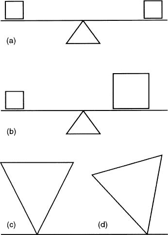
The two factors that determine balance are visual weight and the direction of movement of the visual pattern. Visual weight is conditioned by its position in the frame. A visual element at the centre or close to the centre vertical axis has less weight than one at the edge of the composition. An object higher in the frame is heavier than the same size object in the lower part of the frame. An object in the right of the frame (for most Western observers) will have less compositional weight than if it was positioned in the left of the frame.
Similar to the seesaw principle (a), visual weight increases proportionally the further it is from its point of balance. A small significant object in the background will balance out a larger object in foreground.
The resolution of balance in a composition therefore requires small to be weighted against large with reference to the centre and outside edges of the frame in order to achieve unity of the total image. A small ‘weight’ in the composition can be placed a long way from the centre if a balancing ‘large weight’ is placed close to the centre (b).
‘Weight’ need not only be differences in the physical size of balancing visual elements. Balance can be resolved with line, mass, light/dark, colour, etc.
Dynamic balancing
Finding a dynamic balance requires not only positioning small with large or light with dark, etc., but also finding linking patterns to the main balancing duality.
Our experience of the physical properties of objects provides us with the knowledge that an object that is very large at the top and tapers to a very small base is likely to be unstable and easily toppled (c). The equivalent visual weight is attached to a large object at the top of the frame and a smaller object at the base. The composition appears to be unstable and transient (d).
Whereas a balanced composition aims to promote a sense of equilibrium or stability, dissonance in a compositional grouping induces a feeling of discord or of resolution still to be realized.
Effective dissonance in music is not created (except by accident) by a non-musician aimlessly pressing groups of notes on a piano. It is based on the application of the theory of harmony. Dissonance in visual composition requires the same understanding of technique in order to achieve controlled disharmony.
For many centuries, the aim of composition in Western painting was to weld all the elements of the painting into a pictorial unity to achieve balance. The concept of dissonance – compositional elements deliberately offset in order to create visual tension – only entered compositional technique to any extent in the nineteenth century.
With the advent of ‘snapshot’ photography in the 1860s when exposures of 1/50 second were possible, many artists were influenced by the random photographic compositions created by people in motion. Degas was one of the first artists to use decentralized compositions with the main subject offset to the edge of the frame (see the Degas reproduction opposite Composition, page 209).
A new pictorial convention emerged of cutting off part of an object by the frame to imply that the action continued outside the frame. If the observer is led out of the picture frame, there is set up an expectation or curiosity in the viewer which is not satisfied by the framed image. The composition is unresolved (see Closed and open frames, page 222).
Dissonant compositions are therefore deliberately structured to evoke a sense of incompleteness. Just as there is a strong wish to straighten a picture hung crookedly on a wall, a well-structured dissonant shot will evoke the same feeling of a composition seeking to achieve balance. The friction and conflict that is set up can convey a strong sense of unresolved tension as well as creating interest and involvement.
Dissonant arrangement of subject matter creates a dynamic tension. But increasing the degree of unbalance to an extreme might collapse into visual anarchy and produce a composition of random items that have no relationship.
A shelf with a central object such as a clock flanked by two candlesticks can be arranged symmetrically and provide a balanced but stale arrangement. If the clock is moved towards one of the candlesticks, a dissonance is set up which may make the image stronger and more interesting because of the visual inclination to return to a symmetrical balance.
Dissonance is as necessary to good composition as balance. Offsetting balance creates interest. Achieving balance can satisfy the urge for symmetry but quickly becomes uninteresting. If balance is a full stomach, then dissonance is an appetite that needs to be satisfied.
Many examples are seen in religious art of figures grouped either side of the main subject (see below). Balance is achieved by equal weighting of both sides of the frame. Although formal balance emphasizes the main central subject’s importance, its symmetrical solemnity precludes visual excitement. Another form of classical balance is by the use of the golden section (see Ratio and proportion, page 232).
To hold visual attention, it is necessary to provide greater visual complexity. A formal central grouping of figures balanced around the centre of the frame, although assimilated instantly, fails to provoke further curiosity. Once the eye has swept around the central shape it has visually ‘consumed’ everything provided. To entice the eye to take a second tour, less obvious visual relationships need to be discovered. The eye and mind must be fed with visual variations embedded within the basic dominant pattern although it must always be remembered that the eye takes the visual path of least resistance. Unravelling a very complex set of visual variations may mean a ‘switch off’ for the majority until easier shots come along. But visual variety provides the stimulation necessary for holding the attention.
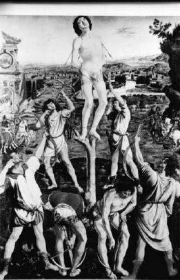
‘The Martyrdom of San Sebastion’ Pollaivols (c.1475). (Reproduced by courtesy of the Trustees, The National Gallery, London).
The viewfinder and composition
An electronic viewfinder will produce a monochrome image with a much smaller contrast range than that experienced by human sight. This tends to provide a much simpler image than the original, eliminating colour contrasts and the emotional effect of colour and emphasizing tone, mass and the perspective of line.
A stronger sense of pattern is usually displayed by a two-dimensional viewfinder picture than is seen by human perception unless an individual has trained himself to ‘see’ like a camera. The viewfinder image therefore helps in composing a picture because to some extent it accentuates certain compositional elements.
Divided interest
A composition with divided interest, where the eye flicks back and forth between two equal subjects, is a composition without balance. One subject must be made subservient to the other by placement, size, focus, colour, or contrast.
Sound is another design element to restore balance as viewer attention will always be directed to the source of dialogue or other sound produced by one of the competing subjects within the frame.
Visual attention can always be captured by movement. Independent of the usual compositional controlling visual elements such as brightness, mass or colour, human perception is invariably attracted by movement. At one stage in human history, survival may have relied on instantly being aware of change in the environment and movement indicates change. It may have tilted the balance between successfully gathering food or being gathered as food. Movement within the frame usually takes precedence over all other compositional devices in attracting attention.
Intrinsic interest
Possibly the strongest design element that can be used in a composition to capture attention is for the content to have a strong emotional or psychological connection with the viewer. Either the subject of the shot has a personal association or it features a familiar human experience.
Millions of snapshots are treasured not for any intrinsic photographic values but because of the innate interest of their subject. This does not prevent a photo having a strong subjective interest and also having qualities which would appeal to a ‘disinterested’ observer with no involvement with the subject. Home videos of domestic or holiday topics can be shot so that they have a much wider appeal beyond their participants or their friends. The usual weakness of home movies is their inability to separate subjective interest from the considerations of structure and design. The content of the video dominates its form.
The personal significance of the content of a shot will always be the most powerful design element in attracting attention but by its presentation (compositional design) its appeal can be broadened to involve and engage a much wider audience.
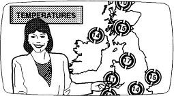
Divided interest
The eye constantly flips between weather board and weather presenter whilst attempting to listen to the weather forecast and pay attention to the constantly changing graphics.
Border incidents
A well-designed image has information included but also information that has been excluded. The frame acts as a controller of attention by limiting what is to be in shot. The edge of the frame is a frontier checkpoint and the basic advice often given to trainee cameramen is to always check the edge of the frame for unnecessary detail. With a small viewfinder image, it is not always easy to see ‘border incidents’ of items creeping into the frame and others sliding out. When observing a large projected image or colour picture, these fringe visual activities are immediately obvious and distracting and shift the emphasis from the main subject of the shot.
Normal perspective
If an observer looks at a field of view through an empty picture frame held at arm’s length, he/she will require the frame to be progressively increased in size the greater the distance the frame is positioned away from him/her in order that the same field of view is contained within the frame at all times.
As we have discussed, the perspective of mass and the perspective of line are created by the distance of the subjects from the observer. Size relationships and convergence of line in his/her field of view will depend on their distance from him/her. Therefore if the observer does not change his/her position, the perspective appearance of the ‘image’ within the frame will remain unchanged. The frame will simply get larger and larger the further it is from the observer’s position.
If a photograph was substituted for the frame and increasingly enlarged to match frame size, the two factors which control the exact replication of perspective characteristics in an image are revealed as image size and the distance of the image from the observer.
No lens produces a ‘wrong’ perspective provided the viewer views the correct size image at the taking distance. A wide angle shot taken close to the principal subject would require the viewer to almost press their nose to the screen in order to experience perspective characteristics of the image that they would have experienced if they had been the camera.
The calculation of what lens angle provides ‘correct’ perspective (i.e. equivalent to an observer replacing the camera) must include image size of reproduction and the distance the viewer is to the screen. A person sitting in the back row of a cinema may be viewing a screen size that is a tenth of the size the audience in the front is experiencing. There is no lens angle that can provide both viewing distances with correct perspective. The audience in the front row will experience wide angle shots as having correct perspective while the audience in the back row may judge narrower angle shots as having more correct perspective.
Often the requirements of a script require interpretation rather than precise replication of correct perspective. Interpretative compositions can therefore be created using perspective characteristics which expand or flatten space.
Estimating distance
There are a number of perceptual clues that are used to estimate distance or space. The depth indicators include binocular vision which allows convergent and divergent movement to be estimated by the use of ‘two’ viewpoints. Subjects moving towards or away from the observer alter the size of the image focused on the retina of the eye. Colour change due to atmospheric haze and hazy outline at long distance also aid depth perception.
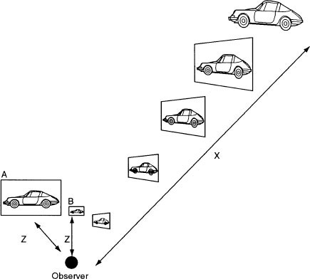
The screen size of the reproduced image will increase proportionally to the viewing distance if the original perspective experienced by the observer at distance z from the subject is to be duplicated.
The viewing distance z of screen A is too close to reproduce a ‘natural’ perspective and would simulate a ‘wide angle’ look at that viewing distance.
Screen B would simulate a ‘narrow angle’ viewpoint because the screen size is too small for viewing distance z.
All these depth indicators can be used in film and television composition not only to replicate normal perceptual experiences but also to create atmosphere or to interpret narrative requirements.
Resolving visual confusions
There is a continuous perceptual quest to resolve visual confusions, to reduce visual ambiguities and to rationalize and explain. In effect this is a continuing drive towards equilibrium – that is, towards no visual uncertainties. The way we achieve understanding in a composition is to group and organize diversity, to simplify complex images into regular patterns, to eliminate, where possible, conflicting readings of an image.
Visual puzzles
There is an equal and opposite force at work in this human disposition towards visual simplicity. Continuous perceptual attention requires continuous challenges. Perception requires visual puzzles to unravel and decode. But if the challenge of the visual puzzle is too great, if the viewer is supplied with images that make no sense, perceptual attention will be discarded once one or two clues have proved unsolvable.
If there is no ambiguity in a visual image, no uncertainty in the act of perception, if there is a surfeit of simplicity and symmetry, attention will drift and a visual condition close to sleep will be induced. Attention often requires unbalance, visual shock, stimulation and arresting images.
Contrast to aid meaning
Although perception seeks visual unity, a detailed visual communication requires contrast to articulate its meaning. Morse Code can be understood if the distinction between dot and dash is accentuated. A visual message requires the same accentuation of contrast in order to achieve coherent meaning. Light, by supplying contrast of tones, can remove visual ambiguity in a muddle of competing subjects but the wrong tonal contrast can produce a confused and misleading ‘message’ – the dots and the dashes come close to the same duration and are misread.
Communication is achieved by contrast. The communication carrier – sound or light – provides a message by modulation. There is a need for polarities whether loud or soft, dark or light; meaning is made clear by comparison.
The choice between harmony and contrast
These two competing systems – harmony, which tends to balance out conflict of mass and contrast, which stresses differences and therefore makes meaning clear – are referred to in Gestalt terminology as tendencies towards levelling and sharpening.
Levelling is the weakening or toning down of irregularity. It is epitomized by the perfect distribution of ratio and balance accomplished in classical art. There are no visual ambiguities or uncertainties of what is displayed either in the objectives of the visual designer or in the perception of the viewer. But perceptual attention demands stimulation whereas harmony tends towards the elimination of visual conflict. There is a visual design need to introduce tension through contrast.
Sharpening allows clarity of communication through contrast. In its most extreme form the middle tones are eliminated to provide a simplification of the image to the bare essentials. If the main purpose of a visual statement is to convey ideas, information and feeling, then contrast is required to articulate the image and to focus on the meaning of the message.
A dynamic image is one where a visual conflict or tension has been set up and then resolved. The yin/yang of visual design is harmony and contrast. Harmony appeases the perceptual system and therefore facilitates the delivery of the message. Contrast grabs the attention and ensures the perceptual system stays switched on to receive the message.

A dynamic image is one where a visual conflict or tension has been set up and then resolved. The yin/yang of visual design is harmony and contrast. Harmony appeases the perceptual system and therefore facilitates the delivery of the message. Contrast grabs the attention and ensures the perceptual system stays switched on to receive the message. (Reproduced by kind permission of Richard L. Rosenfeld.)
Lighting and composition
The most important element in the visual design of television images is light. Apart from its fundamental role of illuminating the subject, light determines tonal differences, outline, shape, colour, texture and depth. It can create compositional relationships, provide balance, harmony and contrast. It provides mood, atmosphere and visual continuity. Light is the key visual force and is therefore central to any consideration of visual composition.
Hard and soft
Within a broad generalization, two qualities of light that are used in television production – hard and soft – have a similarity with the sharpening and levelling previously discussed.
Usually hard light produces the greatest contrast, modelling and texture. It creates depth, shape and relationships. All light, hard or soft, can reveal modelling, texture, contrast – it is a matter of shadow structure which determines the ‘sharpness’ of the effects.
Diffused light is often applied to reduce the contrast introduced by a hard light source and to create an integrated harmony of tones.
Lighting and visual communication
Contrast makes meaning clear. Generally lighting for contrast involves using hard light sources which are often easier to control than diffuse sources. This enables light to be directed and controlled to provide light exactly where it is required and to keep light away from where it is not required. An image with strong contrasts which only emphasizes the required visual elements may appear mannered and artificial because in everyday situations subjects are not lit in such a precise and controlled way.
‘Found’ lighting
Naturally occurring light sources do not discriminate between important and unimportant visual elements ascribed to them by individuals. It is the human mind in the act of perception that attaches relevance to one image as opposed to another. The quest to replicate naturally occurring lighting effects is at odds with most visual communications such as scripted drama, information, etc., which aim, by selective production techniques, to focus on one aspect in order to communicate a specific message.
‘Realistic’ lighting (i.e. everyday random and haphazard illumination) may require modification not only to conform to the technical requirements of the medium (e.g. contrast range, minimum exposure) but also as part of the overall production strategy to be selective in the message produced.
‘Realistic’ lighting aims to replicate naturally occurring light sources whether sunlight or light naturally found in interiors or exteriors. As an objective, it is nearly always compromised because of the technical considerations of the recording medium. Intercutting between a subject in full frontal sunlight facing a subject who has only naturally occurring reflected light will produce an obvious mismatch. Nearly all subjects illuminated by naturally occurring light sources will need some lighting modification even if it is simply restaging their positions to reduce the worst excesses of uncontrolled light.
Elimination of strong modelling
Diffused light technique was used in a move away from what many saw as the ‘unrealistic’ contrast introduced by hard light sources. These selectively lit aspects of a subject and setting, especially in what was considered the artificial and mannered three point portrait lighting system where every face had a key, fill and backlight.
Diffused light often eliminates strong modelling and the separation of planes which indicate depth. It may be difficult to separate foreground/background without some form of backlight or hard light emphasis on selective areas of the frame and therefore the illusion of depth is diminished. The direction and selective coverage of soft light is more difficult to control and therefore inevitably there is less control of tone and mass in a composition.
Controlled lighting and composition
One of the main values of light in relation to composition is the ability to accentuate tonal differences and provide balance or visual unity. Compositional design using light sources relies on control of light direction. Keeping light off surfaces in the field of view can be as important for the composition of the shot as controlling where the light will fall.
Modulating the light pattern of a shot is achieved by introducing selective contrast and this is best achieved by a hard light source. But the degree and extent of the artificial contrast or range of tonal values in an image that is introduced by the selective positioning of lamps gives rise to arguments about styles of lighting.
Colour and composition
Balance in a composition depends on the distribution of visual weight. Colour can be used to balance and to unify an image in many ways. If the weight of colour elements is ignored (or unseen), it can frequently unbalance the considered monochrome composition of tone and line. A composition framed in monochrome may result in over-reliance on tone, mass and linear design as the main ingredient of the composition. Colour not only has a profound influence on composition, in many forms of image making, it is the subject of the composition.
The relative quality of colour
The faithful reproduction of colour requires techniques to ensure that the specific colours of a scene are reproduced accurately and colour continuity requires that the same colours are identically reproduced in succeeding shots. This is often a basic requirement in most types of camerawork but colour, as an emotional influence in establishing atmosphere or in structuring a composition, also plays a vital role in visual communication.
The perception of the apparent hue of any coloured object is likely to vary depending on the colour of its background and the colour temperature of the light illuminating it. Staging someone in a yellow jacket against green foliage will produce a different contrast relationship to staging the same person against a blue sky.
The perceptual impact of a coloured object is not consistent but is modified by the quality of the light illuminating it, by reflection, shadow and by its relationship with surrounding colours.
Balancing a composition with colour
Balance in a composition depends on the distribution of visual weight. Mass, relative brightness, line and the psychological importance of a visual element can all be structured to provide visual unity in an image and to provide a route for the eye to travel in order to emphasize the most important element. Colour can be used to balance and to unify an image in many ways.
An out-of-focus single hued object within the frame (e.g. red) often exerts a strong influence in the composition and may distract attention from the main subject.
Light/dark relationships
As we have seen, the eye is attracted to the lightest part of an image or that part of the image that has the greatest contrast, and if colour is reproduced as a grey scale, yellow, after white, is the brightest colour. Depending on their backgrounds, a small area of yellow, for example, will carry more visual weight than a small area of blue. When balancing out a composition, attention should be paid to the relative brightness of colour and its location within the frame.
Viewfinder adjustment
The monocular viewfinder is the first and often the only method of checking picture composition for the camera operator. It is essential, if the relative compositional weight of different tones is to be correctly assessed, that the brightness and contrast of the viewfinder display is correctly set up (see The viewfinder, page 164). The action of the brightness and contrast controls therefore needs to be clearly understood.
Brightness: This control alters the viewfinder tube bias control and needs precise adjustment. Cap up the camera or place a lens cap over the lens and get the exposure set for black. Increase the viewfinder brightness control and check that the viewfinder image becomes increasingly grey and then white. This obviously does not represent the black image produced by the camera. If the brightness is now turned down, the image will gradually darken until the line structure of the picture is no longer visible. The correct setting of the brightness control is at the point when the line structure just disappears and there is no visible distinction between the outside edge of the display and the surrounding tube face. If the brightness control is decreased beyond this point, the viewfinder will be unable to display the darker tones just above black and distort the tonal range of the image. There is therefore only one correct setting of the brightness control, which, once set, should not be altered.
Contrast: The contrast control is in effect a gain control. As the contrast is increased the black level of the display remains unchanged (set by the brightness control) whilst the rest of the tones become brighter. This is where confusion over the function of the two viewfinder controls may arise. Increasing the contrast of the image increases the brightness of the image to a point where the electron beam increases in diameter and the resolution of the display is reduced. Unlike the brightness control, there is no one correct setting for the contrast control other than to say that an ‘over-contrasted’ image may lack definition and accurate focusing becomes difficult. Contrast is therefore adjusted for an optimum displayed image which will depend on picture content and the amount of ambient light falling on the viewfinder display.
The last monochrome viewers
Nearly all broadcast television cameras are fitted, as standard, with monochrome viewfinders. There are significant exceptions, but the majority of cameras in daily use, up to and including the introduction of high definition equipment, use monochrome viewfinders to acquire the basic material for colour television.
One of the most common misconceptions with this situation is the myth that there is no need for a colour viewfinder except where colour differentiation is necessary, for example sports coverage, snooker etc. The camera manufacturers believe that the viewfinder is simply there to be used for focus and what they term ‘the adjustment of the picture angle’.
The fact that colour plays a significant part in picture composition is either ignored or conveniently becomes the responsibility of other technicians in the television production chain.
Problems associated with monochrome viewfinders
The result of framing a composition in monochrome is often an overreliance on tone, mass and linear design as the main ingredient of the composition. If a colour monitor is accessible, then adjustment can be made for the colour component of the shot, but only too often the frame of reference for the composition is the monochrome viewfinder or a small portable low quality colour monitor. Colours of similar brightness such as red and the darker shades of green merge and may be indistinguishable in the monochrome viewfinder and yet, as separate hues, they exercise a strong influence on the composition. Saturated red and blue appear much darker in a monochrome viewfinder than their brightness value in colour. A small saturated colour against a complementary background has a much greater impact in colour than its viewfinder reproduction.
Compositions based on mass and line
A flat-lit scene viewed in black and white gives the impression of lack of contrast and punch whereas the same scene in colour may be much more acceptable than the monochrome rendering suggests. A shot lit with predominantly red light has very little contrast and low modulation when viewed through a monochrome viewfinder. This often provokes an unnecessary struggle by the camera operator using a monochrome viewfinder to provide dynamic compositions using mass and line, which is quite unnecessary when the same shot is viewed in colour.
Composing with a monochrome viewfinder results in emphasizing contrast, mass and usually the convergence of lines. Colour becomes simply the accidental effect of individual objects within the frame rather than the conscious grouping and locating of colour within the frame. The weight of colour elements is not used to balance the composition and can frequently unbalance the considered monochrome composition of tone and line.

After a prompt has been rigged, check that it does not appear on the edge of frame in the widest angle of the zoom, that it does not foul the rig steering wheel when the camera is panned down, that the glass is clean and does not produce spurious flares when the camera is repositioned and that the cue light on the front of the prompter is working. Check also that the junction between the back of the prompter and camera is covered by black cloth to form a ‘light seal’. Problems with flares on the prompter glass preventing a presenter reading the prompt can be resolved by altering the camera height or by a small reposition and/or by adjustment of lamps.
Quick compositional decisions
Most actuality camerawork – working live or recording as live – requires a stream of continuous pictures involving each camera operator framing up their shots at speed. Occasionally they may have time to reframe without haste and to take time out to consider the precise framing of the shot. This is a rare and infrequent luxury. Most productions require a constant variety of shots often linked to the timescale of a specific event.
The live, multi-camera coverage of an orchestral concert, for example, will be camera scripted in sympathy with the piece performed. Depending on the nature of the music and television treatment decided on by the director, there may be in excess of 300 shots shared between five or more cameras.
Each shot has its designated function in the score and must be ready and framed at the precise bar that it is required. The speed of the camerawork will therefore be synchronized with the music and at times this will entail rapid and continuous shot change. The tempo of the camerawork varies between extremely quick reactions off shot to find the next instrument, to slow camera movement on shot that reflects the mood of the music. Panning movements have to be synchronized with the number of bars allocated to that shot and must finish exactly on the instrument or group of instruments agreed because possibly, at that point in time, a solo or change of tempo may occur.
Reflex framing
Reflex framing, with no time to consider composition consciously, is achieved by relying on habit and the developed feeling for a good picture that instantly oversees eye/hand coordination. If there is no time to consider the image, the only thing to do is to rely on experience and training. Live television continually requires quick compositional decisions.
Camerawork that is carried out in the real time of the event covered often allows no time for any thoughtful considerations about the precise framing. There is no time to re-order the visual elements. The most that can be done in the time available is to trim the shot by way of zoom angle and a slight adjustment of the framing points.
An example of the instinctive response to movement can often be seen in slow motion replays of fast sporting action. The square-on ‘slo-mo’ camera operator in cricket coverage is required to follow the ball as soon as it leaves the bat. Sometimes even the batsman does not know which way the ball went. Continuously during the game, the slow motion replay reveals that the camera operator has instinctively followed the ball to a fielder who has gathered the ball and aimed back at the stumps in one fluid movement. The framing seen in slow motion belied the real speed and technique required to follow this ‘blink of an eye’ action and keep the ball and the players involved in the frame.
During the match, it is sometimes judged that the action of bat, ball and player is too fast for the umpires on the field to assess what has happened and they call upon a third umpire in the stadium to adjudicate. The third umpire can only do this by relying on the slow motion replay of the debated incident. It is somehow inferred that this is a ‘hightech’ solution to an event that is too fast for the eye to see when in fact it relies on the fast reflexes of the camera operator.