The design of your online shop must be attractive so that it builds trust in your visitors. An online shop is one of your company's visual elements, and therefore it has to include the colors, logos, and typeface of your company.
It is necessary to ensure that the chosen design allows for a quick loading of the page and that the page is easy to understand. This builds on the principle that a sophisticated multi-functional system (an online shop is such a system) should appear to be "easy" and simple.
The main principles of the visual aspects of online shop are the following:
- The design of an online shop should be easily scalable—the quantity of goods can change over time, it can increase while some categories of goods might be abandoned.
- The catalog of goods should be well-structured so that the customers can find the product they are looking for by browsing through just one or two subcategories (a search area is a good option too).
- A place should be planned for various information (special sales, discounts, a place for banners of business partners, and so on).
- It is a good idea to decorate the online shop with the themes of some holidays or days of celebration. This would create the feeling that there is "somebody behind the design".
Let's discuss each principle in more detail. First, templates can be subdivided into two base groups:
- Fixed width templates—the width of the templates is usually fixed at 950-990 pixels breadth-wise
- Fluid templates
Fixed width templates are used most often, whereas fluid templates are rarely used. It is because creating a fluid template is more complicated for a web page developer.
http://www.w3schools.com/browsers/browsers_display.asp, you can see that the users' display resolution is growing. Most web page visitors are using a screen size of 1024x768 pixels or more.
Fixed width templates affect the comfortable reviewing of web pages. Using fixed templates can lead to a situation where the web page is difficult to review. For example, if a web page visitor is browsing your web page on a 21.5" iMac PC with a resolution of 1920x1080 pixels and your web page has a fixed width of 850 pixels, it will be difficult to view the page comfortably.
Fluid templates expand or collapse with the width of the screen, whereas fixed templates always stay the same width.
Also, we would like to supplement the main principles with some simple examples. First of all, you should remember that your web page may grow in the future so it is useful to leave some room for growth in the web page design.
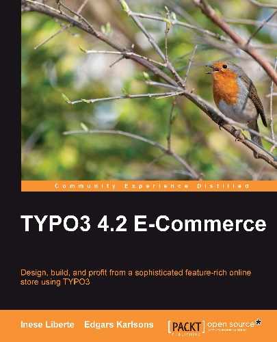
You can see an example of a design in the following screenshot where there isn't place for any content to be added:
As you can see in this example, if you need to add one more menu item, you will have to change the design or add an extra line for the menu.
We recommend dividing the menu into several parts—a menu for bases like About us and Contact, and a menu for sections that may grow, like Catalogue. Also, you can foresee that submenus will be located, for example, across the left part of the web page, so you can increase the submenus and keep the design of your web page.
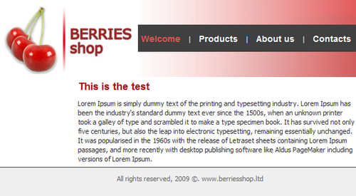
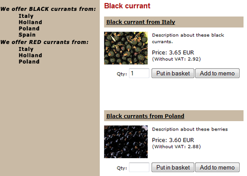
Similarly, it is not good to leave a lot of empty space in you online shop design like you see in the following example:
This online shop looks empty, which isn't good for representation.
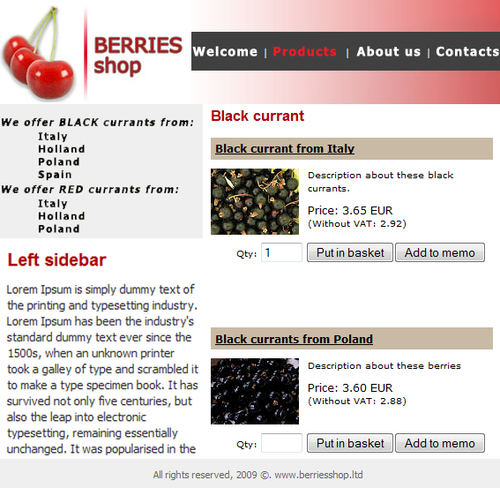
The best way to present your website is to place the content and leave a blank area in a shapely manner. You will have to foresee where you will need to add more content, menus, and other elements, and which parts of your online shop will stay constant for a long time.
Don't forget to leave some place for marketing activities in your design, such as information about discount campaigns, information about new products, and so on.
The next principle is the structure of your catalogue. As we mentioned previously, a catalog should be well-structured. It is important that the customers can find the products they are looking for by browsing through just one to two subcategories.
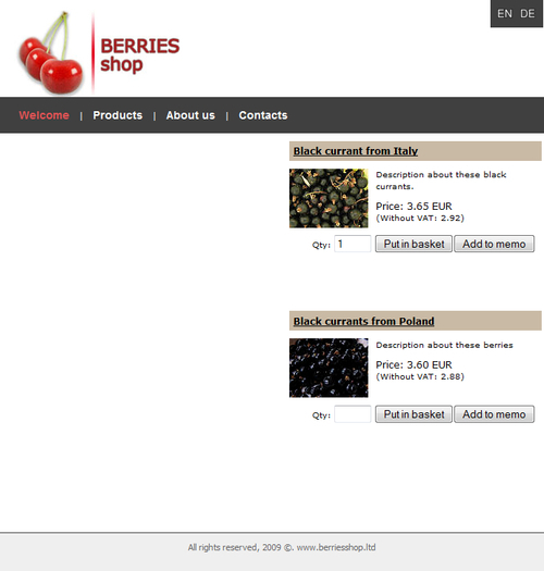
You can see the following example of a catalog menu that isn't structured well, so it is very difficult to oversee it:

Visitors would need to concentrate a lot to find Red currants. We recommend laying out a large catalog or a catalog with many obvious subsections. If a visitor visits your online shop for the first time, it is important that he finds the necessary product and finds it easily.
If you are marketing your online shop as a "good" online shop, visitors should feel comfortable navigating through sections, subsections, and web page content. It is very important that visitors don't feel lost in your site. You can use simple methods to ensure this:
- Using URLs: http://www.yourshop.com/eng/catalogue/currants/blackcurrantsitaly
- Using the inside navigation menu: Catalogue | Currants | Black currant
For ease, oversee the structure of your catalogue hierarchically, as you see in the following image:
And it is even better if you don't use the same words repeatedly. In our example, it is words Black/Red currant from. To solve it, you can use a different technique; for example, add some explanation to the catalogue and structure it like in the following image:
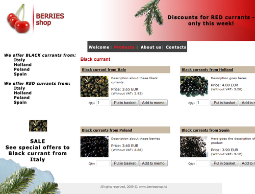
The third principle is that, in your website, space should be planned for various information. You should plan areas for information about special sales, discounts, and a place for banners of business partners, among others. The easiest way to include all the necessary areas in web page design is that you plan base marketing activities before creating your online shop.
In the example below, we can see that there is no place for any banners any more in this design:
If you know that you will use special sales and information about discounts for marketing your site, you should foresee the area for it, like in the following image:
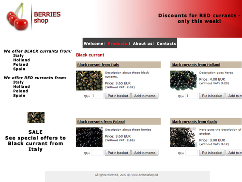
You can highlight your campaign by using:
- SALE
- Attention!
- Only this week
- Special offer
- Use your chance
- Discounts
The fourth principle is to decorate the online shop with the themes of some holidays or days of celebration. We will create some examples to see how your online shop can look at Christmas and on the shop's grand opening.
Look at the ideas for the shop's grand opening theme in the following image:
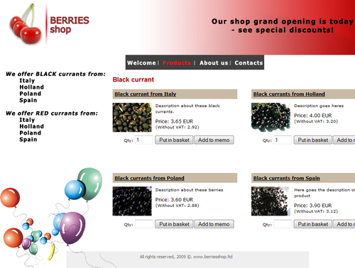
You could use just one element to update your online shop design. Also, you could use several elements, change colors, or add some textual information and greetings for your visitors. We recommend using celebrations to market your online shop and to give special discounts to your customers.
You can set up a "special" package on celebrations, for example:
- Special currant pack at Christmas
- Red currants for a summer party
- Poland currants double pack
Use your imagination and see the results of these sales, and you will learn what is best for your customers.
Look at the ideas for a Christmas theme in the following image:
You could choose celebrations according to what matches your online shop profile. Don't use each and every celebration if it is not necessary.
With these modifications, you keep your online shop alive, dynamic, and interesting. You can find links to external developer resources on TYPO3 at: http://typo3.org/documentation/other-resources/.