
7. Setting Up Your Digital Darkroom
The digital darkroom is a place for both creativity and, equally important, data management. It is here that you will use all the tools at your disposal in an effort to create a final image on screen that matches the image in your mind’s eye, all the while trying to preserve as much of the original data as possible (to minimize digital defects), and ultimately store duplicate versions in a safe backup location. Creating a system to view, store, organize, manage, retrieve, adjust, tweak, catalog, describe, and archive your photos is no small thing. This post-production part of your workflow requires its own set of equipment, and, of course, there is a range in complexity, quality, ease of use, portability, and cost to consider.
You will start with what you have, and as your budget allows, add and upgrade components over time to meet your growing needs and skills. Don’t feel that you need to have it all out of the gate. Just like with your camera equipment in Chapter 5, first make the most of what you have and begin to identify places in your workflow where you want to improve the quality or efficiency of your process.
Hardware Choices
A computer and monitor are the bare essentials of your digital darkroom; if you don’t have them, you’ll need to go shopping before you can do much with your digital photos.
Desktop or laptop, Windows or Mac, are all equally irrelevant to the end user looking at your photos on a stock site. No one cares about what workstation was used to create the photos. The only person it matters to is you.
Figure 7.1. Photographer editing digital photos. © Nicolas Loran (istockphoto.com/nicolas_)

Figure 7.2. CPU Chip. © Khuong Hoang (istockphoto.com/fluxfoto)

These are your tools, and since you are going to be spending a lot of time with them, you need to choose the tools (within your budget) that you are most comfortable with on a daily basis.
Computer
I try to be as operating system–neutral (or platform-neutral) as possible. I use Windows and Mac computers. Over the years, and in different jobs, I have had both positive and negative experiences with both systems. I work on the Photoshop/Lightroom Help Desk for the National Association of Photoshop Professionals and help people with problems on both operating systems. There are pros and cons to each, but again, the operating system you choose will not make your photos look better.
When it comes to choosing between a desktop or laptop computer, the desktop will always win on performance at a given price point. More power under the hood translates into a much more efficient and pleasant editing experience. We are an impatient species. Having to wait while your system churns every time you make an adjustment starts to wear thin quickly.
When you shop for your next computer, it can help to start by considering the minimum requirements posted for the software you are planning to install. We’ll talk software a little later in the chapter, but I don’t think it will come as a surprise when I mention Photoshop as the industry standard in image editing. Photoshop CS5 was released in 2010 and lists the following minimum hardware requirements:
• (Windows) Intel® Pentium® 4 or AMD Athlon® 64 processor
• (Mac) Multicore Intel processor
• 1 GB of RAM
• 1024x768 display (1280x800 recommended) with qualified hardware-accelerated OpenGL graphics card, 16-bit color, and 256 MB of VRAM
Those are the minimums just to install the software. To actually enjoy using the software after installation, you want to exceed each of the minimums by a good margin. Whether you go Mac or Windows, having a multicore processor with at least 2 GB of RAM (preferably at least 4 GB) will make your experience so much more pleasant, efficient, and productive that it is worth the investment. If your computer is more than two years old (and it wasn’t top of the line when you got it), then I think there is an upgrade in your near future.
In addition, you’re going to need a lot of hard drive space to store all your photos. Trust me when I say that you will run out of space eventually, because you need internal drive space for the installation of all your applications along with ample free space for your operating system (and other applications) to use as scratch disk space, dedicated temporary storage used by some programs, for smooth operation. So, on top of all that you’ll need to plan for additional storage for all your photos, video, and other data over time. External drives using high-speed (eSATA, FireWire, and USB 2.0) connections are great for extending your storage capacity without overfilling your primary internal drive.
Plan B (For Backup)
Although it is an additional expense, I can’t stress strongly enough the need for a functioning data backup plan in place. Here are some key elements of a good backup system:
• Data is stored on at least two different storage devices.
• Backups run on an automated schedule so they are not dependent on you to remember.
• A copy of all data is stored in an offsite location.
You want your data stored on at least two different drives to protect against the eventual failure of your primary storage device. Every hard drive will die, and usually at the worst possible time. In addition to equipment failure, you need to be protected against theft and natural disaster. You can have a great local backup system in place, but (heaven forbid) if a meteorite turns your well backed-up office into a crater, it won’t do you a bit of good. You need to keep a copy of your data at another location to truly be protected against the worst-case scenario.
A simple local backup can consist of your internal hard drive and a single external hard drive that you use to mirror (make an exact copy of) the data on your internal drive. Take it one more step and add a second external drive that you mirror to as well and keep that at an offsite location. There are a number of backup software packages to choose from, but check out ViceVersa Pro (www.tgrmn.com) for Windows, and ChronoSync (www.econtechnologies.com) for Mac as a starting point. The benefit of using dedicated programs like these is that you can schedule them to run automatically, and they are smart enough to mirror only the new or changed data, which is much more efficient than manually dragging and dropping files yourself.
Another hardware device worth checking out is a Drobo, www.drobo.com, which uses an array of hard disks in an easy-to-use package to back up your data and protect against equipment failure. In a nutshell, if any single hard drive in your Drobo fails, your data is still safely protected by the remaining disks. You just pop out the bad drive and insert a new one. I’ve been using one myself for over a year. I did have one drive fail (under warranty), and it really was a simple matter to replace the bad drive with no loss of data. The whole unit essentially acts like a single external hard drive despite consisting of multiple disks (although you can partition the device to act like multiple drives).
Figure 7.3. Disaster comes in many forms and it pays to be prepared. © Rob Sylvan

One last option to consider is online backup storage. The upside of online storage is that it is accessible from anywhere, happens automatically in the background, and ensures your data is safely stored in another geographical location from where you are. The downside is that it can take a really long time to get all your data uploaded depending on your Internet connection. I looked into a number of online solutions after a fire destroyed everything in my sister-in-law’s apartment, including her computer, and settled on a service called Backblaze, (www.backblaze.com), because it offers a number of data retrieval options and will back up external hard drives (not all services will). It took over a month to upload about 700 gigabytes of data, but ever since, I’ve enjoyed the peace of mind of having my data far offsite.
Your Monitor
Of all your computer equipment, your monitor is going to provide the most help in improving your overall stock submission acceptance rate. Your monitor is both an output (it displays your photos) and input (you make editing decisions based on what you see) device in your editing workflow. If your monitor is not up to the task of correctly displaying your images, then you are working at a serious disadvantage. An all too common complaint from new contributors is that they just can’t see the problems the inspectors are citing as rejection reasons. This is often the result of editing performed on a sub-standard monitor.
In some cases, it is the result of editing performed on a laptop. Most laptops (especially the cheaper ones) are designed for business tasks, such as spreadsheets, Word documents, and PowerPoint/Keynote presentations. The displays on these laptops are just not up to the task of helping you critically scrutinize your photos to the degree that stock sites require. If you are using a laptop because it is A) what you have, and B) otherwise meets all your needs, then I strongly encourage you to consider purchasing a better external monitor that you can run off your laptop for digital editing tasks. You’ll get the added benefit of increasing your desktop space by using your laptop screen for less critical tasks while devoting full-screen real estate on your best monitor for image editing.
Likewise, if you are using a desktop computer package that was geared more toward the casual home or business user, then it is likely that the LCD monitor it came with just isn’t going to do you any favors when it comes to editing your photos, and you are in the same boat as the laptop user above. Investing in a good monitor is similar to investing in better lenses for your camera. When it comes to your photography, the quality of the optics is too critical to skimp on. By the same token, there is little point in investing in a good monitor if you do not use it to its fullest.


Calibrating Your Monitor
Monitor calibration and profiling packages assist you in performing two important tasks: configuring your monitor to its optimal settings, and creating a custom monitor profile that accurately documents this optimal state. Every display installs a default monitor profile on your system and comes with a default configuration of settings. It has been my experience that, like most default settings, these are a good start, but possibly not the best configuration for editing your photos. The calibration process puts you in charge of determining the settings that are best for your system.
Figure 7.5. Calibration puck on an LCD monitor.

I know some of my peers have not always seen the point of using a calibration device and consequently don’t use them now. From what I can see, it hasn’t held them back, and I certainly respect their decisions. That said, I have been calibrating all of my displays (laptops, too) for years and in all cases I have preferred the calibrated result over the default. I also know that the people who are inspecting new microstock submissions are using calibrated displays. In addition, I have assisted people with display problems—such as thumbnails not displaying in Lightroom or display mismatches between Lightroom and Photoshop—that have been solved by properly calibrating and profiling their monitors.
The most painful part of the calibration process is the opening of your wallet to purchase the calibration package, as you can expect to spend upward of $150.
If you choose to go this route, and I encourage you to pursue it, don’t buy the cheapest solution. I have had good experiences with both the i1 Display 2 from X-Rite (www.xrite.com), and the Spyder3Pro from Datacolor (www.datacolor.com). They are both designed for imaging professionals, have an intuitive interface, and most importantly, produce great results.
Technology in this area continues to improve. This is where you can really harness the power of the Internet to do some research before you buy. Ask in the contributor forums at the sites you are uploading to, check the reviews on Amazon, or talk to the folks in your local camera club/professional organizations. If you want to skip all that, then just pick up the industry standard i1 Display 2 and get on with calibrating.
Once you have a calibration package in hand, the process is as simple as following the series of onscreen prompts, and should take no longer than 5 to 10 minutes to complete. Recalibrate monthly to ensure everything is in top shape.
Software Choices
There is a wide range of image editing software. Balance your needs with your budget. There is no single right answer, and to be honest there are a lot of right answers based on the diversity of approaches I have seen other microstock contributors take over the years.
Ultimately, you will need software tools that allow you to access your photos in order to adjust exposure, tweak white balance, add contrast, change colors, remove distracting elements, crop, resize, reduce noise, increase sharpening, process raw photos (if you shoot raw), and correct lens distortions, to name some of the most common tasks. In addition you’ll need to organize and manage your growing collection of photos, and edit metadata such as the keywords, titles, and descriptions required by stock sites.
The best combination of software that I have found to fulfill all those tasks and more is Adobe’s Lightroom and Photoshop. These are the industry standard image editing applications and have the price tag to prove it. Lightroom 3 costs around $300, while its much bigger brother Photoshop CS5 costs over twice as much. I honestly believe you won’t find a more powerful image editing combination out there. That said, the price tag is steep, and I do have an alternative suggestion. Photoshop Elements 8 is a slightly watered-down (feature-wise) version of the full Photoshop, but at price of less than $100 (I purchased a copy for $50 after rebate) it can probably do everything you need, and it makes a great companion to Lightroom.

Why Lightroom and Photoshop (or Photoshop Elements)? Lightroom is a workflow tool designed to increase efficiency in processing your photos from start to finish. The program copies photos from your memory cards; provides organizational tools for managing your portfolio over time; can be used to add important titles, descriptions, and keywords that stock sites require; will handle 95 percent of the editing and adjustments you need to make; and save new copies for submissions to stock sites. There are some tasks that Lightroom is not designed to handle, such as combining multiple photos into a single final photo, removing distracting elements (like unwanted people or objects in the background), or making complex selections to apply adjustments to targeted areas. For the times when you need to get right down to the pixel level, you need a program like Photoshop or Photoshop Elements to get the job done. Lightroom is designed to work hand in hand with these editors, so it still fits in an efficient workflow when moving a photos between applications.
Is the only route to success through Lightroom and Photoshop? No, not at all. However, since they are so good at doing what needs to be done, offer versions for both operating systems, and are so widely used, they are the applications I will use to teach digital editing techniques in Chapters 8 and 9, as well as the file management and metadata editing skills in Chapter 11. Adobe.com does offer free 30–day trials for Lightroom, Photoshop, and Elements, so be sure to try before you buy.
Choosing a Color Space
Note
There is a whole lot more to understanding color spaces than I am able to address in this book, so if you are interested in diving deeper, I highly recommend Real World Color Management by Bruce Fraser, Chris Murphy, and Fred Bunting from Peachpit Press.
This is a subject that causes a bit of confusion, and for good reason, as it is not exactly intuitive and it involves numbers. Color space is important, though: As your photos move from your camera to your computer and then out into the world, it is very likely that their color space will change at least once, if not twice, which is neither good nor bad. But it is something you should be aware of and make conscious choices about each time it occurs. A basic understanding of what a color space is and how to use that knowledge to your advantage won’t make you a better photographer, but can help you maintain the color appearance in your photos as they move through your workflow and out into the world.
Digital photos are captured in RGB, which uses the additive color model of combining a red channel, a green channel, and a blue channel to reproduce a range of possible colors. The outer limits of a specific range of possible colors, which is called its gamut, is defined by a specific color space within the RGB color model. There are three common color spaces you are likely to encounter when dealing with digital photos:
• sRGB (narrowest range of colors)
• Adobe RGB (slightly wider than sRGB, but much narrower than ProPhoto RGB)
• ProPhoto RGB (widest range of colors)
Each color space defines a specific range of colors, not number of colors (which is determined by the number of bits per channel covered later in this chapter), within the range of all the possible colors the human eye can see (and even beyond what we can see). There are no output devices, such as monitors and printers, that can reproduce every possible color that we can see in the real world. Our photos are only close approximations of the colors we actually see. So these various color spaces were created to help us translate the colors that exist in the real world to the colors that our cameras can capture to the colors that our monitors can display to the colors that our printers can print.
sRGB, Adobe RGB, and ProPhoto RGB are also called working spaces. Working space is the color space you do your image editing in. A device-specific color space defines a range of color that a specific device is able to reproduce.
For example, your monitor has a monitor profile that defines the range of colors it can reproduce. If you print with an inkjet printer, then you likely use a printer profile that defines the range of colors that your printer’s inks in combination with a specific paper are able to reproduce. Beyond working spaces and device-specific spaces, there are mathematical color models that describe the full range human color perception called device-independent color spaces (such as CIELAB), which provide an absolute reference point for our computers to use when doing any conversion from one color space to another.
Color by Numbers
Computers only understand numbers. That means each individual color has to be defined by a number. For example, a single pixel of color could have a red value of 213, green value of 119, and blue value of 78. By themselves, those values are meaningless if not accompanied by a color profile that defines which color space to use to translate those numbers into the closest approximation of the actual color they are supposed to represent. Confused? Let’s use a visual to help bring it home.
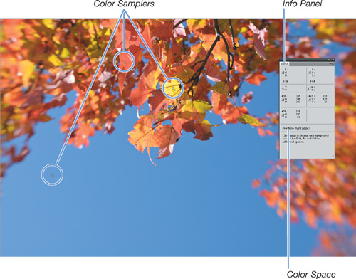
Figure 7.7 is a photo of typical New Hampshire autumn foliage on a sunny, blue-sky day. I opened that photo in Photoshop CS5 and placed three Color Samplers (one in the blue sky, one on a red leaf, and one on a yellow) that correspond to the #1, #2, and #3 shown on the Info panel. In the Info panel, we can see that sampler #1 shows R133, G141, and B203. Below the color samplers in the Info panel, you can see that the range of colors in this photo are defined by the ProPhoto RGB color space.
Figure 7.7. Photo in the ProPhoto RGB color space.
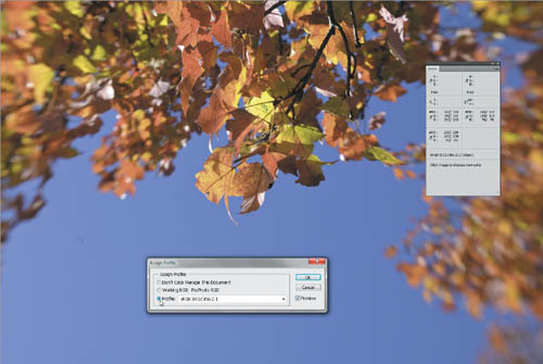
Now, let’s see what happens if we tell Photoshop to keep those same RGB numbers, but use a different color space to determine which colors to display. You can do this easily in any version of Photoshop by using the Edit > Assign Profile menu. You can see the result in Figure 7.8 where I assigned the sRGB profile to the same photo. Notice that the RGB numbers of all three samplers are exactly the same as Figure 7.7, but the colors displayed in the photo are very different (in a bad way). The two sets of numbers separated by the forward slash on the Info panel represent the before and after numbers, which in this case are exactly the same.
Figure 7.8. Assigning a different color space keeps the RGB numbers the same, but changes the color appearance.
Note
You can download this photo and try it yourself by going to www.takingstockphotos.com/downloads.
You might be scratching your head right now, so let me explain: The color profile and the RGB numbers are used together to properly display the colors in the photo. The same set of RGB numbers will produce different colors with different color profiles.
In addition to understanding the relationship between RGB values and color spaces, you need to wrap your brain around the concept of bit depth.
Figure 7.9. Converting between color spaces should result in similar color appearance.

Understanding Bit Depth
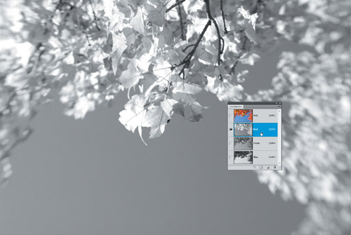
Color data in our photos is stored as a range of brightness levels, represented by grayscale tones, from black to white in incremental steps of gray, in each of the three RGB channels (Figure 7.10). Each brightness level in a given channel tells Photoshop how much of that color to include when combining the three channels to create the color image (recall R133, G141, and B203 from the color sample in Figure 7.7). The total number of grayscale tones that can be stored in a given RGB channel is what is known as its bit depth. The most common photo bit depth is 8 bits per channel, but we’ll also encounter 16 bits per channel. Let’s break it down.
Figure 7.10. Photo from Figure 7.9, but just showing the Red channel. Brighter values correspond to higher amounts of red.
Imagine a single pixel represented by a single bit (short for binary digit). That pixel can have only one of two possible values, either black or white. There’s no room for shades of gray.
Now, imagine a single pixel represented by 8 bits. In the binary language of computers, that translates into 2x2x2x2x2x2x2x2, or 256 different values or shades of gray, ranging from 0 (black) to 255 (white).
A photo that is 8 bits per channel means that each red, green, and blue pixel is represented by 8 bits, or 256 possible values. The combination of all three channels means that 256x256x256, or 16,777,216, possible colors can be represented.
Computers store data as bytes; a byte is simply a grouping of 8 bits. Because of this, the next largest bit depth to consider is 16 bits per channel. This can be confusing because when shooting raw, our cameras can only capture 10, 12, or in some cases, 14 bits of data (depending on the camera model). However, since computers store data in bytes, raw photos are simply referred to as 16 bits per channel.
A photo that is 16 bits per channel means that each red, green, and blue pixel is represented by 16 bits or a theoretical (2x2x2x2x2x2x2x2x2x2x2x2x2x2x2x2) 65,536 possible values per channel. This is far more steps between black and white than the human eye can see, but all that data provides an excellent amount of head room for editing purposes, which is where the real benefit comes in. In other words, the more data that can be stored on an individual channel translates into having more data to work with as our photo travels through the editing pipeline.
Answering the Question
With that understanding, now you can determine the best color space and bit depth for your own workflow. The choice will be dependent on what file format you choose to shoot with on your camera.
If you shoot JPEG, then you will be working in 8 bits per channel because that is all JPEG can handle. In this scenario, configure your camera to save the JPEGs in Adobe RGB and set Adobe RGB as your working space in either Photoshop or Elements. If you use Lightroom to edit your JPEGs, then configure your external editor settings to also use 8 bits per channel Adobe RGB.
If you shoot raw, then it makes more sense to stay in a 16 bits per channel ProPhoto RGB space throughout your editing workflow because you retain as much of the originally captured data as possible during editing. Lightroom’s working RGB space is a variation of ProPhoto RGB, so there is nothing to set there, but you’ll want to configure your external editor settings to also be 16 bits per channel ProPhoto RGB, so that when you send copies to either Photoshop or Photoshop Elements, you still retain all that data until you decide you no longer need it.
An important 16 bit caveat: Not all filters and functions inside of Photoshop and Photoshop Elements will work with 16 bit files. That is not a problem, but it does mean you will first need to convert to a narrower color space, preferably Adobe RGB, and then convert to 8 bits per channel. Once you make the conversion, that data is lost from the file, but that’s OK, because all of the major editing will have already been done. In the end, all files are going to wind up as 8 bit per channel JPEGs anyway, so it is inevitable. The benefits of 16 bits and ProPhoto RGB are in storing more data in your master files, and in having more data on hand for editing. You always want to move from the largest and widest space to the smallest and narrowest space. Think of it like a sculpture: you start with a large raw block of stone, and edit down to the smaller final creation.
Assignment
Here’s a quick monitor test. Go to www.photofriday.com/calibrate.php and determine if you can see the full range of tones in the test image. If not, you may be missing out in seeing important detail in your highlights or shadows.
Evaluate your current hardware and software situation. Are you missing any components? Is there a possible upgrade in the near future? Figure out what component will give you the greatest boost in your workflow and start planning for it.
Download the sample photo shown in Figure 7.7 and go through the steps of assigning and converting color spaces to get a better feel for what is happening under the hood. www.takingstockphotos.com/downloads
Assess your current workflow and determine the points where you are currently changing color spaces and bit depth. Could you be making better use of a higher bit depth and wider color space earlier in your capture and editing stages?