
9. Avoiding Rejection
Anyone submitting work to a stock site has felt the sting of rejection. No one likes it. It can be both a source of frustration and a learning opportunity, so don’t let it get you down. I wrote this chapter to help you learn how to avoid it (or at least reduce its frequency) in the first place. Up until this point in the workflow, we have focused on setting up to create the best capture in camera, then to do the least harm to get the best results doing your basic raw processing. In this chapter, I want to focus on specific tips to deal with real-world situations that simply require digital intervention, follow up with some advice about not going too far in your editing efforts, and leave you with a couple of low-key enhancement techniques.
I know I’ve said this in multiple places throughout the book, but only because it bears repeating. A photo’s usefulness as stock, quality of lighting, and strength of composition can trump minor technical flaws. Too often rejection notices are doled out to people who invested too much time in trying to repair minor technical flaws in an otherwise bad original. Be tough when selecting your keepers, so that the time you invest fixing problems is time well spent.
Digital House Cleaning
Neatness counts. There are all manner of nuisance problems—dust, hair, sensor spots, hot pixels (pixel points of brightness that appear on some sensors), and noise—that can detract from an otherwise good capture. Then there are legally problematic content—logos, copyrighted works, and people without release forms—that simply need to be removed before submission to avoid rejection. It’s best to keep such content out prior to capture, but that is not always practical or possible. In those cases, you need to decide if it is worth your investment of time to do a software fix.
Figure 9.1. PC keyboard: buttons with “yes” and “no.” © Alexander Novikov (istockphoto.com/AlexanderNovikov)

The tools I turn to for solving these problems are Lightroom 3 and Photoshop CS5. However, problems can be solved with other software choices as well. For someone just starting out, Lightroom 3 and Photoshop Elements 8 make a very powerful combination for about half the price (or less) of the full Photoshop CS5. In fact, I feel so strongly about it that I’ll use either Lightroom 3 or Elements 8 for solving all the problems presented in this chapter. Can you use any recent version of Lightroom, Photoshop, or Photoshop Elements? Yes. Can you other image editors? Sure. Use what you have and what you are comfortable with, but know there will be differences in tools and approaches from what I demonstrate here.
The Dreaded Purple Fringe
Note
You can download the photo in Figure 9.2 and follow along by going to www.takingstockphoto.com/downloads/.
Figure 9.2. Notice the bright color fringe along leaf edges and branches as seen at 3:1 view.
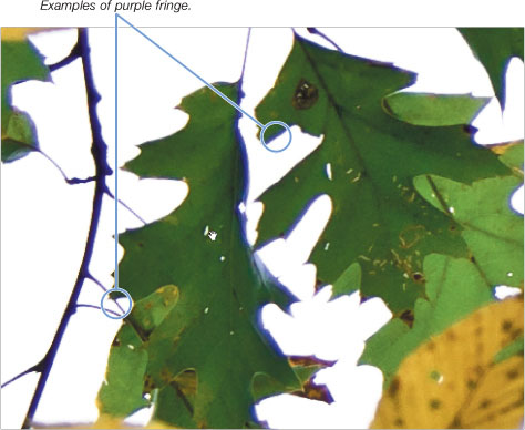
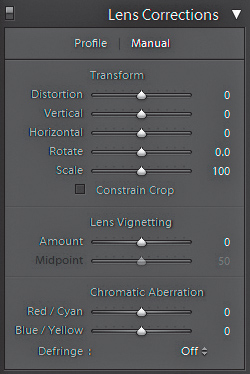
Chromatic aberration is a common problem and almost always an instant rejection. That fringe jumps out like Vegas neon to inspectors, so learn to look for the telltale saturated purplish, bluish, or reddish fringe along the edges of high contrast in your photos when performing your initial inspection at 1:1 view. Can you see the bluish edge along the green leaves as well as the branches in Figure 9.2? The problem occurs when the lens fails to focus all the wavelengths of light onto the same focal plane, or if it magnifies certain wavelengths differently from the others. It is more common in cheaper lenses due to quality of glass, or when using a wide aperture with a high-contrast background. Lightroom 3 has tools to help reduce the visibility of chromatic aberration in the Lens Correction panel (Figure 9.3). This panel is new to Lightroom 3 (and Camera Raw 6.1) and provides a set of tools for dealing with geometric distortion, lens vignette, and chromatic aberration. One approach, using the Profile tab, is to create (or use an existing) lens correction profile for your specific camera and lens combination. I don’t have a profile for the lens I used to capture the photo in Figure 9.2, but check out the Note in the margin to learn more about creating your own profiles. The other approach uses the options in the Manual side of the panel.
Figure 9.3. The Manual tab inside the Lens Corrections panel.
Note
Head over to http://labs.adobe.com/technologies/lensprofile_creator/ to download, and learn about, the free Adobe Lens Profile Creator.
Note
Before you send a copy with your Lightroom adjustments to any external editor, you want to make sure all your basic adjustments (such as white balance, exposure, capture sharpening, and noise reduction) are done so that they too are applied to the new copy.
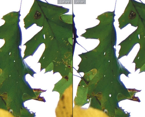
The quality of the results from these controls will vary with the severity of the fringe in question. This is a visual process, and I find zooming in to 3:1 helps you to see the effects of the sliders while you are working. But keep in mind you only need it to look good for the stock site’s image inspectors at 1:1 view. Your job is to tweak the Red/Cyan and Blue/Yellow sliders as needed to reduce the visibility of the fringe as much as you can. Hold the Alt (Mac: Option) key while dragging the Chromatic Aberration sliders to see a preview of just the colors affected by that slider, which really helps you to see what you are doing. Setting the Defringe drop-down menu to All Edges can sometimes offer further subtle improvement. Don’t worry about getting it perfect here (unless you can with some images); just minimize its visibility as much as possible (Figure 9.4), and don’t make it worse. Here’s where having an external image editor like Elements is needed to finish the job.
Figure 9.4. This split Before and After view (View > Before/After) shows the unadjusted image on the left and the corrected version on the right. It’s improved, but not as good as we need to prevent rejection.
There are a number of ways to correct for chromatic aberration in Elements, but here is one of my favorites that is both effective and simple:
- In Lightroom, press Ctrl–E (Mac: Command–E) to send a copy with Lightroom adjustments to your primary external editor.
If you are working with Elements I suggest configuring Lightroom to send copies in 8-bit Adobe RGB, but if you are using the full version of Photoshop I suggest 16-bit ProPhoto RGB. The difference is that Photoshop Elements is very limited in its ability to edit 16-bit images.
- Once the copy opens in Elements, select the background layer in the Layers panel and press Ctrl–J (Mac: Command–J) to duplicate that layer.
- Select the top layer and choose Filter > Blur > Gaussian Blur. When the Gaussian blur dialog box opens, set the Radius to 15 pixels and click OK.
- Back in the Layers panel, with the top layer selected, change the layer mode from Normal to Color.
Double-click the Magnifying Glass icon in the Toolbar to zoom to 100 percent. All signs of the fringing should be gone. However, the colors overall probably look a little duller. Let’s fix that with a trick for using layer masks in Elements:
- Select the bottom layer and click the Create new adjustment layer icon at the bottom of the Layers panel (half-moon icon) and choose Brightness/Contrast. This will place the adjustment layer between the duplicated layers.
Elements supports layer masks, which help us combine multiple layers together, but doesn’t provide a simple way to add a layer mask as in the full version of Photoshop. We’re only going to use the Brightness/Contrast adjustment layer to take advantage of the built-in layer mask so that we can combine the original color of the bottom layer with the fringe corrections in the top layer.
- Select the top (blurred) layer and choose Layer > Create Clipping Mask, which means that everything in that top layer has to pass through the layer beneath it to become visible, and visibility is now controlled by the layer mask on the Brightness/Contrast adjustment layer.
- Click on the white layer mask itself to make it active (Figure 9.5), and choose Edit > Fill Layer. When the Fill Layer dialog box appears, set Use to Background color (which should be black by default when the layer mask is active) and click OK.
Figure 9.5. Layers panel showing the clipping group formed by the top two layers with the layer mask active.

The white area on a layer mask reveals the contents of that layer (or clipping group in this case), while the black area hides the layer. We hid the entire corrected layer, so that we can now bring in only the corrected edges while preserving all the good color in the original.
- With the layer mask still active, select the Brush tool from the Toolbar (press B), and using a soft-edged brush set to white, paint over any areas of remaining purple fringe to reveal the corrected version of the layer.
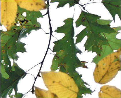
Even in an image with a lot of edges like Figure 9.6, it won’t take more than a few minutes to quickly remove any remaining fringe. Download the example photo and give it a try.
Figure 9.6. Final version with all fringe removed.
Cropping for Composition
Note
Lightroom’s histogram updates after you apply a crop. So it can make a lot of sense to crop first and make exposure adjustments later.
Getting the composition right in camera is always preferred, but there are times when it is not possible or it just doesn’t happen. In those cases, cropping software comes to the rescue. I prefer to do my cropping in Lightroom because it is non-destructive to the original (meaning I can always go back and readjust or remove my crop). Cropping is sometimes one of the first things I do before any of my other processing steps. The reason? There is no reason to adjust exposure levels on an element in a photo that is going to be cropped from the final version. If there is a distracting element near the edge of the frame that you know is ruining the shot, just get rid of it right away.
Figure 9.7. Weak composition caused by subject centered in frame.
Note
You can download the photo in Figure 9.8 and follow the exercise below by going to www.takingstockphoto.com/downloads/.
That being said, in Chapter 3 I discussed the importance of leaving space in your photos as a selling point for designers who might want to put copy there, and that still holds true. The uncropped photo in Figure 9.7 has a very loose composition, but it is possible to improve the composition by cropping away excess pixels and still leave breathing room copy space.
To crop in Lightroom:
1. Select the photo and press R to jump to the Crop tool.
This will bring you to the Develop module (if you are not there already); expand the Crop panel on the right, and place your photo inside the crop rectangle. By default, Lightroom displays an overlay that neatly divides your photo into thirds. Based on the rule of thirds, this overlay can be very useful in finding the strongest composition. Generally speaking, a focal point in your photo that aligns with the intersection of two gridlines results in a stronger composition. There are six different overlays to choose from, and you can cycle through each one by pressing the O key (or choose Tools > Crop Guide Overlay).
Figure 9.8. Healthy Eating. Downloaded over 600 times.

Healthy Eating
Figure 9.9. Father and Son.

Figure 9.10. Ding Dong.

Figure 9.11. Councilman.

2. Choose a desired aspect ratio from the Crop Tool panel.
Tip
Press the L key to switch to Lights Dim mode, which dims everything outside the crop rectangle. Press L again to go to Lights Out and leave only the area inside the crop rectangle visible. Press L once more to turn on the lights.
The aspect ratio of an image is just a way to describe the relationship between the longest edge and the shortest edge. For example, a square image has a 1:1 aspect ratio because both sides are the same length. As one side increases more than the other, the shape becomes a rectangle. The aspect ratio for most photos produced by a digital camera is 1.5:1, or more commonly referred to as 3:2.
3. Resize the crop rectangle by clicking and dragging any corner or side. Keep the lock icon closed to maintain the aspect ratio as you resize the crop.
4. Position the photo by clicking and dragging the photo into place behind the crop rectangle, which remains fixed in the center of the screen (Figure 9.12).
Figure 9.12. A much stronger composition results after cropping.
5. Press H to hide the overlay and evaluate the composition, and press H again to bring it back. Once you’ve decided on a final composition, press R to exit the Crop tool.
Tip
Press I to show the Info Overlay. Choose View > View Options and configure it to show Cropped Dimensions. This way, you’ll see a live update of the final cropped pixel dimensions in the upper-left corner of the image (visible in Figure 9.12).
You might be concerned about the final size of your photo, which is understandable. If you crop off too much, you may have a great composition but a tiny photo. In my experience, a good composition trumps size, but even I have my limits. I try to keep all my final sizes above 6 megapixels, which is more than enough for a wide range of uses. The vast majority of images downloaded from microstock sites are destined for an online project, so while larger file sizes tend to bring in more money per download (because the costs of licenses tend to be based on pixel dimensions), better-looking files tend to bring in more downloads. This is a subjective call, and you are in the driver’s seat.
One last point to consider: It is not unusual to have a designer pop into the iStockphoto forum and complain that photographers are cropping their photos too tightly. Designers often want more flexibility in choosing how, if at all, a photo gets cropped based on the needs of their project. While I completely understand their desire to have that flexibility, it is unfortunately not in your best interests to upload a photo that is too loosely composed. For one, it runs a greater risk of being rejected (rejection can depend on other factors, which we’ll cover in the next chapter, but a weak composition is not going to help put you into accepted territory). The second reason is that potential customers are making their first decision to choose an image based on a rather small thumbnail. A small subject in a weak composition is just not going to make as many people click.
Ultimately, it is your photo and your decision, but it is my experience that a strong composition is not only going to help you get past the inspectors, but bring in more downloads. That said, you need to keep usefulness as stock in mind as you are cropping. Envision your photo in a project all the way through your workflow.
Removing Distracting Elements
Note
You can download the photo in Figure 9.12 and follow along by going to www.takingstockphoto.com/downloads/.
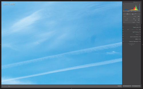
Lightroom’s Spot Removal tool is good for just that: removing spots. The first part of your processing should include examining the photo at 100% or 1:1 view. If you discover a sensor spot, hot pixel, or some similarly unwanted blemish, press the Q key to jump to the Spot Removal tool (Figure 9.13). Here’s how it works.
Figure 9.13. Sensor spots, caused by dust on the sensor, show easily in blue skies and smaller apertures.
- Adjust the Size slider until the Spot Removal circle is larger than the spot you want to remove.
- Set the edit mode to Heal for best results.
- Click on the spot and drag the circle to an area of the photo that contains similar pixels without any spots.
Lightroom will use the pixels at the chosen destination to heal the area within the circle you clicked on.
- Resize and reposition the Spot Removal tool circle after clicking on the spot as needed for best results (Figure 9.14). Press H to show/hide the circles to evaluate the job.
Figure 9.14. Sensor spot removed.

- (Optional) Adjust the opacity slider as needed to reveal original pixels for more realistic blending.
- Press Q to exit the tool.
Note
You can download the photo in Figure 9.14 and follow along by going to www.takingstockphoto.com/downloads/.
If you need to remove anything more complicated than a spot, it is time to head over to Elements to take advantage of the advanced cloning and healing tools, as well as the ability to work with selections and layers. You only want to make this move after your basic processing adjustments are complete because at this point Lightroom is going to create a new copy that includes all your Lightroom adjustments, and it will open this new copy in Photoshop.
Tip
Set the zoom level greater than 100% when working in a small area to see what you are doing more easily.
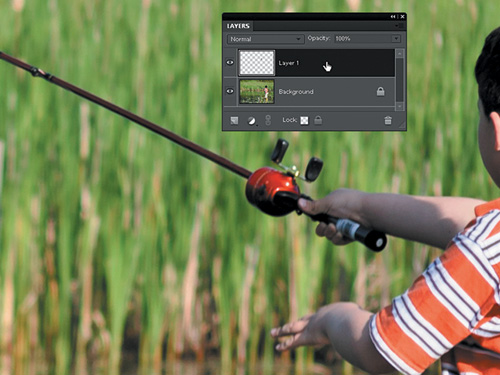
Figure 9.15 is a photo of my son fishing displayed at 100% view in Elements. There is a barely legible logo at the base of the fishing rod that would trigger an automatic rejection. Stock is all about generic scenes with generic equipment. If you’re ever unsure about whether to remove some similarly questionable content, just remember this simple phrase, “When in doubt, clone it out,” and wonder no more. The basic process is the same for any element you want to remove from a photo:
Figure 9.15. The logo on the fishing rod would be cause for rejection. Remove it.

- Click the Create new layer icon at the bottom of the Layers panel (looks like a page curl) to add an empty layer above the background layer.
- Select the Clone Stamp Tool from the Toolbar.
- Check Sample All Layers in the Options Bar so that the Clone Stamp will take pixels from the bottom layer while you work on the empty layer.
Performing our cloning work on the empty layer leaves the original bottom layer untouched, which provides the means to fix any mistakes you make while working by simply erasing the mistake on the top later. Having the cloned pixels on their own layer also provides more flexibility in blending the new cloned area with the original image through layer masks and layer opacity adjustments.
Tip
For this sort of detailed painting with pixels, I find having a pen tablet makes the job much easier. Lightroom, Photoshop, and Photoshop Elements all work really well with a pen-input tablet. Go to www.wacom.com to learn more about these devices.
- Use the Left Bracket key to reduce the brush size or the Right Bracket key to increase the brush size as needed to match the size of the area you want to cover.
- Hold the Alt key (Mac: Option) and click on the area you want to use to sample pixels to apply to the area you want to remove. In this case, I clicked an area of the rod that was a solid color just above the logo.
The Clone Stamp tool works by allowing you to take pixels from the sampled area and then paint with them, so you want to choose a sample that closely matches the area you want to correct.
- With the empty layer active, begin painting over the logo (or whatever it is you are trying to remove).
The goal is to make the scene look as if that element never existed. Don’t just make a logo illegible or a person unrecognizable. Take your time and make the item completely disappear (Figure 9.16).
Figure 9.16. What logo? Careful application of the Clone Stamp has removed all trace of the logo’s existence.
Downsizing to Fix Minor Problems
One of the most frustrating causes for rejection people struggle with has to do with digital artifacts. Artifacts is a rather vague and loosely applied way to say that a photo’s pixels did not look quite right. The problems are most commonly caused by:
• Too much noise reduction, resulting in mushy detail that is then over-sharpened in an attempt to compensate for the mushiness.
• Luminance noise that was not reduced effectively.
The best ways to avoid artifacts are to shoot with enough light that you can get a good exposure at a lower ISO, and to use a faster shutter speed, which should reduce the noise problem at the root. In addition, apply as little noise reduction as possible, and preferably only to the most affected areas of the photo. Finally, apply capture sharpening in conjunction with your noise reduction, paying specific attention to the Masking slider so that you are only sharpening important edge detail and not unwanted artifacts.
As a coup de grâce, if you have a large enough photo to begin with (such as any photo over 8 megapixels), try resizing the photo smaller as a final step. The process of making the photo smaller, called downsizing, averages surrounding pixels together to reduce the total number of pixels in the photo. The end result is that it will appear sharper and lessen the appearance of artifacts. How much smaller should you go? That will depend on how large your photo is to start, how much help it really needs from this process, and what is the smallest size you want the photo to be for licensing. As a rule of thumb, I try to never resize my photos smaller than 6 megapixels. Obviously, the less you reduce the better, but don’t be afraid to reduce the original by 500 to 1000 pixels as it may be just the thing to get your photo accepted.
Note
Generally speaking for most microstock sites, you don’t ever want to make your photos larger than their original dimensions, called upsizing. This will cause an automatic rejection at iStockphoto. Upsizing results in new pixels being created from neighboring pixels, which can degrade detail.
While you can downsize on export from Lightroom by checking the Resize to Fit box on the Export dialog box and entering the desired size, I prefer to use Elements so that I can immediately see the result and either undo or downsize further. Here’s how:
- With the photo open at 100% view in Elements, choose Image > Resize > Image Size. This will open the Image Size dialog box.
- Check the Resample Image box (Figure 9.17). Leave the other boxes checked.
Figure 9.17. Image Size dialog box.
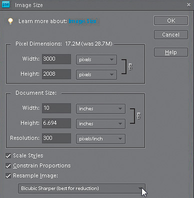
- Choose a resampling algorithm. I prefer to use Bicubic Sharper, which does add a little sharpening to the mix. If the result looks too crunchy, undo and try Bicubic instead.
- The amount will vary for the reasons I stated earlier, but a good start is to reduce the pixel dimensions by 500 pixels and see how it looks.
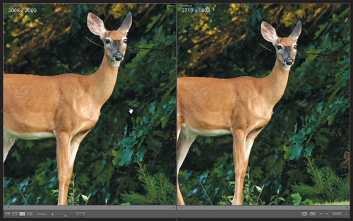
The photo (Figure 9.18) was originally taken with my Nikon D70 in 2006. I increased the ISO to 640 so that I could increase the shutter speed enough to hopefully reduce the chances of introducing motion blur caused by camera shake, since I was hand-holding my 80-400mm lens. The deer was kind enough to pause on the hill long enough for me to capture a few frames. Even after noise reduction I didn’t like the look of the pixels in the background behind the deer. A slight downsizing did the trick.
Figure 9.18. Before and after downsizing.
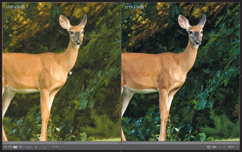
This photo also serves as a good example for why you should start shooting in raw now. In 2006, I processed the original raw file as best I could with Lightroom 1, and then applied a lens blur to the background in Photoshop to further reduce the noise (because Lightroom’s noise reduction wasn’t as good as it is now), before finally downsizing to help it pass inspection. Figure 9.19 shows the originally approved 2006 version on the left with the recently re-processed with Lightroom 3 and Photoshop Elements 8 version on the right. If I had shot in JPEG mode back in 2006, I never would have been able to reprocess that shot so well and make such an incredible improvement. I still chose to break my rule of thumb and resized it below 6 megapixels to ensure it passed inspection (and it did), but for a 640 ISO shot I’m very pleased.
Figure 9.19. The difference improved software can make.
Avoid Overprocessing
Conventional wisdom in the world of microstock says to submit photos in as close to their unaltered state as possible to avoid rejections for overfiltering, which essentially means you went a little too far in your attempt to enhance the look of the photo. Generally speaking, stock is intended to be someone else’s raw material, so theoretically, the more enhancements you apply to a photo, the greater the potential to make it less useful to future customers because they can’t undo your enhancement.
Let’s take an extreme example, like performing a simple conversion to grayscale. By taking all the color out of the photo, you have effectively made that photo useless to every customer who wants a color photo. At the same time, you are only appealing to a much smaller potential audience who does want a grayscale image, but who could easily convert the photo to grayscale on their own. I can already hear you say, “But I intended it to be that way!” OK, that’s legit. The thing is, when submitting for stock, you are not submitting work to be hung in an art gallery. In this scenario, your work is being reviewed by people tasked with approving potentially useful raw stock content. So, there is nothing wrong with your intentions; it’s just that your intentions may not fit well with this outlet.
Now, I am not saying you can never take creative license with your stock submissions. There are many examples of extremely successful stock content that have been heavily touched by the hand of Photoshop. I’m just trying to give you the heads-up that not only does it take a little time to master the technical aspects of certain Photoshop techniques, but just as importantly, it takes time to master knowing when to use which technique on which photo. I will take the liberty of quoting fellow iStockphoto contributor stacey_newman, who came to the following conclusion after getting a series of what she called “experimental motion blurs” accepted. She wrote, “Proof, I guess, that if something is done well, processing is acceptable.”
I know it seems blindingly obvious, but it is tricky to pin down the exact meaning of done well across all the various image reviewers across all the various stock sites. The further you venture beyond the basic raw processing steps outlined in Chapter 8, and the digital housekeeping techniques in the preceding sections, the further you head into subjective territory, which can lead to inconsistent approvals and rejections, and a lot of frustration.
Here are some techniques practically guaranteed to trigger nearly universal rejections for overprocessing:
• Just about any straight application of any filter in Photoshop’s Filter menu, except for intentional tweaks with Lens Correction, Blur, Noise, and Sharpen. I’m sure there are various techniques that utilize one of the other filters as a secret ingredient that produces stellar results, but as a general rule of thumb, avoid Photoshop filter fantasies.
• A simple conversion to grayscale and then bringing back color in one element of the photo.
• Adding borders, signatures, or watermarks of any kind. Save those for Flickr.
• Sloppy removal or replacement of some element in the photo (such as trying to make a logo appear illegible instead of removing it as if it was never there).

So, with that said, you may be wondering, ”What can we do?” The list of possible acceptable enhancements is longer than I could possibly cover here, but I do want to share two techniques that can be used in a lot of situations, and as always, with a very light touch. Back in Chapter 1, I said I would share the processing steps I used with my Christmas tree photo (refer back to Figures 1.4 and 1.5 to see the before and after versions) to help make it pop. Beyond the basic processing steps covered in Chapter 8, the next few sections will walk you through the two simple enhancements you can try on your own photos.
The technique of darkening the edges of a photo to focus attention on the center, referred to as a vignette, has been around for many years, but still proves to be quite popular due to its simple effectiveness and ability to work well with a wide range of subject matter. There are many ways to add a vignette, but since we have been primarily using Lightroom 3 and Photoshop Elements 8, I want to show you one method in Lightroom 3 (which also works in Camera Raw 6) and follow up with another version in Photoshop Elements 8 (which works just as well in the full version of Photoshop).
Adding a Vignette
All of the controls we need are found at the top of the Effects panel (Figure 9.21) in Lightroom’s Develop module. The name, Post-Crop Vignetting, is intended to differentiate it from the Vignetting slider in the Lens Corrections panel, and simply means that Post-Crop works with photos that have been cropped in Lightroom as well as those that have not been cropped at all. Post-Crop Vignette is completely intended for stylistic effect. Here are the available controls:
Figure 9.21. The controls in the top of the Effects panel are devoted to applying vignette effects.
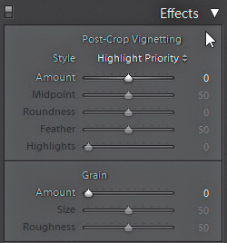
• The Style drop-down menu offers three choices that affect how the vignette effect interacts with the image. The Highlight Priority option puts the focus on preserving and recovering highlights, but at the potential cost of color shifts, while the Color Priority option attempts to avoid color shifts, but cannot protect or recover the highlights. Paint Overlay just adds in either black or white pixels to the existing pixels in the image. Try each option and go with the one that suits the photo and your vision.
• Amount controls how much of the vignette effect you want to apply, and if it is dark or bright. A negative value creates a dark vignette, while a positive value creates a bright vignette. Dark vignettes are the most common choice.
• Midpoint determines how far into the center the vignette can extend. A low value extends the vignette further toward the center, while a high value keeps the effect just on the edges.
• Roundness affects the shape of the inner part of the vignette. A low value moves toward rectangular, while a high value moves toward circular.
• Feather adjusts the softness of the transition of the vignette from the edge to the center. Lower values trend toward harder transitions, while high values increase the softness of the transition.
• Highlights only comes into play with the Highlight Priority or Color Priority styles enabled, and allows you to basically brighten any highlights affected by the vignette to somewhat counter the effect in a more natural way. It is a subtle control that won’t be needed on most photos.
Tip
Hold the Alt (Mac: Option) key to change the Post-Crop Vignetting label into a Reset button to zero out all the sliders in a single click. Double-click a slider to reset it to its default.
My goal for applying a darkening vignette to my Christmas tree photo was an attempt to help make that tree look like it was the one warm light in a dark cold place. I just wanted to darken the outer edges a little bit in preparation for the reverse vignette I’ll cover next.
In this case, I set Style to Color Priority since I am more concerned about preventing color shifts, set the Amount to -10 until I could just start to see the effect, nudged Midpoint up to 78 to push the darkening away from the center, decreased Roundness to -66 to further push the darkening effect toward the edges, and left Feather and Highlights at their respective default settings. Keep in mind that it is perfectly normal to go back and forth between sliders and re-tweak after each adjustment. These controls all work together, so sometimes you need to over-adjust to see the effect and then dial it back down to Earth.
At this point, I am ready to add the final touch in Photoshop Elements to really make that tree pop. If Photoshop Elements (or the full version of Photoshop) is your primary external editor for Lightroom, you can press Ctrl-E (Mac: Command-E) to send a copy with Lightroom adjustments right over. We’ll pick up in Photoshop Elements in the next section.
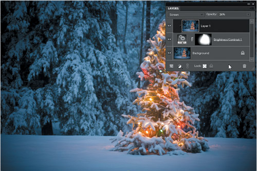
Creating a Reverse Vignette
In the previous technique, we darkened the edges to make the center area appear brighter. In this reverse vignette technique, we’re going to do the opposite and brighten the center slightly while keeping the edges mostly unchanged. We’ll need to call upon the layer mask trick I showed you previously in the purple fringing section to make this work. Here are the steps:
- Duplicate the Background layer by pressing Ctrl-J (Mac: Command-J).
- Select the Background layer to make it active, then click the half-moon-looking Adjustment Layer icon at the bottom of the Layers panel and select Brightness/Contrast. This is that layer mask trick we used before (if you are using the full version of Photoshop you can just apply a regular layer mask).
- Select the top duplicate layer to make it active, then choose Layer > Create Clipping Mask. This just forces the top photo layer to pass through the layer mask on the adjustment layer (full Photoshop users don’t need this step).
- With the top photo layer still selected, click the layer blending mode drop-down menu at the top of the Layers panel and choose Screen. Your background photo should immediately become much brighter.
- Reduce the Opacity of the top photo layer to around 20%. This is subjective and will vary with each photo. In general, we don’t want to over do it, so err on the side of lower opacity.
- Click on the layer mask to make it active.
- Select the Brush tool, and configure a large soft-edged brush set to paint with black. We want a large soft-edged brush to make the transitions between the brighter center and darker edges as smooth as possible.
- Here’s the fun part: With the layer mask active, we’re going to paint back the edges of the original photo on the Background layer. By using a brush and a layer mask, we have much more flexibility to adjust the effect of the vignette than is afforded by the Lightroom Effects panel. This is especially true when, like my photo, the subject is off center.
This is intended to be a subtle effect. I am not trying to put a lighthouse on my front lawn. I just wanted to give that tree a little bit of a boost. Compare Figure 9.22, which just has the original Lightroom vignette, to Figure 9.23, which is the final result after both techniques. As I said, there are a lot of ways to achieve a similar end, but I hope you can see the world of possibilities that exist using these techniques in concert and independently of each other. Always ask yourself this important question before applying any enhancement technique: “Does this effect/trick/tip help enhance the core message this photo is intended to communicate?” If you can’t honestly answer “yes,” then you might be heading into the Photoshop fantasy zone, which is a really fun place to visit, but you don’t want to bring your stock there.
Figure 9.22. The results of the Lightroom Post-Crop Vignette.
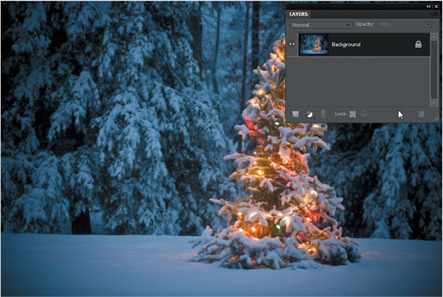
Figure 9.23. The final result combining both types of vignette. The Layers panel shows the arrangement of the three layers used.
Assignment
Head over to www.takingstockphoto.com/downloads/ and download the practice files for the purple fringing, cropping, spot removal, and logo removal techniques and practice each exercise.
Choose a few of your own photos to try the vignette techniques in various degrees and ask yourself if it helps or hinders the communication of that photo’s message. Remember, rejection can result from sloppy editing, too, so practice, practice, practice.
Grab a free 30-day trial version of Lightroom 3 and Photoshop Elements 8 (www.adobe.com) if you don’t have them already.