8. Digital Editing Basics
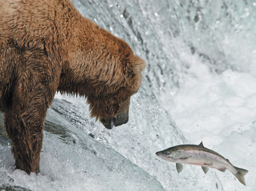
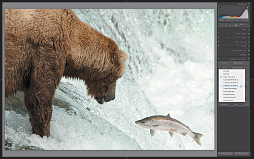
Figure 8.1. Brown Bear. Nikon D200 f/8.0 1/1000 sec ISO 320
The most important part of the stock photography workflow is what happens in your camera at the moment of capture. You need the best raw material to build the highest-quality images, and the work you did leading up to and including the moment of capture can be considered the acquisition of the building blocks of your image. Digital editing is the process of refining that raw material into the final image. In a raw workflow, there are a few basic adjustments—default rendering, white balance, exposure, contrast, noise reduction, and capture sharpening—you need to consider for all your photos as you process your shots. These are the same adjustments your camera makes if you were shooting in JPEG mode (based on your in-camera settings), but with a raw photo you are in the creative driver’s seat. It is up to you to make the right decision each step of the way for the best output.
Back in Chapter 5, I discussed the pros and cons of shooting in raw mode versus JPEG mode, and I am working with the assumption that you have chosen to shoot in raw, or at least to step out of your JPEG comfort zone for now and give raw a try to see what is possible.
Focus on Quality
This is a critical point in your workflow. Just shooting in raw mode does not guarantee quality output. There are many opportunities in post-processing—exposure adjustments, noise reduction, color enhancements, sharpening, and so on—to self-inflict damage on an image. One of my main goals for writing this book is to help you reduce the number of rejections you might have gotten due to post-processing errors, such as:
• Failing to restore detail in vital highlight or shadow areas through poor exposure adjustments
• Not removing enough digital noise, those pesky unwanted discolored pixels that can appear in many digital photos
• Applying too much noise reduction, which has the effect of smudging and softening important edge detail
• Boosting saturation too high in an effort to enhance color, but resulting in overdone cartoonish results
• Over sharpening, which results in harsh and crispy edges on important details
The first step involves learning how to be your own worst critic before you start developing your photos. In Chapter 10 I’ll give you lots of practice seeing your photos like an inspector, and then, in Chapter 11, provide a soup to nuts workflow for managing your photos and putting your inspector-vision to good use evaluating each shoot, but the key message I want to impart right now is this: don’t waste time trying to save shots that are beyond saving. Invest your postprocessing time and energy in only the keepers, and make notes about how to best reshoot the clunkers at a later date.
The reason for this is simple: The more adjustments you need to make to improve the original photo, the more likely you are to introduce new problems, waste time, and in the end, say something like, “I can’t believe this was rejected after I spent hours working on it!” Every photo stands or falls on its own merits, and there are no points for effort.
In a perfect world, we start with the highest-quality capture possible, make as few adjustments as is necessary to smooth the rough edges, and then save out a final version that breezes through the inspection process. Since we are not in a perfect world, we need to come to grips with the less than perfect situations that arise, make the best decisions we can, and keep moving forward as efficiently as possible.
Work Smarter
As much as I enjoy the post-processing side of the equation, I think it is safe to say that we don’t take photos just to spend time with them on our computers. While quality may be job one, job two has to be efficiency. Every photo cannot be treated as if it is your life’s work. You do need time to go and create new photos.
The key to efficiency is to invest some time in learning how to master your tools, and then practice, practice, practice. Unfortunately, I can’t teach the same processing steps in every possible application, but it is instructive to step through the actual processing I did on a not-so-perfect-world photo to show what is possible. If you don’t use Lightroom 3, you will have to translate these basic steps into the application you have chosen to use. However, if you are using Photoshop CS5 with Camera Raw 6, then little translation is required since Lightroom 3’s Develop module and Camera Raw 6 share the same tools, functions, and rendering engine. No matter what application you use, the basic types of post-processing adjustments that every raw photo requires are:
• Choosing a color rendering. Are you going for a neutral look? Something more vivid? Perhaps a black and white? The choice you make here will affect other settings down the road.
• Adjusting the white balance. This is a creative decision you need to make that affects the color casts in the photo.
• Adjusting exposure levels to improve the overall tonal range of the photo, while preserving important detail at the brightest and darkest ends, and accentuating contrast to make the image pop.
• Applying just enough capture sharpening to the important edge detail to overcome the inherent softness in raw captures.
• Evaluating and, if necessary, reducing unwanted noise without degrading detail.
To that end, I’ll cover the basic raw processing steps you need to know in this chapter, and then follow up with tips for solving other digital problems in Chapter 9.
A Little About That Bear Photo
The bear and salmon photo at the beginning of this chapter (Figure 8.1) is one of my favorite photos I’ve ever taken. I had the opportunity to barter a day of Lightroom training in exchange for an all-expenses-paid photo-safari in Alaska. (It was an opportunity I can indirectly trace back to uploading my first awful sample photo to iStock back in 2002, but that is another story.) The reason I picked that photo was simply to show that a lot of what we shoot is under less than perfect conditions, and I don’t want you to get the idea that perfection is the only thing that matters. Approximate perfection is a little more realistic.
The bear photo was taken with a Nikon D200, which is a good camera, not the best, but far from the worst, and I still shoot with it today. The location was Brooks Falls in Katmai National Park, Alaska, on a beautiful, partly cloudy day, which meant the light kept changing. Trying to expose properly for the bear, salmon, and the white water of the falls was a continuous challenge. I used a higher than normal ISO (320 in that shot) because I needed a fast shutter to freeze the motion of the jumping salmon, and with that fast of a shutter you can be less worried about noise.
The biggest problem to avoid, other than being out of focus, was completely blowing out the highlights, which according to the blinking highlight clipping warning on the camera’s LCD screen at the time, it seemed to indicate that I had. It wasn’t until much later, after downloading my memory cards, that I was able to evaluate if it was going to be a keeper or not. I suppose it is obvious I decided it was a keeper, but it came down to three essential factors:
• The composition was strong.
• The focus was on the right part of the scene.
• Exposure adjustments could be made to recover highlight data because I shot in raw mode.
In most cases, if you have those three things you probably have a keeper on your hands too. Let me show you the basic color rendering, white balance, and exposure adjustments I applied to that photo, then I’ll switch to a different photo to look at noise and sharpening.
Setting Defaults and Creating Presets
In order to get the most out of a tool like Lightroom you need to learn how to use it as efficiently as possible so that you are not re-creating the wheel on every photo you process. Two of the most important things you can learn right off the bat are how to set custom default settings that are applied to your raw photos on import and how to create your own Develop presets, which are simply a way to preserve a configuration of settings for reuse.
By design, Lightroom applies default processing settings, such as white balance, brightness, contrast, sharpening, noise reduction, and so on, for each raw image file format it supports after the photo is imported into Lightroom. Even if an adjustment amount is zero, it is still a default setting. Every raw processor has to start somewhere, and since Lightroom can’t read your in-camera processing settings, it has to have its own. However, these default settings are not carved in stone, and you can customize them to your own preferred starting point. One setting I suggest changing first is the default rendering based on your preferred camera profile.
Choosing a Default Rendering
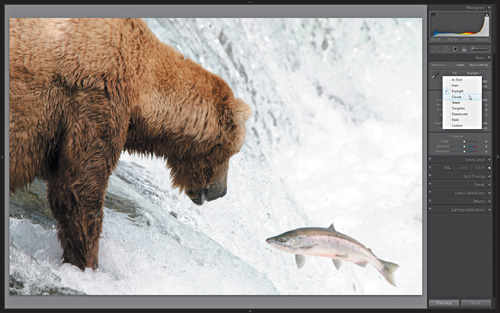
Most digital cameras have built-in options to apply various creative rendering styles to your photos at the time of capture, with names such as Portrait, Landscape, Standard, Vivid, and so on (though the exact names vary with each camera manufacturer). Each of these styles affects the color rendering—the essential look—of the captured image data. The style you choose is completely a matter of individual taste, but as I pointed out in Chapter 5, those styles aren’t actually applied to the raw data. If you are using the software provided by your camera manufacturer, it can read the in-camera settings and apply the same rendering. But if you are using a third-party application, like Lightroom or Camera Raw, then you will have to manually choose the default rendering you prefer in that software.
Lightroom makes this possible through what it calls camera profiles, which are found in the Camera Calibration panel (Figure 8.3) under the Profile dropdown menu.
Figure 8.3. Choosing a profile from the Camera Calibration panel has a big impact on the overall color rendering of the raw photo.Compare against Figure 8.1.
Remember, a key benefit of shooting raw is that you can change this setting (and many others) non-destructively (meaning without harm to the original image data) at any point in your workflow. That said, you do need to start somewhere, so I suggest choosing the profile you want to be your default starting point. Here’s how:
- Select an unprocessed raw photo that is well exposed and contains a variety of colors to better help you evaluate the differences in each camera profile. Either a freshly imported photo or one you just haven’t gotten around to working on yet is fine.
- With that photo selected, press D to jump directly to the Develop module. The Camera Calibration panel is located at the bottom of the right side of the interface.
Note
Adobe has provided a limited set of camera style profiles for most of the current Canon and Nikon camera models. However, there is a means to create custom camera profiles for all camera models via the DNG Profile Editor. Go to http://labs.adobe.com/wiki/index.php/ DNG_Profiles to download this free tool as well as find free tutorials.
- Experiment by expanding the Profile drop-down menu and selecting each available profile in turn to see how it affects the selected photo. As you try each profile, note how the colors change in the selected photo. Compare Figure 8.3, which uses the Adobe Standard profile, against Figure 8.1, which uses my preferred Camera D2X Mode 3 profile, to see the subtle difference it makes. Many people choose the profile that most closely matches the way the photo looks on the camera’s LCD preview. If you configure your camera to shoot raw+JPEG, you can use the JPEG version as visual guide to help find the look you want.
- Once you’ve decided on your preferred starting profile, hold the Alt key (Mac: Option) to change the Reset button (appearing directly below the Camera Calibration panel) to Set Default, and press that button. This will open the Set Default Develop Settings dialog box (Figure 8.4).
Figure 8.4. The Set Default Develop Settings dialog box.
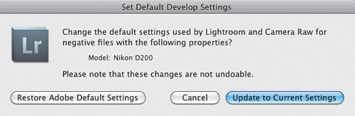
- Click the Update to Current Settings button to set the new default profile and close that dialog box.
From now on, all newly imported raw photos from that same camera model will have this profile applied by default. That’s great, but (and this is a pretty big but) this process does not affect any previously imported raw files. So if you want to apply this same profile to existing photos, you will need to do that manually. The most efficient way to do that is to create a develop preset.
Note
As you develop your photos further, you may find there are other settings you want to change to a different default value, and that is perfectly fine. Change only the settings you want to be used as the new default and repeat Step 4 to update to current settings.
Creating a Develop Preset
A preset is simply a way for you to save a collection of settings for reuse in a single click. These can range from simple things like camera profile changes to more complex multi-setting timesavers. Lightroom stores all of these in the Presets panel on the left side of the interface.
Now that you’ve set your default camera profile, let me show you how to save that as a new preset so you can apply it to any previously imported photos.
- With this photo still selected, choose Develop > New Preset to launch the New Develop Preset dialog box (Figure 8.5). Name the preset the same as the camera profile to make it easy to remember.
Figure 8.5. The New Develop Preset dialog box.
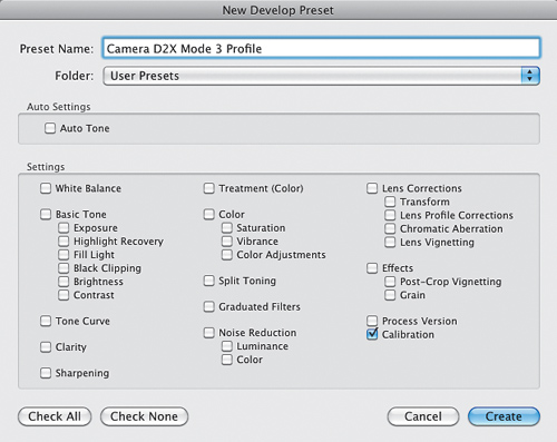
- Click the Check None button to clear the dialog box, then check only the Calibration box. Click Create to save the preset.
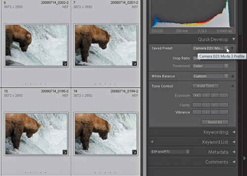
- Now you can press G to jump to Grid view, select all raw photos, and apply that preset via the Saved Preset menu in the Quick Develop panel (Figure 8.6).
Figure 8.6. Applying a preset via the Quick Develop panel.
This is just the tip of the preset iceberg of course, but it nicely illustrates the power of working with raw files. You are free to explore multiple creative paths in developing your photos without altering the original data in your photo, and you can continually take advantage of new rendering technology moving into the future. Keep the concepts of default settings and presets in mind as we continue to move through other essential adjustments.
Adjusting White Balance
The white balance (WB) controls, both in your camera and in your software, are there to help you cope with color casts in your photos that result from light produced by different sources. Without getting bogged down in the technical stuff, you already know that things look slightly different under different light sources. Imagine the sickly green light of fluorescent light, the warm glow of a candle, or the harsh light of high noon. I’m sure you can see them in your mind’s eye. Our brains do a great job of compensating for the different color casts produced by these light sources, but we still don’t always see everything as perfectly neutral. We do see color casts depending on the light we are in, and those casts are intrinsically linked to how we feel about the scene we are viewing.
Imagine a romantic dinner for two. The incandescent wall lamps are turned down, and candle light flickers on the table. Now, imagine you close your eyes for a second and the restaurant has flicked on the overhead fluorescents because the staff wants to go home. Still romantic? No! If all light produced the same feeling, we’d all have switched over to fluorescents long ago. The quality and colors of light are very important variables for you, as a photographer, to use as effects. This is not at all to say that removing or neutralizing color casts is wrong, because it isn’t. It simply depends upon the photo, and it is your job to make the right call.
Using the Tools
Lightroom provides several tools for dealing with color casts. The tools can be used on JPEG or raw files, but you have more control with raw since the actual image data has not yet been rendered into pixels.
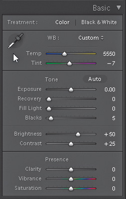
The first tool is actually your camera. The white balance setting you select on your camera will be interpreted by Lightroom, and this considered the As Shot setting you’ll see by default. Depending on the photo, and your intentions, this may be a good enough starting point. If not, then you need to look at the Lightroom tools at your disposal, and there are three—White Balance Presets (WB), White Balance Selector tool (which looks like an eye dropper), and the Temp and Tint sliders—located in the top section of the Basic panel (Figure 8.7).
Figure 8.7. The White balance adjustment tools reside in the top section of the Basic panel.
Note
If you have a JPEG, TIF, or PSD file selected, you will only see As Shot, Auto, and Custom since the actual white balance setting was applied when that photo was originally rendered.
The WB Presets can be an easy starting point if the As Shot rendering is not working for you. Click the Presets drop-down menu (Figure 8.8) and select the preset that best fits the scene’s lighting for that photo. Don’t be afraid to try each in turn to see the differences. You might be surprised by which works best. While presets have recognizable names, some people are confused by Tungsten, which is simply the common light bulb (the filament inside the household light bulb is made of tungsten). The Auto setting is Lightroom’s attempt to neutralize the image, while Custom appears the moment you start using the White Balance Selector Tool or the sliders.
Figure 8.8. Compare the look of this Daylight preset setting against the look of the custom white balance I chose for Figure 8.10. It is subtle, but I preferred the custom.
My favorite custom approach is the White Balance Selector Tool because it is so easy to use. Here’s how:
- Press the W key or click the White Balance Selector tool in the Basic panel.
When the tool is active, the cursor will change into an eye-dropper accompanied by a loupe that displays a zoomed view of the pixels directly under the White Balance Selector Tool (Figure 8.9). Under the pixel grid are the percentages of red, green, and blue contained in the center pixel. You want to pick a target neutral, which means click on a pixel that has R, G and B values that are pretty close together. I look for an area of pixels that should be a neutral light gray, such as the white water in that example.
Figure 8.9. The White Balance Selector tool and accompanying loupe.
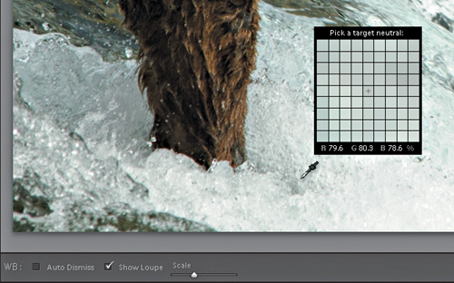
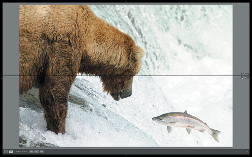
- Move the tool over the photo and choose a pixel that you want to neutralize. With a little looking, I found a nearly neutral point in my photo (Figure 8.9) and clicked on that spot, which caused Lightroom to adjust the R, G, and B values slightly to bring them even closer together, which adjusts the white balance for the entire photo. Figure 8.10 shows a Before and After split view with the original As Shot white balance in the top half and the new custom white balance setting in the bottom.
Figure 8.10. Compare the Before As Shot on top to the custom white balance on the bottom. White balance has a subjective element where there is room for more than one right answer.
Speeding Up the Process
Typically you’ll have multiple photos in any given shoot that were all taken under the same lighting conditions. This is where Lightroom’s Sync and Auto Sync functions come into play.
In Figure 8.10, I only had a single photo selected while I worked on adjusting the white balance, but I actually had a number of similar shots taken in that same light that could use that same exact white balance setting. When you’ve already applied a setting (or combination of settings) to one photo and you later decide you want to apply that same setting to more photos, you can use the Sync function:
Tip
You can hold the Ctrl (Mac: Command) key and individually select multiple files, or hold the Shift key and click the last file in a series to select them all.
- With the adjusted photo still selected, select all other shots you want to adjust in the Filmstrip.
- Click the Sync button to launch the Synchronize Settings dialog box (Figure 8.11).
Figure 8.11. The Synchronize Settings dialog box.
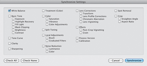
- Check the boxes next to all the settings you want to synchronize in all of the selected photos. In this case, we’d check White Balance. You are telling Lightroom to take the settings from the first selected photo and apply them to the rest of the selected photos.
The Sync button also has a hidden super power. Instead of working on one photo and then synchronizing those settings across multiple photos later, you can enable the hidden Auto Sync function and simply work on multiple photos at once.
Here’s how: With multiple photos selected, hold down the Control (Mac: Command) button and watch the Sync button transform into Auto Sync. As you work on the active photo displayed in the work area, everything you do is equally applied to all selected photos automatically. This can be a huge time-saver when many photos require the same exact adjustments.
It is important to remember to disable Auto Sync—just click the button once more to revert back to Sync—so that you don’t accidentally apply settings to other photos.
Making Exposure Adjustments
In Chapter 6, I discussed the importance of getting a good exposure when you are shooting in order to acquire as much data from the scene as possible without overexposing the capture to the point of data loss. If a photo is too overexposed, you won’t be able to recover the important data in the blown-out areas, which will result in a rejection. If a photo is too underexposed and requires a drastic increase in Exposure, you run the risk of making visible all of the noise hidden in the darker areas of the photo, which will also result in a rejection. The goal of making exposure adjustments is simply to refine a good exposure as opposed to trying to salvage a poor one.
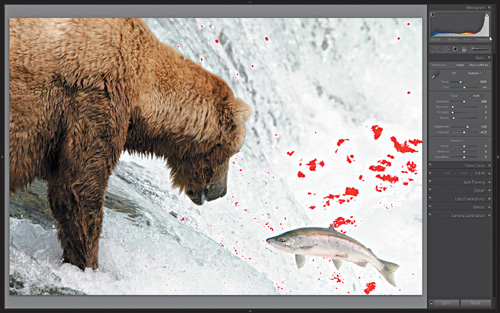
If you look at the histogram for this photo (Figure 8.12) you can see there is a lot of data stacked up on the right edge. If you press J to turn on the Shadow/Highlight clipping warning, you can see the areas of the photo that are currently clipped to pure white and contain no detail. However, because I shot in raw mode there is the opportunity to recover the lost detail in the highlights, as well as make adjustments to improve the total distribution of brightness levels throughout this photo to make it come alive.
Figure 8.12. Photo displaying the red highlight clipping warning on the blown-out areas of the photo, and the histogram is all stacked up against the right edge.
Exploring the Exposure Adjustment Tools
Lightroom is designed to work from the top of the right-side panel group down as you make your adjustments. Starting in the Basic panel (refer back to Figure 8.7 for a better view), under the white balance controls, you’ll see the Exposure, Recovery, Fill Light, and Blacks sliders, which have a direct link to the Histogram panel. In fact, if you move your cursor over any one of those sliders you will see the corresponding area light up on the histogram. Give it a try to see what I mean. The main goal of these four sliders is to work together to adjust the distribution of brightness values in your photo so that important highlight and shadow detail is preserved, without revealing underlying noise.
• Exposure, sometimes in conjunction with Recovery, sets the white point in your photo, which is the line between preserving detail in your highlights and pure white. Moving the Exposure slider to the left darkens the entire image, and moving it to the right brightens. On a properly exposed photo, you want the right edge of the histogram near to the right side without going past.
• Recovery’s primary job is to recover lost highlight detail due to over exposure. Move it to the right to depress the highlights with minimal impact to the rest of the tonal range.
• Fill Light allows you to brighten up your shadows without much impact on the black or white points you set with the other sliders. It is great for adding a little brightness to subjects that were lit from behind. Move it to the right to brighten the shadow areas almost as if you added more light at the time of capture. Be careful, though; too big of an adjustment will bring out the noisier parts of the shadows.
• Blacks sets the black point in your photo, which is the line between having detail in the darkest shadows and pure black. If the left edge of the Histogram does not reach all the way to left side, try dragging the Blacks slider slightly to the right, which will increase the Blacks value and potentially add a bit more depth to an otherwise flat looking photo, which is a common cause for rejection.
The Brightness and Contrast sliders have a role here, too, and although they don’t make areas of the histogram light up, they do affect the tonal distribution in your photo.
• The Brightness slider can be used to make global adjustments—shifting brighter (to the right) or darker (to the left)—to all the tones in your photo with minimal impact on the white or black point.
• When the Contrast slider is increased by moving the slider to the right, it shifts bright areas brighter and dark areas darker. When contrast is decreased by moving the slider to the left, it shifts bright tones darker and dark tones brighter.
Do take some time to make wild adjustments with each of these sliders to get a feel for how they work. Generally speaking, while keeping in mind that the preservation of detail is always your primary mission, for most photos, having a tonal range that results in an edge-to-edge histogram will suffer fewer rejections for exposure and lighting reasons. Please note, this type of result is not achieved through wild adjustments of any of those controls.
Practical Exposure Adjustments
With that in mind, refer to where we left off with my bear photo in (Figure 8.12). The biggest exposure problem is the blown-out highlights. I need detail in the waterfall to avoid rejection. Beyond that, there is actually a pretty good distribution of tones across the histogram. So, the first thing I need to do is see if I can salvage the detail in the highlights, and then fine-tune the overall tonal range. This is where the Recovery slider comes to the rescue. As you drag the Recovery slider to the right, Lightroom decreases the brightness in only the brightest end of the histogram and recovers any data that exists in the highlights. Not every photo will need the help of the Recovery slider, but it is a powerful tool.
Note
There are instances where blown-out highlights are acceptable, such as when the sun, or its reflection, or some other incredibly bright light source is included in the photos. These are called specular highlights and are acceptable in moderation.
I simply moved the Recovery slider to the right until the highlight clipping warning was gone, which brought back all the data in the highlights that first appeared to be lost.
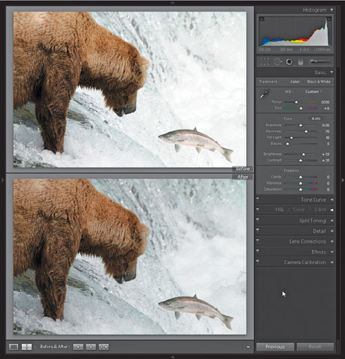
In addition to the Recovery adjustment, I reduced the Brightness slider from +50 to +33, which reduced overall brightness and brought out more detail in the water (did I mention detail was important?). To compensate for the decrease in brightness of the bear, I bumped the Fill Light slider to +18. That was the full extent of the exposure adjustments for that photo. Refer to Figure 8.13 for a before and after comparison.
Figure 8.13. Before and after view showing recovered highlights and increased overall detail.
The Presence Controls
The last three sliders in the Basic panel (Figure 8.7) are Clarity, Vibrance, and Saturation. When used in moderation, the Clarity and Vibrance controls can really make certain photos pop.
• Clarity performs what is called a midtone contrast adjustment. Adobe originally wanted to name that slider Punch, because that is a good description of the effect it can have on your photo. There is a develop preset named General – Punch that sets Clarity to +50 and Vibrance to +25. It serves as a good starting point for many images.
• Vibrance is designed to have less of an impact on the most saturated colors in an image and instead focuses its attention on the less saturated colors. When used in moderation, it can really bring photos to life.
• Saturation affects all colors the same way, so when it is increased it runs the risk of over-saturating some colors to the point of losing detail. When decreased it can be used to remove all color from a photo.
For stock purposes, you want to use these controls with an extremely light touch if at all. In my brown bear photo, I did find that I could add a good amount of clarity, which added a lot more character to the raging water and also helped the subjects leap off the background. When making any adjustments, be sure to examine your photo carefully at 1:1 or 100% view to best evaluate the changes being made.
Sharpening for Stock
It is common to refer to a photo that is nicely in focus as a sharp photo. However, it is important to keep in mind that software sharpening cannot fix a photo that is not in focus, which is a common error made by new contributors. Software sharpening can only be used to improve the appearance of a photo that is already in focus.
Sharpening is really all about enhancing edges. When you take an in-focus photo and enhance edges of the image details, you can really bring that subject to life. Our eyes are drawn to detail. Software sharpening is a tool at your disposal to help lead the viewer’s eye to the most important parts of the photo.
To oversimplify the process, sharpening works by increasing contrast along edges. The result of increasing contrast—pushing some pixels toward white on one side and some pixels toward black on the other side—along the edges creates what are called sharpening halos. The control of these halos is what the sharpening settings are all about.
The late Bruce Fraser advanced an approach to sharpening that separated out three distinct types—capture, creative, and output—that vary in technique and purpose. At this stage of developing a photo we are only concerned about the first type of sharpening, called capture sharpening, which is intended simply to compensate for the inherent softness in a raw photo. This is the type of sharpening that is performed using the sliders in the Sharpening section of the Detail panel (Figure 8.14):
Figure 8.14. The Sharpening controls in the Detail panel.
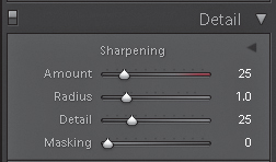
• The Amount slider controls how much sharpening is applied to the photo.
• The Radius slider effectively controls the width of the sharpening halos. This is a key setting to get right and is based on the type of detail in the photo. A photo with wide smooth areas and soft details like a face would typically do well with a Radius of 1.0 to 1.4. A photo with lots of small detail and edgy texture, like a tree and blades of grass, would typically do well with a Radius of 0.8 to 1.0.
Figure 8.15. Young People in a Movie Theater. Downloaded over 1,100 times.

Young People in a Movie Theater
• The Detail slider provides a means to suppress the visibility of the sharpening halos resulting from the Amount and Radius settings.
• The Masking slider controls what pixels in the image will be sharpened by masking out areas of the photo where you don’t want any sharpening to be applied. This is an essential control for fine-tuning the amount of sharpening applied. This will become clearer in the coming example.
Tip
There are two sharpening presets in the Presets panel—Narrow Edges (Scenic) for edgy texture, and Wide Edges (Faces) for wider smooth areas—designed to be good starting points for different types of photos.
Making the Sharpening Adjustments
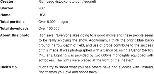
In the example photo (Figure 8.16), the subject, an Echinacea flower, is shown in sharp focus against a very out-of-focus background. This separation of detail makes it quite obvious what the photo is about, and it greatly simplifies the message. A hallmark of a good stock photo is that it communicates a clear message as simply as possible.
Figure 8.16. You always want to evaluate sharpening adjustments at 1:1 view.
Tip
If you want to learn more than you thought possible about sharpening, check out Real World Sharpening with Adobe Photoshop, Camera Raw, and Lightroom (2nd Edition), by Bruce Fraser and Jeff Schewe. (Peachpit Press, 2009).
The end result of a sharpening adjustment is more important than the order in which you move the sliders, and don’t be afraid to come back and tweak some more after using the luminance noise reduction tools (covered in the next section on noise). That said, you need to start somewhere, so here are the steps I used to work on that Echinacea flower:
- Click once on the photo to zoom in and then pan to an area of good detail. Zoom in to 1:1 view to best evaluate the adjustments you are making. It is a challenge to translate the important detail and texture from the image on my screen to the printed page you are viewing, so you can follow along after downloading this photo from www.takingstockphoto.com/downloads/.
- In this example, I clicked on the Sharpening - Wide Edges (Faces) preset (in the Preset panel) since, like a face, this photo has lots of wide smooth areas. It will serve as a better starting point than the default settings.
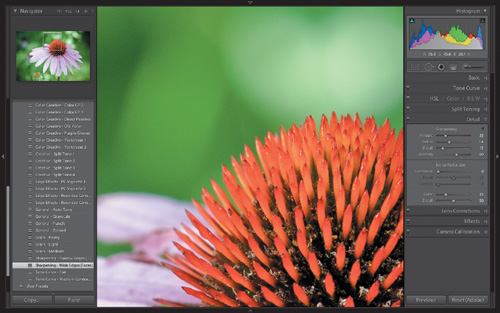
- Amount is subjective. Click on the Amount slider and drag first to the left, to decrease, and then slowly drag to the right while looking at the edges of the detail in your image. You can hold the Alt (Mac: Option) key to switch to a grayscale view to help evaluate detail without color distraction. Lightroom only applies sharpening to the luminance data, which is what you are seeing in that grayscale preview (Figure 8.17).
Figure 8.17. Sharpening applied to luminance data.
Pan around the image as you make your adjustments to evaluate different areas. Don’t be concerned if you see noise or other unwanted detail becoming more visible: This is normal, and we will address that later with the Masking control and really clean it up with the noise reduction controls in the next section. I chose an Amount setting of 45, because to my eye, it provided the best balance between increasing the visibility of important edge detail, without making it look too harsh or fake.
- Now hold down the Alt (Mac: Option) key and click on the Radius slider to get a more accurate preview of what part of the image is affected by those settings. The Radius value contained in the Sharpening - Wide Edges (Faces) preset is a good starting point for this type of photo. If chosen correctly, you may not need to adjust this any further. For this image, I felt a setting of 1.2 worked best with the type of detail in this photo. Visually, the differences can be hard to see at first. Use the two presets mentioned in the tip to help get you in the right ballpark.
- Adjust the Detail slider to suppress the visibility of the sharpening halos as needed. Again, hold the Alt (Mac: Option) key and click on the Detail slider to see a grayscale preview. I found a setting of 25 provided the best enhancement of the detail with room for further refinement from the Masking slider.
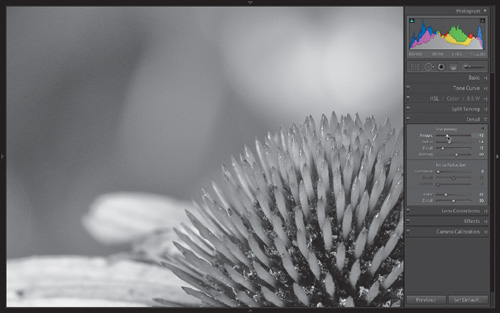
- The Masking slider is how you can really focus your sharpening settings to just the edges that matter. Lightroom automatically detects the edges in the image and uses that information to create what is called a mask, which shields parts of the image from having any sharpening applied to it. When the Masking slider is set to 0 then no mask is present, and all areas of the image are sharpened equally. As the Masking slider is increased, more and more of the image is protected (masked) from having the sharpening applied.
This is a flower, with lots of soft wide areas of color. I don’t want a crispy, edgy image. I want detail to be perceptible, but not overdone. It is always best to have less sharpening than more, so I often use a pretty high Masking setting. Hold the Alt (Mac: Option) key to get a glimpse of just the mask (Figure 8.18) as you move the Masking slider. The white areas of the mask are where the sharpening is being applied, and the black areas have none. I settled on leaving the Masking slider at 61, which protects the smoothest areas of the image, and focuses the combined sharpening settings just to the most important edges.
Figure 8.18. This shows the edge mask that determines where the sharpening is being applied.
Feel free to make exaggerated adjustments with each slider as you get a feel for how they work together. If your edges look too jagged or too pronounced, you may be heading into rejection territory for over-sharpening, so dial back the Amount slider and increase the Masking slider to be safe. You can reset all the sliders back to default settings by holding the Alt (Mac: Option) key and clicking Reset Sharpening.
Dealing with Noise
We’ve looked at the nature of noise as well as ways to reduce noise at the time of capture in Chapter 6, but there will still be images that require a little bit of noise reduction during post-processing. There are a host of software solutions for noise reduction, and if you’ve already got your favorite I won’t try to change your mind. However, I will encourage you to test drive the improved noise reduction tools in Lightroom 3, which underwent a major overhaul in this release.
The goal of noise reduction software solutions is to minimize the appearance of digital noise without sacrificing critical image detail. You need to know that stock photos are just as often rejected for the overuse of noise reduction software (Figure 8.19) as they are for just having too much noise. Your job is to use just enough (and possibly a little less) noise reduction to minimize the appearance of noise in the worst areas, while maintaining sharp details. Too much noise reduction turns pixels into mushy blobs of color that are no more pleasing to the eye than the original noise.
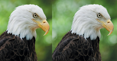
Figure 8.19. Left side photo shows how too much noise reduction has smoothed out important detail. Right side contains critical detail in eyes and feathers. Download and view at 1:1 for best comparison. www.takingstockphoto.com/downloads/
Remember, too, any acceptance or rejection is the result of a cumulative number of factors, so a photo with a strong composition and useful concept can get away with having a little more noise than a photo with less going for it. In other words, don’t waste time reducing noise on a photo that might be rejected for some other reason.
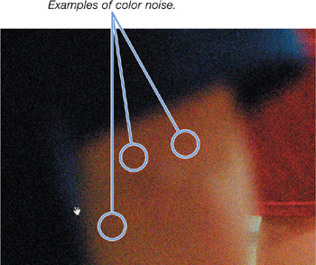
There are two types of noise— Luminance noise (Figure 8.20), which has more of a characteristic of film grain, and color noise (Figure 8.21), which presents as random pixels of color almost like Christmas tree lights—and correspondingly two sets of controls for dealing with each type (Figure 8.22). I over-emphasized the noise in Figure 8.20 and Figure 8.21 to help it show better in the book, but noise is best evaluated digitally at 1:1 view, so download the examples to get a closer look.
Figure 8.20. Luminance noise has a grainy appearance. it’s a common problem in blue skies for some cameras.
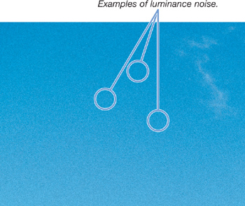
Figure 8.21. Color noise has a random, color-speckled appearance. it’s often caused by high ISO settings and long exposure times.
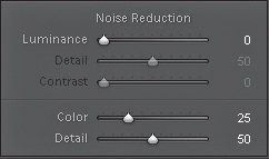
Luminance noise reduction is set to zero by default, as it is less often a problem than color noise. Color noise reduction is set to 25 by default, which is intended to be a good compromise between color noise reduction and detail preservation.
Figure 8.22. Lightroom’s noise reduction sliders in the Detail panel.
Making the Adjustments
The Echinacea flower photo we’ve been working on was shot at ISO 400 on purpose so we’d have more noise to reduce. To really see what is happening here you need to download the photo from www.takingstockphoto.com/downloads/. To help illustrate the effects of the adjustments, start by turning the Color slider to zero. While not the noisiest image I’ve ever seen, if you zoom to 400% and look in the darker regions, you will see both the rainbow-speckled sign of color noise and the grainy appearance of luminance noise quite easily. Let’s walk through the steps to reduce that noise as best we can while still preserving important detail.
- As with sharpening, you want to zoom to 1:1 view to see the effects of the settings you apply.
- Pan to an area of the image that shows both noise and important detail.
- Start with the Luminance slider and slowly drag until the grainy areas start to smooth out. As you see the grainy areas smooth out, drag the Luminance slider back to the left to bring back a little grain. A general rule of thumb: apply less than you think and make your primary focus the preservation of detail. A setting of 25 is probably the highest you will want to use to avoid rejection. I chose a setting of 16, which appeared to reduce the noise enough and preserved more detail.
- Leave the Detail and Contrast sliders in their respective default settings. These have little effect on low noise images such as this, and high ISO images are unlikely to be good candidates for microstock outputs.
- (Optional) You may want to re-tweak your sharpening settings after reducing the luminance noise.
- Click on the Color slider and slowly drag until the color noise is removed. Similar to the Luminance slider, the default setting of 25 is likely the highest you want to use for the sake of detail preservation. I felt a setting of 16 here too was sufficient for reducing the noise enough and saving the detail in the flower. Leave the Detail slider at the default.
Tip
You can visit my Lightroom-centric blog at www.lightroomers.com, which is chock-full of free tutorials and tips intended to help you master a Lightroom workflow.
The goal should always be to remove enough of the noise to prevent it from being a visual distraction while maintaining crispness in the important detail areas to enable it to pass inspection at 100% or 1:1 view.
Assignment
If you’re not shooting in raw mode already, this is a great opportunity to start.
- A free 30-day free trial of Lightroom 3 is available from Adobe. I highly recommend you download a copy and give it a test drive to see what is possible.
- Set your camera to shoot both raw and JPEG (or just raw if you prefer). Choose a shooting assignment from Chapter 3 and create some photos. Import those photos into Lightroom and do the following:
A. Configure your custom default settings.
B. Create a preset with those same settings and apply the preset to other photos from that shoot.
C. Choose your top 3 to 5 keeper photos from that shoot and apply white balance, exposure, sharpening, and if needed, noise reduction adjustments.
- Head over to www.takingstockphoto.com/downloads/ and download the sample photos for this chapter. All your image evaluations need to be done on screen, so the more practice you have the better!