
9.4. Creating Accessible Sites
There are many books on the market that have the luxury of going into extreme detail about creating accessible websites, spending a great deal of time learning why a certain technique is applied. Since this is a book about testing, we are only going to cover the basics of what is required to create and test that a site is accessible.
9.4.1. Working with Images
A picture can say a thousand words, and can allow developers to express complex ideas in a small amount of space. When developers first learn about creating accessible websites, a popular starting point is applying the alternative text attribute to image tags.
9.4.2. When to Add Alternative Text
Standards state that all images should have this attribute, but does it really make sense for all images to have text describing them? The alternative attribute is read by screen readers and is intended to provide an alternative access method for images — simply put, a short description of an image.
It does not make sense for decorative images, such as gradiated backgrounds, spacers, or rounded corners to have alternative text applied to them. When actually testing a site with alternative text applied to decorative images, you will find it is not useful (we are jumping ahead of ourselves here, but we will get there).
When images are used as decorative purposes, it's best to remove the image from the page and add it as a background image using CSS. This technique will remove the need for alternative text and remove the image from the structural flow of the page. Another acceptable solution is applying an empty alternative text attribute.
<img src="/Images/RightRound.png" alt="" />
9.4.3. Creating Effective Alternative Text
Developers are not just struggling with the fact that alternative text should be added to each image on a page: it's knowing the proper text that should be contained in this attribute. Creating proper alternative text cannot be done simply by looking at an image. Consider the image in Figure 9-19.
There are many choices that could be used as alternative text:
To identify something: alt="Luna the dog"
Part of a photo gallery: alt="Luna ice climbing in January"
It may be about the breed of dog: alt="Grey and white Siberian Husky"
It may be about the author: alt="Jeff's Siberian Husky dog named Luna"
Could be about accessibility: alt="Image that contains many alternative text combinations" "
Figure 9-19. Image without a caption to show the importance of a detailed description of an image

In this situation the most appropriate alternative text and caption for the image in Figure 9-19 would be author Jeff McWherter's Siberian Husky named Luna.
Context is important to the alternative text, as is the length of the text. A good rule of thumb is to keep the alternative text of an image between 40 and 80 characters. When a more in-depth description is needed the long description attribute should be used.
Alternative text should not contain the phrase "image of ..." This can get bothersome when listening to a screen reader with images that contain alternative text such as this. Generally when images are rendered, screen readers will identify them as such, and when the alternative text contains the word image, you get something that sounds like this "image image of ..."
When creating alternative text, avoid providing information in the text that is not otherwise available. If you were to identify Luna by name in the alternative text, but not in other content on the website, a user who can see the image would be at a disadvantage and not get all the information about the image.
In some situations alternative text needs to describe a color swatch, such as in an online store that sells clothing. It's very difficult to try to fully describe a color, but valid alternative text for this situation may be "Style 7958 blue stripes." This alternative gives the user the most information you have. If they know they are not fond of stripes or the color blue they will be able to tell this product is not a choice for them. Applying this technique allows someone who cannot see the product, to be able to make choices based on the information presented to them.
There are some situations where you cannot fit an adequate description of an image in the alternative text. Charts, diagrams, and complex illustrations, such as the one listed in Figure 9-20, are common situations that need a more in-depth description on the image.
Long descriptions are meant to be an extension to the alternative text not a replacement. Long descriptions should contain a link to file the page that contains the long description.
Figure 9-20. United States elderly population growth
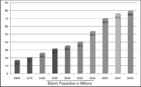
The alternative text for this image could get pretty complex: alt ="The Growing Elderly Population: 1960 16.6 million, 1970 20 million, 1980 25.6, 1990 31.1, 2000 34.7, 2010 39.4, 2020 53.2, 2030 69.4, 2040 75.2, 2050 78.9." Instead of creating alternative text this complex, choose to use the longdesc attribute. We can provide a long description stored at a separate URL to create a clean interface for the description to be read.
<img scr="Images/ElderlyPopulation.png" alt="The Growing Elderly Population chart"
longdesc="TheGrowingElderlyPopulation.html" />

            <h1>The Growing Elderly Population</h1>
            <ul>
                <li>1960 16.6 million</li>
                <li>1970 20 million</li>
                <li>1980 25.6 million</li>
                <li>1990 31.1 million</li>
                <li>2000 34.7 million</li>
                <li>2010 39.4 million</li>
                <li>2020 53.2 million</li>
                <li> 2030 69.4 million</li>
                <li> 2040 75.2 million</li>
                <li>2050 78.9 million</li>
            </ul>
9.4.4. Working with Forms
Creating accessible forms is where many developers run into issues. There are many small nuances to learn about creating accessible WebForms.
9.4.4.1. Layout
The HTML to render certain forms can be complex, mainly because of the amount of fields that are collected on some forms. Many forms on the Internet today are not accessible with one of the most common reasons being tables used for laying out the fields. In most situations creating forms without using tables is much quicker after you have learned a few techniques.
The form in Figure 9-21 is an example of what a common form to collect an address would look like. Many web developers' first instinct is to create a table containing two columns and three rows. The example in Figure 9-21 was not created using tables.
Figure 9-21. Simple form to collect addresses
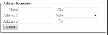
The form in Figure 9-21 was created using div tags, and very little CSS (the trick is float:left and align:right).
<div id="SaveAddress">
    <fieldset>
        <legend>Address Information</legend>
        <div class="FloatLeft">
            <div>
                <asp:Label ID="lblName" AssociatedControlID="txtName"
                Text="Name" runat="server" />
                <asp:TextBox ID="txtName" MaxLength="55" runat="server" />
            </div>
            <div>
                <asp:Label ID="lblAddress1" AssociatedControlID="txtAddress1"
                <Text="Address 1" runat="server" />
                <asp:TextBox ID="txtAddress1" MaxLength="55" runat="server" />
            </div>
            <div>
                <asp:Label ID="lblAddress2" AssociatedControlID="txtAddress2"
                <Text="Address 2" runat="server" />
                <asp:TextBox ID="txtAddress2" MaxLength="55" runat="server" />
            </div>
        </div>

        <div class="FloatLeft">
            <div>
<asp:Label ID="lblCity" AssociatedControlID="txtCity"
<Text="City" runat="server" />
<asp:TextBox ID="txtCity" MaxLength="55" runat="server" />
</div>
<div>
<asp:Label ID="lblState" AssociatedControlID="ddlState"
<Text="State" runat="server" />
<asp:DropDownList ID="ddlState" CssClass="StateDropDown"
runat="server" />
</div>
<div>
<asp:Label ID="lblPostalCode" AssociatedControlID="txtPostalCode"
e" Text="Zip" runat="server" />
<asp:TextBox ID="txtPostalCode" MaxLength="15" runat="server"
/>
</div>
</div>
<div style="clear: both;">
<asp:Button ID="btnSaveAddress" Text="Submit" runat="server" />
</div>
</fieldset>Both of these code snippets are separate, but relate directly to Figure 9-22. The first is the HTML example and the other is the CSS.
#SaveAddress .FloatLeft div{
            text-align: right;
            padding: 2px 15px 2px 2px;
            color: #1D8DE3;
}
.StateDropDown {
            width:150px ;
}
        .FloatLeft {
            float: left
        }
9.4.4.2. Labels
Normally we don't place elements on a web form without providing an explanation of what the intention of the field is. This would make the fields useless. The simplest way to provide intention is with a label. The following example shows how the label tag for an id attribute is used to associate a label with an HTML input textbox as in Figure 9-22.
<label id="lblName" for="txtName">Name</label>
<input id="txtName" type="text" maxlength="55" name="txtName"/>
Figure 9-22. Name field rendered onscreen

A screen reader will read this field as: "Name. Edit (hyptertext)." Form labels should be very short, descriptive prompts that inform the user what they would type or define the task of the control. Providing short prompts may not describe the intent of the field fully. In these cases providing context-sensitive help will help users determine exactly what the fields on the form accomplish. Tab index was created to allow developers to modify the order in which fields gain focus when the tab key is pressed. It's important to mention that the Tab index of the fields should be in a logical order.
9.4.4.3. Form Validation
Form validation ensures that the user has entered necessary and properly formatted information into the form. Form validation can happen on the server side, where the form is posted back to the server or on the client side, usually via JavaScript. Accessibility standards state that your web application should be usable when scripts are turned off or not supported. Many developers interpret this as "since I can't do validation via JavaScript, I shouldn't do it at all." This issue is easily resolved by still applying client-side validation, but also including a server-side validation. Usually client-side validation will validate the fields as you are navigating between the form elements, and the server-side validation is used as a "sanity" check to make sure everything is correct — indicating which fields are incorrect in one list of items.
The uses of red asterisks are extremely popular for indicating issues with a form field. This could cause problems to a person with vision or cognitive disabilities. Choose to add a more descriptive text to the field error such as "Required, or Format should be (XXX-XXX-XXXX)."
9.4.5. Working with Tables
Tables are a great way to create a heated discussion between accessibility experts and web developers. Tables cause accessibility issues when they are used as a layout tool. Accessibility standards state that tables should only be used for tabular data. What exactly is tabular data? If you would find the data in a spreadsheet, then most likely it's considered tabular data. Layout should be left to CSS. I have yet to see a website design that could only be accomplished with tables. Figure 9-23 is an example of tabular data.
Figure 9-23. Example of tabular data
The example table in Figure 9-24 is an example of what a simple accessible table may look like.
<table cellspacing="0" summary="Inventory of trees in the McWherter
backyard">
            <caption>Tree's in the McWherter backyard</caption>
            <thead>
                <tr>
                    <th>Number of Trees</th>
<th>Type of Tree</th>
<th>Year Planted</th>
</tr>
</thead>
<tbody>
<tr>
<td>1</td>
<td>Bing Cherry</td>
<td>2008</td>
</tr>
<tr class="odd">
<td>1</td>
<td>Stella Cherry</td>
<td>2008</td>
</tr>
<tr>
<td>1</td>
<td>Plum</td>
<td>2003</td>
</tr>
<tr class="odd">
<td>1</td>
<td>Peach</td>
<td>2002</td>
</tr>
<tr>
<td>2</td>
<td>Pine</td>
<td>Unknown</td>
</tr>
</tbody>
</table>The previous example table should look familiar, with the exception of a few things. The summary attribute on the table tag, the caption tag, and the thread and tbody tags all help make this simple table accessible. By adding a description to the top of the table, it makes it much more understandable.
Tables can be complicated for screen readers to work with. The example in Figure 9-24 is a table at its simplest and table data can become much more complex. It's important to note that screen readers will read the data contained in the table in a linearized order, reading left to right, and then moving to the next row. The example in Figure 9-24 is a form created using tables.
Figure 9-24. Form created using a table

Example of a table used to layout form data. This is why layout with tables is not accessible. A screen reader would linearize this data and present the user with something that sounds like this "Table with three columns and two rows Name Address one CityEdit Edit Edit Table end Submitbutton."
Another common place where developers tend to use tables when they shouldn't is when they are listing data. Unordered lists and ordered lists should be used when the data should be represented as a list as in Figure 9-25.
Figure 9-25. Unordered list
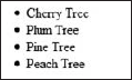
<ul>
    <li>Cherry Tree</li>
    <li>Plum Tree</li>
    <li>Pine Tree</li>
    <li>Peach Tree</li>
</ul>
Definition lists should be used to list definitions as in Figure 9-26.
Figure 9-26. Definition list
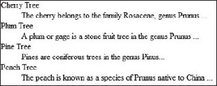
<dl>
        <dt>Cherry Tree</dt>
        <dd>The cherry belongs to the family Rosaceae, genus Prunus ...</dd>

        <dt>Plum Tree</dt>
        <dd>A plum or gage is a stone fruit tree in the genus Prunus ...</dd>

        <dt>Pine Tree</dt>
        <dd>Pines are coniferous trees in the genus Pinus...</dd>

        <dt>Peach Tree</dt>
        <dd>The peach is known as a species of Prunus native to China ...</dd>
</dl>
It takes work and discipline to break away from using tables as layout tools, but it is necessary to remove accessibility barriers from your web application.
9.4.6. Working with Media
The accessibility standards surrounding media elements such as video and audio are very straightforward but these rules are the most time-consuming and difficult for developers to adhere to. One of the most important things to remember when creating audible content is to create content that is very clear with minimal background noise.
9.4.6.1. Controls
The simplest of these rules is when video or audio is added to a web application, that media elements should not "auto play." Allowing elements to "auto play" could create crosstalk when a user is using a screen reader and this can be very frustrating. Not only should the user be in control of when the media element starts, but they should also have the ability to stop them after they have been started.
9.4.6.2. Captioning
Simply put, captions are a text representation of the spoken word. Captions give users with auditory disabilities another access method to video. There are two types of captions methods. Closed Captioning allows the captions to be turned off, whereas Open Captioning are captions that are not able to be turned off. Accessibility standards state that captions should be the following:
Synchronized. The text should appear at the same time as the audio equivalent.
Equivalent. The content of the text should be the same as the spoken word.
Accessible. The caption's content should be accessible and available to those who need it.
Developers who do not have a background in audio/video and have added captioning to a video will tell you it can be a very time-consuming and painful process. Figure 9-27 and 9-28 shows what captions on a video may look like.
9.4.6.3. Audio Descriptions
Audio descriptions are used to provide additional information about the visualization onscreen. Audio descriptions allow the video to be accessible to a person with a visual disability.
Audio descriptions describe anything relevant that can only be seen visually. In the following example, the author of the video feels that it's important to stress what the people in the video are wearing. This could be because of references made later in the video to where the interview is being held.
Corey Haines, wearing a brown Web Ascender shirt, sits to the left of Jeff McWherter, who is also wearing a Web Ascender shirt.
Figure 9-27. Example of open captions

Corey: "Alright here I am at Web Ascender with Jeff McWherter who I would very much like to thank because without him I don't think I would have made it up here to Michigan..."
Jeff: "Oh well, thank you for being here."
Figure 9-28. Video for which the audio description was applied

9.4.7. Working with JavaScript
In recent years the topic of JavaScript in accessible web applications has become more popular. AJAX (Asynchronous JavaScript and XML) has been the latest development trend, with many developers hopping on the bandwagon to learn how to incorporate these technologies into their applications.
Accessibility standards state that a web page should be fully functional with JavaScript turned off. This definition often confuses developers as to what exactly fully functional means?
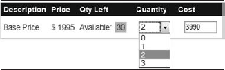
Just because a web application contains JavaScript, it does not necessarily render the application inaccessible (it depends on what the JavaScript is accomplishing). Much of the JavaScript that is added to web applications are used to make the navigation or form data entry easier. In most situation pages that use this JavaScript, it will be accessible. The example in Figure 9-29 collapses regions to make it easier to navigate the information. If JavaScript is turned off, all the regions would show, making this web application accessible when JavaScript is turned off.
Where JavaScript becomes an issue is when the functionality of a web application is dependent on the scripts. Figure 9-30 is an example where users are not able to enter the total cost because it's calculated. Depending on how the server side of this application was coded, if the server did not perform the calculation, then the cost would always be zero. Thus, the web application would not be accessible when JavaScript is turned off.
Figure 9-29. Collapsible regions with JavaScript

Figure 9-30. JavaScript that a web application's functionality is dependent on
A common question that I receive when speaking about accessibility is "how can my web application have rich interfaces and not require JavaScript?" The answer is to provide interactions in your web applications that work without JavaScript and still create the scripts for people who can use them; just make sure the functionality of your web application doesn't need to rely on these scripts. Many times the functionality that causes accessibility issues with JavaScript can be duplicated with server-side code, to make the web application accessible.
9.4.7.1. Things to Keep in Mind
There are some things that you should keep in mind, however.
Web applications should be fully navigable by using a keyboard.
Web applications should not rely on the presence of specific input devices (such as a mouse).
When using JavaScript event handlers, use ones that are device-independent.
Screen readers generally don't refresh the view of a page when an update occurs, so AJAX transactions may go unnoticed.
9.4.8. Other Accessibility Elements
The elements that have been covered so far are considered to be the "major" elements in developing accessible web applications, but there are more elements that need to be used to create fully accessible web applications.
9.4.8.1. Abbreviations and Acronyms
Abbreviations and acronyms can cause screen issues. For instance, when a screen reader encounters the term HTML it would sound similar to "hitml." By using the abbr and acronym tag, screen readers will read the title attribute.
<abbr title="Michigan>MI</abbr>
<abbr title="Winking Smile">;)</abbr>
<abbr title="Web Ascender">WA</abbr>

<acronym title="HyperText Markup Language">HTML</acronym>
<acronym title="H T M L">HTML</acronym>
9.4.8.2. User-Preferred Text Size
Developers should think ahead and think about how their web applications will look with larger font sizes. Web applications should use the font size set by the user, normally the font size stored by the browser.
Some web applications include custom-created controls to increase the font size of the page, similar to the images shown in Figure 9-31. These controls are useful to users that have low vision and may be new to the web but are unfamiliar with changing the font size via the browser.
Figure 9-31. Custom controls to increase the font size on a web application
9.4.8.3. Simple Interfaces
Simplifying web interfaces is one of the best things that can be done for all the users of a web application. As web applications grow older in times, content is added over and over again, often making the interface of the application difficult to use.
9.4.8.4. Frames
Frames are starting to become a thing of the past, but there are still some web applications that take advantage of this HTML technique. Different screen readers handle frames differently; some readers will announce the frameset, read the content of the first frame, and then move to the next frameset. Other screen readers will announce each frameset and then select which frameset to navigate to. In both situations it is imperative that all framesets have a good description of their purpose.
9.4.8.5. Navigation
Navigation can cause accessibility issues to some users. Links on web pages should be clearly indicated and labeled correctly. Links should clearly be links, using a contrasting color or possibly making the font bold or underlined. I am fairly positive that I am not the only one who has inherited a web application from someone where the navigation links were labeled incorrectly.
Developers have a tendency to use "Click here" as link text. Generally, navigation links that have the word "click" in them should be phrased differently. Screen readers will append the words "HTML Link" to the link text, therefore multiple links with the phrase "Click here" will become confusing.
Skip links or skip navigation is a concept that allows users who cannot use a pointer device such as a mouse to skip past complex or frequently appearing navigation elements.
<a href='#MainContent'>Skip to Content</a>

<ul>
    <li><a href="∼/NavigationLink1.aspx">Navigation Link One</a></li>
    <li><a href="∼/NavigationLink2.aspx">Navigation Link Two</a></li>
    <li><a href="∼/NavigationLink3.aspx">Navigation Link Three</a></li>
    <li><a href="∼/NavigationLink4.aspx">Navigation Link Four</a></li>
    <li><a href="∼/NavigationLink5.aspx">Navigation Link Five</a></li>
    <li><a href="∼/NavigationLink6.aspx">Navigation Link Six</a></li>
</ul>

<a name='MainContent' />
<div>
    Lots of text about the main content goes here
</div>
9.4.8.6. CAPTCHA
Completely Automated Public Turing Test to Tell Computers and Humans Apart, is a technique used when collecting form data on web applications to try to differentiate between a person and an application trying to automatically fill out a form.
CAPTCHAs are images that are very hard to read and pose issues with visibility disorders. Although some CAPTCHA techniques incorporate an audio alternative, these too are still very hard to understand.
Providing both the audio and visual CAPTCHA are acceptable, but also providing a link to request for help nearby is useful.
9.4.8.7. Timeouts
Different users require different amounts of time when navigating and filling out form data on your web applications. Any timeouts you may have, such as logging a user out after a certain amount of time, should have the ability to allow the user to request more time. This can easily be accomplished with a dialog that appears before the timeout period asking if the user they would like more time. If the user does not respond then the timeout task would be completed.