
Chapter 7
Implementing Your Designs

The sixth and final step in the design thinking process brings everything together into an end-product solution. By this point, you understand more about your audience and the problem to solve, have explored what you could build to solve that problem, and begun to materialize that solution through testing it. Now, you must implement your designs.
Implementation is an art. To implement, you must be a master communicator. How do you clearly communicate your ideas to others? How do you learn the working styles of the people you need to collaborate with to build your designs? How can you express your ideas so that they are implemented correctly? It’s not enough to blindly deliver specifications to others and expect them to advocate for and build the designs; you must first think about how those people will approach creating the product.
Implementation is also a science. By following certain procedures while implementing, you can set up your designs so they can scale. You are expressing knowledge—in this case, the knowledge that allows someone to re-create your vision at scale. This step requires precision—exact specifications need to be delivered that cover all use cases for your product, not just a single flow. To do this, you rely on systems to share your designs—not just systems that express all these use cases, but systems that express the components that the designs are built upon.
By using art and science, you can bring the project together, share it with others, and implement your solution.
Where Are You in the Design Thinking Process?
As you leave the test phase of the design thinking process, you have tried your ideas with users in order to understand how the designs function. You should know whether users are able to use the designs, and whether the product could solve the user’s problems. Ideally, you have a good sense of what works, what needs to be revised, and what needs to be removed to create the product you want to build. Given all this knowledge, you’re ready for the last step in the design thinking process—implement (FIGURE 7.1).

FIGURE 7.1 The NN/g design thinking model. The sixth step of the model is implement. It’s the last step in the model, where you finally launch the designs that you’ve created to your users.
During the implement step of the process, you are working toward completing your designs. You’ve spent the rest of the design thinking process understanding what the problems are and exploring how to solve them. Now, you are tasked with making the solution a reality.
The implement step should have a solid foundation for the product. You should have a system that allows you to design easily and consistently. You should have a way for your designs to be built by developers. Finally, you should have a framework for future enhancements. These systems will allow your team to build the product and deliver it at scale—not just for a few usability tests, but for every person who wants to use the product.
How can you be sure the product will meet all the needs of the users? Until this point, you have built for one (or perhaps several) flows, depending on your tests. To scale, you need to think of all the use cases for the product. One way for you to structure the designs and deliver a solution that works for users’ needs is to take inventory and track all use cases via user stories.
Implement
Now that you have a completed, validated design approach, you need to build the product. This is the last step of the design thinking process that will get you across the finish line—delivering the product solution so the team can implement it.
How do you deliver your designs, though? What can you do to ensure your design intent is honored across the product? What do you hand off, and how do you do so? During implementation, you leverage statements about your users’ needs, diagrams that communicate how users move through the product, visual guidelines for building the product, and documentation that explains how all the pieces fit together.
To start, let’s talk about your users first—through a process artifact called user stories.
User Stories
You know what you’re building. You know the problem you’re trying to solve, the designs that solve that problem, and the people you are solving the problem for. To implement those designs, however, you need to get a lot more specific.
Until this point, a lot of your work has been about the vision and direction of the solution. That vision is important, and something that should remain the North Star of the solution. To accomplish that vision, you need to know the steps you must take to get there. That’s where user stories come in—the individual tasks users take within a product to accomplish their goals.
What Is a User Story?
To ensure all the features and functionalities that users need are captured in the requirements of a product, product teams often create user stories. A user story is an informal, general explanation of a software feature written from the perspective of the end user. Essentially, it describes the solution from the user’s point of view.
Imagine you were working on a financial retirement platform. To accomplish users’ goals, you may write user stories like the ones in FIGURE 7.2 to describe core needs users have and tie them to features you believe will solve them.
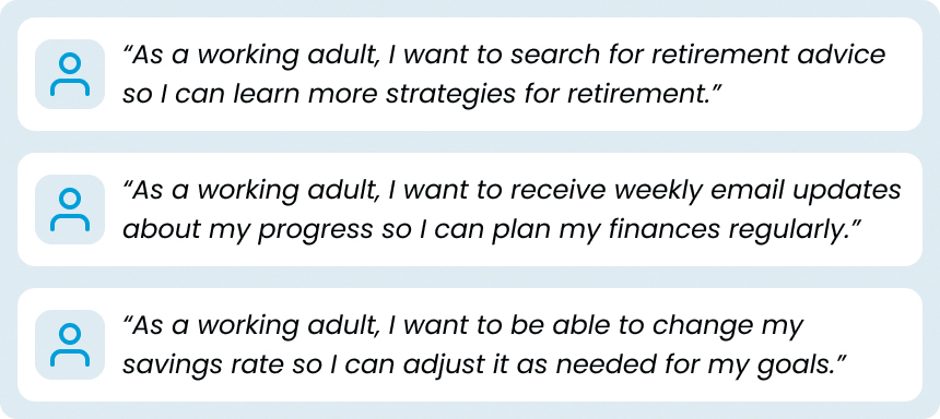
FIGURE 7.2 Several user stories for a financial services product.
Let’s say that in your design thinking process, you saw that users wanted to search for financial information to plan for retirement. Maybe you learned this in a user interview, it came up during a usability test, or it was a feature from another product. Regardless of how you discovered this information, you’ve decided that you want to put this functionality in your product.
To communicate the need and the desired functionality for your product, you could create a statement that captures what you aim to make, who you aim to make it for, and why. That statement would look something like the one in FIGURE 7.3.

FIGURE 7.3 A user story centered on search functionality for a product.
This statement helps align the entire team around your vision. You know who you are designing for—a target user. You know what they want—the ability to search for advice. Finally, you know why they want it—to better prepare for retirement.
By writing these statements, you can better empathize with your users. Additionally, you can better understand the user’s perspective while creating your product for them.
To write a user story, you can use the formula in FIGURE 7.4.
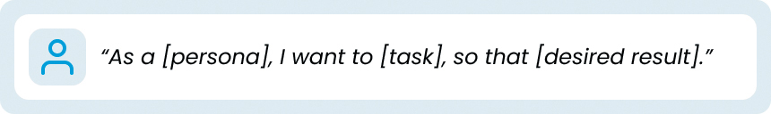
FIGURE 7.4 The formula for writing user stories.
As a [persona]…
This part of the formula comes from the perspective of the user and frames the solution through their eyes. It is crucial for user stories—you are writing the product requirements through the lens of the user. Leveraging your user research and referencing the persona or user you defined earlier in the design thinking process keeps you grounded in the user’s needs. You can make statements like “would Jane/John ask for this feature?” or “what would Jane/John want to do here?”
…I want to [task]…
This next part of the formula outlines the high-level description of the solution. It explains, at a glance, the specific thing you will focus on for your persona. Generally, this is the feature or functionality you are looking to create to address the problem to solve.
…so that [desired result].
This final part of the formula is the problem to solve, the issue that you encountered in your research.
Putting all these elements together, you get a short, specific, and goal-oriented statement from the user’s point of view. This statement explains the work to be done in a clear, concise way while also allowing you to be flexible with designing the implementation of that solution.
Author’s Note
Usually, user stories are written by product managers looking to build the product by combining all the disciplines involved in its creation—design, engineering, editorial, and more. While designers don’t normally write user stories, they absolutely influence them, either directly, by advocating for the user, or indirectly, by improving the business’s understanding of the user with design thinking.
How Do You Create User Stories?
Using the formula, you can create all the user stories you need for your product.
First, you need to understand the goals of your personas. What do they want? What do they need? Ideally, you figured this out during the empathize and define phases of the design thinking process—though some of this may have come out in testing as well.
Let’s say that one of the high-level goals of our users is to retire (FIGURE 7.5). They are coming to your financial platform to save money for retirement. You can then break down the various ways users have communicated why they want to achieve this goal, or how.

FIGURE 7.5 A user’s goal.
The goal can become a larger initiative that helps frame the specific things you will do to help users accomplish the larger goal with the product. Often referred to as an “epic,” you can get a bit more specific (FIGURE 7.6) about what you will do to support users’ larger goals.

FIGURE 7.6 An epic, which is a collection of user stories based on users’ goals.
For this financial product, you could have an epic that allows users to grow their retirement savings using a retirement account through your service. This would accomplish the main goal—be prepared to retire.
To accomplish this epic, you can break it down even further (FIGURE 7.7). This epic is ambitious and contains many smaller parts. How do you enable users to grow their savings? Luckily, you can support this epic with a bunch of smaller user stories.
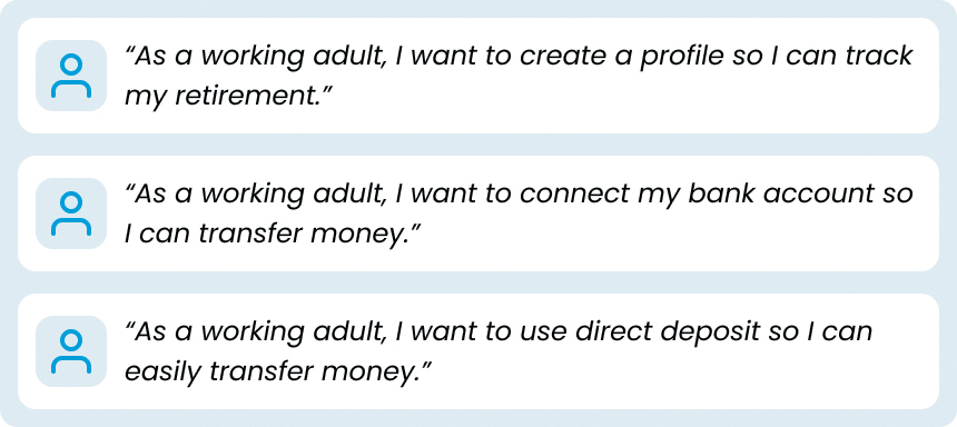
FIGURE 7.7 Several user stories that relate to users’ goal of retirement.
Using the framework for writing user stories, you can create a series of short, specific, actionable initiatives that support the epic and, in turn, support the user’s original goal—be prepared to retire. For your financial product, you need to allow users to create an account, connect a bank account, and even support automatic payments into that account, all in the effort of having them be prepared for retirement.
Putting it all together, it could look like FIGURE 7.8.
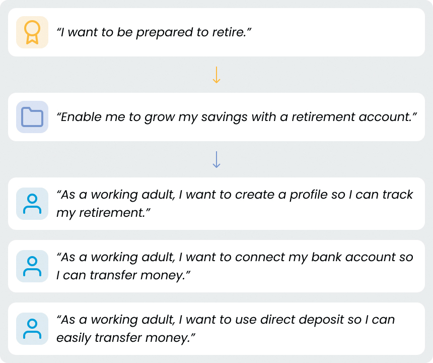
FIGURE 7.8 A user’s goal, which leads to an initiative (an epic) based on several user stories that will allow users to accomplish their goal with your product.
Each element of the user’s goals supports the next. The first element, the high-level goal, or initiative, is the core user need. Next, the specific product feature, or epic, is an aspect of that user’s need. Finally, the functionalities of that feature, or user stories, are the pieces you need to create in order to support that aspect of the user’s needs.
This is how user stories are constructed on product teams. You start with an initiative, usually driven by some market opportunity the business recognizes (via user research, competitive analysis, or some other method). From that initiative, you embark on various epics that would satisfy that initiative. Each epic has smaller components, called user stories, that allow you to accomplish the goals of that epic (and thus the initiative). It generally ends up looking like FIGURE 7.9.
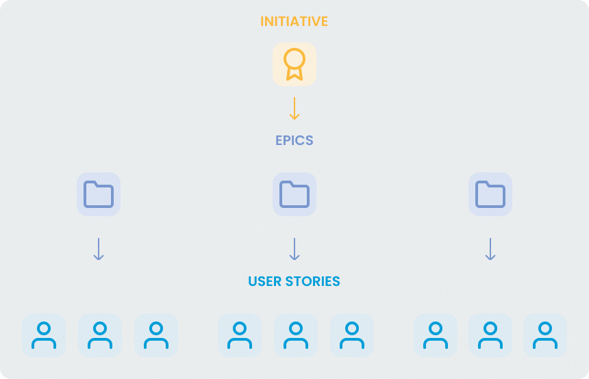
FIGURE 7.9 A goal, or initiative, supported by several epics, which are composed of many user stories.
In this way, you can organize all your ideas for the product into an actionable plan to build it.
How Do You Prioritize User Stories?
You can use user stories to structure all the work to be done for your product. Those stories can roll into epics, those epics into initiatives. But as a business how do you know what initiatives to pursue in the first place? Which epics should you follow? What user stories are most important?
You could use a few methods to prioritize your user stories:
MoSCoW: Standing for Must, Should, Could, and Won’t, you can use this technique to categorize each user story by group.
Priority: Using a system like High, Medium, and Low you can assign a weight to each story to emphasize the importance of each story.
Effort: Using a system like Extra Small, Small, Medium, Large, and Extra Large (as if you were talking about T-shirt sizes), you can assign a number of resources to each story to help prioritize.
Sometimes, these prioritization methods can be combined. For example, a user story may be something that Must (MoSCoW) be built for the product, and it may be Large (Effort). In that case, it would be something the team would start on sooner, since it’s a resource-intensive necessity for the product and needs to be built at some point, so starting it sooner would make sense.
Usually, user stories are written and prioritized when requirements are scoped out for a project to be developed—so often, they come when it’s time to deliver designs to developers. This is because this process helps efficiently build products and ensures no functionality is missing from a feature.
User Stories Give Implementation Structure
User stories help you make sure you’re building the right features and functionalities for your users. They allow you to establish a user’s goals, create initiatives that support those goals, and determine mechanics in the product that facilitate those initiatives. User stories allow you to cover all use cases, push for the right features, and keep the user front and center as you implement your designs.
It can be challenging to know how to write user stories, which ones the business wants to prioritize, and what’s most important for your users. Thankfully, as designers, you can rely on other team members to help you create and prioritize your stories. Usually, defining these user stories and deciding what epics and initiatives to focus on is a team effort, with Product leading that effort. As a designer, however, it’s important to understand how this all plays out, so you can do what you do best—advocate for the users in those stories.
Let’s Do It!
Let’s make some user stories for our solo traveler project. Be sure to use the formula in FIGURE 7.10 to frame your thinking.
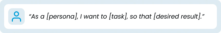
FIGURE 7.10 The formula for writing user stories.
Author’s Note
Refer to the “User Stories” section in the appendix for examples to compare your user story with.
I won’t be prescriptive about how you visualize this—that’s up to you. You could use Microsoft Excel, Word, Figma, or even a piece of paper if that helps you think through the logic of each task your users need to accomplish in your solution.
Don’t worry about making epics or initiatives at this point. You could go the extra mile and include those as well if you’d like. Alternatively, it could be a good thought exercise to start from epics or initiatives and filter down to the stories you want to include. I’ll leave that up to you as well.
Flow Charts
As you move through the implement step of the design thinking process, you will need to explain the logic of your product to your partners so that you can build the designs correctly. You’ll need to map out how a user moves through the product—the steps they need to take so that they can complete their tasks. Not only will you need the happy path—the path users take to accomplish their goals most commonly and easily—you will also need the unhappy paths as well—the paths where additional logic may be needed, like an error form if a user makes an incorrect selection, or a subscription process for users who aren’t logged in to the product.
Some of this may sound familiar based on the work you did in Chapter 5, “Prototyping Solutions,” regarding task flows. This is because task flows are a subset of a broader class of design deliverable that we’ll discuss next—flow charts.
What Is a Flow Chart?
When designing an experience for users, you must create various ways those users will move through that experience. You must think about how they onboard to the product, move through specific features, and complete the tasks that they came to the product to perform. To support this thinking, you can create flow charts to visualize the paths users take as they move through the product.
Looking at the flow chart in FIGURE 7.11, you could imagine the user (represented by the circle) moving through the flow from the left side of the diagram to the right side. As they move through the flow, they reach a choice (represented by the diamond in the middle of the diagram) and must decide which way to go through the experience. They eventually reach the end of the task, represented by the oval on the right of the diagram. A flow chart helps show how someone moves through any process, from the real world to digital.
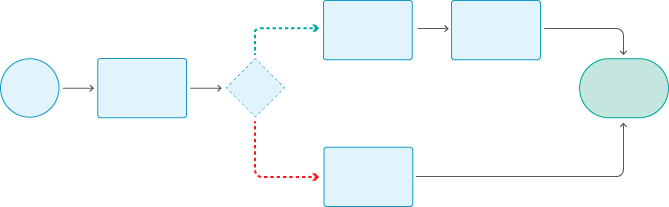
FIGURE 7.11 A high-level overview of a flow chart, which is a series of steps a user takes through an experience.
When thinking through ideas and explaining how a product functions, you can use several types of flow charts to visualize how a user moves through the product.
You’ll hear people refer to flow charts as task flows, user flows, wireflows, flow diagrams, and more. As with many other concepts in the industry, the terms are commonly used interchangeably. I offer these brief definitions to help describe the nuance between different types of flow charts—some flow charts are less specific, while others are quite detailed.
A task flow keeps the flow at a high level.
A user flow explores various paths a user could experience depending on their choices.
A wireflow ties your flows to your designs.
Each can have different levels of fidelity and description as well. The names of your artifacts are important, so that you can define a common language among the design thinking process with your peers. However, don’t let the names of the deliverables get in the way of what’s more important—the information you are trying to communicate with your artifacts.
Let’s take a closer look at each type of flow chart.
What Is a Task Flow?
We discussed task flows in Chapter 5. As a reminder, and in context with other types of flow charts, a task flow is the most abstract version of a flow chart. It is a linear depiction of a single, specific task performed by the user (FIGURE 7.12).
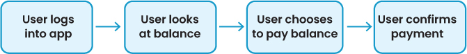
FIGURE 7.12 A simple task flow.
Essentially, a task flow is the high-level steps a person would take to get to a specific goal. A task flow is simple, sequential, and non-branching—just the single series of steps from point A to point B.
FIGURE 7.13 is a task flow for a user to discover, explore, and sign up for online cooking classes. It depicts, at a high level, how a user would go from landing on a homepage to subscribing to the product. There’s a clear, linear path the user would take to accomplish this goal—they would land on the homepage, interact with the premium content for free, and at the end of that interaction, they would be prompted to subscribe. When they do, they land back on the content page, ready to consume more content.

FIGURE 7.13 A more detailed task flow.
Task flows are an excellent place to start when considering how your product functions. They are a great way to organize your thoughts and identify the high-level steps your user will take as they move through your product. When beginning to ideate a new feature, or trying to figure out how all your designs could logically flow together, it’s a good idea to make a few task flows to flesh out your ideas and sequence how your product works.
Task flows are good to have around when you’re ready to deliver the product as well, because they set the stage for more detailed flow charts that are useful for developers—user flows.
What Is a User Flow?
A user flow is a more detailed task flow (FIGURE 7.14). It includes all the ways a user can move through a process to complete a task. If a task flow outlines the high-level steps a user takes to get from point A to point B, then a user flow outlines each possible step a user can take as they move from point A to point B.

FIGURE 7.14 A task flow that depicts the high-level steps a user takes to buy a MetroCard.
FIGURE 7.15 is a user flow from the New York City subway system that outlines the process of buying a MetroCard to pay for the subway. Purchasing a MetroCard requires a lot of inputs from users. A task flow would show the happy path a user would take through this process—showing the single high-level steps required to complete this task.1

FIGURE 7.15 A user flow for buying a MetroCard.
1 Link to image is this: https://en.wikipedia.org/wiki/Flow_process_chart#/media/File:Subway_Fare_Card_Machine_Flow_Process_Chart.jpg
Unlike with a task flow, you are looking at multiple possibilities in the user flow. What if the user’s card isn’t valid? What if they insert the wrong amount of money? What if you need to give them change because they put in too much money? There are so many alternative cases you need to consider when designing a robust, fully functional system. That’s where user flows can help you find each of the states you need to design for.
FIGURE 7.16 is a flow chart I created for a solo traveler project (like the one in this book!). Users can send “pings” to other users nearby to communicate and meet up for various reasons. One of the core use cases I considered was the ability to meet up to share a cab.

FIGURE 7.16 A user flow for a solo traveler app.
This user flow shows all the logic within that process, and how the system will respond as a result. For example, a user could send a “ping” to meet up, and someone might respond. Or it’s possible no one receives that ping because no one is around. Or perhaps people see it, but no one chooses to respond to it. Each of these logical possibilities is covered in the user flow in Figure 7.16. That’s the intent of a user flow—to cover the entire system, not just an individual piece of it.
User flows allow you to explore all the logical possibilities in a process. You must think of each possible scenario and design for it—this makes sure you cover all use cases and avoid any dead ends in your product when users end up using them.
Good user flows include a key, or legend (FIGURE 7.17), that explains what each symbol represents in the flow.

FIGURE 7.17 The structure of a user flow, which includes a legend that explains what each symbol in the flow means.
You need a legend because if you don’t have one, it’s a lot harder to follow along. With all the branching logic, it’s easy to lose your place or the part of the process you are in, and having symbols helps reduce the cognitive load of whoever’s reading the flow.
What Is a Wireflow?
If you want to take the concept of a user flow one step further, you can mock up each step in the process and show exactly what the user sees in the flow. Referred to as a wireflow, it allows you to show the specific, screen-level instances of how a user would complete a task (FIGURE 7.18).
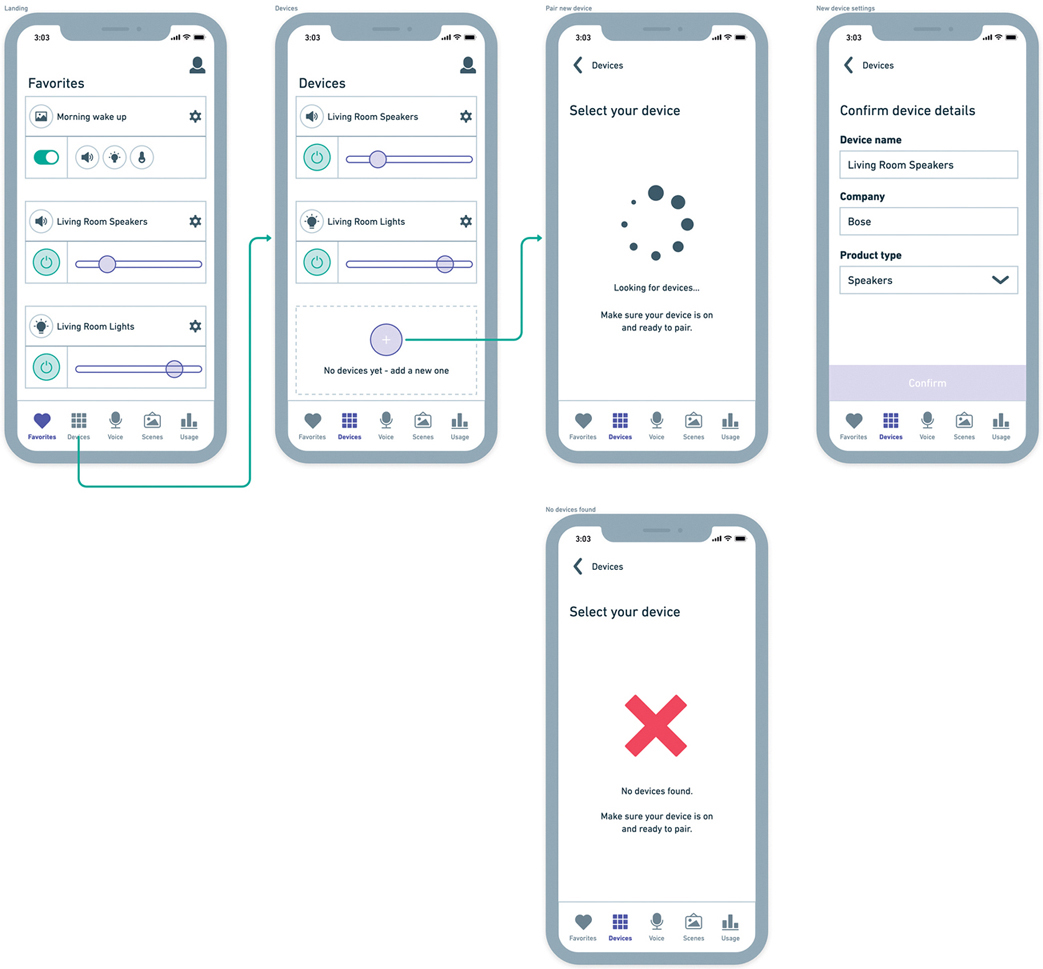
FIGURE 7.18 A wireflow for an app that controls smart devices.
Wireflows build on user flows. You take the same logic from a user flow, except instead of symbols, you show the screens a user would interact with, the places where the user would interact on those screens, and where those interactions lead. Additionally, you would use annotations to explain what’s happening at that moment in the wireflow, to provide additional context to what the user’s currently doing.
In Figure 7.18, you can see a wireflow for a smart device app. In it, you can navigate to your devices page, add a new device, and try to pair it to your app. This wireflow represents a slice of a user flow—you can see the happy path where the app can find the user’s new device, and the “unhappy path” where the app fails to find the user’s new device.
Note that wireflows can exist for any level of fidelity—you can use them during ideation as you work in low or mid fidelity, or you can use them during implementation of your ideas as you work in high fidelity.
Wireflows are excellent at walking through a task, step by step, to illustrate the workflow. Visualizing your ideas in this way helps you see, screen by screen, what a user will experience when you build it, and presents the user journey in the context of specific screens.
Which Flow Chart Should You Use?
If you’re unsure which version of a flow chart to use in your projects, ask yourself what would be helpful to visualize to organize your thoughts and align the team.
If you’re early in the process, use a task flow to lay out the general, high-level steps. This will let you organize a sequential, logical way for users to go through your product. This is helpful to share with the team during the planning stage, to make sure everyone is on the same page about their vision for the product.
If you’re headed to development and you want to make sure you’ve covered all the possible states in your product, then make a user flow. This will let you uncover edge cases and ensure you don’t miss error states, empty states, or anything else that a user may experience in your product. Share these user flows with your team to make sure that you’re not missing any states and that developers have a good understanding of each state they need to account for.
If you’re looking to present your ideas to the team as a complete design, use a wireflow. This will let you walk through the product as if you were the user and will show everyone what each screen will look like so that the team can align on the execution of the user experience. This could be early, such as if you are iterating for usability testing, or later, such as if you are pitching your designs to stakeholders for approval.
No matter the stage of the design thinking process, flow charts are excellent tools for organizing your thoughts, building alignment, and making sure you cover all your bases as you implement your designs.
Flow Charts Facilitate Implementation
Flow charts help you take the product across the finish line. Although they were useful earlier on in the prototype step of the design thinking process to think of your flow for users to test, they return here for a different purpose: to capture all the logic in your product. Flow charts allow you to think of all the edge cases in the product. What happens when the user isn’t signed in, but needs to in order to access their shopping cart? Or if a user submits a request for a driver in a rideshare product, but no one responds? You need to think through all these cases to have a successful user experience for your product, and flow charts allow you to visualize and represent those possibilities.
Let’s Do It!
Let’s make a flow chart for the solo traveler project. You have three options to choose from:
Task flow
User flow
Wireflow
Which should you choose? Well, if you’ve been following along with the exercises up to this point, you’ve already experienced making two of these for your project. In the “Task Flows” section of Chapter 5, I asked you to make a task flow. In the “Prototyping” section of Chapter 5, I asked you to visualize and connect that task flow, which is essentially a wireflow.
Author’s Note
Refer to the “User Flow” section in the appendix for examples to compare your user flow with.
Let’s experience what it’s like to make a user flow—all the logic needed to implement a solution. You can start fresh with a new flow or use the task flow/wireflow from Chapter 5 as a starting point for your user flow. Remember that you’ll want to think about all the steps and logic required to implement your designs. Are there error states? Extra steps not fully captured by the flows you’ve already created? Conditional logic, such as, a user being a free or premium customer? Think about all the possibilities and visualize them in a user flow—you’ll need to account for those when the product is created.
Style Guides
When your testing is complete and you’re ready to start implementing the product, you will need to make sure your branding and visual guidelines are ready as well. You may have some high-fidelity designs that you’ve tested already, or you may still be in a lower-level fidelity and not fully sure what your product looks like visually. No matter the case, it can be beneficial to create some high-level view of what your product will look like.
To accomplish this, you can make a quick guide, called a style guide, that globally represents your product’s visual design.
What Is a Style Guide?
A style guide is a short document (FIGURE 7.19) that shows branding and visual design decisions such as typography, color, icons, photography, and more to help give a sense of what the product feels like.

FIGURE 7.19 A style guide for a car rental app.
Documents like this help show others the vision of what you are creating. You can use them to pitch a direction for your product, get buy-in or approval from stakeholders, or even use it as a feedback document to make sure you’re on the right track.
Style guides help drive UI decisions as well, because they combine brand elements with UI elements, showing how the branding would apply to the product.
The result feels like a mix between a moodboard and a UI sheet. You have brand elements, like photography and color, which would be used in a moodboard, but you also have UI elements to be used in the product, like buttons, icons, and cards.
What Goes into a Style Guide?
Style guides can vary depending on the needs of the product you are working on. Generally, there are common elements across products that can be valuable to share at a high level using style guides.
Imagery
Imagery helps to set the tone of the product. It can include images you intend to use in the product, images that inspired you initially during the product’s creation, or images that convey the feeling of the product. Essentially, these are the things that make the product feel a certain way and are related to it somehow (FIGURE 7.20).

FIGURE 7.20 Images are often used in a style guide to convey the tone of the product.
For this car rental app, some of our brand values include luxury, movement, and travel. These images help to convey those principles and set the tone for the rest of the style guide.
Typography
The typography section (FIGURE 7.21) of a style guide is used to communicate the typefaces, fonts, sizes, and use cases of the text in the product. Best practice is to name the typeface, then show examples of its font weights and how those could be applied to the product.
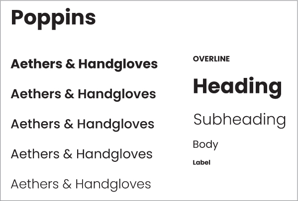
FIGURE 7.21 Typography is commonly included in a style guide to show the text used to communicate with users.
For the car rental app, we are using Poppins, a geometric sans serif font. The design would benefit from something that feels wider, like a car, and something that is round, like a car’s wheels. Poppins is a popular, common font to use in design, and feels at home in this product.
Color Palette
The style guides should also include the colors (FIGURE 7.22) that you intend to use in the product. This is more than just the brand’s colors—it should also include some UI states, like active or inactive colors, in addition to system statuses, like success, warning, or error (commonly green, yellow, and red, respectively).
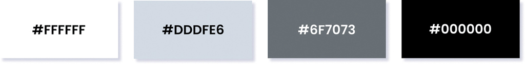
FIGURE 7.22 Color values for a style guide. Among other reasons, color is often used in style guides to make sure assets are created using the same color values.
For the car app’s color section, there is the background color (white), several grays to indicate UI status (like inactive or unselected), and the primary color, black. Black in this app is an indicator of luxury—the app is intentionally branded toward a higher-end consumer who wants to rent a luxury car for a trip. Using this color scheme carries that feeling throughout the product.
Iconography
As you move on to iconography, you start to incorporate UI elements into the style guide. Icons (FIGURE 7.23) help convey feeling in the product, and the choices you make with them greatly influence the user’s experience.

FIGURE 7.23 Iconography used in a style guide. Generally, a style guide contains a link to download icons so that everyone can access the same resources.
Here, the icons are a lightweight-stroke icon set called Feather Icons. They are a set of open-source icons that are customizable and applicable to many use cases and industries. They are excellent for this application because they are rounded like the typography and they feel luxurious, which is the intended feeling when trying to influence users to think about cars.
UI Components
UI components (FIGURE 7.24) help show how all the other design decisions outlined in the style guide come together to form in-product elements that users can interact with. Showing the UI components allows others to imagine what it would be like to use the product.
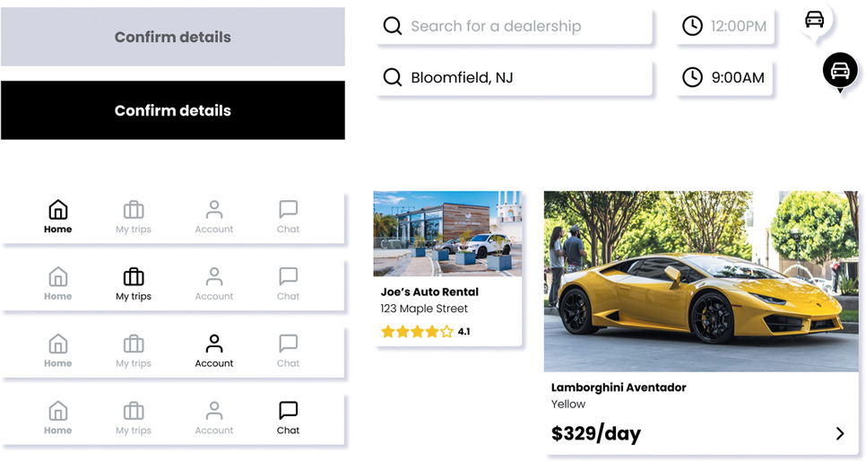
FIGURE 7.24 While not all style guides include UI components, it’s helpful for a designer to communicate the elements of a design that are commonly repeated in the product, such as buttons, search fields, and cards.
For the car rental app, there are components like buttons, text fields, navigation bars, and cards. These will be the most common and crucial elements in the product to navigate and interact with. Users will have to enter a lot of information in text fields, they will browse a lot of cards to look at car dealerships and cars they can rent, and they will need to move around the app using the app’s navigation bar at the bottom of the phone.
Mockups
Including mockups in your style guides can be helpful (if you have them). These tie everything together and show how the UI components shared previously play out when combined (FIGURE 7.25).
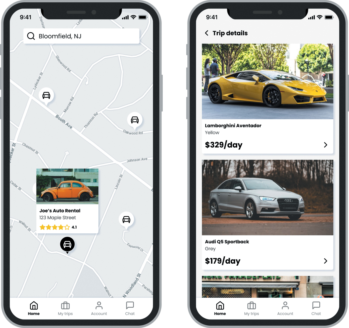
FIGURE 7.25 Mockups for a style guide. Mockups are rare, but they’re helpful for those who aren’t familiar with how all the elements combine in the product.
For the car app, the mockups show how the navigation, cards, and text fields combine into the user’s experience with the product. Imagine clicking a card for a car dealership (on the left) and seeing the cars available from that dealership (on the right).
This is just one way a style guide can play out. You may want to include different elements in your style guide, such as spacing or grid lines, or UI components that are specific to your product, like a graph. Use this framework as a guideline for creating a style guide for your product.
Style Guides Portray Your Brand
Although you may be tempted to rely on the product itself to communicate the visual design decisions that have been made, the product can only go so far. As you add features and functionalities to the product, it is easier for your visual design to become out of sync. Deviations in the color, size, and shape of your UI components is a common side effect of not having a style guide to point to for basic design decisions. Having a high-level view of all the visual design logic you apply to your product is a crucial component to scaling your designs and implementing your product.
Let’s Do It!
Let’s create a style guide for the solo traveler app. Create a one-page document that shows, at a high level, the visual-design decisions for your product.
Your style guide should include the following information:
Color
Typography
Iconography
Imagery (if applicable)
Author’s Note
Refer to the “Style Guides” section in the appendix for examples to compare your style guide with.
Your guide could also include UI components, like a bottom app bar, header, cards, buttons, or anything else that is a consistent and common pattern in your product. If you’d like to show these in context, like with a mockup or two, all the better.
Practice It!
If you like this layout and want to apply it to your project, feel free to use the following template to get started.
https://tinyurl.com/asuxd-styleguide-template
I also recommend you search Figma’s Community section for style guide templates, so you can see different options for how to lay out your style guide.
Design Systems
Style guides allow you to define the visual identity of your product. They communicate, at a high level, all the broad aesthetic decisions you make around color, typography, imagery, iconography, and even some UI components. Style guides affect more than the product—they extend to branding, marketing materials, social media presence, and more.
A style guide’s effect goes wide across the product and the channels that promote the product. However, its breadth comes at the sacrifice of its depth. A style guide cannot capture all the applications of visual design to a product. You may know your typography from a style guide, but do you know how it is used in the product? At what font weight, size, or line height? You may know your colors, but do you know when to apply each one, where, and how?
That’s the benefit of a design system. Where a style guide broadly captures the visual identity of a product, a design system provides the documentation and pieces that allow the product to be implemented consistently and at scale.
Designing for Consistency and Scalability
As you move through implementing your designs and creating a product, your visual design should stay consistent throughout the user’s experience. This is a key element of a good user experience—you are creating patterns and establishing a visual language with your design choices. The colors you use indicate functionality, like interactive text or disabled states. The shapes and shadows you use for buttons suggest brand values and establish aesthetics. Ideally, you stay internally consistent with those choices—for example, if you decide the buttons are blue in one part of your product, then they should remain that same shade of blue throughout your product.
Author’s Note
This inconsistency of design happened on a product I worked on—each designer used a different style for the buttons in the product. As a result, buttons had different colors, different shapes, and different sizes. It led to a worse user experience and added cognitive load for the user because we were internally inconsistent—all because we didn’t have a system to design by.
This matters for the implement step of the design thinking process. When you build your designs, you need a roadmap explaining your visual design choices. Ideally, this is baked into each screen you produce and share with developers. Sometimes, however, you lose consistency in your design deliverables.
Perhaps you select a slightly different shade of blue for your buttons over the course of a flow. Maybe you increase the font weight here or there, for things to look nicer. Or perhaps you change the size of text, and in one section of your product your headings are larger than the headings of another section. It is very easy to lose consistency as you scale, especially if you are moving fast or among different teams.
If you design without a system, then over time, it becomes harder and harder to remain consistent. It takes longer to design, because you must remake your design decisions, like the appropriate size of text for a section or a color for an interactive component. If you could design without having to make these decisions, you would be able to move faster, stay consistent, and increase the scalability of your design process.
From a development perspective, engineers will also want to build systematically. They will ideally establish a style in code, and then apply that style unilaterally throughout the product wherever it applies to the design. That way, if there is ever a need to change the design, by changing that style, the change applies to the entire product. This speeds up development, avoiding situations like “hard coding” sections of the product only to go back later to update them (or, commonly, never go back at all).
Author’s Note
Building a product using variables and systems is extremely important. For one of the products I worked on, the developers hard coded the navigation instead of relying on a system that would allow them to swap links in and out of the bottom app bar. Users wanted a change in the navigation pattern, but the company couldn’t deliver on that change until a year later.
For these reasons, and more, it is beneficial to adopt a design system. A design system is a set of reusable components that combine to form experiences. They are governed by common standards, have a clear set of documentation, and in some cases, even have a set of principles that accompany why they were made and how to use them.
To use design systems in your projects, you must start at the foundational concept of understanding them—atomic design.
What Is Atomic Design?
Atomic design, first conceptualized by Brad Frost, is a methodology for creating design systems. Borrowing concepts from chemistry, it asks you to think about the products you create on a molecular, or “atomic,” level. Atomic design reduces products down to their smallest components and builds on top of those components by connecting them to form larger ones.
Another way to think about it is to imagine a product as a series of building blocks (FIGURE 7.26) that combine to form an experience. Each block plays off others, allowing you to take smaller elements and combine them to form a larger experience.

FIGURE 7.26 A design system is made of up smaller pieces that combine to form a larger experience. (sukiyaki/Shutterstock)
Pulling from a predefined set of blocks, or components, allows you to stay consistent and deliver comparable experiences across different parts of the product easily, quickly, and at scale.
Author’s Note
As with all the other times I’ve noted it, the definitions can vary from person to person. Some might say a singular property, like an instance of color, is actually a token rather than an atom, and that the combination of several tokens, like in a button, is an atom. In Brad Frost’s original definition, singular properties like a color were considered atoms. The definitions shift as the industry’s understanding of design and the ability to communicate it improve and evolve. As long as you can communicate your decisions, you’ll be good.
Atomic design is also made of up several components, broken into five categories, from smallest to largest:
Atoms
Molecules
Organisms
Templates
Pages
Atoms
In chemistry, atoms are the basic building blocks of matter. In design, atoms are the smallest, most individual elements in a product.
When designing a product, the smallest expression of that design is considered an atom—an element with a single property. These are the things like the colors in your UI, the text on the screen, or the icons used to take actions within the product (FIGURE 7.27).
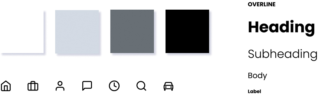
FIGURE 7.27 The most basic form of an atom in atomic design—color, typography, and iconography.
Atoms can also be represented a little bit more complexly, like combining several properties into a single component. A button has several properties, like color, shape, text, icons, elevation, curvature, and states, but it’s still small enough that some refer to it as an atom (FIGURE 7.28).
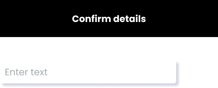
FIGURE 7.28 More complex atoms that take on multiple properties, like color, shape, space, typography, and elevation.
Molecules
When you start to combine these atoms into larger forms, you get molecules—instances of multiple design decisions that turn into compound elements.
When you take atoms like color, typography, and icons and put them together, you start to form UI elements that have more functionality. Perhaps you create a navigation bar, or a form field with an icon, or an interactive timer component (FIGURE 7.29). You can start to see smaller atoms influence the design of your components and combine like building blocks to create larger, more complex elements in a design.

FIGURE 7.29 A series of atoms combined into molecules, like a navigation bar, a search field with text and icons, or a time picker.
Organisms
Once you have stronger building blocks to use in your system, you can start to form organisms. Organisms are collections of molecules that combine to form more complicated, distinct sections of an interface.
This is where parts of your UI combine to form more complex components. You can use several molecules in tandem to form organisms, which start to look like real, contextual parts of your product. This is where a design system can start to feel less like a style guide and more like a style guide applied to a product—you see the product starting to form into recognizable pieces in a user experience (FIGURE 7.30).
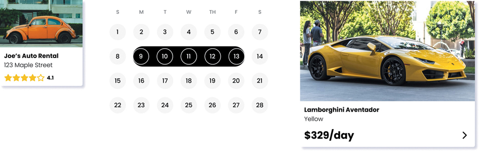
FIGURE 7.30 Several examples of organisms, like cards or a date picker.
Templates
Using enough organisms, you can start to form the overall skeleton of your product by creating templates.
Templates show your layouts in action, taking the core idea of atoms, molecules, and organisms and putting them together to form the structure of an experience. Templates provide context for how all the individual parts play together to form an experience.
The templates in FIGURE 7.31 show where the pieces would go but don’t include the data that would power those experiences. Rather, templates show how the pieces would fit into the experience without actually pulling in the data that powers the end user experience—like the metadata in a card (pictures, prices, reviews, and so on).

FIGURE 7.31 Several templates for a product. They outline the logic of how the pieces combine to form a user experience.
Pages
Once your templates are established, you can add the real-world data to create pages.
Pages show real or representative content to fully demonstrate the actual user experience. You can use pages to test real content, observing what the product would look like with actual data (FIGURE 7.32). Pages are the final form of the product in action.
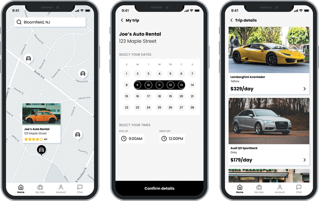
FIGURE 7.32 The pages that power the end user experience.
Atomic Design in Action
When you put all these concepts together, you get a systematic process for how you can think about building your product (FIGURE 7.33).
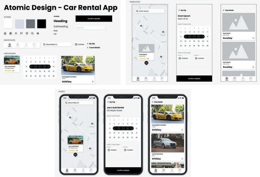
FIGURE 7.33 The stages of atomic design, from atoms to molecules to organisms to templates to pages.
Zooming out and combining each step of atomic design, you can see how each step builds off the previous one. To build pages full of real content, you need templates to understand their structure. For templates, you need organisms to lay out your designs. To make organisms, you need molecules that can combine into distinct elements of your interface. To make organisms, you need atoms, the foundational building blocks of your design system.
How Can You Make a Design System?
To use a design system for your products, you can follow a process to understand what you have, create a common language for it, then make a series of smaller pieces to build it.
Audit the Current Product
To make a design system, you must first know what’s in your product (if you have one you’re working from). Conduct an audit of the visual patterns and make a list of your atoms. What do your buttons look like? What colors do you use? What typography do you have, and where? How is it applied?
To support this work, it helps to take screenshots of all the flows in your product. This will let you take stock of all the UI components you’ve created and systematically work your way through each screen until you have a clear sense of all your design decisions.
If you built your product from a style guide, that helps as well! Leverage the design decisions from that artifact as they are applied to your product and incorporate them into the design system.
Establish Your Visual Language
After you have a good sense of the design decisions you’ve already made, it’s time to form opinions on what you want to do for your product moving forward. To create a set of atoms that’s consistent and easy to pull from, unify design decisions in your UI. Think about your colors—how many different grays do you need? Do you need different typographic treatments for similar sections of your product? Do you have a consistent set of spacing? These small, tiny decisions will filter through the rest of the process, and it’s important to form an opinion on all of them before moving to the next step.
Create a Component Library
Once you have decided your visual language, you need to use wireframing software (like Figma) to make the actual atoms, molecules, and organisms that will power your product. Start small—create atoms for color, typography, iconography, and spacing. Build off that—make buttons from color, type, and space. Make form fields from color, type, space, and icons. Keep combining those smaller elements into larger ones until you have a library of all the components commonly used in your product.
Create All the States of Each Component
When building your component library, don’t forget to include other states—a button isn’t always active; a form field isn’t always empty (FIGURE 7.34). You will need each of these states to create pages for your final designs, so make sure you think about them as you build atomically.
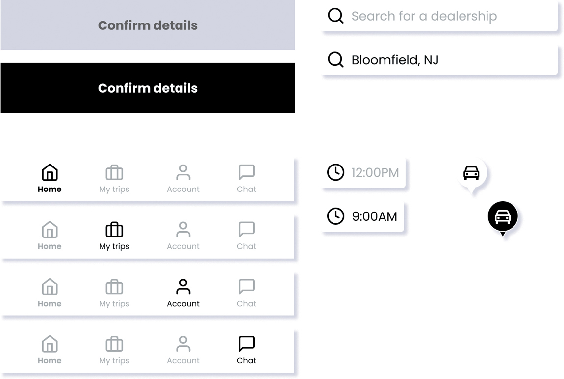
FIGURE 7.34 Different states for various components in a design system, including buttons, search fields, and navigation bars.
What Systems Can You Look at Today?
Many organizations use design systems to build their products. Some organizations have designers and engineers that specifically work on these systems as their primary job function. These systems are robust not only in the number of components they have, but also in having a deep philosophy behind why they made the design decisions they have.
Many companies offer both their philosophies and components to the public, to showcase the strength of their design prowess in addition to helping the community and pushing forth the design craft. These public facing resources are invaluable—you can learn a lot looking at any of these systems to understand what companies do and why they do it.
Examine the images in the following sections to see some examples of established design systems and explore what’s possible when using design systems to build products.
Material by Google
Google is one of the companies that lead the design industry regarding design systems documentation and structure. It makes its entire design system’s logic and structure public facing, allowing anyone to view its design decisions, observe its specifications, and pull code to implement its design patterns (FIGURE 7.35).
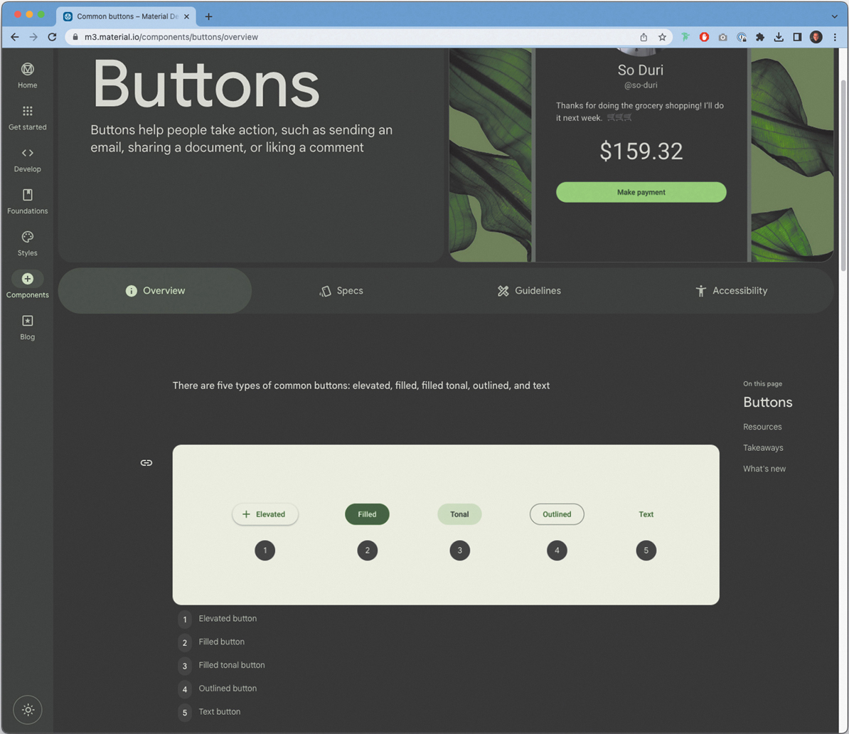
FIGURE 7.35 A sample page from Google’s design system, Material. Available at https://m3.material.io/.
Carbon, by IBM
Like Google, IBM also provides its design documentation and components for the public to see and use. Both companies have a similar structure to their pages, offering guidelines, components, community resources, and blogs that discuss case studies and updates regarding the system and its implementation patterns (FIGURE 7.36).
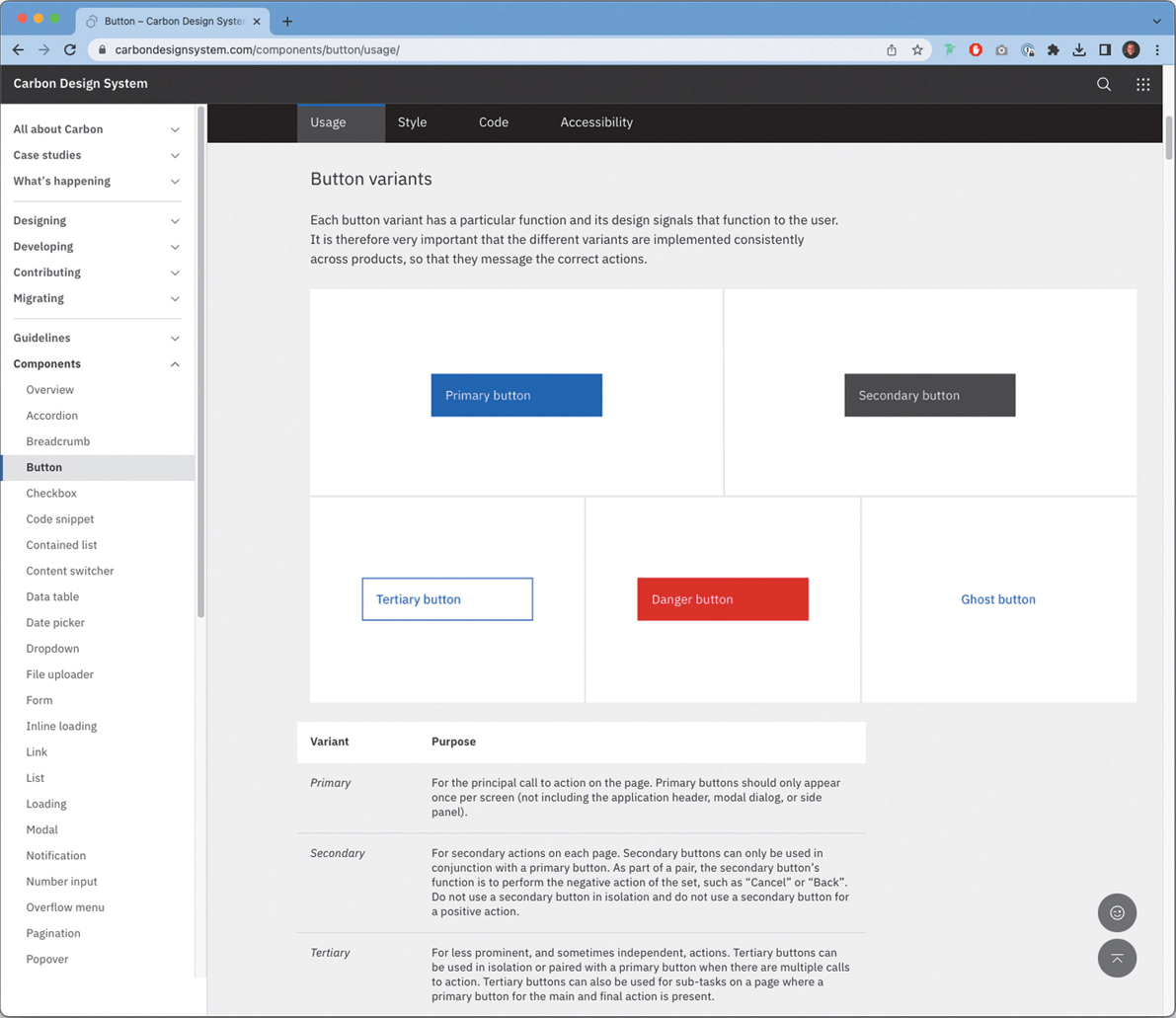
FIGURE 7.36 A sample page from IBM’s design system, Carbon. Available at https://carbondesignsystem.com/.
Polaris, by Shopify
Similar to Google and IBM, Shopify also offers its design system to the public, including the same content as the other two (and various other companies as well). Interestingly, Shopify offers upcoming designs (in the form of alpha and beta components) in addition to older designs (marked as legacy or deprecated components). Seeing the history of the system allows additional context into the decision making of the company and helps us understand where it’s been and where it’s headed (FIGURE 7.37).
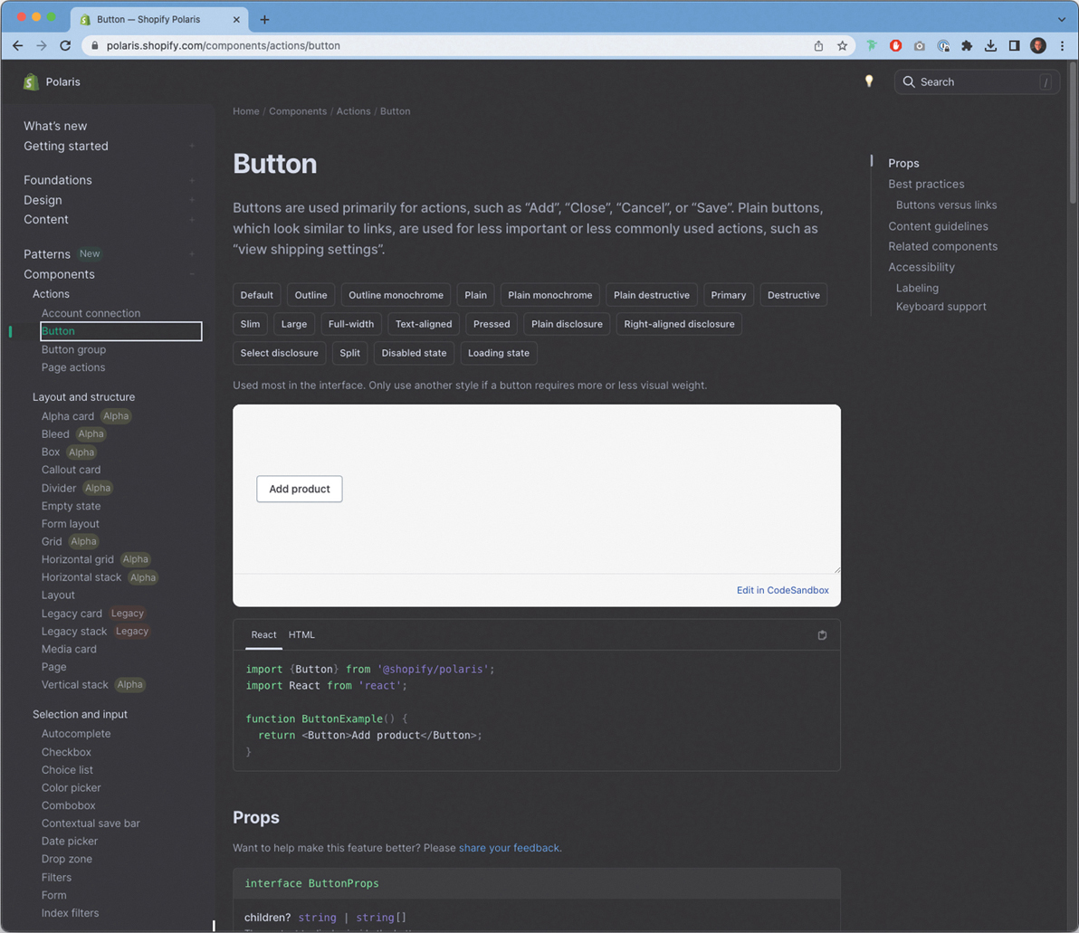
FIGURE 7.37 A sample page from Shopify’s design system, Polaris. Available at https://polaris.shopify.com/.
Design Systems Improve Implementation
Design systems allow you to design the product consistently and at scale. Having a common visual style in your product will lead to better user experiences—you will have less internal inconsistency, a clearer visual language, and more flexibility to make changes to the product as it evolves. Even if your product is small or just getting started, it’s important to create a system in which you design it.
Let’s Do It!
Let’s start creating a design system for the solo traveler app. You should already have all the pieces you need in your designs.
Find the elements you use consistently—things like styles, buttons, navigational elements, cards, or anything else that repeats across your solution.
Organize these elements and turn them into components in your design software.
Author’s Note
Refer to the “Design Systems” section in the appendix for examples to compare your design system with.
Depending on your design software, they may also be called symbols or a different word entirely. Essentially, what you’re doing is creating a “master” instance of each design decision.
Once you’ve created your master components, go back to your designs and replace the individual elements with copies linked to your master components.
That way, if you ever change the master component, your designs will update automatically—just like they would in code.
Delivering Designs
You’ve reached the final point of the implement step in the design thinking process. Now that you’ve done all the work in understanding the problem to solve, and you feel that your designs solve that problem well, you need to prepare your design decisions in such a way that others can easily build them and make them real.
It’s finally time to deliver your designs to developers.
Delivering Your Designs
You’ve ideally been communicating with developers this entire time. You’ve ideated possible solutions, discussed technical feasibility, and kept a strong dialogue going as you tested your designs with users. At some point, though, developers will need to see the actual designs, fully specified, so that they can build them.
There are plenty of tools you can use to do this—Sketch, Adobe XD, Figma, and other wireframing tools make this process a lot easier than it was in the past. Each of these tools offers some way for developers to “inspect” the design so that they can take that blueprint and apply it in code.
In the example in FIGURE 7.38, you can see a preview of what this looks like for a developer using Figma. A developer can select any element in your design file and look at all the properties they need to build it. They can pull colors, shadows, icons, images, and even animations, if you add them, in the code format they require in order to put it into the product (at the time of this writing, in CSS, iOS, or Android).
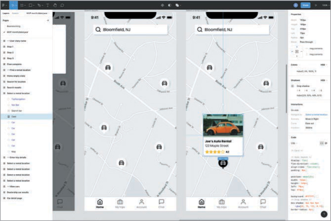
FIGURE 7.38 A wireframe in Figma, which provides the specifications developers need to build the product.
This is an extremely powerful workflow option for product teams. In the past, you would have to write specification documentation for every single screen and each component, as shown in FIGURE 7.39.

FIGURE 7.39 A specification document that outlines the functionality of a component in a design.
In this example, the designs were annotated to provide not only functionality but also pixel sizes so that developers could put those into code. Although some places have the need for robust documentation, like the example in Figure 7.40, many companies now remove this step from the workflow, letting designers focus more on actually designing the product. If a developer needs to see a specification, they can go into the file where the design was made and look themselves.
Author’s Note
Design systems help too! If you use the same button in multiple places, you can have a centralized documentation system that reduces overhead for everyone involved. A developer will pull the design system button and put it into the product. No rewriting specifications every time you create a button (or any other design system component).
Because developers (and other team members, like product teams) now have a direct line to the files, it’s important that you structure them in a way that makes the most sense for an observer. People looking at your work might be seeing it for the first time, or they may lose context of where they are in the user’s journey. In fact, after several weeks away from a particular flow, you might forget too. That’s why the structure of your design file, and how you deliver it, plays such a huge role in implementing your designs.
How Should You Structure Your Content?
Depending on the size of your product and the portion of the product you work on, you may want to structure your file in different ways. One way to structure it is to create pages based on milestones, like so:
Initial brainstorm Month/Date/Year
MVP Month/Date/Year
Release 1.0 Month/Date/Year
Release 2.0 Month/Date/Year
This form of organization lets you see the product’s evolution over time and works really well if you don’t have a lot of features. If you’re working on a lightweight, early-stage product and rushing to a minimum viable product release, then this could work well.
Alternatively, you could organize by feature, like so:
Feature 1
Feature 2
Feature 3
Brainstorming
This schema lets you stay organized by initiative and revisit these pages when it’s time to update a feature or add new functionality to one.
Another way to organize could be by user role, like so:
User role 1
User role 2
User role 3
This structure may work nicely for a platform that changes slightly, depending on who’s signed in.
Any of these (or even other) schemas can work for storing your files. It’s up to you how you organize, and it will drastically vary by the product you work on, how mature it is, and how much content you must design.
How Should You Organize Your Screens?
When preparing your files for implementation, it’s valuable to organize screens in a logical, easy-to-follow way. After working with several design teams and seeing how each team chose to organize, I have found that the most efficient, effective way to organize designs is based on flows, then states.
Organizing by flows (user flows, user stories, or otherwise) allows you to show each step (FIGURE 7.40) in the happy path of a user trying to accomplish a task. If there are deviations from that happy path (error states, loading states, and so on) you can capture those directly after illustrating the happy path.

FIGURE 7.40 The structure to organize your screens in a design file. It starts with the user story, followed by each sequential step in a flow.
This is a sample structure for how you can break down a file into easy-to-follow, digestible stories that other team members can follow. By using user stories, for example, these flows can tie directly to product initiatives and developer tasks to complete, which improves the ability to track designs and follow along without having context on the inner workings of your project file.
First, list out an artboard that shows high-level project details, as shown in FIGURE 7.41.
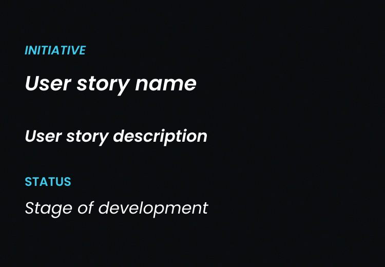
FIGURE 7.41 The details of a user story at the start of a flow. This provides clarity and context for the screens that come after this.
Four pieces of information are detailed in this summary sheet:
Initiative—What feature, epic, or project is this flow related to?
User story name—What user flow, or user story, does this flow relate to?
User story description—What is the actual user story? What are the details of the task the user is trying to accomplish?
Status/stage of development—At what point in the design thinking process are you with this flow? Is it still being designed, ready to be built, or already in the product?
Filled out, the summary sheet could look like FIGURE 7.42.

FIGURE 7.42 The filled-in user story summary.
For this flow, you are working toward the MVP of a car rental app. The user story is to search for nearby dealers. The description is the user story as written by a product manager, as it appears in the project management software you use to build the product. The status is that this flow is ready to be built by developers.
After you list out the details in your summary sheet, you then list each step the user takes in the actual product to complete the task. Choose the steps that outline the happy path—the path without any problems or navigation to a part of the product outside the current task. If there are deviations, you can show them later.
For this user story, you have four screens (FIGURE 7.43) that illustrate the happy path—the empty state of the search screen, the user searching a location for car dealerships, the search results, and a selected state showing a car dealership the user is interested in.
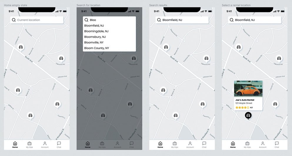
FIGURE 7.43 The screens that show the flow for the user story in Figure 7.42.
Since that’s all you need for this flow’s happy path, this flow is complete. You would need to show unhappy path moments in a later section of the file (for example, if there are no search results in a geographic area, or the user misspelled a location) but that’s not necessary in this row.
Putting this all together, you’d get something like FIGURE 7.44.
Figure 7.44 shows a single row of signs—a summary sheet describing the user story, and four screens that depict the user’s happy path toward completing that story.
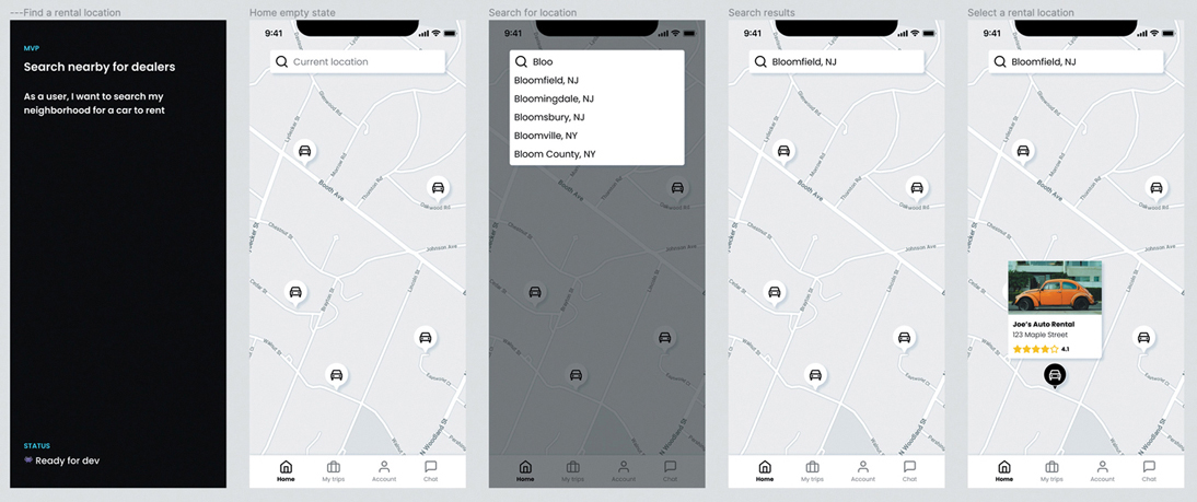
FIGURE 7.44 The combined user story and flow. Delivering designs in this way makes things a lot clearer for the reader.
If you follow this logic for all your user stories, it would look something like FIGURE 7.45.
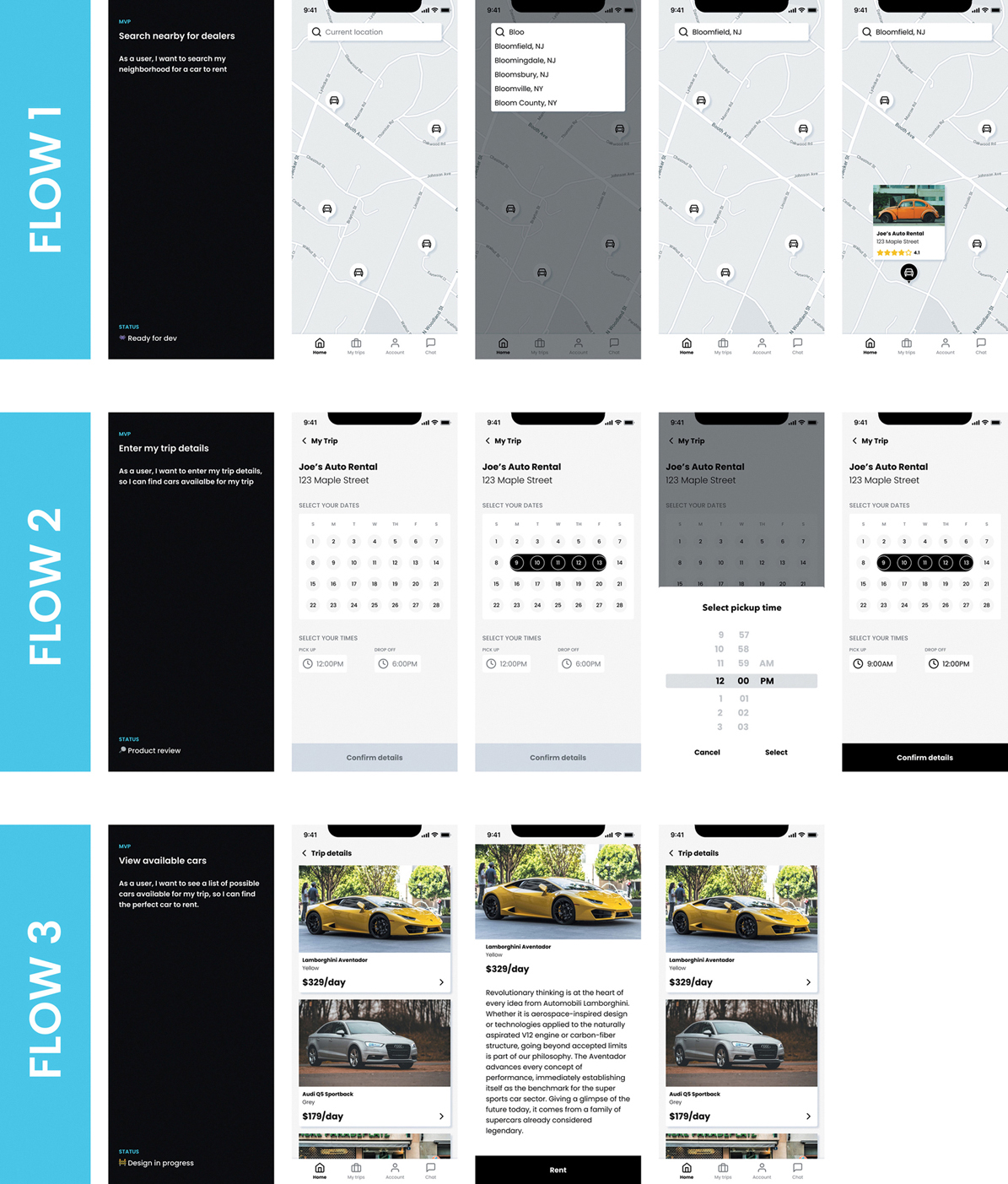
FIGURE 7.45 An example of how a design file could be structured to make the designs clearer for the reader, even if they have no context about the project.
Here, you can see that this initiative has multiple flows, with different screens, each of which all our team members can follow easily. You establish context (the user story, the description, the stage of development) and follow that up with each step in the flow for the user to accomplish their goal.
If you structure your pages and your screens in an organized, clear way for anyone on the team to follow, then implementing your designs will be easy, consistent, and frictionless for everyone involved.
Provide Specifications and Context
To deliver your designs, you must provide not only their specifications but also the context around them. You can’t assume people understand what you are trying to accomplish with the designs you’ve created. They may not have been involved in the research, ideation, testing, or any other part of the design thinking process. Even if they were, they may have seen things differently than you. You need to take your vision, put it down on paper, and explain to people what you are trying to build.
To accomplish this, you need to have clearly defined deliverables that show that vision. To show someone how your design functions, root it in the people you design for. Take a user story, illustrate the flow for that story, and lay that out sequentially for the reader. This will give them the context they need to understand the vision and build the design.
Let’s Do It!
Author’s Note
Refer to the “Delivering Designs” section in the appendix for examples to compare your delivery designs with.
It’s time to deliver your designs! Using both the user stories and the designs you created in previous exercises, lay out your design files so that they clearly show how a user would accomplish each user story you made for your product.
If you’re missing a few screens to do this, that’s OK—you can create those screens now. Part of the reason to go through this exercise is to identify if anything is missing—after all, it’s better to find out now than when the product launches!
If you have a lot of user stories (more than five), it may be difficult to create the flows and screens for each one. I challenge you to see if you can create all of them, but if not, then try to do at least three so you can get some practice.
The End of the Process?
After you deliver your designs and your product is built, you have officially ended the design thinking process. You’ve hit every part of the process. You started by empathizing with users and understanding their needs. You moved on to define the problem to solve so that you could ideate solutions to that problem. You built prototypes of your ideas, tested them with users, and finally, finished implementing your designs with developers. You’ve completed the process for the product that you wanted to build, and ideally, created something that helps improve the lives of the people you’ve been designing for this entire time.
So, what happens next? Let’s take another look at the model from the Nielsen Norman Group (FIGURE 7.46).

FIGURE 7.46 The NN/g design thinking process. The process is a circle, not a line—it is always flowing, always repeating, always existing.
I could have written about a lot of design thinking models that have similar processes. I chose this one for a specific reason—its cyclical nature. Other models are represented as lines, as if design thinking starts at the project’s kickoff and ends once the product is complete.
That’s not how design thinking works—at least, not for me. You can always improve the experiences you create by going back to the start and repeating the process. You can take your current product and evolve it further, enhancing the user experience with new features and functionalities. You can improve the understanding of your users by speaking to them again, showing them what you built, and interviewing them about their future needs. You can find new problems to solve, then try to solve them by ideating new possibilities and testing them.
Other models assume that once you implement something, you’re done. And you could be if you want to be! But the Nielsen Norman model of design thinking offers the possibility to continue—the chance to keep iterating and improving the lives of the people you design for. Personally, that’s a chance I’m thrilled to take.