
Appendix
What Good Looks Like
As you work through the “Let’s Do It!” sections of Chapters 2 through 7, you might benefit from seeing what a good result looks like. I’ve included examples of how I would approach each exercise presented in the book. These examples are some of many possibilities of what your exercises could look like.
In design, we are influenced by our experiences—what we see, what we consume, what we come across. As a result, there’s no singular “answer” for a problem—rather, the way to think about what good looks like is whether your answer addresses the problem you are trying to solve. If it does, great! If not, then iterate on it until you feel confident your answer will help the people you design for.
The references here are not intended to be the correct answers; rather, they are possible answers, or the answers I happened to arrive at when I worked on each exercise. Use these examples as a guide or a reference—not a solution.
Chapter 2: Using Empathy as a Design Tool
Surveys
Finished with your survey? Great! Maybe it starts with something like FIGURE A.2.1.
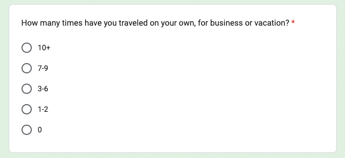
FIGURE A.2.1 A closed, single-response question to determine how frequently the respondent travels.
I start by asking how often the respondent travels on their own. If they don’t travel a lot by themselves, then they won’t be a good interview candidate.
Next, I ask what products they use when they travel (FIGURE A.2.2). I do this to inform the competitive analysis in the future (more on this later), but also to get a sense of how this person likes to travel. Do they seek out hotels? Do they seek out social interaction? Knowing where they browse helps us get into the mindset of how they like to travel. This question also helps us in a future competitive analysis informing us of which products to analyze based on how many people select those products here.
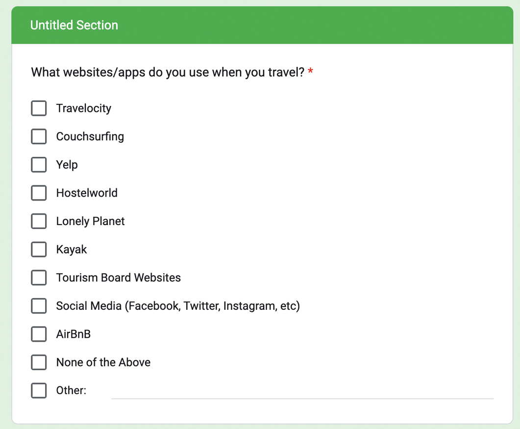
FIGURE A.2.2 A closed, multiple-response question to determine the online products the respondent uses.
I then collect demographic information (FIGURE A.2.3). This helps me avoid asking this later and keeps me informed for a future step in the process—the persona, which is a representation of our target audience. You’ll learn more about personas in Chapter 3.

FIGURE A.2.3 A closed, single-response question to determine the respondent’s age.
Finally, I ask for the respondent’s name and if they will be interested in participating in an interview (FIGURE A.2.4). By asking upfront, I can filter out the people who don’t want to participate in the survey, saving me time later.

FIGURE A.2.4 A set of open-response questions that allow us to follow up with the respondent.
From here, I would send this survey via social media and to friends to find participants to talk with. Hopefully I’ll get enough people interested in an interview!
Interview Script
Let’s look at how your script could have played out.
Ideally, the screener survey found good people to talk with—people who often travel alone. So, I focus on their experiences of traveling alone to better understand their wants and needs from solo travel.
Two of the first questions I can ask (after asking for permission to record) are the following:
How often do you travel?
How often do you travel alone?
Why is this? It’s because I want to prime the participants into thinking about travel. A simple, easy icebreaker question like “How often do you travel?” helps ease the participant into the conversation and gets them in the mindset of the problem area: travel.
Next, I can ask about a time when the participant traveled alone. A question like this will be very open ended and lead to many different possibilities, so I need to be agile in the response and follow up on anything interesting this question might reveal.
When was the last time you traveled alone?
Be sure to respond to this question for follow-up information. The story that they tell can lead anywhere, and there may be some interesting information in that story. I’d have a few follow-up phrases to keep in mind, such as “tell me more about that” and “go on” to promote conversation.
Next, I want to know more about the factors they consider when traveling alone. Ask it in the following way:
What factors do you consider when traveling alone?
It’s important to ask the question in a neutral way, not saying anything about positive or negative attributes. If the participant goes negative, figure out why. If the participant goes positive, also figure out why. A good follow-up here is “Why is that?”
Next, I can start to ask for some of the “normal” things people do when traveling alone. To that end, probe for information about how they spend their time while traveling alone.
How do you spend your time when traveling alone?
This should lead to some more stories about their solo travel experiences. As with the last question, I want to follow up on anything interesting that comes out of this answer. I’d make sure to ask why and probe for more information.
The last two questions probably provided a lot of information and stories to think about. Some of that information may have been positive or negative, but there’s no way to guarantee that. To really get at the joys and pain points of solo travel, ask for that information. These next two questions are flexible—I might get these answers from the last questions I asked, or I might have to ask these to make sure I learn the positive and negative elements of solo travel.
What do you like about traveling alone?
What do you dislike about traveling alone?
The next couple of questions are secondary. They relate to the core problem but start to explore other verticals around solo travel. I can ask about whether the participant tries to be social during solo travel experiences. This can provide insight into possible product features or help me find ways to remove blockers in the travel experience.
Do you try to meet new people when traveling alone?
Next, I probe into how people prepare for a solo trip. By discussing how they do their research, I can learn whether the solution needs to handle the actual experience while on the trip or the parts of the experience before the trip as well.
How do you do your research on a travel destination?
Lastly, give the participant time in the conversation to bring up anything they’d like to discuss. Offer them the opportunity to share something that’s off script—you may learn something that wasn’t even on your radar.
Is there anything else I haven’t asked that you think is important to talk about?
Putting it all together, you end up with the following script:
Hi there! I’m a designer working on a personal project exploring solo travel experiences. I’m looking to learn more about your thoughts and opinions on traveling alone. I’m going to ask you some questions today about your experiences with solo travel. Overall, this should take around 30 minutes. How does that sound? Do you have any questions before we begin?
Great. One last thing—before we begin, would you mind if I record this session? It’ll be used only to share internally with my team later.
How often do you travel?
How often do you travel alone?
When was the last time you traveled alone?
What factors do you consider when traveling alone?
How do you spend your time when traveling alone?
What do you like about traveling alone?
What do you dislike about traveling alone?
Do you try to meet new people when traveling alone?
How do you do your research on a place you are traveling to?
Is there anything else I haven’t asked that you think is important to talk about?
Data Set
I’ve put together an exercise that will allow you to practice affinity mapping in addition to seeing what a sorted, organized data set looks like. If you’d like extra practice (or you don’t have a data set of your own), try sorting the data in this file: https://tinyurl.com/asuxd-affinity. If you’d like to see the groupings and insights, then remove or delete the rectangle that’s blocking the solution. Have fun!
As for the exercise itself, I’m going to go through this data set and show you how I grouped all the information. I wrote out observations for all my users and organized them by participant, as in FIGURE A.2.5.

FIGURE A.2.5 All the data points from my interviews across different users.
From this data set, I started looking for themes across different insights. I found related data points and put them together into groups. I repeated this process, shuffling around data points from group to group until I settled on a few groupings that made the most sense.
I made a few small groups that felt like themes but didn’t have a lot of data points in them. Those groupings are in FIGURE A.2.6.
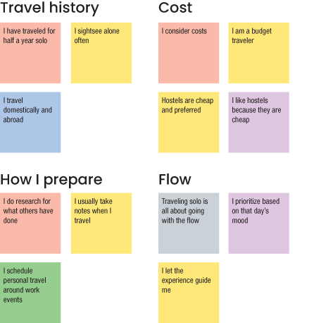
FIGURE A.2.6 Several smaller themes from my user interviews.
Generally, people had some similarities in how often they traveled, how they prepared, and how they thought about costs while traveling. They also had a few thoughts around “going with the flow” when traveling alone—having some flexibility in their schedule to act spontaneously was important to them.
Some insights around the mechanics of travel surfaced as well—from transportation to language barriers, to the technology people used to facilitate travel (FIGURE A.2.7).
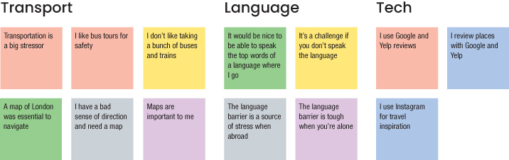
FIGURE A.2.7 Additional smaller themes that emerged from my affinity map exercise.
Two much larger themes dominated a lot of the insights from the research—the first around social interaction, as shown in FIGURE A.2.8.
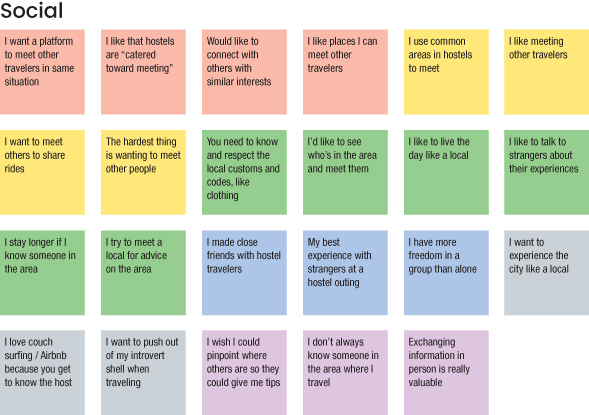
FIGURE A.2.8 All the insights in my research regarding social interaction when traveling alone.
For the social category, a lot of users were interested in socializing, though there were some challenges around making that happen. There are 23 different insights here, so with a little massaging, I could break this out into more detailed information regarding the nuances of their thoughts around social interaction. For the first pass at this data set though, this is a good place to start.
There were also a lot of insights around safety, seen in FIGURE A.2.9.
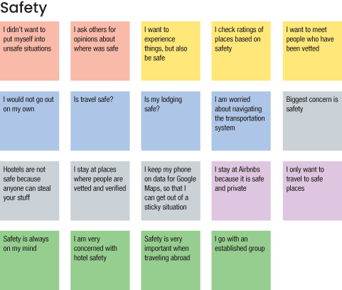
FIGURE A.2.9 All the insights around safety from my interviews.
Safety was top of mind for a lot of participants. Traveling alone in a new location by yourself is a scary thing, so people wanted to feel safe while exploring. Sometimes safety concerns prevented travelers from maximizing their travels, which was a frustration for participants.
This one ended up a little large as well, at 19 insights. On a second pass, I could probably break this out into multiple subcategories as well.
Finally, there were a few insights I didn’t really know what to do with, and that’s OK. I can always make a Parking Lot and leave them there or come back to them later as shown in FIGURE A.2.10.
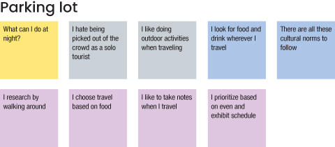
FIGURE A.2.10 Several insights that didn’t feel like they fit anywhere. On a future pass, maybe I’ll be able to find a home for a few of them.
Putting the exercise all together, I ended up with the affinity map shown in FIGURE A.2.11.
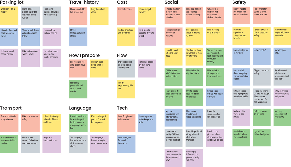
FIGURE A.2.11 The first pass of my affinity map based on my user interviews.
This is good for a first pass. The social and safety categories are a lot bigger than the others, so I would probably want to break those out a bit more into more granular sub themes. From there, I would want to come up with I Statements for each section, such as “I like to go with the flow” for the Flow section or “I am conscious of how much I spend” for the Cost section.
If you’d like to see where I eventually landed for this affinity map, look at this exercise (which you can do yourself!) https://tinyurl.com/asuxd-affinity.
Affinity mapping is an iterative process where you can refine and massage the information into different interpretations. I hope this exercise inspired you to examine your own data set and explore different mappings of the insights you gathered on your interviews!
Chapter 3: Defining the User’s Problems
Persona
Based on the data set in the affinity mapping exercise, you may have created a persona that looks like the one in FIGURE A.3.1.
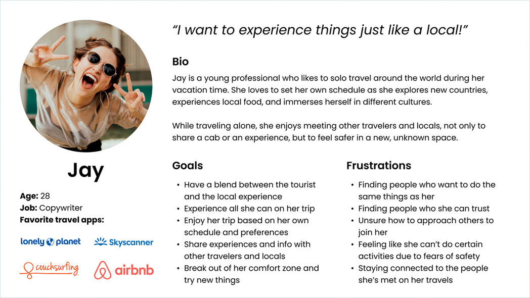
FIGURE A.3.1 A persona based on research done for a solo traveler project.
This is Jay, a solo traveler who seeks to maximize her trip and experience things like a local does. Let’s look at each section of this persona to understand more.
Name/Photo
For this project, a lot of the user interview participants were women. This persona photo captured how they felt about travel—excited, outgoing, and thrilled to experience new places. The name felt appropriate as well—it didn’t link to anyone we interviewed, and it was simple enough to represent the target audience.
Overview
Jay is a 28-year-old copywriter—additional information that represented the user interview participants. Most of the participants were between the ages of 25–35, so Jay is in that age range. Additionally, a lot of the participants relied on couch surfing and hostels over hotels, in part because of monetary reasons, so a high-paying profession for Jay wouldn’t match the budget the target user would have for travel. While none of the user interview participants were copywriters, that profession would match the budget for the persona for Jay.
Quote
Although not necessary, a quote can really help flesh out the top things a person is looking for in an experience. This quote sums up what Jay is looking for—a travel experience that reflects how locals experience their location. It’s ideal if this quote is a real quote from the interview, but it’s OK if it’s not.
Background/Bio
In the user interviews, people said they loved to travel alone because it allowed them freedom and flexibility. People had the choice to do what they wanted, when they wanted, with no constraints around any travel partners. People also expressed that they wanted to experience things like local residents do, which is a huge part of the travel experience for them.
Additionally, people enjoyed meeting new people during a trip—not just locals. Sharing experiences with others, in a safe way, is an important part of the solo traveler experience.
Likes/Goals
A lot of Jay’s likes/goals come from the I statements in the affinity mapping exercise. Statements like “I want to experience things like a local” and “I want to meet other people” really came forward. Research showed that users wanted to connect with others and have local experiences during their travel. Additionally, being able to experience things on their own schedule was important.
Dislikes/Frustrations
A lot of these also come from the I statements in the affinity mapping exercise. Statements like “Safety is a top priority for me” and “Cost is a factor in my trip” help show what gets in Jay’s way (and what you can design for). Research found that when traveling alone, people sometimes felt unsafe in their environment and would make decisions primarily with safety in mind. However, social connection allowed these people to feel safer and enjoy their trip more fully. A lot of the stories around not being able to enjoy a trip to the fullest came down to connecting with others and feeling safer.
User Journey Map
Based on the user interview data and the persona generated from the solo traveler project, a user journey map might look like FIGURE A.3.2.

FIGURE A.3.2 A user journey map based on Jay’s experiences when traveling alone.
This user journey map represents one example of how our persona could move through their user experience. Like the persona itself, the journey is not necessarily real, yet it is a representation of a real user journey. It’s built from stories heard during user interviews, insights gathered from affinity mapping, and goals that real people had.
If you recall, Jay is a solo traveler who seeks to maximize her trip and experience things like a local does. She loves to travel alone, but even when she does, she still wants to connect with others along the way. She likes to travel on her own terms, yet still participate in activities with others from time to time on her trip. I took this information and created a story for Jay that matches her habits, wants, and pain points and reflects how she experiences travel.
Author’s Note
A single set of user interviews can result in multiple journeys, and a single user journey may have multiple interpretations. We can tell many stories based on what we’ve learned from user interviews, in different ways. This is how user experience design can be more subjective and more like art, as opposed to times when it is more methodical and more like science.
Let’s explore Jay’s current state and how she experiences her user journey as she prepares for and goes on her trip.
Persona/Background
Jay’s journey map starts with her photo, quote, and bio. Although this information is included in the persona, it’s good to include here as well—not everyone on the team may have read the persona, and by including it here, they don’t have to go find that artifact. Instead, the journey provides a brief description of who Jay is so that people seeing this journey have the information they need.
Phases
Jay’s journey takes places over five phases: planning, arrival, exploration, socialization, and recall. Essentially, Jay’s user journey follows her before, during, and after her trip. Jay’s user experience extends beyond the actual trip—she must prepare for it beforehand and wants to relive it afterward. By looking at the entire journey, design opportunities may surface that will enhance her experience during her trip, such as by helping her prepare for the trip or by more easily saving memories from the trip.
Actions
I decided to tell a longer story with Jay’s actions rather than using quotes in this section. There’s no single right way to make a user journey map (or most design artifacts), and I wanted to use a more narrative format for this journey map, since there’s a lot to express about Jay’s journey. Some stories end up longer than others to communicate all the research and insights done from user interviews.
Jay starts by planning a trip to Costa Rica. She does research ahead of time to find local activities to participate in and book a hostel, all budget friendly (all user research insights).
Then, she gets on her flight and arrives in Costa Rica late at night. Tired and unfamiliar with her surroundings, she struggles to find a cab to her hostel. Once there, she relaxes and prepares for the bulk of her trip—exploring Costa Rica. These were also insights from our research; participants mentioned how they struggled with transportation and communication.
When Jay starts to explore Costa Rica, she begins visiting the tourist attractions—in part because that was her research, but also because it’s safer that way. She is still not feeling fully comfortable in the area and wants that extra layer of safety before she branches out more. This was also reflected in our research—participants felt less safe when traveling alone, yet they still wanted to explore and see the sights.
Finally, Jay starts to socialize. She meets people through her hostel, activities, and exploration. She connects with other travelers and locals, which enhances her trip greatly. We also saw this in our research—participants wanted to meet others so that their trip could be enhanced.
Finally, Jay’s trip ends. She records the contact information of those she met and heads home. She recalls the trip by talking about it with others and looking at photographs. She had a great time and wants to share her experiences. This was also a part of our research. People talked fondly of their travel experiences, outside of the several times they didn’t feel safe.
This story didn’t happen—at least, not as it’s depicted in this journey. Rather, this is a representation of the stories we heard in our interviews, and that’s OK. I’m not trying to tell a story that actually happened, but rather represent the general idea of the stories that occurred so that I can empathize with the persona and get a sense of how people travel.
Thoughts/Feelings
Jay’s thoughts and feelings are represented by an emotional curve in the graph. For the most part, she has a great trip—she loves to travel and enjoys both preparing for a trip in addition to talking about it after. However, Jay has a few rough spots during the trip. Sometimes, she doesn’t feel as safe, or transportation is a hassle, or she had an experience that didn’t meet her expectations or even a social interaction she didn’t like as much as other elements on the trip. Therefore, her emotional curve fluctuates between these experiences. In a few spots, it dips from happy to sad, but for the most part, she had an amazing time on her trip and remembers it fondly.
Insights
Finally, I have a section dedicated to possible opportunities based on the story in the journey map. Since Jay does a lot of up-front research, for example, perhaps a product that helps her do that research would help her in her journey. Once Jay starts to explore a new place, she’s concerned for her safety; perhaps some features that identify how crowded places are or rank them by their perceived safety would make Jay feel better. Furthermore, since Jay likes to socialize so much, maybe an app that helps her socialize more easily would be right up her alley. Now that I have a story to work from, I can see where Jay thrives and where Jay struggles and start to think of ways to enhance her user experience.
Problem Statements
Let’s look at a breakdown of generating a problem statement for the solo traveler project, going through the same steps you did in this chapter.
In the solo traveler project, the research from interviewing solo travelers revealed that travelers feel nervous while traveling alone. They feel they don’t have a lot of familiarity with their new surroundings and feel that having some good resources around where they are would help them feel safer. Seeing this problem, you want to write a problem statement that will help you design. Let’s give it a shot:
As a [traveler], I want [information] so that [I can travel well].
This problem statement could help you design something for the users. But it lacks substance. You don’t have a lot of context around the user. The user needs are quite broad. And the goal is too ambiguous. Let’s get more specific:
As a [single female traveler], I want [to be informed about my safety] so that [I don’t have to worry about being in a bad situation].
This allows you to be a lot more targeted, focusing the solution on solo female travelers. You need to provide them with safety information. You can empathize, because you don’t want the solo travelers to be in a bad situation. However, the statement made some assumptions that would have constrained the design. The statement assumed the travelers were female—you spoke with a lot of female travelers in the user interviews, for example, so that bias is in the problem statement. Don’t assume that for the design solution.
Additionally, the need is very specific—for travel, it’s possible that people want more than just information about safety. You may want to broaden that aspect of the problem statement as well.
Let’s try again:
As a [solo traveler], I want [a detailed country guide] so [I can travel well].
This problem statement is closer, but it makes an assumption about the solution. The user and goal are broader, but a product solution is included as a user need. Users might not want a detailed country guide. Let’s try again:
As a [solo traveler], I want [to feel informed and assured] so that [I can travel well].
This one doesn’t assume a solution—rather, it focuses on the needs heard in the research. The user interviewees expressed that they felt unsafe when traveling alone. To feel safer, they expressed that they wanted information and assurance about their environment.
Let’s try one more adjustment to the problem statement to see if you can take it a bit further:
As a [solo traveler], I want [to feel informed and assured] so that [I can feel comfortable on my trip].
Here, the goal is adjusted. The last iteration had a good sense of the user and their needs, but this one really amps up what good looks like for the user. If you enable users to feel comfortable while traveling, then you’ll have created a great design solution.
The problem statement is in a good spot. Let’s see if you can pair it with a How Might We statement:
As a [solo traveler], I want [to feel informed and assured] so that [I can feel comfortable on my trip].
How might we provide a way for our users to maximize their solo travel experience?
Here, the problem statement is applied in a design prompt by asking “how might we?” Now, the project team will design to make users feel comfortable so they can maximize their solo travel experiences.
Competitive Research
We could have picked any of the techniques we covered for our competitive analysis. For our purposes, since we’re headed into ideation on a new product idea, I’d lean toward starting with a lightning demo to gather inspiration and start giving me some ideas.
So, for the solo traveler project, let’s look at products that are related to travel. Let’s start with one of my favorite travel products, Airbnb (FIGURE A.3.3).
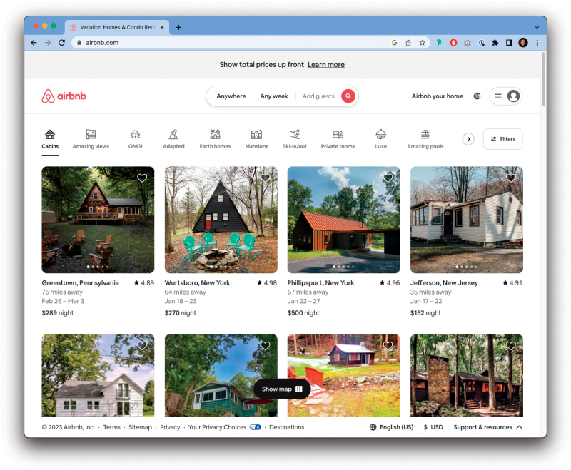
FIGURE A.3.3 Airbnb’s landing page.
Looking at Airbnb, it has some very interesting filters at the top. It’s rare to be able to sort by such specific and interesting things, like “amazing views” or “OMG!” It’s a fun, playful way to get people excited about travel. Let’s add that to the board.
Thinking more about our persona and our research, recall that a lot of travelers we spoke to rely on hostels. Let’s check out a hostel website.
Hostelworld.com has an interesting option called “roamies” (FIGURE A.3.4). Sounds a lot like our persona, Jay! Clicking that link took me to a page that promises adventure in a small group. That’s exactly what Jay is looking for, and perfect inspiration for our project.

FIGURE A.3.4 Hostelworld’s roamies option, designed for travelers who want to experience adventures in small groups.
Let’s explore some other travel inspiration. I’m a big fan of Tripadvisor (FIGURE A.3.5), so perhaps they’ll have something that inspires us.
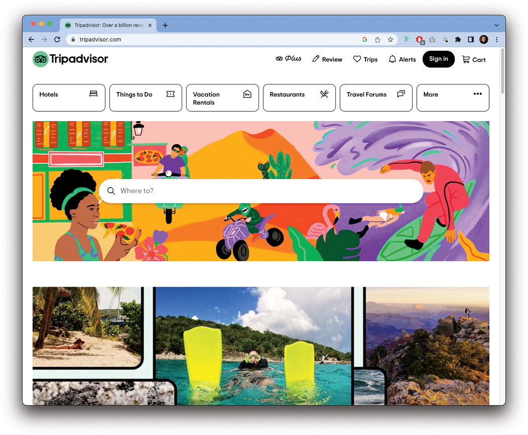
FIGURE A.3.5 Tripadvisor’s home page.
I love the imagery here—there’s a lot of energy, excitement, and exploration coming from the illustrations and real-world photography being used on this site. It makes me want to travel.
We’ve looked at some related areas, so let’s start to diverge a bit more from companies that offer travel experiences to the actual travel experiences themselves. A lot of travel blogs exist, so let’s see if we can find one that gets us inspired.
After some searching for a travel blog, I came across a website called The Travel Episodes (FIGURE A.3.6). It has amazing photography that makes me want to go travel and backs it up with some compelling text to describe their journeys. Looking at this presentation of content makes me feel like going on an adventure.

FIGURE A.3.6 The Travel Episodes has incredible photography and writing to get me excited about travel.
What else can we search for? Jay mentioned she wanted authentic experiences, so let’s look for examples of those too.
A company called Withlocals (FIGURE A.3.7) offers private, personal experiences with people that live in the area a traveler is visiting. This service would be perfect for Jay to spend an afternoon experiencing things like a local would.
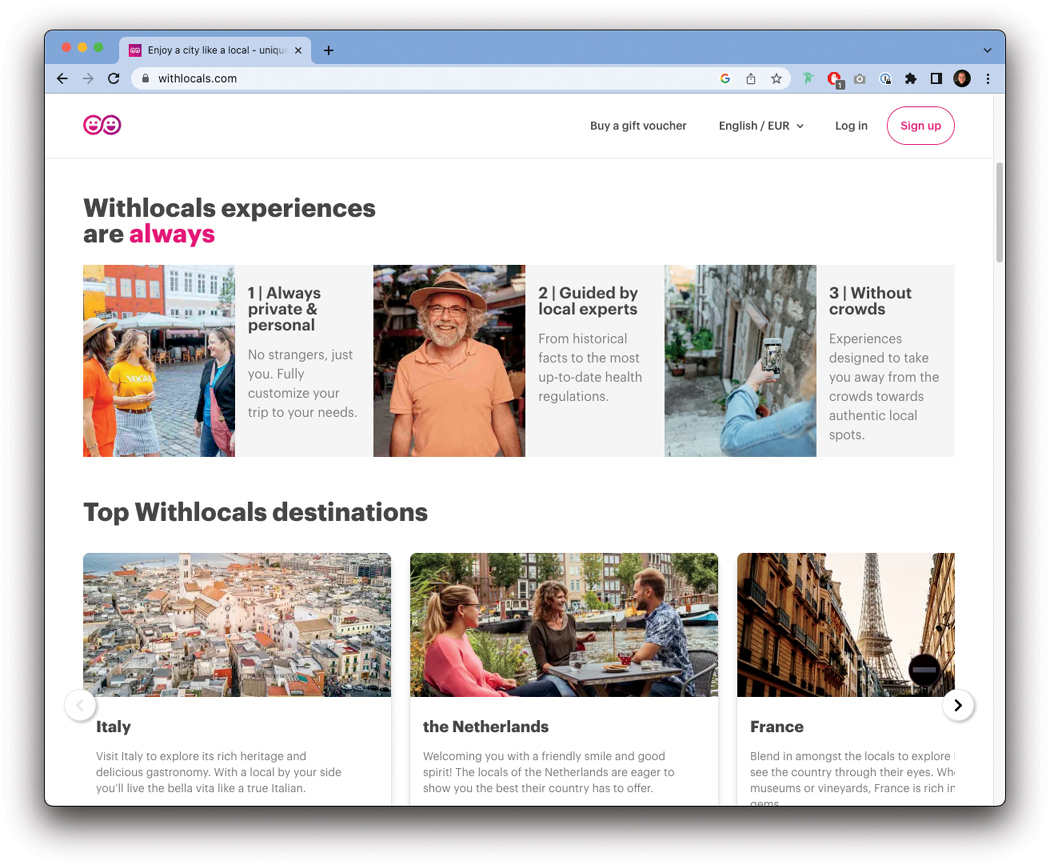
FIGURE A.3.7 Withlocals.com offers travelers experiences with locals.
Let’s see if we can find one more example to inspire us.
Searching another one of my favorite travel sites, Lonely Planet (FIGURE A.3.8), I learned they have a feature that creates travel itineraries based on activities, like being outdoors or seeing cultural wonders. It seems like a really cool way to think about travel, and I feel compelled to add it to my board.

FIGURE A.3.8 Lonely Planet allows travelers to select an activity and then recommends a destination.
Putting our board together, we get FIGURE A.3.9.

FIGURE A.3.9 Our lightning demo mood board.
Now that we have our mood board, we can start to get inspired for our ideation. We found fun ways to search, like with interesting filters or by choosing an activity before a destination. We found experiences, like guided tours from locals or small group adventures. We were also inspired by the design of the products we observed, like stunning imagery or compelling text. We could use all these elements in our eventual design solution—whatever it may be.
Chapter 4: Exploring Ideation Techniques and Tools
Brainstorming
Working from the problem statement, I gave myself 20 minutes to generate the list of ideas shown in FIGURE A.4.1.
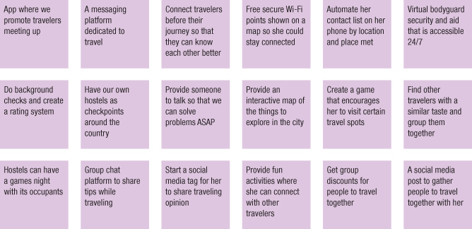
FIGURE A.4.1 Concepts generated from my brainstorm.
That’s a ton of ideas to think about! Not all of them would necessarily lead to a product you want to create—for example, you may not practically be able to provide a virtual bodyguard service. However, you could provide a mentor experience, such as a local who shows travelers around for a few hours. By seeing an idea and building off of it, you can create a new experience that might actually work for users.
But you’re not ready to evaluate the ideas just yet—that will come later. For now, let’s groups these into themes (FIGURE A.4.2) and see if anything else comes up.
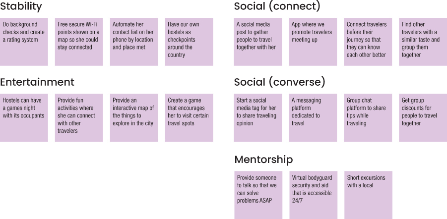
FIGURE A.4.2 Concepts grouped into themes.
While creating the themes, I took the idea about a local showing users around—it felt like a potentially interesting idea that might be valuable to have in the product. Let’s look at the themes a little more closely:
Stability—Jay is concerned around traveling by herself, so making her feel more secure would enhance her trip.
Entertainment—Jay wants to maximize her trip, so including possible activities for her to do in new places could enhance her experience.
Mentorship—Jay wants to connect with others, especially locals, to learn more about the places she goes. This could help her do so (and provide her security as well).
Social (connect)—Jay likes traveling alone but still wants to meet people. This would let her connect to them.
Social (converse)—Jay wants not only to meet others while traveling but also to share experiences with them. This theme would allow her to do so.
From these themes, you could start to combine different ideas and think of possible solutions to the problem to solve. You could even brainstorm again, using the themes as a guide to focus the ideation. You have so many possibilities!
Sketching
For this exercise, I was inspired by the brainstorming session around the problem to solve. From that session, I saw a lot of ideas around socialization and exploring things like a local, two things that our persona Jay really values. Jay wants her trip to be her own—to explore things as she wishes, to opt into activities that she wants to participate in. At the same time, she wants to connect with others—other travelers, and people who live in the areas she visits.
Jay would benefit from a short-form, flexible, customized way of connecting with other people—mostly around activities. See the sights, book a tour, have drinks with friends—something that she can opt into with as much or as little time as she chooses to dedicate to it, all on her schedule.
To satisfy this need, I decided to explore a product that would let Jay meet up with others and have short excursions in the areas she travels to. Maybe see a show, do a walking tour, eat some local cuisine, whatever she wants to do.
For our sketching exercise, I used the crazy 8s method (FIGURE A.4.3) to visualize some of these options. First, I folded a piece of paper into eight sections, then I timed myself for eight minutes and drew some possibilities.

FIGURE A.4.3 The sketches from my crazy 8s activity.
For this exercise, I couldn’t fill up the paper with the eight minutes I gave myself. That’s OK—you don’t need a full piece of paper to start exploring the idea. You could also give yourself more time if you really want to have those eight ideas.
Going from left to right, starting at the upper-left corner, I began by thinking of how Jay would use this service. I thought of a map view, with a search she conducted looking for food tours. You see a map, a search bar, and some results of the search with reviews of each of those tours. She has the option to book one if she likes.
The next sketch shows Jay searching by topic, in some sort of card view. This could be filters, or a way into the search screen you saw in the first sketch—I’m not sure yet. That’s OK too—this is an exploration. There are a few pre-populated search topics that are most common for our users, and a search bar in case Jay wants something else.
The third sketch shows the profile of one of the locals—a tour guide that offers experiences in this product. The guide has a picture, a name, reviews, and the ability to book for an activity. It would probably help confidence and safety (things Jay cares about) if you add a piece of verification, like a checkmark or a label that says this is an authentic user of this product.
The fourth sketch shows Jay’s calendar—the things she has signed up for and plans on doing that day. It’s like other calendars, so I didn’t feel like doing anything too special here—the app may or may not need some custom calendar options. Perhaps you could use a native phone app instead of a custom calendar option in the product.
The fifth sketch asks for a follow-up from Jay after an event. This type of feedback will help you know what events to recommend to Jay at a later date, signals the quality of the events to other users, and allows Jay to rate her favorite activities. It’s also the perfect moment to foster additional connection, sharing the profiles of everyone who was in the event with her. If Jay meets someone and doesn’t get their contact info, she can follow up here and make friends during her trip—another of her goals.
Finally, the last sketch shows an event some of her friends are going to. It’s a way for Jay to reconnect with those friends and continue experiencing things with others.
All these sketches are participatory for Jay—none of these are things she must do. Rather, they serve to satisfy her needs to connect, on her terms, with the people around her for local, authentic experiences.
Overall, not a bad ideation session for eight minutes, right?
Mind Mapping
For my additional ideation exercise, I chose to build off the idea that I’ve been working from for the last two exercises: a travel app that allows people to connect with others for activities. I realized I don’t have too many activities planned out to populate the app with, so it’s hard to contextualize what people will actually do when using the app to find events. It’s hard to build without content, so I figured I should think of some activities to help tell the story of using the product and sell the vision of creating it.
I need to generate a lot of ideas based on relationships between concepts. Sounds like a mind map would be perfect for this exercise. For this exercise, I used a product called Whimsical1—it’s one of my favorite digital ideation tools.
I started by listing out the beginning point for the mind map—the concept of an activity. From there, I began to think of activities that someone could do on a trip. I thought of one or two, like going to a museum or eating some food. I realized I’d need some higher-level categories for each activity to fit into, so I wrote down three categories to capture the basic ideas I was coming up with: Move, See, and Eat (FIGURE A.4.4).
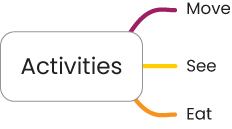
FIGURE A.4.4 The next step for my mind map was high-level categories.
Next, I started to slot some activities into each of these categories (FIGURE A.4.5). I had museums and food, and I started to think of more and more things to do:
Sit on a bus
Walk around a city
Watch a show
Visit a museum
Have an authentic meal at a local’s house
Meet friends for drinks
Eat street food

FIGURE A.4.5 The next iteration of my mind map, with more activities filled in.
As I filled in these activities, I realized I needed another level of hierarchy for some of the categories. There were really two types of movement—one where the person is doing the moving (like walking) and one where the person is being moved (like being on a bus). Additionally, there were multiple types of activities in the Eat category—locations and types of food. I split out these sections and filled them in with more ideas (FIGURE A.4.6).

FIGURE A.4.6 My mind map, split out into greater detail and with even more activities.
I could have kept going at this point, thinking of more categories and ideas that fit into those, but this felt like a good start for some of the content that could find its way into my product. The purpose of this ideation was to think of things that Jay could choose from when on her trip, and I came up with 18 different ideas across three major themes. This felt like a successful ideation that fit into the rest of the work I’ve done for this project.
Car Method
For this exercise, I wanted to think of all the things that could be added to the product idea we’ve been working on in this chapter. I decided to use the Cars method to think of the smallest, largest, and middle ground options for this product.
I started by listing all the features I could think of for the product:
User profile creation
Payment processing
Calendar view of user’s activities
Verified tour guide profiles
Search for activities to participate in
See list of participants
Ability to friend people after an activity
Suggest activities based on friends
Rate activities
Suggest activities based on user’s reviews
Custom activities created by and sponsored by the company
From this list, I grouped things by related concepts and shifted a few things around. I came up with the following categories:
User related:
User profile creation
Activity related:
Search for activities to participate in
Verified tour guide profiles
Calendar view of user’s activities
Payment processing
Custom activities created by and sponsored by the company
Social:
See list of participants
Ability to friend people after an activity
Recommendations related:
Rate activities
Suggest activities based on friends
Suggest activities based on user’s reviews
Some things felt more critical than others to the product functioning well, so I moved a few around and split out each section into what felt like logical cutoff points for a small, medium, and large size for the product.
Compact:
User profile creation
Search for activities to participate in
Verified tour guide profiles
Calendar view of user’s activities
Payment processing
Midsize:
Rate activities
See list of participants
Ability to friend people after an activity
Cadillac:
Suggest activities based on friends
Suggest activities based on user’s reviews
Custom activities created by and sponsored by the company
Finally, I put all these ideas together in a one-page table (TABLE A.4.1) to make it clear what features I’m recommending based on how much I want to invest in the product. Note that the table uses colored bullets to show the compounding features.
TABLE A.4.1 Features I’d Propose for This Product
SIZE | FEATURE SET | VISION |
|---|---|---|
Compact |
| A lightweight, simple version of the product that allows users to create an account and participate in activities |
Midsize |
| A more mature product that includes social features allowing users to connect more easily |
Cadillac |
| The most developed version of the product, using data to power recommendations and content created by the company to introduce even more activities for users to participate in |
Note that this is a list of ideas—you aren’t committed to these at this point. Rather, this is a form of prioritization that will help you in your design thinking process. You could visualize each version of the product, as outlined here, then see which would produce the best user experience relative to the cost to build it.
Chapter 5: Prototyping Solutions
Task Flows
Author’s Note
A product is more than one task flow. Realistically, to test all the aspects of my product I’d want flows for the other things in it as well—things like creating an account, managing Jay’s schedule, and connecting with people after an activity is over. For now, though, I want to focus on a single aspect of the product to make things less complex (though those other elements of the product are still on my mind).
For my task flow, I wanted to think about one of the core aspects of the product I built—the ability to find and book experiences. The way I’ve designed and prioritized my product coming out of ideation was to have Jay socialize with others through the context of experiences. By allowing Jay to find and book experiences with locals and other travelers, she could directly connect with others and potentially develop those connections further should she choose to after an activity.
Therefore, one core pillar of my product is finding and booking experiences—and that’s the flow I want to start with. I’ll be approaching the next few exercises in this book looking to make this flow as good as I can—from planning it out to visualizing it to eventually testing it with users.
FIGURE A.5.1 outlines the high-level steps Jay would need to take to book an experience using my product. To book an event, Jay would take the following steps:
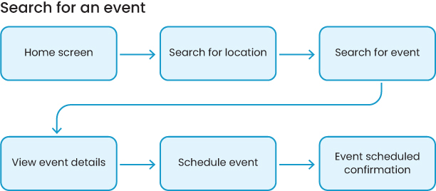
FIGURE A.5.1 A task flow for finding and booking an event in the app I’m designing.
Home screen—First, Jay needs to be in the product. I had her start at the home screen, though if I make the next step accessible from anywhere in the product (such as putting it in the bottom navigation of the app) then she could start from a lot of places. For simplicity (and testing my eventual prototype), I decided to start here.
Search for location—Next, Jay needs to search for an event, so she would interact with some search call-to-action (such as, a button that says search in the navigation of the app). To find an event, however, she first needs to start from a location—that way, the product can narrow down the results and not force Jay to look in a lot of different places she might not be going to. This will make it easier for the product to surface relevant results and for Jay to look through them.
Search for event—Once she’s selected a location, Jay needs to select an event to look at so she can book it. There may be multiple sub-steps here, such as selecting from a category of events to look through or typing in an additional search query to find the specific event she wants to attend. At this level of planning, however, I can simplify and look at a higher-level picture of the steps Jay needs to take.
View event details—After Jay finds an event that’s interesting to her, she will need to see its details to make the decision as to whether she wants to go on the event. Here, the product can satisfy her wants and needs by showing reviews, other friends that are attending the event, who the tour guide is, how long the event is, and so on—all the details she needs to decide.
Schedule event—When Jay has made up her mind and wants to attend the event, the product needs to allow her to schedule it. Again, this may be multiple steps—choose a date, choose a time, look at her schedule, and book it. For planning purposes, I can stay a little higher level with this one as well and say that she “schedules” it.
Event scheduled confirmation—Finally, Jay needs confirmation that her event has been booked. This could be multiple steps, like a confirmation screen and viewing it in some sort of calendar, or even something as simple as a pop-up window or a notification. I’ll figure that out when I start designing.
Now I have my high-level task flow that I will use through the rest of the prototyping phase of the design thinking process so that you can work toward making the prototype.
Low-Fidelity Wireframes
To make low-fidelity wireframes, I need some sense of the steps a user will take in my product. Looking back at the last exercise, I made a task flow that maps out the steps Jay needs to take to book an experience, as shown in Figure A.5.1.
To visualize these steps, I made some sketches using the crazy 8s method of folding a piece of paper and giving myself all the time I needed to draw each step in the process, as shown in FIGURE A.5.2.
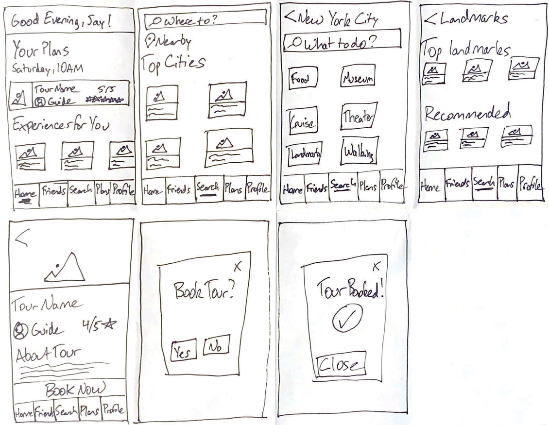
FIGURE A.5.2 Low-fidelity wireframes that represent how Jay might book an event in my product.
These sketches represent the task flow from the last exercise. However, I’ve added some more detail now that I need to start thinking about where the content and interactions will be on each screen.
1. Home screen—For the home screen (the first box in Figure A.5.2), I thought it’d be nice to greet Jay with a welcome message whenever she opens the app. There’s also a preview of her schedule (the next event coming up) and some recommended events she might want to investigate. She can use the navigation at the bottom of the screen to get around the product too—things like a “friends” section for the people she meets during an event, a search option, a calendar (her “plans”), and a profile to manage her settings and presence in the app.
I want Jay to search for an event; to get there, she’ll click the search option in the bottom navigation.
2. Search for location—The search screen starts by asking for a location to narrow down the results. Jay can type one in the search box, hit the pin beneath it to search nearby, or tap one of the cards to search based on popular locations. I haven’t figured out the content yet, but that’s OK—I’ll get there.
To progress, Jay needs to search for a specific city. In this example, I went with New York City.
3. Search for event—The next screen shows more options for a New York City–based search. Jay can type in the search box, or she can choose a category, like Food, Museums, or Walking. For this flow, I decided for Jay to choose Landmarks.
4. Select an event—Once I got into visualizing the task flow, I realized there was another sub-step I wanted to sketch out for the eventual prototype to make sense. Within the category results, Jay needs to browse for an event that she wants to participate in. To do so, she looks at a list of Top Landmarks and Recommended Landmarks. Choosing one of these cards would take her to the next step in the flow.
5. View event details—After selecting an event from her options, Jay can now see all the details of that event—the name, the tour guide, the ratings, and more details about the tour. She has a lot of information that helps her make up her mind. If she feels good about the experience, she can book it by tapping the Book Now button at the bottom of the screen.
6. Schedule event—I didn’t go into too many details in this wireframe—rather, I said to myself “she’ll book it somehow” and represented that using a modal. In reality, she would need to choose a date, a time, and compare that to her schedule. To visualize the concept, however, this was all I needed at this level to make sure the task flow was working and could be represented.
If Jay says yes, she’ll see her booking confirmation in the next screen.
7. Event scheduled confirmation—As with the last wireframe, I decided to broadly represent the concept of confirmation using the same modal with a check mark. In one way or another, the product would communicate to Jay that she has indeed booked the event. This might be a notification, a pop-up, or some other interaction pattern that clearly lets Jay know she’s all set for the event.
There are plenty of details I still need to figure out—the specific content that goes into each screen, the registration details, and the visual styles of some of these elements, such as what icons represent the navigation best. That comes later. For now, I’ve accomplished what I needed to for low fidelity—begin visualizing the product, make sure the flow makes sense, and have just enough information and detail to move on to the next phase of prototyping: mid fidelity.
Mid-Fidelity Wireframes
Let’s continue with my app—the traveler’s app that allows people to book experiences and connect with attendees. The low-fidelity wireframes looked like Figure A.5.2.
I went into Whimsical to convert these from low fidelity to mid fidelity. FIGURES A.5.3 and A.5.4 show where I landed.

FIGURE A.5.3 Mid-fidelity wireframes for my traveler app.
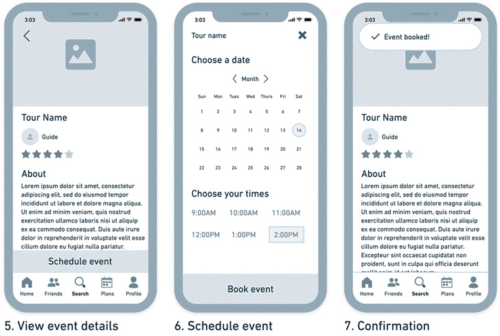
FIGURE A.5.4 My mid-fidelity wireframes for my traveler app.
1. Home screen—The home screen has the same information as the low fidelity version but has a bit more detail around the spacing and the quality of the image—it’s easier to follow than the sketches from before. I’ve also made some choices around the icons that I’d like to use to represent each option in the navigation.
2. Search for location—On the search page, I’ve filled in some of the places Jay can choose without having to type into the search box. I decided to look up the most popular cities in the world and put them as options in my prototype—it adds some realism to the flow that you can see is taking more shape.
3. Search for event—As with the last screen, I focused on the things Jay would search by and added a little more specificity. Jay would technically be looking at multiple results, so I made everything plural. “Shows” sounded more appropriate than “Theaters,” so I made that change as well.
4. Select an event—For this screen, I added some categories so I could get a sense of what types of events that Jay would be able to choose from. Things like “Top Landmarks” and “Essential New York” made a lot of sense to me as the things someone might want to do the most when visiting New York City. I added a category called “The city in a hurry,” assuming Jay might not want to spend all her time on a tour.
5. View event details—This screen stayed mostly the same between the low- and mid-fidelity versions—I added some more structure to the page to figure out its layout and filled in the description with lorem ipsum placeholder text.
6. Schedule event—This is the page that got the most updates. Instead of the modal from before, I fleshed out the details of confirming the date and time. This screen will probably have multiple states in my prototype, so I may need to make a few more screens that represent each selection the user makes while testing the flow. That can come at the last step before making the prototype.
7. Confirmation—Finally, this screen changed a bit as well. It’s the same screen as the event details screen, except there’s a notification at the top of the screen that shows Jay she booked the event. I felt like I could reuse design elements to communicate this to the user and I don’t need anything too wild here—a simple banner notification will do.
Now that I have my mid-fidelity wireframes, I can move on to the next step, high-fidelity wireframes.
High-Fidelity Wireframes
To create my high-fidelity wireframes, I used my mid-fidelity wireframes as a starting point (Figure A.5.4).
From here, I was able to re-create each of these screens (using Figma) in high fidelity (FIGURES A.5.5 and A.5.6) because I had a good blueprint for the content, functionality, and sections of the product I was trying to design.

FIGURE A.5.5 My high-fidelity wireframes for my traveler app.
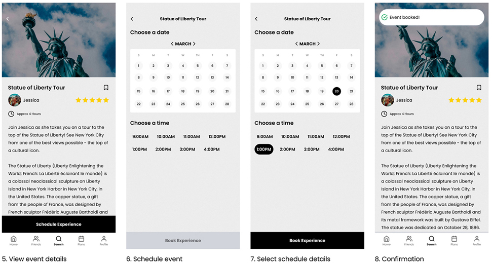
FIGURE A.5.6 My high-fidelity wireframes for my traveler app.
Did you notice how each screen from the mid-fidelity version made it over to the high-fidelity version without much change? This is because I spent so much time in planning the details of each screen in low and mid fidelity. When I got to high fidelity, it felt like all that was left to do was to “color it in” by choosing images, content, and iconography that reflected my goals for the product.
1. Home screen—I added the content Jay would expect to see—things related to the city she’s currently visiting, New York. She sees her next plan, which is to visit the Empire State Building. She also sees some recommended experiences—a row of cards that are Experiences for you and a row of cards that are the Best of New York.
2. Search for location—On the search tab in the bottom navigation bar, Jay can see locations she can search by. I’ve taken the content from the mid-fidelity wireframes and added more imagery to support the idea of those locations. These images will ideally entice Jay to explore different places and get excited about the possibility of traveling to them.
3. Search for event—Similarly for this page, I’ve added pictures of the things Jay can do once she searches by location—in this case, New York City. These images give Jay a sense of what to expect and continue to foster that sense of excitement.
Jay’s looking for something to do related to the famous places in New York City, so she taps Landmarks.
4. Select an event—For this screen, I added a lot more content so it could feel more real—the mid-fidelity wireframes didn’t have a lot of content planned out for this screen.
Here, Jay can see a lot of different landmarks to consider—places like Central Park, the World Trade Center, and Grand Central Terminal. Jay has a lot of options! She decides to check out the Statue of Liberty tour.
5. View event details—When designing this screen, I realized I’d left out a few possible details that could make the product feel more real and be beneficial for Jay—things like the ability to save the tour for investigation later (the bookmark beneath the picture) and the amount of time the tour would take to complete (the clock beneath the tour guide photo). These help Jay plan her trip.
Jay reads the description of the event, looks at how much time it would take, then proceeds to schedule the experience by tapping the button at the bottom of the page.
6. Schedule event—This is the first of two screens needed in the prototype to communicate what’s happening. The first of these is the empty state for scheduling an event—no dates or times are selected. Jay would first choose the date that works for her, then choose the time from that date (and times would reset based on each day’s availability).
7. Select schedule details—Jay proceeds to choose a date and then a time to book the experience. As she selects each option, those selections are reflected by changing color (from no color to a black fill). This is to communicate to Jay that she has made a selection and that the system has registered that selection.
After selecting her options, Jay proceeds to tap the button at the bottom that says Book Experience.
8. Confirmation—On the confirmation page, Jay sees a notification at the top that lets her know her experience has been booked. The notification would slide in, then slide back out after a few seconds. If she taps it, she can go to her Plans to see all her booked experiences—but that’s not a necessary thing I need to design for my prototype, so I left that out for now.
That’s it for my high-fidelity wireframes! This is enough to start testing the experience. Now, there’s just one step left before this step of design thinking is over—connecting all these screens together into a prototype.
Prototype
From the last exercise, I have my high-fidelity screens (Figures A.5.5 and A.5.6).
In order to take each of these screens and connect them into a prototype, I went back to Figma and used their prototyping capabilities to select the points I wanted the user to click and the screens those clicks lead to, as in FIGURE A.5.7.
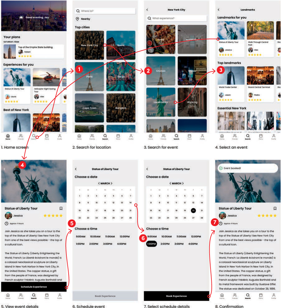
FIGURE A.5.7 The high-fidelity wireframes, connected by arrows that indicate where someone clicks and where that leads to.
In order for someone to progress through this prototype, these are the steps they would need to take:
Home screen—Click the search icon at the bottom.
Search for location—Click the New York City card.
Search for event—Click the Landmarks card.
Select an event—Click the Statue of Liberty Tour card.
View event schedule—Click the Schedule Experience button at the bottom.
Schedule event—Click the calendar.
Select schedule details—Click the Book Experience button on the bottom.
Confirmation—No inputs required (it’s the end of the prototype).
And that’s it! My prototype is ready for usability testing.
Chapter 6: Testing Your Designs
Usability Testing: Plan and Define
For my version of the solo traveler project, I created the prototype in Figure A.5.7.
Let’s see if I can define the parameters of my test.
Purpose
What do you want to accomplish with your test?
The purpose of my test is to determine the usability of one of the core flows of my product—the ability to find and book an event. I want to make sure users know how to find events and can book them, so I need to make sure the way I’ve structured that is intuitive for people.
I’d also like to probe a little into the value proposition of some of the features I haven’t prototyped out. I intend to ask users how they feel about going on group tours, if they want to meet people during those tours, and if they’d be open to connecting with them after the tours. That will allow me to better design the “Friends” feature I intend to put into this product were I to release it.
Scope
What part(s) of the product will you be testing, and what are their flows?
The scope of my test is directly related to the purpose—the core flow of finding an event and booking it. I will not be testing other elements of this product (it’s just as important to define what is not in scope).
In the future, I will need to test the usability of the Friends feature, but that’s not in scope of this test.
Audience
Who will you be testing with?
I’d like to test with people like my persona, Jay—so people who like to travel, travel alone, and want to maximize their travel by experiencing things like a local, meeting people, and seeing the sights. To find this audience, I’ll rely on my personal network and social networks to find participants.
Moderation
Will you be conducting the test, or will you use an external service to do the testing for you?
I’ll be there. I don’t want to use a service to do unmoderated testing, because part of the purpose of this test is to ask users what they would want in social features and whether or not that would be valuable.
Remote
Will you be present with the users, or will you connect virtually?
I’d like to do this testing remotely—I’ll be able to select from a wider user pool, and I don’t have a facility where I can conduct this testing more easily.
Author’s Note
One time, I was testing prototypes with a user, and they connected with their phone instead of their laptop. The design was too small, and they couldn’t see all the buttons I wanted them to interact with. I had to adjust the prototype on the fly to make sure the interactive elements were visible on their screen. I try to avoid that scenario as often as I can by testing the prototype ahead of time and requesting that users come with a specific device before the session, or providing that device myself.
Software/Hardware
What technologies do you need to test with? Do users need to bring devices to test on?
To accomplish this, as of this writing, I’d use Figma. My designs and prototype are already there. I can create a share link that I give to users to test with. I’d need video conferencing software that lets me share my screen, like Zoom or Google Meet. I’d also ask that users connect with their laptops or computers, to test the prototype. It would be better to test on phones, but the reality of testing prototypes is that everyone has a different phone size and I’d need to make different prototypes for different phones, which is a little too much overhead for this project.
Finally, to help record the conversation a bit more easily, I would use Otter.ai to get transcripts of each conversation. It will be easier to capture quotes that way than by having to listen to each video, trying to find what users said. If I’m using Zoom, I may use their recording software instead.
Quantitative
What metrics will you track for quantitative results?
For the quantitative metrics that I’ll track, I want to relate them to the purpose—can users get through the event booking flow? For that, I’ll track:
Task completion—What percentage of users were able to complete the task without assistance?
Error rate—How many errors did a user make along the way toward completion?
Task satisfaction—What number, on a scale from 1 to 5 (with 1 being the lowest), would users give this experience for their satisfaction with it?
Safety—What number, on a scale from 1 to 5 (with 1 being the lowest), would users give this experience for their feeling of safety with it?
For the safety question specifically, it would be nice to get some early signals about how confident and safe users would feel going to events with this product.
Qualitative
What metrics will you track for qualitative results?
For the quantitative metrics that I want to track, I’ll relate them to the task flow in addition to the future of the product. I’ll track the following aspects for this test:
What did users like about this experience?
What did users dislike about this experience?
What would they want to add to this experience?
For the Friends feature specifically, what would they want to see from that experience?
With the structure of the test in place, I feel confident that I can move on to recruiting for the test.
Usability Testing: Recruit and Conduct
For this exercise, you need to find users and test with them. To do so, you’ll need to figure out what method you want to recruit with, then from there, conduct the testing.
Let’s start by thinking about the script for my test. I’m going to go screen by screen through my prototype and write down the questions I want to ask about each screen. This will make sure that I’m prepared for the usability testing and that I know what I want users to do at each step in the process.
FIGURE A.6.1 is the homepage of the prototype and is designed to introduce the user to the product. I want to know what the user is thinking when they land here and what they think this product can do for them.
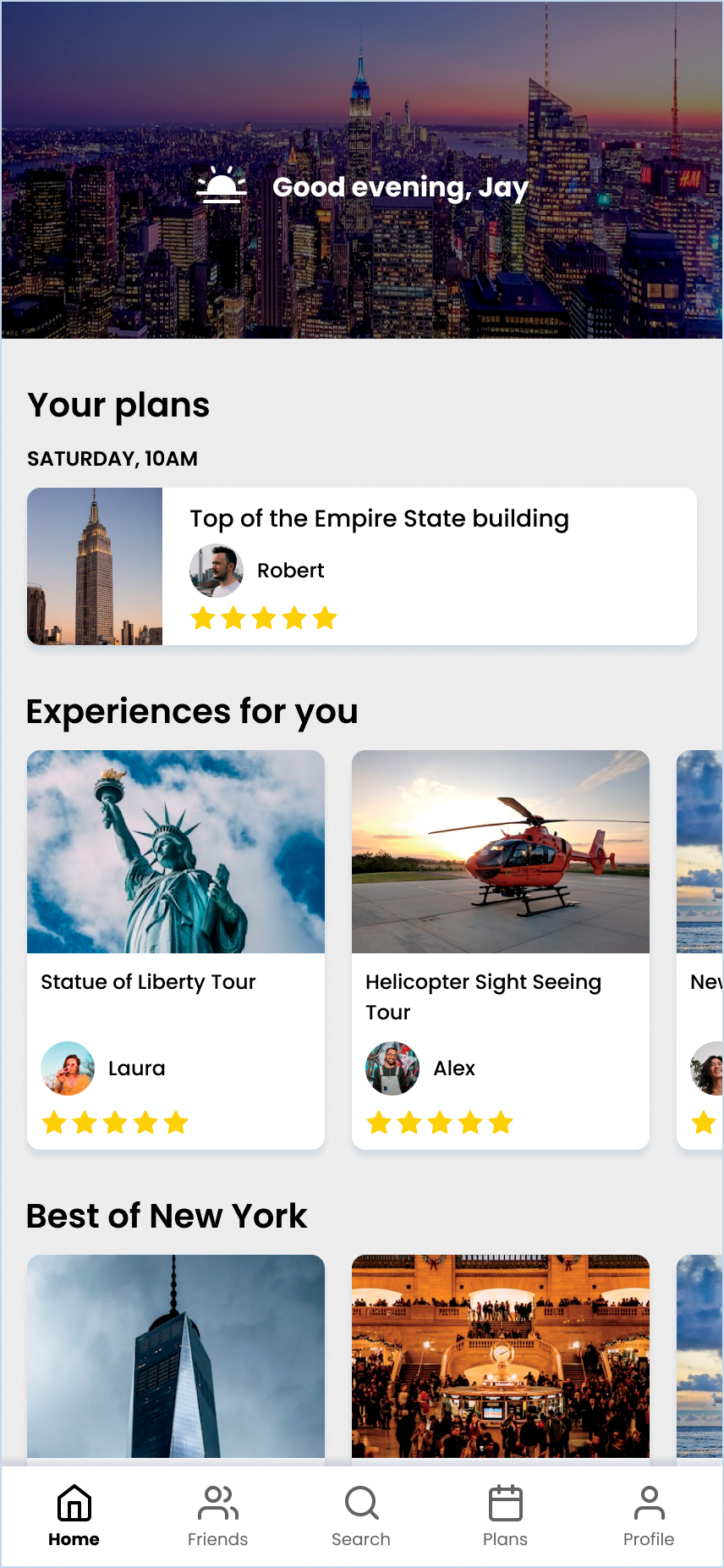
FIGURE A.6.1 The first screen in my prototype, the home page.
I’d ask the following questions:
What are you seeing on this screen?
What do you think this product can do for you?
What would you want to interact with first?
I’d then direct them to the first step in the prototype, which is to search for events to look at. I hope they will interact with the search icon at the bottom, but before they click it, I’d ask:
What would you expect to see on the next screen?
This question would expose a sense of expectations before they navigate to the next step.
The second screen in the prototype shows users what they can expect when starting a search. Given the number of activities in the product, they would need to narrow down by location before looking for activities. However, this may not be intuitive for users—they might start thinking about what they want to do rather than where they want to do them. I’d probe for that as users start to take in the search landing screen (FIGURE A.6.2).
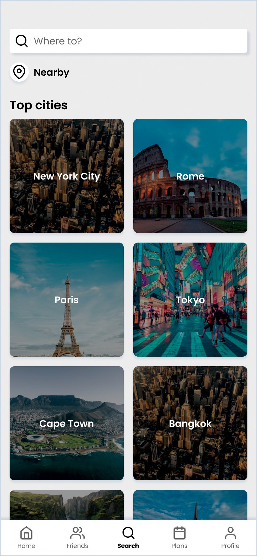
FIGURE A.6.2 The second screen of my prototype, the search landing page.
I’d ask the following questions:
What are you seeing on this screen?
Does this match your expectations?
I’d then direct them to search for activities based in New York City and hope they interact with the first option that’s present—the image that says New York City. Before they interact, I’d ask, again:
What would you expect to see on the next screen?
On the third screen (FIGURE A.6.3), the user can access specific event categories.

FIGURE A.6.3 The third screen in my prototype, which shows activities in a location.
I’d ask the following:
What are you seeing now?
Are these categories interesting to you?
Do you feel that any categories are missing?
Did you expect to search by city, then by category? Why or why not?
From there, I’d ask them to look for activities based on famous places in New York City. I’d avoid using the word “landmarks” (which is where I want them to go) because I don’t want them to look for the specific word I say. Rather, I want them to find the concept I’m referring to.
Before they click anything, I’d ask:
What would you expect to see on the next screen?
In general, this is a good question to ask before the user goes to the next screen, so that you can get a sense of what they expect and plan for it in your designs.
On the fourth screen (FIGURE A.6.4), the user can select a specific activity.
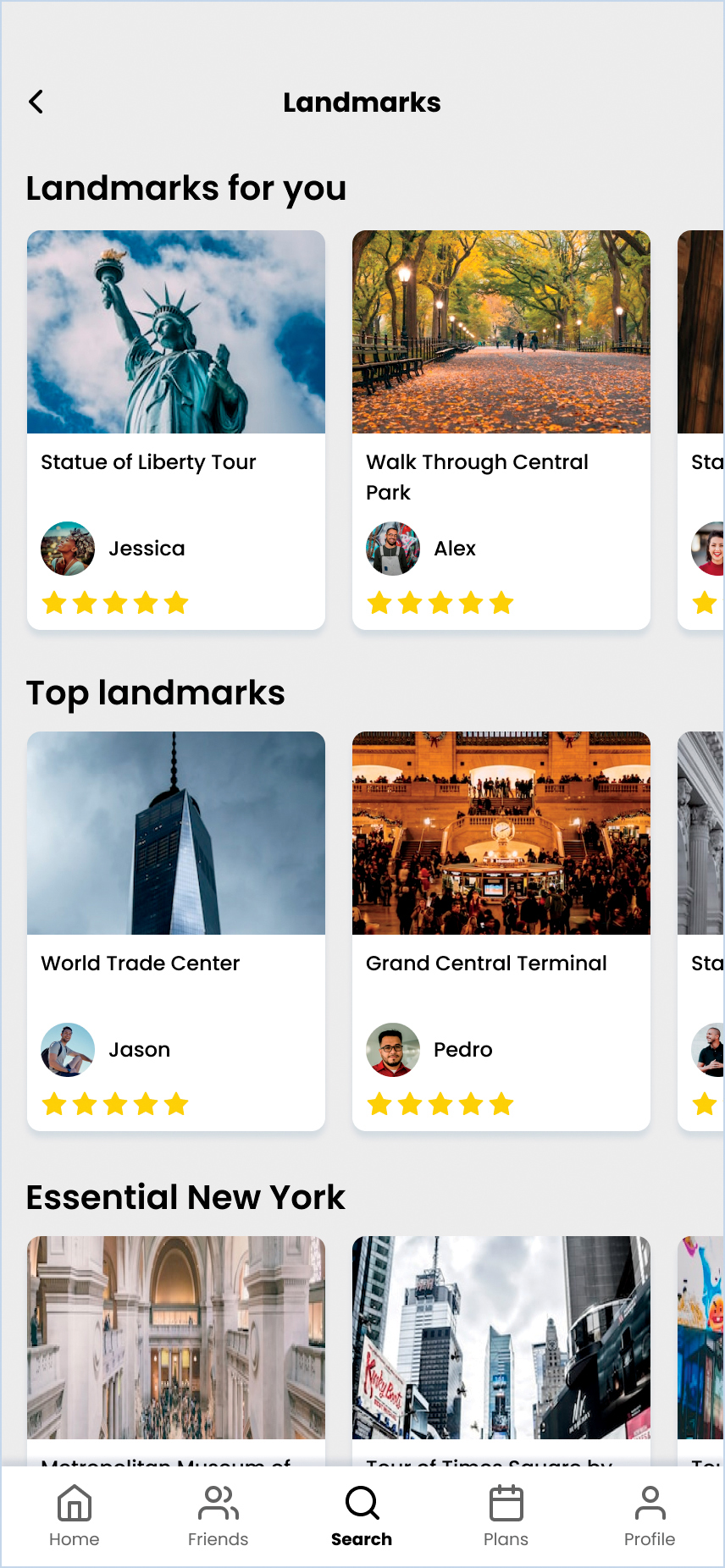
FIGURE A.6.4 The fourth screen of my prototype, which shows activities based on landmarks in New York City.
I’d ask the following questions:
What are you seeing now?
Does this match your expectations?
From there, I’d ask them to look at the Statue of Liberty tour, which would take them to the fifth screen in the prototype (FIGURE A.6.5). I’d ask, again:
What would you expect to see on the next screen?
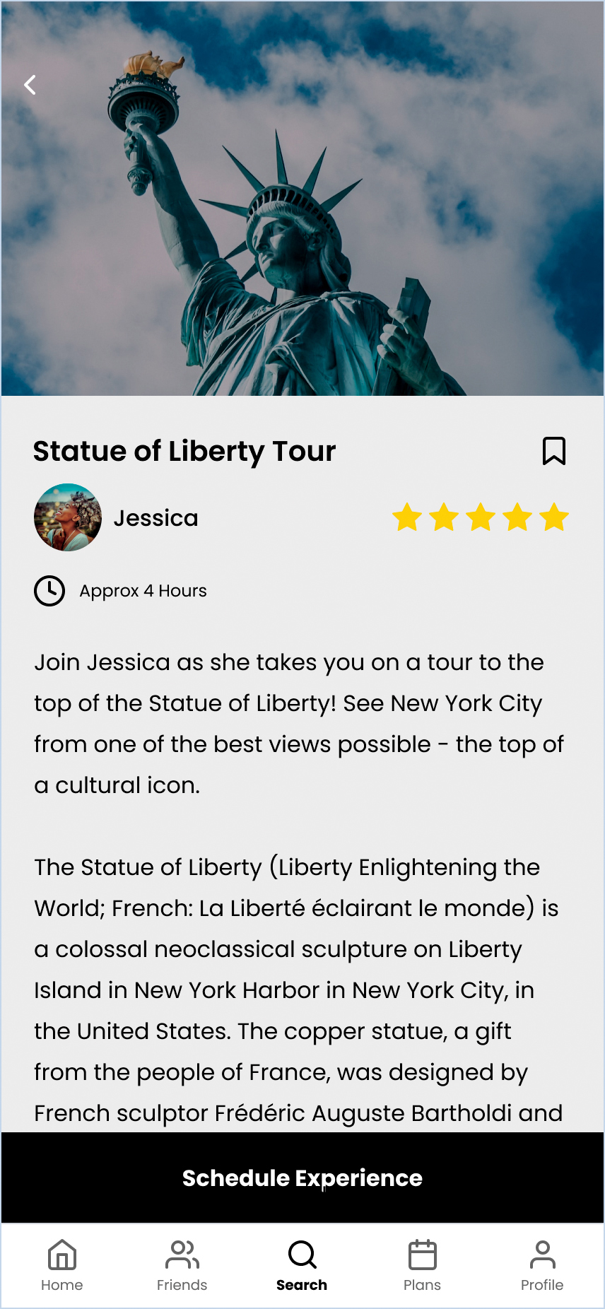
FIGURE A.6.5 The fifth screen in the prototype, which shows an activity detail page.
On this screen, I’d want to know the following:
What are you seeing on this screen?
Is this information interesting to you? Is it valuable?
What would make you interested in booking this experience?
What would make you feel safe booking this experience?
The safety question is an important one—I identified earlier in the persona work that safety is crucial for my persona, so additional verification might be needed here to make users feel safer.
Once I get the answers to my questions for this screen, I’d move to the next step—the booking flow (FIGURE A.6.6).
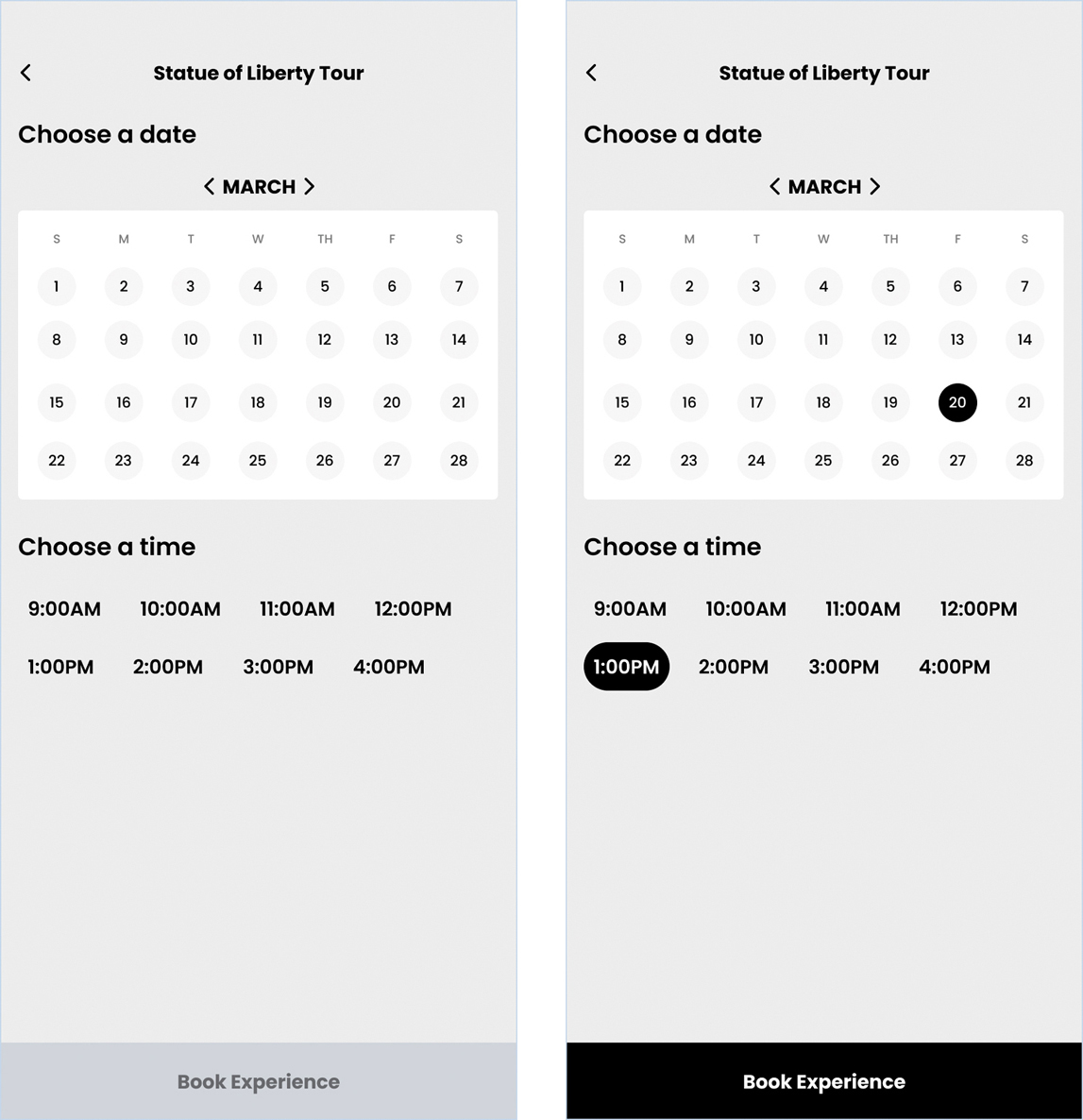
FIGURE A.6.6 The sixth and seventh screens in my prototype, the booking options screen before and after selections are made.
I’m bundling these two together questions-wise because they’re very similar—they’re the same screen, just different states of it. I need both screens for my prototype, but I can have the same question set for the two.
What are you seeing on this screen?
Are there any additional booking options you’d like to see?
What would you expect after making all your selections here and moving on to the next step in the process?
These questions will allow me to better develop this screen in the future and help anticipate customer expectations once I make my product.
After the user finishes booking the experience, I have one last screen in the prototype (FIGURE A.6.7). Before clicking Book Experience, I’d ask, one last time:
What would you expect to see on the next screen?

FIGURE A.6.7 The eighth screen in my prototype, the confirmation results.
Here, I’d ask the user the following:
What are you seeing now?
What did you expect to see?
Do you know if your event has been booked?
I’m curious if the banner at the top of the screen is enough to communicate that the event has been booked. I’m not sure it is, so asking that question outright is important to know if I got the results I wanted from my designs.
Since this is the last screen in the prototype, I’d then ask some closing questions about the overall experience:
On a scale from 1 to 5, how satisfied were you with this product?
On a scale from 1 to 5, how safe would you feel going to an event booked using this product?
What did you like about this experience?
What did you dislike about this experience?
What would you want to add to this experience?
Imagine that you could interact with the other people from this tour and add them as friends. What would you want to see from that experience?
Is there anything else you’d like to share?
These closing questions are important. They let me know how successful and meaningful the flow was for the user. They give me signals as to what they liked and didn’t like so I can make adjustments. Finally, they let me know more about how I can define and evolve the Friends feature, which is a crucial component of this product.
I also offer an opportunity for the user to share anything they’d like to about the experience. Not all users share afterward, but some do, and they usually have really good insights.
Now that I have my test plan complete, to test my designs I would try to find people to test with. I would reuse the screener survey from Chapter 2 to find my test participants, aiming for six people to test with. I’d use various social media outlets and communities to share the survey, such as LinkedIn, Facebook, and Slack. From there, people would take my survey and identify whether they want to be a part of testing, and I’d follow up with the best candidates to test with. After that, I’d test my designs and look at the results!
Usability Testing: Analyze Results
After conducting usability testing with six participants, I made the stoplight chart shown in TABLE A.6.1.
TABLE A.6.1 Stoplight Chart for Usability Testing Results
U1 | U2 | U3 | U4 | U5 | U6 | Average | |
|---|---|---|---|---|---|---|---|
Satisfaction | 5 | 3 | 4 | 4 | 5 | 5 | 4.33 |
Safety | 5 | 2 | 4 | 3 | 4 | 3 | 3.50 |
Completion Rate | 100% | 100% | 100% | 100% | 100% | 100% | 100% |
Errors | 0 | 2 | 1 | 1 | 0 | 0 | 0.67 |
City then Activity | ✔ | / | ✔ | / | / | ✔ | / |
Event Felt Safe | ✔ | ✘ | ✔ | / | ✔ | / | / |
Satisfied by Booking | ✔ | / | ✔ | ✔ | ✔ | ✔ | ✔ |
Saw Notification | ✔ | ✘ | ✘ | ✘ | ✔ | ✔ | / |
I structured this table to best demonstrate the results of each part of the usability test. The columns represent each user, followed by an average of the overall sentiment or results of all users. The rows represent insights regarding the usability testing, such as satisfaction scores, errors, or individual aspects of the test that I wanted to track.
Satisfaction—This represents the satisfaction score users provided for the prototype. Overall, most users were satisfied with the product, which is a great sign that this product could help them with their needs.
Safety—This represents how safe they felt going to the actual event. This result was lower, in part because some users didn’t feel like there were enough assurances or information to verify the tour guide or that they’d be in a safe environment. Some sort of verification process or signal might help here.
Completion Rates—This represents completion rates. No one had issues completing the task, though there were a few snags represented later in the table.
Errors—This tracks errors; in this case, there were a few errors where things could have been more clear or more visible to the user, such as the notification at the end of the flow or the process of choosing the city first when searching. There isn’t much I can do about the latter (it’s a limitation of the product’s data) but for the former, I can improve the UI before launching the feature.
City then Activity—This tracks whether users felt searching by city and then by event type was intuitive. This result was mixed—some users thought this was fine, but others would have preferred searching by activity first, as an activity would help determine where they wanted to travel.
Event Felt Safe—This shows how many users thought the event would be safe to attend. Results were mixed here—the fact that this event was booked through a product helped improve user confidence, but there was no verification process and no reviews of the person taking people around. Additionally, there was no guarantee that the people who were also at the event would be safe, so there was some concern there as well. Additional verification methods—like a checkmark on the tour guide, seeing the profiles of who else was attending, or an onboarding to the app that caused the users to verify themselves—would make them feel more comfortable going to the event with others.
Satisfied by Booking—This represents satisfaction with the booking options for the event. For the most part, people didn’t feel like anything was missing there.
Saw Notification—This shows who did or didn’t see the notification. About half the users missed it (the notification somewhat blends into the background), so improving the animation and contrast of that notification will help others see it in the future.
Hopefully these results illustrate what you can work toward for your usability testing for your projects!
Chapter 7: Implementing Your Designs
User Stories
Let’s take another look at my design solution in FIGURE A.7.1.

FIGURE A.7.1 High-fidelity wireframes for my traveler app.
My solution is to allow solo travelers the ability to find events hosted by local tour guides and connect with that tour guide and other travelers to enhance the solo travel experience. To facilitate implementing this solution, I can write user stories that explain the tasks that solo travelers should be able to perform when using this product. Let’s take another look at the formula in FIGURE A.7.2.

FIGURE A.7.2 The formula for writing user stories.
To deliver the user stories needed for this solution, I’ll have to think of all the tasks that solo travelers want to complete so that those tasks make their way into the product.
Let’s start with events:
As a solo traveler, I want to find different types of events in the city I’m traveling to so that I can experience things like a local.
As a solo traveler, I want to see an event’s details, including reviews, a verified host, and the participants, so that I can feel comfortable going to this event.
As a solo traveler, I want to leave feedback about an event so I can share my experiences with others and keep track of how much I liked an experience.
These user stories feel like a good place to start. They cover the basics of event information—what events exist, what their perceived quality is, and how a user can provide feedback.
In writing these user stories, I’ve noticed that some of these stories include elements that aren’t currently in the designs, like seeing other attendees on an event page, or the screens that represent what happens after an event is over. Sometimes, this happens—and that’s OK. It’s better to catch these now, rather than find out after you’ve committed a development team to the work (or worse, launched the product!). Part of the reason why you write user stories at some point during the project is to make sure you cover all these use cases so that the user experience is holistic and complete.
What about booking events and tracking the events solo travelers have participated in? Let’s write some stories for those as well:
As a solo traveler, I want to be able to book an event (immediately or in advance) so that I can save my spot in an experience when I’m traveling.
As a solo traveler, I want to see a schedule of my upcoming events so that I can plan my trip and confirm my attendance.
As a solo traveler, I want to see a history of my past events so that I can be reminded of all my experiences.
These user stories capture the event management experience—booking, scheduling, and history. This allows solo travelers to plan their trip, build a schedule, and reflect on their previous experiences.
What about a solo traveler’s profile? How do solo travelers have a presence in the product, and how do they interact with one another? How can I be sure that the company can recall the information of the people that use the product to book events?
As a solo traveler, I want to be able create an account and log in to the product so that I can access my information.
As a solo traveler, I want to have a public profile so that I can connect with the people I meet in an event before an event, during an event, and after the event is over.
As a solo traveler, I want to keep track of the people I meet on events so that I can continue the conversation and develop deeper connections.
These user stories cover the ability for users to establish accounts, manage profiles, and connect with other users outside of actual events. These speak to the need for users to have a presence in the product and use that presence to support making connections with others.
These are just a few of the user stories I could write for this project. They don’t cover other essential elements required to make this solution work, such as the tour guide user experience (posting an event, having a tour guide profile, reading reviews about a tour guide’s profile, and so on). There are other stories most likely required to make the traveler user experience function as well.
The truth is that there’s a lot to making a brand-new product that goes outside of the core problem to solve—in this case, allowing solo travelers to maximize their travel experiences. While “creating a profile” isn’t something that supports that problem, it’s required for creating a functioning product. Making sure you write the user stories that enable a functioning product, in addition to addressing the problem to solve, is all a part of creating user stories.
User Flow
To make my user flow, I decided to start from my Chapter 5 task flow from the Appendix (FIGURE A.7.3).

FIGURE A.7.3 A task flow for finding and booking an event.
This is a great baseline to start thinking about all the logic I want to capture in my user flow—the journey a user goes down when booking an event. I thought about additional elements, like the app surfacing results based on the user’s location—whether or not there are any search results based on a location—and conflicts the user may have if they try to book two events at the same time. The user flow for this journey is in FIGURE A.7.4.
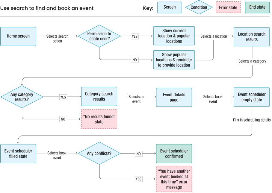
FIGURE A.7.4 A user flow for using the search function to find and book an event.
A lot has changed from the task flow! What was so easily represented at a high level became complicated once I got into the specifics and thought about all the edge cases that could come from it. I now have conditional logic (represented by diamonds) and error states (represented by red boxes) to help show additional possibilities that could happen to the user as they move through this flow.
To transition from task flow to user flow, I included a few new elements as well. Outside of the new shapes, the steps a user takes are on the arrows that link between screens and states. This helps separate what the user does versus what the system does and makes actions and destinations clearer to someone reading this flow. I’ve also included a key in the upper-right corner—contextually, I’d hope that each element of this user flow makes sense to the reader, but I went ahead and described each shape in the key in case it doesn’t.
Style Guides
Working from my high-fidelity designs, I took the main themes from those screens and put them into a high-level overview of my visual-design decisions, as shown in FIGURE A.7.5.

FIGURE A.7.5 A style guide for the solo traveler app.
In my style guide, I hit the core elements of my designs:
Color—I use three main colors in my design: black, white, and gray. I do have some components that are yellow (the reviews on the cards), so I add that to the color styles as well. Note that I’m not counting the colors on images, since that’s not a part of the UI system, but rather the content that the system surfaces to the user.
Typography—I use one font family: Poppins. From that font family, I have a heading, a subheading, a body, an overline, and a label classification, all of which happen at different points in my designs.
Iconography—I have one family of icons, from Feather Icons, and I use several in my designs. They all have a similar weight, style, and feel.
Components—I include several types of components. I have my buttons, app bar, search field, and cards. These are the most common UI components in my designs.
Imagery—I wanted to include some images, especially since this product so heavily relies on the places a solo traveler can visit. I include both location imagery (generally a square card in my designs) and event imagery (generally a wide rectangle in my designs).
That’s all I feel I need for my style guide at this level. I show off the smaller visual elements (like color, typography, and iconography), how those elements combine into components (like buttons, text fields, and cards), and the stunning visual imagery I rely on for my product (the locations and the events). Combined, these should give people a good sense of how my product feels.
Design Systems
I put together a list of my most common repeated elements and created styles and components for each, as shown in FIGURE A.7.6.

FIGURE A.7.6 The master components that power the design system for my solo traveler app.
Starting at the top, I’ve created atoms—styles for each color in my designs, the typography used throughout the app, and the shadows on my cards. That way, I’ll always have the same style, no matter where the element appears in my solution. If I want to change my primary color, for example, I can choose this master component and change the value, and then everything else will change automatically.
Styles also help me design faster—instead of trying to remember which values I chose for my shadows on my cards, I can pull the style from here and apply it immediately.
Moving on to the next row of components, you can see things starting to get a little more complex, with molecules from my design system. Those colors from the styles start coming into play on the buttons. There is text combined with other design elements. You can see how the atoms are starting to combine into more complex elements.
If I were to update an atom used in these molecules, they’d update automatically as well and flow through the rest of my designs, keeping me consistent and helping me to design more quickly and at scale.
In the final row, you see organisms—even more complex components that incorporate atoms and molecules to make larger structures that are repeatedly used in the product, like the app bar and cards. Although the metadata in some of these organisms (like the cards) changes significantly across the product, the master components provide structure to those organisms so that I stay consistent.
Design systems can be quite robust and detailed, especially as your product grows and scales. In fact, there are designers dedicated to creating and maintaining the design systems of larger products so that they feel like a unified user experience. If you like this type of organization and thought applied to your designs, you may want to consider that as a career option in the future.
Delivering Designs
Working from the user stories I created from another exercise, I can visualize the screens required to deliver each of those stories. I’ll demonstrate this for the user stories that come from the screens in my prototype.
As a solo traveler, I want to find different types of events in the city I’m traveling to so that I can experience things like a local.
For a user to find an event, they need the ability to search for that event and see a list of search results. In FIGURE A.7.7, I show the screens needed to do that—from the home screen to the location search screen to the event search screen to a list of events in a location.

FIGURE A.7.7 The screens required to deliver the happy path for users looking for an event in a location.
A user could take other steps to find an event—they could just choose an event on the home screen, for example. There’s also conditional logic to consider, like if there are no search results. To accomplish the happy path, however, and communicate my designs to the rest of the team, the path in Figure A.7.7 will suffice.
Let’s try another user story.
As a solo traveler, I want to see an event’s details, including reviews, a verified host, and the participants, so that I can feel comfortable going to this event.
For this story, it’s pretty simple—I need to show a list of events and then the information of a specific event. I’m able to do this in two screens, which makes this story easier to communicate (FIGURE A.7.8).
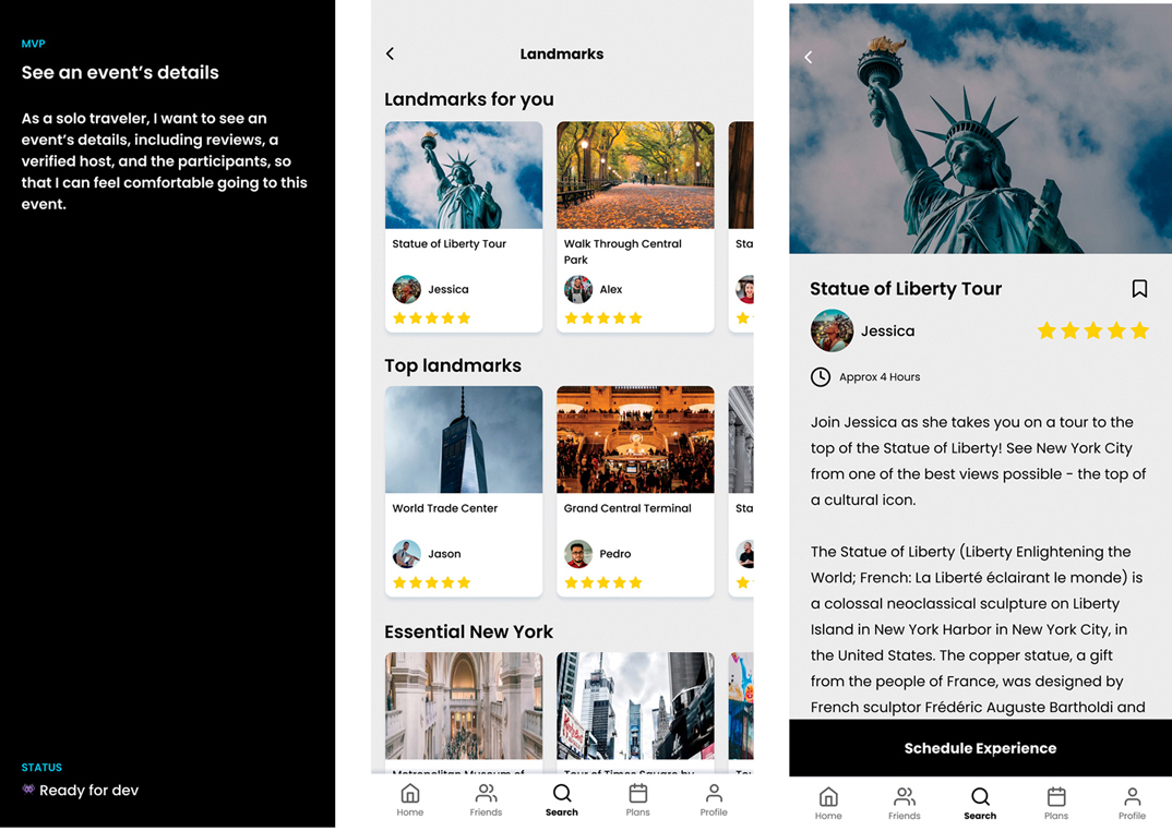
FIGURE A.7.8 The screens required to deliver the happy path for users who want to learn more about a specific event.
Let’s try one last story.
As a solo traveler, I want to be able to book an event (immediately or in advance) so that I can save my spot in an experience when I’m traveling.
For this story, it’s also somewhat straightforward from my prototype—show the event, show the selection screens, then show the event being booked (FIGURE A.7.9).

FIGURE A.7.9 The screens required to deliver the happy path for users to book an event.
However, I do want to say that this story has a little more to it that’s not being captured here, mainly for the animations and state changes that go into making selections. Do buttons animate as the user taps them, like on the calendar or the time picker? How does the banner at the end of the flow appear and disappear on the screen?
These are nuances that can’t be captured presenting the flow in this way and shows us that there may need to be supplemental forms of documentation when you deliver designs. Hopefully, in a real-world scenario you could reference motion guidelines or write separate documentation that outlines how systematic things enter and exit the screen, like presses of a button or notifications.