
35. COMPOSE FOR DESIGN
![]()
I’LL END THIS chapter with a helpful tip from my experience as a magazine and commercial photographer: compose for design. This is a hard concept to get across sometimes, especially if you’re new to photography or haven’t had experience working with designers, publications, and agencies. However, I believe working in this particular photography environment has made me a stronger portrait photographer.
Composing for design simply means designing the portrait to move the viewer’s eye to your subject, but there’s another element: designing with the potential for the portrait to be used with other elements later. For example, each time I’m on a portrait shoot for a magazine, I have to compose at least one or two shots for the publication’s cover (Figure 35.1). Not only does the portrait need to look great, it also needs to have enough room on top for the magazine’s title, and room below and on one side for more text. When I’m working on a campaign with an ad agency, we discuss composition of portraits prior to being on location because I’ll need to photograph in a way that meets their needs when they create the advertisement.
Not a magazine or advertising photographer? What about senior portraits that might be used for graduation announcements and invitations? Many brides and grooms like to use engagement portraits as the background for save-the-date announcements. And don’t forget the family photographs that are used for holiday cards and social media invites, etc. Composing with design potential in mind is a great way to create versatile, creative images.
The key to composing for design is managing the portrait’s white space (Figure 35.2). This design-centric term does not refer to the parts of your image that are strictly white (although white space can certainly be white). Instead, it refers to empty space that can be used for design elements, like text, other graphics, etc. White space minimizes the distraction of external design elements. For example, an out-of-focus portion of the right-hand side of the frame can serve as great white space on which to place the name of your subject and graduation date (Figure 35.3). Not only did the composition of your subject and the out-of-focus background drive the eye to your subject, it also left some valuable space for extra designs. Senior portrait and wedding photographers use this space all of the time to create beautiful products for their clients—material that might keep them coming back, as well as bringing them new potential clients.
Now, I’m not saying design should be the only thing guiding your composition. I’m emphasizing its value in making you a more considerate, well-versed portrait photographer. You are a photographer first. However, I’ll mention two things before closing. First, photography is an art influenced by eons of design, be it architectural, natural, or purely artistic. Composing for design is simply extending this influence and creating artistic possibilities out of your own work. Second (and this relates more to those wanting to enter into portrait photography on a semi-professional or professional basis): composing for design increases your potential to meet the needs of those folks with whom you’ll be working. I attribute much of what I earn from various clients to my ability to compose for design, which essentially means I can be a team player in the grand process of a magazine going to print or an ad campaign going to market. We often get wrapped up in the notion that photography is a lone wolf, individual style of work, and in many cases, it can be. However, entering into the industry relies on your ability to work well with other professionals, and composing for design is one of the strongest aesthetic ways of contributing to the work.
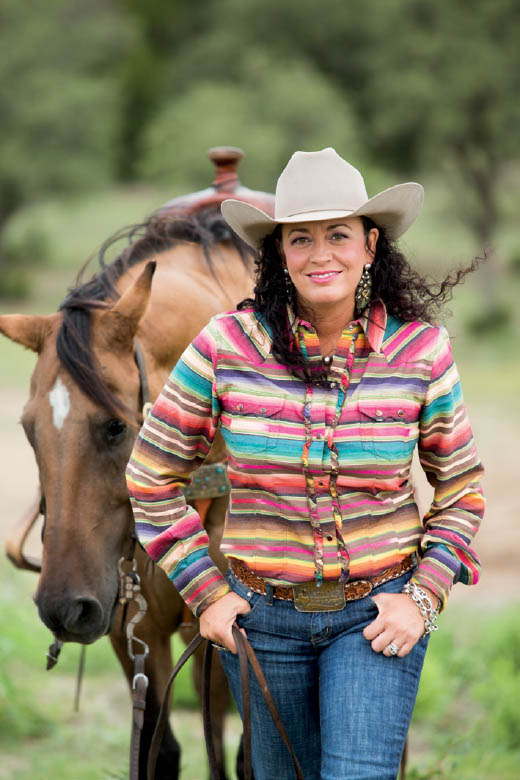
35.1 While on assignment, I made sure to compose several images of Amy with enough room above her and the horse for a magazine’s masthead if the image were to be selected as a cover.
ISO 400; 1/160 sec.; f/4; 200mm
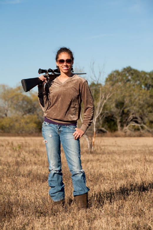
35.2 This portrait includes a great deal of design-worthy white space while still being composed comfortably. The sky and the out-of-focus trees and grass to camera right of the subject can easily be used for text or more imagery based on a designer’s preferences.
ISO 200; 1/1600 sec.; f/5; 95mm
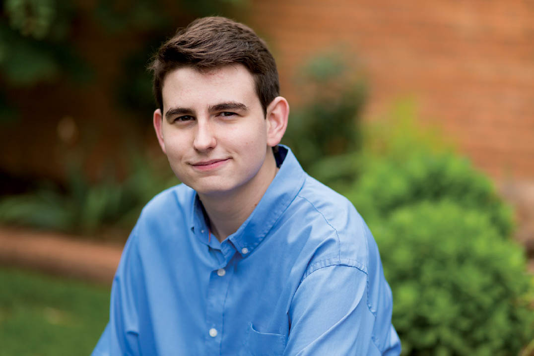
35.3 This senior portrait may serve well for a graduation invitation based on the attractively out-of-focus background to camera right of the subject.
ISO 200; 1/320 sec.; f/2; 85mm