
ANALYSIS OF LETTERING SAMPLES
Here are four works by renowned artists. Observe their work on the shape of the letters and their positioning and composition. With practice, you will be able to reach this level.
To make it easier to analyze these lettering samples, I have provided my commentary, but please do not hesitate to make your own analysis as you observe, among other things, the shape of the letters, their dynamism, the spaces, the rhythm, etc.

2. Wells Collins (United States). Produced with the Tombow Dual Pen, then vectorized and reworked using Illustrator.
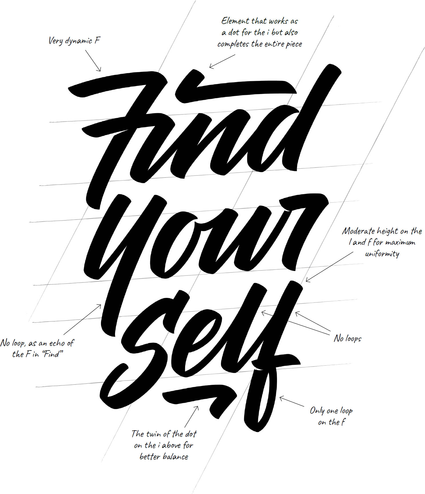
1. Terence Tang, Tiniun Studio (United States). Personal piece produced in felt pen, reworked in pencil and then vectorized in Illustrator.
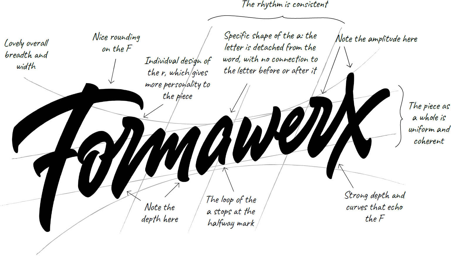
2. Sergey Shapiro (Russia). Logo created with a felt-tip brush pin, then reworked in pencil and vectorized.

3. Matt Vergotis (Australia). Logo created with a felt-tip brush pen and then reworked directly in Illustrator in order to be vectorized. Matt Vergotis is particularly fond of small, fine-point felt pens.