
EXERCISE 5 | LEAVING YOUR COMFORT ZONE!
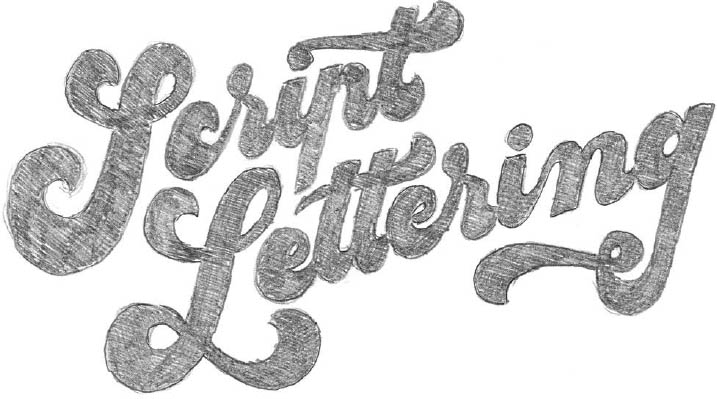
Up to this point, you have been using a relatively classic style of script lettering to expand on your skeleton. Now it is time to explore some more modern styles.
ACCENTUATING CONTRASTS
Take a new piece of paper and place it on top of your last version. Now add a considerable amount of thickness to the thicks and thins. Do not be afraid to saturate your piece with graphite. The contrast will give an assertive style and more personality to your work.
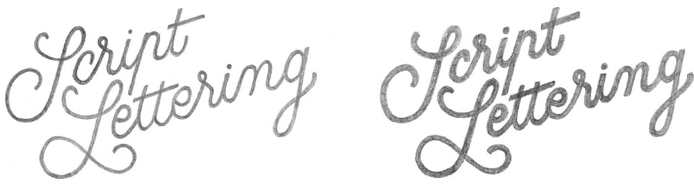
Here are two successive versions of my lettering piece, showing a progressive thickening of the thicks and thins. You will notice that the style changes considerably from one piece to the next. The end product is still very clearly handwriting, but drawing is becoming more important here.

1. The first version is reminiscent of the American Spencerian script style of the Ford and Coca-Cola logos (page 2).
2. The second version looks more contemporary and is related to the disco or funky posters of the 1970s. I have thickened the base of the letters considerably, which is what produces the funky effect.

3. Here is another version, in negative, which I invite you to try as well. What you end up with is a white piece with a dark outline, which really highlights the lettering.
FORMAL RESEARCH
After having gradually thickened your thicks and thins, feel free to explore some new styles, such as Stencil Script or Monoline, of which you can find some examples here (see also the outline for the exercise on page 39).
Vocabulary
Stencil is a font created before the Second World War to mark the United States Army’s equipment cases and vehicles using stencils. Its letters have the feature of being divided in the middle.
Stencil Script is a manuscript style that also includes this feature of having the letters cut in half in the middle or divided into segments.
Monoline is a script that does not have any thicks and thins, which produces an even line.

4. Scott Biersack (United States). Sketch in Stencil Script. The original Stencil style can be found here in the words “DON’T” and “YOUR.”
5. Brett Stenson, via Jolby & Friends (United States). Lettering in inked Monoline and then reworked in Photoshop.

6. Lettering in Stencil Script by me.
7. Claire Coullon (France). Logo in Monoline produced in felt pen, reworked in pencil, and then vectorized in Illustrator.
8. Paul von Excite (Netherlands). Logo in Monoline produced in pencil and then vectorized in Illustrator.
Working in Stencil is not easy. Try to really absorb these exercises in order to understand how the letters are composed; note that they are most often segmented at the top. The care that you give to the creation of your spaces and your contrast in the beginning of the process will make this work considerably easier.
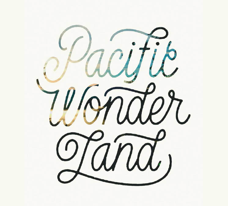
In a few sketches, you can explore a classic rendition of cursive script; a more stylized version, used to create vintage logos, for example; and a funky, Stencil, or Monoline version. Using this skeleton, all of the styles in script lettering will become accessible to you.
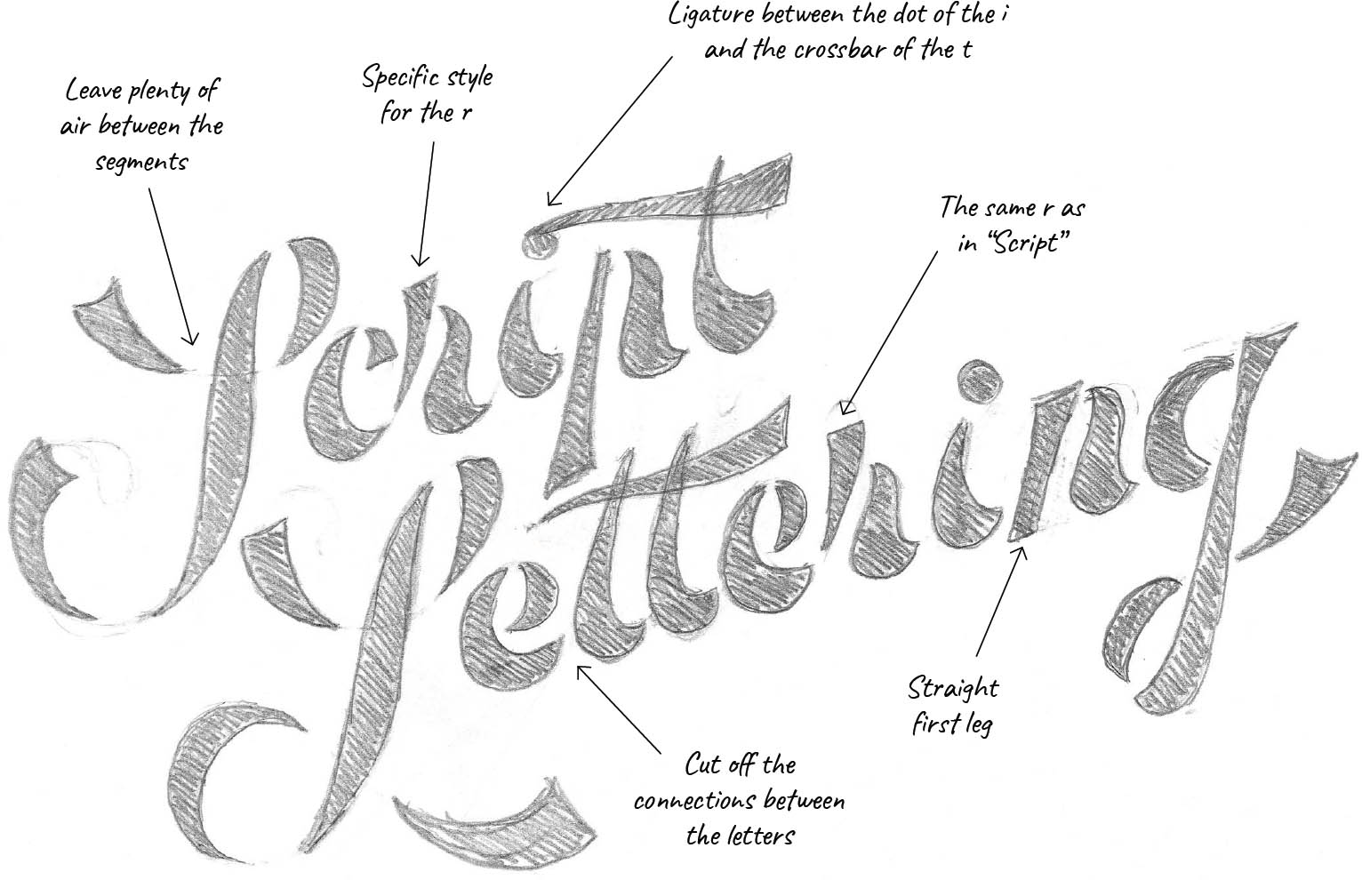
1. My explorations in Stencil Script, produced based on the skeleton we used at the beginning of this chapter. I have added a few annotations to help you understand the foundations of this style.
2. and 3. I created two Monoline versions: one fine and one thicker. As with the Stencil version, working from a skeleton makes it possible to quickly create a sketch that is faithful to the style you want for your lettering project.
TAKING STOCK
Lay your sketches on the table. Study all of these different, more or less classic, versions. Take the time to observe which of them best meet your expectations and seem the most interesting to you, and set the others aside.
Now take your best results and work on them until you have improved them as far as you can, always working on separate sheets.
An Open Mind
Stay open to the ideas you would not have thought of at first. Do not forget that these are non-definitive sketches, even if they are going in a very well-defined direction. The study of a variety of tracks can be an asset if you need to present a project to a client. You can guide the client toward familiar ideas, but you can also suggest different and unexpected avenues and thus pique their curiosity.

4. I decided to keep the negative (page 50) and rework it until it was finalized.