
WHAT IS LETTERING?
Lettering began with the American letter painters of the second half of the nineteenth century. They were the ones who named this art, which began as “hand lettering.”
This discipline, a direct descendant of calligraphy, consisted of drawing letters with a paintbrush, in styles that were called brush lettering or script lettering, which will be described in detail later. These styles could be found on numerous signs and advertisements covering the walls of buildings. Lettering very quickly spread into the marketing field and could be found in print advertising and also in the creation of visual identities, especially in logos. A number of famous brands have had hand-lettered logos from their inceptions, including Coca-Cola and Ford.

1. The first version of the script-lettered Ford logo appeared in 1906. It was reworked in 1911 to take the form it has today. It is one of the most beautiful examples of hand-lettered logos.
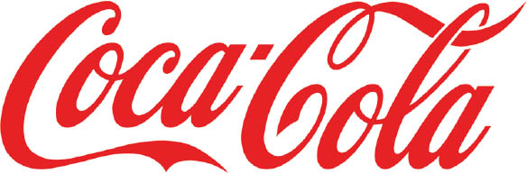
2. The Coca-Cola logo dates back to 1886 and has barely changed since its creation.
Lettering continued to be a vibrant field in the United States, with continually evolving styles, up until the arrival of computers. Typographic characters then came into use in the 1950s and 1960s with the emergence of fonts such as Helvetica and Futura.
In Europe, the field of lettering did not enjoy the same level of enthusiasm at first. Even though there was some lettering done in the American style, the Europeans were more inclined to use typographic characters with serifs, and later sans-serif fonts, or even fonts that imitated handwriting, such as Roger Excoffon’s Mistral font. That font was a contributing factor in the use of handwritten characters on Parisian restaurant signs and signs for other kinds of businesses in the 1960s.
Once computers and new printing techniques arrived, the practice of lettering was gradually abandoned. Letter painters became rare and graphic designers, now equipped with computers, saw their work evolve toward the almost exclusive use of computer fonts. As a result, lettering almost disappeared, except in the work of a few diehards, such as typographers and calligraphers.
It was not until the early 2010s that a number of graphic designers decided to refocus on letter design and give lettering its own place in the landscape of graphic design again. Thus, “vintage” styles have made a comeback. The letter has regained some nobility for professionals in visual communication who want to create unique works.
But this renaissance is also an expression of the need to return to a more authentic and manual kind of activity, the desire to get one’s eyes off the computer screen to rediscover the joys of drawing. Because lettering is, most of all, drawing! Widely considered to be a way of distancing oneself from the computer and, more specifically, from the Internet, the discipline of lettering is, in certain ways, akin to meditation: an activity that we can plunge into and that keeps us focused for hours, making us forget everything around us. Lettering is all of that and much more, and this is what I invite you to discover in this book.

3. The typographic font Mistral, conceived by Roger Excoffon (France) in the 1950s based on his own handwriting (Olive foundry).