
EXERCISE 3 | CHOOSING THE STYLES FOR EACH WORD
Take stock at this point. Consider the different arrangements that you have chosen and weigh the pros and cons of each.
The structures of your compositions can influence your choice of one style of lettering or another. In my first version, for example, the word “Ateliers” is stretched out in height at the beginning and end of the word, which would tend to suggest the use of a typographic character. It would be tricky to use brush or script lettering here; the word would be too distorted and would become less readable, both in terms of balance and in terms of aesthetics. On the other hand, it might be wise to choose one of those styles for the word “Lettering” because it works particularly well to alternate between typographic characters and a manuscript style in the same composition, and that makes for good readability and greater contrast. From an aesthetic standpoint, this kind of alternation is always pleasing to the eye.
Return to your best efforts and try to apply a variety of styles, which you might alternate or invert in another version, in order to create a visual overview of the piece under different conditions. If your piece also has shorter and less important words, try out a variety of styles on them and compare them.
In my case, I chose two versions, each of which I then took in a variety of directions using different styles.
Form and Content
Keep in mind that the lettering style you choose must be consistent with the content of the message and its purpose. A lettering piece that has to do with Valentine’s Day will work better if you make it full of curves than if you use a vintage style with Gothic characters.
Don’t Overdo It!
While it is advisable to alternate the lettering styles you use in a piece, be careful not to use too many of them. In any graphic project, it is always important to limit the different styles of typographic characters you use to avoid overloading the formatting and to maintain an overall coherence. The same is true in lettering. In any one piece, use a maximum of two or three different styles.
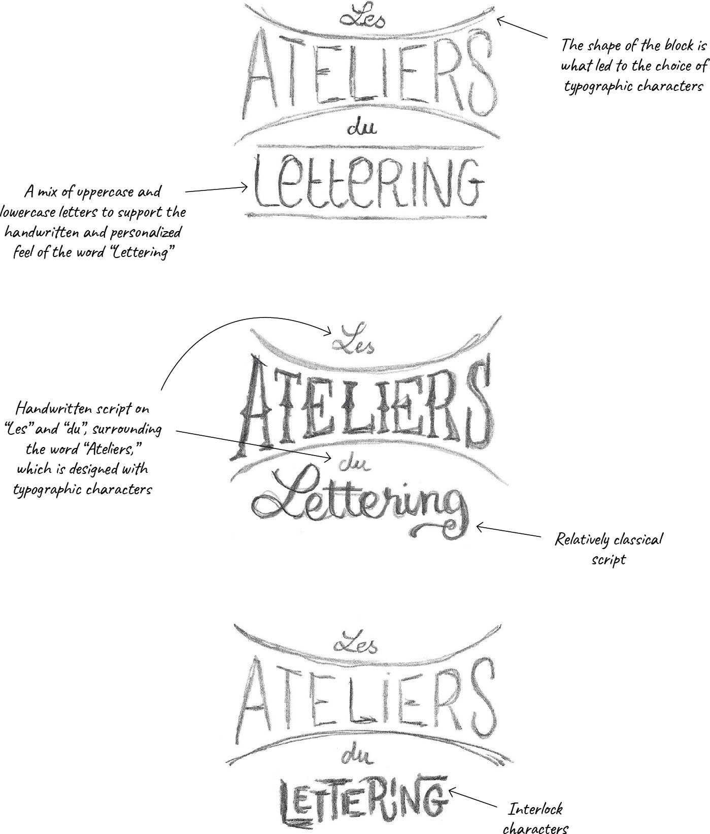
Track 1. In my opinion, versions 2 and 3 on this page have more character. Version 1, in which the styles are close to each other, does not provide enough of a visual contrast. Overall, this organization of the block seems very interesting and uniform to me.
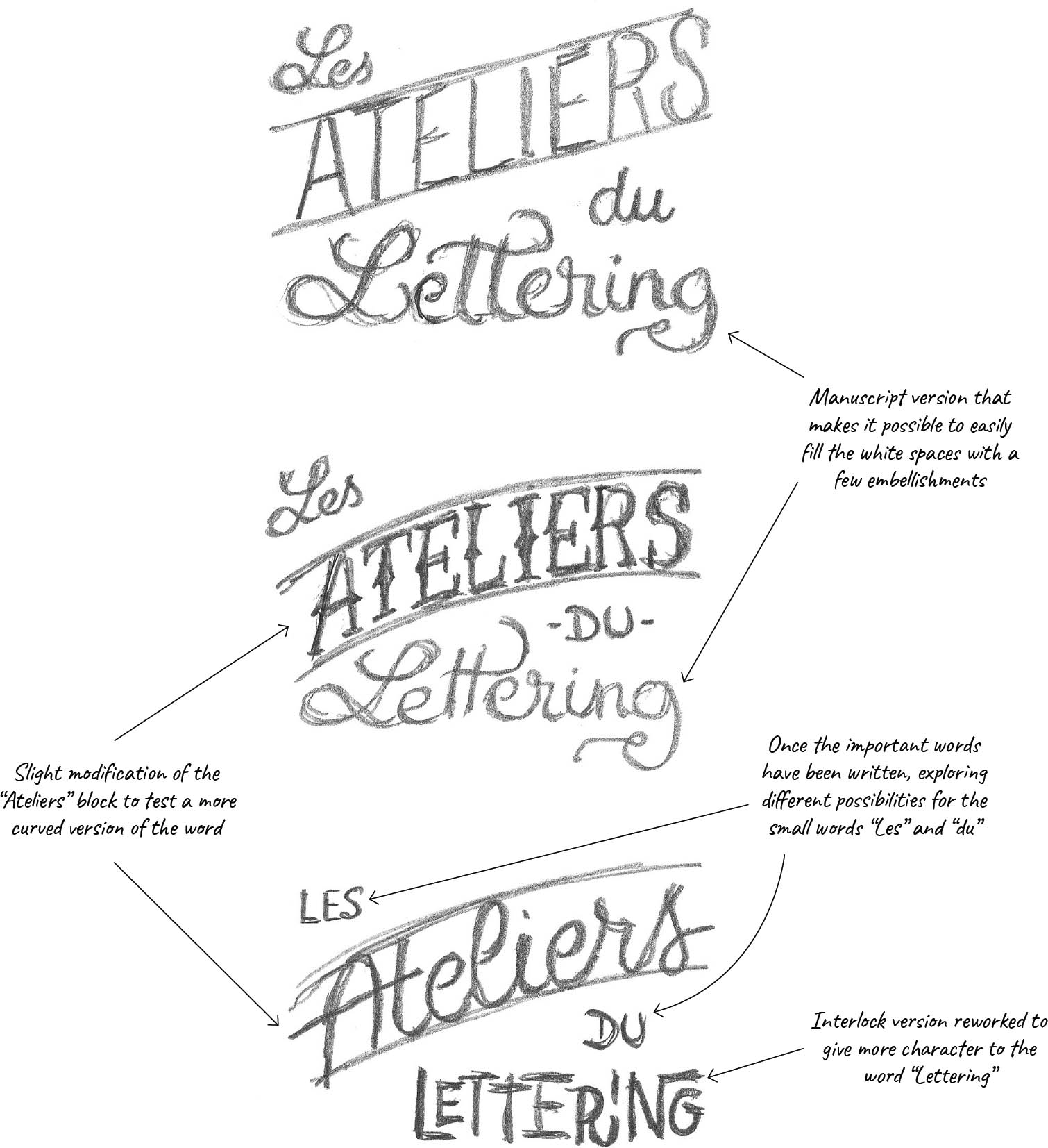
Track 2. In each case, I alternated between manuscript and typographic styles. The first version is the most uniform, in my opinion. “Ateliers” written in this curved manner does not work all that well in these sketches, and overall balance seems to be more complicated to establish.
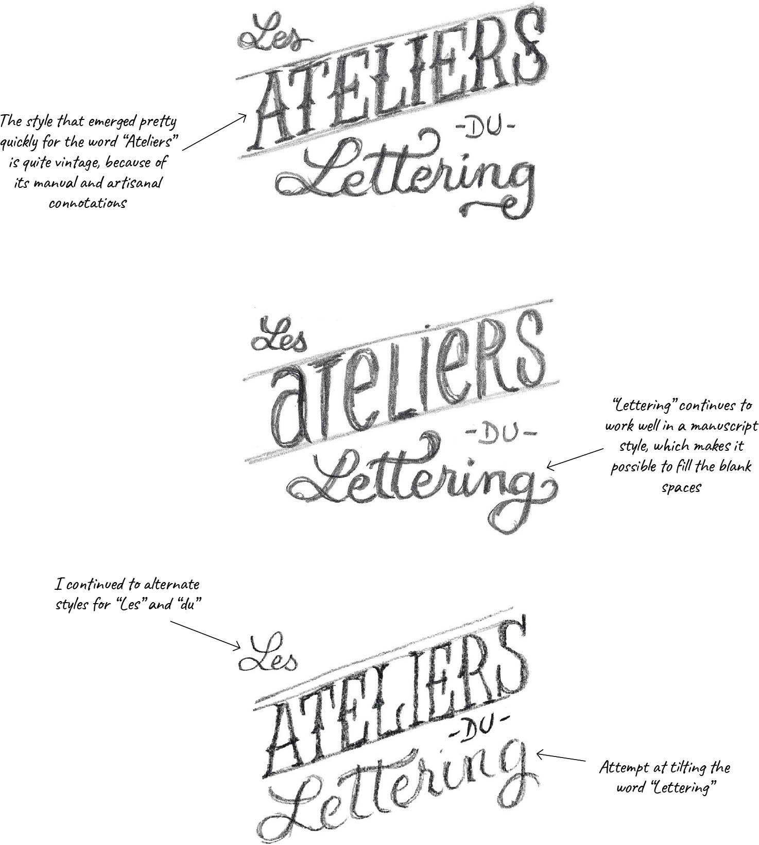
Track 2b. Using track 2 as a starting point, I redid a small series of sketches with the word “Ateliers” in typographic characters and “Lettering” in a manuscript style.