Chapter 5. Compositing Quick Tips

The challenge with writing a book like this is knowing when to stop, because the more I use Photoshop the more techniques I discover.
So before we move on to working through projects from start to finish, I’ve included a handful of compositing techniques that I’m regularly asked about. These quick tips are helpful to know before tackling any project.
Techniques covered in this chapter include: how to create a realistic horizon line when making scenes from a number of different photographs; how to use brushes for compositing into grass; how to add realistic shadows (an unavoidable and essential compositing skill); and two techniques using color to seamlessly blend images together for a realistic composite.
Creating a Horizon Line
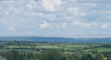
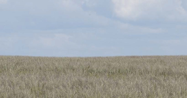
You might think that a horizon line is perfectly straight, but when the ground is something like a field, the horizon line is made up of distant blades of grass of varying sizes and angles.
You can mimic this look very easily using brushes that are included with Photoshop, but rather than manually painting the horizon line we can make the process much quicker using the Pen tool.
1. With the grass (ground) layer already open in Photoshop, grab the Pen tool (P) and make sure that the Path option is selected from the options at the top of the screen (Figure 5.1).

2. Starting from just outside the left side of the image and finishing just outside the right of the image, draw a path across the width of the grass just below the horizon line. Do this by adding numerous points and creating slight angles to join them so that the path isn’t perfectly straight (Figure 5.2).

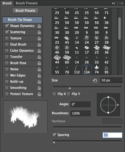
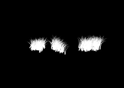
3. Grab the Brush tool. In the Brush Preset Picker, choose number 134, which looks like three blades of grass (Figure 5.3). Click the Brush panel icon (Figure 5.4) so that we can adjust some settings and make brush 134 perform how we need it to for a realistic horizon line.


4. In the Brush panel, click Brush Tip Shape, set Size to 50px, and set Spacing to 5% (Figure 5.5). Make sure that the Shape Dynamics and Scattering checkboxes are selected; all others should be unselected.
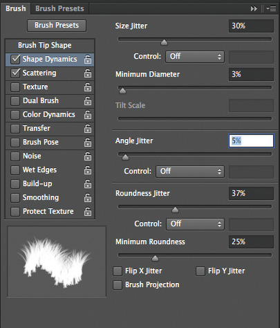
5. Click Shape Dynamics, and set Size Jitter to 30% and Angle Jitter to 5% so as to vary the size and angle of the grass a little, making it look more realistic (Figure 5.6). All other settings can remain at their default.
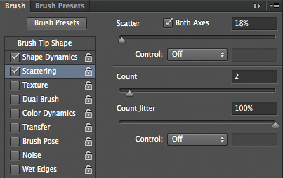
6. Click Scattering and set Scatter to 18% and Count to 2 (Figure 5.7). The settings used here aren’t fixed in stone but do work well for this image. For your own images, experiment with settings to see what works best.
7. Now we need to add the sky. Go to File > Place Embedded (File > Place in earlier versions of Photoshop), choose your sky image, and click OK. Use the transform handles to resize your sky layer so that it fills the layer, and press Return/Enter to accept the transformation.
Note
You could simply open the file and drag it across, but I prefer to use the Place Embedded or Place command because it allows me to automatically add the file into the image I’m working on.
8. With the Move tool selected, use the up and down arrow keys to position the sky layer so that the horizon line is just slightly beneath it (Figure 5.8).
9. Add a layer mask to the Sky layer (Figure 5.9) and with the Brush tool selected, set the foreground color to black.

Tip
Press the D key to set the foreground and background colors to their default of black and white. You can also quickly swap the foreground and background colors by pressing the X key.
10. Click the Path panel; the path we created earlier is highlighted. Click the Stroke Path with Brush icon at the bottom of the Path panel (Figure 5.10).

The horizon line has been created and looks like distant blades of grass (Figure 5.11).
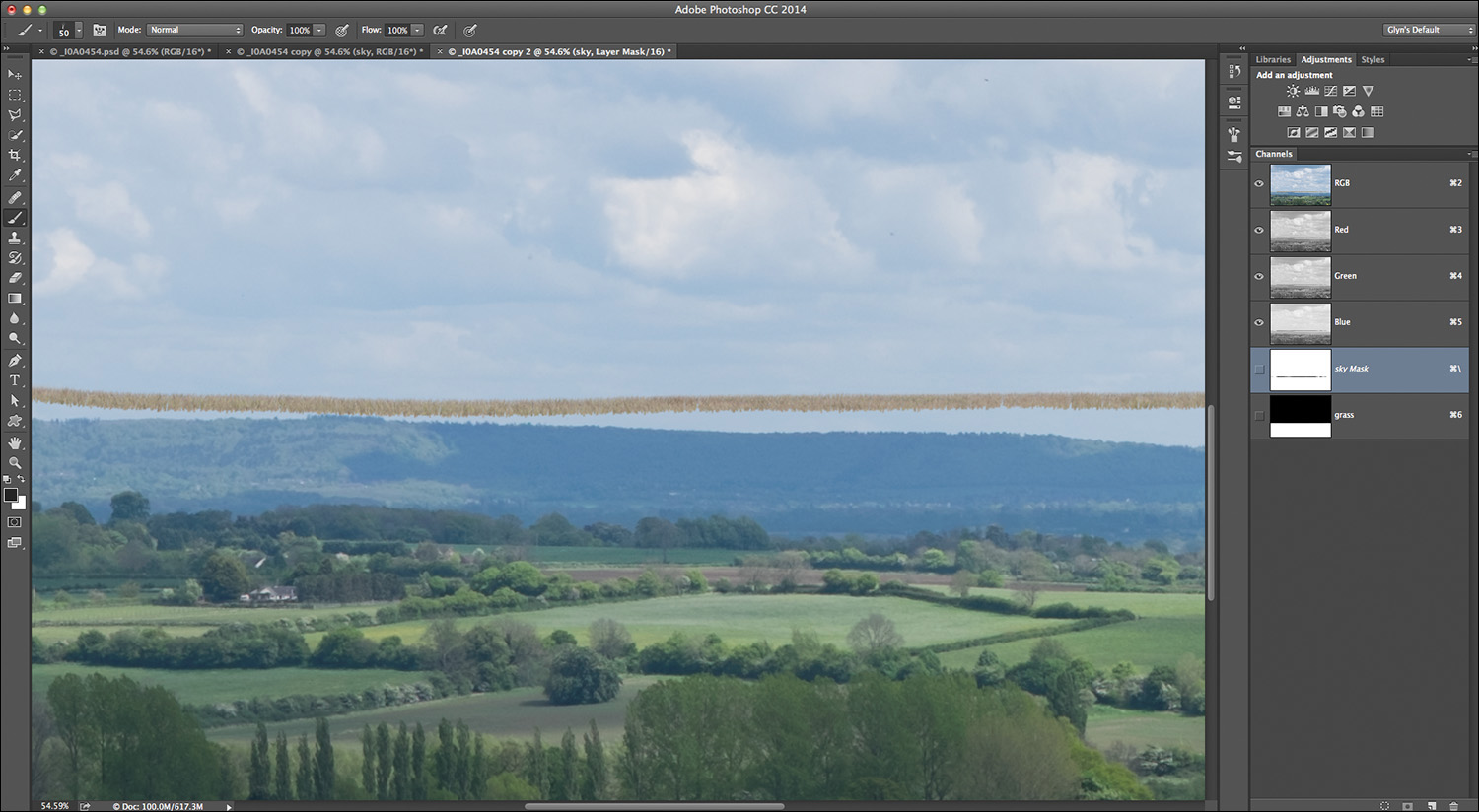
11. Click underneath the work path in the Path panel to deactivate it (Figure 5.12). In the Layers panel, click the layer mask attached to the sky layer. With a normal medium soft-edged brush and a black foreground color, paint over the area below the horizon line to reveal the grass (Figure 5.13).
Tip
For speed, rather than using a brush to paint in the area below the horizon line, you could make a selection of that area with the Rectangular Marquee tool and then choose Edit > Fill > Contents > Black. Any gaps could then be quickly filled with a medium soft-edged brush.
Compositing into Grass
Now we’ll put the giraffe that we cut out in Chapter 1 into the long grass. This is very easy to do using the same brush we just used to create the horizon line.
1. With the giraffe positioned above the layers that go into making the background, click the thumbnail of the layer containing the grass (Figure 5.14). Use the Lasso tool to make a rough selection of the area around the giraffe’s hooves (Figure 5.15), and go Layer > New > Layer via Copy (or press Command/Ctrl+J).
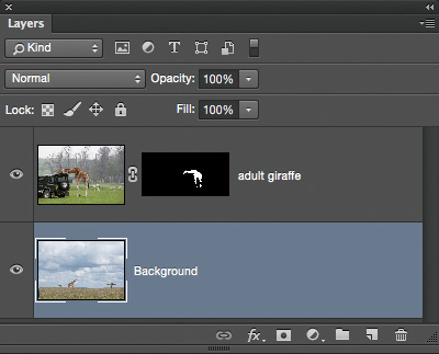

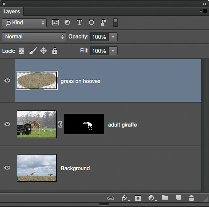
2. Rename this new layer grass on hooves and drag it to the top of the layer stack. Add a black layer mask by Option/Alt-clicking the layer mask icon at the bottom of the Layers panel (Figure 5.16).
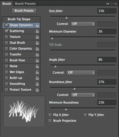
3. Choose the Brush tool (B), click the Brush Preset panel, and choose brush number 134. In the Shape Dynamics section, set Size Jitter to 25% and Angle Jitter to 8%; leave all other settings at their default (Figure 5.17).
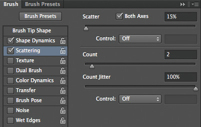
4. In the Scattering section, set Scatter to 15%, Count to 2, and Count Jitter to 100% (Figure 5.18).
5. With a size of 150px, a foreground color of white, and the layer mask active, paint over the giraffe’s hooves with the brush. This reveals parts of the layer that we cut out, but in the shape of our brush, faking the look of the giraffe standing in the long grass (Figures 5.19 and 5.20).

Note
To see the layer mask view, as in Figure 5.20, Option/Alt-click the layer mask thumbnail in the Layers panel. Option/Alt-click again to return to the normal view.
Tip
There may be times when you want to create composite images with surfaces like sand or snow. In situations like these, you can do a lot during the photo shoot that will help considerably when it comes to retouching. Buy some bags of sand or fake snow and spread it across the area where the model is standing during the photo shoot. Blending their feet realistically into the new scene will be much easier.
Shadows
If there’s one thing that can make or break a composite image it’s the shadows. I guess we’ve all seen pictures where it seems as if the person that has been added to a scene is levitating because the shadows just don’t look right.
I’ve mentioned that observing real life can help tremendously with retouching, and this is especially true with shadows. Shadows in the real world seem to be made up of two parts: the contact shadow, where the person or object is in direct contact with a surface, and the shape shadow that appears because of the light.
There are many ways to add the shape shadow. A lot of times you can do this by creating a copy of the cutout, filling it with black, and then using Transform and opacity, but there are times when that won’t work.
Here’s an equally simple technique you can use, but getting it to look just right will take plenty of practice—but that’s the same with everything you do in Photoshop.
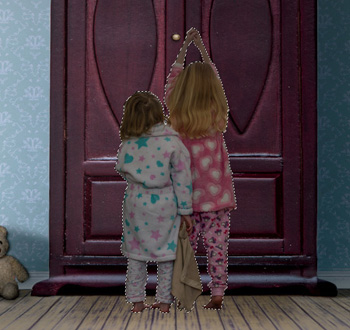
1. Add a new blank layer (Layer > New > Layer), name it contact shadow, and click OK. Drag this layer below the cutout in the layer stack (Figure 5.21).

2. In the Layers panel, Command/Ctrl-click the layer mask used to create the cutout. In this example I clicked the layer mask in the children layer, which loads the cutout as a selection (Figure 5.22).
Note
If you didn’t create your cutout using a layer mask, Command/Ctrl-click the layer thumbnail.
3. With the selection active, go to Edit > Fill > Contents > Black, and click OK. This fills the selection of the children in black (Figure 5.23). Go to Select > Deselect, and with the Move tool (V) press the down arrow key on your keyboard twice—just enough so you can see the black outline appearing around the children’s feet (Figure 5.24).

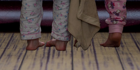
4. Soften the contact shadow a little by going to Filter > Blur > Gaussian Blur and adding a Radius of 1 pixel.
5. The contact shadow looks good around the feet, but you may also be able to see it in other areas around the children. Option/Alt-click the layer mask icon at the bottom of the Layers panel to add a black layer mask, and hide the contact shadow (Figure 5.25). Then with a normal soft-edged brush and a white foreground, brush on the layer mask to reveal the contact shadow where the feet and the floor meet.
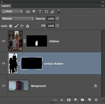
6. Next is the shape shadow, so add a new blank layer above the contact shadow layer and name it shape shadow. Lower the opacity of this layer to 20% (we can alter this later), and with a normal round brush at 20% hardness, paint in the shadows. (I always paint in the shadows using these settings, and adjust the opacity or blur the hardness later if I want.) In this example, I will later add a bright light to the gap along the bottom of the wardrobe doors, meaning the shadows it creates will extend off the bottom of the picture (Figure 5.26).

Note
You don’t have to be completely accurate with the shape you paint, as long as it resembles a shadow.
Matching Color #1
Another make-or-break situation for composite images is when the color of the background scene and the color of the assets being added don’t match.
For example, Figure 5.27 shows the original studio shot of the model and Figure 5.28 is where a new background has been added, using the Blend Mode compositing technique we covered in Chapter 2. The warm color of the model doesn’t match the cool and desaturated color of the background, which means the composite doesn’t work.

We could correct this in Photoshop using color adjustment layers, curves, and so on, but here’s a quick and effective technique to match the color without any adjustments. It’s a technique I use very often, and 99 percent of the time it will be all you need to do.
1. No matter which technique you used to bring together the cutout and the new background, add a copy of the background scene to the top of the layer stack. In this example, I used the blend mode compositing technique to add a new background behind the model, added a copy of the textured background to the top of the layer stack, and named it texture-color (Figure 5.29).

2. Go to Filter > Blur > Average. No properties box will appear, and Photoshop will simply apply Average Blur to the texture-color layer. Because there are no properties, there is no need to apply Average Blur as a Smart Filter, because it does only one thing: mix all the colors of that layer together (Figure 5.30).

3. Now that we have a layer containing an average of all the colors that make up the background, add it onto the model by making a selection of the model and clicking the layer mask icon at the bottom of the Layers panel (Figure 5.31).
4. Change the blend mode of the texture-color layer to Color, and lower the opacity to 20% (Figure 5.32). Doing this adds the color of the environment onto the model and blends the two elements much more realistically.

Figures 5.33 and 5.34 clearly show how the Average Blur technique helps to match the color across the picture. The result is very subtle but just enough to make a difference.
Tip
This technique can also be used on a scene or view. It’s a good thing to do if you’re going to add additional color effects, because the colors will be much more balanced and even.
Matching Color #2
I learned this incredibly simple but effective technique from my friend Pete Collins of KelbyOne. It’s another technique for subtly matching color in composites, but it’s also great for adding a slight haze to distant objects, which is something we see in the real world.
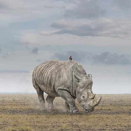
Figure 5.35 is a composite picture of a rhino that I created; we’ll also be working on it in the projects section of this book.

In Figure 5.36 you can see the layer stack, including the cutout of the rhino. All you need to do for this technique is lower the opacity of the layer to no less than 90%. This introduces a little color from the background and adds a slightly hazy effect. You’re done! Techniques don’t get much simpler or quicker than this.

Note
If you go lower than 90%, you will start to see the background coming through the rhino.
Figure 5.37 shows the “before” image. In Figure 5.38, the “after” image, you can see a little of the background color on the rhino, and the lowered opacity has given it a slight hazy effect—perfect for distant objects.