
The Introduction talked about the concept of Dark Environments, the problem where the right monitoring is rarely available when and where you need it. This is indeed a problem that we as an industry are long overdue to talk about and address, but there are two sides to this story. If we forget about all the practical problems (security, access, licensing, overhead, training, and so on) of getting the right tool plugged into the right environment, the tables are completely turned around. For some, instead of a being starved for data with too few metrics, many are frightened by the vast sea of all possible metrics, and how easily one could be duped by selecting the wrong one.
The objectives of this chapter are:
- Understand which types of metrics should be used to determine whether to keep or discard tuning changes.
- Understand which types of metrics are used to identify components responsible for a particular slowdown.
- Remember that tracking, graphing, and sharing your system’s tuning progress over time helps people on your team care more about performance.
This chapter breaks down this vast sea of metrics into three loose categories and shows how to put each category to work to accomplish key performance goals.
Which Metric?
When wrestling with performance issues
, we spend a lot of time asking these three questions:
- The Resource Question: How much of the hardware resources is the system using (CPU, RAM, network, disk)? 35%? 98%?
- The Blame Question: What components of the system-under-test (SUT) are to blame for a particular performance problem? A “component” needs to be something specific that we can investigate, like a single Java method in a specific source code file, or perhaps a single DB query or other network request.
- The User Benefit Question: Will the end users notice the response time impact of a particular tuning enhancement? And which code or configuration change performs better?
On a good day tuning a system, I am capable of doing the right thing, “following the data” instead of guessing at the answers to these three all-important questions. That means taking the time to capture certain metrics from carefully planned load tests. But when firefighting a really stressful production problem, or perhaps just on a bad day when my socks don’t match, all bets are off and my explanations for things are a nasty tangle of unsubstantiated guesswork. The Dark Environments issue makes this even harder because conjecture rules when the right metrics aren’t available, which unfortunately is pretty frequently.
As such, this chapter aims to make it easier to find a helpful metric by first focusing on answering these key questions with metrics. In short, Table 3-1 shows the metrics I suggest for answering each of our questions.
Table 3-1.
Metrics for Common Performance Questions
Performance Question | Answered by: | |
|---|---|---|
1 | Are resources (CPU/RAM/etc…) available? | The basics: PerfMon, TypePerf, ActivityMonitor, top/htop/topas/nnon/sar, and so on |
2 | Which component is to blame for slowing things down? | Server-side data like thread dumps, Profiler data, verbose GC data, SQL throughput/response time, and so on |
3 | Does the end user benefit? Which code change performs better? | Response time and throughput metrics from the load generator. |
Some metrics help answer more than one of these questions. For example, questions 2 and 3 both deal with response times, to some extent. My point is not to forge tight metric classifications without overlap, but to give you a reasonably good starting point for what metrics to use to answer each of these key questions.
Later in the book, the four chapters on the P.A.t.h. Checklist answer question 2 (what is to blame?). Question 1 (are there available resources?) uses metrics from tools everyone is familiar with, right? Top, PerfMon, nnon, and so on. Brendan Gregg’s USE method is a great way to avoid forgetting to watch resource consumption. Here is the link:
If a machine is part of your load test and you don’t have access to resource consumption metrics, beware or blaming it for any of your problems.
I really think that learning the troubleshooting techniques
in the four P.A.t.h. chapters is a do-able thing. It might be more of a challenge to stay abreast of all three of these metrics questions for the duration of the tuning process—forgetting just one of them is so easy.
The rest of this chapter is devoted to answering question 3, determining whether your end users will benefit from various proposed performance changes.
Setting Direction for Tuning
Deciding which tuning enhancements to keep sets a lot of the direction for the tuning process. Generally, faster response time and higher throughput metrics from your load generator should provide the final say on whether to keep a particular change. Lower resource (CPU/RAM) consumption is also key, but normally it is a secondary factor.
All of this advice sounds a bit trivial, so let me zero in on this point: only decide to keep a performance tuning change once the load generator tests shows it will benefit the end user or reduce resource consumption. Just because a code or config change benefitted some other environment doesn’t mean it will benefit your environment. Furthermore, unsubstantiated guessing deflates confidence in a tuning project. Avoid it when you can.
Consider this example: a code change that buys you a 10ms response time improvement can do magical, transformational things to a system with 30ms response time, but the likelihood of making a big performance splash is pretty low if you apply that same 10ms-improvement-change to a system with 3000ms response time. Let the load generator metrics drive the bus; let them guide which code/config changes to keep.
But tuning guidance doesn’t come solely from load generator metrics, because tuning conspicuously high CPU consumption out of the system is pretty important, too. CPU plays an even larger role than getting rid of CPU-heavy routines—it provides us with a handy yardstick, of sorts, that we can use to determine whether a system will scale. Chapter 6 provides very specific guidance on the matter, stay tuned.
Many different metrics
, like those to be discussed in the P.A.t.h. chapters, contribute to deciding what change to keep: server-side verbose GC metrics, SQL response time metrics, micro-benchmark results. But ultimately, these changes should only be kept in the code base if the load generator results show benefit for the end user. Remember: load generator metrics drive the bus. CPU and RAM consumption metrics are important too—they ride shotgun.
The Backup Plan: Indirect Performance Assessment with Load Generator Metrics
The P.A.t.h. chapters show how to directly assess and single out what parts of the system are the slowest, and the four performance anti-patterns in Chapter 1 help you conjure up what changes are likely to improve performance. After deploying a change, if the load generator response time and throughput metrics (and resource consumption) show sufficient improvement, then you keep the change; otherwise you revert it (I do). You return to the P.A.t.h. Checklist to reassess the performance landscape after your brilliant change (because the landscape changes in interesting ways; check it out) and then you deploy another change and repeat. That’s how tuning works. Mostly.
Before I got into a groove of using the P.A.t.h. Checklist and a modest tuning environment, discovering root cause was a bit tougher. I sought out ways to dislodge extra hints and clues from the load generator metrics. These “indirect” techniques are still helpful today, but they’re much less necessary when you can directly observe performance problems with P.A.t.h.
But I will share some of these techniques here, because sometimes you don’t have access to the system for a quick run through P.A.t.h., like when you’re looking at someone else’s load generator report. Likewise, sometimes it takes a second supporting opinion from a different metric to make the case for a particular optimization sufficiently compelling to the team, and convincing the team is a surprisingly large part of it all.
Large Payloads are a Red Flag
Logically interrogate the requests in your load test with the largest payloads, asking whether all of those bytes are really necessary? For example, have a look at Figure 3-1.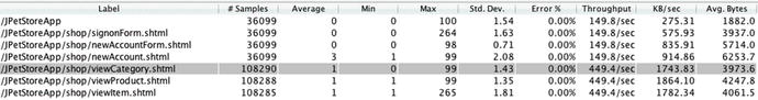
Figure 3-1.
The rightmost column, Avg. Bytes, shows the size of HTTP responses for each process (leftmost column). Large outliers in this column (there are none in this figure) would be prime suspects for performance issues. Data from JMeter Summary Report.
The request with the most bytes in the Avg. Bytes column is newAccount.shtml, which has 6253.7 bytes on average. This number does not scare me, especially in relation to the Avg. Bytes numbers for the other rows in the table. But if one Avg. Bytes value is a few times bigger or more than the others—that’s something to investigate. At a minimum, the extra bytes will take extra time to transfer, but it can get a lot worse. What if the system spent precious time assembling this large page? One time I saw this, a flood of disabled accounts (that no client wanted to see) were accidentally enabled and plumbed all the way from backend to browser, wasting a ton of time/resources. A separate time, not only was the client repeatedly requesting data that could have been cached on the server, but the XML format was needlessly large and no one cared enough to insure the payload was compressed. Zipping text files often shrinks a file by 90%. Use this to minimize the bytes transferred. If you application hails from 1999, perhaps the large size is from all the data being crammed onto a single page instead
of having nice “first page / next page / last page” support.
Variability Is a Red Flag
One semi-obvious sign of a fixable performance problem in response time metrics is variability. In most cases, the more jittery the response time, the worse the performance. So, pay attention to the HTTP requests with the highest standard deviation (the Std. Dev column), showing highly variable response time. Of course, highly variable response time could be attributed to certain benign things, like occasionally complex data or other processing.
The three rows in Figure 3-2 show slightly different XSLT process transforming the exact same .xslt files with the same .xml files—you can tell by the exact same values for Avg. Bytes (the rightmost column) for each row. The data is from three different tests, each a 60 second steady state run with 8 threads of load, and each shows dramatically different performance.
Figure 3-2.
Results from load tests with three implementations of XLST processing. Data from jmeter-plugins.org Synthesis Report.
Note that response time (Average) and standard deviation (Std. Dev.) are roughly proportional to each other. Throughput is inversely proportional to both of these. In other words, performance/throughput is great when both response time and variability are low.
If the very low .51 standard deviation with 400+% throughput improvement (1273.3 instead of 5325.8) is not compelling for you, perhaps the time series graphs of the same data in Figure 3-3 will convince you.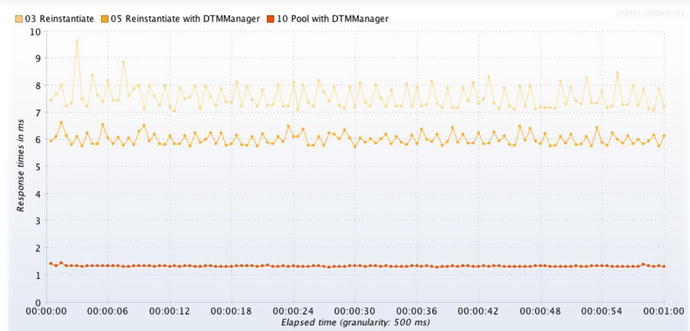
Figure 3-3.
From top to bottom, good, better, and best XSLT response time with 3 different XSLT API idioms. The faster the test, the less zig-zaggy variability.
Extra variability in response time, as shown in the graphs here, can help point you to which system request could use some optimization. Variability in other metrics
, like throughput and CPU consumption can help point out issues.
Creatively Setting Direction for Tuning
Yes, the load generator metrics should drive the bus and call the shots on what optimizations to keep. But also keep in mind there is much room for creativity here. This section provides a few examples of creatively restructuring tests and test plans to provide performance insights.
Two chapters in this book help you run load tests that model (aka imitate) a regular production load. Chapter 4 describes how to evolve a load script from an inflexible, stiff recording of a single user’s traffic into a dynamic workload simulation. Chapter 5 helps you detect some performance characteristics of an invalid load test, which can help you avoid making bad tuning decisions based on invalid load generator data.
The gist, here, is that making the load test more real is a good thing. As preposterous as it might sound, though, there are a lot of fantastic insights to be gained by making your load test less real. Let me explain this insanity by way of two examples.
Creative Test Plan 1
Once upon a time I was on a tuning project and sure enough, I was wandering aimlessly in some Dark Environments. I was lacking security access or licenses (geez, it could have been anything) to all my favorite monitoring tools. How was I supposed to tune without metrics? This was a middle tier system, and I was trying
to figure out whether all the time was being spent calling non-Java back-end systems or perhaps within the Java tier itself. To find out how fast the Java side was, I decided to comment out all calls to databases and back-end systems, leaving a fully neutered system except for entry into and exit from the Java architecture. It should have been pretty quick, since most of the real work was commented out, right?
Response time in a load test of the neutered system was 100ms. Is that fast or slow? For a point of comparison to this 100ms, the “do nothing” example in the previous chapter took just about a single millisecond. I had two different systems that did about the same thing (nothing), and one was dramatically slower. Ultimately, this helped us find and fix some big bottlenecks that pervaded every part of the architecture. That’s some creative testing.
Creative Test Plan 2
Here is another example where we remove part of the workload of a test plan (seemingly a setback) to make some forward progress. Figure 3-4 shows a test in which four different SOA services are called sequentially: First, Second, Third and Fourth. The response time of First is so much slower than the other three requests that the fast services spend most of the test literally waiting for the First service to finish executing. All this waiting around severely limits throughput (not shown), and we are robbed of the chance to see how the services perform at the higher throughput.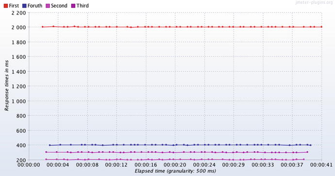
Figure 3-4.
The three fast services
in this test mostly wait around for the slower service
To get around this problem, we need to divide and conquer and enlist the help of another technician. One developer works on improving the performance of the slow service (First) by itself in one environment, while the three fast services are tested by themselves with a different load script in a different environment. Without this approach, the three fast services would miss out on testing at much higher throughput. When just about any environment can be a tuning environment, this is much easier. Having a single monolithic tuning environment makes this standard “divide and conquer” approach very difficult.
Tracking Performance Progress
Load generator response time and throughput metrics are so important, a weeks- or months-long tuning effort should march to their beat. Chapter 2 on Modest-sized Tuning Environments encourages us to complete more fix-test cycles every day, by using smaller, easier to manage and more accessible computing environments. As that testing happens, on each day of tuning you will have many more results, good and bad, and both the results and the test configurations become easy to forget because there are so many. To remember which changes/tests make the most performance impact, put the results of each test on a wiki page in a nice, clean table (such as in Table 3-2) to share with your team. Some wiki tables even allow you to paste a little thumbnail image (expandable, of course) of a performance graph right in a table cell. Put the most recent tests at the top, for convenience.
Table 3-2.
Example of Load Test Results That Document Which Changes Had the Biggest Impact
Test ID | Start / Duration | Purpose | Results | RPS | RT (ms) | CPU |
|---|---|---|---|---|---|---|
3 | July 4, 6:25pm, 10 min | Added DB index | Huge boost! | 105 | 440 | 68% |
2 | July 4, 11:30am, 10min | Test perf change to AccountMgr.java | performance improved | 63 | 1000 | 49% |
1 | July 4, 9am, 10 min | Baseline | 53 | 1420 | 40% |
Remember that the role of the project manager of a performance tuning project is to be the four year old kid in the back of the family car, pestering us with the question, “Are we there yet?” Have we met our performance targets? A table like this one mollifies them, but it is for you too. I am not sure why, but wallowing in a performance crisis makes it very easy to forget the list of changes that need to migrate to production. Keeping the table regularly updated takes discipline, but the table documents and justifies (or not) money spent on better performance. It is essential.
At first, it seems like the rows of the table should compare results from one, unchanged load plan, applying exactly the same amount of load. Is this what we mean by an apples-to-apples comparison? Not quite. Instead, the table captures the best throughput to date for a particular set of business processes, regardless of the load plan, although this would be a great place to document changes
in that load plan. Once your tuning efforts produce more throughput, you will need to dial in to your load plan more threads of load to get closer to your throughput goals.
To create a compelling performance tuning narrative, convert the requests per second (RPS) and date columns of this table into a “throughput improvements over time graph.” This quickly communicates the ups and downs of your hard tuning work (Figure 3-5).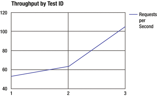
Figure 3-5.
Use graphs like this to help communicate performance progress
Don’t Forget
If you are stuck trying to fix a performance problem from the outside of the system using just resource consumption metrics and load generator metrics, it can become frustrating because there isn’t enough information to identify which parts of the system need to be changed to fix the performance issues. This is where “Blame” metrics come into play. The P.A.t.h. Checklist, which we begin to use in Chapter 8, is specifically designed to fill this gap.
Also remember that one of the main purposes of modest-sized tuning environments is to get more fix-test cycles run in a single day, helping you make more performance progress. But more tests mean more results, and more results are easy to lose track of, so spend some time to find a nice wiki-like solution for documenting performance test results with your team, especially the project manager. To address all those issues surfaced in your performance tests, it helps to triage the problems so your team knows what to focus on.
There are 3 ‘parts’ in this book and you’ve just finished the first one about getting started with performance tuning. Chapters 4, 5, 6 and 7 make up the next part, which is all about load generation—how to stress out your system in a test environment, as if it were undergoing the real stress of a production load.
What’s Next
Getting started quickly tuning your system is a lot easier knowing that you can find real performance defects in just about any environment. Perhaps the next biggest impediment to getting started is the need to create load scripts.
The first part of the next chapter is a road map for getting up and going quickly with your first load script. The second part details how to enhance the first script to create/model a load that better resembles production.