Blending modes are both a mystery and a source of great design power. Each blending mode controls how the pixels in one layer are affected by those in another layer or by a tool from the Tools panel. Most users give up on them because the technical definitions of blending modes get very tricky. The secret is to not worry too much about the technical issues and to learn how to experiment. While you’ll explore the technology and the creativity behind blending modes, there are only a few basics that you must know to make blending modes part of your design toolbox.
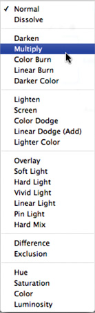
There are 25 different blending options available from the Layers panel and a few additional blending options that work with specific tools. How do they work? The simple answer is, it depends. Your response is likely, depends on what? Simply put, the effect achieved by blending two layers varies with the contents of those two layers. A blending mode compares the content of two layers and enacts changes based on the content of both layers. You’ll find blending modes in many of the tools, and they can be combined with every filter.
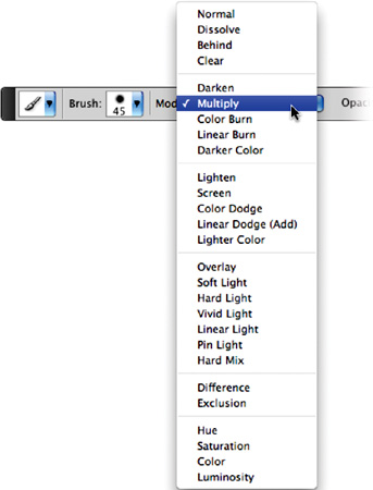
The blending mode specified in the Options bar controls how pixels are affected by a painting or editing tool. Additionally, you can set the blending mode of a layer to control how it interacts with those below it. A clear understanding of the following terms will better help you understand blending modes:
Base color: The original color in the image
Blend color: The color being applied with the painting or editing tool (or the color in the top layer)
Result color: The color resulting from the blend
Here are the different blending modes available through the Layers panel. I have attempted to give you a clear and simple definition as well as a sample of how these images blend.
Original
Blended Image
Note: Blending Mode Practice
For more practice with blending, open the files Ch09_Blend Modes1.psd and Ch09_Blend Modes2.psd in the Chapter 9 folder, and experiment with different modes and opacity settings.

Dissolve
Creates a random replacement of the pixels with the base or blend color.

Color Burn
Evaluates each channel; darkens base by increasing contrast.

Lighten
Evaluates each channel; it then uses base or blend color (whichever is lighter).

Linear Dodge (Add)
Evaluates color information and brightens base by increasing brightness.

Soft Light
Effect is similar to shining a diffused spotlight on the image.

Linear Light
Burns or dodges by decreasing or increasing the brightness.

Difference
Evaluates each channel and subtracts or inverts depending on brightness.

Saturation
Creates color with luminance and hue of base and saturation of blend.

Darken
Pixels lighter than blend are replaced; darker ones are not.

Linear Burn
Evaluates each channel; darkens base by decreasing brightness.

Screen
Results in a lighter color. It is useful for “knocking” black out of a layer.

Lighter Color
Uses highest value from both layers to create resulting color.

Hard Light
Effect is similar to shining a harsh spotlight on the image.

Pin Light
Is useful for adding special effects to an image.

Exclusion
Is similar to the Difference mode but lower in contrast.

Color
Preserves gray levels. It’s very useful for coloring and tinting.

Multiply
Is similar to drawing strokes on the image with magic markers.

Darker Color
Uses the lowest value from both layers to create resulting color.

Color Dodge
Evaluates color information and brightens base by decreasing contrast.

Overlay
Overlays existing pixels while preserving highlights and shadows of base.

Vivid Light
Burns or dodges by increasing or decreasing the contrast.

Hard Mix
Enhances the contrast of the underlying layers.

Hue
Uses luminance and saturation of the base and the hue of the blend.

Luminosity
Is the inverse effect from the Color mode.
Open the file Ch09_Blended_Overlay.psd from the Chapter 9 folder on the CD to experiment with blending modes.
So far you’ve looked at blending modes in a strictly technical sense. While it’s useful to have a clear understanding of the technology, don’t lose sight of the design possibilities. Blending modes are a great way to mix layers together. For a designer, this can be a useful way to create backgrounds for speaker support (like PowerPoint presentations) or DVD menus. Let’s dissect one of those backgrounds:
Open the file Ch09_Speaker_Support.psd from the Chapter 9 folder on the CD. This eight-layer document uses blending modes to create a complex background.
Turn off the visibility icons for all but the bottommost two layers.
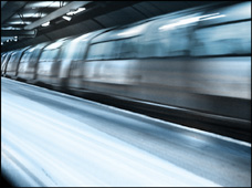
Select the Train layer. It is currently set to the Overlay blending mode. Changing its blending mode will create a different look.
A useful shortcut to cycle blending modes is Shift++(plus). This will step you forward in the blending mode list. Pressing Shift+- (minus) will step backward through the blending mode list. If you have a tool selected that has its own mode settings (such as the Brush or Gradient tool), the shortcut modifies the blending mode of just the tool. To quickly change the mode on a layer, select the Move tool (V) or Marquee tools (M) first. Experiment with different blending modes and opacity settings to try out different looks.
Repeat your blending mode experimentation for the Light, Highlights, and Soft Focus layers. Try out different modes and opacity settings.
Select the Blue layer. It is set to the Color blending mode, which applies its color to all layers below it. This is a very useful way to tint multiple layers for a consistent look.
Continue to experiment with different combinations of blending modes and opacity settings. This sample image provides just a quick glimpse into the power and flexibility of blending modes.
Now that you have a little practice with blending modes, it’s time to explore their creative and production side in greater depth. Blending modes are part of a professional’s workflow. The next three sections showcase a few different ways to better integrate blending modes for professional results.
One way to improve a washed out or flat image is through blending modes. By blending a blurred copy of an image on top of itself, you can quickly create a visual pop. Let’s give it a try:
Open the file Ch09_Spice.psd from the Chapter 9 folder.
Select the Background layer in the Layers panel.
Duplicate the Background layer by pressing Command/Ctrl+J.
Significantly blur the new layer by choosing Filter > Blur > Gaussian Blur. A value of 25 pixels should do the trick.
Select the Move tool by pressing V.
Cycle blending modes by pressing Shift++. Look for modes (such as Overlay or Soft Light) that increase saturation and add visual “pop” to the image.
If needed, adjust the opacity of the layer as desired. You can quickly change opacity by typing in the first number of an opacity setting, such as 4 for 40% opacity. You can type 25 to quickly switch to 25% opacity, for example, if a more specific adjustment is required.

Here’s a quick look at how different blending modes can be used to add instant spice to an image.

Dissolve

Color Burn

Lighten

Linear Dodge

Soft Light

Linear Light

Difference

Saturation

Darken

Linear Burn

Screen

Lighter Color

Hard Light

Pin light

Exclusion

Color

Multiply

Darker Color

Color Dodge

Overlay

Vivid Light

Hard Mix

Hue

Luminosity
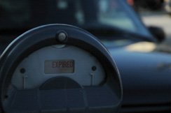
If an image is completely thrown into the shadows, you can turn to blending modes to shed a little light. In fact, this is a technique that is often used by law enforcement agencies to enhance security photos or footage.
Open the file Ch09_Meter.tif from the Chapter 9 folder.
Duplicate the Background layer by pressing Command/Ctrl+J.
Set the top layer to Screen mode. You can choose it from the pop-up menu in the Layers panel or press the keyboard shortcut Shift+Option/Alt+S. The image should appear significantly lighter.

You can further lighten the image by placing another duplicate copy on top. Press Command/Ctrl+J as many times as needed. Each will lighten the image further.
You can also use blending modes to make one image appear as if it were applied to another. If you add the Free Transform command, you can make that stamp match the perspective of the photo. Let’s give it a try:
Open the files Ch09_Boxes.tif and Ch09_Logo.psd from the Chapter 9 folder.
Select the Logo.psd file so it is active.
Choose Select > All and then Edit Copy to add it to your clipboard.
Switch back to the Boxes file and choose Edit > Paste.
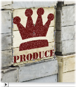
Press Command/Ctrl+T to invoke the Free Transform command. To harness additional transformations, right-click/Ctrl-click. Choose Distort: This will allow you to corner pin the logo and match its angle to that of the box.
You now need to scale the logo smaller. Right-click/Ctrl-click and choose Scale. Shrink the logo so it fits better on the side of the box.
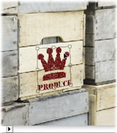
Set the Logo layer to the Multiply blending mode and lower its opacity to 85%. This will make the Logo layer appear to be stamped on the crate.
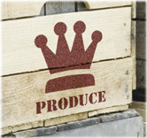
Table 9.1 provides the keyboard shortcuts to make it easier for you to use blending modes.
Table 9.1. Blending Shortcuts
Result Windows | Windows | Mac OS |
|---|---|---|
Shift+Option+N | Shift+Alt+N | |
Dissolve | Shift+Option+I | Shift+Alt+I |
Darken | Shift+Option+K | Shift+Alt+K |
Multiply | Shift+Option+M | Shift+Alt+M |
Color Burn | Shift+Option+B | Shift+Alt+B |
Linear Burn | Shift+Option+A | Shift+Alt+A |
Lighten | Shift+Option+G | Shift+Alt+G |
Screen | Shift+Option+S | Shift+Alt+S |
Color Dodge | Shift+Option+D | Shift+Alt+D |
Linear Dodge | Shift+Option+W | Shift+Alt+W |
Overlay | Shift+Option+O | Shift+Alt+O |
Soft Light | Shift+Option+F | Shift+Alt+F |
Hard Light | Shift+Option+H | Shift+Alt+H |
Vivid Light | Shift+Option+V | Shift + Alt+V |
Linear Light | Shift+Option+J | Shift + Alt+J |
Pin Light | Shift+Option+Z | Shift + Alt+Z |
Hard Mix | Shift+Option+L | Shift + Alt+L |
Difference | Shift+Option+E | Shift + Alt+E |
Exclusion | Shift+Option+X | Shift + Alt+X |
Hue | Shift+Option+U | Shift+Alt+U |
Saturation | Shift+Option+T | Shift+Alt+T |
Color | Shift+Option+C | Shift+Alt+C |
Luminosity | Shift+Option+Y | Shift+Alt+Y |