
Chapter 4. Getting to the Points
A Bézier curve or path is only as elegant, graceful, or accurate as the anchor points that control and shape it. And in order to better control and edit anchor points, you first need to understand and recognize what qualifies as a good anchor point and path, a bad anchor point and path, and an ugly anchor point and path.
A vector design can easily have hundreds of paths and thousands of anchor points within it. Each point that is incorrectly used or sloppily handled will just add to the overall degradation of your visual aesthetic.
Anyone can learn to use a digital tool; that is merely a skill set. I want you to become a vector craftsperson, someone who can handle the basic tools and create professional results. You may conceive of a brilliant idea, but if your vector craftsmanship is weak, it doesn't matter how well thought out the idea is. It will suffer from poor execution.
On Prime Point Placement
There is one assumption to make before we can determine if an anchor point is good, bad, or ugly. We will assume you have the Prime Point Placement (PPP) of your anchor point correct. That is, you have each anchor point in the correct position within your design. We'll go over placing and removing anchor points, as well as PPP in more detail in the next chapter. But suffice it to say for now that if an anchor point is not positioned correctly as you build your vector shape, it will make controlling the path so that it matches your drawing far more difficult and possibly inaccurate.
For sake of demonstration, all of the vector art in the following images (FIGURES 4.1–4.3) contain identical PPP. That is, the anchor points are in the right places. The only difference among the figures will be found in the specific problematic characteristics associated with the individual anchor points.
With that graphic caveat in mind, let's take a closer look.
The Good Anchor Point and Path
In order to demonstrate the good, the bad, and the ugly as those qualities apply to anchor points and paths, I've selected an ornament design that contains only one straight line and depends mainly on the use of Bézier curves to form its shape.
First, however, you must understand the difference between corner anchor points and smooth anchor points. Corner anchor points are placed anywhere your art has an apex that comes to a point. These types of anchor points can be used with or without Bézier curve handles pulled out from one or both sides when the transition between two paths doesn't need to be smooth.
A smooth anchor point is placed anywhere your art needs a curve that transitions from one path into the next. This sort of anchor point always uses Bézier curve handles pulled out from both sides to control the shape of the Bézier curve.
The following images (FIGURES 4.1–4.3) show the anchor points and path build shape on the left and the resulting final shape on the right.
FIGURE 4.1 All of the anchor points in this vector ornament design are of the correct type, either corner or smooth depending on their PPP. The anchor points controlling the Bézier curves that form the main vine in this motif bend smoothly from one side to the other.

The handles are parallel with one another and are not pulled out too far, ensuring a smooth continuity throughout the art. The other anchor point handles that form the remaining Bézier curves are also not overextended, pulled out only as far as needed to form each of the various shapes in the path.
The end result of good anchor points and paths is a graceful and elegant shape.
The Bad Anchor Point and Path
FIGURE 4.2 The anchor points in this vector ornament design are the correct type, but their handles are incorrect. They aren't parallel with one another, so the Bézier curves look less elegant and you begin to lose the visual continuity of the overall path. A consistent creative process that utilizes PPP and The Clockwork Method (which will be covered in chapter 5) will help you steer clear of this problem. At this point, the goal is simply for you to recognize that something is definitely not right. The end result of bad anchor points and paths is a less graceful and more clunky shape.

The Ugly Anchor Point and Path
FIGURE 4.3 Almost all of the anchor points in this vector ornament design are the incorrect type. Any Bézier curve that you want to transition smoothly from one side of an anchor point to the opposite side should always utilize smooth anchor points, not corner anchor points. Using the wrong type of anchor point will cause a curved shape to look pointed.

More problems: Many of the anchor point handles aren't parallel with one another and some are pulled out too far, which prevents a continuous flow through the art and makes parts of it look flat. Some of the other anchor point handles that form the remaining Bézier curves in the design are overextended as well.
Some of these problems emerge from sloppy building and lack of attention to detail, as well as not building vector art point-by-point or shape-building (that is, autotracing). It all comes down to proper craftsmanship.
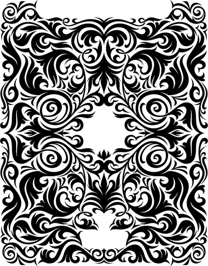
FIGURE 4.4 This shows the final ornament design. This graphic contains 276 anchor points that make up one path.

A Scrutinizing Eye
Throughout the vector build process, you'll need to pay close attention to your anchor points and paths to ensure you're creating quality. That said, no one is perfect; you'll make mistakes as you create your vector art, so it's important to train yourself to spot potential problems with your anchor points.
It may initially seem like I'm asking you to micro-manage your vector art, and in part that is true. But over time it will become second nature, to the point that you won't even consciously think about which anchor points to place or handles to pull. You will, however, notice the steady improvement of the vector shapes that you'll create because of your due diligence.
The Vector No-Fly List
Be on the look-out for the following common vector building mistakes:
1. Incorrect Anchor Point: If you're creating a Bézier curve that bends smoothly from one side of an anchor point to the opposite side as shown in FIGURE 4.5, you need to always use a smooth anchor point rather than a corner anchor point. If a curve looks pointed, then an incorrect anchor point is being used in the Bézier curve.
To convert a corner anchor point to a smooth anchor point (and vice-versa), just select the problem point and click the ”Convert selected anchor points to smooth” button in the Control panel shown in Figure 4.5. The opposite option will appear if the point is already smooth. (Unfortunately, there is no keyboard command for this, nor is it recordable via actions.)
FIGURE 4.5 The correct use of a smooth anchor point shown on top; an incorrect corner anchor point, which causes a pointed look, is shown below.

FIGURE 4.6 Properly extended anchor point handles shown on top; a curve with overextended anchor point handles, which cause a flat appearance, is shown below.

2. Flat Curves: If you pull out your anchor point handles too far on a Bézier curve that bends smoothly from one side of an anchor point to the opposite side, as shown in FIGURE 4.6, the curve will lose its roundness and begin to look flat. It's a telltale sign of overextended handles.
3. Parallels: When you create shapes that contain corresponding Bézier curves that bend smoothly from one side of an anchor point to the opposite side, as shown in FIGURE 4.7, you want to make sure the extended handles at the apex of the path are parallel with one another. If the end vector shape doesn't have a graceful flow, it's a good bet some of the handles aren't parallel.
4. Overextended Handles: This is the result of trying to span the distance between two anchor points using one anchor point handle instead of using both. Much like the flat curve problem, it will result in a shape that is flat, awkward, and clunky. But it also can cause mitering problems on severe angles if you decide to add a heavier stroke to your art later (FIGURE 4.8).
FIGURE 4.7 Parallel handles shown on top; non-parallel handles, which cause an uneven result, are shown below.
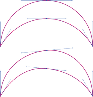
FIGURE 4.8 Both handles properly pulled out to form each Bézier curve is shown on top; the use of one overextended handle, which causes flatness, a clunky shape, and mitering problems, is shown below.

A Good Example
It's good to have a critical eye when scrutinizing your vector work as you build to ensure you're avoiding the telltale signs of problematic anchor points and the Bézier curves they control.
But one could argue that it's more important to recognize good anchor point characteristics. As your eye develops, you'll be able to look at any vector graphic and pinpoint either the good or bad characteristics of its anchor points and curves.
FIGURE 4.9 This complex vector ornament design doesn't contain any straight lines. It completely depends on precisely built Bézier curves created from smooth and corner anchor points. You won't find any of this design's content on the ”no-fly list.”

I should point out that the design shown in FIGURES 4.9 and 4.10 took me about eight hours to build. I had to rebuild several shapes a few times before I dialed in the vector art precisely. I mention this because it would be easy for me to say that if you follow my process, everything will be easy and work the first time. That isn't true.
FIGURE 4.10 Final vector artwork I created for a die-hard Mac fanboy who loves his Apple iPad so much that he hired me to design this custom ornament, which he'll have etched onto the back of it.

Change Your Perspective
When scrutinizing your vector shapes, it's a good idea to select and rotate or flip them, print them out larger, or change your view to outline in Adobe Illustrator in order to pinpoint problem areas you can improve on. If you don't do this, it's too easy for your eyes to get used to what they are looking at.
Changing the visual perspective and orientation of the art forces the mind to reassess the shapes in your design and determine if something needs to be fixed. It's the same principle as holding a drawing up to a mirror in order to discover a distortion.
We'll talk more about self-art direction in Chapter 8.
What is true about my process is that it is a process. Part of that process is recognizing the good and bad characteristics in your own art and in the art of others. While creating this design I had to remind myself of The Clockwork Method (or TCM, a very handy method we'll introduce in Chapter 5). I wasn't following it, and my shapes were looking wonky.
Thank God for CommandControl-Z
Even using this systematic approach for building vector graphics, not every piece of vector artwork you create will be perfect. I still make mistakes every day. Placing anchor points and manipulating handles takes some trial and error.
The ultimate goal of this book is to dramatically reduce your potential for making vector mistakes, help you to recognize when something isn't right, and show you how to fix problems quickly so you can continue building your designs. So when in doubt, Command-Z (or Control-Z) can be your best form of creative accountability.
Design Drills: Vector Skeletons
Proper anchor point placement is critical for creating precise vector artwork. But, unless you have your vector paths selected (V), it can be difficult to tell where all of the anchor points reside within a given design.
On the next four pages, we'll take a closer look at the vector skeletons within two very different sorts of design projects so you can see exactly where all of the anchor points are placed and how those placements affect the final results.
FIGURE 4.11 When you view the sketelal points and paths of these patch designs, created for Major League Baseball (MLB) and National Basketball Association (NBA) licensed products, they reveal that some of the vector content is masked. You can't see it in the final art shown in Figure 4.12.

FIGURE 4.12 The final official MLB- and NBA-licensed patch designs.
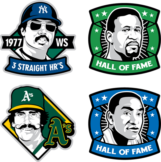
FIGURE 4.13 Not all art requires a massive number of anchor points. Note how I only needed seven anchor points to form the speech bubble in this logotype design for a custom art product.

FIGURE 4.14 This final art shows only four of the 50 ”talkin' heads” I created for the company Veer.
