Chapter 8. Art Directing Yourself
There's a plethora of creative people in the communication arts industry. And we all compete with each other in a global marketplace, with the Internet serving as an ever-present facilitator. Design opinions shift quickly, trends take flight, and we can showcase our work to more people worldwide than ever before.
The quality of work produced by this legion of designers covers the gamut from horrible to heavenly. What separates the best from the rest in this graphic cacophony is often the individual's ability to scrutinize his or her own work earnestly, admit its shortcomings, revise the creative process, and improve his or her capabilities with each new project. In other words, the artist must know how to self-art direct.
Art direction isn't so much about correcting mistakes as it is about shaping perceptions. When you art direct yourself, your goal is to craft an aesthetic that achieves a desired response from a given audience.
Think of it this way: Design tends to be a wonderful paradox where objective methods produce creative work that is viewed subjectively.
Fresh Eyes Effect
Creative people spend so much time looking at their work that it can be very difficult to notice potential problems. Everything begins to blend together. When this happens, honest critique is missed, and with it, needed improvements.
This is a dangerous situation because it can result in subpar work. It also opens the door for your client to notice problems and directly associate that lack of attention to detail with you as a creative person.
A simple method to help you avoid this situation is to use what I call the ”fresh eyes effect.” As you reach various stages in your work, set it aside and work on something completely different for a while. An hour is ideal, but even 15 minutes can be enough to purge your mind's cache and refresh your eyes. When you reapproach your work later, you can scrutinize it with fresh eyes, allowing you to see areas you can improve upon. What you'll need to improve and the degree of improvements or tweaks you'll need to make will be different for each person depending on your ability and what stage of the creative process the work is in.
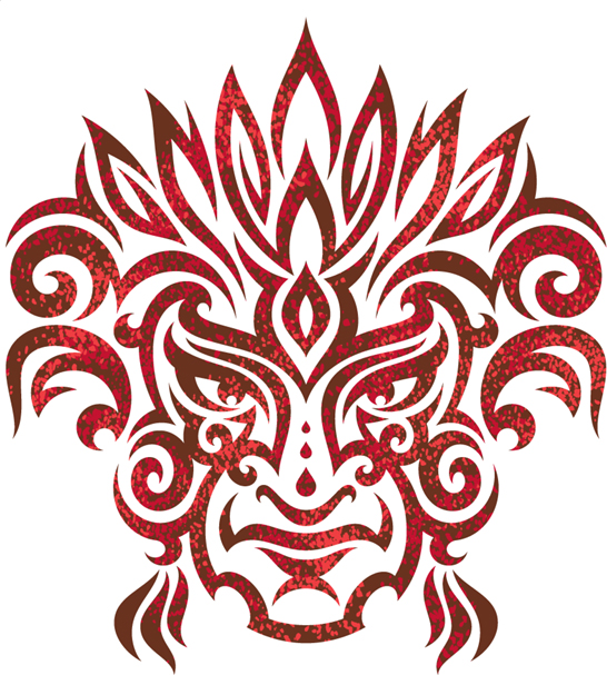
When I was hired by a beverage company to illustrate a tribal tattoo-styled Aztec warrior, I first drew out my refined sketch as shown in FIGURE 8.1. I spent a lot of time working on this, but something just didn't feel right. Whenever that happens, it's a sign for me to set the project down, walk away, and reap-proach it with fresh eyes later. So I shelved the job and decided to pick it up again the next day.
FIGURE 8.1 My initial refined sketch for the tribal tattoo-styled Aztec warrior.

FIGURE 8.2 A new refined sketch derived from the fresh eyes effect.

The next morning, I looked at my initial refined sketch with fresh eyes and was able to pinpoint the problematic attributes within my art. After reviewing my drawing, the proportion of the overall head seemed too thin, the ethnicity didn't look correct either, and the eyes were getting lost in the detail, so they weren't as captivating as they could be. I made the needed corrections to my refined sketch and the overall result was an authentic vibe the previous sketch was missing (FIGURE 8.2).
With my refined sketch dialed in, I was able to get it approved by my client and move forward with building the design in vector form (FIGURE 8.3).
FIGURE 8.3 Building the vector shapes, using TCM, PPP, and other techniques outlined in chapters 5 and 6.

FIGURE 8.4 Final vector artwork used on the packaging of an energy drink. Fresh eyes helped me create work that served my client better.
In a creative environment that demands an accelerated timeline, perhaps using fresh eyes can seem unrealistic. But I'd argue it's not impossible. Even allowing yourself a small amount of time to reset your creative perspective is better than none at all (FIGURE 8.4).
Your Inner Art Director
Self-art direction isn't limited to the drawing stage of a systematic creative process. It can also take place during the building stage of your vector creation.
A responsible designer should always be looking for the opportunity to improve and grow creatively. Part of this growth comes from paying proper attention to detail as you progress through the creative process on any given project.
Listen to your inner art director and be sensitive to those sometimes-fleeting feelings that subtly reveal themselves to you as you work. Don't ignore them—correct the problems that they uncover. The project shown in FIGURES 8.5–8.13 utilizes many of the methods we've covered in this book so far. Along the way, however, my inner art director took notice of areas in my art I could improve upon (FIGURE 8.8).
In chapter 3, I made the case for why you must depend on both analog and digital methods to create your vector art (FIGURES 3.34–3.36). In this project, the same balance of analog and digital apply. Once I have my base vector art in place, as shown in FIGURE 8.7, I will print out a black-and-white version and begin to draw out my shading detail (Figure 8.8). I'll eventually scan this back in and use it as my road map to build the vector shapes that form the shading in my final design (FIGURES 8.12–8.13).
As I was drawing out the shading detail, something about the form of the bottom half of the alien skull was bugging me. My inner art director pinpointed the problem areas at the base of the skull, which was too narrow and which made the shape of my design somewhat awkward. (Figure 8.8). It's important to remember that art direction like this is subjective, for the most part. This area of my art isn't necessarily wrong; it's just not as aesthetically effective or pleasing as it could be. In other words, there was room for improvement, so I made revisions (FIGURES 8.9–8.11).
FIGURE 8.5 Thumbnail sketches for an alien skull design commissioned by a UK publisher.

FIGURE 8.6 My refined alien skull sketch on left (note that I'm working symmetrically) and my vector build shown on right.

FIGURE 8.7 This shows the entire base vector art built. I'll now print it out in black and white so I can draw out my shading.
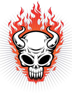
FIGURE 8.8 I revert to analog mode and draw out my shading detail. I'll eventually scan this back in and build my vector shapes from it for shading. As I was shading, my inner art director noticed the areas that could use improvement (circled here in red).

FIGURE 8.9 This is the area that I felt could be improved. It looked too thin and the shading here contradicted my approach elsewhere in the design.
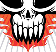
FIGURE 8.10 I reshaped the vectors on the bottom half of the alien skull to improve its overall appearance.

FIGURE 8.11 I continued to create the new vector shapes needed to match the shading style of my design.
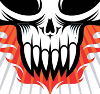
FIGURE 8.12 I built all of the shading shapes based on the drawing that I scanned back in. All that is left now is to finalize my color.
FIGURE 8.13 The final alien skull design that benefited directly from self-art direction.

I could have just let the art stand and not made any of these changes, but I think revising the shape of the skull as well as the added shading helped to make the end product a stronger piece of artwork. This, of course, is my opinion. Art direction tends to be subjective, but it's these types of small refinements that you want to make throughout the creative process to ensure your designs are consistently produced at the highest level possible. In other words, don't settle for good enough: If you think you can improve something, that's a good enough excuse to do it (FIGURE 8.13).
Making small, continual improvements to your work over the entire span of a given project is a sure sign of a healthy creative process.
No one's work is perfect when it hits the page. As you work with others during your career, they'll no doubt point out problems in your work that you're blind to. Don't take offense; it's important to absorb all forms of art direction so you can learn, grow, and become the best you can possibly be.
The fact that you're reading this book reveals that you are well-equipped to accept this sort of input, and that's a good sign.
Avoid Visual Tension
Shape is important when creating vector artwork. But how a shape relates to another shape within any given design context is of equal or even greater importance. You might produce a well-crafted and precise shape, but if it's not balanced well with other shapes, it will suffer aesthetically. I define this type of problematic shape relationship as visual tension.
![]()
![]()
Look at FIGURE 8.14. Where does your eye automatically go when you look at these shapes? Likely, your eye will naturally return to the area circled in red in FIGURE 8.15 because that is where visual tension exists.
FIGURE 8.14 Look at this graphic and let your eye naturally go where it wants to go.

FIGURE 8.15 If you're like most people, your eye zeroed in on the location circled in red. The circle is too close to the edge of the square. Visual tension exists because the shape relationship between the square and circle isn't a balanced one.
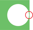
FIGURE 8.16 You can remove the visual tension by moving the circle further away from the square's edge, adding balance to the relationship.

FIGURE 8.17 You can also remove the visual tension by moving the circle further past the square's edge so it clearly overlaps it and improves the shape relationship.

The tension is caused because the circle is too close to the edge of the green square. It unintentionally draws the eye to that area. To remedy this, you have to either move the circle further away from the edge as shown in FIGURE 8.16, or move the circle past the edge as shown in FIGURE 8.17.
Most successful designers are expert manipulators, practiced in the art of using composition to visually guide a viewer's eye through a design or to focus attention on a specific location within a given context. This type of viewer response is what you want, a purposeful attention to important content that is not distracted by unnecessary or poor design.
Bad design, in general, is riddled with visual tension. The more areas of visual tension within a graphic, the more it runs the risk of compromising the intended visual communication. It's crucial, as a self-art director, to recognize and remove visual tension from your artwork. And, as with anything, the first step in solving a problem is recognizing that you have one.
Recognize Visual Tension
Before we jump into a real-world project that contains visual tension, let's take a look at a common graphic that everyone is familiar with, the American flag. I think it's safe to say we've all seen this image enough that we could spot anything in it that is not quite right.
If you look at FIGURE 8.18, you'll see a normal flag and one with a lot of visual tension. Can you pinpoint all 22 areas of visual tension in this graphic? Some problems are obvious, whereas some are much more subtle.
I should point out that sometimes a designer wants to purposely mess up a graphic in order to achieve a certain look and feel. In that context, visual tension is thrown out the window and really doesn't apply at all. But that's the exception, not the rule. So unless the genre specifically calls for a style that is loose, random, or chaotic in its composition, visual tension should be viewed as a negative attribute within a design.
The flag samples demonstrate that visual tension can be both overt and subtle. The latter is the harder to spot, so you'll really need to train your eye so you can detect visual tension in any piece of artwork.
FIGURE 8.18 There is a total of 22 areas of visual tension in the right flag graphic. Eight stars are either positioned or scaled wrong; the blue background is shifted and distorted; six of the seven red stripes are either positioned, distorted, or scaled wrong; and there are seven white stripes that are either positioned, distorted, or scaled wrong.

FIGURE 8.19 We've corrected 19 of the 22 areas of visual tension in the flag graphic. But three subtle areas of visual tension remain. Can you pinpoint them? (One star is positioned wrong, and two of the red stripes are distorted or positioned wrong.)

FIGURE 8.20 The logotype contains numerous areas of visual tension.

Let me walk you through one of my projects in which I isolated several instances of visual tension so you can see how I resolved them.
When I added the various outlines to this hand-lettered logotype, it caused a lot of visual tension (FIGURE 8.20). Look closely and you'll see:
A. The descender of the letter K is too thin.
B. The letter U is sitting on the edge of the letter K.
C. The letter S is touching the edge of the letter U.
D. The letter S was obstructing too much of the letter U.
E. There is too much space between the letter S and the letter K.
F. Both arms of the letter K are too thin.
G. The letter K should overlap the letter O.
H. The exclamation mark is too thin and short.
Visual tension can be caused by any sort of poorly handled shape relationship. Any time your eye is pulled toward an unintended area, it's a safe bet that there is some form of visual tension within the design.
With the visual tension areas identified, we can fix them (FIGURE 8.21). Notice how I also fixed the awkward slivers of negative space created by the outlines around the letters ”U” and ”S.”
FIGURE 8.21 Compare the before and after of this logotype. We've removed all areas of visual tension from the bottom sample to bring a nice balance to our design. Spotting visual tension may at first seem a bit foreign to you, but over time you'll develop the eye to spot these problems so you can correct them.

FIGURE 8.22 Final vector artwork used on packaging for a line of kid's snacks. I paid very close attention when I added in the bear character so as not to create new areas of visual tension within the final design.


spotting Visual Tension
Wherever you are, take the time to scrutinize the design around you. It might be the signage on a building, a T-shirt graphic, a book cover, or an advertisement in a magazine. Anything is fair game. See how long it takes you to spot elements of visual tension.
An easy target for this exercise is the Yellow Pages, which I call the design annual for bad design. If you can't find an example of visual tension there, then you need to find a new career fast.
Full-Tilt Creative Boogie
If creativity has an antithesis, it has to be complacency.
In order to grow as a creative person, it's essential to leave your comfort zone to try new things, take some design risks, be willing to apply new methods like the fresh eyes effect, and catch and fix visual tension, all while you develop new styles for yourself and your clients.
Realize that when you do these things, you're bound to fail, but that only adds to your growth.
Art directing yourself means you need to be your worst critic. Don't settle for good enough. Keep your creative standard high and relentlessly pursue design excellence as often as possible so it becomes your new creative normal.
Resist taking the easy road toward stagnation. Instead, stir up your creative juices and eventually you'll be doing the full-tilt creative boogie!
Design Drills: Hop to It
Nothing teaches methodology like redundancy and also redundancy. We're going to walk through yet another design project in order to cement the entire vector creative process in your brain.
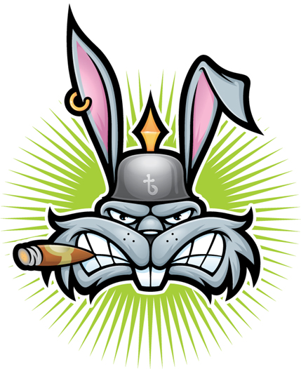
This time, let's take a gander at another character illustration project called ”Thug Bunny” and see what methods are utilized to create the final vector artwork.
FIGURE 8.23 We begin by drawing out thumbnail sketches of our character, Thug Bunny. Step away from your computer, people, and pick up the pencil and paper. Sketching out your ideas before you head into Illustrator is essential to creating precise illustrations.

FIGURE 8.24 Dialing the character in more with a tighter rough sketch. I drew only half of the art, scanned it, and then flipped it to gauge if I was moving in the right direction.

FIGURE 8.25 Using the tighter rough sketch as my guide, I now draw out my refined sketch.
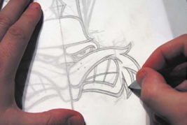
FIGURE 8.26 This is the finalized sketch, which I'll scan in and use to build my vector shapes. Don't forget that we'll rely on our good friend symmetry to complete the picture.

FIGURE 8.27 Rough building on the character's face. The only thing I'm concerned about here is placing the anchor points in their correct positions. I proceed point by point (see chapter 6).

FIGURE 8.28 With my anchor points in their correct PPP, I use the Xtream path plug-in to shape my Bézier curves, adjusting the handles so that the curves match those in my underlying sketch.
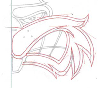
FIGURE 8.29 Notice how I dissected my design into smaller, more manageable, shapes. Now I'll use the Pathfinder panel (Shift-Command-F9 or Shift-Control-F9) to Unite (highlighted in green) my vector shapes.
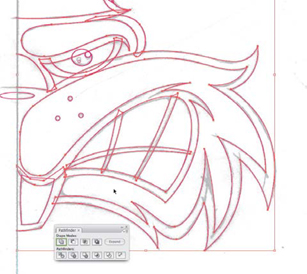
FIGURE 8.30 With all of my base vector shapes completed, I copy them and use the Reflect tool to flip them. (For more information on using symmetry, see chapter 6.)
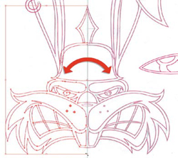
FIGURE 8.31 Once I've fused all of the elements together, I'm ready to start filling in my design with black and white.

FIGURE 8.32 With my black and white filled in, I scrutinize my design, looking for areas I can improve upon. Sometimes I print out the art and mark it up with a red pen, but on this project, my scrutiny was onscreen only.

FIGURE 8.33 I notice areas of visual tension.
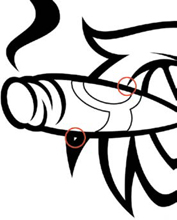
FIGURE 8.34 I remove both areas of visual tension simply by moving the cigar shape down. (For more information on visual tension, review chapter 8.)
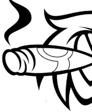
FIGURE 8.35 After walking away from the project for a few hours and returning with fresh eyes, I notice that the brim of the helmet comes to too much of a point, so I rebuild that part (shown in green).
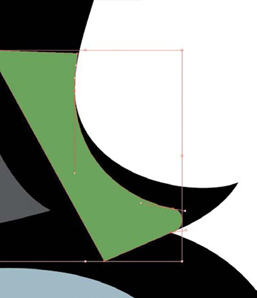
FIGURE 8.36 I modify my black-and-white art and Unite this new piece (colored green) to it via the Pathfinder panel. (For more information about Pathfinder, review chapter 2.)

FIGURE 8.37 This image shows the helmet before the necessary edit.

FIGURE 8.38 This image shows the helmet after.
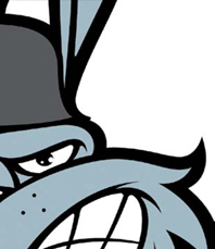
FIGURE 8.39 Time to jump back into analog. At this point, I print out my character design and draw in the shading details.

FIGURE 8.40 I'll scan this drawn shading in and use it as a guide from which to build in Illustrator.

FIGURE 8.41 Like my initial refined sketch, this shading serves as my guide.

FIGURE 8.42 As I was nearing the end of this project, I thought the helmet looked too bare, so I sketched out a logo idea and then built it. After all, Thug Bunny wouldn't be half as cool if he didn't have his own brand logo to emblazon on his helmet.

FIGURE 8.43 Final Thug Bunny character illustration.