Chapter 2. Your Creative Armament
I’ve been creating vector artwork and wrangling with Bézier curves for well over two decades now. For fourteen of those years, I was a die-hard Macromedia FreeHand user. Along the way, I’d use Adobe Illustrator from time to time—you know, if I had to. But when Adobe bought FreeHand, I saw the writing on the wall and committed myself to an exclusive relationship with Illustrator. We haven’t always gotten along, Illustrator and I, but our creative relationship deepens and improves with each passing software release.
A Love-Hate Relationship
It’s hard to use something day in and day out—especially something so closely tied to my personal passion for creativity—without becoming somewhat fanatical about it. Let me start by saying that I love how Adobe Illustrator makes it so easy for me to turn my designs into precise, well-built vector illustrations.
However, as much as I appreciate Illustrator’s many fine qualities, there are times when it drives me absolutely nuts. (Some of you may be nodding your heads in agreement.) Years ago, I wrote a blog post about my “switcher” frustrations and in the process coined the phrase “Adobe Frustrator.” Adobe’s lead marketing director for Illustrator at that time saw my post, agreed with many of my criticisms, and invited me to be on the Illustrator beta team. I’ve been part of that team since the release of Illustrator CS3 and have directly consulted on a handful of new tools and features over the years since. So, as you can see, I’ve been involved in the software’s development for a long time.
After several years of working with Illustrator and contributing to its development as a beta tester, I still have some big gripes about its functionality, and I’ll touch on these throughout this chapter. That said, the program has much improved since I first started using it, and it still is the industry standard for vector design and illustration.
Whether you use Illustrator, Affinity Designer, CorelDraw, Impulse, Inkscape—or any other app from an ever-growing list of open source vector programs—before you can control Bézier curves and build vector art successfully, you must become familiar with your core building tools. All of these programs use Bézier curves for vector building. Illustrator and other apps are often called vector-drawing programs, but it would be more accurate to call them vector-building programs, because they let you build shapes via anchor points and paths. The difference among programs lies in the additional proprietary tools provided to manipulate points and paths.
For ease of communication, this book uses Adobe Illustrator to showcase the creative process. In this chapter, I’ll tell you about the twelve core Illustrator tools I use to build precise vector graphics. If you don’t have Illustrator, eleven of these tools will have equivalents in the other vector programs. The one exception is the VectorScribe plug-in from Astute Graphics. This exists only for Illustrator. This plug-in isn’t mandatory; it just makes the process faster. I’ll show you how to create with and without this plug-in.
Vector building can be accomplished in any vector-based program. The tools may have different names and might not work exactly the same way, but they should all enable you to arrive at the same precise solution. The key to success as an illustrative designer is to get back to basics. A sound and systematic creative process that includes analog drawing at its core will improve your ability to execute digital art at a higher level.
Core Tools for Vector Building
Illustrator is replete with an array of tools that grows with each new software release. Whole books are dedicated to documenting these new tools and how to use them. This book, however, is dedicated to basic training, so I’ll simplify the process by focusing on only the tools you need to create precise vector shapes within any given drawing program.
The Twelve Disciples of Design
Each of the twelve tools listed here serves a specific function in the build process. Keep in mind that some of these tools lend themselves to specific build methods, which are covered in more detail in Chapter 6, “Vector Build Methods.”
The following are the twelve core tools you’ll use to create precise vector shapes:
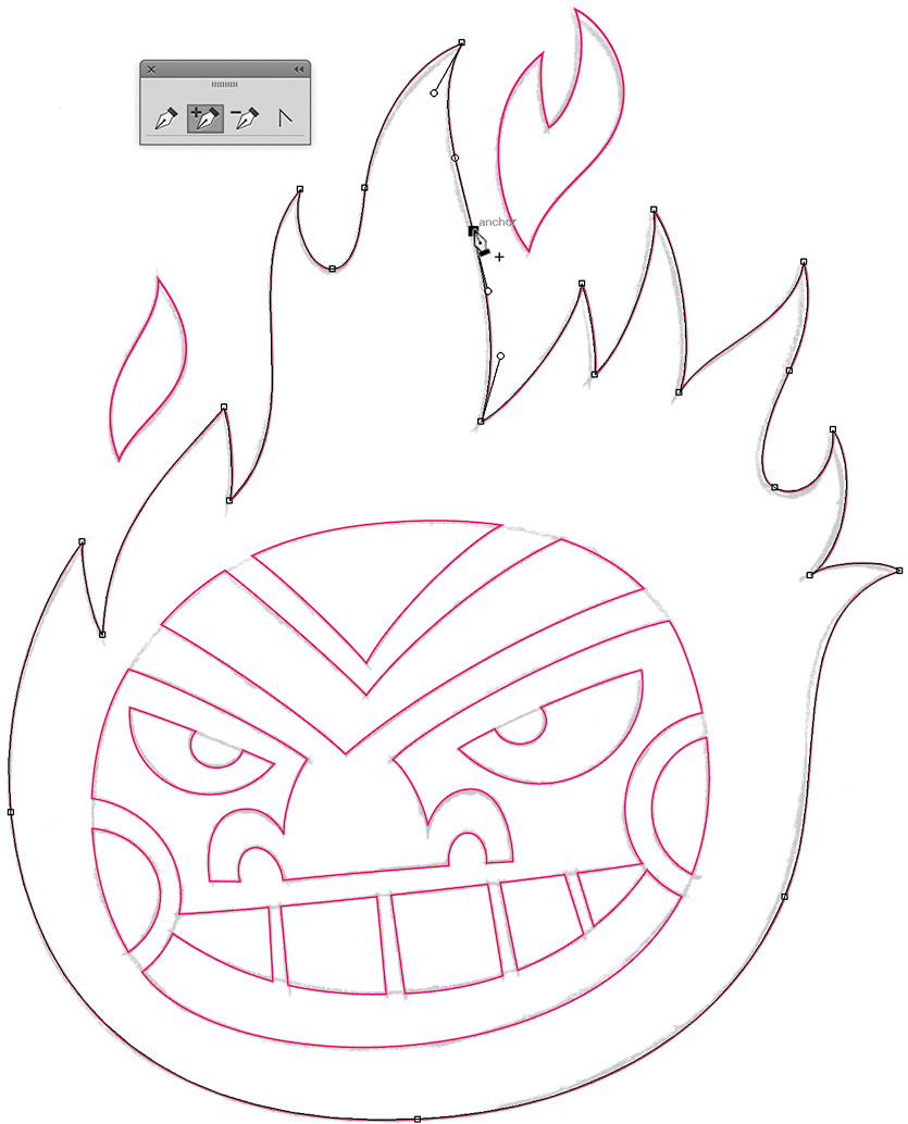
1. Pen tool (P): Precise vector building wouldn’t be possible without the Pen tool. You’ll use it to lay down all of your anchor points, one by one, forming a path that makes the vector shape you need (FIGURE 2.1).

2. Add Anchor Point tool (+): This tool lets you add an additional anchor point to any path you’ve created (FIGURE 2.2).
3. Delete Anchor Point tool (–): This tool removes any anchor point from any path without breaking the path (FIGURE 2.3). But this tool is really useful only on straight paths; if you remove a point on a curved path, it ruins the path’s shape. I’ll explain this in more detail in Chapter 6.
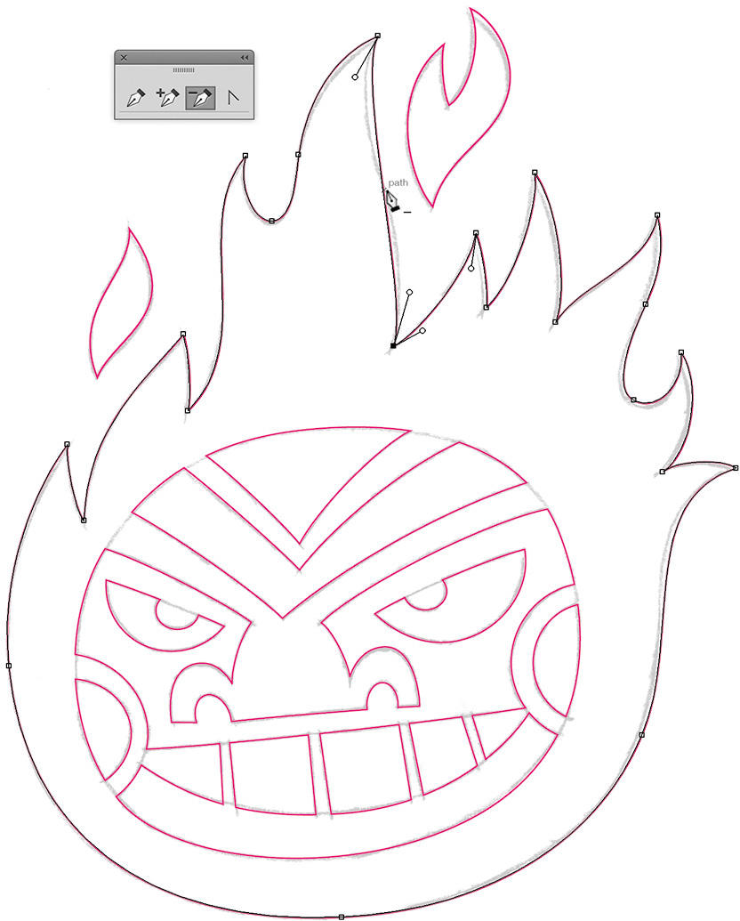
You can also select one or more anchor points and click “Remove selected anchor points” from the Control panel menu at the top of the screen. The results are exactly the same either way.
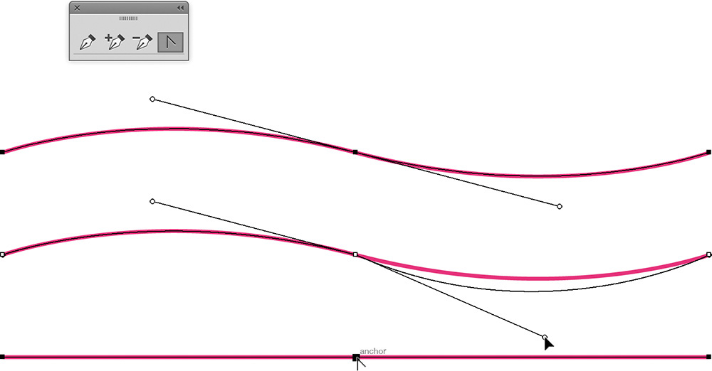
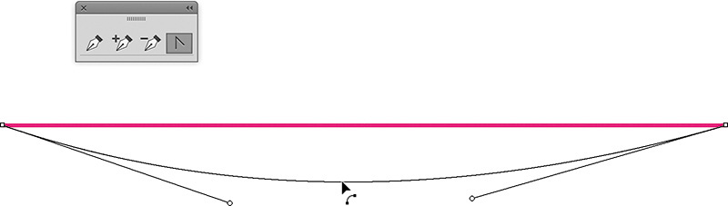
4. Convert Anchor Point tool (Shift-C): This tool converts smooth points to corner points. It can also reveal, isolate, manipulate, and/or retract handlebars independently to adjust a Bézier curve (FIGURE 2.4). You can also use this tool to reshape the segment of a path (FIGURE 2.5). This feature is in Creative Cloud 2014 and above only.
5. Selection tool (V): This tool scales objects larger or smaller when bounding box is visible. It also lets you click or drag to select shapes as individual objects and manipulate handlebars to adjust a Bézier curve (FIGURE 2.6).

6. Direct Selection tool (A): This tool lets you directly click or drag to select a specific segment of a path or individual anchor points. It can also reveal, isolate, and manipulate handlebars to adjust a Bézier curve (FIGURE 2.7).
7. Rectangle tool (M): This tool creates complete shapes with 90-degree angles (FIGURE 2.8). For more information, see “Shape-Building Method” in Chapter 6.

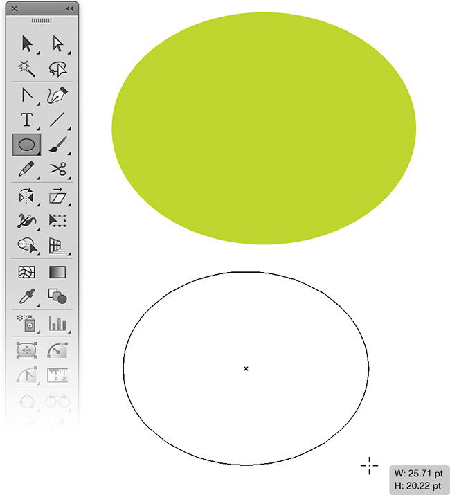
8. Ellipse tool (L): This tool creates complete circular or elliptical shapes (FIGURE 2.9). For more information, see “Shape-Building Method” in Chapter 6.
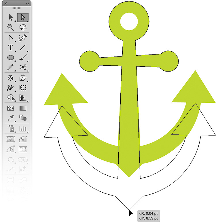
9. Pathfinder tool (Shift-Command-F9 or Shift-Control-F9): This tool lets you build shapes (think cookie cutters) using its Unite, Minus Front, Intersect, and Exclude modes (FIGURES 2.10–2.13). There are other functions within the tool, but I’ll focus on these four.
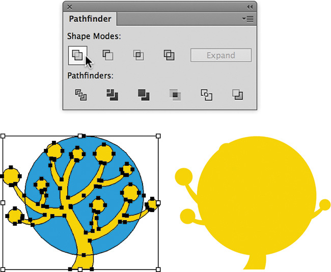
FIGURE 2.10 Pathfinder’s Unite shape mode, before and after. I use this feature a lot when shape building my artwork.
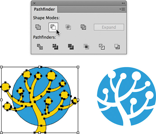
FIGURE 2.11 Pathfinder’s Minus Front shape mode, before and after. I like to refer to this function as Punch, since that better defines it in my opinion. I use this Pathfinder function more than any other.

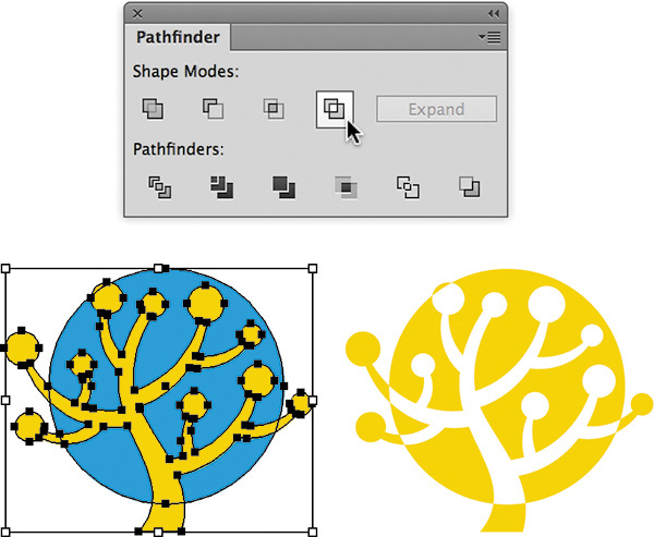
FIGURE 2.13 Pathfinder’s Exclude shape mode, before and after. Personally, I never use this function.
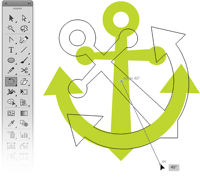
10. Rotate tool (R): This tool lets you define the rotating axis of any selected object and rotate it on the fly or via a specific numerical amount (FIGURE 2.14).
11. Reflect tool (O): This tool lets you flip a selected object horizontally or vertically. You’ll use it mainly for creating symmetrical designs (FIGURE 2.15). For more information, see “Symmetry Is Your Friend” in Chapter 6.
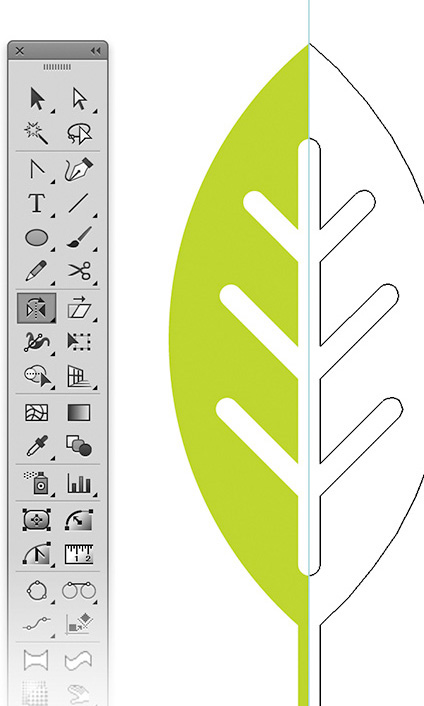
FIGURE 2.15 Reflect tool. Click the central anchor point on your shape and reflect it to form the whole piece of artwork. I’ll cover this type of symmetry in Chapter 6.
12. VectorScribe plug-in (Astute Graphics): This plug-in makes editing and forming your final vector shapes far easier and more precise than Illustrator’s own tools (Convert Anchor Point tool, Shift-C). The plug-in includes six tools (FIGURE 2.16), but I’ll focus on two: PathScribe and Dynamic Corners. It also includes a function called Smart Remove Point.

FIGURE 2.16 The VectorScribe plug-in includes the Dynamic Shapes tool, Dynamic Corners tool, PathScribe tool, Dynamic Measure tool, Extend Path tool, Smart Remove Brush tool, and Smart Remove Point function.
VectorScribe Plug-in
When I first discovered the VectorScribe plug-in, I knew I’d found the Holy Grail of vector building. Simply put, it has fundamentally transformed how I approach my vector artwork because of its extremely intuitive and customizable tools.
I used to love FreeHand because it made building and editing anchor points and paths quicker and easier than Illustrator did, with fewer tools and less hassle. When I switched to Adobe Illustrator, my build time slowed down.
The whole reason I use the VectorScribe plug-in is because it lets me build faster and with greater ease than I could using Illustrator’s own tools and functions. In fact, VectorScribe works so well that I can build even faster and with more precision than I did when I used FreeHand.
That said, the methodology I cover in this book doesn’t require a plug-in to use it. You could choose not to use the plug-ins and still manage to create your vector artwork using only the tools available in Illustrator. It’ll just take you a lot longer, and you won’t be able to customize your workflow to the degree the plug-ins allow.
Since I’m covering only two of the six tools included in the VectorScribe plug-in, I encourage you to experiment with the others on your own. Astute Graphics has developed other helpful plug-ins for Illustrator that I use in my own daily workflow that I haven’t covered in this book, so make sure to check them all out at www.astutegraphics.com.
My Three Amigos
VectorScribe’s PathScribe and Dynamic Corners tools and its Smart Remove Point function—which I fondly refer to as my three amigos—are essential to precise building:
1. PathScribe tool: This tool lets you grab a vector path anywhere (between two anchor points) and bend it into any free-form shape (FIGURE 2.17).

FIGURE 2.17 With the PathScribe tool you simply grab a vector path anywhere between two anchor points and bend the Bézier curve into the specific shape needed to match your drawing. Simply push and pull your paths to form them into your final art (like vector clay, if you will). The functionality is simple, is intuitive, and, most importantly, leads to precise vector building.
2. Dynamic Corners tool: With this tool you can select any corner anchor point and round it off. Because it’s dynamic, you can go back at any time to adjust or remove the rounding (FIGURE 2.18).
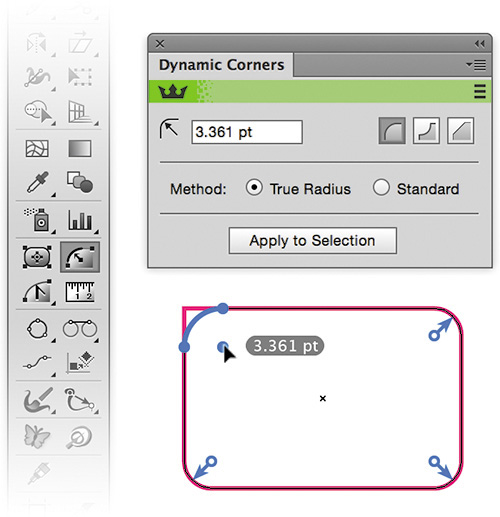
FIGURE 2.18 The Dynamic Corners tool lets you round off any type of path. You can even go back later to adjust it or remove it. It’s jaw-droppingly easy to use and superior to Illustrator’s corner widget feature.
3. Smart Remove Point: This feature allows you to select an anchor point and delete it without destroying the original shape of your vector path (FIGURE 2.19). I’ll cover this function and another called Remove Redundant Point in more depth in Chapter 6.
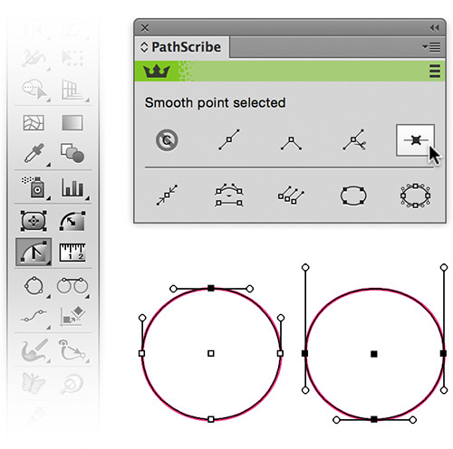
FIGURE 2.19 The Smart Remove Point function lives up to its name. It can smartly remove an anchor point from a path without destroying the path’s overall shape. I cover all of the plugin features in more depth in the video included with this book.
Customize Your Environment
Every vector-drawing program comes with default settings. In general, the defaults are OK, but customizing your preferences will make creating your vector graphics a lot easier. The following customizations are geared for Illustrator. Look for equivalent controls and features in the drawing application of your choice.
My Preference for Preferences
You’ll want to customize these three areas:
• Preferences/General: The settings shown in FIGURE 2.20 will help you make adjustments to your art as you work and scale properly when resizing.
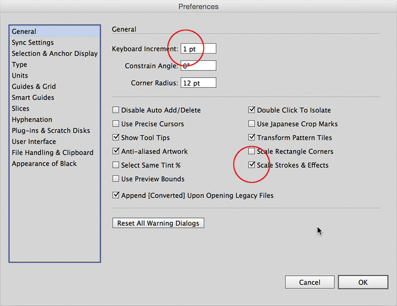
FIGURE 2.20 Preferences > General: Keep Keyboard Increment set at 1 point or lower. Make sure you have Scale Strokes & Effects checked.
• Preferences/Selection & Anchor Display: The settings shown in FIGURE 2.21 make it easier to notice and isolate problem areas in your vector shapes. They also help you build precise Bézier curves by editing and adjusting the anchor points and the handles that control the paths.

FIGURE 2.21 Preferences > Selection & Anchor Display: Select the largest display for your Anchors and Handles (the ones featuring the handles with hollow ends). Check “Show handles when multiple anchors are selected.” Check “Enable Rubber Band for Pen and Curvature Tool” as well—this will help you as you build using the pen tool. If you’re using the VectorScribe Plug-in, then make sure to input 3° in the “Hide Corner Widget for angles greater than” box. This will prevent them from displaying. You can also toggle this on and off by going to View > Hide Corner Widget.
• Preferences/Smart Guides: The settings shown in FIGURE 2.22 will let you use Smart Guides to assist you as you build. This will help you know when you’re hovering over an anchor point in a path that isn’t selected, for example. It will also deactivate some features that can get in the way while you build.
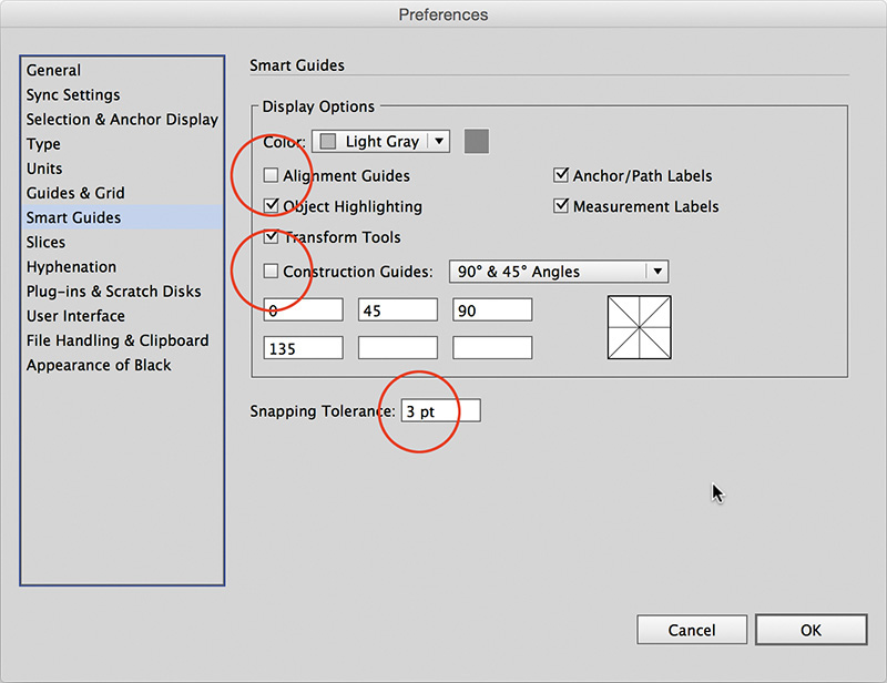
FIGURE 2.22 Preferences > Smart Guides: Make sure you uncheck Alignment Guides. And set Snapping Tolerance to 3 pt. or lower. I uncheck Alignment Guides because the program tries to associate everything you build with other elements in your file whether you want it to or not, and this can become highly annoying as you build vector shapes. I turn off Construction Guides for the same reason.
Keyboard Shortcuts and Actions
Illustrator’s customizable keyboard commands and actions are, in my opinion, two of the app’s most underrated features. Most people never even tap into them.
Keyboard shortcuts are just what they sound like: the ability to use a key command instead of hunting down the command in a drop-down menu. They help make your workflow more efficient.
Not all functions in Illustrator let you add a shortcut command, though. In those cases, actions are your best bet. Actions allow you to record multiple keyboard commands, dialog box entries, or menu choices. You can even choose a specific keyboard shortcut to trigger your action. The end result lets you push one button to run a series of commands instantly, which obviously saves time. The best way to determine how you can best use actions is to simply experiment. Anything you do routinely is a good candidate for an action.
For example, I have an action that converts all text to paths and then saves my artwork as a PDF onto my desktop so I can email a design to a client. It’s all about streamlining mundane tasks.
To create your own keyboard shortcuts, go to Edit > Keyboard Shortcuts > Select and pick either the Tools or Menu command from the drop-down menu in the pop-up window. Select a specific tool or menu command and then enter the key you want the task to be assigned to. Illustrator will tell you if the key is already assigned, and you can decide to ignore or override it. Click Save, and your keyboard shortcut is ready to use. It’s that simple.
To create an action, go to Window > Actions. On the Actions panel, click the fly-out menu in the top-right corner. Then click New Action. In the pop-up window that opens, name your action, assign it to an action set (mine is GS Actions), bind your action to an F key, and click Record > Proceed to compile the series of commands you want to record (FIGURE 2.23). (Remember that not all functions in Illustrator are recordable.) Once done, click Stop in the Actions palette. You now have a customized action at the ready.
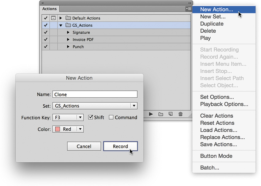
FIGURE 2.23 To create the Clone shortcut, from the Actions menu, choose New Action. Next, record yourself copying a shape (Command-C or Control-C) and then pasting it in front (Command-F or Control-F). Stop recording. You have now assigned a Clone keyboard shortcut to the F3 key.
Make sure to save your action set by going to the fly-out menu in the top-right corner of the Actions panel and clicking Save Actions. I also recommend saving a copy of your actions to another location outside of the application folder because if you ever have to re-install illustrator, you’ll lose them.
How you ultimately use these features will depend greatly on what type of work you’ll be creating, but when it comes to building vector graphics, I have customized a handful of commands to make routine tasks easier. Here are twelve shortcuts and two actions I’ve assigned to function keys in order to simplify my workflow and save time:
• F1 is Make Clipping Mask (Command-7 or Control-7).
• F2 is Release Clipping Mask (Option-Command-7 or Alt-Control-7).
• F3 is Clone. Illustrator has no clone command. To clone an object, you must copy a shape (Command-C or Control-C) and then paste it in front (Command-F or Control-F). That’s two commands and four keys to hit. Keyboard shortcuts don’t allow multiple commands, so you’ll need to record an action and bind it to a function key (Figure 2.23).
• F4 is Send to Back (Shift-Command-[ or Shift-Control={).
• F5 is Bring to Front Again (Shift-Command-] or Shift-Control-]).
• F6 is Ungroup (Shift-Command-G or Shift-Control-G).
• F7 is Unite. This lets me unite two individual shapes into one without moving my cursor to the Pathfinder panel. Since the Pathfinder panel functions don’t have keyboard commands, I created an action for this function and assigned it to the F7 key.
• F8 is Deselect All (Shift-Command-A or Shift-Control-A). Sometimes when you’re zoomed into your design, you can’t click the artboard to deselect an object. Assigning the Deselect shortcut to the F8 key is like killing three keys with one click.
• F9 is Punch (Minus Front). Using this I can select two shapes, one on top of the other, and, like a cookie cutter, punch out the top shape from the bottom shape with one button push. Since the Pathfinder panel functions don’t have keyboard commands, I created an action for this function and assigned it to the F9 key.
• F10 is Place Image. Since Illustrator’s place command requires three keys (Shift-Command-P), I’ve utilized the F10 key to streamline this function. Almost everything I create in Illustrator is based on a drawing, so this is how I get my refined sketches into the vector-building environment with one key press instead of three.
• Option-F1 is Select Same Fill Color. I use this to quickly select vector elements with the same fill attributes.
• Option-F2 is Select Same Stroke Color. I use this to quickly select vector elements with the same stroke attributes.
Stop Re-creating the Wheel
When you begin a new project, you should be able to start building immediately. You shouldn’t have to waste time setting preferences, importing graphic styles and color swatch libraries, creating new layer structures, and so on, at the start of each and every project. I save myself a ton of time by creating a new document profile in Illustrator that makes my favorite settings the default for each new document I create.
In this section, I’ll show you how to set the foundation for a creative process that lets you spend less time fussing with your computer and more time producing great designs.
Create a New Document Profile
Creating a new document profile in Illustrator is a simple three-step process:
1. Create a new document (Command-N or Control-N). In the New Document dialog, select the general properties you want, name the file, and click OK (FIGURE 2.24).
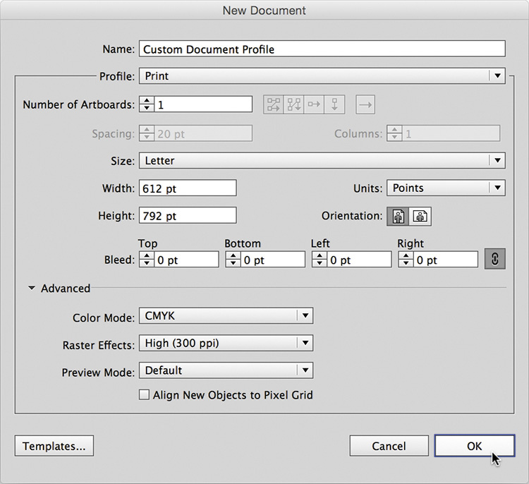
FIGURE 2.24 Many of the settings in the New Document window will be determined by the specific project you’re working on. If you overlook something after you click OK, don’t worry. You can always go back and revise it as needed.
2. Customize your properties. In your new document, set up properties in the way you like to work. Maybe you prefer rules to always be visible, specific colors to be loaded in your swatches panel, and so on. It’s up to you. All of the resource files provided with this book reflect my preferred document profile. (We’ll go over three essential properties that you should include in your new document profile in “Set Graphic Styles for Building” later in this chapter.)
3. Save your startup profile (Command-S or Control-S). Once you have your file set up with all the properties you want, it’s time to save it. On a Mac, go to File > Save (Command-S) and save your startup profile in this location: User/Library/Application Support/Adobe/Adobe Illustrator Version/Language/New Document Profiles.
On a PC, go to File > Save (Control-S) and save your startup profile in this location: User > AppData > Roaming > Adobe > Adobe Illustrator Version Settings > Language > x64 > New Document Profiles.
From this point forward, your new profile will appear in the New Document dialog (FIGURE 2.25). You can simply select it and get straight to work.
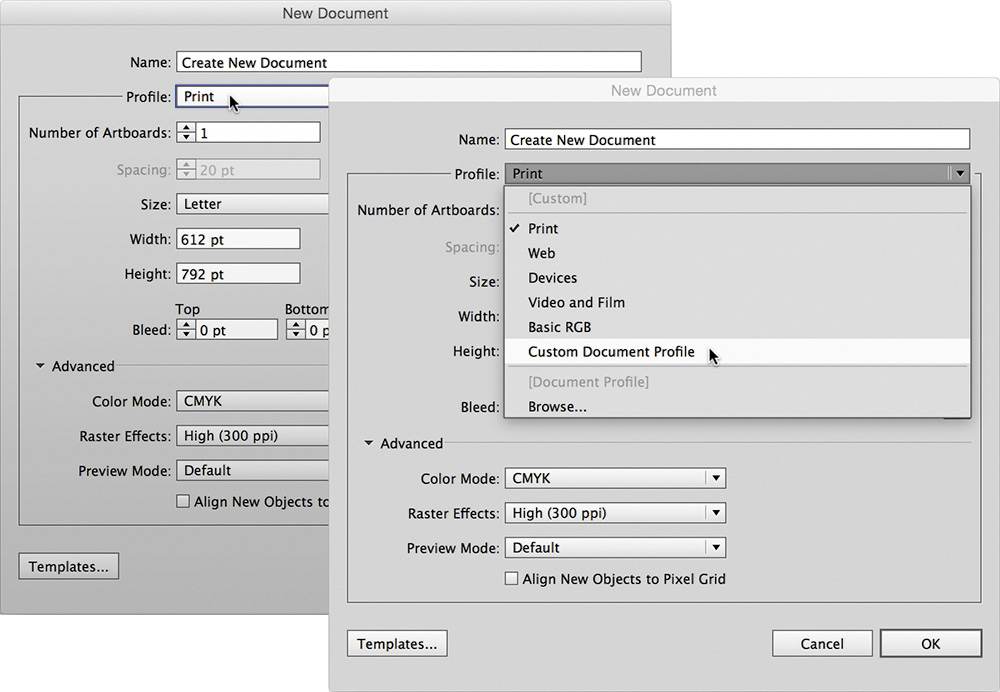
FIGURE 2.25 This is how your startup profile is listed in the New Document pull-down menu when you’re creating a new document.
When you begin a new project using your customized new document profile, you can focus on the creative work rather than the tools needed to pull it off. Saving specific profiles for specific types of work you do on a regular basis will help you be more efficient and allow you to spend more time on actual creative work and less on file management.
Read on to learn about ways to speed up your vector build times.
Set Graphic Styles for Building
Two primary tasks define the creative process described in this book: drawing and building. You’ll draw out your art, scan it in, and then build it within Illustrator or whatever application you prefer. Drawing is the creative foundation on which you build.
Prior to starting the building process, you’ll want to create two simple graphic styles and save them in your new document profile. These determine your working line weight and color during the build process. To create a graphic style, just create any shape with any fill or stroke color and width you want and drag it into the Graphic Styles palette. Done.
When I scan in a drawing that will form the basis of a digital illustration, the scan shows up in black and white, and then I reduce its opacity so it becomes my guide for building. By setting my default line styles to magenta, the colored lines pop off the background, and I can clearly see what I’m creating. Use whatever color you want as long as it’s not black, which would be too hard to see (FIGURE 2.26).
FIGURE 2.26 My default graphic style is a .5 pt. magenta-colored stroke. I also have a secondary graphic style that is a .25 pt. magenta-colored stroke. These help me easily see what I’m creating.
As you build your vector art, you’ll zoom in and out so you can see certain portions better. When I’m zoomed out, I use the .5 pt. stroke graphic style, and when I’m zoomed in I use the .25 pt. stroke graphic style. Using a .5 pt. stroke when zoomed in produces a line that’s too fat, which makes it hard to analyze contoured shapes as you build. Using a .25 pt. stroke when zoomed out does the opposite: the line is too thin and hard to see.
Of course, depending on your monitor’s resolution, you might prefer to use a different weight for your graphic styles. Experiment and figure out what works best for you.
Enable Smart Guides for Building
I highly recommend that you enable Smart Guides (Command-U or Control-U) as you build your artwork. Smart Guides make snapping to points and paths more obvious. Without them, it’s easy to think something is snapped into the correct location only to find out later that it’s slightly off.
Smart Guides also help you select items with more precision and provide live pop-up information when you rotate items or hover over content in your document (FIGURE 2.27).
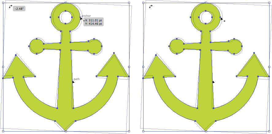
FIGURE 2.27 Left: With Smart Guides enabled, you can select a point or path or rotate a selected object. Smart Guides also give you dynamic information that changes based on which tool you’re using and which shape you mouse over. Right: With Smart Guides turned off, a selected point, path, or rotated object displays no information.
Using Smart Guides is a balancing act, however. I find myself toggling them on and off throughout the creative process because they can sometimes get in the way or force a snap when you don’t want it.
If you’re not used to working with these guides turned on, I suggest you get used to it. The benefits outweigh the annoying UI behavior.
Establish a Layer Structure for Building
For whatever reason, Adobe has decided that layer information isn’t worthy of being one of the properties you can add to a new document profile. This is highly annoying and should be added to a future version of the software, in my humble opinion.
For now, you have to establish layers manually. Whether I’m working on a logo design, character illustration, or pattern design, I follow the same hierarchy when it comes to layering (FIGURE 2.28). I start with four layers: storage (which I name X), temp, build, and sketch.
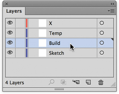
FIGURE 2.28 I begin every project with four layers: storage (which I name X), temp, build, and sketch.
From the top down, my layers are as follows:
1. Storage (which I name X): As I build artwork, I tend to experiment. So I make copies of elements and move them to my X layer, which is not visible. I also make a copy of all of my paths before I start coloring and put those in the storage layer as well. Think of this build habit as vector insurance in case you mess something up. It also lets me easily take elements I may have created for one project and reuse them in another.
2. Temp: I use this layer to test things before I actually make them part of the art. The more I build, the more a file can get cluttered visually, so this gives me space to turn off the other layers and work on a clean surface. Once I have the specific vector art dialed in, I move it to the build layer.
3. Build: This is where most of my building takes place. It serves as my vector staging ground, where I construct the vector artwork and finesse my Bézier curves.
4. Sketch: This is where I place my scanned refined drawing (either a .tif or .psd file with the opacity set to around 20%). I then lock the layer so it cannot move. This image serves as my guide to build from.
Because I do this all the time, I hired a programmer to create a custom script for Illustrator that automatically sets up my document with this layer structure. I’ve included this script and the simple instructions in the resource files for this book.
As a project progresses from building the base vector graphics and I begin to colorize my design and add in detailing, I continue to add more layers as needed to make managing and editing the artwork easier. I’ll cover this in more detail later in the book.
 Field Notes: Bézier Curve Jedi Master
Design Drills: Deconstructing Design
Not all professional designers and illustrators practice good layer management, but that doesn’t mean you shouldn’t. In fact, you should, because having an established layer structure for each and every vector art file you create will make the creative process easier to manage.
Organizing and grouping related content on its own layer as you build will let you easily isolate a specific group when edits are needed down the road. And, I assure you, edits will be needed—they always are. Grouping related content by layers lets you to make adjustments faster and refine details in your design without other vector shapes getting in your way.
Let’s deconstruct two of my designs. By turning your layers on and off, you’ll be able to see how the vector content is organized.
Señor Skully
This design was originally created for a sticker manufacturer, but the client changed directions. So, I turned it into a Day of the Dead poster (FIGURES 2.29–2.33).
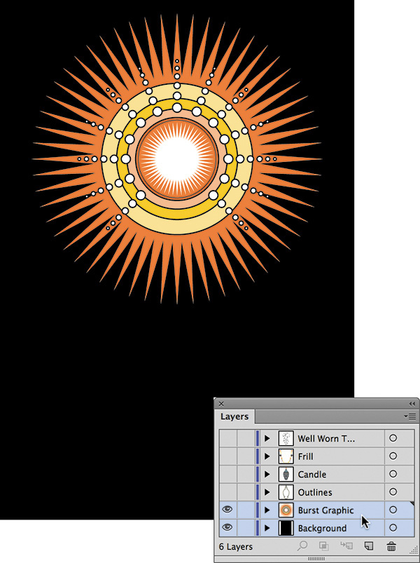
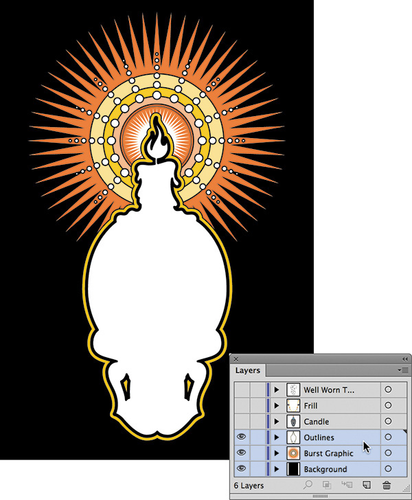
FIGURE 2.30 Keeping my outlines for this design on their own layer makes experimenting with the stroke thickness much easier.
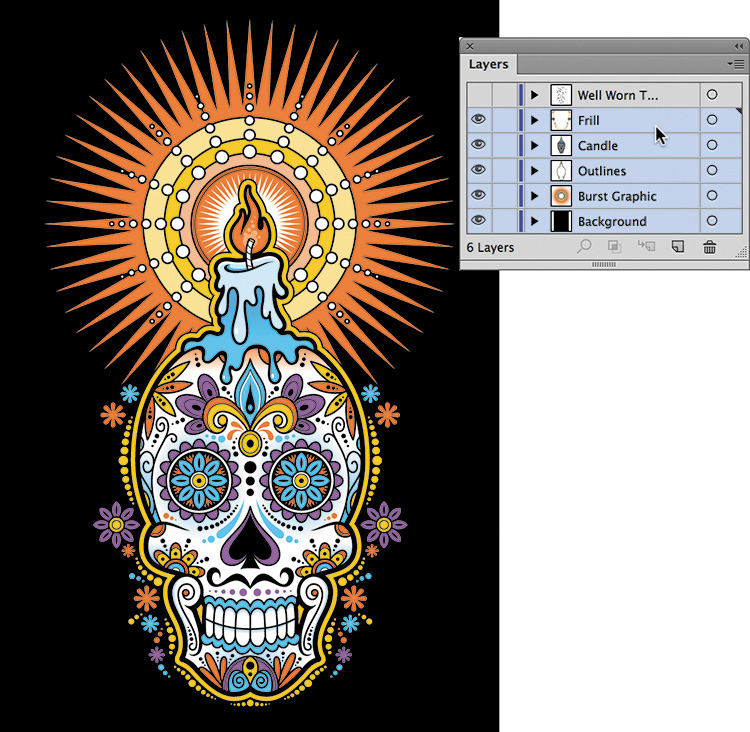
FIGURE 2.31 These layers contain most of the ornament and detail in this design. At any time I can lock a layer and focus on specific content to adjust it without accidently altering other areas of my design.
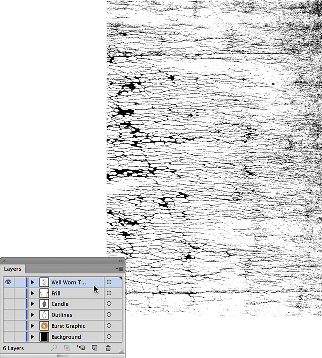
FIGURE 2.32 This is the texture I placed on the topmost layer so it aesthetically interacts with my design’s content. For more information about using textures, see my “Creating and Using Textures for Design” course on Lynda.com.

Creative Monster
I created this illustration for a poster to promote a creative conference. The detailing is complex, so I used layers to make the creative process easier and more manageable (FIGURES 2.34–2.38).

FIGURE 2.34 These five layers make up the base elements of this character illustration. I’ll continue to build on these using additional layers.
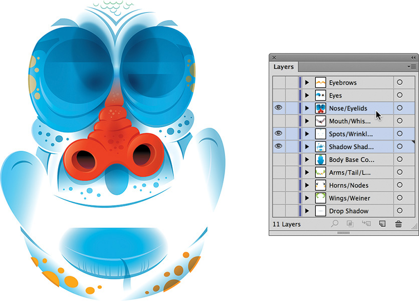
FIGURE 2.35 The hierarchy of layers isn’t always in a specific order—you can change it according to the visual needs of your project. The common denominator in these three layers is the use of gradients and blend modes to detail out the design.

FIGURE 2.36 These three layers contain the facial elements. Because these are complex, I assigned each to its own layer so I could easily access and refine the art.
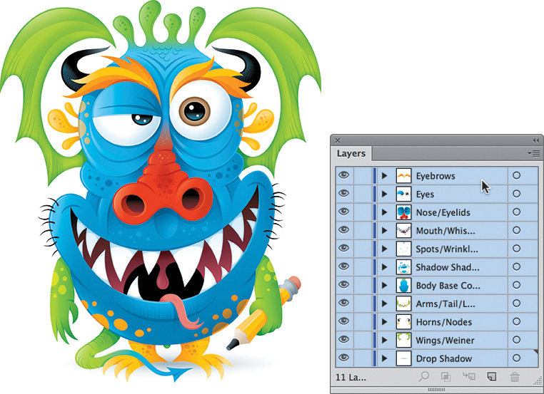
FIGURE 2.37 With all layers turned on, the character illustration is ready to integrate into the poster layout.