
Chapter 8. Art Directing Yourself
There’s a plethora of creative professionals in the communications industry, and they’re all competing with one another in a global marketplace, with the Internet serving as an ever-present facilitator. Design opinions shift quickly, trends take flight, and designers can showcase their work to more people worldwide than ever before.
What will set your work apart in this graphic cacophony is your ability to scrutinize your work honestly, admit its shortcomings, revise your creative process, and improve your capabilities with each new project. In other words, you have to know how to art direct yourself.
Art direction isn’t so much about correcting mistakes as it is about shaping perceptions. When you art direct yourself, your goal is to craft an aesthetic that achieves the desired response from the intended audience.
Think of it this way: Design tends to be a wonderful paradox where objective methods produce creative work that is viewed subjectively.
Fresh Eyes Effect
As a creative person, you can spend so much time looking at your work that it can be difficult to detect potential problems. Everything starts to blend together. When this happens, honest critique is missed and, with it, needed improvements.
This is a dangerous situation because it can result in subpar work. It also opens the door for your clients to notice problems and directly associate that lack of attention to detail with your creative services.
A simple way to avoid this situation is to use what I call the fresh eyes effect. When you reach a particular stage in your work, set it aside and turn your attention to something completely different for a while. An hour is ideal, but even 15 minutes can be enough to purge your mind’s cache and refresh your eyes. When you approach your work later, you can scrutinize it anew and more easily see areas that need improvement. The number and kinds of tweaks you’ll need to make will vary depending on your ability and what stage of the creative process the work is in.
When I was hired by a beverage company to illustrate a tribal tattoo-styled Aztec warrior, I first drew out and refined my sketch, as shown in FIGURE 8.1. I spent a lot of time working on this, but something just didn’t feel right. Whenever that happens, it’s a sign for me to set down the project, walk away, and approach it later with fresh eyes. So I shelved the job and decided to pick it up again the next day.
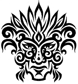
The next morning, I looked at the sketch with fresh eyes and was able to pinpoint the problems: The proportion of the overall head seemed too thin, the ethnicity didn’t look right, and the eyes were getting lost in the detail, so they were less captivating than they could be. I made the needed corrections, and the overall result was an authentic vibe that was missing in the initial refined sketch (FIGURE 8.2).

With my refined sketch dialed in, I was able to get it approved by the client and move forward with building the design in vector form (FIGURE 8.3).

FIGURE 8.3 Building the vector shapes, using The Clockwork Method, Prime Point Placement, and other techniques outlined in Chapters 5 and 6.
In a creative environment that demands an accelerated timeline, using fresh eyes may seem unrealistic. But it’s not impossible. Even allowing yourself a small amount of time to reset your creative perspective is better than none at all (FIGURE 8.4).
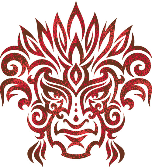
FIGURE 8.4 The final vector artwork used on the packaging of an energy drink. Fresh eyes helped me create work that served my client better.
Your Inner Art Director
Self-art direction isn’t limited to the drawing stage. It should take place throughout the entire creative process.
As a responsible designer, you should always be looking for opportunities to improve and grow creatively. So, you’ll want to continually make micro-adjustments and conceive better ways to pull things off as you create your vector artwork on any given project.
Listen to your inner art director and be sensitive to the sometimes-fleeting feelings that reveal themselves as you work. Don’t ignore them—correct the problems that they uncover. They may seem insignificant, but, as a designer, you should care about this level of detail because no one else will ever be as passionate about your work as you are.
As I work through a project, I pay close attention when that inner voice declares, “Something doesn’t feel right.” Even if I don’t understand why at that moment, I’ll stop and give myself some time to figure out what to do next. This type of internal conversation happens with every project I work on (FIGURES 8.5–8.9).
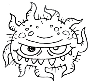
FIGURE 8.5 This is a thumbnail sketch for a germ character for a licensing company. In general, it encapsulates the idea I’m after, but my inner art director is telling me to refine the form so that the shapes I’ll use to build it in vector form are clear, eliminating guesswork.
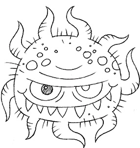
FIGURE 8.6 This is my refined sketch. I’ve thoroughly defined the shapes needed to create the character in vector form and have identified exact proportions. I’m ready to start building digitally.
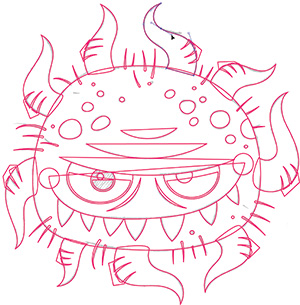
FIGURE 8.7 As I start building my vector shapes, my inner art director tells me to keep the tentacles separate from the body, rather than fusing them. I also add other shapes in the eye that will make detailing easier.

FIGURE 8.8 I choose a tonal family (See Chapter 9, “Basic Coloring and Detailing”) and begin composing my color palette to create a nice contrast between the shapes that make up this character.

FIGURE 8.9 My inner art director played a huge role in deciding which details—such as shading, highlights, and gradients (more on these in Chapter 9)—to add to create the final illustration. ![]()
No one’s work is perfect when it hits the page. As you collaborate with others during your career, they’ll no doubt point out problems in your work that you’re blind to. Don’t take offense; it’s important to absorb all forms of feedback so you can learn, grow, and become the best you can possibly be.
The fact that you’re reading this book shows that you’re ready to accept this sort of input, and that’s a good sign. In time, being your own art director will become second nature.
Avoid Visual Tension
Shape, and thereby form, is important when creating vector artwork. But how a shape relates to another shape within any given design context is of equal or even greater importance. You might produce a well-crafted and precise shape, but if it’s not well balanced with other shapes in a composition, it won’t stand up aesthetically. I define this type of problematic shape relationship as visual tension.
Look at FIGURE 8.10. Where does your eye automatically go when you look at these shapes? Your eye will probably return to the area circled in red in FIGURE 8.11 because that’s where visual tension exists.
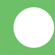

FIGURE 8.11 If you’re like most people, your eye zeroed in on the location circled in red. The white circle is too close to the edge of the square. Visual tension exists because the relationship between the square and circle is unbalanced.
The tension comes from the circle being too close to the edge of the green square. It unintentionally draws your eye to that area. To remedy this, you have to either move the circle further away from the edge, as shown in FIGURE 8.12, or move the circle past the edge, as shown in FIGURE 8.13. These are the fundamental design decisions you’ll make every day as a designer.
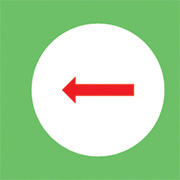
FIGURE 8.12 You can remove the visual tension by moving the circle further away from the square’s edge, adding balance to the relationship.
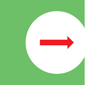
FIGURE 8.13 You can also remove the visual tension by moving the circle past the square’s edge so it clearly overlaps it and improves the shape relationship.
Most successful designers are expert manipulators, practiced in the art of using composition to visually guide the viewer’s eye through a design or to focus attention on a specific location within a given context. You want the viewer to give purposeful attention to important content and not be distracted by unnecessary elements or poor design decisions.
Bad design, in general, is riddled with visual tension. The more areas of visual tension within a graphic, the greater the risk of compromising the intended visual communication. It’s crucial, as a self-art director, to recognize and remove visual tension from your artwork. And, as with anything, the first step in solving a problem is recognizing that you have one.
Recognize Visual Tension
Before jumping into a real-world project that contains visual tension, let’s take a look at a common graphic that everyone is familiar with: the American flag. I think it’s safe to say we’ve all seen this motif enough that we could spot anything in it that’s not quite right.
If you look at FIGURE 8.14, you’ll see a normal flag and one with a lot of visual tension. Your challenge is to pinpoint all 22 areas of visual tension in this graphic. Some problems are obvious, while others are much more subtle. In FIGURE 8.15, it may seem at first that all the issues have been remedied, but look more closely.
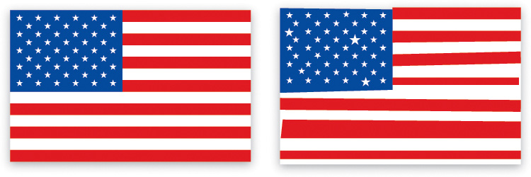
FIGURE 8.14 There are a total of 22 areas of visual tension in the right flag graphic. Compare this with the left flag and see whether you can find all the areas where elements are distorted or positioned or scaled incorrectly.

FIGURE 8.15 In this version of the flag graphic, I’ve corrected 19 of the 22 areas of visual tension. But three areas of subtle tension remain. Can you pinpoint them?
As a designer, you may sometimes intentionally mess up a graphic to achieve a certain look and feel. In that context, visual tension is thrown out the window. But that’s the exception, not the rule. So, unless the genre specifically calls for a style that’s loose, random, or chaotic in its composition, you should be mindful that visual tension is a negative attribute within a design.
The flag samples demonstrate that visual tension can be both overt and subtle. The latter is obviously harder to spot, so you’ll really need to train your eye to detect it.
Let’s walk through a project in which I isolated several instances of visual tension so you can see how I resolved them.
When I added the various outlines to this hand-lettered logotype, it caused a lot of visual tension (FIGURE 8.16). Look closely and you’ll see the following:
A. The descender of the “K” is too thin.
B. The “U” is sitting on the edge of the “K.”
C. The “S” is touching the edge of the “U.”
D. The “S” is obstructing too much of the “U.”
E. There’s too much space between the “S” and the “K.”
F. Both arms of the “K” are too thin.
G. The “K” should overlap the “O.”
H. The exclamation mark is too thin and short.

Visual tension can be caused by any sort of poorly handled shape relationship. Any time your eye is pulled toward an unintended area, it’s a safe bet that there’s some form of visual tension within the design.
Once I’d identified the areas of visual tension, I was able to fix them (FIGURE 8.17). Notice how I also fixed the awkward slivers of negative space created by the outlines surrounding the “U” and “S.” When I added a bear character, I paid very close attention so as not to create new areas of visual tension (FIGURE 8.18).
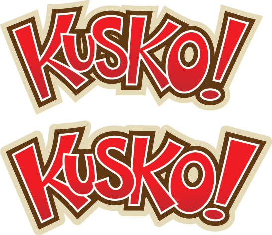
FIGURE 8.17 Compare the before and after of this logotype. I removed all areas of visual tension as shown in the bottom sample to improve the readability of the design. Spotting visual tension may seem a bit foreign at first, but over time you’ll be able to spot these problems quickly.

To grow as a creative person, it’s essential to leave your comfort zone, take design risks, apply new methods like the fresh eyes effect, and eliminate visual tension. All of this will help you develop new styles for yourself and your clients.
Realize that when you do these things, you’re bound to fail, but those failures only add to your growth as a creative professional. You simply can’t improve without trying and failing. So use T.N.T. (Try New Things) to blow up your creative norm.
Remember, art directing yourself means you need to be your own worst critic. Don’t settle for good enough. Keep your creative standard high and relentlessly pursue design excellence so it becomes your natural creative penchant.
Resist taking the easy road toward design stagnation. Instead, stir up your creative juices and eventually you’ll be doing the full-tilt creative boogie!
 Field Notes: Spotting Visual Tension
Design Drills: Hop to It
Nothing teaches methodology like redundancy. So, let’s walk through yet another design project—this time, a character illustration called “Thug Bunny”—to help cement the vector creative process in your brain (FIGURES 8.19 TO 8.39).
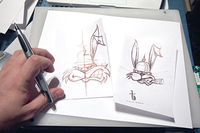
FIGURE 8.19 I start by drawing out thumbnail sketches of the Thug Bunny character. Remember to step away from your computer at the beginning of the project and pick up pencil and paper. Sketching out your ideas before you head into Adobe Illustrator is essential to creating well-crafted vector art.
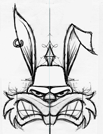
FIGURE 8.20 Drawing is a progressive medium, so I’m now dialing the character in more with a tighter rough sketch. I draw half of the art, scan it, and then flip it to gauge whether I’m moving in the right direction.

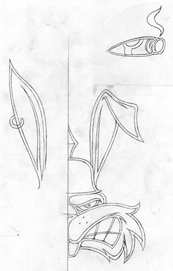
FIGURE 8.22 This is the finalized sketch, which I’ll scan in and use to build my vector shapes. I’ll rely on my good friend symmetry to complete the picture.
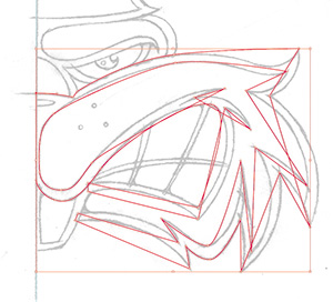
FIGURE 8.23 Here I’m doing rough building on the character’s face. The only thing I’m concerned about is placing the anchor points in their correct positions. I proceed point by point (see Chapter 6, “Vector Build Methods”).
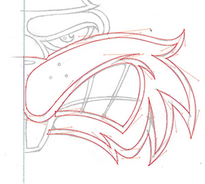
FIGURE 8.24 With my anchor points in prime placement, I use the PathScribe plug-in to shape the Bézier curves, adjusting the handles so that the curves match those in the underlying sketch.
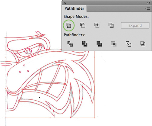
FIGURE 8.25 Notice how I dissect my design into smaller, more manageable shapes. Now I’ll use the Pathfinder panel (Shift-Command-F9 or Shift-Control-F9) to unite my vector shapes. The Unite tool is circled in green.

FIGURE 8.26 With the base vector shapes completed, I copy them and use the Reflect tool to flip them. (For more information on using symmetry, see Chapter 6.)
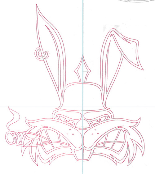
FIGURE 8.27 Once I’ve fused all the elements together, I’m ready to start filling in the design with black and white.
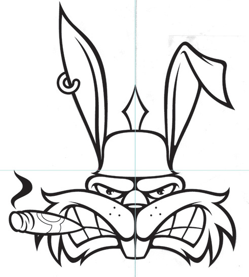
FIGURE 8.28 With the black and white filled in, I scrutinize my design, looking for areas to improve on. I usually print out the art and mark it up with a red pen, but on this project, I just zoomed in and scrutinized the artwork onscreen.
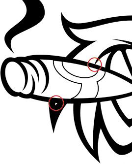
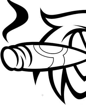
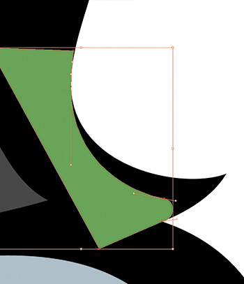
FIGURE 8.31 After walking away from the project for a few hours and returning with fresh eyes, I notice that the brim of the helmet comes to too much of a point, so I rebuild that shape (shown in green).
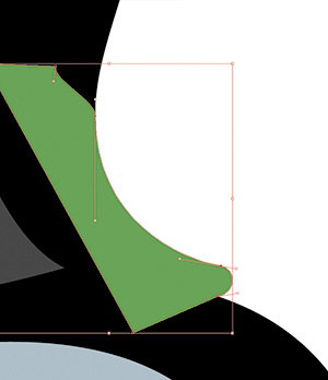
FIGURE 8.32 I modify my black-and-white art and unite this new piece (shown in green) to it via the Pathfinder panel. (For more information about Pathfinder, review Chapter 2, “Your Creative Armament.”)


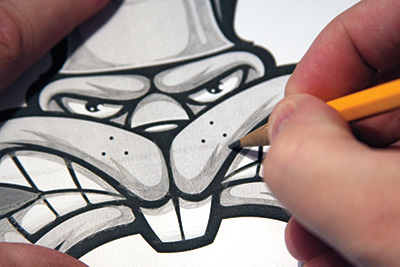
FIGURE 8.35 It’s time to jump back into analog. At this point, I print out my character design in black and white and draw in the shading details using a 2B pencil.
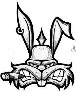

FIGURE 8.37 Analog methods like this drawn shading improve digital workflows and make vector building easier.

FIGURE 8.38 As I near the end of the project, I decide that the helmet looks too bare, so I create a unique logo mark. After all, Thug Bunny wouldn’t be half as cool if he didn’t have his own logo to emblazon on his pickelhaube.
