
Chapter 4. Getting to the Points
A Bézier curve or path is only as elegant, graceful, or accurate as the anchor points that control and shape it. To better control and edit anchor points, you first need to understand and recognize what qualifies as a good anchor point and path, a bad anchor point and path, and an ugly anchor point and path.
A vector design can easily have hundreds of paths and thousands of anchor points within it. Each point that’s incorrectly used or sloppily handled will just add to the overall degradation of your visual aesthetic.
Anyone can learn to use a digital tool; that’s merely a skill set. I want you to become a vector craftsman, someone who can handle the basic tools and create professional results. You may conceive of a brilliant idea, but if your vector craftsmanship is weak, it doesn’t matter how well thought out the idea is. It will suffer from poor execution when you build the vector artwork.
On Prime Point Placement
There’s one key question to ask before you can determine whether an anchor point is good, bad, or ugly: is it in the correct position within your design? That is, is the Prime Point Placement (PPP) of your anchor point correct? Chapter 5, “Shape Surveillance,” covers placing and removing anchor points, as well as PPP, in more detail. But suffice it to say for now that if an anchor point isn’t positioned ideally as you build your vector shape, it will make controlling the path so that it matches your drawing far more difficult and possibly inaccurate.
For the sake of demonstration, all the vector art in FIGURES 4.1–4.3 contains identical PPP. That is, the anchor points are in the ideal locations. The only difference among the figures is in the specific problematic characteristics associated with the individual anchor points themselves.
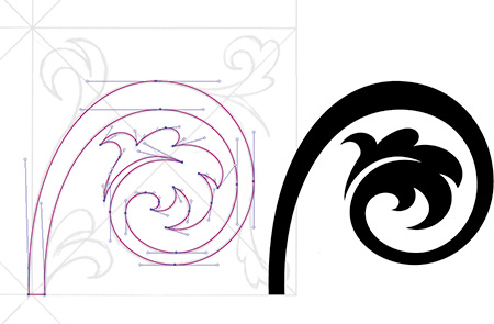
FIGURE 4.1 Elegant results come from correct use of corner and smooth anchor points and handles. The anchor point positions and the paths they create are on the left; the resulting final shape is on the right.
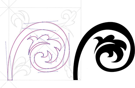
FIGURE 4.2 The anchor points in this vector ornament design are the correct type; the problem lies with their handles. Again, the anchor point positions and paths are on the left, and the resulting shape is on the right.
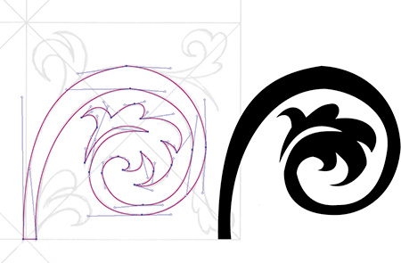
FIGURE 4.3 This is what happens when anchor points are the wrong type. As usual, the anchor point positions and paths are on the left, and the resulting less-than-ideal shape is on the right.
With that graphic caveat in mind, let’s take a closer look.
The Good Anchor Point and Path
To demonstrate the good, the bad, and the ugly as those qualities apply to anchor points and paths, I’ve selected an ornament design that contains only one straight line and depends mainly on the use of Bézier curves to form its overall shape.
First, however, it’s important to understand the difference between corner anchor points and smooth anchor points. A corner anchor point is placed anywhere there’s an apex that comes to a point. It can be used with or without Bézier curve handles pulled out from one or both sides when the transition between two paths doesn’t need to be smooth or continuous.
A smooth anchor point is placed anywhere there’s a curve that transitions elegantly from one path into the next smoothly. This sort of anchor point always uses Bézier curve handles pulled out from both sides to control the shape of the curved path.
The anchor points controlling the Bézier curves that form the main vine in the motif shown in FIGURE 4.1 bend smoothly from one side to the other, creating graceful curves.
The handles are parallel with one another and aren’t pulled out too far, ensuring smooth continuity throughout the art. The other anchor point handles that form the remaining Bézier curves are also not overextended; they are pulled out only as far as needed to form each of the various bends in the path.
The end result of good anchor points and paths is elegant final artwork.
The Bad Anchor Point and Path
In the vector ornament design shown in FIGURE 4.2, the anchor points are the correct type, but their handles are used incorrectly. They’re not parallel with one another, so the Bézier curves look less elegant, and the visual continuity of the overall path is lost. A consistent creative process that utilizes PPP and The Clockwork Method (introduced in Chapter 5) will help you steer clear of this problem. At this point, the goal is simply to recognize that something is definitely not right. The end result of bad anchor points and paths is a less graceful form, and thus the final art is more clunky.
The Ugly Anchor Point and Path
Almost all the anchor points in FIGURE 4.3 are the incorrect type. For any Bézier curve that you want to transition smoothly from one side of an anchor point to the opposite side, use a smooth anchor point, not a corner anchor point. Using the wrong type of anchor point will cause a curved shape to look pointed, as shown in the top arch of the vine.
More problems: Many of the anchor point handles aren’t parallel with one another, and some are pulled out too far, which prevents continuous flow through the art and makes parts of it look flat. Some of the other anchor point handles that form the remaining Bézier curves in the design are overextended as well.
Some of these problems emerge from sloppy building habits, such as not zooming in when you build, which can result in anchor points being placed in positions that aren’t going to work well. It all comes down to proper craftsmanship and paying attention to detail. FIGURE 4.4 shows the final context for this artwork.

A Scrutinizing Eye
You’ll need to pay close attention to your anchor points and paths throughout the vector build process to ensure that you’re creating quality. That said, no one is perfect; you’ll make mistakes as you create your vector art, so it’s important to train yourself to spot potential problems as you review.
It may seem like I’m asking you to micromanage your vector art, and in part that’s true. But over time it will become second nature, to the point that you won’t even consciously think about which anchor points to place or handles to pull. You will, however, notice the steady improvement in your vector shapes because of your due diligence.
• Incorrect anchor point: If you’re creating a Bézier curve that bends smoothly from one side of an anchor point into the opposite side, as shown in FIGURE 4.5, use a smooth anchor point rather than a corner anchor point. If the curve looks pointed, then you’re using an incorrect anchor point in the path.
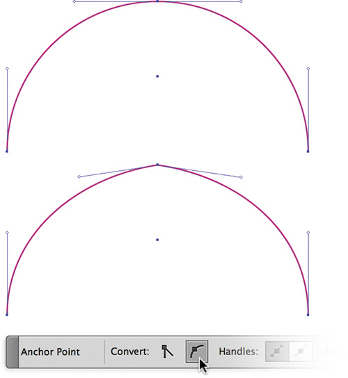
FIGURE 4.5 The correct use of a smooth anchor point (top) and an incorrect corner anchor point, which causes a pointed look (bottom). In a design that contains thousands of anchor points, it’s important to scrutinize as you build or you can easily overlook a problematic anchor point.
To convert a corner anchor point to a smooth anchor point (and vice versa), select the problem anchor point and click the “Convert selected anchor points to smooth” button in the Control panel (Figure 4.5). The opposite option will appear if the point is already smooth. (Unfortunately, there’s no keyboard command for this, nor is it recordable via actions.)
• Flat curves: If you pull out your anchor point handles too far on a Bézier curve that bends smoothly from one side of an anchor point to the opposite side (FIGURE 4.6), the curve will lose its roundness and begin to appear flat. Flatness in a curve is a telltale sign of overextended handles.
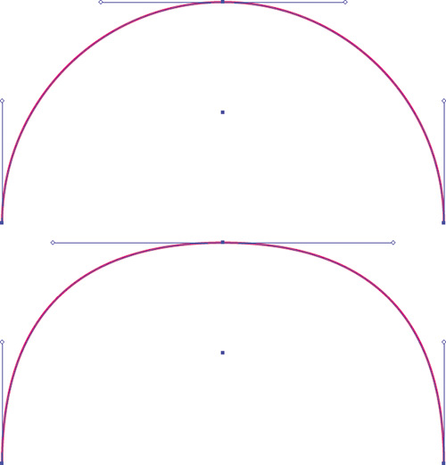
FIGURE 4.6 Properly extended anchor point handles (top) and a curve with overextended anchor point handles, which cause a flat appearance (bottom).
• Parallels: When you create shapes that contain corresponding Bézier curves that bend smoothly from one side of an anchor point to the opposite side (FIGURE 4.7), make sure the extended handles at the apex of the curve are parallel with one another. If the end vector shape doesn’t have a graceful flow, it’s a good bet some of the handles aren’t parallel.
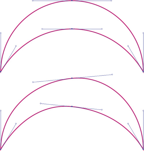
FIGURE 4.7 Parallel handles shown (top) and nonparallel handles, which cause an uneven result (bottom). This won’t apply to every arch, but it will apply to most curved vector shapes.
• Overextended handles: This is the result of trying to span the distance between two anchor points using one anchor point handle instead of both. Much like the flat curve problem, it will result in a shape that is flat, awkward, and clunky. It also can cause mitering problems on severe angles, if you use a heavier stroke (FIGURE 4.8).
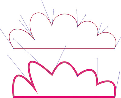
FIGURE 4.8 Both handles of each path properly pulled out to form Bézier curves (top); trying to achieve the same curve using only one overextended handle causes flatness, resulting in a clunky shape and mitering problems (bottom).
A Good Example
It’s good to have a critical eye as you build your vector work to ensure that you’re avoiding the telltale signs of problematic anchor points and the Bézier curves they control.
But it’s even more important to recognize good anchor point characteristics. As your eye develops, you’ll be able to look at any vector graphic and pinpoint the good or bad characteristics of its anchor points and curves.
I should point out that the design shown in FIGURES 4.9 and 4.10 took me about eight hours to build. I had to rebuild several shapes a few times before I dialed in the vector art precisely. I mention this because it would be easy for me to say that if you follow my process, everything will be easy and work the first time. That isn’t true.
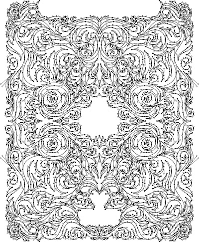
FIGURE 4.9 This complex vector ornament design contains no straight lines whatsoever. It depends on precisely built Bézier curves created from smooth and corner anchor points. You won’t find any of the “no-fly list” problems in this motif.

FIGURE 4.10 Final vector artwork for a die-hard Mac fanboy who loves his Apple iPad so much that he hired me to design this custom ornament, which he’ll get etched into the back of the device. ![]()
What is true about my process is that it’s a process. Part of that process is recognizing the good and bad characteristics in your own art and in the art of others. While creating this design, I had to remind myself of The Clockwork Method. I wasn’t following it, and my shapes were looking wonky.
Thank Goodness for Command-Z/Control-Z
Even with this systematic approach to building vector graphics, not every piece of vector artwork you create will be perfect. I still make mistakes every day. Placing anchor points and manipulating handles takes some trial and error.
The ultimate goals of this book are to dramatically reduce your potential for making mistakes, to help you to recognize when something isn’t right, and to show you how to fix problems quickly so you can continue building your designs. So when in doubt, Command-Z (or Control-Z) can be your best form of creative accountability.
Remember, the creative process is almost always a messy one. Don’t focus on perfection. Focus on your process, because process makes perfect.
 Field Notes: Change Your Perspective
Design Drills: Vector Skeletons
Proper anchor point placement is critical for creating precise vector artwork. But, unless you have your vector paths selected (V), it can be difficult to tell where all the anchor points reside within a given path.
FIGURES 4.11–4.14 show the vector skeletons for two very different sorts of design projects so you can see exactly where the anchor points are placed and how those placements affect the final artwork.
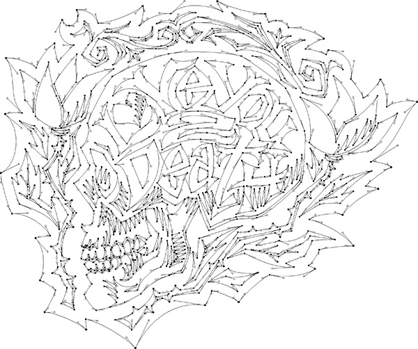
FIGURE 4.11 Viewing the skeletal points and paths of this hand-lettered design I created for Neenah Paper reveals that none of the paths are perfectly straight. Even the paths that appear to be straight have subtle curves. Nothing in nature is perfectly straight, so adding this type of detail improves the aesthetic in my opinion.

FIGURE 4.12 Placed bitmap textures give the final poster design a more organic look and feel. For more information regarding the use of textures in your designs, see DrawingVectorGraphics.com. ![]()
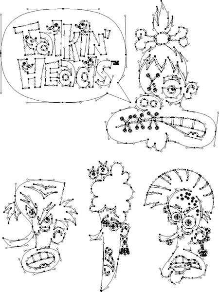
FIGURE 4.13 Not all art requires a massive number of anchor points. I used only seven anchor points to form the speech bubble in this logotype design for a stock illustration set.
