The Flow of Smoke
Go to an extreme and retreat to a usable position.
—Brian Eno
The experience of time that I wanted included in this image begins when the wave is crashing and ends when it is about to recede. I am capturing motion with stillness. All of the aesthetic choices that will direct the viewer’s unconscious eye, as well as which of the images captured would be used in the final composition, were chosen with that in mind. Knowing what the final picture should look like, let us begin at the beginning.
Step 1: Combine the Three Images
You’ll use elements from three different captures to produce the final image. These are your source files, which you’ll find on the disc that accompanies this book. Look in the CH06 folder in the CH06 16 BIT SOURCE FILES folder.
SFDLWS050083.tif
SFDLWS050085.tif
SFDLWS050091.tif
Note
This is how the files got their names: SF is the location, as in San Francisco. DLWS is the event—the Digital Landscape Workshop. The digits 05 represent the year that the images were captured, and 83, 85, and 91 are the specific files. As you create your own naming convention, keep it simple and easy to remember. For example, from the file name, I can tell you where and when the image was taken. From the number, I can tell you where each capture was in the shooting sequence.
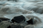
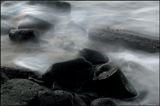
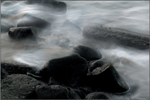
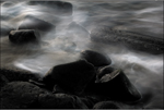
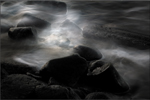
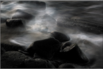
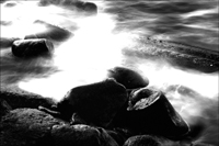
1. | Open the files SFDLWS050083.tif, SFDLWS050085.tif, and SFDLWS050091.tif. I chose SFDLWS050091 as the base image, because it has all the necessary detail in the rocks, but no water (Figures 6.4a, 6.4b, and 6.4c). Figure 6.4a. The Smoke base image will be the TEXTURE layer.
Figure 6.4b. This image will be named IN when we make it a layer, because in this capture, the water was moving in.
Figure 6.4c. This image will be named IN/OUT when we make it a layer, because in this capture, the water was moving both in and out.
|
2. | Shift-drag the Background layer from SFDLWS050085 onto SFDWLS050091, and name the new layer IN/OUT (for inward/outward flow of the water). Do the same with the Background layer from SFDLWS050083 and name the new layer IN (for the inward flow of the water). Duplicate the Background layer, name this layer TEXTURE, move it atop the layer heap, duplicate it again, and create a layer mask for the layer TEXTURE. Duplicate the IN and OUT layers and create layer masks for them. Note The three duplicated layers should be together and above the layers from which they were copied. This lesson, except for the image maps, which were done after the fact, follows my workflow exactly as I did it the first time. What that means is that I wrote this lesson when I first created the image. Where I have changed a step, I will make note of what actually happened. In those instances, I’ve spared you what I originally did in order to save you time. In other words, in this lesson you will see most of the warts. The reason I chose to duplicate all the layers was that I knew I was going to build up the depth of the image with multiple versions of my source layers. I was not certain, however, if I was going to use them all. Also, I knew I would need to see what was actually going on in the layer on which I was working. As soon as I filled the layer mask with black, I concealed that layer and saw only the layer beneath. By having a copy of the layer, I could toggle back and forth, by turning the eyeball off and on, to see exactly what was in the layer that I had concealed. Some image maps were done after the fact, because I knew that this image was going to become a lesson in this book from the first moment that I looked at the captured files in my file browser. So, after I created the amount of detail and opacity that I felt was visually appealing, I went back and mapped it out. This was to ensure that I would have the most accurate representation of what I had done. Remember, the goal of image mapping is to train yourself how to engage in perfect practice by practicing at practicing. It is also a way to record in a visual way what you did. |
3. | From the bottom, the layer stack order should be Background, OUT, OUT copy, IN, IN copy, TEXTURE, and TEXTURE copy. Turn off everything but the Background and OUT layers. Make the OUT layer active and fill the layer mask with black. “Save As” the file (Shift-Ctrl-S/Shift-Cmd-S) SMOKE 16bit and save it as a Photoshop document (.PSD). Note Be sure to close the original source files. Once you have shift dragged them into one document, you no longer need them. You have duplicated all of the layers and their layer masks because, as you have seen in the two lighting lessons, by alternating layers of sharper, more defined images (those with high-to-low sharpness) with those that are in focus but contain blur, you can create an illusion of depth. |
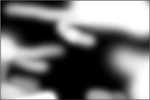
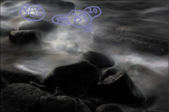
4. | Make the IN/OUT layer active. Fill the layer mask with black, and brush in the water. My choices for brushing were based on the light-to-dark decisions that I made when I created the first set of image maps. Note You don’t have to map out the image all at once. You can build up the image maps the same way you build the image, in layers. Image maps are a way to teach yourself how to organize an image in a visual way. The goal is to practice at practicing to the point where you will be able to work on an image without using them. Figure 6.5a. Before adding the first layer of water.
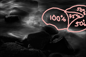
Now that you have started building the foundation of the movement, it’s time to build in the crescendo of the crashing wave while further reinforcing your choices about light-to-dark and in-focus-to-blur (Figures 6.5b, 6.5c, and 6.5d). Just as you did in the previous step, you will make your decisions with that in mind. Figure 6.5b. The image map.
Figure 6.5c. After brushing in the water.
Figure 6.5d. The layer mask.
|
5. | Make the IN layer active. Fill the layer mask with black, and brush in the water (Figures 6.6a, 6.6b, 6.6c, and 6.6d). Figure 6.6a. Before.
Figure 6.6b. Image map for the IN layer.
Figure 6.6c. After.
Figure 6.6d. The layer mask.
Now you are going to further build up depth by creating a series of layers that range from very defined detail to less-defined detail. By doing this, you will achieve greater dimension in the water’s mist. |
6. | Make the TEXTURE layer active. Fill the layer mask with black, and brush in the rocks (Figures 6.7a, 6.7b, 6.7c, and 6.7d). Figure 6.7a. Before.
Figure 6.7b. The image map layer.
Figure 6.7c. After.
Figure 6.7d. The layer mask.
|
7. | Make the IN/OUT copy the active layer. Move this layer so it is above the TEXTURE layer. Fill the layer mask with black, and brush in the water (Figures 6.8a, 6.8b, 6.8c, and 6.8d). Figure 6.8a. Before.
Figure 6.8b. The OUT copy image map.
Figure 6.8c. After.
Figure 6.8d. The layer mask.
|
8. | Duplicate the TEXTURE layer and move the copy on top of the IN/OUT copy layer. What you now have is a layer of sharp above a layer of blur, then sharp, then blur, and then sharp. By building the image this way, and varying the opacity of the sharp and blur layers, you give the image a three-dimensional quality that using only one layer can’t achieve. Note As it turns out, you did not need the IN copy layer other than to use it (if you chose to) as a reference. So if you want to, you can discard it, which is what I did. I left it in the 100-ppi file, however, for consistency. |
9. | Next, do “The Move,” create a master layer, and name it MASTER 1. For CS2 and above, press and hold Ctrl-Alt-Shift-E/ Cmd-Option-Shift-E. For CS and below, press Ctrl-Alt-Shift/Cmd-Option-Shift, then type N and then E. |
10. | Save the file as SMOKE 16bit.psd. |


Step 2: Correct Color Cast
Now that you have one image, you can address the second-biggest issue, which is the overall color cast.
1. | |
2. | Create a BP Curves adjustment layer to correct the black point and a WP Curves adjustment layer to correct the white point. This is where I placed what will be the black and white point sample points (Figure 6.8e). Figure 6.8e.
Note If you’re looking for the black and white points in the 100-ppi file, you’ll notice that, although there are four sample points defined, none of them marks the black point. I will further discuss this issue under Step 5: Black-and-White Conversion. |
3. | Create a master layer, name it MASTER 2, and save the file (Figures 6.8f and 6.8g). Figure 6.8f. Before.
Figure 6.8g. After setting the black and white points.
|


Before I move on to adding selective sharpening and contrast to the image, you should notice that I have not run the Nik Skylight filter. The Nik Skylight filter is used to remove the blue cast that is inherent in shadow and, to varying degrees, in sunlight. However, because water is blue, if I correct for blue cast, the image will be reddish-brown and I will see more of the sand underneath the waves than I want. So in this instance, I will leave the blue cast and use it to my advantage. (RGB is a formula to mix color.) Here is what the image looked like both before and after I ran the filter (Figures 6.8h and 6.8i).
Figure 6.8h. With Nik Skylight filter.

Figure 6.8i. Without Nik Skylight filter.

Step 3: Selective Sharpness and Selective Contrast
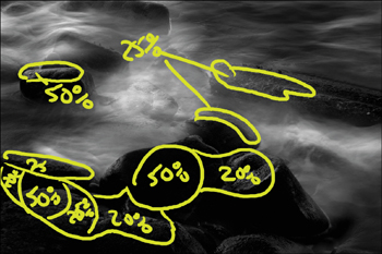
1. | Duplicate the MASTER 2 layer twice. Name the first layer CONTRAST and the second layer SHARPEN. Make the CONTRAST layer active and hide the SHARPEN layer. Using the Nik Contrast Only filter, boost the contrast in a visually appealing way. The settings that I used were in the Basic menu: I left the Saturation at its default of 50%, Brightness at 55%, and Contrast at 60%. In the Advanced menu, I left the Protect Highlights at default 0% and the Protect Shadows at 30% (Figures 6.9a, 6.9b, 6.9c, and 6.9d). Figure 6.9a. Before.
Figure 6.9b. Image map.
Figure 6.9c. After.
Figure 6.9d. Layer mask.
Note Remember that with the Nik filter, you can protect the shadows and highlights as well as adjust the saturation. |
2. | Make the SHARPEN layer active and launch the Nik Sharpener Pro software. After you decide what parts of the image are important and where you want the viewer’s unconscious eye to go, use it to selectively sharpen the image (Figures 6.10a, 6.10b, 6.10c, and 6.10d). Note Because I wanted the viewer’s eye to go first to the center rock, I made it the sharpest. To further force the eye to move to this central area, I also sharpened the sides of the dark rocks that face the center one. Refer to the “How to Sharpen” Steps in Chapter 2. If you do not have the Nik Sharpener Pro software, look back at the section in Chapter 2 on how to sharpen in the LAB color space. If you have the Nik Sharpener Pro software, my settings were: for Printer—Type Epson Ink Jet, Printer resolution—2880 × 1440, and Paper Type—Textured and Fine Art. I left the image dimensions alone. Under Advanced, I used the eyedropper to select different shades of gray ranging from light to very dark. I did not change the black sample box. I chose not to sharpen the whites, so that I would not run the risk of blowing out the highlights. Sharpening by color is an approach that allows me very granular control over my image. |
3. | Turn on the CONTRAST layer (Click the Eyeball on.) and this is what you should see (Figure 6.10e). Figure 6.10a. Before.
Figure 6.10b. Image map.
Figure 6.10c. After.
Figure 6.10d. Layer mask.
Figure 6.10e. Combined Sharpness and Contrast layers.
|


Step 4: Light-to-Dark, Dark-to-Light, and Render Lighting
Why I chose to address the building up of the light-to-dark relationship of this image at this point, instead of closer to the beginning of the manipulations, is based on what I know about contrast and sharpness. Contrast is the difference in brightness between the light and dark areas of a picture. If there is a large difference between them, then the result is an image with high contrast. Therefore, by increasing the contrast, I can also darken and lighten the image. To a lesser degree, the same is true for sharpening. Sharpening, or un-sharp masking, an image creates the illusion of sharpness by adding contrast to pixel edges.
When I first began mapping this image, I knew that I would make it a black-and-white one, one of high contrast with deep, textured blacks (Zone II) and textured whites (Zone IX). Even though this image is fairly monochromatic and destined to be a continuous-tone black-and-white one, it still has all of its “color.” Keeping in mind that RGB is not a color, it’s a formula for mixing color, you are going to build up the relationship of light-to-dark, just as you built up the illusion of depth in the master layer.
To do this, you will use three separate blending modes with the Curves adjustment layers that you are about to create. The first Curves adjustment layer will use the blending mode Multiply. As we have discussed previously, the Multiply blending mode doubles the density of the image and increases the saturation in relationship to the increase in density. In this instance, that is a benefit instead of a detriment, because we aim to deepen the blacks while maintaining their detail. The second Curves adjustment layer will use the blending mode Luminosity, which affects only the light-to-dark aspect of the image and not the color or saturation. The last Curves adjustment layer that you will create will use the blending mode Normal. Normal, like Multiply, increases the saturation of the image, but Multiply doubles its density. You don’t want to go very far with this adjustment.
Note
The three adjustment layer choices that we are about to make are the outcome of working with this image. The only decisions that were made beforehand were to darken the image after adjusting the contrast and sharpening, and to use the Multiply blending mode approach to darken the image with the first Curves adjustment layer. The other steps were taken to achieve the effect of light-to-dark so that I could re-create my original vision of this image.
The Multiply Blending Mode Light-to-Dark Adjustment layer
1. | Create a Curves adjustment layer, click OK, and name it L2D MULTI. |
2. | Select Multiply as the blending mode, fill the adjustment layer with black, and paint with white at varying levels of opacity. These figures illustrate what I did (Figures 6.11a, 6.11b, 6.11c, and 6.11d). Figure 6.11a. Before.
Figure 6.11b. Image map.
Figure 6.11c. After.
Figure 6.11d. The layer mask.
|


The Luminosity Blending Mode Light-to-Dark Adjustment Layer
Note
When you chose the Multiply blending mode, you made decisions about color. Now you will, selectively, further darken areas in the image that you already darkened in a previous adjustment layer. In order to accomplish this without increasing the saturation, you will use the Luminosity blending mode.
1. | Create a Curves adjustment layer. |
2. | Click on the center point, and drag it until the image is darkened. Do not pull the center point to where you clip or flatten the top or bottom of the curve. Click OK. Select Luminosity as the blending mode, fill the adjustment layer with black, and paint with white at varying levels of opacity. These figures illustrate what I did (Figures 6.12a, 6.12b, 6.12c, and 6.12d). Figure 6.12a. Before.
Figure 6.12b. Image map.
Figure 6.12c. After.
Figure 6.12d. The layer mask.
|


The Normal Blending Mode Light-to-Dark Adjustment layer
1. | Create a Curves adjustment layer. |
2. | Click on the center point and drag it until the image is darkened, but without clipping either end of the curve. Leave the blending mode at Normal. Fill the adjustment layer with black and paint with white at varying levels of opacity. This illustrates what I did (Figures 6.13a, 6.13b, 6.13c, and 6.13d). |
3. | Create a master layer, name it MASTER 3, and save the file. Now convert the file to 8 bit (Image > Mode > 8bit), and save it as SMOKE 8bit.psd. |
The Render Lighting Effects Layer
A believable probability is better than an improbable believability. In order to create a believable probability, you must mimic reality; i.e., if light comes from one direction, you must create corresponding shadows that follow that direction. In this use of the Render lighting filter, you will place both light and dark where you want them and at the intensity you desire.
Figure 6.13a. Before.

Figure 6.13b. Image map.

Figure 6.13c. After.
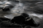
Figure 6.13d. The layer mask.

Note
Remember, this filter can be used to add darkness to an image as well as to add light. Thus, you can brush in darkness to increase an image’s apparent lightness.
1. | Duplicate the MASTER 3 layer and rename it LIGHTING. |
2. | Go to Filter > Render > Lighting Effects. The lighting choice from the Styles menus is Soft Omni. Assuming that you agree with my choice of the rock as the focus of this image, place the center point of the light on the center of the rock. |
3. | Click on the top anchor point and reduce the size of the light by dragging it so that the top anchor point is just inside the top of the image. You are now going to change the color of the light. Because water is blue, we want to reinforce the decision we made in Step 2, which was not to remove the blue color cast of the image. That means that any light we add to the image should have some form of blueness to it as well. |
4. | Double-click on the white box located to the right of the Intensity slider in the Light type dialog box. This brings up the Color Picker dialog box. Click on the blue part of the spectrum on the color selector slider located next to the larger color box. (Make note of the Hue value, which for my selection was 222. It’s OK if your RGB values are different than R: 204, G: 204, and B: 204; they are not active. Figure 6.13e.) Click OK. |
5. | Double-click on the white box in the Exposure dialog box, which brings up the Color Picker again, and type in the RGB values R: 204, G: 204, and B: 204. This is so that the ambient light will match the color of the light source’s light. The settings that I finally settled on were Intensity 85, Gloss –72, Material 100, Exposure –68, and Ambience 89. The final adjustment that I made was to lower the LIGHTING layer’s opacity to 70% (Figures 6.14a, 6.14b, 6.14c, 6.14d, and 6.14e). Figure 6.14a. Before.
Figure 6.14b. Image map.
Figure 6.14c. After applying Lighting Effects.
Figure 6.14d. After brushwork and lowering layer opacity.
Figure 6.14e. The layer mask.
|


Note
Because of the challenges that the size of the preview creates, it is a good idea to save what you are doing as a default and dial in the look you want.
Diminishing Contrast Using a Curves Adjustment Layer
After applying the Render > Lighting Effects filter, a hot spot has appeared in the upper left corner and the upper midpoint of the image. To diminish it, I suggest that you break a sacred Photoshop rule, “Thou shalt not clip a curve.” You will lower the contrast and darken the area in question with a Curves adjustment layer by “clipping” the upper part of the curve.
1. | Create a Curves adjustment layer. (Make sure your Curves dialog box is set to display the finer, 10-point grid, rather than the coarse, 4-point grid. Alt/Option-click the grid to switch between them.) |
2. | Click on the uppermost point of the curve and lower the upper curve anchor point by one grid mark. This lowers the contrast. Click on the center of the curve and drag the center point downward, on a diagonal, one grid point. This slightly darkens the image. The input value should be around 151 and the Output value around 99. Click OK, select the blending mode Luminosity, and name the adjustment layer LWR CONTRAST LUM. Fill the layer mask with black, then brush in the darkened, lowered contrast (Figures 6.15a, 6.15b, 6.15c, and 6.15d). Figure 6.15a. Before: The area that needs to be darkened and have its contrast lowered.
Figure 6.15b. Image map.
Figure 6.15c. After.
Figure 6.15d. The layer mask.
|


Step 5: Black-and-White Conversion
As soon as I harvested the first of the captures that comprise this image, I visualized the final print as a continuous-tone black-and-white one. All of the issues of contrast, sharpness, and color, as well as how this image was constructed, were addressed with this in mind. As you observed in the previous chapter, there is a relationship between red, green, and blue when it comes to converting an image from color to a continuous-tone black-and-white one. Also, as we discovered in the previous chapter, you can change the image dramatically by changing the order of the Channel Mixer layers. By changing the layer order, the contrast changes. The Channel Mixer layers are also adjustment layers, which means that they have layer masks, giving you exceptional control over the relationship of Red, Green, and Blue.
The steps for a basic black-and-white conversion are:
- Analyze the image using a Hue/Saturation adjustment layer (by bringing the saturation slider to 100%).
- Note the major color components. (You may want to address some issues in the image after converting the image to black-and-white by increasing/decreasing the saturation and darkness/lightness of the colors in the image.)
- By shift-clicking on the potential highlight problem areas, place sample points. (Remember to bring the saturation slider to 0% when you are done.)
- Create the Channel Mixer adjustment layer for the Green channel. Select Green from the Output Channel menu, then click Monochrome.
- Modify the sliders until the image looks appealing. (Make sure that your sample points fall between 244 and 247, but try to keep as close to 244 as possible.)
- Repeat Steps d and e for the Red channel and then the Blue channel.
- If you intend to do brushwork on all three of the Channel Mixer layers that were created in the basic, black-and-white conversion, create a fourth Channel Mixer layer. In that layer, assign the values of 33 Red, 33 Green, 33 Blue, and a Constant of 1.
When it comes to fine-tuning an image, this is the way that I work. Once I have done the basic conversion, I look at each Channel Mixer layer individually and make note of what I like best about each one. Then, I observe the changes that occur as I change the layer stack order, again noting what I like and dislike. (For this image, from bottom to top, I prefer this order: Blue, Red, Green.)
Note
As I discussed in Chapter 5, a black-and-white conversion using a multiple Channel Mixer approach starts with Green (luminance), then Red (generally the lighter aspect of the tonal range of the image), then Blue (generally the darker end of the tonal range of an image). But your choices will depend on the colors in any given image. If an image is mostly blue, the green and red channels will appear to be darker, and so on. Case in point—in this image, I chose not to remove the blue cast, because I wanted to enhance the water. Water is blue. If I corrected for the blue cast, the image would be reddish-brown, and I would see more of the sand underneath the waves than I wanted.
Also, during this conversion, I used all four of the sample points that Photoshop allows. This means that, during the CCD color-cast correction, I had to move the sample point that I used for finding the black point of this image. I moved the black sample point from where it was in the rocks to where it is now on the center rock, which is the visual focus point of this image. I then laid down two more sample points in areas that looked to me like they might be problematic. Once you decide what area of an image is most important (e.g., the model’s face over the bear’s face in the first part of Chapter 5), one of the sample points becomes the most critical. It is that sample point on which I base my decisions. It is not important that all the sample points hit 244–247.
It’s now time to selectively change the dynamics of the way red, green, and blue relate to each other by painting on the layer masks. This approach replicates the black-and-white, darkroom two-step development process mentioned earlier in the book. (See the sidebar “Doing the Developer Two-Step” in Chapter 5.) A two-step development process done traditionally was tedious, time-consuming, and expensive, but it produced the best tonal range to be had out of a print. The next series of steps you’re going to take will replicate that process, but more accurately than you could in a traditional darkroom, and without your having to inhale all those chemicals. I know of no other way of converting a black-and-white image that affords you so much control. In this image, you will be working on all three Channel Mixer layers, so you will need to create a fourth, or Neutral, one.
Creating and Moving Sample PointsHow you create a new sample point is first, you select the eyedropper from the Tools palette (keyboard command “I”) and select the color sample tool, which is the second tool in that pull-down menu. (You can scroll through any tool by holding down the Shift key and clicking the letter that is that tool’s keyboard command.) Holding the Shift key down, you click on the area in which you want to place a sample point. Keep in mind that Photoshop allows for no more than four sample points. How you move an existing sample point is by again selecting the color sample tool and simply Shift-clicking on the sample point you want to move and then dragging it to the new area in which you want to place a sample point. |
Note
The numbers I came up with for this image are:
Green CM layer: R: +9, G: +90, B: +10, Constant –3
Red CM layer: R: +83, G: +4, B: +14, Constant –2
Blue CM layer: R: +10, G: +17, B: +74, Constant 0
The images printed in this book are too small to adequately show the subtlety of what was done. Therefore, after you do the next step, find the layer set in the 100-ppi SMOKE file entitled C M LAYERS UNTOUCHED. Take a look at this file, which contains the layers before the layer masks were modified.
Make active whatever you decided would be your top Channel Mixer layer. Create a new Channel Mixer layer, check the Monochrome box, and type in 33 for Red, 33 for Green, 33 for Blue, and 1 for Constant. Click OK. Name this layer NEUTRAL.
Note
This adds a little density and allows you to work on all three of the other Channel Mixer layers without worrying that there might be some color bleed in an area where all three layers were worked on. We did the same thing in the second, advanced black-and-white conversion method in Chapter 5.
This is what the image looks like after the basic Green, Red, Blue Channel Mixer conversions (Figure 6.16a).
Figure 6.16a.

This is what the image looks like after the Channel Mixer order is changed to Blue-Red-Green (Figure 6.16b).
Figure 6.16b.

This is what the three image maps look like (Figures 6.17a, 6.17c, and 6.17e).
Figure 6.17a. Blue image map.

Figure 6.17c. Red image map.

Figure 6.17e. Green image map.

After you adjust the layer masks (shown in Figures 6.17b, 6.17d, and 6.17f), this is what you have (Figure 6.18).
Figure 6.17b. The layer mask.

Figure 6.17d. The layer mask.

Figure 6.17f. The layer mask.

Figure 6.18. After adjusting the layer masks.

Addressing Issues of Dark-to-Light Using a Curves Adjustment Layer
So far, every choice you have made has dealt with the light-to-dark aspect of the image. In this step, you will explore the dark-to-light aspect. It is important to remember that darkness is as important to an image as lightness. The use of dark isolates can have as much impact as the use of light ones.
1. | Create a Curves adjustment layer. (Make sure your Curves dialog box is set to display the finer, 10-point grid.) |
2. | Click on the center point and darken the image by dragging it, on the diagonal, by one grid line. Click OK and name this layer D 2 L NORM. Because you want to reveal, and not conceal 80% of what you have just done, leave the layer mask white, and paint with black. Now, paint the areas of the rocks that are too dark by painting back in some lightness (Figures 6.19a, 6.19b, 6.19c, and 6.19d). Figure 6.19a. Before.
Figure 6.19b. Dark-to-light image map.
Figure 6.19c. After.
Figure 6.19d. The layer mask.
In the course of everything you have done to this image, some of the texture detail in the foreground rocks has been lost. As we have talked about several times previously, in the Zone System, Zone IX is textured white (244–247) and Zone II is textured black. To retrieve the detail in the Zone II areas of this image, you are again going to break the sacred “Thou shalt not clip a curve” Photoshop rule. Note When it comes to global adjustments, you never want to clip a curve. But in this instance, you are targeting a very small area for which, regardless of how much care you took in the editing process up to this point, you would still find yourself dealing with more or less the same issue. You don’t need to worry about what will happen to the highlights; you will be masking them. What you need to do is open the shadows, which you will be allowing through your mask. Be careful of making things dogma. Solve the problem at hand; don’t assume that a tool’s limitation is not also the tool’s power. |
3. | Make the NEUTRAL layer the active one. (You want this Curve to be under the D 2 L NORM adjustment layer.) Create a Curves adjustment layer, click on the control point, and move the curve until it looks like this (Figure 6.20). Click OK and name it ROCKS. Figure 6.20. Deliberately clipping the ROCKS curve.
What you should be looking at is this (Figure 6.21). Figure 6.21. The high-contrast result of clipping the curve.
|
4. | Fill the layer mask with black and brush back the foreground rocks (Figures 6.22a, 6.22b, 6.22c, and 6.22d). Figure 6.22a. Before.
Figure 6.22b. Image map.
Figure 6.22c. After.
Figure 6.22d. The layer mask.
|


Step 6: Fixing a Concrete Problem
By now, you know that a good, dynamic workflow habit is to always give yourself an exit strategy. Initially, I thought that the broken piece of the concrete Coast Guard pier was important, but after the image was converted and a print was made, the concrete piece distracted from the central focus point of the image. Because I had built in an exit strategy, I could reach back to the beginning and use the original source layers to correct the problem. (If I had flattened this image, I’d have been out of luck.)
Note
In this image’s original workflow, the file was saved as a 16-bit layered Photoshop Document file (.psd), the file was then flattened, converted to 8-bit, and saved as SMOKE 8bit.psd. My work with the image went on from there. Later, I had to reopen the 16-bit file and convert it to 8-bit in order to address the issues that arose after the image was first printed. To save time and streamline the efficiency of this lesson, I suggested that you convert the entire file to 8-bit.
The issue confronting you now is that all of the layers that you need are color ones, so before you can remove the unwanted piece of concrete pier, you need to convert the color layers that you want to use into continuous-tone black-and-white.
1. | Move the IN copy layer that you duplicated in the beginning to just below the LWR CONTRAST layer, and fill the layer mask with white. Make the D 2 L NORM layer active, make a master layer, and call it CORRECTION 3. Create a layer mask and fill it with black. Turn the layer off and discard the IN copy layer. You no longer need it. This layer is in color, and you have just created the black-and-white version that you need. |
2. | Duplicate the IN/OUT layer, move it to just below the LWR CONTRAST layer, and fill the layer mask with white. Make D 2 L NORM the active layer, create a master layer, and call this one CORRECTION 2. Create a layer mask and fill it with black. Turn the layer off and discard the duplicate of the IN/OUT layer. |
3. | Duplicate the LIGHTING layer. Fill the layer mask with white. Move this layer to just below the LWR CONTRAST layer. Make the D 2 L NORM layer active, create a master layer, and call it CORRECTION 1. Create a layer mask and fill it with black. Turn the layer off and discard the duplicate of the LIGHTING layer. You created correction layers in a particular order based on the decision to capture motion with stillness. Thus, you want the motion of the water, the CORRECTION 3 layer (the IN layer copy), to be primary. The more diffused CORRECTION 2 layer (the IN/OUT layer copy) will be the underpinning of the final image, while the light and dark image structures of the CORRECTION 1 layer (the LIGHTING layer copy) will provide the finishing touches. |
4. | Make CORRECTION 3 the active layer and brush it so that it looks something like this (Figures 6.23a, 6.23b, 6.23c, and 6.23d). Figure 6.23a. Before.
Figure 6.23b. Image map.
Figure 6.23c. After.
Figure 6.23d. The layer mask.
|
5. | Make CORRECTION 2 the active layer and brush it so that it looks something like this (Figures 6.24a, 6.24b, 6.24c, and 6.24d). Figure 6.24a. Before.
Figure 6.24b. Image map.
Figure 6.24c. After.
Figure 6.24d. The layer mask.
|
6. | Make CORRECTION 3 the active layer and brush it so that it looks something like the final image (Figures 6.25a, 6.25b, 6.25c, 6.25d, and 6.25e). Figure 6.25a. Before.
Figure 6.25b. Image map.
Figure 6.25c. After.
Figure 6.25d. The layer mask.
Figure 6.25e. All three correction layers combined.
|
7. | Duplicate the D 2 L NORM adjustment layer, move it above the CORRECTION 3 layer, and lower the opacity to 50%. Make a master layer, name it MASTER FINAL, and save the file (Figure 6.26). Figure 6.26. The final Smoke image.
|