
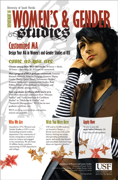
Most graphic designers have some formal art training. While design pros don’t necessarily need to know how to draw (and many can’t draw a lick), they do know the elements, principles and theories of composing attention-getting information-conveying visual communication. So now is a good time to cover some introductory lessons from that art class you always meant to take. Think of this as your super-abridged art education.
First, we introduce the seven elements of design. As the word “elements” implies, these are basic units of visual communication.
1. Space
2. Line
3. Shape/Form
4. Size/Scale
5. Color
6. Texture
7. Value
Second, we cover six principles or rules of good design.
1. Focal Point/Emphasis
2. Contrast
3. Balance
4. Movement
5. Rhythm/Pattern
6. Unity
Third, we share four laws of Gestalt theory.
1. Proximity
2. Similarity
3. Continuity
4. Closure
Familiarity with the elements, principles and theories of design helps you in a couple ways. First, you have a vocabulary to talk about what you see in visual culture. Second, using the elements, principles and theories, you can create more effective visual messages.

Positive and negative space. Which is which? Switching up positive and negative space is visually interesting. But the point is you need both.

Line is everywhere. On the left, line signifies direction and movement. In the text examples above, line communicates personality.
Element No. 1: Space
We’ve already talked about space, the sandbox in which visuals and type play together. You also know about negative and positive space. Positive space is filled space. Negative space is empty space, which is not your enemy.
Whether positive or negative, space is more than a key element in graphic design. Space is a requirement. You can’t talk about, create or evaluate graphic design without accounting for space.
Sometimes, however, what counts as positive or negative space is negotiable. Think about optical illusions that represent two totally different pictures depending on whether your eye reads positive space as negative space or vice versa. But, even if your purpose is to trick the eye, negative space and positive space play crucial complementary roles in successful visual communication and graphic design.
Element No. 2: Line
If negative space is empty space, then to delineate the limits of space or to create positive space, the line is our most primal tool.
Notice we didn’t call the line “primitive” because lines can be quite sophisticated, such as the lines required to write language or to sketch representations of the world we see around us. Yet lines are primal in that they usually are the first graphic marks humans make, whether dragging a stick through sand or doodling with a crayon on the wall.
Lines may be straight, angular or curvy. They may be thick or thin, continuous or interrupted. The edges of a page or screen represent lines. Negative space can form lines, such as the lines of margins.
We obviously need the line in order to produce typography. Lines construct boxes and borders. Illustrations drawn with lines are called “line art.”
Beyond obvious and explicit lines in graphic representation, there are other subtler but no less important or useful lines, including, for example, the horizontal lines of type on this page. Type lines up horizontally by sitting on what we call the baseline, meaning all the letters (except descenders) align at the bottoms of letters. That’s why we learn to write on lined or ruled paper.
A vertical row of bullets forms a vertical line. Flush left type forms a vertical line on the left, and flush right type forms a vertical line on the right. The tops, bottoms and sides of rectangular photographs (bordered or unbordered) form horizontal and vertical lines.
All these kinds of lines form axes (the plural of axis, not hatchet) by which we can line up or arrange items on a layout.
But wait. There’s more. Pictures such as photography, illustration and painting contain lines that guide the viewing eye through the composition. Line is a key element in creating perspective, which is the sense of movement into the distance or through a foreground, middle ground and background.
So the line is associated with movement and eye flow. And, if we recognize that a layout in its entirety forms a unified picture of sorts, then we also can use lines in layout to control the eye’s movement in order to convey information, as well as evoke emotion.
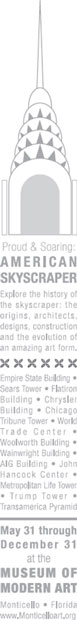
This poster design works because it draws on the instantly recognizable shape of the Chrysler Building.
Element No. 3: Shape/Form
Preschool teachers get excited the first time a toddler draws a circle—even if the circle doesn’t look much like a circle. Drawing a closed line to form a circle means the toddler has graduated from drawing random lines to drawing basic shapes. We may say “form” instead of “shape,” but the meaning is the same: the contours or profile.
We need to be able to talk about shapes in visual communication and graphic design. The shape of most—though not all—layouts is rectangular. Most blocks of copy— though not all—are rectangular, too. That’s why we call them copy blocks.
In art lingo, we speak of two kinds of shapes—inorganic and organic. Inorganic shapes and forms are precisely geometric, such as perfect circles, squares, rectangles, triangles, etc. These don’t appear so much in nature so we say they’re inorganic.
Organic forms are more natural, as found in nature. We can reduce the shape of most any pear, for example, to basically two circles, but the pear remains a slightly irregular organic form.

The size of the leaf graphic on the left shouts, but its contrast with the much smaller logo in the upper left creates visual interest.
Shape can trigger instant recognition. Think scallop shell or space shuttle. Shape also can be evocative. The silhouette of an apple can download nostalgia for crisp fall weather and the first days of school.
Element No. 4: Size/Scale
The notion of size as a graphic design element is not difficult to grasp. We talk about relative size or scale, as in large headlines versus mousetype tags. We talk about exact measured size, as in 125 × 125 pixels or 11-point type. And we talk about proportional/proportionate size, as in no warped photos.
Clearly, then, size is important for composing layouts. It can make things shout with importance. Or make them whisper.
Element No. 5: Color
Color is arguably among the most powerful communication tools in the designer’s toolbox. It draws attention. It orders and organizes. It evokes emotion. In fact, we think color is so important, rathet than cover it here, we’re giving it a chapter of its own.

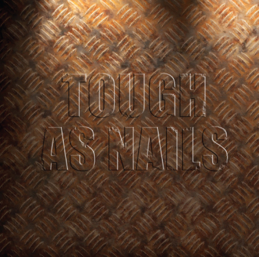
Texture. Overlapping shapes and use of shadow create the illusion of three dimensions in this postcard design. Similarly, color and pattern come together to create the look of metal deck-plating in the example at right.
Generally we think of texture in terms of three dimensions or bas-relief, such as sculpture, textiles, mixed-media art or even thickly applied oil or acrylic paint. But designers can create the illusion of 3D texture, depth and dimension, whether on a screen or paper.
And once we print a design on paper, the paper itself can provide texture. Is the paper a smooth glossy coated one? Or is it bumpy, nubby or slightly furry?
Pattern often goes hand-in-hand with texture. Repeating shapes, for example, can give the visual impression of texture. Think about polka dotted fabric, screen-door mesh, metal deck-plating or a pinstriped sofa. Each of these textures has a distinct repeating pattern.
Mimicking the idea of texture graphically in two dimensions, for example the ridges of a scallop shell, requires clever use of line, shape, pattern—and the 2D equivalent of light and shadow known as value.
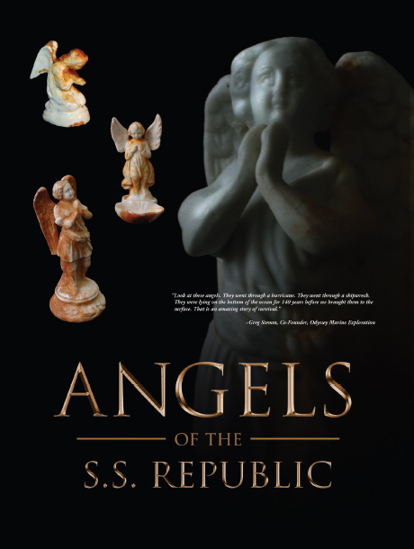
Value. No, we’re not talking about monetary value. We’re talking about dark and light. The contrast between the angels in highlight and the dark background creates contrast and mystery.
Reproduced by permission of Odyssey Marine Exploration.
Element No. 7: Value
Value refers to tones of light and dark. In between white and black we find a range of varying shades of gray. This range is called grayscale. Mixing increasing amounts of white with black—or vice versa—results in various shades of gray.
Black and white photography works visually because, after white and black, the tonal values of gray—from very light gray to almost black gray—stand in for other colors. The wider the assortment of gray tones, the more we perceive depth and dimension. Pictures with very little gray value variation seem “flat.” So white, black, and gray are useful for giving the sense of 3D in 2D as well as color when you can’t use color.
Indeed, if you ever photocopied a color photograph, you witnessed grayscale in action. Color photos that convert well into black and white do so because they have a wide range of color values representing the very light to the very dark and everything in between. Color photos that don’t convert well into black and white usually lack a range of tonal values. Such color photos, when converted to black and white, turn out too light, too dark or too gray, with little variance. The result is a muddy picture.

Focal point and contrast. In this layout, the pairing of the photo and the large decorative “r” creates an eye-catching focal point. Notice how the line of the chairs points to the decorative “r,” which in turn redirects the eye to the headline.
Thus, color has value, too. Even a color picture can seem flat without any gradation in tonal values from light colors to medium colors to dark colors.
As a design principle, value refers to light, dark, and in between, whether we’re talking about black/white/gray or the color spectrum. Value also is necessary for strong composition. We use it to create a sense of depth, as in mimicked texture. We use it to create variation in order to avoid visual monotony. We also use light or dark tones to highlight one thing or de-emphasize another.
That’s it for the seven elements: space, line, shape/form, size/scale, color, texture and value. Put them in your toolbox, and we can move on to the six principles or rules of design, where you’ll see the elements again, by the way.
Principle No. 1: Focal Point/Emphasis
You’ll recall from the works-every-time layout that the visual functions as the eye’s point of entry into the layout. That’s a focal point, the most important thing visually on any layout. Sometimes called the principle of emphasis, the focal point is the center of attention in the design or layout. Another term for focal point is center of visual interest or CVI because it focuses the eye’s attention.
Rule No. 1 about focal points: Have one. Without a focal point, the viewer doesn’t know where to look first. If you’re trying to capture viewers’ attention and control the way their eyes move across the layout, then you need a focal point or CVI.
Rule No. 2 about focal points: Limit one per screen or page, or story or ad. Without a focal point, the eye wanders aimlessly around the layout. So if you have two focal points, then you don’t really have any focal point.
That’s not to say, however, that you can’t clump several items together in space to form one focal point. You also may have several stories grouped together on the same screen or page, each with its own focal point, but when you look at the screen or page as a whole, one story should be dominant and function as the focal point that establishes a visual hierarchy.
The focal point can be anything really, as long as it remains the most eye-catching piece of visual information. Perhaps the focal point becomes so because it sits in a pool of negative space. Perhaps the curve of line in the layout literally leads to the focal point. Maybe the focal point’s shape makes it outstanding. Or its size. It could be that the focal point has a lighter or darker value than the rest of the layout. What we’ve been describing is contrast.

Focal point, check. Now what? Once you’ve decided on a focal point element, your next step is to position it. And you guessed it, there are rules for that, too. In the next few pages we introduce you to the golden proportion and the rule of thirds.
How Designers Use the Golden Proportion and the Rule of Thirds

The golden proportion. The golden proportion is a ratio: 1:1.618. When applied to a golden rectangle, it becomes a kind of compositional grid suggesting asymmetrical placement of items on the layout.
The golden proportion. The golden proportion is really just a ratio: 1:1.618. Mathematicians and scientists are as enamored with the golden proportion as artists and designers of all kinds are—and have been for centuries. Sometimes called the divine proportion or the golden ratio, it has been invested with divine, even magical, properties.
What makes this proportion special is its mathematical principle: the ratio of a to b is the same as the ratio of b to [a + b]. For our purposes, it looks like this: Draw a perfect square. If you increase the perfect square’s width by multiplying it by 1.618, you create what is called a golden rectangle. You’ll find golden rectangles everywhere in art, architecture and design.
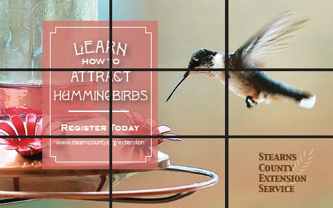
The rule of thirds. The layout for this save-the-date postcard uses the rule of thirds. Key information sits at one intersection of the grid. The hummingbird, which is the focal point graphic, sits at another.
Leaving the math aside, artists and designers like the golden proportion because when applied to shapes like rectangles, triangles and even spirals, it seems to produce a universal visual aesthetic appeal.
The golden proportion applied to a golden rectangle becomes a kind of compositional grid suggesting asymmetrical placement of items on the layout. In fact, a golden grid uses the golden ratio to establish an irregular 3 × 3 grid on the golden rectangle. And that leads us to the rule of thirds.
The rule of thirds. For the mathematically challenged or uninterested, the rule of thirds will seem wonderfully simple compared to the golden proportion. Like the golden proportion grid, the rule of thirds is merely a 3 × 3 grid that suggests layout placement in order to create visually interesting asymmetrical designs.
The rule of thirds simply divides the layout—whatever its format—into an evenly spaced 3 × 3 grid. Then the focal point goes on one of the four gridline intersections. Voilà, pleasing asymmetry guaranteed.
Another way to think about the rule of thirds has to do with symmetrical and asymmetrical balance. If we associate symmetrical balance with the number two, as in two symmetrical sides of a bisected layout, then the quickest route to asymmetry is to work with the number three, as in a 3 × 3 grid.
Contrast is an important principle for designing interesting (in contrast to dull) layouts. Contrast, as a principle, offers a great deal of flexibility. There are limitless ways to achieve it.
Font contrast. Contrast is essential in logos using more than one font. The designer chose a sleek condensed sans serif font to contrast with a grungy decorative blackletter font.
Start with the elements of design. You can employ contrast between filled and empty space. You can employ contrasting sorts of lines or shapes. You may juxtapose contrasting sizes of objects. Introducing a pattern in proximity to no pattern results in contrast. Ditto for texture. Or you may contrast two different kinds of patterns or two different kinds of textures. Color and value also offer powerful contrast tools. Using both dark and light values or colors results in contrast.
You probably can think of other ways to create contrast. However you do it, you need contrast in order to avoid visual boredom.
Principle No. 3: Balance
Imagine a seesaw, basically a board pivoting up and down on a fulcrum. When the board is level, the seesaw is balanced. To achieve balance, each side of the board must carry equal weight.
In design, we think of balance in terms of visual weight. You want your designs and layouts to be visually balanced, unless your communication purpose is to unsettle people by making them feel unbalanced and tense or anxious. There are three kinds of visual balance: radial, symmetrical and asymmetrical.
Radial balance refers to circular designs in which the fulcrum lies at the center, such as dream catchers in Ojibwa Nation culture. Circular designs, often associated with spiritual meanings, are universal across cultures. Interestingly, wherever you split radial balance, you end up with two symmetrical halves. Only radial designs have that property.
Whatever the shape, to achieve symmetrical balance, each side of a bisected design must be a mirror image of the other in terms of visual weight. This is called formal balance. As with all things formal, symmetrically balanced design has its uses. But it may tend toward the traditional and conservative (and sometimes stuffy or boring).
Asymmetry, then, reveals two unequal sides if bisected. Asymmetrical balance tends to be more visually exciting, or at least more visually interesting, than symmetrical balance.
In our earlier seesaw example, we can balance the weight of two unequal sides by adjusting the fulcrum, which would represent the bisecting line or center of gravity.
With visual weight, we have to think about weight differently. Think linear axis and center of visual gravity. Shifting the vertical center axis or center of visual gravity—the fulcrum—to the left or right automatically creates asymmetry.
Balance. This is an example of how breaking the rules can work. What saves this from being a dull centered layout is careful balance, paired with ample white space, pops of color and very careful typesetting. Look, Mom, no rivers!
But an off-center layout is not necessarily balanced. Again, we have to account for visual weight. For example, positive space is visually heavier than negative space. So a lot of filled space requires balancing amounts of empty space. Dark value is visually heavier than light value. So a layout with a lot of dark tones requires balancing amounts of light tones. Larger relative size is visually heavier than smaller relative size, and so on.
Principle No. 4: Movement
The principle of movement goes back to the idea that good design controls the eye’s flow through the composition. The flow of lines can move the eye across the page or screen.
Lines, then, can create movement, and different kinds of linear movement tend to communicate different kinds of symbolic messages. Horizontal lines communicate movement flowing left to right or right to left. Vertical lines tend to communicate stability, such as trees and tall buildings. Vertical lines also may communicate inspirational upward movement, such as mountain peaks, or downward movement, such as a waterfall. Diagonal lines communicate exciting dynamic movement. Two converging diagonal lines communicate distance, such as a road disappearing into a vanishing point in the distance.
Additionally, curving lines also communicate, for example, distance or meandering movement.
You can observe the principle of movement in action by looking at car ads. An ad for, say, a family vehicle is likely to show a full side view (horizontal movement). You want a car ad to convey a sense of motion— people want cars that go. But a family car also needs to communicate safe motion. But sporty cars and performance cars often appear in ads on a diagonal line of movement to communicate excitement.
Yet purity is not required in terms of line and movement. You can have different kinds of lines going on at the same time—although that may not be a good idea if it interrupts the viewer’s flow through your layout as you try to convey important information. A layout with too much movement is said to be “busy.”

Movement. How do these two examples demonstrate movement? Choose all that apply:
Diagonal line
Curving S-line
Motion blur
Depth of field
All of the above
Flow has to do with the pattern of movement the eye takes across the page or screen. The possibilities for such patterns are countless. However, there are some fairly common ones in terms of the layouts we produce for commercial graphic design, such as advertising. The Z pattern is routinely used. In theory, the circular pattern is the most desirable because it may lead the viewer’s eye back to the beginning to look at the layout again.
The bottom line for movement and flow is that you want to move the eye across the layout in order to convey information as well as to evoke emotion. So be strategic about how you do it.
Principle No. 5: Rhythm/Pattern
A pattern, whether regular or irregular, also may create a sort of movement we could call rhythm. Think of music, foot tapping, finger snapping, clapping and dancing. In graphic design, rhythmic movement has to do with repeating items strategically—kind of like a backbeat.
Rhythm. Count the types of rhythm going on in this layout: repeating squares, stars, colors, fonts and numbered items.
Imagine you’re writing a feature story about people who work the night shift. You might decide to use the shape of a moon as a kind of visual theme or graphic icon in your layout. Repeating pictures of moons throughout the layout creates a kind of rhythm. Repeating a color such as the yellow of the moon photo also can create rhythmic movement. Using columns to keep your legs of type uniform creates rhythm. Grouping several photos establishes a rhythm. Repeating your fonts throughout a layout generates rhythm. Such visual rhythm not only results in a visual sense of togetherness for the layout but also helps lead the eye from one thing to another.
The last principle, unity, may seem a little abstract compared to the other five principles. Unity means that all the parts of the design work together, and everything looks like it belongs together.
You wouldn’t wear cargo shorts and flip-flops with a tuxedo shirt, jacket and tie. There’s no unity between the informality of cargos and the formality of tuxedos, and wearing the two together makes for a visually disjointed confusing outfit. The same principle applies in graphic design.
A layout is visually unified if its different parts have visual links or relationships to one another. A good design has some consistency in terms of the pattern of type columns, or rhythm of typography, or style of visuals, etc. Unity refers to oneness, that the result is one cohesive design or visual message.
Unity segues nicely into Gestalt theory because Gestalt laws demonstrate the ways our brains see order in visual chaos.
Gestalt Theory
In the early 20th century, a group of German psychologists studied the way the human brain perceives objects. Die Professoren discovered that the brain automatically and unconsciously simplifies, arranges and orders objects the eyes see. Specific patterns of perception emerged from the research, which became the Gestalt Laws. Four of these laws are of particular interest to designers.
Proximity.
We perceive objects that are close together as belonging to the same group. A related law, the law of Common Fate, says that we perceive objects moving in the same direction as part of the same group. On the left, we interpret one group of circles. On the right, we interpret two groups of circles. The ability to group content aids in creating organization and order in layouts.

Placing elements in proximity to one another goes back to clumping. The idea is to avoid a busy cluttered layout by physically grouping items together that belong together.
Unity. To maintain visual unity, the poster designer chose grunge style fonts and distressed background elements to match the tattoo theme of this poster.
Our minds group things with similar properties, such as color or shape. “Like goes with like.” In this example, we group squares with squares and circles with circles. In layout, we can use similarity to create order and organization through unity.

Continuity.
Our minds will continue a pattern beyond its ending points. Further, our eyes will follow the direction of a line. On the left, our minds see a single cross shape instead of four shorter converging lines. On the right, our eyes follow the direction of the A’s swoop and continue on to the star. Applying this concept can add a sense of direction and movement to your layout. Ergo, flow.

Closure.
We mentally fill in the gaps in order to complete a perceived shape. In this example, we see a star shape even though there is no star outlined. The idea of designing with only a part but having your viewer perceive the whole opens up interesting compositional opportunities, including the interplay of positive and negative space. How cool is that?

Applying Gestalt principles can help control the viewer’s journey through your design. Visual hierarchy tells viewers what’s important along the way.
That completes your basic course in the elements, principles and theories of design. Cue the band for “Pomp and Circumstance” because you’re ready to graduate from mini art school.

Proximity. This Web page includes a visual, navigation text, a headline, some body copy and three different lists. That equals seven different things viewers have to scan. But using proximity to group the visual with the headline and the navigation and then clumping the three lists together reduces the number of areas to scan from seven to just three: a clump in the header, the body copy and a clump of lists.
Similarity. Similarity dictates that every navigation item be typeset in the same font and color as every other navigation item. That similarity among navigation items signals readers that each item is part of the same cluster of navigation options. Similarity also produces unity through making the three lists look alike.
Continuity. The “J” in “Join us” points to the lead of the body copy. Our eyes also follow the invisible gridlines tying screen elements together both vertically and horizontally. The top of the body copy lines up with the top of the boxes listing classes. This draws the viewer from one element to the next.
Closure. The headline “Center for the Arts” is not composed of letters. The words actually are letter-shaped holes punched out of the visual image. Our brains mentally close the gaps and allow us to read those shapes as words.
1. What is a tessellation? If you don’t know, do some basic research to find out. How does the vocabulary of the elements and principles help you explain tessellation without a math degree?
2. Go online to visit the Library of Congress Prints & Photographs Reading Room at http://www.loc.gov/rr/print. Click around until you find several very different photographs you really like. Use the elements and principles of design to explain why you like the photos.
3. Put your hands on a high-end magazine. Find a feature story layout that you believe really works. Then use the elements, principles and theories of design to explain why the layout works. Now do the same thing with an advertisement you find in the same issue.
4. Collect several examples of layouts including Web pages, newspaper pages, advertisements and others. How many of the designs use the rule of thirds? How many of the designs use the golden proportion?
5. Pull out some of your own previous design and layout work. Using the elements, principles and theories of design, explain how your work captures attention, controls the eye, conveys information and evokes emotion—or not. Can you find ways to improve your work using the elements or principles of design? Revise the work as necessary.
6. Imagine you have to design an online portfolio for yourself. Using the six principles of design, do some initial conceptual wireframe sketches for the home page. When you get one you like, label the principles of design you employed. ID and label the elements of design and any Gestalt laws in play, too.
7. Collect examples of logos that demonstrate the four Gestalt laws— proximity, similarity, continuity and closure. Explain how your examples utilize each.