
Being a graphic designer is like being a tour guide. A guide organizes the tour. A designer organizes the layout. Both welcome visitors at a clearly marked starting point to lead them on what is hoped will be an engaging path from start to finish.
Layout is the arrangement of visuals and type in space to compose your design. The layout is the journey visitors take through your grid and the scenic views they get along the way. For the designer-as-tour-guide, it’s a matter of deciding which layout route to lead folks through and what sights to show along the way. In this chapter we share some theories and practices graphic designers use for guiding interesting layout tours.
How do I Know Where to Put Stuff?
Layout begins with thumbnail sketches, and the first thing you sketch is the grid. A grid is a series of horizontal and vertical lines charting out an area. Think of grids as a framework composed of columns or even squares and rectangles that improve the layout’s composition and make your job easier. Your grid helps you organize items on your layout. Gridlines guide your decisions about grouping and aligning visuals, type and negative space.

What size layout? Some layouts have standard sizes. The standard size for business cards in the U.S. is 3.5 × 2 inches.
Creating and Using a Grid.
Designing a grid is not rocket science. Don’t make it complicated. The whole point of having a grid is to simplify your design and layout job.
Start with the type of project you’re producing. The project format may suggest a basic grid structure. Tabloids often utilize a four- or five-column grid, while Web pages commonly use a two- or three-column grid with a header that spans all columns.
Next, consider the content you have to fit on your grid. Do you have a lot of copy or only a little? Select the number of columns and their width to facilitate easy reading. If your task is to design a multiple-page layout, whether paper or digital, how many pages do you have to work with? A light airy design with a lot of negative space is likely to require more pages. More pages equal greater expense. Will your budget allow this? Or is your task to squeeze 10 pounds of stuff into a 5-pound bag?
You also have to consider your visuals. High-impact photos look great covering the page, but lackluster visuals are best kept small. Detailed charts and graphs, however, become illegible if crammed into a too-small space. Sizes of visuals impact your page count as well as your ability to copyfit, and you should design your grid accordingly.
For electronic screens, aspect ratio refers to the ratio of screen width to height.
Various ratios of width to height are standard for different media. Big-screen Hollywood film uses a horizontal format (roughly twice as wide as tall), and traditional standard TV used a slightly more square-ish format. That’s why big-screen Hollywood films have had to be cropped for standard TV viewing, unless they were letterboxed, meaning they were reduced and floated in negative black space. (Either way, cropped or letterboxed, you’ve never seen a warped movie on TV.)
So, for example, regardless of the size of your more contemporary wide-screen TV in inches (measured diagonally from corner to corner), the ratio of its width to height will be 16 units wide by 9 units tall— or 16 to 9. That aspect ratio is expressed as 16:9 or 1.78:1. Your old standard TV had an aspect ratio of 4 to 3, expressed as 4:3 or 1.33:1.
Computer, tablet and smartphone aspect ratios may vary. But they generally have followed television’s lead, with standard aspect ratios of 4:3 and wider formats at 16:9.

The concern with aspect ratio is because you can’t design a square composition and expect it to fit a rectangular format. This becomes especially problematic in planning and composing such things as television commercials, training videos, multimedia websites and even business presentations employing projected computer screen slides. Today designing for aspect ratio is complicated by rotating and not-yet standardized screens on tablets and smartphones.
Aspect Ratios:
Tablets and Smartphones 1.78:1 or 1.33:1
U.S. Standard TV and Computer Monitor 1.33:1
U.S. Widescreen TV and Computer Monitor 1.78:1
U.S. Cinema 1.85:1 or 2.35:1
Most 35 mm Film and Digital Still Photography 1.5:1
Your grid starts with your layout boundary. At this point, you know to start your thumbnails by drawing the outer edges or boundaries of your layout. Remember to draw your sketch in proportion to your design’s final format. For Web wireframes, create your sketch in proportion to the initial screen viewing area, generally 1024 × 768 pixels (basically a horizontal rectangle). Proportion is essential. You can’t fit a square peg in a round hole, and you can’t fit a horizontal ad in a narrow vertical magazine column. In the world of screens, the concept of proportionality is known as aspect ratio. To keep your sketches in proportion, we recommend the use of graph paper. It helps.
The Ingredients of the Grid: Mix and Match to Make Your Own Layout Framework

Format. The outer edges of your page or screen are effectively your base gridlines. To set your layout width and height, you’ll need to do a little research to see if there is a standard size for your layout. For instance, a common video clip size is 640 x 480 pixels. In any case, format dictates the type and placement of the other gridlines you’ll need for your layout.
Margins. Margins are the bands of space at top, bottom, right and left of your layout. When a print layout includes a spread— two pages side-by-side—the side margins become inner and outer margins. Some layout types have standard margins, so again, a little research is required. Printed magazines, for example, may require larger inner margins to account for binding. Depending on your layout type, it can be a good practice to make your margins correspond with live area.
Live Area/Safe Area. Live area or safe area is like a safety fence inside the boundaries of your paper or screen respectively. Any content falling outside of the “fence” may be cut off or disappear from view. It is especially important to respect safe area if you are designing for television. Different television screen aspect ratios make cropped content a real possibility. If you set up margins to correspond with live/safe area, you can keep your content intact and viewable by placing it inside your margins.
Trim and Bleed. Trim is a commercial printing term referring to the physical dimensions of the flat page. Trim size often corresponds directly with format size.
The effect of running material— background color, visuals, type—right off the layout is called a bleed. To create such layouts, designers extend bleed content just beyond the trim size. Commercial printers take the slightly extended design, print it to a larger sheet of paper and trim the edges to achieve the desired finished size. This is where the term trim size comes from, by the way.
Print content may bleed or not. Screen content, however, always bleeds. Even when the content of Web pages, video or commercials stops shy of the viewing device boundaries, something—typically a solid color—fills the rest of the screen. Make a point of choosing that something to fill this space, preferably a something that complements the rest of your design.
Columns, Alley & Gutter. Columns are the quintessential unit of the grid. In fact, we often refer to a grid as a two- or three-column grid. Columns provide a useful framework for determining size and position of layout components. And, as an added bonus, when text is set in the correct size column, it’s easier to read.

An alley is the negative space between a layout’s columns. A gutter is the oversized margin between two facing pages, such as a newspaper’s fold or a magazine’s binding. Alleys and gutters provide essential white space that keeps elements separate and text readable.
Depending on the format and the project, you may need more than one sketch. You may need thumbnails for a front cover and for inside spreads for print, or home page and secondary pages for Web, etc. Begin with the cover or home page because they always set a design’s overall tone for the audience.
Sometimes more isn’t better. Too many columns in too small a layout makes for awkward reading. When you can squeeze only one or two words in a line of copy, your columns are too narrow. Yes, Example-on-the-Right, we’re talking to you.
After you’ve set your outer edges, add gridlines for margins, trim, bleed, live/safe area and any other essential guides.
How many columns? When determining how many columns you comfortably should use, balance aesthetic preferences with readability. For maximum readability, column widths should fall within the range of 2–5 inches or 144–360 pixels. So do a little math: From the width of your page, subtract the left and right margins plus a little more for your column alleys, and then divide by two (two inches for print) or by 144 (144 pixels for Web pages). This should give you a number that’s close to the maximum number of columns you can use on your page.
Most Web pages are designed with two, three or four columns. Column widths are often determined by column content and will vary accordingly. To maintain pleasing proportions, consider setting your Web column grid using the rule of thirds or the golden proportion.
Or let your specific content needs dictate the width and number of your columns.
Now, you are under no obligation to use the maximum number of columns. Beginners may choose to employ fewer columns to simplify things. However, more columns actually offer more flexibility in the overall design. In any event, go with your comfort level.
After vertical columns, you also may add horizontal guides as needed for the design you envision. Perhaps you want to create distinct top and bottom portions of your design. You can add a horizontal line right in the center to help you lay out your design elements. Or perhaps you want to try a more complex grid structure of uniformly sized units, or “modules.” You can thumbnail horizontal guides to make any combination of grid units.
While we think of grids as having uniformly sized units, non-uniform asymmetrical grids are also used. Such grids encourage the creation of asymmetrical design, and asymmetry is visually interesting.
Once your grid sketches are in order, you’re ready to add the first layout item: the focal point.

Embedded photo © Catalin Petolea – Fotolia.com
A custom grid based on dominant artwork. The grid here starts with the standard document boundary and margins, but all other lines are based on the shapes, lines and elements suggested by the art itself.
Since we look at art first, and our eyes are drawn to people’s eyes, this is a great place to align a key headline.
The content of the image, in this case the visual weight of the boy’s head, helps determine the positioning and alignment of the text block below.
Establish a Focal Point.
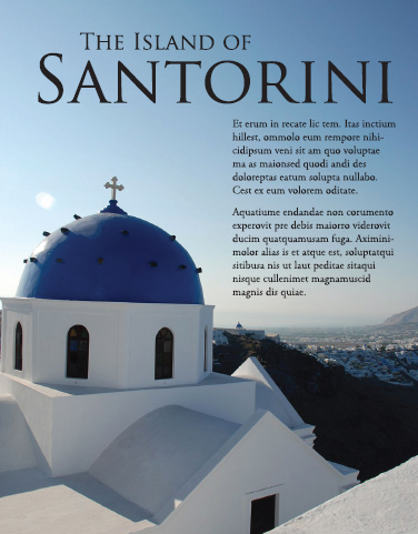
To return to the touring analogy, your focal point is the equivalent of a big sign that says, “Really amazing stuff starts here.” It’s the thing on your layout that captures the visual tourist’s interest in the first place.
Usually the focal point is a visual of some kind. But not all visuals are suited to be focal points. Look for focal-point-worthy visuals such as photographs with strong composition, line, shape, color or interesting angle. Type treatments also may serve as focal points. The key to typographic focal points is contrast by some element of design: space, line, shape, size, texture, value or color.
Once you select a focal point, you have to decide where to put it. The works-every- time layout hangs the focal point from the top of the layout. But knowing a little design theory gives you other options. If you don’t remember the golden proportion and the rule of thirds, consider revisiting Chapter 5: Mini Art School.
Embedded photo reproduced by permission of Kristin Arnold Ruyle.
What if the Copy isn’t Available Yet?
This is a classic chicken-and-egg dilemma. Ideally you want all the copy available before you begin your layout. Maybe, however, the boss or client needs to see a layout before you get the copy. Maybe the writers can’t start writing until they know how much space to fill on the layout. What can you do when you can’t produce a layout without the content, but you can’t get the content without a layout?
Greek text. Sometimes Greek text, meaning stand-in copy, is your best solution. Most professional-grade layout software programs offer some kind of Greek text, which is basically placeholder words. They read like gibberish, as in, “It’s all Greek to me.” The dummy words may be in English, or they may be fake Greek. “Lorem Ipsum” is the ubiquitous phrase of Greek with no meaning. Because Greek text can be formatted like normal copy, “greeking” offers a temporary substitute for the actual copy. This enables you to proceed with planning your layout.
Where do I Put the Rest of My Stuff?
Once your focal point is in place and ready for attention-grabbing duty, the layout must direct viewers to the next important item, typically copy.
Adding Type.
Type placement begins with inserting the main copy and any nondecorative headlines before adding other typographic items such as cutlines and tags. Depending on your format, type may comprise a little or a lot of your layout. Whichever it is, let your grid and your gridlines guide the placement of type.
Once you decide where on the layout to place the type, you can style it in an appropriate font, size and color. Make sure you haven’t forgotten any type items. Adding a missing cutline or subheading after the fact can throw off an entire layout.
Use the other type tips you know:
» Keep your headline and your lead together.
» Reduce leading (line-spacing) as needed on multiple-line headlines.
» Set copy in appropriate column widths to keep long copy reader-friendly.
» Avoid fully justified or centered type.
» Watch for inelegant breaks in headlines or legs of type.
» Avoid widows and orphans (lone words at the top or bottom of columns).
Placing Visuals in Your Layout.
In addition to the focal point, you may have other visuals to include on the layout. And, of course, there are rules for that, too.

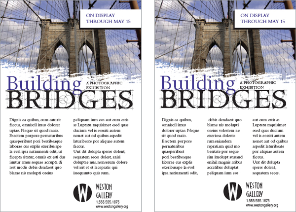
The story at left displays several “don’ts,” including a much-too-skinny column to the right of the image and a photo placement that separates the headline from the start of the text.

Ahhhh, much better.
Place visuals near the top of the layout. Positioning photos near the top of a layout or story is particularly important. Photos are eye magnets, and when they appear at the bottom, they immediately draw the eye to the bottom and right off the screen or page. Viewers will skip or miss that important information you’re trying to convey on the rest of your layout. Does this mean you can never put visuals at the bottom of a layout? Nope. But…
If your picture has direction, be sure it’s pointing the right way. We tell students: “Pictures are arrows. Be sure you’re pointing in the right direction.” If a photo or illustration has a strong direction, such as a particular line’s movement or a face looking in a particular direction, make sure that direction is pointing to the accompanying type or whatever else comes next along the intended visual tour of the layout. Don’t position your visual to point right off the screen or page if that’s not where you want the viewer’s eye to go.
Flipping photos is a bad idea. You may be tempted to “flip” an image that happens to point the wrong way. Flipping photographs is not acceptable in news design—ever—and though it can be done in marketing and advertising pieces, it can get you into trouble. Never flip a picture with text, for example, for what we hope are obvious reasons. Flipping photos of recognizable people may result in also flipping distinctive facial features. Flipping is just plain dangerous.

Using multiple visuals. When placing multiple visuals, position them for overall balance. Image size contrast creates pleasing asymmetry.
Do leave some negative space, but don’t let it get trapped. Make sure it opens to the outer edges of the layout.
Don’t position a visual where it interrupts the flow of reading. Don’t interrupt the flow of reading copy by placing a visual where it chops a line or a column of type in half. Another common mistake is to place a visual between the headline and the lead. Floating a visual in the center of a column without anchoring it to the gridlines is another common mistake causing unhappy results.
Pay attention if you’re “wrapping” text. When you wrap text around a visual, make sure you don’t end up with text columns that are too skinny, leaving you with only one, two or three words per line of type.
When Using Multiple Visuals…
Variety or uniformity of size? When you’re using more than one visual, make them different sizes—and don’t be shy about the size contrast. The most important visual should be the largest. The contrast of sizes is more visually interesting and helps establish visual hierarchy. However, just to contradict ourselves, sometimes an interesting grid arrangement of visuals of the same size makes a nice rhythmic pattern. But the rhythmic grid pattern sacrifices asymmetry and visual hierarchy. Whatever you decide, call it with a visual communication purpose.
Balance, please. If you have multiple visuals on a single screen or page, position them for overall layout balance. Avoid lopsidedness.
Imagine you’re loading people into a small boat. What happens if everyone sits on the same side?

Who’s the pinhead on the right? Call us crazy, but we’d bet the doctor on the right wouldn’t be pleased about how he looks in this news story. When you use multiple headshots, keep the heads the same size and align the images at eye level.
On the other hand, it is acceptable to cluster groups of images together. A cluster of multiple images becomes a single visual element in your layout.
Mug shots. If you’re working with multiple headshots, called mug shots or mugs, make all the heads roughly the same size. To align headshots, try cropping to align everyone’s eyes.
Where to Put Negative Space.
We trust that by now you understand that white space is not your enemy. In fact, negative space is the best tool in your design toolbox for isolating and highlighting important content. It organizes by separating items. Without it, there can be no sense of clustering. Negative space also provides a visual respite for the viewer to avoid visual overload. But even negative space has layout rules.
First, try to consolidate many small puddles of negative space into fewer larger pools. This reduces visual clutter in exactly the same way as clustering positive layout items does. Same principle.
Second, avoid trapped space. Trapped space is a conspicuous chunk of white space isolated in the interior of the layout. If you have trapped space, rearrange the layout so the white space opens to the margins.

Visual hierarchy.
Varying the size of headlines gives a sense of visual hierarchy to even the most text-heavy layouts.
Creating visual hierarchy with relative position and contrasting size is another way to draw a reader through a layout while delivering an extra layer of communication. The hierarchy tells viewers what parts of the layout are more important than others and to look at the important things first.
To create visual hierarchy, rank the items intended as layout content in their order of importance. Your most important item, usually a key visual or a headline, becomes the focal point. A position near the top of the layout gives an element importance. Larger size also imparts greater importance. Visuals and type of lesser importance appear in smaller sizes and lower positions on the layout.
One of the best places to observe visual hierarchy in action is on the front page of a newspaper, either print or online. The lead news story always has the biggest photo, the biggest headline point size and occupies the catbird seat at the top of the page. Graduated headline sizes draw the reader down through the page like steppingstones.
Visual hierarchy applies to newsletters, Web pages, annual reports and any other document that includes multiple stories or chunks of discrete information.
Layouts with Multiple Topics On the Same Screen or Page
Up until now we’ve been dealing primarily with single-topic layouts. But what if your layout must accommodate multiple smaller stories or other items on the same page? Websites as well as print and online editions of newspapers, magazines and newsletters all require the orderly layout of multiple stories on a single print or electronic page, or across several pages.
Modular Page Design.
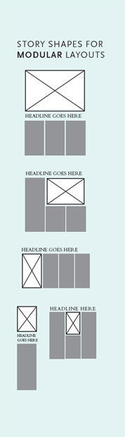
The current trend for newspapers is modular page design. In modular page design, each story is arranged into a rectangle, and the rectangles are arranged on the grid of the page. Modular page design is also used in magazine and Web page design.
Making a rectangular story. At a minimum, a story includes a headline and some body copy. Sometimes there is a subhead called a deck between the headline and the lead. Between the deck and the lead, a story also may have a byline identifying the journalist or author. Many stories also have a photo or visual of some kind along with an accompanying cutline.
Think of it this way, each part of the story—visual, headline, body copy—represents a new rectangle you have to fit into your rectangular story, which will fit into your grid of rectangles on your rectangular screen or page. It’s just like a puzzle.
For each individual story, keep the eye flow moving in the correct direction and in the intended order. The ideal eye-flow order is visual, headline, lead. Otherwise, here are few more helpful hints:
» Body Copy. Strip the story’s body copy into the grid columns. Keep the lengths of the story’s legs even until you run out of story. More than 10 inches per leg is too long. Less than two inches is too short. So is yours a one-column or five-column story?
» Headline. Add the headline on top of the story. The headline should span all the story’s columns, sort of like a roof covering the story. Give the headline a much larger point size than the body copy.
» Deck. If there is a deck, put it under the headline but before the lead. Give it a point size smaller than the main header but larger than the body copy.
» Byline. If the story merits a byline, put it between the deck and the lead. Give it a tastefully modest point size.
» Visual/Photo. Where you place the visual really depends on the size and direction of the image. As a rule, though, keep photo placement near the top of the story. It’s that eye magnet thing. Think works-every-time layout. But a visual as focal point can sit under the headline, or to the right or left of the headline, as long as the visual does not sit between the headline and the lead. In other words, never put a visual between the headline and the lead. Ever. If the image has direction, it should point to the story. Wherever you put the visual, and at whatever size, remember you’re trying to end up with a rectangular story.
» Cutline. Cutlines typically, but not always, go under the visual. A cutline under a photo should run the whole width of the photo.

The modular page. Stories fit neatly into the page grid because of their rectangular shapes.
Placing your stories on a modular page. Unfortunately, laying rectangular stories on a modular page is not as easy as we may have led you to believe.
If you build all your stories in the same size and shape and then just stack them on top of each other, you’ll have one snoozer of a page. To keep things interesting, you need to vary the size and orientation of your stories. For asymmetry, make some stories tall, narrow and vertical. Make others wide horizontals, and maybe even design a few that are square.

Troublesome headlines. “Tombstoning,” when two headlines are positioned side-by-side, is a potential pitfall of modular page design. In the top example, the headlines run together. In the example below, the designer solved the problem by placing the photo between the headlines and using an alternative headline style.
At the level of organizing a whole page of stories, you also need to take a look at all the stories’ visuals. Varying their size and placement on the entire page creates interest. Newspapers like to average about a third of a page devoted to visuals. Whatever your percentage of visuals, you still have to watch out for lopsidedness at the page level. Don’t tip the boat over. Balance is necessary even for asymmetry.
Your goal is an overall page eye-flow guided by the placement of all the stories’ visuals. The eye moves from one image to the next in a particular order according to the visual hierarchy.
Adding visual variety with sidebars. In print, a sidebar is simply a separate block of type with a solid background, a stroked outline or an ample border of negative space. On the Web, a sidebar is one column (either right or left) of the Web page grid.
Print sidebar content relates to its adjacent copy in some way. A sidebar might be a short connected story, a list, a mini biography, a quiz or simply further detail on some aspect of the main content. Normally though not exclusively rectangular in shape, sidebars fit beautifully into modular layouts.
Print sidebars can be as minimal as text and an enclosing box. The visual effect can break up long copy and add life where you don’t have as many visuals as you would prefer. Like good cutlines, sidebars provide a bit of information in nice compact quickly readable chunks.
Web sidebars often include primary or secondary navigation, banner advertising or function-adding widgets such as social media feeds and maps. Unlike print sidebars, Web sidebars are typically functional rather than aesthetic. However, guidelines for designing them are similar.
When designing sidebars, one of the biggest mistakes beginning designers make is neglecting to include margins outside and inside the box. Don’t cheat your margins. No type should touch the sides of the sidebar, either outside or inside its box.
Sidebars can add pops of color to your layouts. Consider applying color to the headline or bullets. Or you might put your color in the box’s background (the fill) or the box’s outline or border (stroke). If you choose a background color, don’t forget the contrast you’ll need between the fill color and the type. If you believe you need to reverse the text, white letters pop best against a dark background. If your sidebar houses Web navigation, make sure hover states (color changes on mouseover) contrast with the background, too.
A Sidebar On Designing Sidebars
Sidebars are a good option for:
» Breaking up text in the absence of good photography
» Highlighting key information lifted from your text
» Providing additional information related to your adjacent copy
» Adding interactivity when presented in the form of quizzes or lists
» Giving your page a little pop of color
When Designing Sidebars:
» Make them contrast with your regular copy by using a different font
» Give them a little color with colored bullets, headings, a border or a background box
» If you use a border or background box, make sure your text doesn’t crowd the box. Give yourself ample margin, inside and out
Multiple-Page Layouts
Laying out multiple pages, whether print or electronic, presents some additional challenges. Three biggies include maintaining unity, making a lot of type inviting and providing navigational signs to keep readers from getting lost.
Visual unity. To maintain visual unity in a multi-page layout, use the same tactics as for a single-page layout. Don’t change from a tuxedo to cargo shorts from one page to next. Use a dash of Gestalt through similarity: Keep repeating compositional elements such as color, shape, texture and pattern. Consistent font styling also provides unity. Using the same grid skeleton on every page is essential, too.

You are here.
Multiple-page layouts need navigational devices such as page numbers, folios and tables of contents. Web pages need persistent navigation so visitors can find content as well as find home at any time and from any location.
Reproduced by permission of Residential Remedies, LLC.
Loads of type. Page after page of gray type is intimidating. To break up any copy-heavy design, including one with multiple pages:
» Use a grid and set copy into inviting legs of type. On the Web, keep copy in a single column, but don’t let that column span the width of the page.
» Break up type with headlines and subheads.
» Add more visuals, including sidebars.
» Deploy negative space strategically.
Navigational signs. In a multiple-page layout, visitors need visual signposts to be able to keep track of their whereabouts. Traditional navigation tools include, for example, tables of contents, teasers, jump lines pointing to where the rest of the story jumped and even logos or the journalism equivalent of logos called flags and sigs (short for signatures). For interactive media, navigation and multimedia controls and menus help visitors move through content, and they should be consistent (have similarity) across pages. Breadcrumb trails are highly useful navigation tools for websites, too. A breadcrumb trail is a text reference to where a website visitor currently is, preceded by a sequential list of the links the visitor followed to get there.
A periodical or serial such as a magazine, newsletter or newspaper— print or Web—needs a folio showing the publication’s name and issue or date. Folios in hardcopy editions also need page numbers. Folios generally appear somewhere in the margins, though still within the safe area or live area.
Exit Here
Remember, good layout works for, not against, your visual communication objectives: capture attention, control flow, convey information and evoke emotion.
Begin the layout with a grid and an irresistible focal point. Use the focal point to point to, not from, your layout. The Gestalt of proximity, similarity, continuity and closure can help with arranging the layout’s flow. Creating a visual hierarchy also aids flow.
For multiple layouts on the same screen or page, modular design is your new best friend. For laying out multiple pages, similarity is the key to visual unity.
Thank you for traveling with us today. Please wait until the chapter has come to a full stop before exiting.
► Try This
1. Compare the visual communication of two organizations that compete with each other by comparing their websites. In particular, compare their websites’ grid structures.
2. Experiment to figure out the live area for an 8½ × 11-inch sheet on your personal printer and also on the copier you use. If you bleed material at the top, bottom and sides, how much white-space margin still prints?
3. Compare the home pages of two online news organizations. What techniques communicate visual hierarchy? Does either employ modular page design? How do you know?
4. Assemble several samples of your own writing to treat as Greek text. Now create thumbnail sketches showing how you would arrange each of these dummy “stories” into a two-page newsletter using modular page design. Execute your design in a page layout program.

Beyond the Works-Every-Time Layout
In Chapter 3 we introduced you to the Works-Every-Time Layout. Now we’d like to introduce you to several other common layout patterns you can add to your designer’s toolbox. These layouts adapt to both print and screen applications. Now that we’ve pointed them out, see how often you run across them each day.
1. Picture window
2. Grid of equal squares
3. Collage
4. Mondrian
5. Type specimen
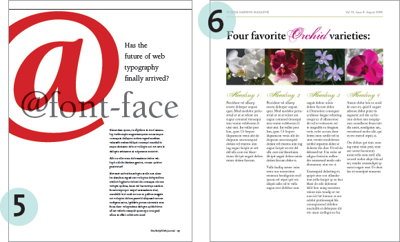
6. Multipanel *


Not all graphic designers embrace the grid. Some feel grids are too restrictive. We humbly disagree. An underlying grid is crucial to keeping a design coherent across multiple pages. And, as we’ve already discussed, a grid takes the guesswork out of deciding where to put content.
Regardless of the type of layout you create, sticking to a grid provides a bit of invisible repetition and makes each page or screen feel like part of the same whole.
* Layout 6 also demonstrates the use of “clotheslining,” a technique where you line up items of unequal height along their top edges. The effect is that of elements hanging off of a clothesline.