Design has one thing in common with biology: There’s no such thing as spontaneous generation. Whether you’re designing for folks in the newsroom or the boardroom, you have some predesign work to do if you hope to produce a design that works, literally and figuratively.
Novices may be inclined to go straight to their computers. But professional designers know that effective graphic design begins with research: information gathering and critical thinking about the project at hand. Next comes brainstorming: tapping into creativity and putting pencil to paper. So we’re going to have to ask you to step away from your computer.

Appealing to your audience. For visual communication, you should speak to the audience in its own visual vernacular. For instance, the visual aesthetics of MTV and early video games are part of the collective memory of Gen X.
RESEARCH
Always start with research. If you’re lucky, the research you need in order to begin a new design comes from the person who sent the work to your desk. Let’s call this person, whoever it is, the boss or client. But you may have to do your own research or at least pitch in with it.
Even the humblest design assignment necessitates collecting basic information about the design’s purpose and deadlines. At the other end of the spectrum, a high-stakes campaign demands extensive research, analysis and planning culminating in multiple coordinated designs accountable to measurable objectives.
Regardless of who collects the facts, and however big or small the design job, you need reliable answers to some standard questions:
1. What is the objective? Communication objectives frame decisions about everything from format to font. Clear objectives also provide the benchmarks for gauging a design’s success. So what exactly is the visual communication purpose? What do you want your audience to think, feel or do? Is the audience learning something new? Are you creating conviction or preference? Or stimulating action or behavior? By the way, speaking of the audience…
2. Who is the audience? To whom must the design speak? Loyal patrons or happenstance traffic? High-powered business people or high-tech tweens? Knowing your audience well is critical for developing visual communication that resonates. Public relations and advertising agencies may invest in research such as focus groups and surveys to collect key consumer insights about where the target audience leans and how it interprets messages. News organizations may use opinion polls to assist issue reporting. For visual communication, the point is to speak to the audience in its own visual vernacular. For instance, the visual aesthetics of MTV and early video games are part of the collective memory of Gen X.
You need to consider any physical needs of your audience, too. How might an audience of baby boomers who are increasingly dependent on reading glasses affect your design?
Design must be inclusive. Consider that members of your audience may be colorblind. Will you need to translate copy into other languages? Do you need versions of signs or printed pieces in Braille? When designing for the Web and multimedia, how will you accommodate visitors with impaired vision or hearing?
3. Does the design need to coordinate with other design work? Any new design has to work with, not against, the organization’s visual identity and graphic design history. If you’re not familiar with that identity and history, bring yourself up to speed. Study the organization’s printed materials and Web-based visual communication.
Meanwhile, get vector copies of the organization’s logos. Vector images use geometry and math to produce and preserve the proportions and quality of line-art illustrations. You also need to know the organization’s rules and regulations for using said logos. Ditto on official colors. Know the approved colors, along with the rules for producing and using them. You can’t plan your whole design around shades of lilac if the organization’s look and feel require fire engine red.
Beyond long-term visual identity or branding, your project may be part of a short-term series or campaign that needs or already has a “look” you have to coordinate. So don’t be shy about asking questions.
4. Who are the competitors, and what does their visual communication say? Predesign research also accounts for the competition’s graphic design. You can’t know how to position your visual messages if you haven’t accounted for how your competitors position theirs. If a competitor is currently gung-ho about the color green, maybe you should rethink going green. If the competitor’s home page features an image of a little girl, choose something else for yours. If a competitor positions itself as the “safety people”… You get the idea.
Accessibility.
Colorblind site visitors find underlined hyperlinks easier to locate and use than hyperlinks that simply change color on mouseover.
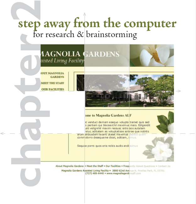
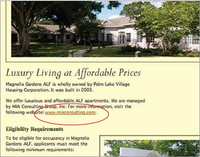
Reproduced by permission Magnolia Gardens ALF.
Return to sender? A design that fails to arrive also fails to communicate. Adhere to electronic and print delivery specifications.
5. How will the final product be delivered or distributed? Nothing is more important in determining the physical size of a design project than format, i.e., the intended channel, medium or vehicle. Print or digital? What kind of print? What kind of digital?
For ads—print or digital—you need the proper dimensions or technical specs (specifications). Size is not always about column inches or fractions of pages, either. Web banner ads measure in pixels.
For Web graphics, file size—the amount of memory a file takes up—is as important as the pixel-by-pixel dimensions. For video and multimedia, add duration—lengths of time in seconds or minutes—to the specifications list.
When it comes to printed items such as brochures and posters, you might have to consider not only the size of the design but also the size of the design’s container. Is your design meant for a brochure rack? A transit kiosk?
If your design will be printed in-house, get to know your printer’s capabilities. Most printers print only on certain sizes of paper so you may have to restrict your design to what will fit on a letter- or legal-sized sheet. Most common laser and inkjet printers also have a built-in print margin that leaves a small white border around the page, even if you want your design to bleed to the paper’s edges.
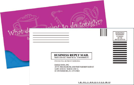
Mailing presents another set of challenges. Is an envelope required? What size? Make sure your piece will fit. Or will the piece self mail? The U.S. Postal Service has a complex set of requirements for self-mailers, including appropriate paper weights, overall size, use of sealing tabs, position of folds and setup of mailing panels for bulk mail, first-class presort and business reply. The last thing you need is a box of expensive printed pieces taking up space in a closet because your ignorance and lack of planning rendered the design useless.
To keep budgets in check, minimize or eliminate “bells and whistles.” Try printing with one or two colors instead of four. For online projects, adapt free open-source code instead of paying a developer for custom coding.
6. What is the budget? No-brainer here, budget impacts design, including how many hours the boss or client is willing to pay you to work on it. Budget also determines what kinds of visuals you can afford, along with such things as the number of ink colors you can use for a printed piece, the type and number of widgets you can add to a Web site or the complexity of an animated infographic.
Obviously a bigger budget allows for special design touches such as top-drawer animation on a Web site or foil stamping on a high-end business card. But a small budget doesn’t oblige poor design. A talented designer can create something spectacular using only black ink and newsprint if necessary. In any case, you have to design within your budget’s limitations. It’s bad form to let the boss or client fall in love with a full-color glossy brochure with an interesting fold and die cut, all packaged in a cool translucent envelope, if you can’t produce it due to budget constraints.
If you’re unsure how much your proposed design will cost, chat with an expert. Commercial printers are thrilled to provide useful suggestions and alternatives to help you produce successful printed pieces. Web designers and developers likewise will assist you with Web-related pricing. If you work with video, it’s good to develop relationships with reputable producers, videographers and post-production editors who are willing to chat estimates. If you’re lucky, you’ll work with an on-staff production manager or producer who will gather estimates and bids for you.

Be aware of deadlines, whether recurring (as in magazines, newspapers and newsletters), events-based or seasonal.
7. What about timing and turnaround? Timing refers to when the finished design reaches the audience. Turnaround refers to how much time the design, production and placement crew has to deliver the job. Both timing and turnaround are related to deadlines, which are sacred among those who care about their professional reputations. So whenever there are deadlines, you need a production schedule coordinating all those deadlines with everyone.
Beyond timing and turnaround, there may be other calendar issues. For example, a message may be seasonal or time-sensitive. Hard news obviously dates almost instantly; feature news, not so much. Or the message may be timeless. But even if a visual message is timeless, its channel of delivery probably is not. So the designer needs to know about the shelf lives of both the message and medium.
8. Who is providing content? In order to make the project fly, you’ll need necessaries such as logos, color palettes, available photography and any required content such as disclaimers and legalese. Will the boss or client be forwarding these materials? Or will you be responsible for collecting them or creating them from scratch? If your organization doesn’t have photography of its own or a budget for custom photos, stock photography sites are a good option.
Now is the time to consider copy, too. Who’s writing it? If you’re not the copywriter or reporter, when will you get the copy? How much copy are you dealing with? Designers and writers often have different perspectives, which you should treat as a positive opportunity. In any event, designers and writers do share the same agenda for an effective piece. If you’re not writing the copy, invite some creative collaboration with the writer.
9. Are there any other design or production considerations or constraints? Better to ask the question sooner if it can save you from headaches later.
A planning document is generally the end product of all this Q&A. Ad agencies call this document a creative brief; design firms, a design brief. Whatever you call it, we highly recommend you have one. The brief serves as a roadmap keeping the visual communication goals front and center and the design process on track.

Keep on track. Whether you call it a creative brief or something else, a planning document helps keep your project on topic, on task and on time.
BRAINSTORMING
With your research brief in hand, you’re ready to brainstorm your project’s design concept and layout possibilities. So don’t even think about turning on that computer yet.
Our brainstorming process goes like this:
1. Dump: Begin with a mind dump. Download everything you know about it—whatever “it” is. Spit it all out on paper. Make diagrams and draw connections. Free associate guilt free. No holds barred. Quantity rocks. The longest list wins.
2. Percolate: Then go do something else. Split focus is when you work on two things at once. Ideas simmer while you and your brain tend to chores and other tasks. Those other tasks can be inspiring, too. Exercising and napping are equally productive. Or force yourself out of your comfort zone by trying something new. Have an adventure.
3. Morph: Now back to work. Change it. Turn it into something else. Or stretch (or reduce) it (or some part of it) to the point of absurdity. Or do the opposite—just to be contrary. Marry it to the random, the incongruous or the formerly incompatible. Think oxymoron. Reject the obvious, as well as your favorites and first choices.
Return to step 1 and repeat the process as necessary. But don’t go it alone if you don’t have to. Brainstorming works best playing with others.
I NEED A GREAT IDEA…I NEED A GREAT IDEA…
The wrong way to come up with a great idea is to try to come up with the great idea. Nothing puckers up the creative juices like pressuring yourself to think of one superior idea.
It’s more fruitful and fun to come up with many ideas. Good, bad, so-so. Let ‘em rip. No criticism.Just scores of ideas.That gets the creativity flowing.
In fact, it’s called “flow” when you’re so focused and productive during the creative process that you lose track of time. And somewhere in that big list you generated, you’ll find a big idea.
Brainstorming Techniques to Stimulate Creativity
Credit for inventing brainstorming as a technique for creative idea generation goes to the late Alex Osborn, the “O” in the legendary ad agency BBDO.Today we recognize that everyone has creative potential just waiting to be exercised.
Try these brainstorming exercises:
I.FLUENT THINKING
In the late 1960s and early‘70s, Frank Williams and Bob Eberle, a couple of educators interested in stimulating creativity in schoolchildren, described “fluent thinking” as a way to generate many ideas quickly.The goal is quantity without being self-conscious about quality.Try it:
Write down two-dozen ways to…(insert your project).
II. SCAMPER
Eberle also came up with the SCAMPER method:
S—substitute it
C—combine it
A—adapt it
M—magnify or modify it
P—put it to other uses
E—eliminate it
R—rearrange or reverse it
III. CUBING
Cubing, from writing guru Elizabeth Cowan-Neeld, refers to the six sides of a cube, as in think outside the box:
1. Describe it
2 Analyze it
3. Compare it
4. Associate it
5. Apply it
6. Argue for or against it

Photo © picsfive – Fotolia.com
Brainstorming leads to the concept or so-called “big idea” driving your visual communication. The concept may be inspired by an arresting photo or illustration. Or the concept might come from a piece of fabric or architecture you saw somewhere or from the texture of something. Put your other senses to work, too, such as sounds, scents and even tastes.
The concept also might be a theme, a metaphor or an analogy. Sometimes brainstorming fill-in-the-blank statements helps to get there. For example:
♦ This company (or organization, topic, product, service, project, etc.) is so __________ that __________.
♦ This company (or organization, topic, product, service, project, etc.) is as __________ as __________.
♦ This company (or organization, topic, product, service, project, etc.) is more __________ than __________.
♦ This company (or organization, topic, product, service, project, etc.) is less __________ than __________.
♦ This company (or organization, topic, product, service, project, etc.) is like __________.
Think about what appeals to the audience. Or what moves it, as the case may be. Get as many ideas as you can on paper. You never know when a dumb idea will trigger a brilliant one. Cast your net wide for visual inspiration.
Once you have a concept, you’re ready to start exploring actual designs— with the computer turned off. So don’t put your paper and pencil away just yet.
THUMBNAIL SKETCHES
There is no single magic bullet solution to any given design project. Instead there may be dozens of possible solutions. The goal is to find the one that best achieves the project’s communication objective and also appeals to the boss or client. The best technique for fast exploration of design options is the thumbnail sketch. Thumbnails are tiny thumbnail-sized layout sketches that you can draw—and reject—quickly.
Don’t let the word “sketch” scare you. Many designers can’t draw. Thumbnails are really more like doodling than illustrating. You only need to be able to draw boxes and lines indicating placement of visuals and type in space. Simple line drawings allow designers to create and compare a number of layout ideas rapidly before selecting the best solution. For designers, this is where the real creativity begins.
Think about what appeals to the audience. Or what moves it, as the case may be. Get as many ideas as you can on paper. You never know when a dumb idea will trigger a brilliant one.

Above: A Web wireframe illustrating the page’s structural areas.
Reproduced by permission Institute for Supply Management, Florida Gulf Coast Chapter
If you’re a beginner, it’s a good idea to do thumbnails on graph paper since it’s important to keep your sketches in proportion to the dimensions of the final design. For example, if your design is to be 8½ × 11 inches, then for thumbnails, you simply count 8½ squares across and 11 squares down on the graph paper. Designers use thumbnail sketches to work out projects with one page or screen, or multiple pages or screens.
Story boards. For design involving animation or video, storyboards are required. Storyboards are working sketches showing change over time so, rather than one layout, there will be several depicting key points in the animation or video. The effect is not unlike a comic book. Nevertheless, all storyboards begin as thumbnails.
Sketches for Web design. For a Web site, a designer would use thumbnails to work out ideas for the general page layout and interface. But due to the nonlinear nature of Web sites, a designer also would need to create a site map to show the links between and flow among pages. Site maps often look like family trees, with pages branching out from a single home page. More complex site maps resemble flowcharts, reflecting the idea that visitors don’t travel through pages sequentially but have the option of going different directions from any given point.
Dummies. In the world of print newspapers, magazines and newsletters, the thumbnail sketch is called a dummy. Like other types of sketches, a dummy is drawn on paper, smaller than actual size but always to scale. Whether very simple or highly complex, the dummy diagrams each page, showing the position of every advertisement, story, photo and other page component. While every publication has its own unique shorthand for creating them, dummies traditionally include wavy lines to indicate text flow and boxes to represent photo and illustration position. For headlines, numerical notations indicate font size, number of columns wide and number of lines deep.
Roughs & comps. The next step in the design process varies designer to designer. For some, the next step is to turn the best couple or few thumbnails into roughs, meaning slightly more detailed, polished sketches. Other designers skip the rough and produce a first draft of a design on the computer.
The next step is a comp, short for comprehensive. The comp is a fully detailed final draft suitable for showing the boss or client. A complex print piece, such as a media kit tucked inside a custom pocket folder, might need a physical mockup the bosses or clients can get their hands on, thus wrap their brains around.
The Web equivalent of a comprehensive is a beta site, a working version of a Web site, which the public can’t yet access. A beta site lets the boss or client experience the interactive components and lets the designer and developer work out any kinks before the site goes live.
Once the beta site is up, a designer also may create a wireframe if the design will be used as a template. Following the idea of wiring the skeletal frame of a 3-D sculpture, a Web site wireframe starts with a full-color image of the page design. Semitransparent and labeled boxes overlaid on the design indicate areas of the template that may be edited. Providing specific names for editable regions makes it much easier for a template user to find and edit the correct page code.
If we step back to review the overall process for any kind of design, we find that traditionally the designer’s workflow has been sketch, rough and comp. But computers changed the game. Today, workflow varies for each artist. Some share thumbnail sketches with their bosses or clients to get early feedback. Others go right from sketch to full-fledged comp, skipping the rough stage altogether.
Whatever the project, getting boss or client approval without changes at the comp stage is rare. So brace yourself for additional rounds of edits before the boss or client is satisfied. In fact, build it into your production schedule.
Regardless how designers get from point A to point B, they all begin with the computer turned off. The best designers consistently start with thorough research. And, believe it or not, they still sketch their ideas on (gasp!) paper. All designers expect to go through many design iterations before and after they turn on the computer in order to complete a project.
Assuming you’ve done your research legwork and your brainstorming homework, then Brava. You have our blessing to turn on your computer.

Sketch, comp, final. The workflow for many designers is sketch, comp, final. Some execute an additional set of sketches called “roughs” between the sketch and comp stages.
From the horse’s mouth. Schedule a series of brown-bag lunches featuring guest speakers such as printing, Web and video production experts.

![]() TRY THIS
TRY THIS
1. Got a project? Do the basic Q&A research then write a design brief. Have someone critique it for you.
2. Visit your library to speak with a reference librarian. Ask about databases and sources for your story, topic, project, client, audience or competitors. Using those resources, do some research.
3. Draw sketches for a Web site home page for your county, city or town. Start by visiting the U.S. Census Bureau Web site (http://www.census.gov), including the American FactFinder tool. Use the site to get a demographic profile of your audience. Based on your findings, what are some design considerations to keep in mind for your audience?
4. Visit the U.S. Postal Service Web site at http://www.usps.com. Locate and read the rules and regulations for business mailings.
5. Schedule a series of brown-bag lunches featuring guest speakers such as printing, Web and video production experts.
6. Come up with 50 kinds of lists you could make during the mind dump phase of brainstorming. Next, list 50 activities you could do to percolate. Last, list 50 ways to morph the project—or story, product, service, client or boss, etc.
7. To brainstorm concepts for your project, come up with 10 plausible fill-in-the-blank possibilities for the following statement:
Our __________ is so __________ that __________.
8. Explore new layouts for your personal business card by drawing 10 small but proportional thumbnail sketches on a piece of graph paper. Assume the business card’s actual size is 3½ × 2 inches or 2 × 3½ inches.
9. Locate the rate card for an online publication. What are the specifications for banner ads? Sizes? Do the specs allow animation? What format? Duration? File size? Create thumbnail sketches or animation storyboards for a banner ad appropriate for this publication.