
In the late 19th century, information that didn’t come from your neighbors came by way of newspapers, which were primarily text. Column after column of type set in tiny little fonts with few visuals save the occasional woodcut illustration. Back then, people actually read the stuff. Word-for-word.
THE ART OF CUTTING TO THE CHASE
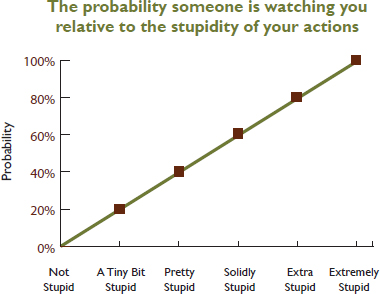
Sometimes an infographic tells the story faster and better than words. Consider this example:
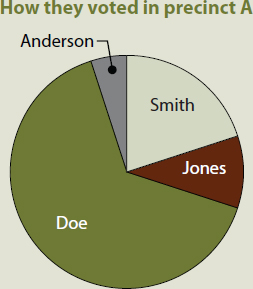
A recent poll showed that 20 percent of the residents in Precinct A voted for candidate Smith, 10 percent voted for candidate Jones, 65 percent voted for candidate Doe and 5 percent voted for write-in candidate Anderson.
Or we could go this route:
Oh, how things have changed.
Here in the early 21st century, people get quicker, handier chunks of visual communication via cell phones and laptops as well as digital TV and newsprint. We scan for pictures and headlines that pique our interest. We may or may not read further. There may or may not be anything further to read. We may be moving so fast that we need to absorb it at a glance or miss it altogether.
More and more, everyone from news organizations to advertising agencies relies on infographics to deliver content to audiences. Infographics—as in information graphics—present information graphically. Partner the reporter’s nose for sniffing out a good story with the designer’s eye for visualizing it, and you’ve got infographics.
But infographics go way beyond performing a supporting role to the main news event. First, infographics are not just for journalism. Second, infographics can tell a deeper and broader story than text alone. And they take up less time and space in the process.
In many instances, an infographic is easier to wrap the brain around than a paragraph of explanatory type, whether news, advertising, public relations or those “assembly required” diagrams we love to hate.
Below, we talk a little about the evolution of infographics before sharing best practices for designing such things as maps, pie charts, fever graphs and timelines.
A TERSE HISTORY OF INFOGRAPHICS
USA Today usually gets credit for popularizing modern infographics. And colorful charts and graphs remain hallmarks of USA Today’s design for busy readers. But people were using graphics to deliver information well before the 1982 origins of USA Today.
The earliest humans on the planet shared information in pictures carved and painted on rocks and caves, not to mention tattooed on bodies. All over the globe, ancient peoples documented themselves and the world around them in pictographs fromjapanese Kanji derived from Chinese ideographs to Egyptian hieroglyphics.
More recently, NASA’s Voyager interstellar space probes, launched in 1977, carry information-rich diagrams. Just in case we’re not alone. No joke.

Is anyone out there? Carl Sagan and a multidisciplinary team developed this plaque for the exterior of NASA’s Voyager space probe. The plaque was designed to communicate basic information about the human race, including what we look like and where we come from.
YOU MIGHT NEED AN INFOGRAPHIC IF…
In addition to communicating long-distance with extraterrestrials, infographics come in handy if:
♦ You need to communicate quickly.
♦ A verbal or written account is too complicated—or tedious—for comprehension.
♦ Your audience can’t hear or read well—or at all.
Illustration by Caryl Loper.
Sometimes your topic offers clues to suggest an infographic is desirable or even that a certain kind of infographic is suitable. For example, people as key actors—heroes, villains or victims—suggest bio boxes. Dates imply a timeline. References to geographic areas such as neighborhoods, floor plans or precincts hint at maps.
21ST CENTURY MULTIMEDIA INFOGRAPHICS
In modern history, infographics recruited the aid of sound and motion while working in the TV business. Infographics went 3D with the invention of video games. With the great Web migration, infographics reinvented themselves as interactive. Color graphics, sound effects, animation, 3D perspective and interactivity all working together changed everything. We called it multimedia.

Next generation diagrams. Active diagrams like the heart diagram above are great for print. For the Web, we can take the diagram one step further by adding interactive animation and audio.
Consider a diagram showing the flow of blood through the heart. In print, we would use arrows and ordinal numbers to signify directional and sequential flow. We would add a short block of explanatory type.
But in today’s electronic formats, that infographic would animate a blood-flow demo. High-end animation would simulate 3D perspective and might even feel something like a theme-park ride to viewers scooting along veins and then arteries.
In addition to typographic chatter, audio could add the recorded sound of the heart pumping blood, along with studio sound effects and perhaps some music. Voiceover narration could add yet more information and help accommodate the visually impaired.
So when you’re brainstorming infographics, don’t forget to concept for multimedia. No need to go gonzo, but take advantage where available and appropriate to your project’s objectives.
A self-consciously ironic infographic about types of infographics. Purity is not required. Mix and match. Or invent a new form.
|
| ||||||||

|
|
|


Not just for news reporting. Infographics and graphics packages can be used to great effect in newsletters, magazines and annual reports.
Reproduced by permission of the National AHEC Organization.
GRAPHICS PACKAGES
Gonzo multimedia infographics bring up a good point about combining and linking infographics. In the newsroom, a graphics package reports a story by using multiple types of graphics together. These often are anchored by a focal illustration or lead graphic and supported by related smaller graphs, charts, timelines, bio boxes, etc. The combination of well-crafted story, photos and infographics makes one-stop-shopping of visual appeal, in-depth information and at-a-glance comprehension.
We have two recommendations about packaging graphics:
1. Don’t avoid packaging stories because you’re not in the news business. Visual storytelling can be effective and useful in any public communication context, including PR and advertising.
2. Plan, plan, plan. Without serious coordination, a graphics package may result in visual information overload. Creating successful graphics packages requires significant preparation and cooperation. This may mean enlisting the help of photographers, illustrators, animators, researchers and writers.
Most anyone can create simple charts and graphs. Effective graphics packages are the product of professional team effort.
As with all public communication, there are ethical guidelines to follow when creating infographics. Here we cover a few of the biggies:
Can you spell plagiarism and copyright? Never reproduce someone else’s graphic without permission. And after you get permission, you must credit your source. Usually graphics sources are noted in the lower left corner. Same goes for attributing the sources of your information.
Stick with the facts, please. It should go without saying that guessing at or making up information to fill in the blanks of an infographic is a career-ending no-no. But we’ll say it anyway: In infographics, the word is “information,” not “fiction.” Keep it factual from credible sources you can corroborate and attribute. If you have holes in your information, work harder at your research to fill in the blanks. Or drop the graphic.
Speaking of filling in the blanks with credible sources, do be critical about the sources of data. Who pays the research bills? What are the agendas of your sources and their funding arms? Perpetual skepticism is not simply an occupational hazard of the information business. It’s a prerequisite. That fact segues to the ways so-called objective numbers can mislead.
Statistics (and people) can be shifty. There are two big ways you can get in trouble when using numerical data: 1. The numbers are flawed to begin with. 2. Your presentation of the numbers is questionable or misleading. Avoid both.
If you didn’t collect the data for your infographic, put on that skeptical hat. Track down the original study to give it the once over. If you’re clueless about stats, enlist the expertise of someone with a clue.
CHARTS CAN LIE
Each pie chart below contains accurate data. Yet, each chart tells a completely different story. Poorly executed charts can be downright misleading. In this case, plotting cherry-picked numbers creates a false impression.

Think of your infographic as a design within a design. The rules for making good layouts work for making good infographics as well.
Even if the original data are good, your graphical representation of the data may not be. Some common ways to ruin perfectly good stats include:
♦ Cherry picking numbers to prove your point
♦ Failing to adjust money for economic inflation (or deflation)
♦ Inflating the significance of large numbers if they represent a small percentage of the whole (or vice versa)
♦ Specious comparisons (like comparing apples and oranges)
And there are others. So if you don’t know what you’re doing in the research and quantification department, partner with someone who does.
On the other hand, don’t be one of those wimpy math-phobic communication types. Don’t let numbers intimidate you. Read a book. Sign up for a class. Take an expert to lunch.
Being ethical means accounting for diversity. Account for the diversity of your infographic audience. People respond best when you invite them to identify with your visual messages. Beyond being inclusive, stay alert for images and text that are inaccurate, inappropriate, unfair or injurious.
We’ve fast-forwarded from ancient cave painting to multimedia infographics. We’ve also suggested when infographics may be useful, along with some ethical hazards to avoid. Time for the fun part: the design how-to.
DESIGNING INFOGRAPHICS
Everything we’ve covered so far will serve you well in designing infographics, starting with research, brainstorming and thumbnail sketches. You’ll also use what you know about grids and layouts, along with the elements and principles of design. Your knowledge of color, typography and photos and illustrations applies here, too. In addition to the basics of good design, we offer the following tips on designing infographics.
Design tips for all types of infographics.
1. Infographics must be able to stand alone. This is perhaps the most important thing to remember when designing any type of infographic. If people are scanners searching for interesting things to look at, then the infographic may be the only thing the viewer sees. Infographics shouldn’t rely on information buried somewhere else.
2. Thoroughly research your topic before you begin. It does make sense to understand the material you’re attempting to illustrate. You won’t be able to facilitate others’ understanding if you don’t get it, either.
3. Use a grid to organize and structure your infographic. Think of your infographic as a design within a design. The same rules for good layouts work for specific graphics and infographics, too. As in larger layouts, a grid provides order and organization for the various parts of your layout, such as chatter and callouts. Aligning elements to a grid provides cohesion and unity, and it will help your reader understand the flow of the graphic.
4. Group things. As you create your graphic elements, be sure to cluster related items, and leave ample negative space between items to prevent confusion. Employ proximity. Remember, clumping is good, and clutter is bad.
5. Choose a design scheme compatible with the overall design. Think colors, fonts and other design details. If you’re creating an infographic for an existing Web site or serial publication, there may be a style guide that specifies the look of design elements. If there is no style guide, you’re hired. You get the job. Create a style guide in order to maintain similarity and unity.

Don’t forget unity. Choose a color scheme for your charts and graphs that coordinates with your overall design scheme.
Small embedded photo © Nicholas Larento - fotolia.com

6. Use care if your graphic must appear in black and white. Color is one of your greatest allies, providing organization and wayfinding for viewers. If you can’t use color for your infographic, be clever with grayscale. But each gray should vary from the last one by at least 20 percent, or the eye has a hard time telling them apart.
7. Give credit where credit is due. Attribute. Cite. This goes for the source of your data and the source of any photos or illustrations you use.
8. Minimize ornamentation. You’re shooting for a clean comprehensible infographic. Cutesy backgrounds and other embellishments can detract from your message. Easy does it.
9. Keep the writing tight. Keep headlines and titles short. If possible, explain your subject and purpose in six words or less. For chatter and label text, keep your writing concise and in the third person. Use action verbs.
Tips for common infographics.
1. Maps. Put your map on a grid and eliminate unnecessary details, called “map fat.” Streamline and simplify. Be sure to include a scale showing distance. Include a legend as needed and directional indicators (at least North, if not all four directions), and indicate reference points for your reader.
2. Pie charts. Pie charts are intended to show parts of a whole. The full circle represents 100 percent. So don’t forget to indicate what the “whole” is. This ain’t no mystery. Then slice your pie portions accurately.
3. Fever charts. Known for their spikes and valleys, fever charts are good for showing change over time. A background grid helps readers quickly grasp the trends. Remember algebra, slope and “rise over run”? Didn’t think so. But you do need to know that the Y-axis equals the rise going up and down vertically. What are you measuring? The stock market? Rainfall? Daily traffic? That’s your Y. The X-axis is always time or “run,” running left (from the past) to right (into the future). In 3D, the Z-axis pushes out towards the viewer.
4. Bar charts. Bar charts are good for comparing things. Generally, use horizontal bars—except if you’re dealing with time. If your bar chart shows change over time, revert back to the idea of time as horizontal “run” going left to right, and lay in your bars as vertical blocks and towers. In either case, label each bar with the actual number it represents. Once again, a grid in the background helps clarify relationships visually.

Data maps. Maps are commonly used to show location but can be equally effective in illustrating data.
Reproduced by permission of the Florida AHEC Network.
Maps are a common infographic form.There are several types including locator maps, geological maps and statistical maps.
Reproduced by permission of USF Health.

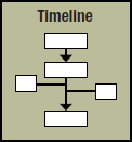
5. Timelines. Timelines are excellent for sharing history, providing context, demonstrating cause and effect, etc. The rules say it’s good practice to limit a timeline to 10–20 items or “frames.” The best timelines are visually to scale or proportional to the time range they represent, which suggests enlisting the help of a grid again. Or think in terms of the timeline-equivalent of a measuring tape segmenting and parsing out your particular units of time. If your timeline includes giant gaps, a list format may be a better choice.
Semantic analysis of tweets around the #internetsummit hashtag
Internet & Technology Summit 2009 • Tampa, Florida
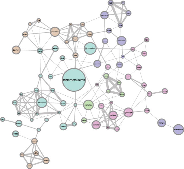
Data visualization. Data visualization is the art of rendering collected data in graphic form. On the simple end of data visualizations are basic pie and bar charts. On the opposite end are complex diagrams such as the above semantic analysis.
Reproduced by permission of Innovation Insight.
6. Diagrams & illustrations. These are the most complex of the graphic styles and usually require real artistic skill to execute. Diagrams and illustrations are best when kept simple. Again, the rules for good composition will help you set up strong diagrams and illustrations. Give them focal points, as well as rhythm and flow.
Like all visual communication, the best infographics provide accurate information simply. Practice that, and you can’t go wrong. However, we’re not finished covering visual storytelling. Next up, storyboards for planning video.
![]() TRY THIS
TRY THIS
1. Design an infographic bio for yourself. First imagine a real-world use for it, such as putting it on a social media page or adding it to your resume. Then design it accordingly.
2. Design a multimedia timeline demonstrating either the history of infographics or the development of multimedia infographics. Research comes first. No cheating.
3. Put your hands on some credible basic research statistics. Thumbnail a two-page magazine spread for a graphics package illustrating the research project’s findings. Execute one statistical graph or chart from your package.
4. Following the rules for map design, execute a floor plan of one room in your home or office.