

Ask children about their favorite colors, and you get instant exuberant responses:“Red!”“Blue!” People just respond to color. We select or reject everything from clothes to cars based on what colors say to us.
In this chapter we talk about how designers harness the power of color to grab our attention, organize visual flow and evoke emotion. We also talk about finding color inspiration on the color wheel as well as from culture, history and nature. But translating inspiration into effective design requires some understanding of color technologies. We cover that, too, before offering a few tips on designing with color.
Color organizes. Color change in this site’s navigation buttons lets the visitor know where she is in the site.
Reproduced by permission of the Tampa Bay Area Regional Transportation Authority.

THE POWER OF COLOR: IMPACT, ORGANIZATION & EMOTION
Color Creates visual impact. Color is eye-catching. It makes you look. Picture a black and white poster with one pop of color—a hat, for instance—in bright pink. That bright pink immediately becomes a focal point. Part of the attention-getting power is the principle of contrast at work. But a color’s shade and intensity also play a role in attracting interest, whether as eye entry point, contrast, wow factor or all of the above.
If color captures attention, you can use color to keep drawing the eye’s attention over and over again for flow through your design. The eye will follow color around your composition like a dog follows the cook in the kitchen.
Color organizes. Imagine you’re in an airport terminal. You see a large group of people wearing red T-shirts. Either they’re all part of the same group or it’s a freakish coincidental convergence of red T-shirt lovers. Our money is on the group thing.
Color can sort and clump to indicate what goes with what. That’s the principle behind color-coding systems, such as electrical wiring and mall parking lots. This is some potent design mojo if you think about it.
Color evokes emotion. For example, the concept of team colors is meant to inspire strong emotions. The kind of emotions we feel, however, depends on whether we’re looking at the home team’s colors or the opponent’s. So, once again, designers are tactical about employing color persuasively.
Although humans do respond physiologically to color, most of the emotional muscle we attach to color is learned. We’ll be talking more about both the science and symbolism of color. As for designing with color, some people seem to be born with color sense. For others, just trying to match two socks is a challenge. Fortunately, there is help.
HOW TO CHOOSE COLOR: CULTURE
Even though Western Christians associate red and green with Christmas, not everyone celebrates Christmas or shares those particular meanings of red and green. At the same time, color science tells us that people with a common form of color blindness can’t distinguish between red and green. That fact always makes us wonder about the wisdom of red and green traffic lights, another example of cultural meanings of color used to communicate visual messages.

It’s patriotic. The colors blue, red and white stir up feelings of national pride for Americans.And the British. And the French…
Reproduced by permission of Stetson University College of Law.

Retro color. Ever notice that the reigning color palette in the 1950s was turquoise, pink and black? Ever notice that everything in the 1950s was “atomic”?
The sighted and those who aren’t colorblind do read symbolic meanings into color.
However, the meanings people attach to colors depend on their cultures, and, even within the same culture, what a particular color says can change across contexts.
In U.S. culture, for example, white can symbolize purity, such as a white wedding dress, a custom that began as a way to communicate the bride’s virginity. But in China, brides often wear red, a color that symbolizes good fortune. The thought of a red wedding dress is a little shocking in the United States because we associate red dresses with, well, something else. On the other hand, in numbers of Pacific Rim cultures, white is the color of mourning while Americans and Europeans connect black with mourning.
So it’s important to consider the audience when communicating with color.
It’s also important to consider context. The same color can symbolize multiple things within the same culture depending on the circumstance. In the United States, green can be a fresh, cool, natural, environmentally friendly and healthy color. But “hospital green” has negative associations with sickness and cold impersonal institutions. Green also can connote envy.
The point is not to take the symbolic meaning of color for granted.
HOW TO CHOOSE COLOR: HISTORY
Like clothing styles, color styles come and go. If someone you know has an old pink-tiled bathroom, you know what we’re talking about. Knowing a little bit about the history of color trends can help you choose (or avoid) time- and era-evocative colors for your designs.
For example, Rebecca dates herself by admitting she had an elementary-age bedroom sporting a burnt orange chenille bedspread, stylized “daisy” curtains in shades of yellow, orange and green, and a gigantic foot-shaped green shag rug. If you don’t get the joke, we’ll tell you that burnt orange, avocado green, harvest gold and brown are classic early 1970s colors.
Every decade has a color palette or two. Pink, black and turquoise still evoke the 1950s. Neon brights bring to mind the 1980s.
In fact, color designers are currently deciding what colors will be trendy two years from now. So if you’re plugged in to the industry, you might even be able to choose color for your designs based on the future.
HOW TO CHOOSE COLOR: NATURE
If you’re still having a hard time putting colors together, take a cue from nature. Colors that appear together naturally can make pleasing palettes for your designs. You might not consider putting bright orange, deep green and deep blue-violet together on your own. But on a bird of paradise plant, these colors come together in a vibrant color scheme.
Mother Nature has great color sense. If a color pairing occurs in nature, it’s a good bet the pairing will look good in your layout. Blue sky and yellow leaves inspired the color palette for this magazine spread.

“Christmas, kings and blue jeans” If you can remember that phrase, you can remember the three primary colors and their complements.
If you’re dealing with color photography in your design, your photos also may help you choose your color scheme. As we keep saying, it’s about looking. Examine your photos. Dominant colors should suggest a color scheme to you.
HOW TO CHOOSE COLOR: COLOR SCIENCE & THE COLOR WHEEL
Knowing something about color science along with the mechanics of the color wheel takes a lot of guesswork out of choosing color schemes in graphic design. Before you wig out over the word “science,” we promise to keep things practical by skipping the physics and chemistry.
For our purposes, color is light, whether we see it as a light source shining through our computer screens or as reflected light bouncing off of a printed surface like paper. Technically—and perhaps contrary to intuition—white is the mixture of all colors of the light spectrum visible to the human eye, and black is the absence of any light, thus color. Think white light passing through a prism to reveal the color spectrum. Then think black outer space as a vacuum absent of light without the presence of stars.
But that takes us back into physics and chemistry. So let’s move on to the color wheel.
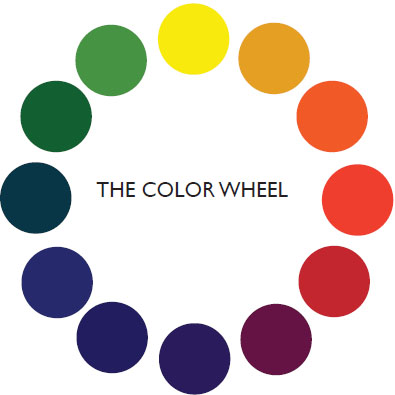
“Christmas, kings and blue jeans.” If you can remember that phrase, you can remember the three primary colors and their complements. Christmas colors are red and green. The king’s royal colors are purple and yellow. And blue jeans typically are stitched with orange thread. All six colors have relationships to each other defined by their positions on the color wheel, which is a useful thing to know in design.
The color wheel is like an analog clock with three primary colors, three secondary colors and six tertiary colors arranged in 12 specific positions. What makes this arrangement helpful is that it predicts how colors work together. Indeed, you can build a color wheel once you understand these working color relationships.
Primary Colors. Using the clock analogy, the primary colors yellow, blue and red appear four hours apart, say, at noon, 4 and 8, respectively, to form a triangle.
Secondary and complementary colors. Next we can build the secondary colors by mixing two primary colors at a time. You probably remember this from grade school. Mixing yellow and blue produces green, which goes between yellow and blue on the wheel. Mixing blue and red makes purple, which goes between blue and red on the wheel. Mixing red with yellow makes—you got it—orange, which goes between yellow and red.
| Primary | Primary | Secondary | Complements |
|---|---|---|---|
| Yellow | + Blue | = Green | Red and Green |
| Blue | + Red | = Purple | Yellow and Purple |
| Red | + Yellow | = Orange | Blue and Orange |
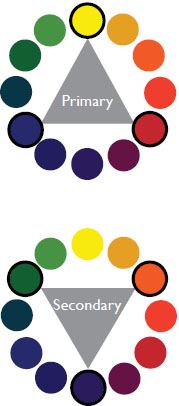
Notice how each secondary color appears on the wheel directly opposite the primary color it complements. Per “Christmas, kings and blue jeans,” green lies opposite red, purple lies opposite yellow, and orange lies opposite blue.
Now you know the relationship between primary and secondary colors: Mixing any two primary colors produces the secondary complement of the third primary color. Now you also know how to create contrast with color: Pair colors opposite each other on the wheel.
Analogous color. Additionally, you now know how side-by-side colors on the wheel are related. Mixing colors next to each other on the wheel produces “in between” colors. Side-by-side colors on the wheel are related because they contain some of the colors sitting next to them. We call that analogous color. Pairing analogous colors creates unity.
| Primary | Secondary | Tertiary |
|---|---|---|
| Yellow | + Orange | = Yellowish Orange |
| Yellow | + Green | = Yellowish Green |
| Blue | + Green | = Bluish Green |
| Blue | + Purple | = Bluish Purple |
| Red | + Purple | = Reddish Purple |
| Red | + Orange | = Reddish Orange |
Analogous color. Analogous colors appear side-by-side on the color wheel. Even though the third set “jumps” the tertiary colors, the set is still considered analogous.

You’re getting warmer… The same design rendered in a warm palette on the left and a cool palette on the right. Does one stand out more than the other? Which do you prefer?
Although the primary colors are yellow, blue and red, other triplets of color from the color wheel also can make pleasing color palettes. Form any triangle four hours apart on the color wheel to locate a viable color-scheme triplet.
Tertiary colors. Mix a primary color with the closest secondary color on the wheel to get those subtler “in between” tertiary colors.
Accordingly, a color actually may be a mixture of colors. Yellow, for example, isn’t just yellow anymore. Are you seeing pure primary yellow? Or is it a cooler yellow with hints of green? Maybe you’re seeing a warmer yellow with hints of orange.
Color temperature. The notion of warm and cool colors reveals another property of the color wheel: One side is warm, and the other side is cool. Obviously, the red-orange-yellow side is warm, and the green-blue-purple side is cool. Maybe not so obviously, you can warm up a cool color by adding a little red, orange or yellow. Or you can cool down a warm color by adding a little green, blue or purple. That’s part of how contrasting color works. Notice how each opposite, thus contrasting, color pair on the wheel includes both a warm and a cool color.
Another good thing to know about warm and cool colors is that when used in layouts, warm colors appear to come forward and cool colors recede. This concept can be helpful when you’re trying to emphasize or deemphasize elements in your layout.
We’re still not done with the color wheel yet, though. We’ve mixed similar colors side-to-side around the wheel, and we’ve matched contrasting colors on opposite sides of the wheel. But when we mix colors on opposite sides of the wheel, something unexpected happens: We get gray! You probably created this effect in your younger finger-painting career.
Gray. Gray, which lies at the center of the color wheel, has an interesting property in relation to colors around the wheel. We think of gray as a neutral color that goes with any color. Gray reflects hints of the contrasting complement of any color you pair it with. An orange shirt will make a gray suit look rather bluish, while a blue shirt will warm up the same gray suit to a slightly orange shade. Your eyes automatically draw out that complementary color in a kind of trick of the eye called spontaneous contrast.

Neutral gray. Each center square contains the same 50 percent gray, yet each square looks different. Gray changes visually relative to the adjacent color.
Hue, saturation & value. The color wheel as we’ve described it so far deals with hue or pure color. Hue answers the “what color?” question moving around the color wheel. Saturation and value describe other dimensions of color. Saturation refers to the amount or intensity of a hue, and value refers to the lightness or darkness of a hue. You’ve already learned about color value as a principle of design. So let’s start with saturation.

One color, different values. If you use different values (tints) of a single color in your layout, you create the illusion of having used more than one color.
Saturation answers the question, “How much of the pure color?” If you spill grape juice on your white shirt, you get a purple stain. How much grape juice saturates the shirt determines the amount of purple in that stain. You might begin with a rich purple stain. After you launder the shirt, some of the purple in that stain washes away to become a less saturated hue. If you then spilled a little bit of mustard on the grape juice stain, its purple also becomes a less saturated, less pure, more muddy purple hue (almost grayish).
It’s the same thing in design. Take those color photos for your brochure, for example. You want beautiful rich saturated color, not pale washed-out or dirty color, right? Saturation is about the degree of presence or absence of the pure color.
Assuming the color is present, value refers to how much gray (from white to black on the grayscale) is in the color. Value, you’ll recall from mini art school, answers, “How light or dark is the color?”
For value, we talk about tint and tone. Are you aiming for a light pastel tint of purple? Or a dark earthy eggplant purple tone? To get pastel colors, called tints, you dilute the hue with white (or lighter shades of gray). To get earthy colors, called tones, you dull the hue with black (or darker shades of gray).
Returning to that grape juice stain, the washed-out stain is less purple because some of the purple in the stain has been replaced with the background white of the shirt to give a lighter pastel tint to the remaining purple. If we never washed the purple stain, some of the pigment that makes grapes purple might oxidize. This would add black to the purple stain, dulling the stain’s color to a dirt-like earth tone.
In sum, the color wheel can inspire your project’s color choices. However, knowing that three analogous or triplet colors will make a harmonious palette is only the start. It’s also important to consider people’s responses to color culture, history and nature, all of which also can inspire your design’s color. Furthermore, successfully designing with color requires some knowledge of color technology.
COLOR TECHNOLOGY: THAT’S NOT THE COLOR I CHOSE. WHAT HAPPENED?
We’ve all experienced this: The layout, the typesetting and the color were brilliant. But something awful happened after pressing “print.” The saturated orange turned nasty pink. The pure blue came out blue-green.
Color matching from device to device is one of the most difficult challenges designers face. In order to understand it, we need to explain a bit about the technology of color. The shorthand we use when talking about the mechanics of color can seem like an alphabet soup for the uninitiated: CMYK and RGB. But it’s not really complicated.
Printed color vs. screen color. The short answer to the question “what happened to my color” is that monitors and printers don’t speak the same language. Monitors and printers render color using two totally different technologies. Screen color uses an “additive process” while print color uses a “subtractive process.” For electronic color, we overlap light. For printed color, we manufacture and then layer inks.
The color wheel as we’ve described it is based on printed color and subtractive color theory: Assuming white is a mixture of all colors and assuming most paper we print on is white, then to get specific colors during printing we, theoretically, have to “subtract” color from the white paper background, which is reflecting white light.
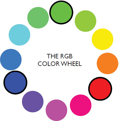
Unlike the subtractive color of printing on paper, electronic color, as we see it on television, computer and cellular phone screens, is created through an additive color process. Remember, black is the absence of color, and our electronic screens are, theoretically, black when they’re turned off. So to get color on electronic screens we literally have to add light.
The color wheel, screen version. Monitors use a different method for building the colors you see on screen. Screen colors are created from various combinations of red, green and blue instead of the red, blue and yellow used in the classic art color wheel.
Adobe product screen shot(s) reprinted with permission from Adobe Systems Incorporated.
Remember from the color wheel that blue, red and yellow represent the three primary colors in subtractive color. In printing, blue becomes cyan, red becomes magenta, and yellow stays yellow. That system is called CMYK, for cyan, magenta, yellow and key. When we mix cyan, magenta and yellow, in theory, we produce black, which is the K or key in CMYK, although printers just use black ink instead of mixing it from CMY.
But if we begin with black in screen environments, then we need a different color system for electronic color. For electronic color, we need an efficient way to produce white. That system is RGB, standing for red, green, blue, which become the primary colors in additive color theory because overlapping these colors of light produces white. Looking at RGB’s different color wheel, it’s interesting to note that overlapping blue and red light produces magenta, overlapping blue and green light produces cyan, and overlapping red and green light produces yellow. In other words, CMY become secondary colors in additive color theory.
To make a long story short, your printouts don’t match what you see on screen because your screen is speaking French and your printer is speaking Portuguese. The two devices need a translator. Such translation is called calibration, which is part of an overall process called color management.
Color management. Color management is the formal term for getting your color to match properly across devices, from scanners to digital cameras to monitors to printers. Some aspects of this process can be handled by making adjustments at the device level or through the system settings on your computer. Your computer monitor, for example, can be calibrated to match the settings of any output device, including your personal printer or a commercial printer.

Color management. Apply color profiles to your layouts consistent with the profiles used by your output device (uh, that would be your printer). You’ll have a better chance of keeping consistent color from screen to printed page.
A more in-depth way to manage color involves the application of color profiles to images and layouts. These profiles allow for more accurate— though not necessarily completely accurate—color translation from device to device. The International Color Consortium (ICC) created some of the most commonly used color profiles, but there are other color profiles out there, some industry-specific.
The ICC has profiles for almost any application, whether you’re working in additive RGB space for Web design or subtractive CMYK space for commercial printing.
WORKING IN CMYK COLOR SPACE
Print designers work in “CMYK color space.” They prepare all graphics and layouts in CMYK mode to correspond with commercial printing technology. The most common technology printers use to apply inks to paper is called 4-color process (or full-color, built color or process color) because just four ink colors—cyan, magenta, yellow and black—are combined to build any color. You’ll recall that cyan, magenta and yellow correspond with the three primary colors on the subtractive color wheel, and you can build any color from those three colors.
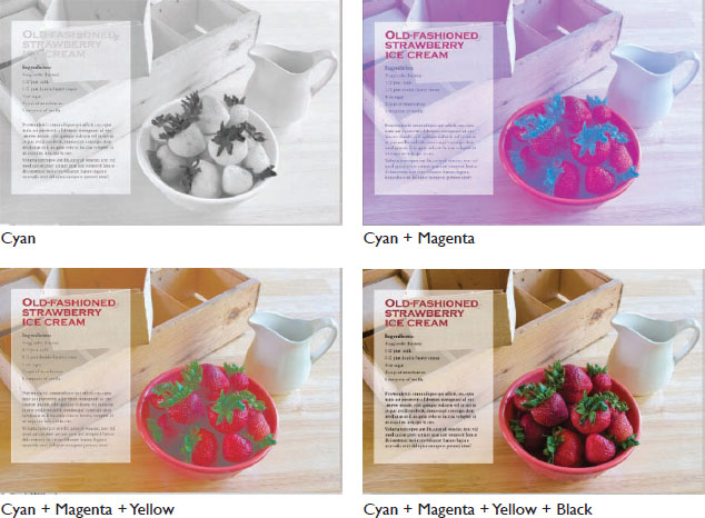
4-color process. In 4-color process printing, cyan, magenta, yellow and black inks are layered to create the final image.

Warning signs. An out-of-gamut warning signals that you’ve chosen a color that won’t reproduce accurately in print.
Adobe product screen shot(s) reprinted with permission from Adobe Systems Incorporated.
In printing, instead of mixing ink colors beforehand, printers use four separate plates to build colors on the paper. Printers separate the colors designed on a document and put each onto its own C, M, Y or K printing plate. The technique is called color separation. Printers apply the appropriate ink color to each of the four plates, and apply each one to paper, one on top of the next.
You can imagine that getting four printing plates to line up precisely for every printed page requires some skill. If the paper wiggles even slightly while on the printing press, color alignments, called registration, are thrown out of whack. When registration is off, the finished piece is blurry instead of crisp.
Printers introduced black ink to the printing process because of registration issues. Most copy prints in black, and type has a lot of fine detail. It’s extremely difficult to consistently line up multiple printing plates to print clean type. Printing process-color black type by layering cyan, magenta and yellow also wastes ink. Why use three inks to print text when one will do?
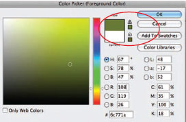
Setting up a document for commercial printing. When you set up a document for CMYK printing, you must save your document and related graphics in CMYK mode. You also need to specify colors within your software program using CMYK builds. CMYK builds are a series of digit pairs that indicate the percentage of each C, M, Y and K that make up a color. Most graphic design applications provide a space for you to specify a build or provide some sort of swatch palette that will generate the proper build for you.
Watch for “out of gamut” warnings when choosing color from swatch palettes. Your monitor can display many more colors than printers are capable of re-creating with ink, and an out-of-gamut warning signals that you’ve chosen a color that won’t reproduce accurately in print.
Four-color process printing is not your only option. Documents can be printed using only one, two or three inks. This process is called spot color printing.
Spot color printing. Instead of trying to build a particular color with CMYK, designers can choose premixed colors from a swatch book. Sometimes called matched color, choosing spot colors is like picking out paint colors from paint chips. Pantone created the PANTONE MATCHING SYSTEM®, sometimes referred to as PMS® Colors, the most commonly used color-matching system for solid colors in the world.
When printing with spot colors, printers create a plate for each spot color the designer has specified. If the job uses two spot colors, only two plates are needed. Three colors require three plates. If a full-color—i.e., 4-color process—design is not required, printing with one or two spot colors is a cost-effective option.
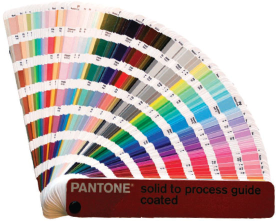
Choosing spot color. When designers choose spot colors, they use a chip chart such as this Solid to Process Guide from PANTONE®. The PANTONE MATCHING SYSTEM® is the most commonly used color-matching system for solid colors in the world.
Setting up a document to use spot colors. If you use one or more spot colors in your document, you must load those colors into your color palette from a preset library. These libraries generally come pre-installed with professional-grade design software applications. If you don’t specify the spot color in your color palette, your printer will print your document as process color instead. This means a more expensive print job. It also means that you won’t get the exact color you chose from the swatch book.
Achieving accurate color is always difficult, and the consistency of spot inks is one of the most compelling reasons to use them. Consistent color is essential when creating and communicating brand identity. For example, the University of South Florida’s official colors are green and gold. USF would prefer always to print its logo matched using PANTONE® colors: PANTONE 343 green and PANTONE 4515 gold or PANTONE 872 metallic gold.
For print jobs requiring both full color and the accuracy of spot color, there are a few options. First, printing is not limited to four plates. A printer can add an additional spot color plate to a 4-color process print job, giving you the best of both worlds. Many printers have 6-color presses capable of printing six plates in one run. It’s possible to print using many more plates, but the more plates required, the more expensive the job.

Specifying color. When reproducing the USF logo in various media, use the following for green and gold respectively:
For spot color printing:
PANTONE® 343 and PANTONE® 4515
For process color printing:
C=100 M=0 Y=69 K=60
C=0 M=8 Y=47 K=23
For Web and screen:
#00573C
#DFD0A5
Another option is to use the 4-color process version of your selected spot color. For each PANTONE spot color, there is a corresponding color build. For example 100:0:69:60 builds USF green, and 0:8:47:23 builds USF gold. Be aware, however, that CMYK builds don’t match their spot color counterparts. They come close, but no banana. If you need 4-color process and accurate spot color, add those spot color plates to the 4-color process plates on press.
For Web applications, USF specifies yet another kind of color system for its logo. That moves us from printed color technology to electronic color technology.
WORKING IN RGB SPACE
Designers who prepare layouts and graphics for the screen work in RGB space. Spot colors and print registration clearly aren’t issues on-screen, but working in RGB has its own set of challenges.
Getting different colors in electronic environments depends on the saturation, or in the case of light “intensity,” of red, green and blue light along with their various combinations. It’s a little like having a dimmer switch for each of the overlapping RGB colors. Simultaneously turning the three dimmer switches to different and varying degrees produces different colors.
For any electronic color, the red, green and blue in RGB each has a numerical value between 0 and 255, whether a color is 0 (meaning off) or 255 (meaning fully on). Black, for example, would be 000 000 000 (or just 000), indicating that red, green and blue are all off. White, for example, would be 255 255 255, meaning red, green and blue are each at full intensity.
Since specifying nine numbers for any and every color is unwieldy, a system called the hexadecimal code mathematically converts these nine numbers into six numbers and/or letters. Let’s skip the math, here, too. Just know that designers specify Web colors by their corresponding combinations of numbers/letters in the hexadecimal system. If every PANTONE® color has a particular number specifying its ink formula, you can think of each hexadecimal color as having a particular set of numbers and letters specifying its light formula.
Going back to USF’s green and gold logo, the university specifies its hexadecimal Web colors as #00573C green and #DFD0A5 gold.
Now, to throw a monkey wrench into the whole setup, computer monitors vary. They aren’t all the same in their quality or even capacities to display color. So USF’s specific hexadecimal Web colors may not look the same from computer monitor to computer monitor, undermining the whole reason for specifying particular colors in the first place.
For designers, this raises two issues: First, on the front end of design, designers make sure their own monitors are color calibrated to ensure the colors designers see on their own screens are indeed the colors being specified.
Second, on the back end of design, designers have to consider the screens of the audiences looking at electronic colors. These audience screens probably aren’t calibrated, and they may not even have the capacity to display a specified color.
To avoid the problem, designers historically have relied on “Web safe palettes” of colors. These colors look fairly consistent across most monitors. However, this palette is limited and (forgive us for saying so) garish. As monitor quality has improved, many designers have abandoned the Web safe palette. However, differences across monitors still do exist so designers are wise to double-check their work on different browsers in different platforms.
Let’s review: For printed color, you can build the effect of full color using 4-color process CMYK. Or, if you need to match particular colors, you would use a pre-mixed ink formula from a swatch system such as the PANTONE MATCHING SYSTEM®. In designing for the screen, however, you switch to the hexadecimal system and RGB additive color.
That concludes the tech portion of this basic color lesson. Time to move on to tips for using color in your own designs.
TIPS FOR DESIGNING WITH COLOR
Choose one main color & add an accent color or two for interest. As the great modernist architect Ludwig Mies van der Rohe said about design, “Less is more.”
Make your color palette work for your communication purpose. Are you thinking contrasting color complements that pop against each other? Or a calmer scheme of cool colors? Perhaps a monochromatic scheme taking advantage of varying tints, tones and textures of one color is just the thing. You also have choices about saturation and value.
Design for visibility & readability. Consider the purpose of the design, as well as the environment in which viewers consume it. An outdoor board requires quick communication in less-than-ideal viewing circumstances. Web site readers skim quickly until they find what they’re looking for. A magazine subscriber may dive into type-heavy articles, where color needs to break up pages of columns of words. Whatever the environment, visibility and readability remain critical.
Visibility and readability. Pair colors with care, especially when placing colored text on colored backgrounds. Color pairings lacking contrast result in illegible copy.

While readability means readers can read it easily, visibility means viewers can see it clearly. Either way, you need contrast. The rule of thumb says stick with dark-on-light or light-on-dark color combos. Unless your purpose is a psychedelic mood, stay away from saturated complements for type and background fill because they create a vibrating effect that’s hard on the eyes.
Mostly, in terms of readability and visibility, think value. Light type on a dark background pops, although we’ve warned you about reversing. Dark type on a light background pops. But dark-on-dark and light-on-light both lack contrast, thus visibility and readability.
Use splashes of color for visual emphasis. Splashes of color, referred to as spot color (not to be confused with spot color in printing), are like cosmetic makeup. Maybe a little red lipstick (or a red ball cap) is all you need to perk up the look. In a literal sense, spot color adds a few well-chosen spots or splashes of color to highlight focal points or draw the eye around the layout.
If your composition is all black on white, using a spot color like saturated orange on the headline, for a drop cap and in a pull quote, for example, breaks up visual boredom and invites the eye to chase the small areas of orange around the page or screen.
Using less saturated tints of spot color to highlight larger areas of the composition is another way to design with color. For example, instead of using saturated orange as spot color, you may opt for diluting that orange down to a soft peach color and spreading it over a bigger area. You even can place sheer tints, of pale peach for example, over dark type without disrupting readability—if you’re careful.
COLOR RULES!
Since we’ve traveled a lot of color territory, let’s map what we’ve learned:
1. For color inspiration, look to the color wheel, nature, culture and history.
2. Think “Christmas, kings and blue jeans” to remember the primaries and their secondary complements.
3. For brightness or intensity, choose pure saturated hues.
4. For pastel tints, dilute with white.
5. For earth tones, dull with black.
6. For contrast, pair:
♦ opposite colors on the wheel.
♦ warm with cool hues.
♦ any hue with gray.
♦ light with dark values (grayscale).
7. For unity, choose analogous colors on the wheel and colors of similar saturation or value.
8. The three main color “languages” for producing color are:
♦ CMYK, building full color from separated layers in 4-color process printing.
♦ PANTONE® (sometimes referred to as PMS®), matching specific colors by ink formula for printing.
♦ RGB, adding color with light using the hexadecimal system for screen.
9. When designing with color:
♦ Don’t go nuts in choosing a palette, whether it’s complementary, analogous or monochromatic.
♦ Design for visibility and readability.
♦ Use splashes of spot color for visual emphasis.
Most important, don’t forget to use color to create impact, organize what goes with what and get the emotional juices flowing.

Visual impact. A splash of bright pink in an otherwise black and white layout instantly becomes the focal point.

For contrast, pair opposite (complementary) colors on the color wheel.
![]() TRY THIS
TRY THIS
1. Collect printed pieces in which color is a crucial element of the design. You can collect ads or stories from magazines and newspapers. Collect rack brochures, direct mail pieces, take-out menus, candy wrappers, shopping bags, fast-food wrappers—anything printed.
Write a short paragraph about each, describing why the designer chose that color for that piece. Is the color about history? Emotion? Culture? Does the color wheel play a role in selection of the main or supporting colors?
2. Find three pictures demonstrating different cultural meanings for the same color. For example, find three pictures each using the color red to communicate a different symbolic message.
3. Imagine you must brand a new restaurant. Name the restaurant. Then go outside to find a color palette inspired by nature. Take some photos of your color inspiration. Use your design software’s color functions to match your nature-inspired palette.
4. You’ve been hired as the art director for a new musical play set in the 1990s. Suggest a historical color palette for the production’s overall design, and justify your recommendation with some graphic evidence.
PANTONE® and other Pantone trademarks are the property of, and are used with the written permission of, Pantone LLC.