
Being a graphic designer is like being a tour guide. A guide organizes the tour. A designer organizes the layout. Both welcome visitors at a clearly marked starting point to lead them on what is hoped will be an engaging path from start to finish.
Layout is the arrangement of visuals and type in space to compose your design. The layout is the journey visitors take through your grid and the scenic views they get along the way. For the designer-as-tour-guide, it’s a matter of deciding which layout route to lead folks through and what sights to show along the way.
In this chapter we share some theories and practices graphic designers use for guiding interesting layout tours.
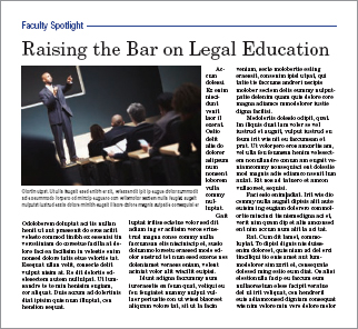
Start with a focal point. Your focal point is the visual starting point for your layout. It can be a strong photograph, illustration, type element or combination of the three.
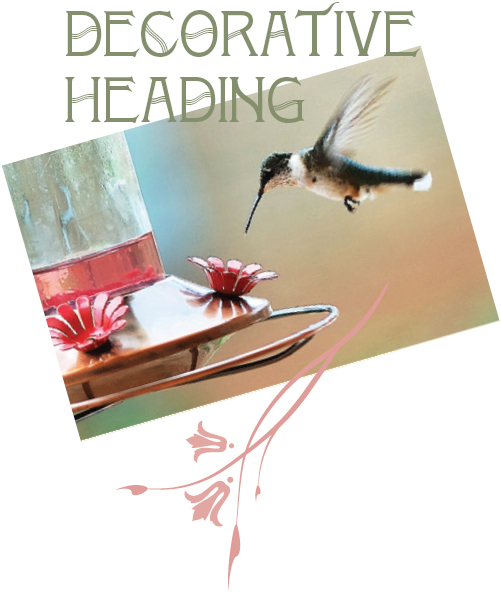
Photo reproduced by permission of Cliff Keller.
HOW DO I KNOW WHERE TO PUT STUFF?
Layout begins with thumbnail sketches, and the first thing you sketch is the grid. Gridlines should indicate a proportional outline of the format and include margin lines, column guides and any other gridlines as necessary or desired. Once your grid sketches are in order, you’re ready to add the first layout item: the focal point.
Create a focal point. To return to the touring analogy, your focal point is the equivalent of a big sign that says, “Really amazing stuff starts here.” It’s the thing on your layout that captures the visual tourist’s interest in the first place.
Usually the focal point is a visual of some kind. But not all visuals are suited to be focal points. Look for focal-point-worthy visuals such as photographs with strong composition, line, shape, color or interesting angle. Type treatments also may serve as focal points. The key to typographic focal points is contrast by some element of design: space, line, shape, size, pattern, texture, value or color.
Once you select a focal point, you have to decide where to put it. The works-every-time layout hangs the focal point from the top of the layout. But knowing a little design theory gives you other options. So let us introduce you to the golden proportion and the rule of thirds.

The golden proportion. The golden proportion is a ratio: 1: 1.618. When applied to a golden rectangle, it becomes a kind of compositional grid suggesting asymmetrical placement of items on the layout.
The golden proportion. The golden proportion is really just a ratio: 1:1.618. Mathematicians and scientists are as enamored with the golden proportion as artists and designers of all kinds are—and have been for centuries. Sometimes called the divine proportion or the golden ratio, it has been invested with divine, even magical, properties.
What makes this proportion special is its mathematical principle: the ratio of a to b is the same as the ratio of b to [a + bj. For our purposes, it looks like this: Draw a perfect square. If you increase the perfect square’s width by multiplying it by 1.618, you create what is called a golden rectangle. You’ll find golden rectangles everywhere in art, architecture and design.
Leaving the math aside, artists and designers like the golden proportion because when applied to shapes like rectangles, triangles and even spirals, it seems to produce a universal visual aesthetic appeal.
The golden proportion applied to a golden rectangle becomes a kind of compositional grid suggesting asymmetrical placement of items on the layout.
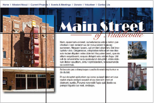
The Rule of thirds. The designer of this Web site used the rule of thirds to determine the main heading placement.
In fact, a golden grid uses the golden ratio to establish an irregular 3 × 3 grid on the golden rectangle. And that leads us to the rule of thirds.
The rule of thirds. For the mathematically challenged or uninterested, the rule of thirds will seem wonderfully simple compared to the golden proportion. Like the golden proportion grid, the rule of thirds is merely a 3 × 3 grid that suggests layout placement in order to create visually interesting asymmetrical designs.
The rule of thirds simply divides the layout—whatever its format—into an evenly spaced 3 × 3 grid. Then the focal point goes on one of the four gridline intersections. Voila, pleasing asymmetry guaranteed.
Another way to think about the rule of thirds has to do with symmetrical and asymmetrical balance. If we associate symmetrical balance with the number two, as in two symmetrical sides of a bisected layout, then the quickest route to asymmetry is to work with the number three, as in a 3 × 3 grid.
WHERE DO I PUT THE REST OF MY STUFF?
Once your focal point is in place and ready for attention-grabbing duty, the layout must direct viewers to the next important item, typically copy.
Adding type. Type placement begins with inserting the main copy and any nondecorative headlines before adding other typographic items such as cutlines and tags. Depending on your format, type may comprise a little or a lot of your layout. Whichever it is, let your grid and your gridlines guide the placement of type.
Once you decide where on the layout to place the type, you can style it in an appropriate font, size and color. Make sure you haven’t forgotten any type items. Adding a missing cutline or subheading after the fact can throw off an entire layout.
Use the other type tips you know, too:
1. Keep your headline and your lead together.
2. Reduce leading as needed on multiple-line headlines.
3. Set copy in columns to keep long copy reader-friendly.
4. Avoid fully justified or centered type.
5. Watch for inelegant breaks in headlines or legs of type.
6. Avoid widows and orphans (lone words at the top or bottom of columns).
Placing visuals in your layout. In addition to the focal point, you may have other visuals to include on the layout. And, you guessed it, there are rules for that, too.
1. Place visuals near the top of the layout. Positioning photos near the top of a layout is particularly important. Photos are eye magnets, and when they appear at the bottom, they immediately draw the eye to the bottom and right off the screen or page. Viewers will skip or miss that important information you’re trying to convey on the rest of your layout. Does this mean you can never put visuals at the bottom of a layout? Nope. But…
2. If your picture has direction, be sure it’s pointing in the right direction. We tell students:”Pictures are arrows. Be sure you’re pointing in the right direction.” If a photo or illustration has a strong direction, such as a particular line’s movement or a face looking in a particular direction, make sure that direction is pointing to the accompanying type or whatever else comes next along the intended visual tour of the layout. Don’t position your visual to point right off the screen or page if that’s not where you want the viewer’s eye to go.
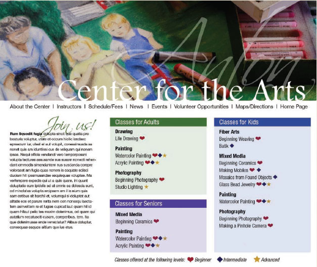
Embedded photo reproduced by permission of Kristin Arnold Ruyle.
WHAT IF THE COPY ISN’T AVAILABLE YET?
This is a classic chicken-and-egg dilemma. Ideally you want all the copy available before you begin your layout. Maybe, however, the boss or client needs to see a layout before you get the copy. Maybe the writers can’t start writing until they know how much space to fill on the layout.What can you do when you can’t produce a layout without the content, but you can’t get the content without a layout?
Greek text. Sometimes Greek text, meaning stand-in copy, is your best solution. Most professional-grade layout software programs offer some kind of Greek text, which are basically placeholder words.They read like gibberish, as in,”It’s all Greek to me.” The dummy words may be in English, or they may be fake Greek.”Lorem Ipsum” is the ubiquitous phrase of Greek with no meaning. Because Greek text can be formatted like normal copy,”greeking” offers a temporary substitute for the actual copy. This enables you to proceed with planning your layout.
Above: The story at left displays several “don’ts,” including a much-too-skinny column to the right of the image and a photo placement that separates the headline from the start of the text.
Below: Ahhhh, much better.

3. Flipping photos is a bad idea. You may be tempted to “flip” an image that happens to point the wrong way. Flipping photographs is not acceptable in news design—ever—and though it can be done in marketing and advertising pieces, it can get you into trouble. Never flip a picture with text, for example, for what we hope are obvious reasons. Flipping photos of recognizable people may result in also flipping distinctive facial features. Flipping is just plain dangerous.
4. Don’t position a visual where it interrupts the flow of reading. Don’t interrupt the flow of reading copy by placing a visual where it chops a line or a column of type in half. Another common mistake is to place a visual between the headline and the lead. Floating a visual in the center of a column without anchoring it to the gridlines is another common mistake causing unhappy results.
5. Pay attention if you’re “wrapping” text. When you wrap text around a visual, make sure you don’t end up with text columns that are too skinny, leaving you with only one, two or three words per line of type.
When using multiple visuals…
1. Variety or uniformity of size? When you’re using more than one visual, make them different sizes—and don’t be shy about the size contrast. The most important visual should be the largest. The contrast of sizes is more visually interesting and helps establish visual hierarchy.
However, just to contradict ourselves, sometimes an interesting grid arrangement of visuals of the same size makes a nice rhythmic pattern. But the rhythmic grid pattern sacrifices asymmetry and visual hierarchy Whatever you decide, call it with a visual communication purpose,
2. Balance, please. If you have multiple visuals on a single screen or page, position them for overall layout balance. Avoid lopsidedness. Imagine you’re loading people into a small boat. What happens if everyone sits on the same side?
On the other hand, it is acceptable to cluster groups of images together. A cluster of multiple images becomes a single visual element in your layout.
3. Mug shots. If you’re working with multiple headshots, called mug shots or mugs, make all the heads roughly the same size. To align headshots, try cropping to align everyone’s eyes.
Where to put negative space. We trust that by now you understand that white space is not your enemy. In fact, negative space is the best tool in your design toolbox for isolating and highlighting important content. It organizes by separating items. Without it, there can be no sense of clumping. Negative space also provides a visual respite for the viewer to avoid visual overload. But even negative space has layout rules.
First, try to consolidate many small puddles of negative space into fewer larger pools. This reduces visual clutter in exactly the same way as clumping positive layout items does. Same principle.
Second, avoid trapped space. Trapped space is a conspicuous chunk of white space isolated in the interior of the layout. If you have trapped space, rearrange the layout so the white space opens to the margins.

Using multiple visuals. When placing multiple visuals, position them for overall balance. Image size contrast creates pleasing asymmetry.
Do leave some negative space, but don’t let it get trapped. Make sure it opens to the outer edges of the layout.
The brain automatically and unconsciously simplifies, arranges and orders objects the eyes see.
You’ve got a grid, a focal point, a headline, some copy and maybe an extra visual or two. So far so good. But not necessarily an exciting visual trip to write home about. A little Gestalt Theory may be just the thing.
Gestalt theory. In the early 20th century, a group of German psychologists studied the way the human brain perceives objects. Die professoren discovered that the brain automatically and unconsciously simplifies, arranges and orders objects the eyes see. Specific patterns of perception emerged from the research, which became the Gestalt Laws. Four of these laws are of particular interest to designers.
1. Proximity. We perceive objects that are close together as belonging to the same group. A related law, the law of Common Fate, says that we perceive objects moving in the same direction as part of the same group. On the left, we interpret one group of circles. On the right, we interpret two groups of circles. The ability to group content aids in creating organization and order in layouts.
Placing elements in proximity to one another goes back to clumping. The idea is to avoid a busy cluttered layout by physically grouping items together that belong together.

2. Similarity. Our minds group things with similar properties, such as color or shape. “Like goes with like.” In this example, we group squares with squares and circles with circles. In layout, we can use similarity to create order and organization through unity.

3. Continuity. Our minds will continue a pattern beyond its ending points. Further, our eyes will follow the direction of a line. On the left, our minds see a single cross shape instead of four shorter converging lines. On the right, our eyes follow the direction of the As swoop and continue on to the star. Applying this concept can add a sense of direction and movement to your layout. Ergo, flow.

APPLIED GESTALT
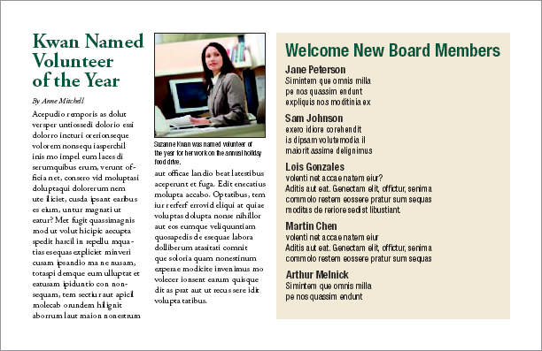
Proximity. This Web page includes a visual, navigation text, a headline, some body copy and three different lists. That equals seven different things viewers have to scan. But using proximity to group the visual with the headline and the navigation and then clumping the three lists together reduces the number of areas to scan from seven to just three: a clump in the header, the body copy and a clump of lists.
Similarity. Similarity dictates that every navigation item be typeset in the same font and color as every other navigation item. That similarity among navigation items signals readers that each item is part of the same cluster of navigation options. Similarity also produces unity through making the three lists look alike.
Continuity. The “J” in “Join us” points to the lead of the body copy. Our eyes also follow the invisible gridlines tying screen elements together both vertically and horizontally. The top of the body copy lines up with the top of the boxes listing classes. This draws the viewer from one element to the next.
Closure. The headline “Center for the Arts” is not composed of letters. The words actually are letter-shaped holes punched out of the visual image. Our brains mentally close the gaps and allow us to read those shapes as words.

Visual hierarchy. Varying the size of headlines gives a sense of visual hierarchy to even the most text-heavy layouts.
Reproduced by permission of USF Health.

4. Closure. We mentally fill in the gaps in order to complete a perceived shape. In this example, we see a star shape even though there is no star outlined. The idea of designing with only a part but having your viewer perceive the whole opens up interesting compositional opportunities, including the interplay of positive and negative space. How cool is that?
Applying Gestalt principles can help control the viewer’s journey through your design. Visual hierarchy tells viewers what’s important along the way.
Creating hierarchy. Creating visual hierarchy with relative position and contrasting size is another way to draw a reader through a layout while delivering an extra layer of communication. The hierarchy tells viewers what parts of the layout are more important than others and to look at the important things first.
To create visual hierarchy, rank the items intended as layout content in their order of importance. Your most important item, usually a key visual or a headline, becomes the focal point. A position near the top of the layout gives an element importance. Larger size also imparts greater importance. Visuals and type of lesser importance appear in smaller sizes and lower positions on the layout
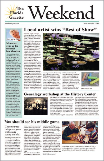
One of the best places to observe visual hierarchy in action is on the front page of a newspaper, either print or online. The lead news story always has the biggest photo, the biggest headline point size and occupies the catbird seat at the top of the page. Graduated headline sizes draw the reader down through the page like steppingstones.
Visual hierarchy applies to newsletters, Web pages, annual reports and any other document that includes multiple stories or chunks of discrete information.
LAYOUTS WITH MULTIPLE TOPICS ON THE SAME SCREEN OR PAGE
Up until now we’ve been dealing primarily with single-topic layouts. But what if your layout must accommodate multiple smaller stories or other items on the same page? Web sites as well as print and online editions of newspapers, magazines and newsletters all require the orderly layout of multiple stories on a single print or electronic page, or across several pages,
Modular page design. The current trend for newspapers is modular page design. In modular page design, each story is arranged into a rectangle, and the rectangles are arranged on the grid of the page. Modular page design is also used in magazine and Web page design.
Making a rectangular story. At a minimum, a story includes a headline and some body copy. Sometimes there is a subhead called a deck between the headline and the lead. Between the deck and the lead, a story also may have a byline identifying the journalist or author. Many stories also have a photo or visual of some kind along with an accompanying cutline.
Think of it this way, each part of the story—visual, headline, body copy—represents a new rectangle you have to fit into your rectangular story, which will fit into your grid of rectangles on your rectangular screen or page. It’s just like a puzzle.
For each individual story, keep the eye flow moving in the correct direction and in the intended order. The ideal eye-flow order is visual, headline, lead. Otherwise, here are few more helpful hints:
1. Body Copy: Strip the story’s body copy into the grid columns. Keep the lengths of the story’s legs even until you run out of story. More than 10 inches per leg is too long. Less than two inches is too short. So is yours a one-column or five-column story?
2. Headline: Add the headline on top of the story. The headline should span all the story’s columns, sort of like a roof covering the story. Give the headline a much larger point size than the body copy.
3. Deck: If there is a deck, put it under the headline but before the lead. Give it a point size smaller than the main header but larger than the body copy.
4. Byline: If the story merits a byline, put it between the deck and the lead. Give it a tastefully modest point size.
STORY SHAPES FOR MODULAR LAYOUTS
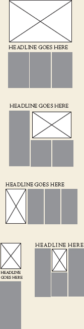
The modular page. Stories fit neatly into the page grid because of their rectangular shapes.
5. Visual/Photo: Where you place the visual really depends on the size and direction of the image. As a rule, though, keep photo placement near the top of the story. It’s that eye magnet thing. Think works-every-time layout. But a visual as focal point can sit under the headline, or to the right or left of the headline, as long as the visual does not sit between the headline and the lead. In other words, never put a visual between the headline and the lead. Ever. If the image has direction, it should point to the story. “Pictures are arrows…” Wherever you put the visual, and at whatever size, remember you’re trying to end up with a rectangular story.
6. Cutline: Cutlines typically, but not always, go under the visual. A cutline under a photo should run the whole width of the photo.
Placing your stories on a modular page. Unfortunately, laying rectangular stories on a modular page is not as easy as we may have led you to believe.
If you build all your stories in the same size and shape and then just stack them on top of each other, you’ll have one snoozer of a page. To keep things interesting, you need to vary the size and orientation of your stories. For asymmetry, make some stories tall, narrow and vertical. Make others wide horizontals, and maybe even design a few that are square.
At the level of organizing a whole page of stories, you also need to take a look at all the stories’ visuals. Varying their size and placement on the entire page creates interest. Newspapers like to average about a third of a page devoted to visuals. Whatever your percentage of visuals, you still have to watch out for lopsidedness at the page level. Don’t tip the boat over. Balance is necessary even for asymmetry.

Troublesome headlines. “Tombstoning,” when two headlines are positioned side-by-side, is a potential pitfall of modular page design. In the top example, the headlines run together. In the example below, the designer solved the problem by placing the photo between the headlines and using an alternative headline style.
Your goal is an overall page eye-flow guided by the placement of all the stories’ visuals. The eye moves from one image to the next in a particular order according to the visual hierarchy.
Add visual variety to a page with a sidebar. A sidebar is simply a separate block of type with a solid background, a stroked outline or an ample border of negative space. Sidebar content relates to its adjacent copy in some way. A sidebar might be a short connected story, a list, a mini biography, a quiz or simply further detail on some aspect of the main content. Normally though not exclusively rectangular in shape, sidebars fit beautifully into modular layouts.
A SIDEBAR ON DESIGNING SIDEBARS
Sidebars are a good option for:
 Breaking up text in the absence of good photography
Highlighting key information lifted from your text
Providing additional information related to your adjacent copy
Adding interactivity when presented in the form of quizzes or lists
Giving your page a little pop of color
When designing sidebars:
Make them contrast with your regular copy by using a different font
Give them a little color with colored bullets, headings, a border or a background box
If you use a border or background box, make sure your text doesn’t crowd the box. Give yourself ample margin, inside and out
While there is very little actual design to a sidebar except for the enclosing box, the visual effect can break up long copy and add life where you don’t have as many visuals as you would prefer. Like good cutlines, sidebars provide a bit of information in nice compact quickly readable chunks.
When designing sidebars, one of the biggest mistakes beginning designers make is neglecting to include margins outside and inside the box. Don’t cheat your margins. No type should touch the sides of the sidebar, either outside or inside its box.
Sidebars add pops of color, too. Consider adding color to the headline or bullets. Or you might put your color in the box’s background (the fill) or the box’s outline or border (stroke). If you choose a background color, don’t forget the contrast you’ll need between the fill color and the type. If you believe you need to reverse the text, white letters pop best against a dark background.
MULTIPLE-PAGE LAYOUTS
Laying out multiple pages, whether print or electronic, presents some additional challenges. Three biggies include maintaining unity, making a lot of type inviting and providing navigational signs to keep readers from getting lost.
Visual Unity. To maintain visual unity in a multi-page layout, use the same tactics as for a single-page layout. Don’t change from a tuxedo to cargo shorts from one page to next. Use a dash of Gestalt through similarity: Keep repeating compositional elements such as color, shape, texture and pattern. Consistent font styling also provides unity. Using the same grid skeleton on every page is essential, too.
Loads of type. Page after page of gray type is intimidating. To break up any copy-heavy design, including one with multiple pages:
♦ Use a grid and set copy into inviting legs of type.
♦ Break up type with headlines and subheads.
♦ Add more visuals, including sidebars.
♦ Deploy negative space strategically.
Navigational Signs. In a multiple-page layout, visitors need visual signposts to be able to keep track of their whereabouts. Traditional navigation tools include, for example, tables of contents, teasers, jump lines pointing to where the rest of the story jumped and even logos or the journalism equivalent of logos called flags and sigs (short for signatures). For interactive media, navigation and multimedia controls and menus help visitors move through content, and they should be consistent (have similarity) across pages.
A periodical or serial such as a magazine, newsletter or newspaper—print or Web—needs a folio showing the publications name and issue or date. Folios in hardcopy editions also need page numbers. Folios generally appear somewhere in the margins, though still within the safe area or live area.
EXIT HERE
Remember, good layout works for, not against, your visual communication objectives: capture attention, control flow, convey information and evoke emotion.
Begin the layout with a grid and an irresistible focal point. Use the focal point to point to, not from, your layout. The Gestalt of proximity, similarity, continuity and closure can help with arranging the layout’s flow. Creating a visual hierarchy also aids flow.
For multiple layouts on the same screen or page, modular design is your new best friend. For laying out multiple pages, similarity is the key to visual unity.
Thank you for traveling with us today. Please wait until the chapter has come to a full stop before exiting.
You are here. Multiple-page layouts need navigational devices such as page numbers, folios and tables of contents. Web pages need persistent navigation so visitors can find content as well as find home at any time and from any location.
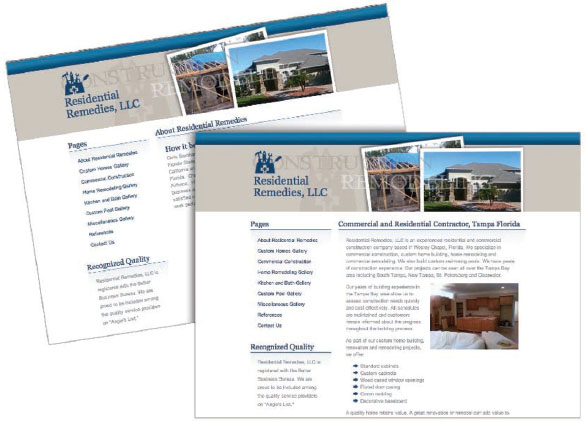
Reproduced by permission of Residential Remedies, LLC.
 TRY THIS
1. Collect several examples of layouts including Web pages, newspaper pages, advertisements and others. How many of the designs use the rule of thirds? How many of the designs use the golden rectangle?
2. Find an example of a magazine ad that uses a horizontal visual. Redesign the ad using a vertical visual instead.
3. Collect examples of logos that demonstrate the four Gestalt laws—proximity, similarity, continuity and closure. Explain how your examples utilize each.
4. Acquire copies of your local newspaper. Can you tell which story is the most important on each page? What layout techniques convey this information?
5. Using the same newspaper, look at the story shapes. Does your newspaper use modular page design? Do the headlines span all columns of their respective stories? If not, what are the other headline treatments?
6. Assemble several samples of your own writing. It doesn’t matter what these files or documents say; treat them as Greek text. Now create thumbnail sketches showing how you would arrange each of these “stories” into a two-page newsletter using modular page design. Execute your design in the page layout program of your choice.