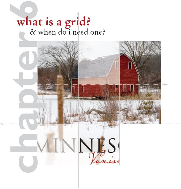
A grid is a series of horizontal and vertical lines charting out an area. You see a grid every time you read the newspaper, look at a Web site, unfold a map or watch a football game. Graph paper is nothing more than a grid. Latitude and longitude form a grid of the planet.
In graphic design, you need grids for complex or multiple-page layouts to give their designs unified cohesive skeletal structures. In addition to Web sites and newspapers, magazines, newsletters, brochures and advertisements all use grids. Even the columns on a works-every-time layout count as a grid.
Think of grids as a framework composed of columns or even squares and rectangles that improve the layout’s composition and make your job easier. Your grid helps you organize items on your layout. Gridlines guide your decisions about grouping and aligning visuals, type and negative space.
In this chapter we cover grid vocabulary and the process of designing a grid. Then we show how “breaking the grid” can add visual impact.

Using a grid. An example of a Web page that uses a two-column, two-row grid structure.
GRID VOCABULARY
Format. To begin any layout, first establish the edges of the page, whether print or screen. The edges of your page are effectively your base gridlines. There are standard sizes for many formats that help you determine what your layout width and height should be. For instance, the standard business card is 3½ × 2 inches, and many Web pages are 800 × 600 pixels. In any case, your format will dictate the type and placement of the other gridlines you’ll need for your project. By the way, in design dimensions, the first number refers to width, and the second, to height.
Margins: header, footer & thumb space. Another common set of gridlines indicates the width of margins on all four sides of the layout. The top margin is the headspace or header, and the bottom margin is the foot space or footer.
In a single-page layout, the side margins are simply left and right margins. However, when a layout includes a spread—two pages side-by-side—the side margins become inner and outer margins. Whether they are in a single page or part of a two-page spread, outer margins become the proverbial thumb space.
Margins need not be the same size on all four sides. For example, you could have a 2-inch top margin and 1-inch inner, outer and bottom margins. But if your layout has multiple pages or screens, maintaining a consistent margin setup across all your pages adds visual unity.
Establishing format gridlines and margins is the essential first step in creating your layout. But there are other types of gridlines you may need to add to your design sketches, such as bleed, live area/safety area and trim size.
Trim size. In commercial printing, trim size refers to the physical dimensions of the flat page. In many cases trim size corresponds directly with format size. The trim size of a traditional U.S. letter is 8½ × 11 inches, for example. However, consider a more complex piece such as a pocket folder. While the finished size of a pocket folder is typically 9 × 12 inches, a pocket folder at the printing stage is much larger. The width doubles, and the height increases by the size of the pocket. When designing complex print pieces, you need to add gridlines to indicate trim lines and folds. Without them, you might find yourself with backwards brochure panels and upside-down pockets.
You might expect that you have every square inch or pixel of your trim size or screen to fill with your design elements. You’re right—and wrong.
Bleed. Running page content right to the page’s edge is called a bleed. The effect is to bleed material—background color, visuals, type—right off the layout. Bleed lines and trim lines go hand in hand. To create a layout with a bleed, a designer makes the bleed content extend just beyond the trim size. Commercial printers take the slightly extended design, print it to a larger sheet of paper and trim the edges to achieve the desired finished size. This is where the term trim size comes from, by the way. Establishing bleed lines as part of your grid helps you ensure that your printer can properly trim your printed piece.
Print content may bleed or not, depending on the designer’s preference. Screen content, however, always bleeds. Even when the content of Web pages, video or commercials stops shy of the viewing device boundaries, something—typically a solid color—fills the rest of the screen. Make a point of choosing that something to fill this space, preferably a something that complements the rest of your design.

Above: A single page with margins.
Below: A bleed line (pink) usually sits  inch beyond the trim line (black). To prevent unintended cropping, keep content inside the live area (yellow).


The space between.
Above: Two pages, side-by-side with live area (yellow). The space between the live areas is called the gutter (green).
Below: Detail of a two-page spread showing alley and gutter.
Bleeding background pattern, texture or image can be effective. However, there are some types of content that should not bleed. Do not bleed tag content, such as logos, phone numbers and URLs, for example. This is where live area becomes important.
Live area & safe area. Live area or safe area is like a safety fence inside the boundaries of your paper or screen respectively. Content you place inside the fence will print or appear on screen as intended—nothing will be cut off or fall outside the viewing area of the screen. Any content falling outside of the live area may be cut off. You may have experienced this disappearing act watching made-for-big-screen movies on a traditional standard TV screen. Whole chunks of the original film’s sides are cropped off in order to make the film’s height “fit your television screen.” Or, if the movie has been letterboxed, you experience the original wide-format film with wide black borders of negative space on the top and bottom of your TV screen.
Live area is particularly important for printing documents that will have bindings. Visuals and text placed outside the live area may fall into the fold or be cut off when the printed design is trimmed. The audience won’t be able to see, much less read, your content.
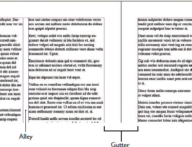
Column, alley, gutter. in creating inviting readable columns for type, space unoccupied by type is also important to overall readability. An alley is the negative space between a layout’s columns. We mostly associate columnar grids with news design such as magazines, newspapers and newsletters, but Web pages, collateral materials and copy-heavy advertising also use columns. In each instance, alleys keep columns of material from running together.
A gutter is the oversized margin between two facing pages, such as a newspaper’s fold or a magazine’s binding. The gutter is where the bindery puts the staples in a multi-page print newsletter. Think of gutters as double margins because they include the right margin for the left-hand page and the left margin for the right-hand page.
Just to make things confusing, there is some interchangeability between the terms gutter and alley. Some desktop publishing software programs may refer to the alley as the gutter.
Grid unit or module. In addition to vertical columns, a grid may be divided into rectangles or squares, called grid units or modules. These modules may or may not be separated by alleys. While we think of grids as having uniformly sized units or modules, non-uniform asymmetrical grids are fairly common. Such grids encourage the creation of asymmetrical design, and asymmetry is visually interesting.
CREATING & USING A GRID
Designing a grid is not rocket science. Don’t make it complicated. The whole point of having a grid is to simplify your design and layout job.
Grids absolutely should be part of your thumbnail sketches. Start with the type of project you’re producing. The project format may suggest a basic grid structure. Tabloids often utilize a four- or five-column grid, while Web pages commonly use a two- or three-column grid with a header that spans all columns.
Next, consider the content you have to fit on your grid. Do you have a lot of copy or only a little? Select the number of columns and their width to facilitate easy reading. If your task is to design a multiple-page layout, whether paper or digital, how many pages do you have to work with? A light airy design with a lot of negative space is likely to require more pages.

Grids are not just for graphic designers. Fine artists sometimes grid roughs of their compositions to help them reproduce their work in the correct proportions. Each grid unit or module becomes its own small “picture” in relation to the others. This type of grid process is especially helpful in translating the proportions of small compositions into large-format visuals such as murals.
For television, film and computer screens, aspect ratio refers to the ratio of screen width to height.
Various ratios of width to height are standard for different media. Big-screen Hollywood film uses a horizontal format (roughly twice as wide as tall), and traditional standard TV used a slightly more square-ish format.That’s why big-screen Hollywood films have had to be cropped for standard TV viewing, unless they were letterboxed, meaning they were reduced and floated in negative black space. (Either way, cropped or letterboxed, you’ve never seen a warped movie on TV.)
So, for example, regardless of the size of your more contemporary wide-screen TV in inches (measured diagonally from corner to corner), the ratio of its width to height will be 16 units wide by 9 units tall—or 16 to 9. That aspect ratio is expressed as 16:9 or 1.78:1. Your old standard TV had an aspect ratio of 4 to 3, expressed as 4:3 or 1.33:1.
Computer monitor aspect ratios may vary. But they generally have followed television’s lead, with standard aspect ratios of 4:3 and wider formats at 16:9.
The concern with aspect ratio is because you can’t design a square composition and expect it to fit a rectangular format. This becomes especially problematic in planning and composing such things as television commercials, training videos, multimedia Web sites and even business presentations employing projected computer screen slides.
Aspect Ratios:
U.S. Standard TV and Computer Monitor 1.33:1
U.S.Widescreen TV and Computer Monitor 1.78:1
U.S. Cinema 1.85:1 or 2.35:1
Most 35 mm Film and Digital Still Photography 1.5:1

Standard Definition (SD) TV (4 × 3)

HDTV (16 × 9)
More pages equal greater expense. Will your budget allow this? Or is your task to squeeze 10 pounds of stuff into a 5-pound bag?
You also have to consider your visuals. High-impact photos look great covering the page, but lackluster visuals are best kept small. Detailed charts and graphs, however, become illegible if crammed into a too-small space. Sizes of visuals impact your page count as well as your ability to copyfit, and you should design your grid accordingly.
Your grid starts with your layout boundary. At this point, you know to start your thumbnails by drawing the outer edges or boundaries of your layout. Remember to draw your sketch in proportion to your design’s final format. Proportion is essential. You can’t fit a square peg in a round hole, and you can’t fit a horizontal ad in a narrow vertical magazine column. In the world of screens, the concept of proportionality is known as aspect ratio. To keep your sketches in proportion, we recommend the use of graph paper. It helps.
Depending on the format and the project, you may need more than one sketch. You may need thumbnails for a front cover, for inside spreads, for a back cover, etc. Begin with the cover or home page because they always set a design’s overall tone for the audience.
Next add margins. Don’t forget to account for live area. For example, a typical live area for print advertisements is  -inch in from the trim size. But in many cases -inch is too stingy for a comfortable visual margin.
Certain types of binding, such as three-ring and spiral binding require extra gutter width to accommodate the binding. Perfect binding, with that square spine we see on larger magazines and hardcover books, eats up margins in the gutter and can eat right into your design.
You probably don’t want your layout to feel crowded or claustrophobic. Allowing ample margins ensures some negative space in even the most type-heavy design. There’s no hard, fast rule for this, but we recommend a minimum of ½-inch margins on a multiple-page heavy-copy project. At the least, however, account for the live area.
Then add columns & other guides. When determining how many columns you comfortably can work with, take a cue from newspaper design. For maximum readability, columns should be at least two inches wide. So do a little math: From the width of your page, subtract the left and right margins plus a little more for your column alleys, and then divide by two. This should give you a number that’s close to the maximum number of columns you can use on your page.
If you translate your pixel measurements into inches, this trick works for establishing Web columns, too. Just multiply column width by Web resolution, which is 72 dpi. Two inch columns become 144 pixel columns. Or, if your Web columns are to vary in width, make sure your particular column width will accommodate the desired content. For example, if you design a column on the left to house your navigation, make the column wide enough to fit the link with the longest name.
Now, you are under no obligation to use the maximum number of columns. Beginners may choose to employ fewer columns to simplify things. However, more columns actually offer more flexibility in the overall design. In any event, go with your comfort level.
SKETCHING A GRID

Start by drawing a bounding box in the shape and proportion of your document.

Add margin lines as needed.

Add column guides suitable for your page size and other grid lines as needed.

Embedded photo © Catalin Petolea - Fotolia.com
A custom grid based on dominant artwork.
The grid here starts with the standard document boundary and margins, but all other lines are based on the shapes, lines and elements suggested by the art itself.
Since we look at art first, and our eyes are drawn to the people’s eyes, this is a great place to align a key headline.
The content of the image, in this case the visual weight of the boy’s head, helps determine the positioning and alignment of the text block below.
After vertical columns, you also may add horizontal guides as needed for the design you envision. Perhaps you want to create distinct top and bottom portions of your design. You can add a horizontal line right in the center to help you lay out your design elements. Or perhaps you want to try a more complex grid structure of modules. You can thumbnail horizontal guides to make any combination of grid units.
Now sketch in visuals, headlines & type. With your grid established, you’re ready to experiment with layouts by making everything line up with the margin and column guides you created. Don’t float anything in the layout without anchoring it somehow to a gridline. That’s the beauty of a grid. It takes the guesswork out of positioning type, visuals and negative space.
Don’t feel obligated to fill every square inch (no pun intended) of your grid structure. Remember, white space is not your enemy. Negative space has visual weight and keeps the layout from feeling too crowded. It also helps isolate and emphasize the more important stuff, namely your type and visuals. You even can fill whole units or modules with negative space. Do try to hook what seems like extra negative space to the outside edges of your layout next to your margins to avoid trapped negative space.
After doing some thumbnails, you may decide to modify your grid. That’s fine. It’s your grid. It’s your design. You are master of your grid universe.
OTHER APPROACHES TO DESIGNING A GRID
A different approach, more suited to single-page designs such as posters, advertisements, postcards and flyers, is to let your main visual or artwork suggest a grid structure.
This technique starts as before, with a layout outline and margins. Next, sketch in the dominant visual. Then let that visual’s compositional elements such as lines and shapes guide a sort of grid structure of vertical and horizontal lines to position headlines, body copy, etc., for maximum attention-getting, eye-flow and information-conveyance.
This method really makes you use your eyes to look carefully at how your visual, for example a photo, seems to point to where everything else should go on the layout.
Another variation on this approach examines the sizes of both the largest and smallest visuals you want to place on the layout relative to the overall dimensions of the layout itself. Then, after establishing your margins, divide the page into the maximum number of columns or units possible according to the size of the smallest visual.
As an example, let’s say you have two photos to work into your layout. Let’s assume one photo is roughly two-thirds as wide and two-thirds as tall as the live area.”Thirds” suggests a 3 × 3 grid, dividing the page into three columns across and three units down. But the other smaller photo is roughly one third as wide and one sixth as tall as the live area. “Sixths” suggests a 3 × 6 grid—three columns wide by six units tall. Since going with the maximum possible number of grid units offers the most layout flexibility, you establish a 3 × 6 grid.
BREAKING THE GRID
Sometimes you can shake things up by breaking away from your own grid. You might do it to capture attention or evoke emotion. Either way, breaking the grid is a way to surprise your audience with something unexpected.
Bleeding items such as a headline or a visual off of the grid and into the margins is a common way to break the grid. Or you may decide to stretch or condense a portion of your grid so that, for example, one column or one row of units is not uniform with the rest of the grid. You also can break the grid by tilting or rotating an item, a photo maybe, on the grid. A less common way to break the grid is to tilt or rotate the entire grid on the page or screen.

Photo © Catalin Petolea - Fotolia.com
Hanging your design elements out to dry. Clotheslining is a technique where you line up items of unequal height along their top edges.The effect is that of elements hanging off of a clothesline.
In the example below, design elements are clotheslined across a single page with a four-column grid.
By leaving the bottom edges purposely uneven, you create interestingly shaped white space at the bottom of the page.

Not all graphic designers embrace the grid. Some feel grids are too restrictive. We humbly disagree. An underlying grid is crucial to keeping a design coherent across multiple pages. And, as we’ve already discussed, a grid takes the guesswork out of deciding where to put content.
These three pages are out of the same book. Each page uses the same 3 × 3 grid structure, yet each page is distinctly different. Because the underlying grid provides a bit of invisible repetition, each page feels like part of the same whole.

You may think of other ways to break the grid. Remember, though, that while it’s fine to break the rules if you have a good reason, you do need a good reason.
And that’s as hard as it gets when it comes to designing a grid and using it to arrange your layout.

Above: “Breaking the Grid” by tilting the photo in this layout creates drama and visual interest.
The final step in designing a grid is to use your desktop publishing software to set up your grid system as your project template.
 TRY THIS
1. Compare the visual communication of two organizations that compete with each other by comparing their Web sites. In particular, compare their Web sites’ grid structures.
2. Experiment to figure out the live area for an 8½ × 11-inch sheet on your personal printer. If you bleed material at the top, bottom and sides, how much white-space margin still prints?
3. Figure out the live area for an 8½ × 11-inch sheet on the copier you use most often. If you try to copy material that bleeds at the top, bottom and sides, how much white-space margin still prints?
4. Find three examples of designs that break the grid. In each case, how does breaking the grid help—or not—the design’s visual communication in terms of capturing attention, controlling eye flow, conveying information and evoking emotion?
5. Put your hands on a copy of a badly designed (ugly) news publication or newsletter. Redesign its look by redesigning its first page. First, choose a format—Web? 8½ × 11-inch? Tabloid? Then, using graph paper, experiment with new designs. Thumbnail grids for two-, three-, four- and five-column template systems. Choose the one you feel works best, and write a brief rationale explaining why.
6. Design an 8½ × 14-inch flyer for a bike-a-thon benefiting the local dog park or for your garage band’s debut. First, write the flyer’s copy. Don’t forget any important details (like maybe tags). Second, find your flyer a visual, either a photo or an illustration. Then use the visual as the dominant element dictating the flyer’s grid structure. Thumbnail a variety of layout options for the flyer. On each, pencil in lines indicating how your visual guides the grid and how the grid guides type and negative space.