Summarizing Location, Scatter, and Relative Position
Quantitative data can be described with numbers that summarize the center of a data set, the amount of scatter represented among its elements, and sometimes even the relative position of a particular value within the set of data. A distribution of quantitative data values can be characterized by its shape, its center, and its spread. Developing summary statistics is an important step in working with sample data.
Measures of Location
There are three measures of central tendency: the average value or mean, the middle value or median, and the most frequent value or mode. While the mode, by definition, is a member of the original set of data, the mean and the median do not necessarily belong to the original data set.
The Mean
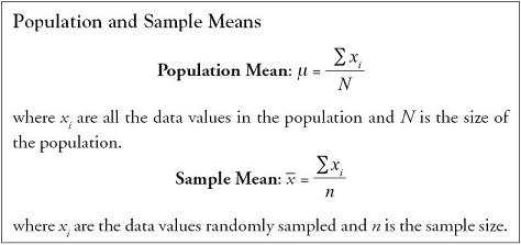
The arithmetic average of a set of data is the mean. It is the sum of the individual data values divided by the number of observations. In the study and use of statistics, it is important to know whether the mean is formed using all elements in the population or whether the mean is based on a random sample of elements taken from the population. The population mean is denoted by the symbol μ, pronounced “mew,” and the sample mean by the symbol ![]() . Their computations are the same, boxed for easy reference.
. Their computations are the same, boxed for easy reference.
The mean is the most frequently used measure for the center of a set of data. The mean is sensitive to the presence of extreme values in a data set, however, and may not be a reliable measurement of the center of a distribution when outliers are present. Microsoft Excel can easily compute the mean for a set of sample data by typing into a spreadsheet cell the function =average(range for data).
The Median
The middle value of an ordered set of data is the median.
- For an odd number of observations, the median is the middle number when the data are put in an ordered array.
- For an even number of observations, the median is the average of the middle two values when the data are put in an ordered array.
Unlike the mean, the value of the median is not influenced by the presence of outliers and may provide a more reliable estimate of a distribution’s central value when outliers are present. In discussions of residential housing values, for example, we frequently see references to median home values in lieu of average home values because of the potential bias introduced by a few high-value homes into the calculation of the mean home value in a given market. Excel can easily compute the median for a set of sample data by typing into a spreadsheet cell the function =median(range for data).
The Mode
The single most frequently occurring value in a data set is the mode. If there are two values that both occur with highest frequency observed in the data set, the data are said to be bimodal. It is possible that a mode does not exist in a data set. In general, the mode is not as reliable an estimate of the data set’s central value, and so the mode is not used as often as the mean or the median to characterize the center of a distribution. Excel can easily compute the mode for a set of sample data by typing into a spreadsheet cell the function =mode(range for data).
Comparing the Mean, the Median, and the Mode
A preliminary estimate of the shape of a distribution can be readily obtained using a comparison of the mean, the median, and the mode. If the value of the mean, the median, and the mode are all roughly equal, the shape of the distribution is said to be symmetric. If the mean is larger than the median and the mode, there are more values in the upper end of the distribution inflating the value of the mean. In that case, the distribution is skewed to the right, or positively skewed, with a longer tail into the right end of the distribution. If, on the other hand, the mean is smaller than the median or the mode, then there are more values in the lower end of the distribution pulling the value of the mean down. In that case, the distribution is skewed to the left, or negatively skewed, with a longer tail into the left end of the distribution. This is a valuable preliminary analysis to conduct, particularly on large data sets where it may be time consuming to build a frequency distribution to examine the shape graphically. With the use of Excel’s built-in toolkit, descriptive summary statistics can be prepared easily, giving the analyst a sense of the shape of the distribution relatively quickly.
Estimating the Mean From Grouped Data
Sometimes managers may receive reports of data that have already been summarized into a frequency distribution. If the calculated mean is not included in the report, being able to back out an estimated mean is quite useful.
For estimating either the population or the sample mean from grouped data, we use the concept of a weighted average.

Let’s consider the example captured in Figure 1.5, Chapter 1, characterizing the city mileage for 67 subcompact cars. To estimate the mean, we set up the calculation as follows:
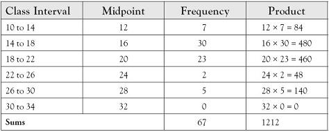
So the estimate for the average city mileage for subcompact cars in model year 2011 is 1212 ÷ 67 or 18.09 miles per gallon (MPG). For comparison, the actual mean value for the 67 cars reported is 18.75 MPG.
Measures of Spread
In addition to determining the center of a distribution, describing the concentration of data around its center is important. We will cover three measures of spread or dispersion: the range, the variance, and the standard deviation.
The Range
A preliminary sense of the spread among data is given by the range over which the data vary, from the smallest value to the largest value in the data set. The range is technically defined as the difference between the maximum and the minimum values, although we often say that the data range from one value to the other, describing the range by stating the location of the two end points of the distribution. Because the range is established by the two extremes of the distribution, it is both the most sensitive of the measures of spread to the presence of outliers and the least representative of the dispersion among the complete set of data. Excel can easily compute the range for a set of sample data by typing into spreadsheet cells each of two functions
=max(range for data)
=min(range for data)
and then subtracting the minimum value from the maximum value.
The Variance
The variance is a frequently used measure of spread whose numerator is the sum of the squared differences of each value from its mean. When the population mean, μ, is known, the numerator is divided by the population size, N. The resulting measure is the population variance, σ2, pronounced “sigma-squared.” When the population mean is not known but is estimated by ![]() , the numerator is divided by the sample size minus one (n − 1). By dividing by one less than the sample size, we allow for more fluctuation in small samples. When samples are comparatively large, subtracting one from n does not make a significant impact on the overall value. The resulting measure is the sample variance, s2.
, the numerator is divided by the sample size minus one (n − 1). By dividing by one less than the sample size, we allow for more fluctuation in small samples. When samples are comparatively large, subtracting one from n does not make a significant impact on the overall value. The resulting measure is the sample variance, s2.

Excel can easily compute the variance for the set of population data by typing into a spreadsheet cell the function =varp(range for data) and can also compute the variance for the set of sample data by typing into a spreadsheet cell the function =var(range for data).
The Standard Deviation
The standard deviation is the positive square root of variance. For a population, the standard deviation is σ, or sigma, and for the sample, the standard deviation is s. Where the variance is given in squared units, the standard deviation is given in the same units the mean is reported in. So, if we are discussing the average value of a mutual fund in dollars, its variance is in squared dollars, but its standard deviation is in dollars, as the mean is reported. And that is a good part of its virtue.
A particularly useful expression of dispersion is given by the coefficient of variation, which is the standard deviation divided by the mean of the data set, written as a percent.
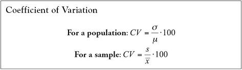
In computing the coefficient of variation, we can compare the relative amount of dispersion across a number of sets of data, where the means and their standard deviations may be otherwise quite disparate. For example, coefficients of variation can be compared for “penny” stocks and for blue chip stocks, despite the fact that the mean value of “penny” stocks will be quite different from the mean value of the blue chip stocks. Making such comparisons yields measures of comparative risk or stability as a percent of the mean value of the stock. Excel can easily compute the standard deviation for a set of sample data by typing into a spreadsheet cell the function =stdev(range for data). Alternatively, if we have already computed the sample variance, we can simply take the square root of the sample variance by entering into a cell the equation =sqrt(variance). When calculating the standard deviation for a set of population data, the Excel formula is =stdevp(range for data).
Estimating the Standard Deviation From Grouped Data
If data have already been summarized into a frequency distribution and the standard deviation is not included in the report, being able to back out an estimated standard deviation is also useful.
For estimating either the population or the sample standard deviation from grouped data, we use the class frequencies, midpoints, and results of our prior calculations of the estimated mean.

Let’s update the example characterizing the city mileage for 67 subcompact cars. Since there are no cars in the first and last categories, we eliminate those two lines to simplify the presentation here. To estimate the standard deviation, we set up the calculation as follows:

Since the units are in MPG, the sample standard deviation estimated from the group data is 3.96 MPG. For comparison, the actual standard deviation for the 67 cars reported is 3.71 MPG.
Chebyshev’s Theorem and the Empirical Rule
Two applications using the mean and the standard deviation are given by Chebyshev’s Theorem and the Empirical Rule. Chebyshev’s Theorem is named after the Russian mathematician Pafnuty L’vovich Chebyshev who proved that a minimum percentage of data values fall within two bounds on either side of the mean. Stated specifically, Chebyshev proved that the minimum percentage of values lying within k (k > 1) units of standard deviation of the mean is given by the following formulation.

This is true regardless of the shape of the underlying distribution. So, for example, we know that
- within k = 1.25 units of standard deviation,
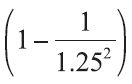 × 100 = (0.36) × 100 = 36% or a minimum of 36% of all data values will fall within the interval (
 − 1.25 • s, + 1.25 • s), and
 - within k = 1.5 units of standard deviation
 × 100 + (0.556) × 100 = 55.56% or a minimum of 55.56% of all data values will fall within the interval ( − 1.5 • s, + 1.5 • s).
This can be a useful metric to anticipate the concentration of values close to the mean.
If the shape of the underlying distribution is known to be normal—that is, the distribution is bell-shaped and symmetric about the mean—then a stronger statement can be made than Chebyshev’s Theorem provides us. If a distribution is normal, the Empirical Rule estimates a much more precise percentage of values that fall close to the mean. Again, the comparison of the mean, the median, and the mode can be useful in estimating the shape of the distribution.

Quantiles: Measures of Relative Position
A special class of measures is useful in dividing a data set into proportionate segments. They are quantiles, and we have already worked with one of them, the median.
- The median is a quantile that divides a data set into two equally populated halves, with 50% of the data set falling above the median and 50% of the data set falling below the median.
- A quartile divides a data set further by splitting the lower half and the upper half in two, so that there are four equally populated quarters of the data set, each containing 25% of the data values.
- A decile divides a data set into 10 equally populated segments, each containing 10% of the data values.
- A percentile divides a data set into 100 equally populated segments, each containing 1% of the data values.
If you have ever taken a national examination, you probably received a scaled score for the exam that was equated to a percentile. A reported score equated to the 87th percentile, for example, means that 87% of the people taking the same test earned scores at or below that reported score and 13% of the people taking the test earned scores at or above the reported score, which establishes a measure of the relative position of the reported score within the entire data set.
To identify a quantile, the data set must first be put in an ordered array, from smallest to largest value. While everyone agrees on the calculation procedure to find the median, differences in procedures can lead to small differences in the values given for other quantiles. One of the simplest procedures to find the first and third quartiles is to apply the procedure for finding the location of the median to the lower and upper halves of the data set. Applying it to the lower half yields the first quartile and applying it to the upper half yields the third quartile. To find the location of a particular percentile, A, for example, use the following procedure:

Excel can easily compute the kth quartile for a set of sample data by typing into a spreadsheet cell the function =quart(range for data,k) and can also easily compute the kth percentile for a set of sample data by typing into a spreadsheet cell the function =percentile(range for data,k).