
Depicting Data in Telling Ways
Data flow from the pulse of business: your operations, your business, your market, your industry. Managers and analysts routinely collect and examine key performance measures to better understand their operations and make good decisions. Statistics is the study of principles and methods for exploring data and making correct conclusions.
Developing a full and articulated understanding of key performance measures often begins with a descriptive summary. Descriptive summaries can be developed graphically, which we address here, or numerically, which we develop in the next chapter.
Descriptive Narration
Graphic summaries provide a picture of key data that can be used to elicit important questions, fuel understanding, and facilitate communication. Important data tell stories worth listening to and worthy of retelling. Good graphics capture the detail in the data as well as the overview of their story. They arise in complex environments, so their summaries should depict their complexity. Good graphics present the actual data and show causality, multiple comparisons, multiple perspectives, the effects of the processes that lead to their creation, or the effects of subsequent changes made to those processes. They should visually reinforce the reason the data are of significance and integrate number, word, and illustration.
Complexity is difficult to display, for obvious reasons. Still, complexity can be thoughtfully captured in sequenced layers that allow the content to unfold, inviting interpretation and developing their meaning in the process. A rich and insightful discussion of graphic excellence can be found in any of the works by Edward Tufte (http://www.edwardtufte.com).
Data are generated either by counts or by measurements. Count data arise in settings where sampled elements are classified by a key attribute and assigned to categories, such as defective versus acceptable products, commodities whose prices rose as opposed to remained the same or even fell, or the number of sales made using credit rather than debit card, check, or cash. These are qualitative, or categorical, variables and their summaries are handled differently from quantitative variables. Quantitative variables capture data arising from measurements that include the dimensions of time, distance, length, volume, rates, percent, and monetary value. Some qualitative sample data can, under certain circumstances, be converted to rates or percents and can then be treated as quantitative sample data. Also, quantitative data can be assigned to intervals of measurement values that serve as categories and can be treated using methods appropriate to qualitative data.
Summarizing Qualitative Variables
Qualitative variables can answer the question: how many or how frequently? Qualitative sample data are discrete counts of elements in separate categories. Some qualitative variables may have only two categories (for example, defective or acceptable) or have multiple categories (for example, numbers of sales by geographic region within the service area).
Summarizing sample data for qualitative variables by category can be achieved in a column chart, where the horizontal axis marks each category and a column rises over the category to a level marked on the vertical axis by the count of elements in each category. Columns in the graph do not touch across the categories to convey the fact that there is not an implied continuum or even necessarily an order in which the categories are listed across the horizontal axis. See Figure 1.1 for an example of a column chart for the number of nonfatal occupational injuries and illnesses involving day(s) away from work in 2008 as reported by the U.S. Bureau of Labor Statistics.
Figure 1.1. An Example of a Column Chart: Number of Injuries and Illnesses in the United States in 2008 (http://www.bls.gov/news.release/osh2.t01.htm)

While the data reported in Figure 1.1 are accurate, they are one dimensional. They do not invite insight, comparison, or perspective. The data would be more telling if presented as an incidence rate on a common basis. See Figure 1.2.
Figure 1.2. An Example of a Column Chart: Incidence Rate of Injuries and Illnesses in the United States per 10,000 Workers in 2008 (http://www.bls.gov/news.release/osh2.t01.htm)
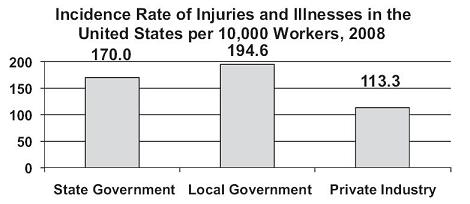
Even though the data reported in Figure 1.2 are also one dimensional, they are reported as a rate applied to a common basis of 10,000 workers, which invites comparison and some insight.
Sometimes data can be split on an additional dimension and summarized in a stacked or side-by-side column chart, as shown in Figures 1.3 and 1.4.
Figure 1.3. An Example of a Stacked Column Chart, Comparison of the Numbers of Injuries and Illnesses by Occupations and Industry in the United States, 2008 (http://www.bls.gov/news.release/osh2.t01.htm)
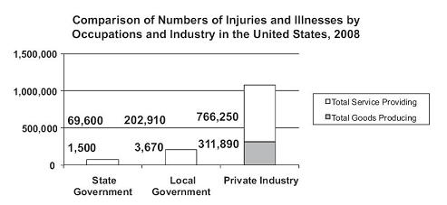
Figure 1.4. An Example of a Side-by-Side Column Chart, Comparative Incidence Rates per 10,000 Workers for Injuries and Illnesses in the United States, 2008 (http://www.bls.gov/news.release/osh2.t01.htm)

The introduction of an additional dimension leads us to recognize the low numbers of injuries and illnesses reported among workers producing goods in the state and local government sectors. Given state and local government workers are largely in the services sector, however, these results are not terribly surprising.
With the conversion of data to a comparable basis per 10,000 workers shown in Figure 1.4, the introduction of the second dimension of occupation generates an interesting insight—that workers in the goods producing occupations within local governments registered an injury/illness incidence rate
- 88% higher than workers in comparable occupations within state governments:
Rate of injury/illness, goods producing, local versus state government = = 1.876 or approximately 88% higher in local government than state government, and
 - 160% higher than workers in comparable occupations within private industry:
Rate of injury/illness, goods producing, local government versus private industry = = 2.604 or approximately 160% higher in local government than private industry.
We can also see that workers in service-providing occupations within private industry were significantly less injury/illness prone than in either governmental sectors. The magnitudes of differences reported in the graphic give readers pause to consider a number of questions: possible differences in the nature of jobs among the different sectors, the possibility of different training for worker safety and health, the impact of potentially differing benefit packages, among others. Underscored here is an important principle of data summary: When surprises occur, say so, and present the surprising results as clearly as possible. If the magnitudes of results are unexpected, as they are in this case, say so, and present the surprising magnitudes as clearly as possible. If no data occur in an expected category, say so, and discuss what the results might mean.
A special note of caution is due in working with the data shown in Figure 1.4. Because there are comparatively fewer workers in goods producing within governmental sectors, the incidence rates across service providing and goods producing occupations are not additive within sectors. We would have to convert the rates to an average weighted by the number of workers in each occupation within each sector to achieve additive rates. The caution echoes a broader principle in graphical integrity to avoid distortion of the data.
Summarizing Quantitative Variables
Where qualitative variables respond to the question of how many, quantitative variables can answer the question of how much. Sample data generated by measurements can take on any value along a number line and are considered continuous, in comparison to count data, which are discrete because they take on only the whole number counts of sampled elements.
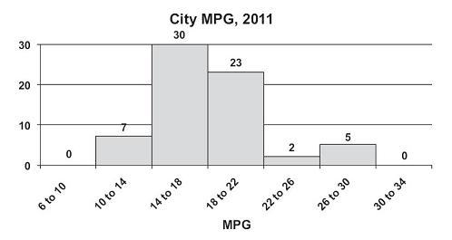
Comparable to using the column chart for categorical data, summary of continuous variables can be accomplished with the creation of classes into which the various sample values can be sorted and counted. The resulting frequency distribution looks very much like a column chart, where the height of each column represents the counts of data in each class. In contrast to the column chart, however, columns in a frequency distribution are contiguous to convey the fact that there is a continuous scale on the horizontal axis. See Figure 1.5 for an example of a frequency distribution for the miles per gallon (MPG) ratings for city driving for subcompact cars, model year 2011, available for new car sales in the United States.
Figure 1.5. An Example of a Frequency Distribution, U.S. City Driving MPG, Model Year 2011 (http://www.fueleconomy.gov)
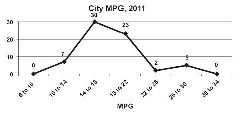
Information contained in the frequency distribution can also be displayed in a line graph, where the data point for the frequency is located at the center of each class interval. This is also referred to as a frequency polygon. See Figure 1.6.
Figure 1.6. An Example of a Line Graph, U.S. City Driving MPG, Model Year 2011 (http://www.fueleconomy.gov)
When the message to convey is not the number of vehicles in each class but the comparative frequency of vehicles in each class, the use of a pie chart focuses the reader’s eye on the portion of the total each class represents. A pie chart is a circular illustration of the total sample that is then broken into slices representing each class’s relative frequency as a portion of the whole sample. See Figure 1.7. A pie chart can be used with quantitative data, as shown here, or with qualitative data, where slices represent the categories used to summarize the data.
Figure 1.7. An Example of a Pie Chart, U.S. City Driving MPG, Model Year 2011 (http://www.fueleconomy.gov)

An interesting combination of column and line graph can be created as a Pareto chart depicting both frequency and cumulative relative frequency for each class. See Figure 1.8. Pareto charts can also be used with categorical data, when categories represented are given in decreasing order of incidence from left to right on the horizontal axis.
Figure 1.8. An Example of a Pareto Chart, U.S. City Driving MPG, Model Year 2011 (http://www.fueleconomy.gov)

Bivariate Data
To investigate underlying relationships between measures, x-y scatterplots are useful in giving the reader a bird’s eye view of potential relationships, where the horizontal x-axis represents the independent variable and the vertical y-axis represents the dependent variable. We can explore the relationship between, for example, the city mileage and the highway mileage for subcompact model cars for 2011. See Figure 1.9. The graph clearly shows the direct relationship between city and highway mileages. As a car’s city mileage improves, so does its highway mileage.
Figure 1.9. An Example of an x-y Scatterplot, Mileages for Subcompact Model Cars, 2011 (http://www.fueleconomy.gov)

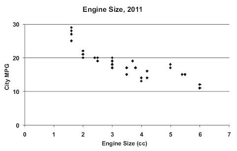
The use of an x-y scatterplot is especially valuable in looking at potential causal relationships. Figure 1.10 depicts the city mileage as a function of, or effect of, the engine size for subcompact cars model year 2011. The graph strengthens the statement that increases in engine size cause decreases in the overall city mileage for the car.
Figure 1.10. An Example of an x-y Scatterplot, Engine Size and City Mileage for Subcompact Model Cars, 2011 (http://www.fueleconomy.gov)
Gathering Data: Probabilistic Sampling Techniques
Collecting key performance data may present a challenge depending on the nature and complexity of underlying processes. Statistical inference requires careful data collection. Four sampling designs are reviewed here.
Simple Random Samples
When elements to be sampled occur in finite batches or cohorts and an ordered listing of them, or sample frame, is possible, a simple random sample is a straightforward technique to use in obtaining a random sample. In a simple random sample, every element in the population has an equal chance of being sampled. One means of constructing a random sample to assign a random number to each element in the sample frame, using either a random number table or Excel’s built-in random number generator. A serial sort of the list based on the assigned random numbers identifies the order in which elements in the sample frame are selected.
For a qualitative variable, a minimum sample of 5% of the batch is usually required. When the batch or cohort is either very large or very small in size, a substantially different sample size may be in order. These considerations will be discussed in later sections. For a quantitative variable, a minimum sample of 30 elements is typically considered sufficient, although that number may be larger for variables over which measurement values differ greatly.
Systematic Samples
Sometimes sample elements occur in streams rather than batches, such as products off a manufacturing line, sales at an online site, or customers at a store site. Elements arrive sequentially rather than simultaneously, which precludes the creation of a sample frame since the elements to sample are not all present at once. To randomly sample from a stream of elements, a 1-in-k systematic sample may be used, where an initial element is randomly selected and then every kth element is sampled. Systematic sampling is easy to use and has the advantage of sampling the population evenly. Caution must be used, however, if there is some preexisting pattern in the population of elements. A systematic sample is not an appropriate design to use in a population where some periodic pattern occurs because of the real possibility that sampled elements will themselves represent a cyclic bias in the measurement of interest and thereby distort the estimate of the true population measure. If a sample size and the population size are known, the period k within which to select the sampled element can be estimated by taking the population size and dividing by the desired sample size.
Stratified Samples
Where patterns do exist in the population being sampled, the population can be segmented into subpopulations with the use of nonoverlapping strata, or layers, of relatively similar elements. Every element in the population must be a member of one and only one subpopulation. A sampling design should be used so that variability on the measure of interest within each stratum is minimized, and variability between strata is maximized. Proportionate samples of each subpopulation should reflect the fractional representation of each stratum within the population. For example, if women represent 67% of the population and men the remaining 33%, the respective sample sizes taken should reflect the same proportions. Either simple random samples or systematic samples can then be selected from within each stratum so that elements within each layer have the same chance of being sampled. The resulting samples are then composed to form the total sample from the population. The use of a stratified sample forces the proportions of sampled elements to reflect the proportions of elements as they exist in the larger population and produce a reasonably precise and unbiased estimate of the variable being measured.
Cluster Samples
When a population can be divided into groups that are equally heterogeneous, with each group or cluster serving as a microcosm of the larger population, sampling a few randomly selected clusters can produce an unbiased estimate of the measure in the larger population. As with stratified sampling, the groupings, whether they are strata or clusters, must be mutually exclusive and collectively exhaustive. In cluster sampling, however, variability on the measure of interest is maximized within each cluster and minimized between clusters. By sampling within randomly selected clusters, the cost of data collection can be reduced, particularly when clusters are defined by geographic regions, allowing sampling to be done in a more narrowly defined geographic region.
The Focus of This Text
This text is about analyzing sample data. The techniques and examples used in this text assume the collection of simple random samples. For other sampling techniques, a more advanced sampling text should be consulted.