
2.0
NATURE VERSUS NURTURE
ARCHITECTING EXPERIENCE BEGINS WITH EMPATHY
Changing the way businesses create experiences starts with defining what the experience is and should be. The challenge here is how we see the world.
When we surround ourselves with people like us, as so many executives do, the work we do together is often based on shared perspectives and ways of thinking. Our personal and professional experiences can be enormously valuable in making business judgments, but they can also make us biased and work against us.
The secret ingredient in creating any meaningful experience is empathy: the ability to understand and share another person’s feelings. Seeing the world through the eyes of others gives you a competitive advantage because so few businesses truly have a disciplined method for doing so.
In his remarkable commencement address to the graduates of Kenyon College in 2005, novelist and essayist David Foster Wallace said, “The most obvious important realities are often the ones that are hardest to see and talk about.”

Our revenues keep falling. Managers agree that customers keep jumping on these silly technology trends and they’re not listening to us like they used to. I think we need to cut budgets, but also talk louder so customers hear us again. We just earned a raise.
To get a quick sense of the value of seeing through others’ eyes, consider the customer journey for those who live a connected lifestyle. The smart phone is not a “second screen,” it’s the first screen. Those who live la vida digital interact with the screen through a native set of gestures of swiping and pinching. Yet, how do we greet them with our digital properties? We make them click and scroll. The only time they pinch to zoom is to magnify a button so they can click it to move forward. The only time they swipe is to move a page side-to-side so they can see it all, which they can’t do without swiping because it was designed for another type of screen.
That process isn’t native, nor is it optimized for customers who would like to get through their day without having to multiscreen or cross-channel-hop their way through it. Yet, companies make them conform to their journey because they chose to adapt legacy design philosophies and systems rather than innovate or create something altogether intuitive and natural for a new series of devices.
EVERYTHING IS DIFFERENT NOW: YOUR DIGITAL CUSTOMERS ARE ACCIDENTAL NARCISSISTS–AND THAT’S A GOOD THING!
When you look at digital customers and how they differ from the traditional customers we’ve grown to know over the last several decades, you’ll find that they absolutely do expect great experiences. Your digital customers are becoming accidental narcissists. (I mean this lovingly, of course.) By living a digital lifestyle, they have become the center of their digital egosystem. They share more information online and they receive more feedback than the analog customers before them.
They are connected, always on, unabashedly multitasking, and living across multiple screens each and every day. Your connected customers can’t help it. The nature of these social and mobile networks is that they prompt them to share their world, their way.
How do you design an experience for them? You have to get or become them.
BABY, IT’S BOLD OUTSIDE
Not only are connected consumers different today, they continue to change as digital further evolves.
Most businesses take a “broadcast” approach to guide customers in their journey without taking the time to deeply understand the context of customers’ use of products and what their experience will be at each touch-point. Many companies are unfortunately designing consumer experiences based on legacy. We build upon what we know and how we’ve done things in the past. When we speak to customers, we use language, technologies, and processes that predate the lives of many connected customers.
It’s time to think about scrapping what we have to create or invent a new experience from scratch, one that’s not only more representative of the times, but also caters to the preferences, behaviors, and aspirations of our connected customers. To do that, we must understand their preferences, expectations, and behaviors.

BORN THIS WAY: NURTURE VERSUS NATURE
In 2011, a certain video of a one-year-old baby hit YouTube and started making the rounds on many tech blogs.1 The video was posted by Jean-Louis Constanza, CEO at Orange-Vallee, a subsidiary of the France Telecom brand Orange.2 The video featured a one-year-old girl playing with an iPad. Her ability to pinch and zoom and swipe was eerily natural and intuitive. Her father thought it would be interesting to see what would happen if she had something non-digital to make her way through.
So he handed her a magazine. She pinched and swiped the printed pages and, to her dismay, nothing seemed to work. In frustration, she quickly tossed the magazine aside.
This little girl will only know a world that’s “digital first.” In fact, customers like this will have to learn what analog means, whereas earlier generations had to learn about the digital revolution as it evolved and will forever be “analog first.” This means that CRM systems, websites, emails, call centers, retail or brick-and-mortar structures as well as the governing vision, methodology, and metrics for doing business today are out of touch, by design, with connected customers.
At the end of the video, Constanza’s narrative really brought the message home to me and its now 5 million viewers: “For my one-year-old daughter, a magazine is an iPad that doesn’t work. It will remain so for her whole life.”
That was years ago. Imagine life now.
Many analog-first executives define strategy, develop and manage roadmaps, and design critical touch-points such as websites, apps, sales and service programs, social and mobile initiatives, and customer loyalty initiatives based on antiquated perspectives and the philosophies, processes, and technologies that support them. Essentially, we use new opportunities to do things the way we always have.
Mobile devices are as capable of performing tasks as PCs (and stuff altogether new), yet they are still generally treated as a “smaller” version of the desktop experience with limited functionality, content, and navigation points along their journey. From the connected customer’s perspective, mobile design should be different. From swiping to spreading, pinching to tapping-and-holding, users expect to navigate intuitively on each mobile device they use and be presented with a natural and intuitive journey that reflects their behavior and aspirations.
Meanwhile, the advent of wearable computers, smart watches, and the “Internet of Things” are rapidly ushering in a brand-new set of possibilities to evolve from traditional approaches.
1 http://news.cnet.com/8301-17852_3-20120086-71/1-year-old-thinks-a-magazine-is-a-broken-ipad/.
2 www.youtube.com/watch?v=aXV-yaFmQNk.

2.1
SKEUMORPHISM
COMFORT WITH THE OLD MUST MAKE WAY FOR THE THRILL OF THE NEW
Creating great CX is not just about giving customers what they want when and how they want it. We can also innovate to deliver something so unique, something so enchanting, that once encountered they can’t live without it.
One of the biggest problems with customer experience design today is that it is most often too closely tied to legacy philosophies, processes, and systems, which were crafted for a different way of doing business in a different time for a different type of customer. Without understanding customers and how behaviors and values are changing, without aligning our teams around a bigger and bolder vision of what we want to offer—something that is going to truly matter to people—we are just managing businesses the way we always have.
Obviously, most information as presented today was designed for a very different era of engagement. From televisions to desktops to laptops, information design has evolved as screens shrank and became increasingly portable. The most popular current solutions to the multiscreen problem are responsive and adaptive design, both of which allow programmers to make your content scale from one-to-many, reaching the broadest set of visitors possible, regardless of whether they’re on a smart phone, tablet, laptop, or TV. Design for mobile devices has become the priority in developer circles, and most branded sites are undergoing a retrofit of sorts, with designers adapting existing experiences for smaller screens. But what if the technical purpose of or the content on pages isn’t the problem? What if it’s the content itself and the customer’s ability to relate that pose a challenge? What if they don’t culturally match that of a digital native or a connected customer?
Now think beyond phones and tablets and imagine smart watches, home appliances, automobiles, wearables, home devices, and the entire universe of the “Internet of Everything” (IoE). Cisco defines the IoE as bringing together people, process, data, and things to make networked connections more relevant and valuable than ever.1 Designing for a medium is not the same as designing for experience, and the types of media you’re designing for are going to keep evolving. It’s better to think beyond them.
How do you do this? Let’s take the case of your company’s website. Ask yourself, what is the purpose of a website among today’s connected customers? The role of the website hasn’t really been revisited since the 1990s. And over the years they have evolved into a Frankenstein monster of sorts. Different pages serve the different needs of different lines of business and functions more than those of the customer. Who is the copy on the site really written for? Chances are much of it is written to appease the person approving the copy or the project.
What does a web page need to accomplish in today’s real-time world—one where the average teenager can only focus up to seconds before reaching for a device? And what could a site actually deliver or enable if we switched from a point-click-and-scroll design philosophy to one that prioritized elegance and simplicity, in which swiping, pinching, zooming, and other hand-based gestures changed the very nature of user interaction?
You could not only change the dynamics of interaction, but completely alter a site’s functionality to please the more connected, less patient visitor. You could offer a natural and effortless interaction where technology is invisible and experience is at the forefront. Your desktop site would become an extension of the smaller screen experience rather than the other way around. But even more, your site could offer an immersive experience where story and imagery combine to create a powerful bond with visitors.
THE FUTURE SEEMS ALL TOO FAMILIAR
Without applying a digital-first methodology to designing customer experiences, it is almost inevitable that you default to solutions of another era.
I can think of no better example than that of skeumorphism, the design philosophy that says that objects in the digital world should look much like their equivalents in the physical world. The design of features such as the icons for file folders and for email were crafted to look like their pre-digital versions in order to ease people into the new territory.
For a laugh and also a reality check, take a look at this set of examples, most of which were originally shared by Portland, Oregon-based web technologist, developer, and teacher Scott Hanselman.2 I took the liberty to add a few others of course.

When’s the last time you actually used a disk? Younger consumers might not even know what one is. If you 3D printed them one, they’d think you had printed the “save” icon.

Clipboards symbolize the function of copying and pasting. I can’t remember the last time I actually held a clipboard—can you?

Bookmarks represent the act of saving online content. My Kindle is about the size of some of these.

I can’t even tell what the voicemail icon is—a roll of tape? a roll of 110 film?

The phone icon resembles a handset from the 1950s.

Find files by using a magnifying glass. That’ll work. I haven’t touched a magnifying glass since biology in high school.

While many of us do miss the days of Polaroid and Kodak moments, most digital natives take photos with their phones.

Speech recognition is definitely [not] related to a ribbon microphone from the 1930s.

The fact that “carbon copy” is still in our language, let alone used to inspire the design of an icon, is absolutely mindboggling.

And nothing says digital video more than a strip of film, right?

This address book represents not only a long-gone era, but a way of organizing information that digital trumped for good reason.

But maybe the most hilarious of all is this use of an hourglass.
Designing an experience that’s rooted in memories is akin to driving forward while looking in the rearview mirror.
I’m old enough to remember what it was like to have to get up and change the channel on a television and turn over a 33 album on a turntable to hear the rest of it. I also remember the lifesaving relationship between a pencil and a cassette tape. The fact that I remember these things, no matter how fondly, doesn’t mean that I should make them part of anyone’s experiences today. That was then. This is now.
Now let’s talk about the remote control for a moment.
I remember jumping up eagerly as a child from the couch or floor to run over to the TV and turn the knob briskly to find another program—the first version of channel surfing. My generation cherished the remote control as a blessing.
But the evolution of the remote control over the last 60-plus years has been nothing short of unexceptional. Instead of innovating a new way to navigate channels, we again operated within the parameters of the past.
In 1950, Zenith developed the first remote, which featured two buttons and was called the Lazy Bones. In the 1960s, with the square-shaped Zenith Space Commander, the remote jumped from two to four buttons. In the 1970s, we were introduced to the current, slimmer style of remotes, which began to house more and more buttons. With every new stage of evolution, the design became increasingly complex and unintuitive, because designers iterated rather than innovating. The familiar impeded the new and better.


A Page from TV Guide in 1971

Today’s TV Listings from a Cable Provider
The on-screen channel surfing experience also hasn’t gotten better, in fact becoming messier and more confusing. Consider the page of TV Guide from 19713 by comparison to the screenshot from a popular cable provider4 today.
I often hear the objection to such criticisms that consumers aren’t ready for change. Of course anytime a technology revolution comes along, the old guard says they’re perfectly happy with the way things were, until all of a sudden they aren’t. After that moment when their eyes are opened to the splendors of the new and better, they look back at the old and say, “I can’t believe we used to do things that way!”
How happy are you with your TV experience today? Don’t you wish it were better suited to the way you interact with technology now? Well, on this front, there’s hope. Finally a savvy app designer decided to move boldly forward (not), and now there’s a smart phone remote app.
When digital natives first see a television, they walk up to it and swipe the glass left or right to change channels, or perhaps up and down to activate a menu.
And needless to say, they like to be always connected.
2B
2 BILLION+
CONSUMERS ARE
ONLINE
28%
ONLY 28% PREFER
TO RESOLVE SERVICE
ISSUES VIA THE PHONE
WHY ARE YOU HOLDING YOUR iPHONE AGAINST YOUR FACE?
The fact that we still call our iPhone and Droids phones first is almost laughable. For most users, the percentage of time that’s spent in telephone conversations versus in apps, texts, or in the browser is minute. While most people worldwide now spend more time on their smart phones than a PC, they’re most often not calling anyone.
Teletech, a global business process outsourcing company, reports that “Only 28 percent prefer to resolve service issues via the phone.” Many connected customers will make a call only when there’s no other option provided by a company. That’s a negative experience before they’ve even reached customer service.
DESIGNING TOMORROW–TODAY
If you’ve ever visited Disneyland or the Magic Kingdom Park in the Walt Disney World Resort, you have most likely been transported into the future by Tomorrowland. Did you know that Tomorrowland—when conceived in 1955—was imagined as life in 1986?5
Yet today, Tommorrowland still feels like tomorrow. And it should; Tommorrowland has undergone a massive overhaul so that it now depicts the imagined world of 2055. This is an analogy for brands—you have to reinvent yourself to always be aspirational and relevant.
If Disneyland had simply bolted-on new rides, updated façades, and updated employee costumes, visitors would be falling out of love with the experience. Such is true with your experience.

Disney’s Tomorrowland6
Your roadmap is already off course.
We build upon legacy not only because it’s what we know, but because we’re still profitable doing so. But what happens when your connected customers outnumber your legacy customers? Well, it’s either happened or is happening.
We’ve lulled ourselves into satisfaction with incrementalism; we’ve come to a point where we need to substantially reinvent.
The point where business meets design is where you create incredible experiences that are:
Imaginative
Game-changing
Unforgettable
Functional
Meaningful
Shareable
Actionable
Intuitive to the user, the device, and the screen
Contextually relevant to the consumers in their state of mind and intention on whatever screen they’re using in that moment
A fresh approach is required:
In our ethos
In our brand essence
In our product
In our product ecosystem
In our marketing
In the click path
In our service
In our rewards
In our perspective about our digital customers
Experience is evergreen.
1 www.cisco.com/web/about/ac79/innov/IoE.html.
2 www.hanselman.com/blog/TheFloppyDiskMeansSaveAnd14OtherOldPeopleIconsThatDontMakeSenseAnymore.aspx.
3 http://aprilsbirthday.wordpress.com/television-line-up-thursdaynight-jan-16-1971/.
4 http://blogs.app.com/inthemoney/2011/06/20/new-programguide-comes-to-comcast/.
5 www.imagineeringdisney.com/blog/2012/8/20/tomorrowland-67-part-1.html.
6 © Disney.

2.2
BUSINESS MEETS DESIGN
IF YOU EMPATHIZE WITH CUSTOMERS, WHAT YOU’LL SEE THROUGH THEIR EYES WILL SURPRISE YOU
Raise your hand if you love the flying experience. For a variety of reasons in a multitude of ways, many airlines do not provide positive experiences at every moment of truth, if at any moment of truth. They provide a service to get you from here to there while saving money by compromising on your comfort and overall experience.
If any companies stand to benefit from improving customer experience, it’s the airlines, which is what makes the response of American Airlines to one great customer suggestion especially bizarre yet typical. Dustin Curtis was an American customer, and he also happens to be a user interface designer.1 In 2009, he wrote an open letter to American Airlines to express his frustration with the poor user experience at AA.com. The story speaks volumes about how far so many brands have to go in appreciating the need not only for site redesign but also better product development, customer service, and everything in between.
At the time of Dustin’s letter, AA.com looked like the screenshot at the top of this page.

AA.com at the time of Dustin’s Letter

Dustin’s Suggestion
After trying to purchase a flight, Dustin was inspired to share his thoughts with the company:
Recently, I had the horrific displeasure of booking a flight on your website, aa.com. The experience was so bad that I vowed never to fly your airline again. . . . If I was running a company with the distinction and history of American Airlines, I would be embarrassed—no ashamed—to have a website with a customer experience as terrible as the one you have now. How does your CEO, Gerard J. Arpey, justify treating customers this way? Why does your board of directors approve of this? Your website is abusive to your customers, it is limiting your revenue possibilities, and it is permanently destroying the brand and image of your company in the mind of every visitor.2
But it’s easy to complain. What I found most notable about his letter was that Dustin took time to offer his suggestions for a better user experience. His example is shown at the bottom of the opposite page.
Minimal. Clean. Useful.
In a fascinating and surprising occurrence, Dustin received an email reply from an American Airlines employee. I say surprising because we still live in a time when getting any kind of response from a company is extraordinary. I say fascinating because of the nature of the response. The reply came from a designer at the airline:
I like to think I’m decent at what I do, and I know the others I work with here are all pretty good. The problem with the design of AA.com, however, lies less in our competency (or lack thereof, as you pointed out in your post) and more with the culture and processes employed here at American Airlines.
The group running AA.com consists of at least 200 people spread out among many different groups, including, for example, QA, product planning, business analysis, code development, site operations, project planning, and user experience. We have a lot of people touching the site, and a lot more with their own vested interests in how the site presents its content and functionality. . . .
It only takes a few hours to put together a really good-looking one, as you demonstrated in your post. But doing the design isn’t the hard part, and I think that’s what a lot of outsiders don’t really get, probably because many of them actually do belong to small, just-get-it-done organizations. But those of us who work in enterprise-level situations realize the momentum even a simple redesign must overcome. . . .
Change starts with aligning people around a common vision to do better. The American designer went on to put his finger on the core problem that makes doing this so difficult:
Our Interactive Marketing group designs and implements fare sales and specials (and doesn’t go through us to do it), and the Publishing group pushes content without much interaction with us. . . . Oh, and don’t forget the AAdvantage team (which for some reason, runs its own little corner of the site) or the international sites (which have a lot of autonomy in how their domains are run). . . . Anyway, I guess what I’m saying is that AA.com is a huge corporate undertaking with a lot of tentacles that reach into a lot of interests. It’s not small, by any means.
No, it’s not. But, it is possible once you ratchet the conversation up from a design level to a business level. Executives don’t speak technology or design. They speak return and outcomes. They talk to stakeholders and shareholders. Our American Airlines customer was simply sharing the truth. This is what happens when touch-points are relegated to fiefdoms to own at will without a collective agreement or effort to improve and unite the holistic customer experience.
You’d imagine that with a public exchange such as this, the entire digital team at American Airlines would reevaluate its approach. No—the company fired the designer, saying that3 he violated a nondisclosure agreement.
On top of that, an American spokesperson posted an official response that read in part:
More than 90 percent of AA customers rate [the then] AA.com as “good” or “excellent.”4
We constantly receive feedback on the site. Like Mr. Curtis’s input, we value and consider all of the opinions we receive.
Move along . . . nothing to see here.
But the real topper is that in fact Curtis’s feedback was considered helpful. Look familiar?

The New AA.com

Great Design Is All the Work You Don’t Ask People Who Use Your Product to Do
—Rebekah Cox5
PARK AT YOUR OWN RISK
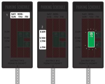
Even the best of intentions in experience design can go badly astray because of not authentically putting ourselves in the customer’s place. Take the case of a big redesign of the parking signs in New York City.
I sometimes wonder whether parking signs are designed to help you learn when to and when not to park or to help you fail. The latter would make more sense. After all, cities generate significant revenue by reinforcing parking restrictions. New York is certainly one of the more infamous culprits in parking trickery. As a FastCompany Design article said,6

New York City Parking Signs after Improvement9
Parking in New York is a famously expensive, famously shady, and famously dangerous affair. It also usually involves some guesswork, due to the city’s parking signage, which tends to be maddeningly inscrutable.
In an effort to improve the situation, the city made a bold move and hired design firm Pentagram to make more user-friendly signs. Adweek reported the news: “That seems appropriate, as the pentagram is the sign of the devil, and parking in Manhattan can be sheer hell.”7
The new signs were limited to 140 characters of text or less, roughly half the verbiage of the old signs. “The days of puzzled parkers trying to make sense of our Midtown signs are over,” said City Council member Daniel Garodnick, who is described in a DoT statement as a “longtime supporter of syntactic clarity.”8
While the new Twitter-friendly signs are an improvement, the information is still presented in the familiar format. Skeumorphism, anyone? Are they really easier to use or intuitive or simply iterative?
Nikki Sylianteng’s Clearer Version10
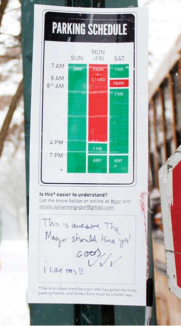
Comments Wanted on Sylianteng’s Signs
Now consider the parking signs designed by Nikki Sylianteng.11 The now-Brooklyn-based designer was at the time living in Los Angeles, and she was fed up with getting parking tickets. She created the much simpler and clearer version shown here, which is actually innovative.
In her sign, visualization trumps text.
Sylianteng shared with Wired magazine that instead of using a text-based approach, she translated all of the information into a visual explanation that answered two main questions: Can I park here? And for how long? “I just visualized what I construct in my head when I’m reading the sign,” she said.
Sylianteng not only came up with the new design, she has become the Banksy of parking signs, hanging up rogue signs all around Manhattan and Brooklyn. She posts a laminated printed copy of her version right below the city-approved version and asks for drivers to comment in a space below the signage.
“A friend of mine called it functional graffiti,” she told Wired.
The public seems to support her work. One comment read, “This is awesome. The mayor should hire you!” It’s telling and also a bit sad when experience architects become the Robin Hoods of customer engagement.
1 idsgn.org/posts/why-american-airlines-userexperience-fails/.
2 From Curtis’s Letter, “Dear American Airlines,” http://dustincurtis.com/dear_american_airlines.html (letter since removed).
3 https://econsultancy.com/blog/4936-american-airlines-res-an-employee-for-customer-engagement#i.4gepu92j1e0rqm.
4 www.telegraph.co.uk/travel/travelnews/6531610/American-Airlines-worker-red-for-replying-to-web-user-complaint.html.
5 www.technewsworld.com/story/72185.html. Photo courtesy of Fortune Live Media, https://www.ickr.com/photos/fortunelivemedia/7598316956/in/photolist-4HMjKU-czrcU9-czrrym-czrmUL-2Aib4G.
6 www.fastcodesign.com/1671608/pentagram-redesigns-new-york-s-inscrutable-parking-signage.
7 www.adweek.com/adfreak/pentagram-redesigns-nycs-parking-signs-twitter-size-bites-146550.
8 www.nyc.gov/html/dot/html/pr2013/pr13-02.shtml.
9 http://a841-tfpweb.nyc.gov/dotpress/2013/01/nyc-dot-commissioner-sadik-khan-city-council-speaker-quinn-and-council-member-garodnick-unveil-newly-designed-simplied-parking-signs-in-midtown.
10 Reproduced with permission from Nikki Sylianteng. nikkisylianteng.com.
11 www.wired.com/2014/07/a-redesigned-parking-sign-so-simple-youll-never-get-towed-again/?mbid=social_fb.

2.3
MOMENTS OF TRUTH
STOP FOCUSING ON THE FUNNEL
Experience architecture is the art of engendering desired emotions, outcomes, and capabilities in customers throughout the customer journey. It’s about branding through experiences; but it’s also about storytelling through design, narrative, and user experience (UX) to evoke responses that shape experiences we want people to have and share.
Most companies’ resources are imbalanced toward acquisition of customers over retention of them. Compare marketing and advertising to support, service, newsletters, and emails and you see that efforts aimed at yanking people into the brand vortex far outweigh those devoted to building relationships and earning trust.
But customer experience doesn’t start when the customer has come to you and it doesn’t stop at a transaction. I like the depiction here of the customer journey created by Oracle, showing it as an infinite loop.
When we are traveling through this journey as customers, we observe what works and doesn’t work quite well. Yet we tend to lose perspective when we shift to the sell-and-serve side. That’s why I like the language Oracle uses for every stage. It conveys empathy with the customer perspective.
BUY: MARKET & SELL
1. Need
2. Research
3. Select
4. Purchase
OWN: SUPPORT & SERVE
5. Receive
6. Use
7. Maintain
8. Recommend

Oracle’s Customer Journey
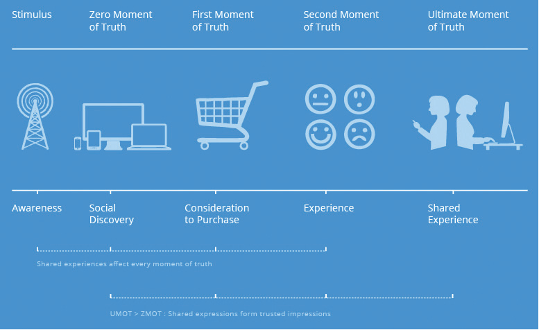
The Four Moments of Truth
DESIGNING FOR THE FOUR MOMENTS OF TRUTH, AND EVERY MOMENT IN BETWEEN
In my previous book, What’s the Future of Business (WTF), Changing the Way Businesses Create Experiences,1 I broke down the new connected customer journey into a series of dynamic moments linked by technology and shared experiences: the Four Moments of Truth.
In reading the following descriptions of each of these moments of truth, keep in mind all the different screens customers will use, the various contexts of each engagement, and the channels you have and should have for offering a seamless, native, and pleasing experience.
Zero Moment of Truth (ZMOT): Introduced by Google, this the moment when people are searching for what they want, which Google has a great interest in, given that online search is such a common way for them
to do so.
First Moment of Truth (FMOT): This concept was introduced by P&G and is the moment when people see your product and form first impressions about it.
Second Moment of Truth (SMOT): This is actually more than a moment; it’s the collection of moments when people feel, think, see, hear, touch, smell, and (sometimes) taste as they experience your product. It’s also how your company supports them in their efforts throughout the relationship.
Ultimate Moment of Truth (UMOT): This is the instant when a customer creates content based on an experience with your product or service and publishes online, in apps, on YouTube, Amazon, and so on, in their social communities and networks for others to find.
The intention of doing so is a combination of self-expression and the desire to inform others. This is gold and this type of information is desperately sought after by consumers in their decision-making journey. This experience then becomes discoverable for anyone who searches each network. This is why one customer’s UMOT becomes the next person’s ZMOT.
Things are not so linear, of course. Customers come and go, in and out of journeys, using different devices and channels. What doesn’t change is the intention behind what they do. At the same time, what’s inevitable is “the experience.”
Between the Zero Moment of Truth and the Ultimate Moment of Truth customers go through a series of steps that ignite the emotions and senses. Right now, for most companies and brands, those steps are broken and incongruous.
According to Google, 91 percent of smart phone users would do the same thing—look up information on their smart phone while right in the middle of a task. In fact, 69 percent of online consumers agree that the quality, timing, or relevance of a company’s message influence their perception of a brand. Google’s research has uncovered a fundamental change in the way people consume media. As Google’s senior vice president of ads and commerce, Sridhar Ramaswamy, explained in the Wall Street Journal,
The old days of predictable, periodic media sessions have been replaced by numerous short bursts of digital activity throughout the day. The old model was a four-course meal in the same restaurant. Today’s is a series of constant bite-sized snacks all over town.
PEOPLE WILL TALK AND PEOPLE WILL LISTEN
In this new era of connected consumerism, I can’t help but think of the lucid words of Maya Angelou:
I’ve learned that people will forget what you said, people will forget what you did, but people will never forget how you made them feel.
I’ve spent the better part of the last two decades studying how technology affects human behavior and continues to disrupt businesses. One of the most profound things I’ve learned is that how you make people feel is the currency that consumers exchange to inform their decisions.
If you love something, you share it. If you dislike something, you share it. The worst are those experiences that are so passive or uninspiring that people quietly react with a sense of meh or nothing at all. People believe that when someone else takes the time to share an experience, they do so with a genuine intention of engaging with someone else to help, warn, or educate others.
What if you could design each moment to build upon the previous one and to match intentions and desired outcomes? More so, what if you could design what people think and share?
That’s experience architecture.
SHARED EXPERIENCES ARE THE NEW SEARCH
Search is still a natural step in the discovery process. But traditional search is only part of the story now. Study after study shows that consumers most trust others like themselves. They don’t trust executives. They don’t trust ads. They do trust peers.
Shared experiences—those that are passed on through social networks, communities, and apps—serve as the ultimate PageRank now. The future of search is distributed. It happens in apps, in social networks, in video channels such as YouTube, and in image networks such as Pinterest. ZMOT is more important than ever and it’s also bigger than search. It’s about micro-experiences and using each to build upon the previous one to facilitate what’s next.
Most people have heard the statistic that YouTube is the second largest search engine. But why is this true? Because connected customers aren’t just seeking information; they’re searching for richer content. I’m sure you’ve looked up videos to learn how to use a product rather than reading an instruction manual. You’ve also looked up videos to hear what people think or how people use products before you decide to buy.
A research study published by Ask Your Target Market2 stated that 95 percent of consumers use both YouTube and Google when searching for relevant content. YouTube, apps, blogs, and forums are search engines not for web pages but for shared experiences.
Shared experiences have become a critical part of marketing. That’s why Google’s search algorithm continuously evolves to build shared experiences in relevant formats and channels into usable search results. This changes everything from SEO to tracking search behavior to the very idea of websites. Learning how to spark the exchange of experiences is vital. The ultimate moment of truth represents the future of discoverability, branding, and influence.
Every day, customers are sharing experiences in the form of videos, blog posts, reviews, Tweets, and status updates—content that remains online and builds upon itself, forming an indexable, searchable, and highly influential repository of information about companies and products in the cloud. And every day, customers search for this type of content to help make decisions, hacking the traditional marketing touch-points that you invest in today. SEO, branding, and sales compete with this content, and at some point soon, shared experiences will eclipse traditional marketing no matter how creative or aggressive it is.
These sharable experiences set the stage for a customer journey stitched together by micro-experiences, or as Google calls them, micro-moments, to help serve or aggregate peer content to move people along their path in real time at the right time in the right place though the right device.3
These intent-rich moments are the “I want to . . . moments”:
I want to know more about . . .
I want to go . . .
I want to do . . .
I want to buy . . .
Today, too many of those who attempt to touch the customer at various points in their journey are not aware of the impact they could have on the customer if they were to compete for these micro-moments. And in addition, countless experiences today are sought and exchanged with very little or no intervention by brands. Right now, these moments are peer-driven.
IGNORANCE + ARROGANCE = IRRELEVANCE
Truth can be a painful surprise. But we all know that perception is reality. It’s important not to be on the defensive in reacting to shared experiences. That will almost surely come back to bite you.
Have you ever tried to cancel your cable or phone service? It’s more painful than actually calling customer support for help, and that says a lot.
That’s because when you try to cancel a subscription—Internet, cell, or cable service, satellite radio provider, software, or gym membership—the goal of the retention specialist you are forwarded to is to help you see the error of your ways. This is the epitome of back-customer-experience architecture.
Take the case of a notorious dustup when a couple of customers attempting to cancel their Comcast service encountered this retention technique. One of them was technology TV personality Veronica Belmont. To say she’s connected is a gross understatement.
Veronica and her husband, Ryan Block, had decided to cancel their service, and when she called, she was so frustrated about 10 minutes into the call that she passed the phone to Block, a former editor-in-chief of AOL’s Engadget and co-founder of community site gdgt. He decided to record it and Veronica posted it on Twitter.
Needless to say, the recording went viral.4
Comcast describes the job of the retention specialist as “equal parts detective, ally, troubleshooter, and negotiator.” Here’s a snapshot of the Comcast retention specialist job description:5
For any number of reasons, customers may feel the need to make a change either to a lower level of Xfinity service or even a different carrier. Your job is to convince them that Xfinity can meet their changing needs better—and keep them in the family.
Rather than focus on customer experiences, satisfaction, or relationships, Comcast and so many companies have built entire departments around trying to force people to keep a service they don’t want.
![]() “SO THIS WEEKEND, @RYAN AND I ATTEMPTED TO CANCEL COMCAST OVER THE PHONE. THIS IS HOW IT WENT DOWN: SOUNDCLOUD.COM/RYAN-BLOCK-10/...
“SO THIS WEEKEND, @RYAN AND I ATTEMPTED TO CANCEL COMCAST OVER THE PHONE. THIS IS HOW IT WENT DOWN: SOUNDCLOUD.COM/RYAN-BLOCK-10/...
Comcast apologized via Twitter.
![]() “@Ryan we are sorry & embarrassed by what happened. We’re determined to be better. We clearly have more work to do. bit.ly”
“@Ryan we are sorry & embarrassed by what happened. We’re determined to be better. We clearly have more work to do. bit.ly”
Ryan Block then responded:
![]() “@comcast i hope the quick action you take is a thorough evaluation of your culture and policies, and not the termination of the rep”
“@comcast i hope the quick action you take is a thorough evaluation of your culture and policies, and not the termination of the rep”
Tom Karinshak, Comcast’s senior vice president of customer experience, also issued an official apology on the company’s website,6 stating that “the way in which our representative communicated with them is unacceptable and not consistent with how we train our customer service representatives.” Sure enough, blame was placed on the rep rather than the company culture or standards it sets for customer retention.
But the rep wasn’t going rogue, according to Lauren Bruce, a former Comcast customer account executive, who talked with Bloomberg about the incident: “Unless a customer was moving, we were encouraged to use retention techniques.”7 Since writing this chapter, this scenario continues to happen and each example is as or more egregious.
What an ugly incident. And it’s hardly a worst case. Companies are allowing bad experiences with them to be shared with the whole world every day.
By coordinating your efforts to elevate the customer experience, you won’t be badly surprised by what appears in the new channels for each zero moment of truth discovery.
2 www.brafton.com/news/95-percent-of-consumers-use-google-search-youtube-to-nd-relevant-web-content.
3 http://blogs.wsj.com/cmo/2015/04/08/outside-voices-why-mobile-advertising-may-be-all-about-micro-targeting-moments/.
4 https://twitter.com/Veronica/status/488836129919991808.
5 http://jobs.comcast.com/jobs/descriptions/Customer-Account-Exec-1---Retention-job-Greenwood-Village-Colorado-4350421#.
6 http://corporate.comcast.com/comcast-voices/comcaststatement-regarding-customer-service-call.
7 www.businessweek.com/articles/2014-07-18/that-comcastcustomer-service-rep-wasnt-going-rogue.
