
5.0
MAPS R US
THE STAGES OF THE MAPPING PROCESS
Too often, considerations of technology, channel, and content come first, and companies follow a generalized approach to experience architecture rather than focusing on their customers as individuals. Change starts with a shift in perspective from that of a campaign (one-to-many) to that of a personal journey (one-to-one).
Customer journey mapping starts with understanding the current customer journey (from Point A to Point X) and how it aligns with the goals of your business and brand promise. Then you work to identify the improvements you want to make.
Before we dive into the steps in the process, here is an overview of the three mappings you should do in order to formulate the best experience architecture blueprint and align the whole team around it. Each is a very helpful tool, and they build on one another.
We’ve reviewed journey and experience maps. Before we move on, let’s revisit them for a moment.
JOURNEY MAPS
Journey maps are the most popular and familiar of the bunch. With them, you take a walk in the shoes of your customers to highlight the strategic and technological solutions necessary to better serve them.
As no customer journey is ever truly linear, the process must involve more than outlining the moments of truth driving customers toward conversion. You want to be mapping an idealistic physical and digital pathway. Think of this map as an exploded view of the funnel, with considerations for technology, channels, devices, and content.
Journey maps should:
Build a customer-first grid for a frictionless journey.
Indicate points of influence and key touch-points.
Expose challenges and opportunities to streamline waypoints between Point A and Point X.
Identify the micro-experiences where people come in and out of the journey, why, and how.
Surface content and technology gaps.
Discover context, intentions, and aspirations.
Reveal cracks in services and processes by comparison to their expectations and desires.
Inspire new products and services before, during, and after transactions.
Help you prioritize investments that optimize experiences and sunset those that don’t.
EXPERIENCE MAPS
Customer journeys are always emotional in some way. So feelings, as irrational as they are, must be taken into account, and you must work to shape them. Customers are always having all sorts of thoughts as they proceed on their journeys, and all sorts of life situations. Experience maps help to focus on these aspects of customer experience, layering a better awareness of them into your ultimate map of the journey. This is the Sphere of Experience.
Using the Adaptive Path framework, we can uncover the critical information about these aspects of customers’ experiences, taking account of what people are:1
Doing: What actions are customers taking to meet their needs? What are their key behaviors?
Thinking: How do people frame and evaluate their experience? What do they expect?
Feeling: What emotions do people have along their journey? What are the highs? The lows?
This is in addition to the context of their engagement with you, including time, place, devices they’re on, and channel.
A good experience map brings the physical, digital, and emotional scenarios of customers together in a visually engaging graphic. Creating them requires a combination of qualitative and quantitative research about your customers.
EXPERIENCE FLOW
This is where X marks the spot. Of course, the goal of experience architecture is not just to chart the current state but also to plan the future state. I believe to best depict the future experience you want to create, in order to align the team around the plan optimally, the process should culminate in crafting a large, integrated representation of the ideal customer journey, depicting what customers would ideally do, think, and feel as they interact with you at all touch-points.
Philips Design introduced the practice of experience flow creation in 2001 for this purpose, defining this kind of map as a tool to show2 an experience “from expectation, to first impression, then through discovery, usage, and finally to memory.” The flow is a large visual poster that helps everyone in the company, no matter their focus, understand the current customer experience and the one you want to create. These should be carefully designed so that they immediately make sense to everyone in all departments. They allow you to communicate multiple viewpoints and create a holistic representation that encapsulates a remarkable amount of information.
Philips uses these posters to walk through the journey with the experience team for making the plans for moving forward.
Ideally, you should create each of these tools in your overall process. But whether you do so or take a different approach, the essential thing is that you consider not only the more obvious practicalities of the pain-points in the journey, but also customers’ emotions, life situations, and aspirations.
1 http://mappingexperiences.com/.
2 www.design.philips.com/sites/philipsdesign/about/design/aboutus/Experience-Flows.page.

5.1
JOURNEY MAPPING
JOURNEY MAPPING DO’S AND DON’TS
To help businesses feel a sense of urgency around the need for businesses to invest in the digital customer experience, Salesforce declared that we are entering an era of “the Customer Journey”1 to help you “know your customer like never before.” My research into transformation around the digital customer experience at Altimeter revealed that customer journey mapping is thought about in two different ways:
1. As the act of outlining the customer journey through physical and digital touch-points, which may or may not be informed by research
2. As the act of researching and charting the customer journey based on digital customer behavior and trends
The best practice is to combine these two notions. You should research both the physical and digital journeys and how customer behaviors and expectations play a role at each touch-point.
A good place to start is to develop a grid that outlines channels and maps activities against stages specific to your customer lifecycle. In this example, Oracle outlines a sample cross-channel customer experience.2
This high-level journey map illustrates how a customer could move through multiple touch-points during the buying process. The map you ultimately want to create should comprise three journeys:
1. The journey as it stands (current state)
2. The journey that could be optimized (future state)—Point A to Point X
3. The journey that should ultimately be (ideal state)—the Sphere of Experience
The key difference between the first two and the third is that the first two involve iterating, and the third is more innovative in nature. You can see in the Oracle example that there are several hops that must be made between real life and various types of screens. All of these must be connected. Each channel plays a role in each moment of truth, so they should of course connect.

Sample Cross-Channel Customer Experience
In all journey maps, you create a detailed diagram that outlines the steps your customers undergo in engaging with your company during each moment of truth.3 But journey maps come in many styles. They can visualize a sequence of events. They can illustrate how a customer interacts with one part of your business. More elaborate maps also sketch out behaviors and activities post-transaction.
Let’s take a look at one such model. Here, we see an expanded view of one journey to understand the moments of truth that cause friction or move people along. Beehaus, a visual communications agency, reinterpreted the earlier referenced dynamic Customer Journey. In this example, Beehaus visualized the consumer journey as an ellipse breaking out each micro-moment that transpires as people traverse through and also in/out of it.
More so, the journey was complemented with an “influence loop,” an additional ellipse that demonstrated that online consumer experiences connected the dots throughout the journey. This would later be called the Ultimate Moment of Truth in WTF. In 2015, Google updated its positioning on ZMOT to now include “micro-moments.”4 They reflect momentary bursts of I-want-to-know moments, I-want-to-go moments, I-want-to-do moments, and I-want-to-buy moments. They matter to consumers and they matter to brands.
The graphical series mapping, “Where X Marks the Spot,” builds upon my original model on which this was based.
Kerry Bodine, a former CX analyst at Forrester Research and now a consultant, shared with me that there are four major types of journey maps:5
I’ve found that many prospective journey mappers embark on this activity without articulating what they want to get out of it—and without fully grasping that there are several variations of journey maps to help them achieve their objectives.
Kerry notes that while they look similar on the surface, each of the four has a different focus and business purpose:
1. Existing state: These maps illustrate what your customers do, think, and feel as they interact with your business today. Because these maps highlight existing pain-points between you and your customers, they’re best suited for driving incremental improvements to your customer experience.
2. Day-in-the life: These maps also illustrate what people do, think, and feel today; however, they take a wider view by examining activities, whether they involve your company or not. Because these maps highlight existing pain-points in peoples’ lives, they’re best suited for driving innovation through addressing unmet needs.
3. Future state: These maps illustrate what your customers will do, think, and feel as they interact with your business at some point in the future. They’re best suited for communicating your vision for how new products, services, and experiences will function.
4. System: Often called service blueprints, these diagrams usually start with a simplified version of either an existing or future state journey map. Then they layer on the system of people, processes, policies, and technologies (both customer-facing and behind-the-scenes) that are responsible for delivering that experience today or in the future. If built on an existing state journey map, system journey maps can help you identify the root causes of existing customer pain-points. If built on a future state journey map, they can help you identify the system that needs to be in place to support the intended experience.

The fundamental mandate of good customer journey mapping is to be customer-centric. This is easier said than done. During my digital transformation research, I spent some time with GM’s David Mingle, Executive Director, Global Connected Customer Experience. In our conversations, he shared that a significant challenge is to focus decision makers on observing evolving markets through a customer-focused lens to influence new and more empathetic thinking.
Automotive has a long history of being very inward thinking. It’s a real challenge for the industry to put the customer first, rather than their own functional hats or what’s best for them. What’s best for customers is best for us, but that’s not traditionally how automotive has thought about it.
The same is true for most companies in most sectors.
Michael Hinshaw is the managing director of customer experience innovation firm MCorp Consulting. He offers some helpful pointers about how to walk in your customers’ shoes:6
Know whose journey you are mapping. To do this, you need to look through the eyes of a single customer at a time, represented by a research-based customer persona, which represents a core segment of your market. We’ll discuss the best practices for crafting them coming up.
Talk to your customers. Most companies don’t regularly gather outside-in customer perspectives, or broadly share the insights with the firm when they do. This requires not only setting up the operations for doing so, but applying expertise to interpreting the data you get. We’ll also explore the best methods for this coming up.
Must-haves. Emphasize what your customers most want and need from each interaction as they move through the journey. Carefully consider how they think and feel at each step. Remember, experience is sensory!
A number of key reasons that teams fail in being customer-centric in the process were highlighted in an article by Michael Fauscette, group vice president, Software Business Solutions, IDC, titled “The Major Flaws of Customer Journey Mapping.”7
“The problem . . . is in the way that the maps are developed and used in many companies,” he wrote. He highlighted the main mistakes made in mapping:
Limited view: As discussed, the siloing of departments leads each group to understand the journey primarily, or exclusively, as it affects their role.
Projecting: By far my favorite of the list because I’ve seen it so many times. Projecting is the phenomenon of mistaking your own personal view as that of someone else. So often, strategists project needs, preferences, and behaviors onto customers instead of opening up their minds to discover them.
Identification: Many companies don’t really take the time to understand their customers. Doing so requires actually gathering data and carefully analyzing it.
Linear: As we’ve discussed, funnels and journey maps are often laid out in either a top-down or left-to-right presentation. But, customers don’t flow in linear movements. So these processes, systems, and departments are designed to serve a fantasy world.
A great set of the basic requirements for getting the process right has been outlined by Jim Tincher, founder of Heart of the Customer and a seasoned veteran of customer experience work who led initiatives at Best Buy and Gallup before forming his own consultancy. His list repeats some points made, so I won’t elaborate on those, but adds several others:8
Represent your customers’ perspective. Include interactions as your customers experience it, not the way you think they will based on the channels, assets, and path you’ve introduced.
Use research. Don’t make assumptions. Don’t let cognitive biases distract you from the truth. Let real data and research unfold in a story that inspires transformation.
Represent customer segments. Your different segments typically have very different customer experiences. We found during a pre-sales project for a service company that one segment typically spent two hours researching the category while another consistently spent more than six weeks doing the same, using very different tools. Imagine trying to represent these very different experiences as one.
Include customer goals. A great customer journey map shows your customer’s goals at each stage of the process (Point A to Point X). For example, a customer who initially purchased from you for herself may later want to send a gift to a friend. How are you helping her do so?
Focus on emotion. Emotions are critical to any experience, whether B2B or B2C, and a great customer journey map communicates these emotions.
Represent touch-points. The customer journey map is often built to communicate the order and type of touch-points, including those not in your control.
Highlight moments of truth. Some interactions have more impact than others. Great journey maps separate those critical moments of truth from the rest. For example, when visiting a hospital, a bad check-in taints the rest of the patient experience.
Measure your brand promise. A critical outcome of a great customer journey map involves measuring how your experience supports your brand promise. If your brand promise is to be effortless, highly customized, or unique, then your journey map is an excellent way to document whether your customer feels you are meeting that goal.
Include time. Experience length provides important context. Does the typical call last 30 seconds or 10 minutes? Did shoppers spend 20 minutes or 40 hours deciding on a product?
Ditch the PowerPoint. Why limit yourself to such a basic tool for something as important as your customer experience? We’ll explore visual options just ahead.
A map isn’t an end in itself; it is meant to serve as a basic tool for aligning your team about the mission going forward and creating the sense of urgency about it. It should be shared throughout the business. A good designer will be able to capture a great deal of information in a visually impressive way that is easily appreciated by all parties.
Do it right. After all, the Sphere of Experience is where business meets design.
1 https://www.salesforce.com/blog/2015/01/2015-the-year-of-the-customer-journey.html.
2 www.ukoug.org/what-we-offer/news/notes-from-the-oracle-crm-keynote-by-melissa-boxer-vice-president-crm-product-management-and-product-strategy.
3 http://blogs.hbr.org/2010/11/using-customer-journey-maps-to/.
4 https://www.thinkwithgoogle.com/micromoments.
5 kerrybodine.com/blog/4-types-customer-journey-maps.
6 http://cursos.campusvirtualsp.org/pluginle.php/59435/mod_resource/content/1/Customer%20Journey%20Mapping-%2010%20Tips%20for%20Beginners.pdf.
7 www.cmo.com/articles/2012/10/30/customer-journey-mapping-10-tips-for-beginners.html.
8 www.heartofthecustomer.com/customer-experience-journey-map-the-top-10-requirements/.

5.2
EXPERIENCE MAPS
A MAP THAT’S WORTH 10,000 WORDS
Before going into more detail about how to map the journey, let’s walk through a few possibilities for the types of maps you might want to create.
ACTIVITY AND EXPERIENCE GRIDS
Jim Tincher shared one of his favorite journey maps to give us a better idea of how to bring his 10 steps to life. Yes, it’s profoundly more sophisticated than previous examples we reviewed. It should be. This is a grid approach that works well as it provides an in-depth overview of people and the context and relationship between need, goals, state, and device. Now you get to exercise your experience architecture work.
In this example, Tincher showcases the journey the Young Families segment uses to purchase health insurance.1 The design is meant to convey the journey, emotions, and technologies a consumer uses in a variety of scenarios.

Sample Customer Experience Touch-Point Map

The most visible spot on the map is the photo representing your customer segment. That is deliberate, in that it focuses the reader on that customer to learn more about the segment first. The eye is then drawn to more information about the segment, including the verbatim here.
This style of journey mapping allows you to tell a deeper, more complete story. It’s a multidimensional approach that helps stakeholders see and appreciate how the journey should unfold. More so, it’s about how you choose to influence and inspire behavior throughout the journey—because like experiences, it’s going to happen with or without you. Don’t optimize reality or what “is” today. Instead shape it. Define the desired “future state” that works for everyone.
The purpose of this map is to understand the research and analysis journey, so those touch-points form the center of this map. It facilitates organizational discussions about how each touch-point contributes to your customer’s experience. To appreciate the enormous value of this, consider how your strategy would change if you knew each of these four things about your customer’s purchase journey:
1. Friends and family are far more likely than advertising to kick off a research process. Seeing your product category at a friend’s house or in your newsfeed creates the curiosity necessary to begin the research process. How does this change your marketing and branding strategy?
2. The two highest-impact moments occur outside of your control: when potential customers look at review sites and other third-party sites. How are you engaging third-party sites to make certain the products you carry are included and reviewed fairly? How are you provoking and rewarding customers for contributing to UMOT?
3. The one Hot Zone, that is, an area with high importance and low satisfaction, is your website’s research functionality. While purchasing at your retail store is a Bright Spot, with high customer scores, how will this knowledge impact how you deploy your resources? How would you rethink your website to optimize the new customer journey?
4. The research phase has a high Customer Effort Score, meaning it takes far more work than your customers expect. Can you gain market share if you can simplify this process for them? Can you optimize for the screen or the intention? Explore creative and simple ways to reduce friction.
Journey maps cover touch-points, yes; however, they should also illustrate the emotional journey. Emotions represent an important pillar in experience architecture. So does psychology, among other things we’ll cover shortly. Again, the journey you design enables desired outcomes and goals. They also by their very nature evoke emotional responses throughout, which are yours to design.
Tincher also provides an additional example that explores the customer experience through an emotional impact map. Contrast the Touch-Point Map to the Emotional Impact Map, which involves scheduling a physical exam for members of the Seniors Segment. The center focuses on the customer’s emotional levels. Touch-points are still included and moments of truth are called out, but the focus is on your customer’s emotions as they travel through the experience. Understanding this emotional impact typically requires ethnographies or journaling, combined with quantitative surveys to collect the scores, which are all techniques used by UX specialists, as we’ll discuss later.
USING YOUR EMOTIONAL IMPACT MAP TO DRIVE CHANGE
The point of this map is that it facilitates—or better yet, inspires—conversations about how your customers feel about the journey you are taking them on, and explores how each touch-point enhances or takes away from the customer’s emotional response.
Tincher poses the questions, how would your strategy change if you knew that:
Two weeks is the magic time for appointment availability—patients who have to wait longer than two weeks are far less satisfied with the process and are more likely to leave your practice altogether.
The mailed reminder engages seniors, and is very well-received, whereas other segments have a neutral or negative response. What will you do when budget pressures threaten to cut this offering?
The speed of check-in is a moment of truth that impacts the rest of the experience. Loud rooms or waits beyond ten minutes cause a negative reaction that lasts for the rest of the physical.
The check-in process requires far more effort than seniors expect from this process, receiving a Customer Effort Score of 4.6. Other segments have lower scores, suggesting that check-in is a particular pain-point for the Seniors Segment.
While this is a specific example, imagine how your experience plays out today and where friction, inaction, or missed opportunities prevent success. It exists today.

Sample Customer Experience Emotional Impact Map
MAKE IT A FULL EXPERIENCE MAP
One style of map that is especially comprehensive and in-depth is what Chris Risdon, head of Design, Capital One Labs (formerly Adaptive Path), calls an experience map.
Risdon and the Adaptive Path team have worked with the likes of NPR, AirBnB, and Twitter. Experience maps are impressive as an overall tool for really digging deeply into the full breadth of the customer experience.
Risdon defines an experience map as
[a]n artifact that serves to illuminate the complete experience a person may have with a product or service. But it’s not just about the illustration of the journey (that would simply be a journey map). And it’s not a service blueprint which shows how a system works in enough detail to verify, implement and maintain it.
Risdon virtually walked me through a case study for Rail Europe, a U.S. distributor that offers North American travelers a single place to book rail tickets and passes throughout Europe, instead of going to numerous websites.3
This map, although small on the page or screen, is actually five feet wide. And sometimes they’re longer.
Rail Europe already benefited from having a solid, functional website and an award-winning contact center. Risdon notes that the company’s goal was to develop a better understanding of their customers’ journeys across all touch-points. Doing so would allow them to more fully understand where they should focus their budget, design, and technology resources. This is something every business needs to undergo, not just once, but repeatedly as new devices and ultimately behaviors change and evolve.
Risdon explains that customer experience maps begin with five critical components: the lens, the journey model, qualitative insights, quantitative information, and the takeaways. These are the building blocks that help an experience map stand on its own. It’s something that can be circulated across an organization and doesn’t require any explanation or framing. More so, it’s meant to be actionable, guiding all aspects of redesign. As Risdon says, “A good experience map feels like a catalyst, not a conclusion.”
To create the of Rail Europe experience map, Adaptive Path created a survey that garnered over 2,500 responses as well as conducting field research with Rail Europe customers.

Sample Customer Full Experience Map
TAKE INVENTORY OF TOUCH-POINTS
Start with a touch-point inventory that catalogs all touch-points a customer has with the product or service, great and small. As you can imagine, the number of touch-points is often incredible, maybe overwhelming. In addition to cataloging touch-points, you also want to consider the relationship between them.
Answer these two questions:
1. Do we force customers to multiscreen?
2. Can we empower a journey from beginning to end on one screen?
Adaptive Path shared this touch-point inventory for our reference.
In this example, the inventory of touch-points is divided into six journey stages:
1. Research and planning
2. Shopping
3. Booking
4. Pre-travel (documents)
5. Travel
6. Post-travel
Each touch-point is also labeled as follows:
 = Nonlinear, no time restrictions
![]() = Linear process
= Linear process
 = Nonlinear, but time based
Once you have the groundwork set, there are five dimensions to an Adaptive Path experience map that we’ll run through next:
1. The lens
2. The journey model
3. Qualitative insights
4. Quantitative information
5. Takeaways

Sample Touch-Point Inventory
THE LENS
The lens is the filter through which you view the journey. Looking at the experience through a lens of guiding principles helps us keep the entire journey in context. In this case, the guiding principles are as follows:
People choose rail travel because it is convenient, easy, and flexible.
Rail booking is only one part of the travel process.
People build their travel plans over time.
People value service that is respectful, effective, and personable.
Risdon further explains how to define the lens:
If you have clearly different personas, or user types with fairly different paths, then the lens will likely be a summary of the persona—in which case you’ll make multiple maps for each persona. But often the core of the experience (and the opportunities and pain-points the map highlights) will be the same because you may be focusing on core touch-points that apply to each persona. In this case, the lens could be some overarching principles, such as design principles or a value proposition. . . .
So you look at the journey, and specifically the touch-points within the journey, and ask yourself, “Does this match up to the principles? Does this meet the needs for this persona?”
The key is that you want to look at the journey against some type of criteria—and personas, value propositions, or principles are that criteria.

A Sample Adaptive Path Experience Map
THE JOURNEY MODEL
The journey model is referenced as such because as Risdon explains, the nature of each journey makes each look different. A journey model is used to illustrate the most important dimensions of engagement, how customers traverse through each phase of the journey, and how they switch between the different channels and screens.
In this example, Risdon shows us the likely journey someone takes as he researches a trip and then purchases a ticket. Again, this represents the experience as it is, created in the hope of identifying the places where the journey is suboptimal.
You can see in the magnified example the moment when a customer moves from the Second Moment of Truth to the Ultimate Moment of Truth with common activities such as broadcasting plans, sharing experiences, sharing photos, tagging Rail Europe, and writing posts. This visualization helps you consider the triggers that incite the experiences your customers are having, and figure out where improvements can be made.
As Risdon says,
You aren’t simply illustrating the journey step-by-step, but ideally revealing something about it based on how you model the data, for example, how many people use one channel over the other, which part of the experience is blatantly broken, or which part of the experience hasn’t been considered much.
This is a great example of effective visual design, which is bringing data to life in a way that tells its own story to a viewer, without requiring elucidation.

Reproduced by permission of Chris Ridson.

Reproduced by permission of Chris Ridson.
QUALITATIVE INSIGHT
Maps can be created to highlight a specific aspect of the customer experience that data is revealing should be probed into. An example is the map created by Risdon shown on the next page. He explains about it, “In this experience map, the journey model highlights the switching between channels, with the size or density of the arrows indicating qualitative information about the volume of switching.”
This means that the map shows when someone is likely to switch screens or channels based on existing data. Imagine if you didn’t have to switch anything—if the experience you designed was seamless and native.
Risdon describes the Adaptive Path approach to enriching the maps it makes:
When applying qualitative insight, we often use a framework of “doing, thinking, feeling” with the doing being the journey model, the thinking framed as “Can I use this? Will this work? I like how this feels,” and the feeling utilizing responses such as frustration, satisfaction, sadness, and confusion.

Reproduced by permission of Chris Ridson.
That allows them to indicate what people are thinking and feeling each step of the way.
To illustrate the kinds of takeaways this facilitates, let’s walk through those for the Rail Europe customers for each moment of truth and the micro-experiences that connect them.
|
ZERO MOMENT OF TRUTH (ZMOT) RESEARCH AND PLANNING + SHOPPING |
SECOND MOMENT OF TRUTH (SMOT) TRAVEL |
||
| THINKING |
• What is the easiest way to get around Europe? • Where do I want to go? • How much time should I/we spend in each place for site seeing and activities? |
• I want to get the best price, but I’m willing to pay a little more for first class. • How much will my whole trip cost me? What are my trade-offs? • Are there other activities I can add to my plan? |
• I just figured we could grab a train but there are not more trains. What can we do now? • Am I on the right train? If not, what next? • I want to make more travel plans. How do I do that? |
| FEELING |
• I’m excited to go to Europe! • Will I be able to see everything I can? • What if I can’t afford this? • I don’t want to make the wrong choice. |
• It’s hard to trust Trip Advisor. Everyone is so negative. • Keeping track of all the different products is confusing. • Am I sure this is the trip I want to take? |
• I am feeling vulnerable to be in an unknown place in the middle of the night. • Stressed that the train won’t arrive on time for my connection. • Meeting people who want to show us around is fun, serendipituous, and special. |
|
FIRST MOMENT OF TRUTH (FMOT) BOOKING + POST BOOKING / PRE-TRAVEL |
ULTIMATE MOMENT OF TRUTH (UMOT) POST-TRAVEL |
||
| THINKING |
• Do I have all the tickets, passes, and reservations I need in this booking so I pay more shipping? Rail Europe is not answering the phone. How else can I get my question answered? |
• Do I have everything I need? • Rail Europe websites was easy and friendly, but when an issue came up, I could’nt get help. • What will I do if my tickets don’t arrive in time? |
• Trying to return ticket I was not able to use. Not sure if I’ll get a refund or not. • People are going to love those photos! • Next time, we will explore routes and availability more carefully. |
| FEELING |
• Website experience is easy and friendly! • Frustrated to not know sooner about which tickets are eTickets and which are paper tickets. Not sure my tickets will arrive in time. |
• Stressed that I’m about to leave the country and Rail Europe won’t answer the phone. • Frustrated that Rail Europe won’t ship tickets to Europe. • Happy to recieve my tickets in the mail! |
• Excited to share my vacation story with my friends. • A bit annoyed to be dealing with ticket refund isuues when I just got home. |
QUANTITATIVE INFORMATION
A map should also visualize the quantitative information you obtain through research and analysis. It’s recommended that you conduct field research such as interviews, a survey, and digital anthropology. Risdon explains the importance as such:
In one case, it can be used to emphasize certain parts of the journey (only 10 percent encounter this touch-point, while 70 percent encounter that touch-point). In other cases, particularly from a survey, it might be about the touch-points themselves.
We conducted a survey for Rail Europe that allowed us to get three really telling data points—the enjoyability of this particular phase of the journey, the relevance of Rail Europe to that phase (for example, Rail Europe was very important in the booking, but not as important after the trip), and the perceived helpfulness of Rail Europe in that phase. This highlighted gaps as well as showed where there was a good alignment between relevance and helpfulness.
Ultimately, you want to use the map to help you assign an experience score to each moment of truth. Looking back at the overall map, you will see bars of varying lengths for each of the moments of truth representing how the company scored on the three key factors.
Again, this is a very effective visualization technique.
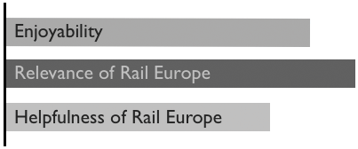
The Scoring of Three Key Factors
In another part of the map, quantitative information is visualized very differently, through the use of arrows, showing the volume of channel switching at a particular touch-point.
The solutions you come up with for your own maps will surely be different, but the fundamental mandate is the same: your data visualization must communicate both what is happening and what should be happening with great clarity.

Quantitative Information Visualized with Arrows
FORMULATING TAKEAWAYS
Once you have created your customer journey or experience map, you must use it to have your team consider the following main questions:
Where can you improve experiences?
Where is the desired experience unclear or confusing?
Where can we innovate?

Here are examples of the kinds of opportunities you might identify and action steps for capitalizing on them that you could uncover, for each moment of truth.
These takeaways then drive the development of your customer experience improvement strategy.
To sum up, the best customer journey maps are those that are (1) illustrative in their own right and (2) actionable and inspiring. They must communicate the need to change and rally stakeholders to believe in and fight for transformation. Finally, they must create a sense of urgency about doing so.
This work underscores the growing importance of UX. Customers have choices. They’re also becoming more abundant.

1 www.heartofthecustomer.com/wp-content/uploads/2013/05/Creating-a-Customer-Focused-Customer-Experience-Map-White-Paper1.pdf.
2 www.adaptivepath.com/about/.
3 www.adaptivepath.com/ideas/the-anatomy-of-an-experience-map/.