In this chapter, we finally get to what many of you have been waiting for, developing the user interface. We will walk through the activities related to creating and populating a list view, which includes the following topics:
- The
ListViewandListAdapterclasses - Creating the Points of Interest
list viewlayout - Extending
BaseAdapter<>to provide data to theListViewwidget - Creating a custom cell layout
- Handling row selections
When we created the POIApp project, a default layout and activity was created for us. Rather than deleting these, let's give them more appropriate names and remove unnecessary content as follows:
- Select
main.axmlin Resources | Layout. - Right-click on it, select Rename, and enter the name as
POIList.axml. - Double-click on it to open
POIList.axml. - Click on the Hello World button and then click on the the Delete button.
- Select
MainActivity.csand rename it asPOIListActivity.cs. - Double-click on it to open
POILIstActivity.cs. - Rename the class inside as
POIListActivity. - Change the layout ID referenced in the
SetContentView()API call toResources.Layout.POIList. - Remove the code related to the Hello World button that we removed from the layout. Your class should now look like the following code:
[Activity (Label = "POIs", MainLauncher = true)]
public class POIListActivity : Activity
{
  protected override void OnCreate (Bundle bundle)
  {
    base.OnCreate (bundle);

    SetContentView (Resource.Layout.POIList);
  }
}
Now, we need to add a ListView widget from the Toolbox pad. By default the Toolbox pad is displayed on the top right-hand side of the IDE as follows:

The Toolbox pad is organized with basic widgets at the top of the list and container widgets such as ListViews further down the list. There is a search box at the top that allows you to filter the widgets in the list, and there are two buttons to the right-hand side of the search box that allow you to adjust the way widgets are listed. Now, perform the following steps:
- Enter
ListViewin the search field. - Select the
ListViewwidget, drag it over the content area of the layout designer, and drop it on the layout.
You have now added a ListView widget to POIList.axml. On the bottom right-hand side of the IDE, you will notice the Properties and Document Outline pads.
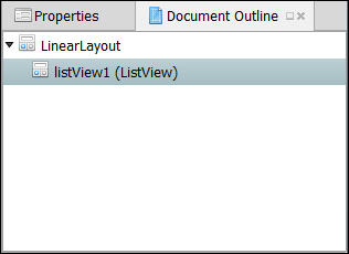
Activate the Document Outline pad and you will see an outline of your layout document listing all the widgets, Views, or view groups contained in it. The Document Outline pad provides a convenient means of navigating and selecting widgets, particularly as layouts get more complex. Select listView1 and then click on the Properties tab.
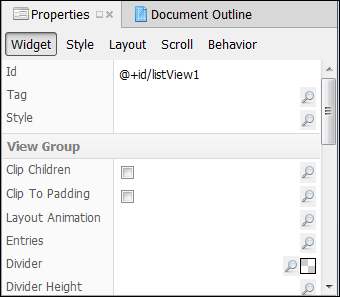
The Properties pad allows you to modify the properties of the currently selected widget. There are five buttons at the top of the pad that switch the set of properties being edited. As you may recall from Chapter 1, The Anatomy of an Android App, the @+id notation notifies the compiler that a new resource ID needs to be created to identify the widget in API calls, and listView1 identifies the name of the constant. Now, perform the following steps:
- Change the ID name to
poiListViewand save the changes. - Switch back to the Document Outline pad and note the changed name.
- Switch back to the Properties pad and click on the Layout button.
- Under the View Group section of the layout properties; note that the width is set to
match_parent. Enter the same setting for the height. This simply tells the control that it can use the entire content area provided by the parent, excluding any margins specified. In our case, the parent would be the top-levelLinearLayout.
Note
Prior to API level 8, fill_parent was used instead of match_parent to accomplish the same effect. In API level 8, fill_parent was deprecated and replaced with match_parent for clarity. Currently, both the constants are defined as the same value, so they have exactly the same effect. However, fill_parent may be removed from the future releases of the API; so, going forward, match_parent should be used.
Now let's focus on the layout designer. You will notice two buttons, Content and Source, at the bottom of the designer, which allow you to switch between a visual representation of the layout (Content) and an XML source code view of the layout (Source). This is very useful as some tasks are just quicker in the Source view; however, the Content view is useful in viewing the arrangement of widgets visually. The Content view's usefulness is somewhat limited only because many times portions of a view must be constructed with code at runtime; however, when the view can be specified completely in XML, the Content view is very useful.
In the Content view, you will notice a few useful tools arranged at the top of the window, as shown in the following screenshot:
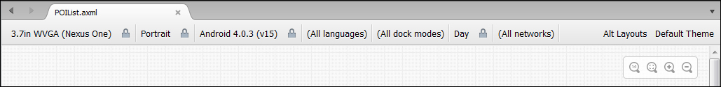
In the upper-right corner, you will find a set of zooming controls. These allow you to zoom the layout in or out depending on your monitor size and the level of details you would like to view. Across the top, you will find drop-down menus that also let you select things such as the screen size of the device to simulate, orientation of the device, and the version of the Android platform to simulate.
We now turn our attention to the layout for each row in the ListView widget. The Android platform provides a number of default layouts that can be used with a ListView widget.
For more control over content layout, a custom layout can also be created, which is what is needed for poiListView.
To create a new layout, perform the following steps:
- In the Solution pad, select Resources | Layout, right-click on it, and select Add | New File.
- Select Android from the list on the left-hand side, Android Layout from the template list, enter
POIListItemin the name column, and click on New.
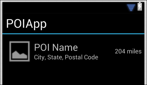
There are a number of ways to achieve this layout, but we will go with a RelativeLayout utility to demonstrate its capabilities. The following diagram shows the way the POI data should be organized:

There is a lot going on in this diagram. Let's break it down as follows:
- A
RelativeLayoutview group is used as the top-level container; it provides a number of flexible options for positioning a relative content, its edges, or other content. - An
ImageViewwidget is used to display a photo of the POI, and it is anchored to the left-hand side of theRelativeLayoututility. - Two
TextViewwidgets are used to display the POI name and address information. They need to be anchored to the right-hand side of theImageViewwidget and centered within the parentRelativeLayoututility. The easiest way to accomplish this is to place bothTextViewclasses inside another layout; in this case, aLinearLayoutwidget with the orientation set to vertical. - An additional
TextViewwidget is used to display the distance, and it is anchored on the right-hand side of theRelativeLayoutview groupand centered vertically.
Now, our task is to get this definition into POIListItem.axml. The next few sections describe how to accomplish this using the Content view of the designer when feasible and the Source view when required.
When POIListItem.axml was created, a top-level LinearLayout was added. Change this top-level ViewGroup drawable to be a RelativeLayout view group:
- With
POIListItem.axmlopened in thecontentmode, select the entire layout by clicking on the content area. You should see a blue outline going around the edge. - Press Delete. The
LinearLayoutview group will be deleted and you will see a message indicating that the layout is empty. - Locate the
RelativeLayoutview group in the toolbox and drag it onto the layout. - With the
RelativeLayoutview group selected, use the Properties pad to set the Padding option to5dp, the Layout Height option towrap_content, and the Layout Width option tomatch_parent. The padding controls how much space will be placed around eachListViewitem as a margin, and the height determines how much of theparentcontrol height is used. The Padding and Layout Height values can be set from the Layout section of the Properties pad.
Note
Setting the Layout Width option to match_ parent will cause the POIListItem content to consume the entire width of the screen, while setting the Layout Height option to wrap_content will cause each row to be equal to the longest control; in this case, it is the ImageView widget.
Android runs on a variety of devices that offer different screen sizes and densities. When specifying dimensions, you can use a number of different units including pixels (px), inches (in), and density-independent pixels (dp). Density-independent pixels are abstract units based on 1 dp being 1 pixel on a 160 dpi screen. At runtime, Android will scale the actual size up or down based on the actual screen density. It is best practice to specify dimensions using density-independent pixels.
Add an ImageView widget to the left-hand side of the layout to display an image if available for the POI as follows:
- Locate the
ImageViewwidget in the toolbox and drag it onto the layout. - With the
ImageViewwidget selected, use the Properties pad to set the name topoiImageView, and the height and width to65dp. The name can be set from the Widget section of the Properties pad, and the Height and Width options from the Layout section. - In the property grouping named
RelativeLayout, set Center Vertical totrue. Simply clicking on the checkbox does not seem to work, but you can click on the small icon that looks like an edit box to the right-hand side and just entertrue. If everything else fails, just switch to theSourceview and enter the following code line:android:layout_centerVertical="true"
Add a LinearLayout view group that will be used to lay out the POI name and address data as follows:
- Locate the LinearLayout (vertical) view group in the toolbox. Adding this widget is a little trickier because we want it anchored to the right-hand side of the
ImageViewwidget. Drag theLinearLayoutview group to the right-hand side of theImageViewwidget until the edge turns to a blue dashed line, and then drop theLinearLayoutview group. It will be aligned with the right-hand side of theImageViewwidget. - In the property grouping named RelativeLayout of the Layout section, set Center Vertical to
true. As before, you will need to entertruein the edit box or manually add it in theSourceview. - Switch to the Code view to see what has been added to the layout. Notice the following code lines from the listing:
android:layout_toRightOf="@id/poiImageView"
android:layout_centerVertical="true"
Add TextView classes to display the POI name and address:
- Locate
TextViewin the toolbox and add aTextViewto the layout. ThisTextViewneeds to be added within theLinearLayoutview groupwe just added, so dragTextViewover theLinearLayoutview group until it turns blue and drop it. - Name the
TextViewasnameTextViewand set the text size to22sp. The text size can be set in the Style section of the Properties pad; you will need to expand the Text Appearance group by clicking on the ellipsis button on the right-hand side.Note
Scale-independent Pixels (sp) are like
dpunits, but they are also scaled by the user's font size preference. Android allows users to select a font size in the Accessibility section of Settings. When font sizes are specified usingsp, Android will not only take into account the screen density when scaling text, but will also consider the user's accessibility settings. It is recommended you specify font sizes usingsp. - Change the sample text in
nameTextViewtoPOI Name. This can be accomplished by double-clicking on the widget in the Content view and entering the text directly. Alternately, it can be entered in the Widget section of the Properties pad. - Add another
TextViewto theLinearLayoutview group using the same technique except dragging the new widget to the bottom edge of thenameTextViewuntil it changes to a blue dashed line and dropping it. This will cause the secondTextViewto be added belownameTextView. Set the font size to14sp. - Name the new
TextViewasaddrTextViewand set the sample text to City, State, Postal Code.
Add a TextView to show the distance from POI:
- Locate the
TextViewin the toolbox and add aTextViewto the layout. ThisTextViewneeds to be anchored to the right-hand side of theRelativeLayoutview group, but there is no way to visually accomplish this; so, we will use a multistep process. Initially, align theTextViewwith the left-hand edge of theLinearLayoutview group by dragging it to the left-hand side until the edge changes to a dashed blue line and drop it. - In the Widget section of the Properties pad, name the widget as
distanceTextViewand set the font size to14sp. - In the Layout section of the Properties pad, set Align Parent Right to
true, Center Vertical totrue, and clear out thelinearLayout1view group name in the To Right Of layout property. Change the sample text to204 miles.
The following diagram depicts what should be seen from the Content view at this point: