Hour 9. Using Advanced Interface Objects and Views
,What You’ll Learn This Hour:
 How to use segmented controls (a.k.a. button bars)
Ways of inputting Boolean values via switches
How to include web content within your application
The use of scrolling views to overcome screen limitations
After the last few lessons, you now have a good understanding of the basic iOS interface elements, but we’ve only just scratched the surface. Additional user input features are available to help a user quickly choose between several predefined options. After all, there’s no point in typing when a touch is enough. This hour’s lesson picks up where the last left off, providing you with hands-on experience with a new set of user input options that go beyond fields, buttons, and sliders.
In addition, we look at two new views you can use to present data to the user: web and scrolling views. These features make it possible to create applications that can extend beyond the hardware boundaries of your device’s screen and include content from remote web servers.
User Input and Output (Continued)
When I set out to write this book, I originally dedicated a couple of hours to the iOS interface widgets (fields, buttons, and so on). After we got started, however, it became apparent that for learning to develop on iOS, the interface was not something to gloss over. The interface options are what makes the device so enjoyable to use and what gives you, the developer, a truly rich canvas to work with. You’ll still need to come up with ideas for what your application will do, but the interface can be the deciding factor in whether your vision “clicks” with its intended audience.
In the past two hours, you learned about fields, sliders, steppers, labels, and images as input and output options. In this lesson, you explore two new input options for handling discrete values, along with two new view types that extend the information you can display to web pages and beyond.
Switches
In most traditional desktop applications, the choice between something being active or inactive is made by checking or unchecking a check box or by choosing between radio buttons. In iOS, Apple has chosen to abandon these options in favor of switches and segmented controls. Switches (UISwitch) present a simple on/off UI element that resembles a traditional physical toggle switch, as shown in Figure 9.1. Switches have few configurable options and should be used for handling Boolean values.
Note
Check boxes and radio buttons, although not part of the iOS UI Library, can be created with the UIButton class using the button states and custom button images. Apple provides the flexibility to customize to your heart’s content—but sticking with what a user expects to see on an iDevice screen is recommended.
To work with the switch, we’ll make use of its Value Changed event to detect a toggle of the switch and then read its current value via the on property or the isOn instance method.
The value returned when checking a switch is a Boolean, meaning that we can compare it to TRUE or FALSE (or YES/NO) to determine its state, or evaluate the result directly in a conditional statement.
For example, to check whether a switch mySwitch is turned on, we can use code similar to this:
if ([mySwitch isOn]) { <switch is on> } else { <switch is off> }
Segmented Controls
When user input needs to extend beyond just a Boolean value, you can use a segmented control (UISegmentedControl). Segmented controls present a linear line of buttons (sometimes referred to as a button bar), within which a single button can be active within the bar, as shown in Figure 9.2.

Segmented controls, when used according to Apple’s guidelines, result in a change in what the user is seeing onscreen. They are often used to choose between categories of information or to switch between the display of application screens, such as configuration and results screens. For just choosing from a list of values where no immediate visual change takes place, the Picker object should be used instead. We look at this feature in Hour 12, “Making Choices with Toolbars and Pickers.”
Note
Apple recommends using segmented controls to update the information visible in a view. If the change, however, means altering everything onscreen, you are probably better off switching between multiple independent views using a toolbar or tab bar. We start looking at the multiview approach in Hour 11, “Implementing Multiple Scenes and Popovers.”
Handling interactions with a segmented control is very similar to the toggle switch. We’ll watch for the Value Changed event and determine the currently selected button through the selectedSegmentIndex, which returns the number of the button chosen (starting with 0, from left to right).
We can combine the index with the object’s instance method titleForSegmentAtIndex to work directly with the titles assigned to each segment. To retrieve the name of the currently selected button in a segmented control called mySegment, we could use the code fragment:
[mySegment titleForSegmentAtIndex: mySegment.selectedSegmentIndex]
We use this technique later in the lesson.
Web Views
In the previous applications that you’ve built, you’ve used the typical iOS view: an instance of UIView to hold your controls, content, and images. This is the view you will use most often in your apps, but it isn’t the only view supported in iOS. A web view, or UIWebView, provides advanced features that open up a whole new range of possibilities in your apps.
In Hour 7, “Working with Text, Keyboards, and Buttons,” you used another view type, UITextView, which provides basic text input and output, and which straddles the line between an input mechanism and what we’ll typically refer to as a view.
Think of a web view as a borderless Safari window that you can add to your applications and control programmatically. You can present HTML, load web pages, and offer pinching and zooming gestures all “for free” using this class.
Supported Content Types
Web views can also be used to display a wide range of files, without needing to know anything about the file formats:
HTML, images, and CSS
Word documents (.doc/.docx)
Excel spreadsheets (.xls/.xlsx)
Keynote presentations (.key)
Numbers spreadsheets (.numbers)
Pages documents (.pages)
PDF files (.pdf)
PowerPoint presentations (.ppt/.pptx)
You can add these files as resources to your project and display them within a web view, access them on remote servers, or read them from an iDevice’s file storage (which you learn about in Hour 15, “Reading and Writing Application Data”).
Loading Remote Content with NSURL, NSURLRequest, and requestWithURL
Web views implement a method called requestWithURL that you can use to load an arbitrary URL, but, unfortunately, you can’t just pass it a string and expect it to work.
To load content into a web view, you’ll often use NSURL and NSURLRequest. These two classes provide the ability to manipulate URLs and prepare them to be used as a request for a remote resource. You first create an instance of an NSURL object, most often from a string. For example, to create an NSURL that stores the address for Apple, you could use the following:
NSURL *appleURL;
appleURL=[NSURL URLWithString:@"http://www.apple.com/"];
Once the NSURL object is created, you need to create an NSURLRequest object that can be passed to a web view and loaded. To return an NSURLRequest from an NSURL object, we can use the NSURLRequest class method requestWithURL that, given an NSURL, returns the corresponding request object:
[NSURLRequest requestWithURL: appleURL]
Finally, this value is passed to the requestWithURL method of the web view, which then takes over and handles loading the process. Putting all the pieces together, loading Apple’s website into a web view called appleView looks like this:
NSURL *appleURL;
appleURL=[NSURL URLWithString:@"http://www.apple.com/"];
[appleView loadRequest:[NSURLRequest requestWithURL: appleURL]];
We implement web views in this hour’s first project, so you’ll soon have a chance to put this to use.
Tip
Another way that you get content into your application is by loading HTML directly into a web view. For example, if you generate HTML content in a string called myHTML, you can use the loadHTMLString:baseURL method of a web view to load the HTML content and display it. Assuming a web view called htmlView, this might be written as follows:
[htmlView loadHTMLString:myHTML baseURL:nil]
Scrolling Views
You’ve certainly used applications that display more information than what fits on a single screen; in these cases, what happens? Chances are, the application allows you to scroll to access additional content. Often, this is managed through a scrolling view, or UIScrollView. Scrolling views, as their name suggests, provide scrolling features and can display more than a single screen’s worth of information.
Unfortunately, Apple has gone about halfway toward making scrolling views something that you can add to your projects using the Interface Builder (IB) tools. You can add the view, but until you add a line of code to your application, it won’t scroll. We close out this hour’s lesson with a quick example (a single line of code) that enables UIScrollView instances that you add in IB to scroll your content.
Using Switches, Segmented Controls, and Web Views
As you’ve probably noticed by now, we prefer to work on examples that do something. It’s one thing to show a few lines of code in a chapter and say “this will do <blah>,” but it’s another to take a collection of features and combine them in a way that results in a working application. In some cases, the former approach is unavoidable, but this isn’t one of them. Our first hands-on example makes use of web views, a segmented control, and a toggle switch.
Implementation Overview
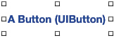
In this project, we create an application that displays flower photographs and flower information from the website FloraPhotographs.com. The application enables a user to touch a flower color within a segmented control (UISegmentedControl), resulting in a flower of that color being fetched and displayed from the FloraPhotographs site in a web view (UIWebView). The user can then use a toggle switch (UISwitch) to show and hide a second web view that contains details about the flower being displayed. Finally, a standard button (UIButton) enables the user to fetch another flower photo of the currently selected color from the site. The result should look very much like Figure 9.3.
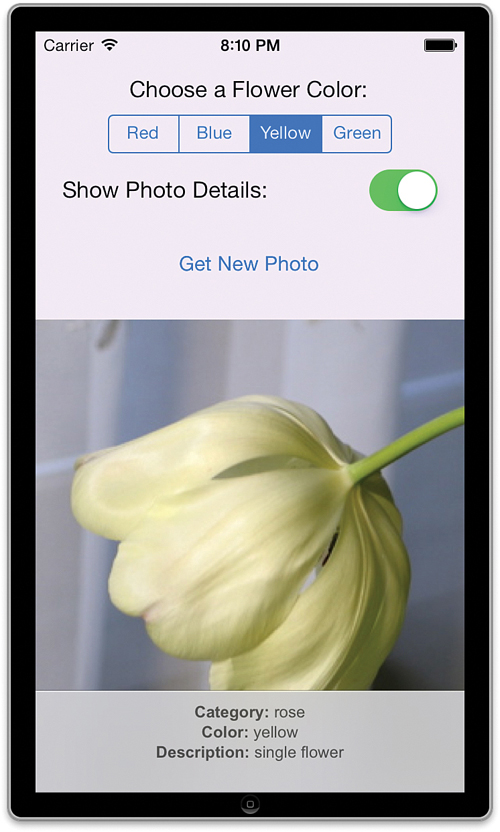
FIGURE 9.3 The finished application will make use of a segmented control, a switch, and two web views.
Setting Up the Project
This project will, once again, use the Single View Application template we’re starting to love. If it isn’t already running, launch Xcode and then create a new project using the same settings as in the previous hours. This project should be called FlowerWeb.
You should now be accustomed to what happens next. Xcode sets up the project and creates the default view in Main.storyboard and a view controller class named ViewController. We’ll start as we always do: planning the variables, properties, outlets, and actions we need in the view controller.
Planning the Properties and Connections
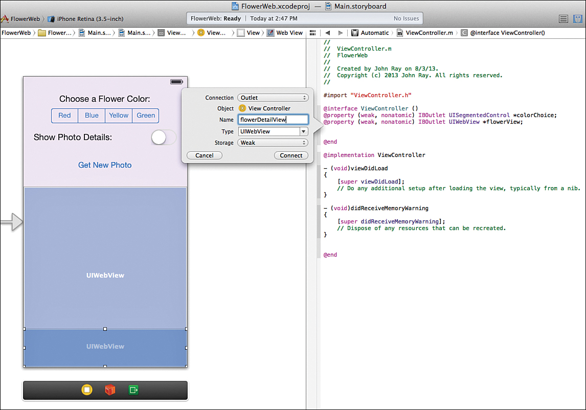
To create the web-based image viewer, we need three outlets and two actions. The segmented control will be connecting to an outlet called colorChoice because we’ll use it to choose which color is displayed. The web view that contains the flower will be connected to flowerView, and the associated details web view to flowerDetailView.
For the actions, the application must do two things: get and display a flower image, which we’ll define as the action method getFlower; and toggle the flower details on and off, something we’ll handle with a toggleFlowerDetail action.
Designing the Interface
By now, this process should seem a bit familiar. We’ve defined the outlets and actions, so it’s time to build the UI. Prepare your Xcode workspace for developing the UI: Choose the Main.storyboard file to open the IB editor, and then close the project navigator, if necessary, to make room on your display. We begin by adding the segmented control.
Adding a Segmented Control
To add a segmented control to the user interface, open the Object Library (View, Utilities, Object Library), find the segmented control (UISegmentedControl) object, and drag it into the view. Position the control near the top of the view in the center. Because this control is ultimately used to choose colors, click and drag a label (UILabel) into the view, as well, position it above the segmented control, and change it to read Choose a Flower Color:. Your view should now resemble Figure 9.4.
By default, the segmented control has two segments, titled First and Second. You can double-click these titles and edit them directly in the view, but that doesn’t quite get us what we need.
For this project, we need a control that has four segments, each labeled with a color: Red, Blue, Yellow, and Green. These are the colors that we can request from the FloraPhotographs website for displaying. Obviously, we need to add a few more segments to the control before all the choices can be represented.
Adding and Configuring Segments
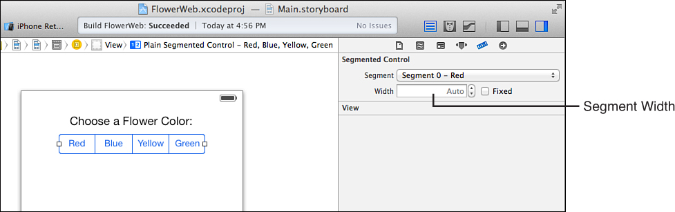
The number of segments displayed in the segmented control is configurable in the Attributes Inspector for the object. Select the control that you’ve added to the view, and then press Option-Command-4 to open the Attributes Inspector, shown in Figure 9.5.
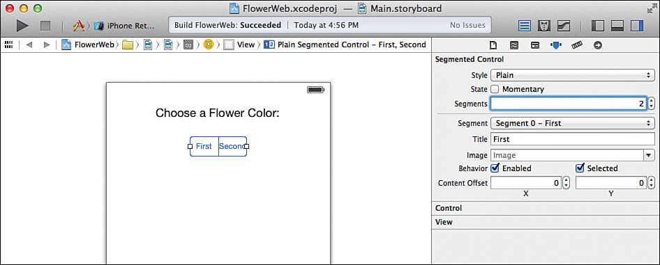
FIGURE 9.5 Use the Attributes Inspector for the segmented control to increase the number of segments displayed.
Using the Segments field, increase the number from 2 to 4. You should immediately see the new segments displayed. Notice that directly below where you set the number of segments in the inspector is a drop-down with entries for each segment you’ve added. You can choose a segment in this drop-down and then specify its title in the Title field. You can even add image resources and have them displayed within each segment.
Note
Note that the first segment is segment 0, the next is segment 1, and so on. It’s important to keep this in mind when you’re checking to see which segment is selected. The first segment is not segment 1, as you might assume.
Update the four segments in the control so that the colors Red, Blue, Yellow, and Green are represented. The segmented control should now have titles for all the colors and a corresponding label to help the user understand its purpose.
Note
iPad developers who want to take advantage of their extended screen space might try adding a few more segments to the segmented control. The colors violet and magenta can be added and will be automatically recognized by the FloraPhotographs site.
Sizing the Control
Chances are, the control you’ve set up doesn’t quite look right in the view. To size the control to aesthetically pleasing dimensions, use the selection handles on the sides of the control to stretch and shrink it appropriately. You can even optimize the size of individual segments by setting them to a fixed width using the Segmented Control Size options in the Size Inspector (Option-Command-5), as shown in Figure 9.6.
Adding a Switch
The next UI element we’ll add is the switch (UISwitch). In our application, the switch has one role: to toggle a web view that displays details about the flower (flowerDetailView) on and off. Add the switch to the view by dragging the switch object from the Library into the view. Position it along the right side of the screen, just under the segmented control.
As with the segmented control, providing some basic user instruction through an onscreen label can be helpful. Drag a label (UILabel) into the view and position it to the left of the switch. Change the text to read Show Photo Details:. Your view should now resemble Figure 9.7, but your switch will likely show up as on.

Setting the Default State
I know you’re getting used to many of the different configuration options for the controls we use, but in this case, the switch has only two options: whether the default state is on or off, and what custom tint (if any) should be applied in the on state.
The switch that you added to the view is set to on. We want to change it so that it is off by default. To change the default state, select the object and open the Attributes Inspector (Option-Command-4). Using the State pop-up menu (see Figure 9.7), change the default state to off.
Adding the Web Views
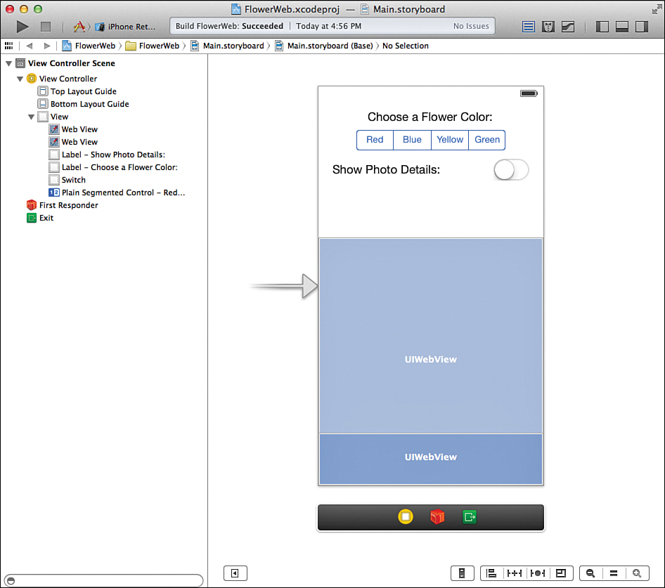
The application that we’re building relies on two different web views. One displays the flower image itself; the other view (which can be toggled on and off) shows details about the image. The details view will be overlaid on top of the image itself, so let’s start by adding the main view, flowerView.
To add a web view (UIWebView) to your application, locate it in the Object Library and drag it into your view. The web view will display a resizable rectangle that you can drag and position anywhere you want. Because this is the view that the flower image is shown in, position it to fall about halfway down the screen, and then resize it so that it is the same width as the device screen and so that it covers the lower portion of the view entirely.
Repeat this to add a second web view for the flower details (flowerDetailView). This time, size the view so that it is about half an inch high and locate it at the very bottom of the screen, over top of the flower view, as shown in Figure 9.8. Remember that you can drag items in the document outline to change their ordering. The closer an element is to the top of the list, the further “back” it is.
Setting the Web View Attributes
Web views, surprisingly, have few attributes that you can configure, but what is available can be very important. To access the web view attributes, select one of the views you added, and then press Open-Command-4 to open the Attributes Inspector (see Figure 9.9).
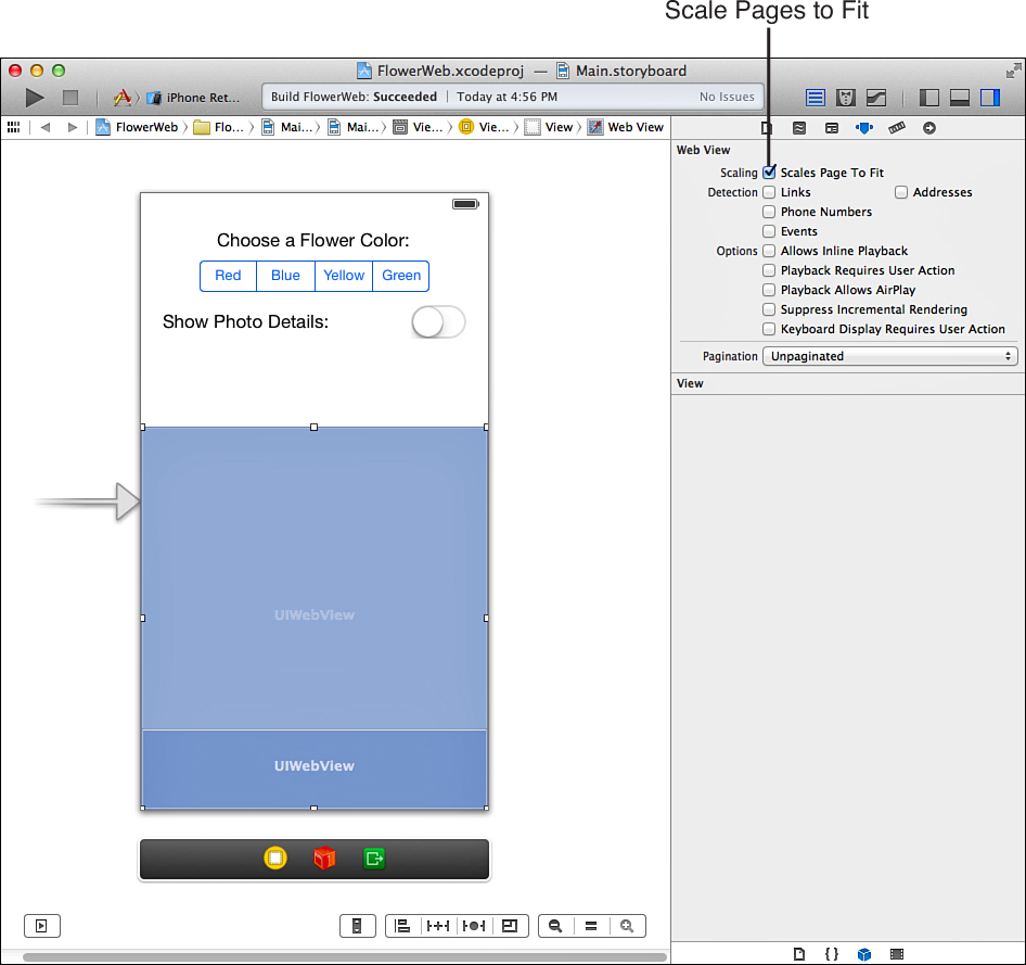
You can select from three types of settings: Scaling, Detection (Phone Numbers, Addresses, Events, Links), and a generic Options. If you select Scales Page to Fit under Scaling, large pages are scaled to fit in the size of the area you’ve defined. If you use Detection options, the iOS data detectors go to work and underline items that it has decided are phone numbers, addresses, dates, or additional web links. The Options settings apply to media playback—whether you can use AirPlay, how media plays in your web view (inline or not)—as well as how web pages render (most do it incrementally) and whether pages are allowed to display a keyboard automatically.
For the main flower view, we absolutely want the images to be scaled to fit within the view. Select the web view, and then use the Attributes Inspector to choose the Scales Page to Fit option.
For the second view, we do not want scaling to be set, so select the web view where the application will be showing the flower details and use the Attributes Inspector to ensure that no scaling takes place. You might also want to change the view attributes for the detail view to have an alpha value of around 0.65. This creates a nice translucency effect when the details are displayed on top of the photograph.
Caution: Understand the Effects of Scaling
Scaling doesn’t necessarily do what you might expect for “small” web pages. If you display a page with only the text Hello World on it in a scaled web view, you might expect the text to be shown to fill the web view. Instead, the text will be tiny. The web view assumes that the text is part of a larger page and scales it down rather than making it appear bigger.
If you happen to have control of the web page itself, you can add a "viewport" meta tag to tell Safari how wide (in pixels) the full page is, as follows:
<meta name="viewport" content="width=320"/>
With the tough stuff out of the way, we just have one more finishing touch to put on the interface, and then we’re ready to code.
Finishing the Interface
The only functional piece that is missing from our interface is a button (UIButton) that we can use to manually trigger the getFlower method anytime we want. Without the button, we have to switch between colors using the segmented control if we want to see a new flower image. This button does nothing more than trigger an action (getFlower), something you’ve done repeatedly in the past few hours, so this should be quite easy for you by now.
Drag a button into the view, positioning it in the center of the screen above the web views. Edit the button title to read Get New Photo. We’re done. You know what that means: time to wire the interface to the code.
Tip
Although your interface may be functionally complete, you might want to select the view itself and set a background color. Keep your interfaces clean and friendly.
Creating and Connecting the Outlets and Actions
We have quite a few interface elements to connect for this project. Our segmented control, switch, button, and web views all need the proper connections to the view controller. Here’s what we’ll use.
Starting with the outlets:
Segmented control for choosing colors (UISegmentedControl): colorChoice
Main flower web view (UIWebView): flowerView
Flower detail web view (UIWebView): flowerDetailView
Fetch a new flower using the Get New Flower button: getFlower
Turn the flower detail view on and off with the UISwitch: toggleFlowerDetail
Okay, the same old story: Prepare your workspace by making sure the Main.storyboard file is selected and then opening the assistant editor. Hide the project navigator and document outline if you need space.
I assume you’re getting pretty familiar with this process, so we’ll move quickly through the connections here and in later hours. After all, it’s just click, drag, and connect.
Adding the Outlets
Begin by Control-dragging from the segmented color button control to the line following the @interface directive in the ViewController.m file. When prompted, configure the connection as an outlet and its name as colorChoice, leaving the other values set to the defaults. This gives us an easy way to get the currently selected color in our code.
Continue building the rest of the outlets, connecting the main (large) web view to the outlet flowerView by Control-dragging to just below the @property line in ViewController.m. Finish the outlets by connecting the second web view to flowerDetailView with the same approach, as shown in Figure 9.10.
Adding the Actions
Our UI triggers two action methods. The switch hides and shows details about the flower through the method toggleFlowerDetail, and the standard button loads a new image for us with getFlower. Straightforward, right? It is, but sometimes you need to think beyond the obvious actions users can take and consider what they will expect to happen when they use the interface.
In this application, users are presented with a simple interface. They should immediately recognize that they can choose a color and push a button to get a flower of that color. But shouldn’t the application be smart enough to load a new flower as soon as the user switches the color? Why should the user have to switch the color and then press another button? By connecting the UISegmentedControl’s Value Changed event to the same getFlower method we trigger from the button, we gain this functionality without writing a single additional line of code.
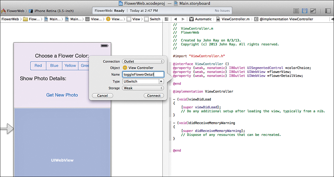
Start by connecting the switch (UISwitch) to a new action named toggleFlowerDetail by Control-dragging to just below the @property declarations in ViewController.m. Make sure that the action is triggered from the event Value Changed, as shown in Figure 9.11.
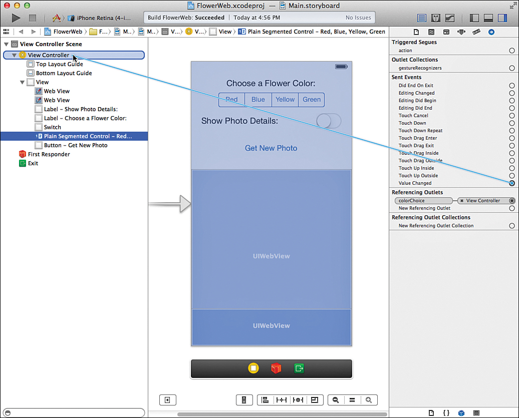
Next, Control-drag from the button (UIButton) to a line under the IBAction you just defined. When prompted, configure a new action, getFlower, that is triggered from the Touch Up Inside event. Finally, we need to target this new getFlower action from the Value Changed event on the segmented control (UISegmentedControl) so that the user can load a new flower just by touching a color.
Switch to the standard editor and make sure that the document outline is visible (Editor, Show Document Outline). Select the segmented control, and open the Connections Inspector by pressing Option-Command-6 (View, Utilities, Connections Inspector). Drag from the circle beside Value Changed to the View Controller line in the document outline, as demonstrated in Figure 9.12. Release your mouse button and choose getFlower when prompted.
Note
Okay, I admit it. In this example, we took a roundabout way of connecting the segmented control to the getFlower method. We could have also Control-dragged from the segmented control onto the getFlower IBAction line in the assistant editor and instantly had our connection.
The problem with the “easy” approach, however, is that you aren’t given the opportunity of choosing which event triggers the action. It just so happens that in this case, Xcode would choose Value Changed for you.
The interface and its connections are finished. The @interface block at the top of your ViewController.m file should look like this:
@interface ViewController ()
@property (weak, nonatomic) IBOutlet UISegmentedControl *colorChoice;
@property (weak, nonatomic) IBOutlet UIWebView *flowerView;
@property (weak, nonatomic) IBOutlet UIWebView *flowerDetailView;
- (IBAction)getFlower:(id)sender;
- (IBAction)toggleFlowerDetail:(id)sender;
@end
Implementing the Application Logic
Our view controller needs to implement two pieces of functionality via two action methods. The first, toggleFlowerDetail, shows and hides the flowerDetailView web view, depending on whether the switch has been flipped on (show) or off (hide). The second method, getFlower, loads a flower image into the flowerView web view and details on that photograph into the flowerDetailView web view. We start with the easier of the two, toggleFlowerDetail.
Hiding and Showing the Detail Web View
A useful property of any object that inherits from UIView is that you can easily hide (or show) it within your iOS application interfaces. Because almost everything you see onscreen inherits from this class, this means you can hide and show labels, buttons, fields, images, and yes, other views. To hide an object, you just set its Boolean property hidden to TRUE or YES (both have the same meaning). So, to hide the flowerDetailView, we write the following:
self.flowerDetailView.hidden=YES;
To show it again, we just reverse the process, setting the hidden property to FALSE or NO:
self.flowerDetailView.hidden=NO;
To implement the logic for the toggleFlowerDetail method, we need to figure out what value the switch is currently set to. As mentioned earlier in the lesson, we can check the state of a toggle switch through the isOn method that returns a Boolean value of TRUE/YES if the switch is set to on or FALSE/NO if it is off.
Because we don’t have an outlet specifically set aside for the switch, we’ll use the sender variable to access it in our method. When the toggleFlowerDetail action method is called, this variable is set to reference the object that invoked the action (in other words, the switch). So, to check to see whether the switch is on, we can write the following:
If ([sender isOn]) { <switch is on> } else { <switch is off> }
Now, here’s where we can get clever. (You are feeling clever, right?) We want to hide and show the flowerDetailView using a Boolean value and we get a Boolean value from the switch’s isOn method. This maps to two conditions:
When [sender isOn] is YES, the view should not be hidden (flowerDetailView.hidden=NO).
When [sender isOn] is NO, the view should be hidden (flowerDetailView.hidden=YES).
In other words, the state of the switch is the exact opposite of what we need to assign to the hidden property of the view. In C (and therefore Objective-C), to get the opposite of a Boolean value, we just put an exclamation mark in front (!). So, all we need to do to hide or show flowerDetailView is to set the hidden property to ![sender isOn]. That’s it. A single line of code.
Implement toggleFlowerDetail in the FlowerWeb view controller stub that Xcode provided for you. The full method should look a lot like Listing 9.1.
LISTING 9.1 Implementing the toggleFlowerDetail Method
- (IBAction)toggleFlowerDetail:(id)sender {
self.flowerDetailView.hidden=![sender isOn];
}
Loading and Displaying the Flower Image and Details
To fetch our flower images, we use a feature provided by the FloraPhotographs website specifically for this purpose. We follow four steps to interact with the website:
1. We get the chosen color from the segmented control.
2. We generate a random number called a “session ID” so that FloraPhotographs.com can track our request.
3. We request the URL http://www.floraphotographs.com/showrandomios.php?color=<color>&session=<sessionID>, where <color> is the chosen color and <session ID> is the random number. This URL returns a flower photo.
4. We request the URL http://www.floraphotographs.com/detailios.php?session=<sessionID>, where <session ID> is the same random number. This URL returns the details for the previously requested flower photo.
Let’s go ahead and see what this looks like in code and then discuss details behind the implementation. Add the getFlower implementation, as shown in Listing 9.2.
LISTING 9.2 Adding the getFlower Implementation
1: - (IBAction)getFlower:(id)sender {
2: NSURL *imageURL;
3: NSURL *detailURL;
4: NSString *imageURLString;
5: NSString *detailURLString;
6: NSString *color;
7: int sessionID;
8:
9: color=[self.colorChoice titleForSegmentAtIndex:
10: self.colorChoice.selectedSegmentIndex];
11: sessionID=random()%50000;
12:
13: imageURLString=[NSString stringWithFormat:
14: @"http://www.floraphotographs.com/showrandomios.php?color=%@&session=%d"
15: ,color,sessionID];
16: detailURLString=[NSString stringWithFormat:
17: @"http://www.floraphotographs.com/detailios.php?session=%d"
18: ,sessionID];
19:
20: imageURL=[NSURL URLWithString:imageURLString];
21: detailURL=[NSURL URLWithString:detailURLString];
22:
23: [self.flowerView loadRequest:[NSURLRequest requestWithURL:imageURL]];
24: [self.flowerDetailView loadRequest:[NSURLRequest requestWithURL:detailURL]];
25:
26: }
This is the most complicated code that you’ve written so far, but it’s broken down into the individual pieces, so it’s not difficult to understand.
Lines 2–7 declare the variables that we need to prepare our requests to the website. The first variables, imageURL and detailURL, are instances of NSURL that contain the URLs that are loaded into the flowerView and flowerDetailView web views. To create the NSURL objects, we need two strings, imageURLString and detailURLString, which we format with the special URLs that we presented earlier, including the color and sessionID values.
In lines 9–10, we retrieve the title of the selected segment in our instance of the segmented control: colorChoice. To do this, we use the object’s instance method titleForSegment AtIndex along with the object’s selectedSegmentIndex property. The result, [colorChoice titleForSegmentAtIndex: colorChoice.selectedSegmentIndex], is stored in the string color and is ready to be used in the web request.
Line 11 generates a random number between 0 and 49999 and stores it in the integer sessionID.
Lines 13–18 prepare imageURLString and detailURLString with the URLs that we will be requesting. The strings, including the color and session ID information, are created with the initWithString method. The color and session ID are substituted into the string using the formatting placeholders %@ and %d for strings and integers, respectively.
Lines 20–21 allocate and create the imageURL and detailURL NSURL objects using the initWithString class method and the two strings imageURLString and detailURLString.
Lines 23–24 use the loadRequest method of the flowerView and flowerDetailView web views to load the NSURLs imageURL and detailURL, respectively. When these lines are executed, the display updates the contents of the two views.
Note
Remember that, as mentioned earlier, UIWebView’s loadRequest method doesn’t handle NSURL objects directly; it expects an NSURLRequest object instead. To work around this, we create and return NSURLRequest objects using the NSURLRequest class method requestWithURL and the imageURL and detailURL objects as parameters.
Fixing Up the Interface When the App Loads
Now that the getFlower method is implemented, you can run the application and everything should work—except that when the application starts, the two web views are empty and the detail view is visible, even though the toggle switch is set to off.
To fix this, we can start loading an image as soon as the app is up and running and set flowerDetailView.hidden to YES. To do this, update the view controller’s viewDidLoad method as follows in Listing 9.3.
LISTING 9.3 Updating the viewDidLoad Method to Set the Initial Display
- (void)viewDidLoad
{
[super viewDidLoad];
self.flowerDetailView.hidden=YES;
[self getFlower:nil];
}
As expected, self.flowerDetailView.hidden=YES hides the detail view. Using [self getFlower:nil], we can call the getFlower method from within our instance of the view control (referenced as self) and start the process of loading a flower in the web view. The method getFlower expects a parameter, so we pass it nil, just as we did in the last hour’s lesson. (This value is never used in getFlower, so there is no problem with providing nil.)
Building the Application
Test out the final version of the FlowerWeb application by clicking Run in Xcode.
Notice that you can zoom in and out of the web view and use your fingers to scroll around. These are all features that you get without any implementation cost when using the UIWebView class.
Congratulations. Another app under your belt.
Using Scrolling Views
After working through the projects in the past few hours, iPhone users might begin to notice something: We’re running out of space in our interfaces. Things are starting to get cluttered.
One possible solution, as you learned earlier in this hour, is to use the hidden property of UI objects to hide and show them in your applications. Unfortunately, when you’re juggling a few dozen controls, this is pretty impractical. Another approach is to use multiple different views, something that you start learning about in Hour 11.
There is, however, a third way that we can fit more into a single view—by making it scroll. Using an instance of the UIScrollView class, you can add controls and interface elements out beyond the physical boundaries of your device’s screen. Unfortunately, Apple provides access to this object in the IB editor but making it work is a bit less obvious than one might hope.
Before closing out this hour, I want to show you how to start using simple scrolling views in a mini-project.
Implementation Overview
When I say simple, I mean it. This project consists of a scroll view (UIScrollView) with content added in the IB editor that extends beyond the physical screen, as shown in Figure 9.13.

To enable scrolling in the view, we need to set a property called contentSize, which describes how large the content is that needs to be scrolled. That’s it.
Setting Up the Project
Begin by creating another Single View Application. Name the new project Scroller. For this example, we’re going to be adding the scroll view (UIScrollView) as a subview to the existing view in Main.storyboard. This is a perfectly acceptable approach, but as you get more experienced with the tools, you might want to just replace the default view entirely.
Planning the Property and Connections
We need to do just one thing programmatically in this project, and that’s set a property on the scroll view object. To access the object, we must create an outlet for it, which we’ll call theScroller.
Designing the Interface
There isn’t much to this project, just a scrolling view and content. Because you already know how to find objects in the Object Library and add them to a view, this should be trivial. Start by opening the Main.storyboard file for the project and making sure the document outline is visible (Editor, Show Document Outline).
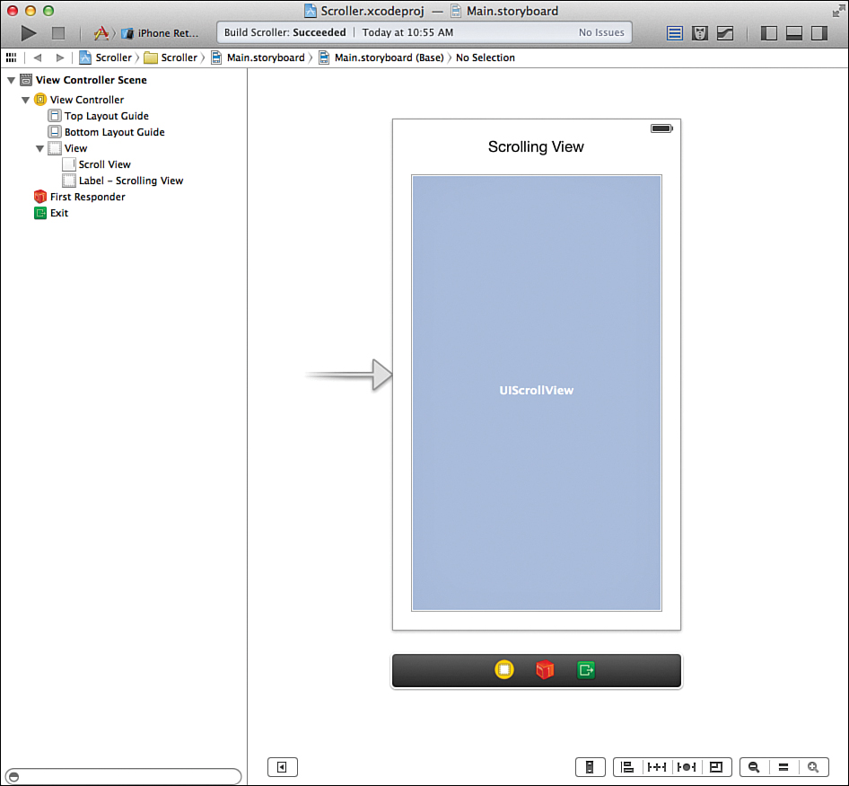
Adding a Scroll View
Using the Object Library (View Utilities, Show Object Library), drag an instance of a scroll view (UIScrollView) into your view. Position the view to just about fill the scene using the guides on the sides and bottom to line it up. Place a label above it that reads Scrolling View (just in case you forget what we’re building). Figure 9.14 shows what your scene should look like at this point.
Tip
The text view (UITextView) you used in Hour 7 is a specialized instance of a scrolling view. The same scrolling attributes that you can set for the text view can be applied for the scroll view, so you might want to refer to that earlier hour for more configuration possibilities. Or just press Option-Command-4 to bring up the Attributes Inspector and explore.
Now that your scroll view is added to your design, you need to populate it with something. Objects are often placed in scroll views by writing code that calculates their position—but how can we do that in such a small space?
Changing the View Controller Simulated Size
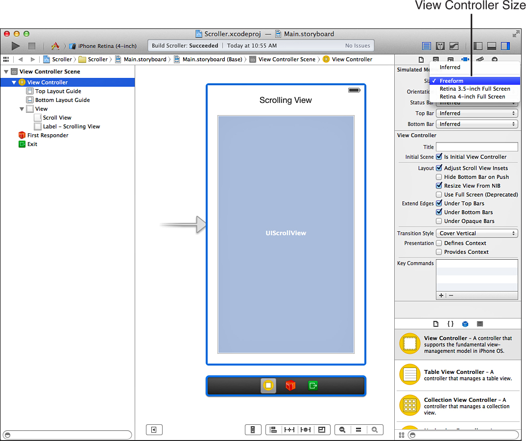
To start, we change the view controller and the default view for the view controller so that they are as large as we want. Begin by clicking the View Controller object in the document outline, and then open the Attributes Inspector (Option-Command-4). Use the Size drop-down menu to switch from Inferred to Freeform, as shown in Figure 9.15.
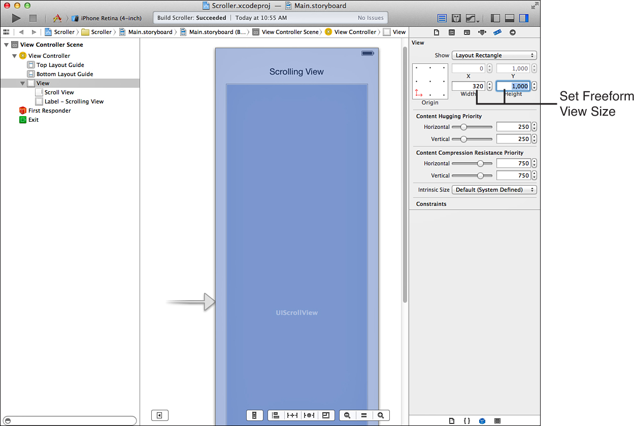
Now that the size for the view controller is set we need to enlarge the view so that we can layout the scrolling view with drag-and-drop convenience. Select the view object within the view controller, and then open the Size Inspector (Option-Command-5). Make a note of the current value of the Height field for the view (you’ll need it again in a minute), and then set the value to roughly double what it is usually—that is, 1000 points for the iPhone and 2000 points for the iPad. As soon as you make the change, your scene should change to take up the expanded space, as (partially) shown in Figure 9.16.
Adding Objects to the Scroll View
Now that your scene is much larger, adding objects to your scrolling view should be straightforward. First, make sure that the scrolling view expanded when you set the new size for the main view. If it didn’t, use the selection handles to resize it to fill your new space, snapping it to the guides on the bottom and left/right sides of the main view.
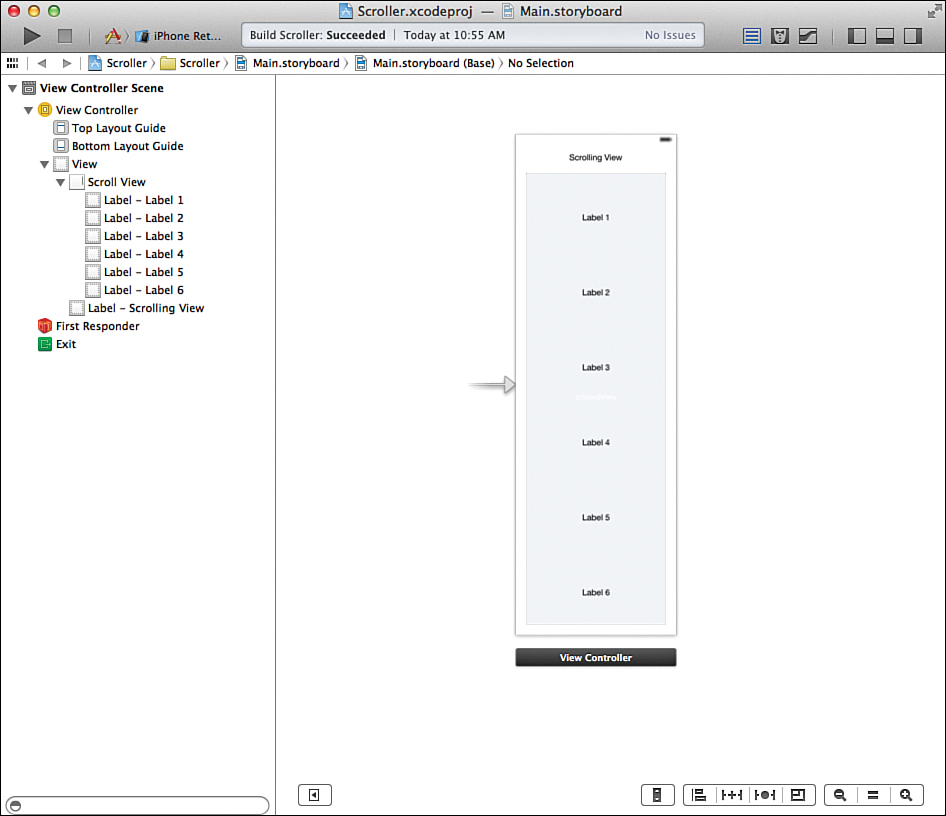
Add several labels (or any other GUI object) to your scrolling view, spacing them evenly from the top to the bottom. For my sample project, I’m adding six labels: Label 1, Label 2, ... Label 6. Figure 9.17 shows my final layout for the iPhone.
Resetting the View Controller Simulated Size
As a finishing step for the interface, we need to get the view and the view controller back to normal. To do this, we need to set the height of the main view, and then reset the view controller size—the exact opposite of the actions we performed a few minutes ago.
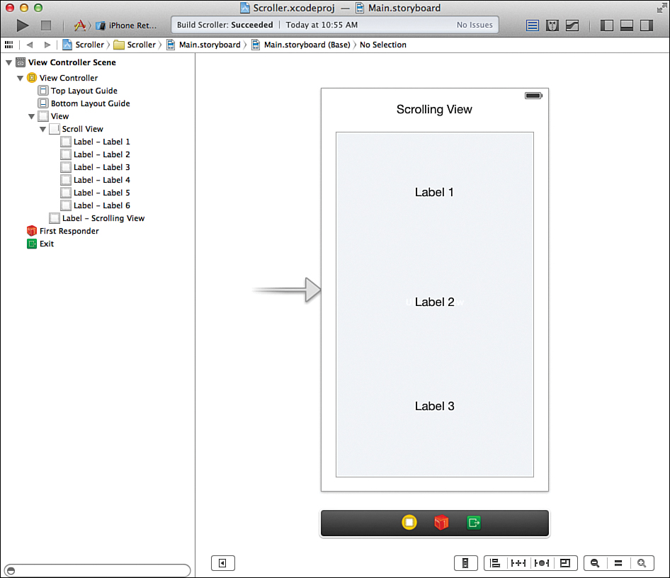
Select the main view object within the scene and open the Size Inspector. Set the value to its original value—that is, 568 for the iPhone 5, 480 for earlier iPhones, and 1004 for the iPad. After making the change, your scene should shrink back down to a manageable size, and several of the labels should be hidden. If your scrolling view does resize correctly when you change the size of the main view, use the selection handles to resize it (or use the Size Inspector).
Finally, select the View Controller object in the document outline, open the Attributes Inspector, and set the size back to Inferred. Now you should have a view, with labels (several hidden), in a “normal”-sized scene, as shown in Figure 9.18.
Now that your interface is finished, its time to get to coding. Don’t worry, you’ll be done before you even know you’ve started!
Another way to get labels into a scrolling view is to lay them out in your main view however you’d like, select them, and then choose Editor, Embed In, Scroll View from the menu bar. This adds a scrolling view to your interface that contains all the selected objects.
Creating and Connecting the Outlets and Actions
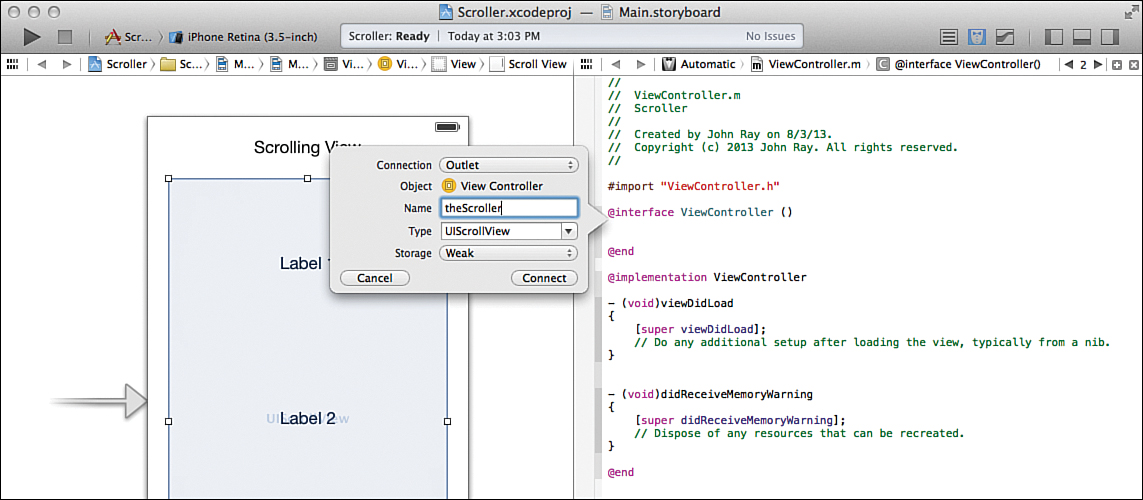
This project needs only a single outlet and no actions. To create the outlet, switch to the assistant editor and disable the project navigator if you need to make a bit of extra room. Control-drag from the scroll view to just below the @interface line in the ViewController.m file.
When prompted, create a new outlet called theScroller, as shown in Figure 9.19.
That finishes up our work in the IB editor; just a teensy bit of implementation remains. Switch back to the standard editor, enable the project navigator, and then select the ViewController.m file to finish the implementation.
Implementing the Application Logic
For fun, try to run the application as it stands. It compiles and launches, but it doesn’t scroll (at least not correctly). The reason for this is because iOS needs to know the horizontal and vertical sizes of the region it is going to scroll. Until the scrolling view knows that it can scroll, it doesn’t.
Adding Scrolling Behavior
To add scrolling to our scroll view, we need to set the contentSize attribute to a CGSize value. CGSize is just a simple C data structure that contains a height and a width, and we can easily make one using the CGSizeMake(<width>,<height>) function.
For example, to tell our scroll view (theScroller) that it can scroll up to 280 points horizontally and 1000 points vertically, we could enter the following:
self.theScroller.contentSize=CGSizeMake(280.0,1000.0);
Guess what? That isn’t just what we could do, it’s what we will do. If you’re developing on the iPhone, edit the ScrollerViewController.m file and add the method viewDidAppear shown in Listing 9.4.
LISTING 9.4 Enabling Scrolling in Your Scroll View
- (void)viewDidAppear:(BOOL)animated {
[super viewDidAppear:animated];
self.theScroller.contentSize=CGSizeMake(280.0,1000.0);
}
If you are working on the iPad, you need to adjust the size to be a bit larger because the screen is larger. Provide the arguments 900.0 and 2000.0 to the CGSizeMake function, instead of 280.0 and 1000.0.
The viewDidAppear method is a standard view controller method that executes as soon as iOS has laid out a scene on the screen. When you implement it, you must pass the viewDidAppear message to the parent object (super); so the first line should be included in any implementation. The second line sets the contentSize and enables the scrolling.
Caution: Wrong Makes Right
Depending on how much attention to pay to developer forums, you’ll find that some who proselytize the notion that, as of iOS 6, Auto Layout (a system you’ll learn about in Hour 16, “Building Responsive and Backward-Compatible User Interfaces”) will automatically calculate the sizes of your scrolling views and will make them scroll automatically. Adding additional code is unnecessary.
Unfortunately, Auto Layout is still rapidly evolving, and many developers have spent sleepless nights trying to make it work for scrolling views. As of iOS 7, it’s still not perfect. If we have to add two or three lines of code to ensure that it works right, no matter what, that seems like the smart thing to do.
Building the Application
The moment of truth has arrived. Does the single line of code make magic? Choose Run from the Xcode toolbar, and then try scrolling around the view you created. Everything should work like a charm.
Okay, so it’s not technically a single line of code for the entire implementation, but it is a single line that makes the scrolling view work.
Yes, this was a quick-and-dirty project, but there seems to be a lack of information on getting started with UIScrollView, and I thought it was important to run through a short tutorial. I hope this gives you new ideas about what you can do to create more feature-rich iOS interfaces.
Further Exploration
As well as useful, the segmented control (UISegmentedControl) and switch (UISwitch) classes are pretty easy to get the hang of. The best place to focus your attention for additional exploration is on the feature set provided by the UIWebView and UIScrollView classes.
As described at the start of this hour, UIWebView can handle a large variety of content beyond what might be inferred by the “web” portion of its name. By learning more about NSURL, such as the initFileURLWithPath:isDirectory method, you’ll be able to load files directly from your project resources. You can also take advantage of the web view’s built-in actions, such as goForward and goBack, to add navigation functionality without a single line of code. One might even use a collection of HTML files to create a self-contained website within an application. In short, web views extend the traditional interface of your applications by bringing in HTML markup, JavaScript, and CSS—creating a potent combination.
The UIScrollView class, on the other hand, gives us an important capability that is widely used in iOS applications: touch scrolling. We briefly demonstrated this at the end of the hour, but there are additional features, such as pinching and zooming, that can be enabled by implementing the UIScrollViewDelegate protocol. We take our first look at building a class that conforms to a protocol in the next hour, so keep this in mind as you get more comfortable with the concepts.
Summary
In this hour, you learned how to use two controls that enable applications to respond to user input beyond just a simple button press or a text field. The switch and segmented control, while limited in the options they can present, give a user a touch-friendly way of making decisions within your applications.
You also explored how to use web views to bring web content directly into your projects and how to tweak it so that it integrates into the overall iOS user experience. This powerful class will quickly become one of your most trusted tools for displaying content.
Because we’ve reached a point in our development where things are starting to get a bit cramped, we closed out the hour with a quick introduction to the scroll view. You learned how, despite appearances, scroll views can be easily added to apps.
Q&A
Q. Why did objects jump around when I resized the freeform view in IB?
A. If your labels or scrolling view moved around a bit, you’re seeing the results of the new Auto Layout constraints system. You’ll learn more about this important tool in Hour 16, but for now, don’t worry too much if things don’t look exactly the way you want in your layouts.
Q. You mentioned the UIWebView includes actions. What does that mean, and how do I use them?
A. This means that the object you drag into your view is already capable of responding to actions (such as navigation actions) on its own—no code required. To use these, you connect from the UI event that should trigger the action to your instance of the web view and then choose the appropriate action from the pop-up window that appears.
Workshop
Quiz
1. How do you add the Apple blur effect to an iOS 7 object?
2. How do you get the opposite of a Boolean value?
3. What type of object does a web view expect as a parameter when loading a remote URL?
Answers
1. Sadly, you don’t (at least not with Apple’s default tools). In this hour, we took a quick look at a way around this limitation using a third-party class.
2. To negate a Boolean value, just prefix it with an exclamation point. !TRUE, for example, is the same as FALSE.
3. You typically use an NSURLRequest object to initiate a web request within a web view.
Activities
1. Create your own “mini” web browser by combining a text field, buttons, and a segmented control with a web view. Use the text field for URL entry, buttons for navigation, and hard-code some shortcuts for your favorite sites into the segmented control. To make the best use of space, you may want to overlay the controls on the web view and then add a switch that hides or shows the controls when toggled.
2. Practice laying out a user interface within a scrollable view. Use graph paper to sketch the view and determine coordinates before laying it out in Interface Builder.
3. Change the FlowerWeb application to take on a more “iOS 7” appearance. Extend the main UIWebView to cover the entire screen, but blur the area behind the main controls.