Chapter 13. Metronome

A metronome can be a useful tool for musicians, and this chapter’s Metronome app enables this functionality to be with you wherever you go. Metronome features the classic arm with an adjustable weight that swings like a pendulum. It supports a range of 25–200 beats per minute, and it produces sounds to denote each beat as well as the beginning of each measure. Three time signatures are supported: 2/4, 3/4, and 4/4. (If you’re not a musician, don’t worry about the concepts of time signatures and measures; this only affects the pattern of sounds produced and is not an important part of this chapter.)
The pendulum-swinging style definitely leans toward mimicking the real world rather than providing an “authentically digital” experience like a proper Metro app would, but this novelty app can get away with it. It also provides a perfect opportunity to introduce transforms, as this is what enables the rotation of the arm.
Introducing Transforms
Silverlight contains a handful of 2D transform classes that enable you to morph elements in exotic ways. The 2D transform classes are
→ RotateTransform
→ ScaleTransform
→ SkewTransform
→ TranslateTransform
→ Three ways to combine all of the above (CompositeTransform, TransformGroup, and MatrixTransform)
Although it can sometimes be useful to manually rotate/scale/skew/translate an element, these transform classes are typically used as the target of animations. Metronome uses animations targeting RotateTransform to enable the swinging pendulum motion of its arm.
RotateTransform
RotateTransform rotates an element according to the values of three double properties:
→ Angle—Angle of rotation, specified in degrees (default value = 0)
→ CenterX—Horizontal center of rotation (default value = 0)
→ CenterY—Vertical center of rotation (default value = 0)
The default (CenterX,CenterY) point of (0,0) represents the top-left corner of the element.
To apply RotateTransform (or any transform) to an element, you use it as the value of the element’s RenderTransform property. This is done in a first attempt at Metronome’s main page, as follows:
<phone:PhoneApplicationPage ...>
<Grid>
<Image Source="Images/metronome.png" Stretch="None" VerticalAlignment="Top"/>
<Canvas Margin="0,60,0,0" Width="200" Height="570" Background="#A0A0">
<Canvas.RenderTransform>
<RotateTransform Angle="30"/>
</Canvas.RenderTransform>
<Image Canvas.Left="94" Source="Images/arm.png"/>
<Image Canvas.Left="66" Canvas.Top="434" Source="Images/weight.png"/>
</Canvas>
</Grid>
</phone:PhoneApplicationPage>
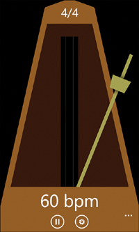
The result is shown in Figure 13.1. The canvas being rotated is given a translucent green background, so it’s easier to see how it’s being rotated.
Figure 13.1 Rotating the translucent green canvas by 30°.
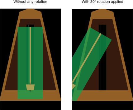
Of course, using the top-left corner as the center of rotation does not give the desired effect. Instead, we want the canvas to rotate around its bottom middle. Based on the size of this canvas, this could be done by setting RotateTransform’s CenterX to 100 and CenterY to 570, but there’s another way to do this that is generally preferred.
Every element with a RenderTransform property also has a RenderTransformOrigin property that represents the starting point of the transform (the point that remains stationary). For RotateTransform, this is the same as specifying the (CenterX,CenterY) point, except that the x and y values used in RenderTransformOrigin are always on a relative scale from 0 to 1. The default origin of (0,0) is the top-left corner, (0,1) is the bottom-left corner, (1,0) is the top-right corner, and (1,1) is the bottom-right corner. You can use numbers greater than 1 to set the origin to a point outside the bounds of an element, and you can use fractional values. Therefore, an origin of (0.5,0.5) can be used to rotate an element around its middle.
Figure 13.2 shows two values of RenderTransformOrigin applied to the translucent green canvas. The first one spins it around its middle, and the second one spins it around its bottom-middle (the desired effect for this app), as follows:
<phone:PhoneApplicationPage ...>
<Grid>
<Image Source="Images/metronome.png" Stretch="None" VerticalAlignment="Top"/>
<Canvas Margin="0,60,0,0" Width="200" Height="570" Background="#A0A0"
RenderTransformOrigin=".5,1">
<Canvas.RenderTransform>
<RotateTransform Angle="30"/>
</Canvas.RenderTransform>
<Image Canvas.Left="94" Source="Images/arm.png"/>
<Image Canvas.Left="66" Canvas.Top="434" Source="Images/weight.png"/>
</Canvas>
</Grid>
</phone:PhoneApplicationPage>
Figure 13.2 Customizing the origin of rotation with RenderTransformOrigin.
How can I rotate an element in 3D?
ScaleTransform
ScaleTransform enlarges or shrinks an element horizontally, vertically, or in both directions. It works like RotateTransform, except it has ScaleX and ScaleY properties instead of an Angle property. ScaleTransform is used in the next chapter.
SkewTransform
SkewTransform slants an element according to separate AngleX and AngleY properties. This transform is leveraged to create the tilt effect used in most apps.
TranslateTransform
TranslateTransform simply moves an element based on its X and Y properties. RenderTransformOrigin has no effect on this transform (nor does this transform have CenterX and CenterY properties) because no point of the element remains stationary when it is moved horizontally and/or vertically.
Combining Transforms
If you want to transform an element multiple ways simultaneously, such as rotate and scale it, the CompositeTransform class is the easiest way to do so. It has all the properties of the previous four transforms, although some have slightly different names: Rotation, ScaleX, ScaleY, SkewX, SkewY, TranslateX, TranslateY, CenterX, and CenterY.
Figure 13.3 changes the transform used in Figure 13.2 to the following (and uses a RenderTransformOrigin of ".5,1"):
<Canvas.RenderTransform>
<CompositeTransform Rotation="30" SkewY="45"/>
</Canvas.RenderTransform>
Figure 13.3 A skewed and rotated arm and weight created with a CompositeTransform.

<Canvas.RenderTransform>
<TransformGroup>
<!-- First rotate, then skew! -->
<RotateTransform Angle="30"/>
<SkewTransform AngleY="45"/>
</TransformGroup>
</Canvas.RenderTransform>
Figure 13.4 The arm and weight are now rotated first and then skewed, which creates a different result from Figure 13.3.

Transforms Versus Layout
<phone:PhoneApplicationPage ...>
<StackPanel VerticalAlignment="Center">
<Button Content="1"/>
<Button Content="2" RenderTransformOrigin=".5,.5">
<Button.RenderTransform>
<CompositeTransform Rotation="45" ScaleY="5" />
</Button.RenderTransform>
</Button>
<Button Content="3"/>
</StackPanel>
</phone:PhoneApplicationPage>
Figure 13.5 A rotated and scaled button still occupies its pretransform space as far as layout is concerned.

The Main Page
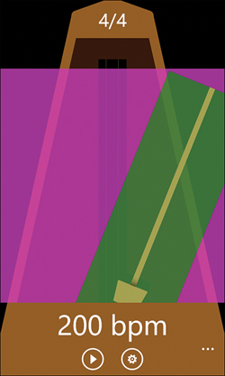
Metronome has a main page, a settings page, and the standard about page. The main page contains the metronome, featuring a weight that can be slid up or down to adjust the number of beats per minute, just like on a real swinging-arm metronome. The main page’s application bar has links to the two other pages, as well as a button for starting and stopping the metronome.
The User Interface
Listing 13.1 contains the main page’s XAML.
Listing 13.1 MainPage.xaml—The User Interface for Metronome’s Main Page
<phone:PhoneApplicationPage x:Class="WindowsPhoneApp.MainPage"
xmlns="http://schemas.microsoft.com/winfx/2006/xaml/presentation"
xmlns:x="http://schemas.microsoft.com/winfx/2006/xaml"
xmlns:phone="clr-namespace:Microsoft.Phone.Controls;assembly=Microsoft.Phone"
xmlns:shell="clr-namespace:Microsoft.Phone.Shell;assembly=Microsoft.Phone"
FontFamily="{StaticResource PhoneFontFamilyNormal}"
FontSize="{StaticResource PhoneFontSizeNormal}"
Foreground="{StaticResource PhoneForegroundBrush}"
SupportedOrientations="Portrait">
<!-- An application bar that acts like the base of the metronome -->
<phone:PhoneApplicationPage.ApplicationBar>
<shell:ApplicationBar BackgroundColor="#925E26" ForegroundColor="White">
<shell:ApplicationBarIconButton Text="start"
IconUri="/Shared/Images/appbar.play.png"
Click="StartOrPauseButton_Click"/>
<shell:ApplicationBarIconButton Text="settings"
IconUri="/Shared/Images/appbar.settings.png"
Click="SettingsButton_Click"/>
<shell:ApplicationBar.MenuItems>
<shell:ApplicationBarMenuItem Text="about" Click="AboutMenuItem_Click"/>
</shell:ApplicationBar.MenuItems>
</shell:ApplicationBar>
</phone:PhoneApplicationPage.ApplicationBar>
<!-- Two storyboards added to the page's resource dictionary -->
<phone:PhoneApplicationPage.Resources>
<!-- A storyboard for swinging back and forth -->
<Storyboard x:Name="SwingStoryboard"
Storyboard.TargetName="MetronomeRotation"
Storyboard.TargetProperty="Angle"
Completed="SwingStoryboard_Completed">
<DoubleAnimation x:Name="SwingAnimation" From="-35" To="35">
<DoubleAnimation.EasingFunction>
<QuadraticEase EasingMode="EaseInOut"/>
</DoubleAnimation.EasingFunction>
</DoubleAnimation>
</Storyboard>
<!-- A storyboard for gracefully stopping (and returning upright) -->
<Storyboard x:Name="StopSwingingStoryboard"
Storyboard.TargetName="MetronomeRotation"
Storyboard.TargetProperty="Angle">
<DoubleAnimation x:Name="StopSwingingAnimation" Duration="0:0:.2" To="0"/>
</Storyboard>
</phone:PhoneApplicationPage.Resources>
<!-- A 1x1 grid with four layers -->
<Grid>
<!-- Bottom layer: The metronome image as a background -->
<Image Source="Images/metronome.png" Stretch="None" VerticalAlignment="Top"/>
<!-- Middle layer: A Canvas containing the swinging arm and weight -->
<Canvas VerticalAlignment="Top" Margin="0,146,0,0">
<Canvas.Clip>
<!-- Clip the bottom of the arm and weight -->
<RectangleGeometry Rect="0,0,480,498"/>
</Canvas.Clip>
<Canvas x:Name="SliderCanvas" Width="200" Height="570" Canvas.Left="140"
RenderTransformOrigin=".5,1" Background="Transparent"
MouseLeftButtonDown="SliderCanvas_MouseLeftButtonDown"
MouseMove="SliderCanvas_MouseMove">
<Canvas.RenderTransform>
<RotateTransform x:Name="MetronomeRotation"/>
</Canvas.RenderTransform>
<Canvas.Clip>
<!-- Ensure the weight's top shadow doesn't extend past the arm -->
<RectangleGeometry Rect="0,0,200,570"/>
</Canvas.Clip>
<!-- The arm -->
<Image Canvas.Left="94" Source="Images/arm.png" IsHitTestVisible="False"/>
<!-- The weight -->
<Image x:Name="WeightImage" Canvas.Left="66" Canvas.Top="434"
IsHitTestVisible="False" Source="Images/weight.png"/>
</Canvas>
</Canvas>
<!-- Top two layers: Text blocks centered at the top and bottom -->
<TextBlock x:Name="TimeSignatureTextBlock" FontSize="40" Margin="0,14,0,0"
HorizontalAlignment="Center" VerticalAlignment="Top"
IsHitTestVisible="False"/>
<TextBlock x:Name="BpmTextBlock" FontSize="60" Margin="0,0,0,0"
HorizontalAlignment="Center" VerticalAlignment="Bottom"
IsHitTestVisible="False"/>
</Grid>
</phone:PhoneApplicationPage>
Notes:
→ The combination of being portrait-only and giving the application bar hard-coded colors enables it to act like the base of the metronome, extending the brown color where the background graphic ends. As with the preceding chapter, the settings item feels appropriate as an application bar button rather than tucked away in the application bar menu.
→ SwingStoryboard changes the angle of the rotated arm from –35° (to the left) to 35° (to the right). The code-behind gets notified of the animation’s completion thanks to its Completed event, so it can play a sound, reverse the animation, and start it again. QuadraticEase gives the animation a very subtle acceleration and deceleration, and its EaseInOut mode ensures that the interpolation remains symmetrical. See Appendix D, “Animation Easing Reference” for a graph of this behavior.
→ StopSwingingStoryboard is not really needed to stop SwingStoryboard; if you are fine with the arm jumping back to its initial location when the metronome is stopped, the code-behind could just call SwingStoryboard’s Stop method at the appropriate time. However, it looks much nicer for the swinging arm to gradually swing back to its vertical resting position, so that’s what StopSwingingStoryboard enables.
→ SliderCanvas is placed inside another canvas that clips the bottom of the arm. (This is the same clipping technique used by the preceding chapter, but done in XAML rather than C#.) The clipping prevents the bar and weight from overlapping the bottom of the metronome image when rotated. It also prevents a bottom shadow on the weight image (seen in Figures 13.1 and 13.2) from extending past the bottom of the arm. SliderCanvas also uses clipping to prevent the weight image’s top shadow from extending past the top of the bar. Figure 13.6 helps visualize the clipping by coloring SliderCanvas green and its parent canvas pink.
Figure 13.6 The canvas shown in pink clips the bottom of the arm and weight, and the canvas shown in green clips the top of the arm and weight.
→ SliderCanvas is given a RotateTransform so it can be animated by the storyboard. When not animated, it has its default value of 0°, which has no visible effect on the canvas. Note that SliderCanvas requires its explicit width and height for the rotation to work correctly. If left sizeless, RenderTransformOrigin would have no effect because any multiple of a 0×0 square gives the same point on the screen.
→ SliderCanvas has an explicit transparent background, so it responds to taps and slides anywhere on its surface. WeightImage and the arm are also marked IsHitTestVisible="False" so they don’t interfere with the canvas events.
The Code-Behind
Listing 13.2 contains the code-behind for the main page.
Listing 13.2 MainPage.xaml.cs—The Code-Behind for Metronome’s Main Page
using System;
using System.Windows.Controls;
using System.Windows.Input;
using System.Windows.Navigation;
using Microsoft.Phone.Controls;
using Microsoft.Phone.Shell;
namespace WindowsPhoneApp
{
public partial class MainPage : PhoneApplicationPage
{
IApplicationBarIconButton startOrPauseButton;
bool isActive;
int beat;
public MainPage()
{
InitializeComponent();
// Assign the start/pause button because it can't be named in XAML
this.startOrPauseButton = this.ApplicationBar.Buttons[0]
as IApplicationBarIconButton;
// Initialize the two sound effects
SoundEffects.Initialize();
// Allow the app to run (producing sounds) even when the phone is locked.
// Once disabled, you cannot re-enable the default behavior!
PhoneApplicationService.Current.ApplicationIdleDetectionMode =
IdleDetectionMode.Disabled;
}
protected override void OnNavigatedFrom(NavigationEventArgs e)
{
base.OnNavigatedFrom(e);
// Remember whether the metronome is running or paused
this.State["IsActive"] = this.isActive;
}
protected override void OnNavigatedTo(NavigationEventArgs e)
{
base.OnNavigatedTo(e);
// Respect the persisted settings
MoveWeight(Settings.WeightPosition.Value);
this.TimeSignatureTextBlock.Text = Settings.TimeSignature.Value + "/4";
// Restore any page state
if (this.State.ContainsKey("IsActive"))
{
if ((bool)this.State["IsActive"])
Start();
else
Pause();
}
}
void SliderCanvas_MouseLeftButtonDown(object sender, MouseButtonEventArgs e)
{
// Center the weight on the vertical position of the finger
MoveWeight(e.GetPosition(this.SliderCanvas).Y -
this.WeightImage.ActualHeight / 2);
}
void SliderCanvas_MouseMove(object sender, MouseEventArgs e)
{
// Center the weight on the vertical position of the finger
MoveWeight(e.GetPosition(this.SliderCanvas).Y -
this.WeightImage.ActualHeight / 2);
}
void MoveWeight(double y)
{
// Clamp the value to a range of -20 to 434
double position = Math.Min(434, Math.Max(-20, y));
Canvas.SetTop(this.WeightImage, position);
// Remember this position
Settings.WeightPosition.Value = position;
// Map the pixel range to a beats-per-minute range of 25-200
int bpm = (int)Math.Ceiling((position + 85) / 2.6);
// Update the display and the animation to match
this.BpmTextBlock.Text = bpm + " bpm";
this.SwingAnimation.Duration = TimeSpan.FromMinutes(1d / bpm);
}
void Start()
{
isActive = true;
// Update the application bar button
this.startOrPauseButton.IconUri = new Uri("/Shared/Images/appbar.pause.png",
UriKind.Relative);
this.startOrPauseButton.Text = "pause";
// Stop the stop-swinging storyboard, just in case it's still running
this.StopSwingingStoryboard.Stop();
// We want the first run of the animation to start with an angle of 0, the
// midpoint of the animation. Therefore, give the storyboard a BeginTime of
// negative 1/2 the duration so it starts halfway through!
this.SwingStoryboard.BeginTime = TimeSpan.FromSeconds(
this.SwingAnimation.Duration.TimeSpan.TotalSeconds / -2);
// Start swinging!
this.SwingStoryboard.Begin();
}
void Pause()
{
isActive = false;
// Update the application bar button
this.startOrPauseButton.IconUri = new Uri("/Shared/Images/appbar.play.png",
UriKind.Relative);
this.startOrPauseButton.Text = "start";
// Start the short stop-swinging storyboard. But first, hand-off the current
// angle, which gets cleared when SwingStoryboard is stopped.
this.StopSwingingAnimation.From = this.MetronomeRotation.Angle;
this.SwingStoryboard.Stop();
this.StopSwingingStoryboard.Begin();
}
void SwingStoryboard_Completed(object sender, EventArgs e)
{
// Play a special tone at the beginning of each measure, determined by the
// chosen time signature. Play a different tone for every other beat.
if (this.beat % Settings.TimeSignature.Value == 0)
SoundEffects.NewMeasureBeat.Play();
else
SoundEffects.Beat.Play();
this.beat++;
// Clear the negative BeginTime used for the first run of this storyboard
// so successive runs are the complete animation
if (this.SwingStoryboard.BeginTime != TimeSpan.Zero)
this.SwingStoryboard.BeginTime = TimeSpan.Zero;
// Reverse the animation
this.SwingAnimation.To *= -1;
this.SwingAnimation.From *= -1;
// Now swing the opposite way
this.SwingStoryboard.Begin();
}
// Application bar handlers
void StartOrPauseButton_Click(object sender, EventArgs e)
{
if (isActive)
Pause();
else
Start();
}
void SettingsButton_Click(object sender, EventArgs e)
{
this.NavigationService.Navigate(new Uri("/SettingsPage.xaml",
UriKind.Relative));
}
void AboutMenuItem_Click(object sender, EventArgs e)
{
this.NavigationService.Navigate(new Uri(
"/Shared/About/AboutPage.xaml?appName=Metronome", UriKind.Relative));
}
}
}
→ This app uses two sound effects—one for a normal beat and one for the first beat of every measure. The use of sound effects is explained in Part V, “Audio & Video.”
→ This app is marked to run while the phone is locked, which can be useful for listening to the metronome beat sounds while playing an instrument. This is done by disabling ApplicationIdleDetectionMode, described in Chapter 8, “Vibration Composer.”
→ This app uses two persisted settings defined as follows in Settings.cs:
public static class Settings
{
public static readonly Setting<int> TimeSignature =
new Setting<int>("TimeSignature", 4);
public static readonly Setting<double> WeightPosition =
new Setting<double>("WeightPosition", 120);
}
The pixel position of the weight is remembered rather than the beats-per-minute value it maps to, because more than one pixel value maps to the same beats-per-minute value.
→ Inside MoveWeight, the duration of SwingAnimation is adjusted to correspond to whatever beats-per-minute value has been chosen.
→ The Start method does a neat trick before starting SwingStoryboard. Because the resting position of the arm is 0°, we want it to start swinging from there to give a seamless animation from 0° to 35°. However, because the animation is set to start at -35°, we need it to start at its halfway point instead. This is accomplished by giving the storyboard a negative BeginTime value. With a BeginTime of negative one-half of the duration, the animation acts like it has already performed the first half of the animation, so it starts halfway through (at 0°)!
→ Inside Pause, SwingStoryboard is stopped and StopSwingingStoryboard is started. But first, StopSwingingStoryboard’s animation must be given an explicit From value matching the arm’s current angle. Otherwise, stopping SwingStoryboard instantly restores the angle to 0° and StopSwingingStoryboard would have no effect.
→ Every time SwingStoryboard completes, the code in SwingStoryboard_Completed plays the appropriate sound, ensures that BeginTime is 0 for remaining runs of the animation, reverses the animation, and then starts it again. It would have been nice to reverse the animation by multiplying its SpeedRatio by -1, but negative SpeedRatio values are not supported. Instead, the To and From values are both multiplied by -1 to toggle between -35 and 35.
The Settings Page
The settings page shows the three possible time signatures (2, 3, or 4 beats per measure) in a list of radio buttons, as shown in Figure 13.7. Because the main page is still running on the back stack, the user can hear how each choice effects the pattern of sounds made by the metronome as they tap each one (if the metronome is left running when navigating away).
Figure 13.7 The settings page enables the user to switch between three different time signatures.

The User Interface
Listing 13.3 contains the XAML for this settings page.
Listing 13.3 SettingsPage.xaml—The User Interface for Metronome’s Settings Page
<phone:PhoneApplicationPage
x:Class="WindowsPhoneApp.SettingsPage"
xmlns="http://schemas.microsoft.com/winfx/2006/xaml/presentation"
xmlns:x="http://schemas.microsoft.com/winfx/2006/xaml"
xmlns:phone="clr-namespace:Microsoft.Phone.Controls;assembly=Microsoft.Phone"
xmlns:shell="clr-namespace:Microsoft.Phone.Shell;assembly=Microsoft.Phone"
xmlns:local="clr-namespace:WindowsPhoneApp"
FontFamily="{StaticResource PhoneFontFamilyNormal}"
FontSize="{StaticResource PhoneFontSizeNormal}"
Foreground="{StaticResource PhoneForegroundBrush}"
SupportedOrientations="PortraitOrLandscape"
shell:SystemTray.IsVisible="True">
<Grid>
<Grid.RowDefinitions>
<RowDefinition Height="Auto"/>
<RowDefinition Height="*"/>
</Grid.RowDefinitions>
<!-- The standard settings header -->
<StackPanel Grid.Row="0" Style="{StaticResource PhoneTitlePanelStyle}">
<TextBlock Text="SETTINGS" Style="{StaticResource PhoneTextTitle0Style}"/>
<TextBlock Text="metronome" Style="{StaticResource PhoneTextTitle1Style}"/>
</StackPanel>
<!-- Three radio buttons and their header -->
<ScrollViewer Grid.Row="1">
<StackPanel Margin="{StaticResource PhoneMargin}"
HorizontalAlignment="Left">
<TextBlock Text="Time signature" Margin="12,7,12,8"
Foreground="{StaticResource PhoneSubtleBrush}"/>
<RadioButton x:Name="TwoRadioButton" Content="2/4" Tag="2"
Checked="RadioButton_Checked" local:Tilt.IsEnabled="True"/>
<RadioButton x:Name="ThreeRadioButton" Content="3/4" Tag="3"
Checked="RadioButton_Checked" local:Tilt.IsEnabled="True"/>
<RadioButton x:Name="FourRadioButton" Content="4/4" Tag="4"
Checked="RadioButton_Checked" local:Tilt.IsEnabled="True"/>
</StackPanel>
</ScrollViewer>
</Grid>
</phone:PhoneApplicationPage>
The stack panel is left-aligned, so each radio button isn’t clickable across the entire width of the page. This is consistent with similar pages in the built-in Settings app, and consistent with design guidelines.
The Code-Behind
Listing 13.4 contains the code-behind for the settings page. When a radio button is checked, the time signature value (2, 3, or 4) is retrieved from the Tag property and stored in the persisted setting.
Listing 13.4 SettingsPage.xaml.cs—The Code-Behind for Metronome’s Settings Page
using System.Windows;
using System.Windows.Controls;
using System.Windows.Navigation;
using Microsoft.Phone.Controls;
namespace WindowsPhoneApp
{
public partial class SettingsPage : PhoneApplicationPage
{
public SettingsPage()
{
InitializeComponent();
}
protected override void OnNavigatedTo(NavigationEventArgs e)
{
base.OnNavigatedTo(e);
// Respect the saved setting
switch (Settings.TimeSignature.Value)
{
case 2:
this.TwoRadioButton.IsChecked = true; break;
case 3:
this.ThreeRadioButton.IsChecked = true; break;
case 4:
this.FourRadioButton.IsChecked = true; break;
}
}
void RadioButton_Checked(object sender, RoutedEventArgs e)
{
// Save the chosen setting
int timeSignature = int.Parse((sender as RadioButton).Tag.ToString());
Settings.TimeSignature.Value = timeSignature;
}
}
}
The Finished Product
