Chapter 10. Tip Calculator


This chapter’s app is a stylish and effective tip calculator. The basic idea of a tip calculator is that the user enters an amount of money, decides what percentage of a tip he or she wishes to pay, and then the app gives the proper amount of the tip and the total. This can be a timesaver at restaurants or other places where you need to leave a tip, and it can either save you money or prevent you from looking cheap!
A tip calculator is one of the classic phone apps that people attempt to build, but creating one that works well enough for people to use on a regular basis, and one that embraces the Windows Phone style, takes a lot of care. This app has four different bottom panes for entering data, and the user can switch between them by tapping one of the four buttons on the top left side of the screen.
The primary bottom pane is for entering the amount of money. It uses a custom number pad styled like the one in the built-in Calculator app. Creating this is more complex than using the standard on-screen keyboard, but the result is more useful and attractive—even if the on-screen keyboard were to use the Number or TelephoneNumber input scopes. This app’s custom number pad contains only the keys that are relevant: the 10 digits, a special key for entering two zeros simultaneously, a backspace key, and a button to clear the entire number. (It also enables entering numbers without the use of a text box.)
The three other bottom panes are all list boxes. They enable the user to choose the desired tip percentage, choose to round the tip or total either up or down, and split the total among multiple people to see the correct per-person cost.
Tip Calculator is the first app to behave differently depending on how it is closed and how it is re-opened, so we’ll first examine what is often referred to as the application lifecycle for a Windows Phone app. Later, this chapter also examines some significant new concepts, such as control templates and routed events.
Understanding an App’s Lifecycle
An app can exit in one of two ways: It can be closed, or it can be deactivated. Technically, the app is terminated in both cases, but many users have different expectations for how most apps should behave in one case versus the other.
A closed app is not only permanently closed, but it should appear to be permanently closed as well. This means that the next time the user runs the app, it should appear to be a “fresh” instance without temporary state left over from last time.
The only way for a user to close an app is to press the hardware Back button while on the app’s initial page. A user can only re-run a closed app by tapping its icon or pinned tile.
A deactivated app should appear to be “pushed to the background.” This is the condition for which an app should provide the illusion that it is still actively running (or running in a “paused” state). Logically, the phone maintains a back stack of pages that the user can keep backing into, regardless of which application each page belongs to. When the user backs into a deactivated app’s page, it should appear as if it were there the whole time, waiting patiently for the user’s return.
Because there’s only one way to close an app, every other action deactivates it instead:
→ The user pressing the hardware Start button
→ The screen locking (either user-provoked or due to timeout)
→ The user directly launching another app by tapping a toast notification or answering a phone call that interrupts your app
→ The app itself launching another app (the phone, web browser, and so on) via a launcher or chooser
The user can return to a deactivated app via the hardware Back button, by unlocking the screen, or by completing whatever task was spawned via a launcher or chooser.
States and Events
An app, therefore, can be in one of three states at any time: running, closed, or deactivated. The PhoneApplicationService class defines four events that notify you when four out of the five possible state transitions occur, as illustrated in Figure 10.1:
→ Launching—Raised for a fresh instance of the app.
→ Closing—Raised when the app is closing for good. Despite the name, a handler for this event cannot cancel the action (and there is no corresponding “closed” event).
→ Deactivated—Raised when the app’s pages are logically sent to the back stack.
→ Activated—Raised when one of the app’s pages is popped off the back stack, making the app run again.
Figure 10.1 Four events signal all but one of the possible transitions between three states.
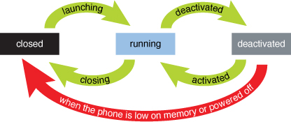
From Figure 10.1, you can see that a deactivated app may never be activated, even if the user wants to activate it later. The back stack may be trimmed due to memory constraints. In this case, or if the phone is powered off, the deactivated apps are now considered to be closed, and apps do not get any sort of notification when this happens (as they are not running at the time). Furthermore, if your app has been deactivated but the user later launches it from its icon or pinned tile, this is a launching action rather than a reactivation. In this case, the new instance of your app receives the Launching event—not the Activated event—and the deactivated instance’s pages are silently removed from the back stack. (Some users might not understand the distinction between leaving an app via the Back versus Start buttons, so your app might never receive a Closing event if a user always leaves apps via the Start button!)
When to Distinguish Between States
Several of the apps in previous chapters have indeed provided the illusion that they are running even when they are not. For example, Tally remembers its current count, Stopwatch pretends to advance its timer, and Ruler remembers the scroll position and current measurement. However, these apps have not made the distinction between being closed versus being deactivated. The data gets saved whether the app is closed or deactivated, and the data gets restored whether the app is launched or activated. Although this behavior is acceptable for these apps (and arguable for Ruler), other apps should often make the distinction between being closed/deactivated and launched/activated. Tip Calculator is one such app.
To decide whether to behave specially for deactivation and activation, consider whether your app involves two types of state:
→ User-configurable settings or other data that should be remembered indefinitely
→ Transient state, like a partially filled form for creating a new item that has not yet been saved
The first type of state should always be saved whether the app is closed or deactivated, and restored whether the app is launched or activated. The second type of state, however, should usually only be saved when deactivated and restored when activated. If the user returns to the app after leaving it for a short period of time (such as being interrupted by a phone call or accidentally locking the screen), he or she expects to see the app exactly how it was left. But if the user launches the app several days later, or expects to see a fresh instance by tapping its icon rather than using the hardware Back button, seeing it in the exact same state could be surprising and annoying, depending on the type of app.
Tip Calculator has data that is useful to remember indefinitely—the chosen tip percentage and whether the user rounded the tip or total—because users likely want to reuse these settings every time they dine out. Forcing users to change these settings from their default values every time the app is launched would be annoying. Therefore, the app persists and restores these settings no matter what.
Tip Calculator also has data that is not useful to remember indefinitely—the current amount of the bill and whether it is being split (and with how many people)—as this information should only be relevant for the current meal. So while it absolutely makes sense to remember this information in the face of a short-term interruption like a phone call or a screen lock, it would be annoying if the user launches the app the following day and is forced to clear these values before entering the correct values for the current meal. Similarly, it makes sense for the app to remember which of the four input panels is currently active to provide the illusion of running-while-deactivated, but when launching a fresh instance, it makes sense for the app to start with the calculator buttons visible. Therefore, the app persists and restores this information only when it is deactivated and activated.
The marketplace certification process sometimes enforces that a launched app appears like a fresh instance!
Implementation
You can attach a handler to any of the four lifecycle events by accessing the current PhoneApplicationService instance as follows:
Microsoft.Phone.Shell.PhoneApplicationService.Current.Activated +=
Application_Activated;
However, a handler for each event is already attached inside the App.xaml file generated by Visual Studio:
<Application ...>
...
<Application.ApplicationLifetimeObjects>
<!--Required object that handles lifetime events for the application-->
<shell:PhoneApplicationService
Launching="Application_Launching" Closing="Application_Closing"
Activated="Application_Activated" Deactivated="Application_Deactivated"/>
</Application.ApplicationLifetimeObjects>
</Application>
These handlers are empty methods inside the generated App.xaml.cs code-behind file:
// Code to execute when the application is launching (eg, from Start)
// This code will not execute when the application is reactivated
private void Application_Launching(object sender, LaunchingEventArgs e)
{
}
// Code to execute when the application is activated (brought to foreground)
// This code will not execute when the application is first launched
private void Application_Activated(object sender, ActivatedEventArgs e)
{
}
// Code to execute when the application is deactivated (sent to background)
// This code will not execute when the application is closing
private void Application_Deactivated(object sender, DeactivatedEventArgs e)
{
}
// Code to execute when the application is closing (eg, user hit Back)
// This code will not execute when the application is deactivated
private void Application_Closing(object sender, ClosingEventArgs e)
{
}
With these handlers in place, how do you implement them to persist/restore permanent state and transient state?
Permanent state should be persisted to (and restored from) isolated storage, a topic covered in Part III, “Storing & Retrieving Local Data.” The Setting class used by this book’s apps uses isolated storage internally to persist each value, so this class is all you need to handle permanent state.
Transient state can be managed with the same isolated storage mechanism, but there are fortunately separate mechanisms that make working with transient state even easier: application state and page state.
Application state is a dictionary on the PhoneApplicationState class exposed via its State property, and page state is a dictionary exposed on every page, also via a State property. Application state can be used as follows from anywhere within the app:
// Store a value
PhoneApplicationService.Current.State["Amount"] = amount;
// Retrieve a value
if (PhoneApplicationService.Current.State.ContainsKey("Amount"))
amount = (double)PhoneApplicationService.Current.State["Amount"];
Page state can be used as follows, inside any of a page’s instance members (where this refers to the page):
// Store a value
this.State["Amount"] = amount;
// Retrieve a value
if (this.State.ContainsKey("Amount"))
amount = (double)this.State["Amount"];
But these dictionaries are more than just simple collections of name/value pairs; their contents are automatically persisted when an app is deactivated and automatically restored when an app is activated. Conveniently, these dictionaries are not persisted when an app is closed, and they are left empty when an app is launched, even if it was previously deactivated with data in its dictionaries.
Values used in the application state and page state dictionaries must be serializable!
Thanks to this behavior, apps can often behave appropriately without the need to even handle the lifetime events. Inside a page’s familiar OnNavigatedTo and OnNavigatedFrom methods, the isolated-storage-based mechanism can be used for permanent data and page state can be used for transient data. The Tip Calculator app does this, as you’ll see in its code-behind.
The User Interface
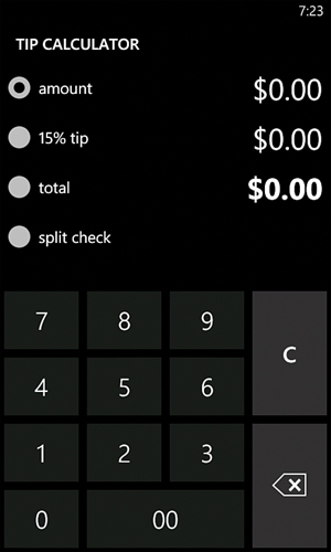
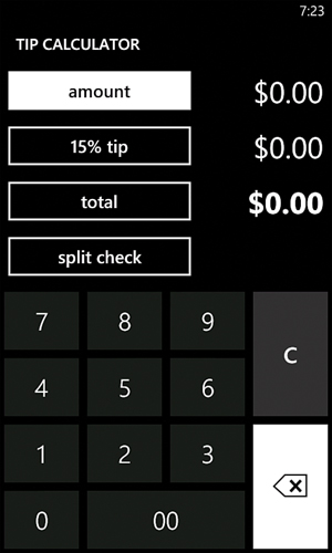
Figure 10.2 displays the four different modes of Tip Calculator’s single page, each with the name of the bottom element currently showing.
Figure 10.2 The bottom input area changes based on which button has been tapped.

The buttons used by this app are not normal buttons, because they remain highlighted after they are tapped. This behavior is enabled by toggle buttons, which support the notion of being checked or unchecked. (You can think of a toggle button like a check box that happens to look like a button. In fact, the CheckBox class derives from ToggleButton. Its only difference is its visual appearance.)
Tip Calculator doesn’t use ToggleButton elements, however. Instead, it uses RadioButton, a class derived from ToggleButton that adds built-in behavior for mutual exclusion. In other words, rather than writing code to manually ensure that only one toggle button is checked at a time, radio buttons enforce that only one radio button is checked at a time when multiple radio buttons have the same parent element. When one is checked, the others are automatically unchecked.
The behavior of radio buttons is perfect for Tip Calculator, but the visual appearance is not ideal. Figure 10.3 shows what the app would look like if radio buttons were used without any customizations. It gives the impression that you must choose only one of the four options (like a multiple-choice question), which can be confusing.
Figure 10.3 What Tip Calculator would look like with plain radio buttons.
Fortunately, Silverlight controls can be radically restyled by giving them new control templates. Tip Calculator uses a custom control template to give its radio buttons the appearance of plain toggle buttons. This gives the best of both worlds: the visual behavior of a toggle button combined with the extra logic in a radio button. The upcoming “Control Templates” section explains how this is done.
Listing 10.1 contains the XAML for Tip Calculator’s page.
Listing 10.1 MainPage.xaml—The User Interface for Tip Calculator
<phone:PhoneApplicationPage
x:Class="WindowsPhoneApp.MainPage" x:Name="Page"
xmlns="http://schemas.microsoft.com/winfx/2006/xaml/presentation"
xmlns:x="http://schemas.microsoft.com/winfx/2006/xaml"
xmlns:phone="clr-namespace:Microsoft.Phone.Controls;assembly=Microsoft.Phone"
xmlns:shell="clr-namespace:Microsoft.Phone.Shell;assembly=Microsoft.Phone"
xmlns:local="clr-namespace:WindowsPhoneApp"
FontFamily="{StaticResource PhoneFontFamilyNormal}"
FontSize="{StaticResource PhoneFontSizeNormal}"
Foreground="{StaticResource PhoneForegroundBrush}"
SupportedOrientations="Portrait" shell:SystemTray.IsVisible="True"
Loaded="MainPage_Loaded">
<phone:PhoneApplicationPage.Resources>
<!-- Style to make a radio button look like a plain toggle button -->
<Style x:Key="RadioToggleButtonStyle" TargetType="RadioButton">
<!-- Override left alignment of RadioButton: -->
<Setter Property="HorizontalContentAlignment" Value="Center"/>
<!-- Add tilt effect: -->
<Setter Property="local:Tilt.IsEnabled" Value="True"/>
<!-- The rest is the normal style of a ToggleButton: -->
<Setter Property="Background" Value="Transparent"/>
<Setter Property="BorderBrush"
Value="{StaticResource PhoneForegroundBrush}"/>
<Setter Property="Foreground"
Value="{StaticResource PhoneForegroundBrush}"/>
<Setter Property="BorderThickness"
Value="{StaticResource PhoneBorderThickness}"/>
<Setter Property="FontFamily"
Value="{StaticResource PhoneFontFamilySemiBold}"/>
<Setter Property="FontSize"
Value="{StaticResource PhoneFontSizeMediumLarge}"/>
<Setter Property="Padding" Value="8"/>
<Setter Property="Template">
<Setter.Value>
<ControlTemplate TargetType="ToggleButton">
<Grid Background="Transparent" >
<VisualStateManager.VisualStateGroups>
...
</VisualStateManager.VisualStateGroups>
<Border x:Name="EnabledBackground"
Background="{TemplateBinding Background}"
BorderBrush="{TemplateBinding BorderBrush}"
BorderThickness="{TemplateBinding BorderThickness}"
Margin="{StaticResource PhoneTouchTargetOverhang}">
<ContentControl x:Name="EnabledContent" Foreground=
"{TemplateBinding Foreground}" HorizontalContentAlignment=
"{TemplateBinding HorizontalContentAlignment}"
VerticalContentAlignment=
"{TemplateBinding VerticalContentAlignment}"
Margin="{TemplateBinding Padding}"
Content="{TemplateBinding Content}"
ContentTemplate="{TemplateBinding ContentTemplate}"/>
</Border>
<Border x:Name="DisabledBackground" IsHitTestVisible="False"
Background="Transparent" Visibility="Collapsed"
BorderBrush="{StaticResource PhoneDisabledBrush}"
BorderThickness="{TemplateBinding BorderThickness}"
Margin="{StaticResource PhoneTouchTargetOverhang}">
<ContentControl x:Name="DisabledContent"
Foreground="{StaticResource PhoneDisabledBrush}"
HorizontalContentAlignment=
"{TemplateBinding HorizontalContentAlignment}"
VerticalContentAlignment=
"{TemplateBinding VerticalContentAlignment}"
Margin="{TemplateBinding Padding}"
Content="{TemplateBinding Content}"
ContentTemplate="{TemplateBinding ContentTemplate}"/>
</Border>
</Grid>
</ControlTemplate>
</Setter.Value>
</Setter>
</Style>
<!-- Style for calculator buttons -->
<Style x:Key="CalculatorButtonStyle" TargetType="Button">
<Setter Property="FontSize" Value="36"/>
<Setter Property="FontFamily"
Value="{StaticResource PhoneFontFamilySemiLight}"/>
<Setter Property="BorderThickness" Value="0"/>
<Setter Property="Width" Value="132"/>
<Setter Property="Height" Value="108"/>
</Style>
<!-- Style for list box items -->
<Style x:Key="ListBoxItemStyle" TargetType="ListBoxItem">
<Setter Property="FontSize"
Value="{StaticResource PhoneFontSizeExtraLarge}"/>
<Setter Property="local:Tilt.IsEnabled" Value="True"/>
<Setter Property="Padding" Value="12,8,8,8"/>
</Style>
<!-- Style for text blocks -->
<Style x:Key="TextBlockStyle" TargetType="TextBlock">
<Setter Property="FontSize"
Value="{StaticResource PhoneFontSizeExtraLarge}"/>
<Setter Property="Margin" Value="0,0,12,0"/>
<Setter Property="HorizontalAlignment" Value="Right"/>
<Setter Property="VerticalAlignment" Value="Center"/>
</Style>
</phone:PhoneApplicationPage.Resources>
<!-- The root grid with the header, the area with four buttons
and text blocks, and the bottom input area -->
<Grid>
<Grid.RowDefinitions>
<RowDefinition Height="Auto"/>
<RowDefinition Height="Auto"/>
<RowDefinition Height="*"/>
</Grid.RowDefinitions>
<!-- The header -->
<StackPanel Grid.Row="0" Style="{StaticResource PhoneTitlePanelStyle}">
<TextBlock Text="TIP CALCULATOR"
Style="{StaticResource PhoneTextTitle0Style}"/>
</StackPanel>
<!-- The area with four buttons and corresponding text blocks -->
<Grid Grid.Row="1">
<Grid.RowDefinitions>
<RowDefinition/>
<RowDefinition/>
<RowDefinition/>
<RowDefinition/>
</Grid.RowDefinitions>
<Grid.ColumnDefinitions>
<ColumnDefinition Width="1.5*"/>
<ColumnDefinition Width="*"/>
</Grid.ColumnDefinitions>
<!-- The four main buttons -->
<RadioButton x:Name="AmountButton" Grid.Row="0" Content="amount"
Style="{StaticResource RadioToggleButtonStyle}"
Checked="RadioButton_Checked"
Tag="{Binding ElementName=AmountPanel}"/>
<RadioButton x:Name="TipButton" Grid.Row="1" Content=" "
Style="{StaticResource RadioToggleButtonStyle}"
Checked="RadioButton_Checked"
Tag="{Binding ElementName=TipListBox}"/>
<RadioButton x:Name="TotalButton" Grid.Row="2" Content=" "
Style="{StaticResource RadioToggleButtonStyle}"
Checked="RadioButton_Checked"
Tag="{Binding ElementName=TotalListBox}"/>
<RadioButton x:Name="SplitButton" Grid.Row="3" Content=" "
Checked="RadioButton_Checked"
Style="{StaticResource RadioToggleButtonStyle}"
Tag="{Binding ElementName=SplitListBox}"/>
<!-- The four main text blocks -->
<TextBlock x:Name="AmountTextBlock" Grid.Column="1"
Style="{StaticResource TextBlockStyle}"/>
<TextBlock x:Name="TipTextBlock" Grid.Row="1" Grid.Column="1"
Style="{StaticResource TextBlockStyle}"/>
<TextBlock x:Name="TotalTextBlock" Grid.Row="2" Grid.Column="1"
FontWeight="Bold" Style="{StaticResource TextBlockStyle}"/>
<TextBlock x:Name="SplitTextBlock" Grid.Row="3" Grid.Column="1"
FontWeight="Bold" Foreground="{StaticResource PhoneAccentBrush}"
Style="{StaticResource TextBlockStyle}"/>
</Grid>
<!-- The bottom input area, which overlays four children in the same
grid cell -->
<Grid Grid.Row="2">
<!-- The calculator buttons shown for "amount" -->
<Canvas x:Name="AmountPanel" Visibility="Collapsed">
<Button Style="{StaticResource CalculatorButtonStyle}"
Background="{Binding CalculatorMainBrush, ElementName=Page}"
Content="7" Canvas.Left="-6" Canvas.Top="-1"/>
<Button Style="{StaticResource CalculatorButtonStyle}"
Background="{Binding CalculatorMainBrush, ElementName=Page}"
Content="8" Canvas.Left="114" Canvas.Top="-1"/>
<Button Style="{StaticResource CalculatorButtonStyle}"
Background="{Binding CalculatorMainBrush, ElementName=Page}"
Content="9" Canvas.Left="234" Canvas.Top="-1"/>
<Button Style="{StaticResource CalculatorButtonStyle}"
Background="{Binding CalculatorMainBrush, ElementName=Page}"
Content="4" Canvas.Top="95" Canvas.Left="-6"/>
<Button Style="{StaticResource CalculatorButtonStyle}"
Background="{Binding CalculatorMainBrush, ElementName=Page}"
Content="5" Canvas.Top="95" Canvas.Left="114"/>
<Button Style="{StaticResource CalculatorButtonStyle}"
Background="{Binding CalculatorMainBrush, ElementName=Page}"
Content="6" Canvas.Top="95" Canvas.Left="234"/>
<Button Style="{StaticResource CalculatorButtonStyle}"
Background="{Binding CalculatorMainBrush, ElementName=Page}"
Content="1" Canvas.Top="191" Canvas.Left="-6"/>
<Button Style="{StaticResource CalculatorButtonStyle}"
Background="{Binding CalculatorMainBrush, ElementName=Page}"
Content="2" Canvas.Top="191" Canvas.Left="114"/>
<Button Style="{StaticResource CalculatorButtonStyle}"
Background="{Binding CalculatorMainBrush, ElementName=Page}"
Content="3" Canvas.Top="191" Canvas.Left="234"/>
<Button Style="{StaticResource CalculatorButtonStyle}"
Background="{Binding CalculatorMainBrush, ElementName=Page}"
Content="0" Canvas.Top="287" Canvas.Left="-6"/>
<Button Style="{StaticResource CalculatorButtonStyle}"
Background="{Binding CalculatorMainBrush, ElementName=Page}"
Content="00" Width="252" Canvas.Top="287" Canvas.Left="114"/>
<Button Style="{StaticResource CalculatorButtonStyle}" FontSize="32"
FontFamily="{StaticResource PhoneFontFamilySemiBold}"
Background="{Binding CalculatorSecondaryBrush, ElementName=Page}"
Content="C" Height="204" Canvas.Top="-1" Canvas.Left="354"/>
<Button x:Name="BackspaceButton" Height="204"
Style="{StaticResource CalculatorButtonStyle}"
Background="{Binding CalculatorSecondaryBrush, ElementName=Page}"
Canvas.Top="191" Canvas.Left="354">
<!-- The "X in an arrow" backspace drawing -->
<Canvas Width="48" Height="32">
<Path x:Name="BackspaceXPath" Data="M24,8 39,24 M39,8 24,24"
Stroke="{StaticResource PhoneForegroundBrush}"
StrokeThickness="4"/>
<Path x:Name="BackspaceBorderPath" StrokeThickness="2"
Data="M16,0 47,0 47,31 16,31 0,16.5z"
Stroke="{StaticResource PhoneForegroundBrush}"/>
</Canvas>
</Button>
</Canvas>
<!-- The list box shown for "X% tip" -->
<ListBox x:Name="TipListBox" Visibility="Collapsed"
SelectionChanged="TipListBox_SelectionChanged"/>
<!-- The list box shown for "total" -->
<ListBox x:Name="TotalListBox" Visibility="Collapsed"
SelectionChanged="TotalListBox_SelectionChanged">
<ListBoxItem Style="{StaticResource ListBoxItemStyle}"
Content="exact" Tag="NoRounding"/>
<ListBoxItem Style="{StaticResource ListBoxItemStyle}"
Content="round tip down" Tag="RoundTipDown"/>
<ListBoxItem Style="{StaticResource ListBoxItemStyle}"
Content="round tip up" Tag="RoundTipUp"/>
<ListBoxItem Style="{StaticResource ListBoxItemStyle}"
Content="round total down" Tag="RoundTotalDown"/>
<ListBoxItem Style="{StaticResource ListBoxItemStyle}"
Content="round total up" Tag="RoundTotalUp"/>
</ListBox>
<!-- The list box shown for "split check" -->
<ListBox x:Name="SplitListBox" Visibility="Collapsed"
SelectionChanged="SplitListBox_SelectionChanged"/>
</Grid>
</Grid>
</phone:PhoneApplicationPage>
Notes:
→ The page’s resources collection contains custom styles for the radio buttons (which contains the custom control template), calculator buttons, list box items, and text blocks.
→ The PhoneTitlePanelStyle and PhoneTextTitle0Style styles, the latter of which was introduced in the preceding chapter, are defined in App.xaml (and not shown in this chapter). This app, and the remaining apps in this book, does this with commonly-used styles so they can be easily shared among multiple pages.
→ For convenience, several elements have their Tag property set. For example, the radio buttons set their Tag to the element that should be made visible when each one is checked. The code-behind retrieves the element reference and performs the work to make it visible.
<Button Content="{Binding IsChecked, ElementName=AmountButton}"/>
→ Because the content of the last three radio buttons is dynamic, the XAML file leaves them blank to avoid a flicker when the code-behind restores their current values. They are set to a string with a space in it to prevent them from initially being too short.
→ AmountPanel is a canvas with precisely positioned and precisely sized calculator buttons. This could have been done with a grid instead, although each button would have to be given negative margins, because the desired style of the buttons requires overlapping them a bit so the visible space between them is 12 pixels rather than 24. Because this app only supports the portrait orientation, the hardcoded canvas layout works just fine.
→ The built-in Calculator app that this is modeled after uses two different colors of buttons that are similar to but not quite the same as the PhoneChromeBrush resource. Therefore, this page defines two custom brushes as properties in its code-behind file—CalculatorMainBrush for the digit keys and CalculatorSecondaryBrush for the other keys. The calculator buttons use data binding to set each background to the value of the appropriate property. This is why the page is given the name of "Page"—so it can be referenced in the data-binding expressions.
The reason data binding is used is that these two brushes must change for the light theme versus the dark theme. As shown in Figure 10.4, light-themed buttons that match the built-in Calculator app have different colors. If these two custom brushes did not ever need to change, they could have been defined as simple resources on the page and StaticResource syntax could have been used to set each button’s background.
Figure 10.4 The custom brushes dynamically change with the current theme, so Tip Calculator’s buttons match the built-in Calculator’s buttons in the light theme.

You cannot use a databound value in a style’s setter!
<Style x:Key="CalculatorButtonStyle" TargetType="Button">
<Setter Property="FontSize" Value="36"/>
<Setter Property="FontFamily"
Value="{StaticResource PhoneFontFamilySemiLight}"/>
<Setter Property="BorderThickness" Value="0"/>
<Setter Property="Width" Value="132"/>
<Setter Property="Height" Value="108"/>
<Setter Property="Background"
Value="{Binding CalculatorMainBrush, ElementName=Page}"/>
</Style>
→ The calculator buttons purposely do not use the tilting effect used on the toggle buttons, because this matches the behavior of the built-in Calculator app. The only thing missing is the sound effect when tapping each button!
→ The graphical content for the backspace button is created with two Path elements. (See Appendix E, “Geometry Reference,” to understand the syntax.) Because the content is vector-based, the code-behind can (and does) easily update its color dynamically to ensure that it remains visible when the button is pressed.
Only provide your own mechanism for text input if the input is very limited!
→ Rather than adding text blocks to TotalListBox, this code uses instances of a control called ListBoxItem. List box items are normally the best kind of element to add to a list box because they automatically highlight their content with the theme’s accent color when it is selected (if their content is textual). You can see the automatic highlighting of selected items in Figure 10.2.
Control Templates
Much like the data templates seen in Chapter 6, “Baby Sign Language,” control templates define how a control gets rendered. Every control has a default control template, but you can override it with an arbitrary element tree in order to completely change its appearance.
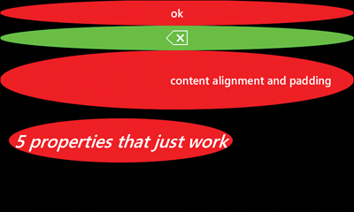
A control template can be set directly on an element with its Template property, although this property is usually set inside a style. For demonstration purposes, the following button is directly given a custom control template that makes it look like the red ellipse shown in Figure 10.5:
<Button Content="ok">
<Button.Template>
<ControlTemplate TargetType="Button">
<Ellipse Fill="Red" Width="200" Height="50"/>
</ControlTemplate>
</Button.Template>
</Button>
Figure 10.5 A normal button restyled to look like a red ellipse.
Despite its custom look, the button still has all the same behaviors, such as a Click event that gets raised when it is tapped. After all, it is still an instance of the Button class!
This is not a good template, however, because it ignores properties on the button. For example, the button in Figure 10.5 has its Content property set to "ok" but that does not get displayed. If you’re creating a control template that’s meant to be shared among multiple controls, you should data-bind to various properties on the control. The following template updates the previous one to respect the button’s content, producing the result in Figure 10.6:
<Button Content="ok">
<Button.Template>
<ControlTemplate TargetType="Button">
<Grid Width="200" Height="50">
<Ellipse Fill="Red"/>
<TextBlock Text="{TemplateBinding Content}"
HorizontalAlignment="Center" VerticalAlignment="Center"/>
</Grid>
</ControlTemplate>
</Button.Template>
</Button>
Figure 10.6 The button’s control template now shows its “ok” content.
Rather than using normal Binding syntax, the template uses TemplateBinding syntax. This works just like Binding, but the data source is automatically set to the instance of the control being templated, so it’s ideal for use inside control templates. In fact, TemplateBinding can only be used inside control templates and data templates.
Of course, a button can contain nontext content, so using a text block to display it creates an artificial limitation. To ensure that all types of content get displayed properly, you can use a generic content control instead of a text block. It would also be nice to respect several other properties of the button. The following control template, placed in a style shared by several buttons, does this:
<phone:PhoneApplicationPage ...>
<phone:PhoneApplicationPage.Resources>
<Style x:Name="ButtonStyle" TargetType="Button">
<!-- Some default property values -->
<Setter Property="Background" Value="Red"/>
<Setter Property="Padding" Value="12"/>
<!-- The custom control template -->
<Setter Property="Template">
<Setter.Value>
<ControlTemplate TargetType="Button">
<Grid>
<Ellipse Fill="{TemplateBinding Background}"/>
<ContentControl Content="{TemplateBinding Content}"
Margin="{TemplateBinding Padding}"
HorizontalAlignment="{TemplateBinding HorizontalContentAlignment}"
VerticalAlignment="{TemplateBinding VerticalContentAlignment}"/>
</Grid>
</ControlTemplate>
</Setter.Value>
</Setter>
</Style>
</phone:PhoneApplicationPage.Resources>
<StackPanel>
<!-- button 1 -->
<Button Content="ok" Style="{StaticResource ButtonStyle}"/>
<!-- button 2 -->
<Button Background="Lime" Style="{StaticResource ButtonStyle}">
<Button.Content>
<!-- The "X in an arrow" backspace drawing -->
<Canvas Width="48" Height="32">
<Path x:Name="BackspaceXPath" Data="M24,8 39,24 M39,8 24,24"
Stroke="{StaticResource PhoneForegroundBrush}"
StrokeThickness="4"/>
<Path x:Name="BackspaceBorderPath" StrokeThickness="2"
Data="M16,0 47,0 47,31 16,31 0,16.5z"
Stroke="{StaticResource PhoneForegroundBrush}"/>
</Canvas>
</Button.Content>
</Button>
<!-- button 3 -->
<Button Content="content alignment and padding"
HorizontalContentAlignment="Right"
Padding="50"
Style="{StaticResource ButtonStyle}"/>
<!-- button 4 -->
<Button Content="5 properties that just work" HorizontalAlignment="Left"
Height="100" FontSize="40" FontStyle="Italic" Margin="20"
Style="{StaticResource ButtonStyle}"/>
</StackPanel>
</phone:PhoneApplicationPage>
The result of this XAML is shown in Figure 10.7. By removing the hardcoded width and height from the template, the buttons are automatically given the appropriate size based on their layout properties and the space provided by their parent element. This is why all the buttons now stretch horizontally by default and why the last button is able to get the desired effect when setting its height and alignment. The second button demonstrates that nontext content now works as well as setting a custom background brush. Because the default red brush is moved into the style and the template binds to the current background, the background is now overridable by an individual button while preserving its default appearance. The same is true for the padding, which the third button is able to override. Notice that the five properties (other than Content and Style) set on the last button automatically work without any special treatment needed by the control template.
Figure 10.7 The custom control template respects many properties that are customized on four different buttons.
It might seem counterintuitive at first, but the template maps the control’s padding to the content control’s margin, and it maps the control’s content alignment properties to the content control’s regular alignment properties. This is a common practice, as the definition of padding is the margin around the inner content, and the definition of the content alignment properties is the alignment of the inner content.
<ContentPresenter Content="{TemplateBinding Content}"
Margin="{TemplateBinding Padding}"
HorizontalAlignment="{TemplateBinding HorizontalContentAlignment}"
VerticalAlignment="{TemplateBinding VerticalContentAlignment}"/>
<ContentPresenter Margin="{TemplateBinding Padding}"
HorizontalAlignment="{TemplateBinding HorizontalContentAlignment}"
VerticalAlignment="{TemplateBinding VerticalContentAlignment}"/>
Still, with all this work, the control template used for Figure 10.7 is not complete because it does not respect the various visual states of the buttons. A button should have a different appearance when it is pressed and a different appearance when it is disabled. To enable this, you must work with the Visual State Manager, and that’s a topic saved for Chapter 19, “Animation Lab.”
How do I make small tweaks to an existing control template rather than create a brand-new one from scratch?
The Code-Behind
Listing 10.2 contains the code-behind for Tip Calculator’s page. It makes use of the following enum defined in a separate file (RoundingType.cs):
public enum RoundingType
{
NoRounding,
RoundTipDown,
RoundTipUp,
RoundTotalDown,
RoundTotalUp
}
Listing 10.2 MainPage.xaml.cs—The Code-Behind for Tip Calculator
using System;
using System.Windows;
using System.Windows.Controls;
using System.Windows.Input;
using System.Windows.Media;
using System.Windows.Navigation;
using Microsoft.Phone.Controls;
namespace WindowsPhoneApp
{
public partial class MainPage : PhoneApplicationPage
{
// Persistent settings. These are remembered no matter what.
Setting<RoundingType> savedRoundingType =
new Setting<RoundingType>("RoundingType", RoundingType.NoRounding);
Setting<double> savedTipPercent = new Setting<double>("TipPercent", .15);
// The current values used for the calculation
double amount;
double tipPercent;
double tipAmount;
double totalAmount;
int split = 1;
RoundingType roundingType;
// Which of the four radio buttons is currently checked
RadioButton checkedButton;
// Two theme-specific custom brushes
public Brush CalculatorMainBrush { get; set; }
public Brush CalculatorSecondaryBrush { get; set; }
public MainPage()
{
InitializeComponent();
// A single handler for all calculator button taps
this.AmountPanel.AddHandler(Button.MouseLeftButtonUpEvent,
new MouseButtonEventHandler(CalculatorButton_MouseLeftButtonUp),
true /* handledEventsToo */);
// Handlers to ensure that the backspace button's vector content changes
// color appropriately when the button is pressed
this.BackspaceButton.AddHandler(Button.MouseLeftButtonDownEvent,
new MouseButtonEventHandler(BackspaceButton_MouseLeftButtonDown),
true /* handledEventsToo */);
this.BackspaceButton.AddHandler(Button.MouseLeftButtonUpEvent,
new MouseButtonEventHandler(BackspaceButton_MouseLeftButtonUp),
true /* handledEventsToo */);
this.BackspaceButton.MouseMove += BackspaceButton_MouseMove;
}
protected override void OnNavigatedFrom(NavigationEventArgs e)
{
base.OnNavigatedFrom(e);
// Remember transient page data that isn't appropriate to always persist
this.State["Amount"] = this.amount;
this.State["Split"] = this.split;
this.State["CheckedButtonName"] = this.checkedButton.Name;
// Save the persistent settings
this.savedRoundingType.Value = this.roundingType;
this.savedTipPercent.Value = this.tipPercent;
}
protected override void OnNavigatedTo(NavigationEventArgs e)
{
base.OnNavigatedTo(e);
// Set the colors of the two custom brushes based on whether
// we're in the light theme or dark theme
if ((Visibility)Application.Current.Resources["PhoneLightThemeVisibility"]
== Visibility.Visible)
{
this.CalculatorMainBrush = new SolidColorBrush(
Color.FromArgb(0xFF, 0xEF, 0xEF, 0xEF));
this.CalculatorSecondaryBrush = new SolidColorBrush(
Color.FromArgb(0xFF, 0xDE, 0xDF, 0xDE));
}
else
{
this.CalculatorMainBrush = new SolidColorBrush(
Color.FromArgb(0xFF, 0x18, 0x1C, 0x18));
this.CalculatorSecondaryBrush = new SolidColorBrush(
Color.FromArgb(0xFF, 0x31, 0x30, 0x31));
}
// Restore transient page data, if there is any from last time
if (this.State.ContainsKey("Amount"))
this.amount = (double)this.State["Amount"];
if (this.State.ContainsKey("Split"))
this.split = (int)this.State["Split"];
// Restore the persisted settings
this.roundingType = this.savedRoundingType.Value;
this.tipPercent = this.savedTipPercent.Value;
RefreshAllCalculations();
// Fill TipListBox and set its selected item correctly
this.TipListBox.Items.Clear();
for (int i = 50; i >= 0; i--)
{
ListBoxItem item = new ListBoxItem { Content = i + "% tip",
Tag = (double)i / 100,
Style = this.Resources["ListBoxItemStyle"] as Style };
if ((double)item.Tag == this.tipPercent)
item.IsSelected = true;
this.TipListBox.Items.Add(item);
}
// Fill SplitListBox and set its selected item correctly
this.SplitListBox.Items.Clear();
for (int i = 1; i <= 20; i++)
{
ListBoxItem item = new ListBoxItem {
Content = (i == 1 ? "do not split" : i + " people"), Tag = i,
Style = this.Resources["ListBoxItemStyle"] as Style };
if ((int)item.Tag == this.split)
item.IsSelected = true;
this.SplitListBox.Items.Add(item);
}
// TotalListBox is already filled in XAML, but set its selected item
this.TotalListBox.SelectedIndex = (int)this.roundingType;
}
void MainPage_Loaded(object sender, EventArgs e)
{
// Restore one more transient value: which radio button was checked when
// the app was deactivated.
// This is done here instead of inside OnNavigatedTo because the Loaded
// event is raised after the data binding occurs that sets each button's
// Tag (needed by the handler called when IsChecked is set to true)
if (this.State.ContainsKey("CheckedButtonName"))
{
RadioButton button =
this.FindName((string)this.State["CheckedButtonName"]) as RadioButton;
if (button != null)
button.IsChecked = true;
}
else
{
// For a fresh instance of the app, check the amount button
this.AmountButton.IsChecked = true;
}
}
// A single handler for all calculator button taps
void CalculatorButton_MouseLeftButtonUp(object sender, MouseButtonEventArgs e)
{
// Although sender is the canvas, the OriginalSource is the tapped button
Button button = e.OriginalSource as Button;
if (button == null)
return;
string content = button.Content.ToString();
// Determine what to do based on the string content of the tapped button
double digit;
if (content == "00")
{
// Append two zeros
this.amount *= 100;
}
else if (double.TryParse(content, out digit)) // double so division works
{
// Append the digit
this.amount *= 10;
this.amount += digit / 100;
}
else if (content == "C")
{
// Clear the amount
this.amount = 0;
}
else // The backspace button
{
// Chop off the last digit.
// The multiplication preserves the first digit after the decimal point
// because the cast to int chops off what's after it
int temp = (int)(this.amount * 10);
// Shift right by 2 places (1 extra due to the temporary multiplication)
this.amount = (double)temp / 100;
}
RefreshAllCalculations();
}
void TipListBox_SelectionChanged(object sender, SelectionChangedEventArgs e)
{
if (e.AddedItems.Count > 0)
{
// The item's Tag has been set to the actual percent value
this.tipPercent = (double)(e.AddedItems[0] as ListBoxItem).Tag;
RefreshAllCalculations();
}
}
void TotalListBox_SelectionChanged(object sender, SelectionChangedEventArgs e)
{
if (e.AddedItems.Count > 0)
{
// The item's Tag has been set to a string containg one of the enum's
// named values. Use Enum.Parse to convert to string to an instance
// of the RoundingType enum.
this.roundingType = (RoundingType)Enum.Parse(typeof(RoundingType),
(e.AddedItems[0] as ListBoxItem).Tag.ToString(), true);
RefreshAllCalculations();
}
}
void SplitListBox_SelectionChanged(object sender, SelectionChangedEventArgs e)
{
if (e.AddedItems.Count > 0)
{
// The item's Tag has been set to the split number
this.split = (int)(e.AddedItems[0] as ListBoxItem).Tag;
RefreshSplitTotal();
}
}
void RefreshAllCalculations()
{
RefreshAmount();
RefreshTip();
RefreshTotal();
RefreshSplitTotal();
}
void RefreshAmount()
{
// Use currency string formatting ("C") to get the proper display
this.AmountTextBlock.Text = this.amount.ToString("C");
}
void RefreshTip()
{
// The content of the tip button and text block are impacted by the
// current rounding setting.
string buttonLabel = (this.tipPercent * 100) + "% tip";
switch (this.roundingType)
{
case RoundingType.RoundTipDown:
this.tipAmount = Math.Floor(this.amount * this.tipPercent);
buttonLabel += " (rounded)";
break;
case RoundingType.RoundTipUp:
this.tipAmount = Math.Ceiling(this.amount * this.tipPercent);
buttonLabel += " (rounded)";
break;
default:
this.tipAmount = this.amount * this.tipPercent;
break;
}
this.TipTextBlock.Text = this.tipAmount.ToString("C"); // C == Currency
this.TipButton.Content = buttonLabel;
}
void RefreshTotal()
{
// The content of the total button and text block are impacted by the
// current rounding setting.
string buttonLabel = "total";
switch (this.roundingType)
{
case RoundingType.RoundTotalDown:
this.totalAmount = Math.Floor(this.amount + this.tipAmount);
buttonLabel += " (rounded)";
break;
case RoundingType.RoundTotalUp:
this.totalAmount = Math.Ceiling(this.amount + this.tipAmount);
buttonLabel += " (rounded)";
break;
default:
this.totalAmount = this.amount + this.tipAmount;
break;
}
this.TotalTextBlock.Text = this.totalAmount.ToString("C"); // C == Currency
this.TotalButton.Content = buttonLabel;
}
void RefreshSplitTotal()
{
if (this.split == 1)
{
// Don't show the value if we're not splitting the check
this.SplitTextBlock.Text = "";
this.SplitButton.Content = "split check";
}
else
{
this.SplitTextBlock.Text = (this.totalAmount / this.split).ToString("C");
this.SplitButton.Content = this.split + " people";
}
}
// Called when any of the four toggle buttons are tapped
void RadioButton_Checked(object sender, RoutedEventArgs e)
{
// Which button was tapped
this.checkedButton = sender as RadioButton;
// Which bottom element to show (which was stored in Tag in XAML)
UIElement bottomElement = this.checkedButton.Tag as UIElement;
// Hide all bottom elements...
this.AmountPanel.Visibility = Visibility.Collapsed;
this.TipListBox.Visibility = Visibility.Collapsed;
this.TotalListBox.Visibility = Visibility.Collapsed;
this.SplitListBox.Visibility = Visibility.Collapsed;
// ...then show the correct one
bottomElement.Visibility = Visibility.Visible;
// If a list box was just shown, ensure its selected item is on-screen.
// This is delayed because a layout pass must first run (as a result of
// setting Visibility) in order for ScrollIntoView to have any effect.
this.Dispatcher.BeginInvoke(delegate()
{
if (sender == this.TipButton)
this.TipListBox.ScrollIntoView(this.TipListBox.SelectedItem);
else if (sender == this.TotalButton)
this.TotalListBox.ScrollIntoView(this.TotalListBox.SelectedItem);
else if (sender == this.SplitButton)
this.SplitListBox.ScrollIntoView(this.SplitListBox.SelectedItem);
});
}
// Change the color of the two paths inside the backspace button when pressed
void BackspaceButton_MouseLeftButtonDown(object sender, MouseButtonEventArgs e)
{
this.BackspaceXPath.Stroke =
Application.Current.Resources["PhoneBackgroundBrush"] as Brush;
this.BackspaceBorderPath.Stroke =
Application.Current.Resources["PhoneBackgroundBrush"] as Brush;
}
// Change the color of the two paths back when no longer pressed
void BackspaceButton_MouseLeftButtonUp(object sender, MouseEventArgs e)
{
this.BackspaceXPath.Stroke =
Application.Current.Resources["PhoneForegroundBrush"] as Brush;
this.BackspaceBorderPath.Stroke =
Application.Current.Resources["PhoneForegroundBrush"] as Brush;
}
// Workaround for when the finger has not yet been released but the color
// needs to change back because the finger is no longer over the button
void BackspaceButton_MouseMove(object sender, MouseEventArgs e)
{
// this.BackspaceButton.IsMouseOver lies when it has captured the mouse!
// Use GetPosition instead:
Point relativePoint = e.GetPosition(this.BackspaceButton);
// We can get away with this simple check because
// the button is in the bottom-right corner
if (relativePoint.X < 0 || relativePoint.Y < 0)
BackspaceButton_MouseLeftButtonUp(null, null); // Not over the button
else
BackspaceButton_MouseLeftButtonDown(null, null); // Still over the button
}
}
}
Notes:
→ In the constructor, three out of four handlers are attached to events using a special AddHandler method that works with a type of event called a routed event. Routed events are discussed later in this section.
→ Inside OnNavigatedFrom and OnNavigatedTo (and MainPage_Loaded), you can see the separate handling of permanent data stored in Setting objects and transient data stored in page state. Although one of the pieces of information to save in page state is the currently-checked radio button, a reference to the radio button itself cannot be placed in page state because it is not serializable. Instead, the radio button’s name is put in the dictionary. When this state is restored inside MainPage_Loaded, the page’s FindName method is called with the saved name in order to retrieve the correct instance of the radio button.
→ Inside OnNavigatedTo, the trick to set the two custom brushes differently for the light versus dark theme is accomplished by checking the value of the PhoneLightThemeVisibility resource.
How can I determine whether the phone is currently using the dark theme or light theme?
→ Unlike with TotalListBox, the items for TipListBox and SplitListBox are created in code-behind because they are much longer lists that can easily be created in a loop. These list box items also have their Tag property set so the code that processes the selected item has a reliable way to discover the meaning of the selected item without parsing its string content. List box items have a handy IsSelected property that can be set to select an item rather than using the list box’s SelectedItem or SelectedIndex property. The two loops make use of this to initially select the appropriate values.
→ In the three list box SelectionChanged event handlers, e.AddedItems[0] is used to reference the selected item rather than the list box’s SelectedItem property. This is just done for demonstration purposes, as either approach does the same thing. List boxes can support multiple selections (if their SelectionMode property is set to Multiple), so any time SelectionChanged is raised, you can discover what items have been selected or deselected via the e parameter’s AddedItems and RemovedItems properties. When a list box only supports a single selection, as in this app, AddedItems and RemovedItems can only have zero or one element.
→ The strings created for the text blocks use currency formatting by passing “C” to ToString. For the English (United States) region, this is what prepends the dollar signs to the numeric displays. If you change your phone’s “Region format” to “French (France)” under the phone’s “region & language” settings, the currency formatting automatically adjusts its display, as shown in Figure 10.8.
Figure 10.8 When the region format is French (France), the euro symbol and comma are automatically used instead of a dollar sign and decimal point.

→ RadioButton_Checked has logic to ensure the selected item is not scrolled off-screen when the bottom pane switches to a list box. This is accomplished with list box’s ScrollIntoView method. However, it is called inside in asynchronous callback because it doesn’t work when the list box isn’t visible, and the setting of its Visibility property doesn’t take effect instantly. (It happens after the event handler returns and Silverlight updates the layout of the page.) Ideally this logic would have been performed in an event handler for a “visibility changed” event, but no such event exists in Silverlight.
→ Because the background color of buttons invert when pressed, BackspaceButton_MouseLeftButtonUp and BackspaceButton_MouseLeftButtonDown swap the stroke brushes of the paths inside the backspace button to ensure they remain visible. However, doing the work in these two event handlers isn’t quite enough. When the user holds their finger on the button and drags it off without releasing their finger, the button colors revert to normal but the MouseLeftButtonUp event is not yet raised to revert the path strokes in sync.
To detect this situation, the backspace button’s MouseMove event is also handled. This event continues to get raised even when the finger is moving outside of the button’s bounds because the button “captures” the mouse input when the finger is depressed and doesn’t release it until the finger is released. The MouseMove handler (BackspaceButton_MouseMove) determines whether the finger is outside the bounds of the button, and calls either the MouseLeftButtonUp or MouseLeftButtonDown handler to adjust the strokes accordingly. As a result, the custom graphics in the backspace button behave appropriately in every situation. Figure 10.9 shows the appearance of the backspace button while a finger is pressing it.
Figure 10.9 When the backspace button is pressed, you can always see the inner content, thanks to the code that switches its brush.
This behavior would be simpler to implement with Visual State Manager animations inside a custom control template for the backspace button. However, it is too early in this book to make use of these features.
Routed Events
Some of the events raised by Silverlight elements, called routed events, have extra behavior in order to work well with a tree of elements. When a routed event is raised, it travels up the element tree from the source element all the way to the root, getting raised on each element along the way. This process is called event bubbling.
Some elements, such as buttons, leverage event bubbling to be able to provide a consistent Click event even if it contents are a complex tree of elements. Even if the user taps an element nested many layers deep, the MouseLeftButtonUp event bubbles up to the button so it can raise Click. Thanks to event bubbling, the button’s code has no idea what its contents actually are, nor does it need to.
Some elements, such as buttons, also halt event bubbling from proceeding any further. Because buttons want their consumers to use their Click event rather than listening to MouseLeftButtonUp and/or MouseLeftButtonDown, it marks these events as handled when it receives them. (This is done via an internal mechanism. Your code doesn’t have a way to halt bubbling.)
Routed Events in Tip Calculator
In Listing 10.2, Tip Calculator leverages event bubbling for convenience. Rather than attaching a Click event handler to each of the 13 buttons individually, it attaches a single MouseLeftButtonUp event handler to their parent canvas using the AddHandler method supported by all UI elements and a static MouseLeftButtonUpEvent field that identifies the routed event:
// A single handler for all calculator button taps
this.AmountPanel.AddHandler(Button.MouseLeftButtonUpEvent,
new MouseButtonEventHandler(CalculatorButton_MouseLeftButtonUp),
true /* handledEventsToo */);
This event is chosen, rather than Click, because MouseLeftButtonUp is a routed event whereas Click is not. Although attaching this handler could be done in XAML with the same syntax used for any event, the attaching is done in C# to enable special behavior. By passing true as the last parameter, we are able to receive the event even though the button has halted its bubbling! Therefore, the halting done by buttons is just an illusion; the bubbling still occurs, but you must go out of your way to see it.
Tip Calculator also leverages this special behavior to add its brush-changing MouseLeftButtonDown and MouseLeftButtonUp handlers to the backspace button. Without attaching these handlers in code with the true third parameter, it would never receive these events. In contrast, it attaches the MouseMove handler with normal += syntax because MouseMove is not a routed event. (Alternatively, it could have attached the MouseMove handler in XAML.)
Routed Event Handlers
Handlers for routed events have a signature matching the pattern for general .NET event handlers: The first parameter is an object typically named sender, and the second parameter (typically named e) is a class that derives from EventArgs. For a routed event handler, the sender is always the element to which the handler was attached. The e parameter is (or derives from) RoutedEventArgs, a subclass of EventArgs with an OriginalSource property that exposes the element that originally raised the event.
Handlers typically want to interact with the original source rather than the sender. Because CalculatorButton_MouseLeftButtonUp is attached to AmountPanel in Listing 10.2, it uses OriginalSource to get to the relevant button:
// A single handler for all calculator button taps
void CalculatorButton_MouseLeftButtonUp(object sender, MouseButtonEventArgs e)
{
// Although sender is the canvas, the OriginalSource is the tapped button
Button button = e.OriginalSource as Button;
...
}
The Finished Product
