Chapter 27. Groceries

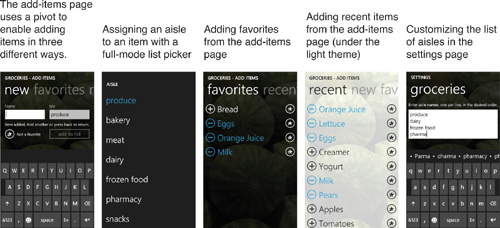
Groceries is a flexible shopping list app that enables you to set up custom aisle-by-aisle lists. Name and arrange as many isles as you want to match the layout of your favorite store! This app has a lot of features to make adding items easy, such as adding in bulk, selecting favorite items, and selecting recent items.
The Groceries app showcases the panorama control, which enables the other signature Windows Phone user interface paradigm—the one used by every “hub” on the phone (People, Pictures, and so on). Roughly speaking, a panorama acts very similarly to a pivot: It enables horizontal swiping between multiple sections on the same page. What makes it distinct is its appearance and complex animations.
The idea of a panorama is that the user is looking at one piece of a long, horizontal canvas. The user is given several visual hints to swipe horizontally. For example, the application title is larger than what fits on the screen at a single time (unless the title is really short) and each section is a little narrower than the screen, so the left edge of the next section is visible even when not actively panning the page. A panorama wraps around, so panning forward from the last section goes to the first section, and panning backward from the first section goes to the last section.
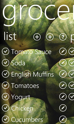
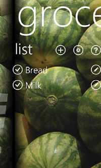
Figure 27.1 demonstrates how Groceries leverages the panorama control. The first section contains the entire shopping list and the last section contains the cart (items that the user has already grabbed). In between are a dynamic number of sections based on the user-defined aisles and whether there are any items still left to grab in each aisle.
Figure 27.1 The grocery panorama, shown the way panoramas are typically shown in marketing materials.

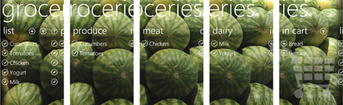
Although the viewport-on-a-long-canvas presentation in Figure 27.1 is the way panoramas are usually shown, that image does not consist of five concatenated screenshots. The reality is much more complex. A panorama consists of three separate layers that each pan at a different speeds, producing a parallax effect. The background pans at the slowest rate, followed by the title, followed by the rest of the content, which moves at the typical scrolling/swiping speed. Figure 27.2 shows what the screen really looks like when visiting each of the five sections in Figure 27.1.
Figure 27.2 Real screenshots when visiting each of the five panorama sections from Figure 27.1.
The Panorama Control
After reading about the Pivot control in the preceding chapter, the Panorama control should look familiar. Panorama, in the Microsoft.Phone.Controls namespace and Microsoft.Phone.Controls assembly, is an items control designed to work with content controls called PanoramaItem.
Although the behavior exhibited by a panorama is more complex than the behavior exhibited by a pivot, it exposes fewer APIs. Like Pivot, Panorama has Title and TitleTemplate properties and a HeaderTemplate property for customizing the headers of its children. Under normal circumstances, there’s no need to use these template properties because the control does a good job of providing the correct look and feel.
PanoramaItem has a Header property, but unlike PivotItem, it also exposes a HeaderTemplate property for customizing an individual header’s appearance. (Of course, you could always directly set Header to a custom UI element without the need for HeaderTemplate.) PanoramaItem has also exposes an Orientation property that indicates the intended direction of scrolling when content doesn’t fit. This property is Vertical by default, but setting it to Horizontal enables a single panorama item to extend wider than the screen. Note that you must add your own scroll viewer if you want scrolling in a vertical panorama item. In a horizontal panorama item, you don’t want to use a scroll viewer; the panorama handles it. Each horizontal panorama item has a maximum width of two screens (960 pixels).
As for the layout of items inside a panorama item, you’re on your own. Although certain arrangements of square images and text are commonly used in a panorama, there are no special controls that automatically give you these specific layouts. You should use the general-purpose panels such as a grid or a wrap panel.
The Main Page
The Groceries app’s main page, shown earlier in Figure 27.2, is the only one that uses a panorama. It provides links to the four other pages in this app: an add-items page, an edit-items page, a settings page, and an instructions page. The code for these pages is not examined in this chapter.
The User Interface
Listing 27.1 contains the XAML for the main page.
Listing 27.1 MainPage.xaml—The Main User Interface for Groceries
<phone:PhoneApplicationPage x:Class="WindowsPhoneApp.MainPage"
xmlns="http://schemas.microsoft.com/winfx/2006/xaml/presentation"
xmlns:x="http://schemas.microsoft.com/winfx/2006/xaml"
xmlns:phone="clr-namespace:Microsoft.Phone.Controls;assembly=Microsoft.Phone"
xmlns:shell="clr-namespace:Microsoft.Phone.Shell;assembly=Microsoft.Phone"
xmlns:controls="clr-namespace:Microsoft.Phone.Controls; assembly=Microsoft.Phone.Controls"
FontFamily="{StaticResource PhoneFontFamilyNormal}"
FontSize="{StaticResource PhoneFontSizeNormal}"
Foreground="White"
SupportedOrientations="Portrait" shell:SystemTray.IsVisible="False">
<!-- Two storyboards for animating items into and out of the cart -->
<phone:PhoneApplicationPage.Resources>
<Storyboard x:Name="MoveToCartStoryboard"
Completed="MoveToCartStoryboard_Completed">
<DoubleAnimation To="-400" Duration="0:0:.2"/>
</Storyboard>
<Storyboard x:Name="MoveFromCartStoryboard"
Completed="MoveFromCartStoryboard_Completed">
<DoubleAnimation To="400" Duration="0:0:.2"/>
</Storyboard>
</phone:PhoneApplicationPage.Resources>
<controls:Panorama x:Name="Panorama" Title="groceries" Foreground="White"
SelectionChanged="Panorama_SelectionChanged">
<controls:Panorama.Background>
<ImageBrush ImageSource="Images/background.jpg"/>
</controls:Panorama.Background>
<!-- The "list" item -->
<controls:PanoramaItem Foreground="White">
<!-- A complex header that contains buttons -->
<controls:PanoramaItem.Header>
<Grid>
<Grid.ColumnDefinitions>
<ColumnDefinition Width="194"/>
<ColumnDefinition Width="Auto"/>
<ColumnDefinition Width="Auto"/>
<ColumnDefinition Width="Auto"/>
</Grid.ColumnDefinitions>
<!-- The normal header text -->
<TextBlock Text="list"/>
<!-- add -->
<Button Grid.Column="1" Margin="0,20,36,0" Click="AddButton_Click"
Style="{StaticResource SimpleButtonStyle}">
<Image Source="Shared/Images/normal.add.png"/>
</Button>
<!-- settings -->
<Button Grid.Column="2" Margin="0,20,36,0" Click="SettingsButton_Click"
Style="{StaticResource SimpleButtonStyle}">
<Image Source="Shared/Images/normal.settings.png"/>
</Button>
<!-- instructions -->
<Button Grid.Column="3" Margin="0,20,36,0"
Click="InstructionsButton_Click"
Style="{StaticResource SimpleButtonStyle}">
<Image Source="Shared/Images/normal.instructions.png"/>
</Button>
</Grid>
</controls:PanoramaItem.Header>
<!-- The panorama item's content is just a list box -->
<ListBox x:Name="MainListBox" ItemsSource="{Binding}">
<!-- Give each item a complex template -->
<ListBox.ItemTemplate>
<DataTemplate>
<!-- A horizontal stack panel with two buttons -->
<StackPanel Orientation="Horizontal" Margin="0,0,0,16">
<!-- The first button sends the item to the cart -->
<Button Style="{StaticResource SimpleButtonStyle}"
Click="AddToCartButton_Click">
<Button.RenderTransform>
<CompositeTransform/>
</Button.RenderTransform>
<StackPanel Orientation="Horizontal">
<Image Source="Shared/Images/normal.done.png"/>
<TextBlock Text="{Binding Name}" Width="300" TextWrapping="Wrap"
Style="{StaticResource PhoneTextExtraLargeStyle}"
Foreground="White"/>
</StackPanel>
</Button>
<!-- The second button edits the item -->
<Button Style="{StaticResource SimpleButtonStyle}"
Click="EditItemButton_Click">
<Image Source="Shared/Images/normal.edit.png"/>
</Button>
</StackPanel>
</DataTemplate>
</ListBox.ItemTemplate>
</ListBox>
</controls:PanoramaItem>
<!-- The "in cart" item -->
<controls:PanoramaItem Foreground="White">
<!-- A complex header that contains a button -->
<controls:PanoramaItem.Header>
<Grid>
<Grid.ColumnDefinitions>
<ColumnDefinition Width="286"/>
<ColumnDefinition Width="Auto"/>
</Grid.ColumnDefinitions>
<!-- The normal header text -->
<TextBlock Text="in cart"/>
<!-- delete -->
<Button Grid.Column="1" Margin="0,20,36,0" Click="DeleteButton_Click"
Style="{StaticResource SimpleButtonStyle}">
<Image Source="Shared/Images/normal.delete.png"/>
</Button>
</Grid>
</controls:PanoramaItem.Header>
<!-- This panorama item's content is a list box in front of a cart image -->
<Grid>
<Image Source="Images/cart.png" Opacity=".3" Stretch="None"/>
<ListBox x:Name="InCartListBox" ItemsSource="{Binding}">
<!-- Give each item a complex template -->
<ListBox.ItemTemplate>
<DataTemplate>
<Button Margin="0,0,0,16" Style="{StaticResource SimpleButtonStyle}"
Click="RemoveFromCartButton_Click">
<Button.RenderTransform>
<CompositeTransform/>
</Button.RenderTransform>
<StackPanel Orientation="Horizontal">
<Image Source="Images/normal.outOfCart.png"/>
<TextBlock Text="{Binding Name}" Width="359" TextWrapping="Wrap"
Style="{StaticResource PhoneTextExtraLargeStyle}"
Foreground="White"/>
</StackPanel>
</Button>
</DataTemplate>
</ListBox.ItemTemplate>
</ListBox>
</Grid>
</controls:PanoramaItem>
</controls:Panorama>
</phone:PhoneApplicationPage>
Notes:
→ The controls XML namespace is once again used to reference the panorama.
→ This page is portrait-only, which is the expected behavior for any page with a panorama. Although the control works in the landscape orientation, there’s not much room for the content!
→ This page is filled with hard-coded white foregrounds. This is necessary to ensure that the app looks the same under the light theme as it does under the dark theme. Because the background image doesn’t change, we don’t want the text turning black.
→ The panorama’s Background works just like the Background property on other elements. You can set it to any brush, although design guidelines dictate that you use a solid color brush or an image brush. This listing sets the background to background.jpg with an image brush.
Be sure to test your panorama under both dark and light themes!

→ Because the panorama wraps around, there is always a visible “seam” where the right edge of the background meets the left edge of the background unless you use specially crafted artwork (as in the Games hub) or a solid background (as in the People hub). The seam is okay; users are used to it, and it helps to indicate that a wrap-around is occurring. (You can see this seam when wrapping around in the Pictures and Marketplace hubs, among many others.) However, the background image used by Groceries has a little bit of shading on the edges to make the transition a little smoother. This is shown in Figure 27.4.
Figure 27.4 Shading in the background image makes the seam less jarring when wrapping from the last panorama item to the first one.
<Border x:Name="background" Background="{TemplateBinding Background}"
CacheMode="BitmapCache" Margin="-1,0"/>
→ In Listing 27.1, the panorama contains the two items that are always there: the list of all items left to find, and the cart. The dynamic aisle items are added in code-behind.
→ The “list” panorama item is given a custom header with three buttons next to the typical header text: one for adding a new item, one for settings, and one for instructions. You can see these in Figure 27.2. Ordinarily, these would be application bar buttons, but because an application bar is not meant to be used with a panorama, they are placed in this available area instead.
→ The “cart” panorama item is also given a custom header with a delete button next to the header text. Whereas the other panorama items (including the ones added in code-behind) contain just a list box, the cart item contains a grid in order to place a distinguishing cart icon behind the list box.
→ Buttons are used throughout this app, and they are all marked with a custom style called SimpleButtonStyle. This style gives each button a new control template that removes the border, padding, and other behaviors, so all you see is the content. (It also adds the tilt effect used throughout this book.) It is defined in App.xaml as follows:
<!-- A button style that removes the border, padding, state changes for
pressing/disabling, and ignores various properties like Foreground. It
simply displays its content with no frills other than the tilt. -->
<Style x:Key="SimpleButtonStyle" TargetType="Button">
<Setter Property="local:Tilt.IsEnabled" Value="True"/>
<Setter Property="Template">
<Setter.Value>
<ControlTemplate TargetType="Button">
<ContentControl x:Name="ContentContainer"
Content="{TemplateBinding Content}"
ContentTemplate="{TemplateBinding ContentTemplate}"
HorizontalContentAlignment= "{TemplateBinding HorizontalContentAlignment}"
VerticalContentAlignment= "{TemplateBinding VerticalContentAlignment}"/>
</ControlTemplate>
</Setter.Value>
</Setter>
</Style>
Figure 27.5 shows what the panorama looks like if each button is left with its default style (with layout adjusted so all the buttons still fit on the screen). The reason that real buttons are used in all these places is that a button’s Click event is only raised for a real tap as opposed to a swiping motion. This enables the user to swipe the panorama on top of a button without inadvertently tapping it. If the MouseLeftButtonUp event were instead used to detect a tap on elements, a swipe that happens to be done on top of an element would trigger the action that’s only supposed to happen on a tap.
Figure 27.5 Groceries is filled with buttons that easily detect non-swiping taps, which is obvious when the custom button style is removed.

Avoid using raw mouse events like MouseLeftButtonDown, MouseMove, and MouseLeftButtonUp inside a panorama (or pivot)!
The Code-Behind
Listing 27.2 contains the code-behind for the main page.
Listing 27.2 MainPage.xaml.cs—The Code-Behind for the Groceries App’s Main Page
using System;
using System.Windows;
using System.Windows.Controls;
using System.Windows.Media.Animation;
using System.Windows.Threading;
using Microsoft.Phone.Controls;
namespace WindowsPhoneApp
{
public partial class MainPage : PhoneApplicationPage
{
Item pendingIntoCartItem;
Item pendingOutOfCartItem;
public MainPage()
{
InitializeComponent();
this.Loaded += MainPage_Loaded;
}
void MainPage_Loaded(object sender, RoutedEventArgs e)
{
// Fill the two list boxes that are always there
this.MainListBox.DataContext = FilteredLists.Need;
this.InCartListBox.DataContext = FilteredLists.InCart;
// Add and fill the other aisles based on the user's data
RefreshAisles();
}
void RefreshAisles()
{
// Remove all aisles. Leave the list and cart items.
while (this.Panorama.Items.Count > 2)
this.Panorama.Items.RemoveAt(1);
// Get the list of dynamic aisles
string[] aisles = Settings.AislesList.Value;
for (int i = aisles.Length - 1; i >= 0; i--)
{
string aisle = aisles[i];
AislePanoramaItem panoramaItem = new AislePanoramaItem { Header = aisle };
// Fill the aisle with relevant items
panoramaItem.Items = new FilteredObservableCollection<Item>(
Settings.AvailableItems.Value, delegate(Item item)
{
return (item.Status == Status.Need && item.Aisle == aisle);
});
// Only add aisles that contain items we still need to get
if (panoramaItem.Items.Count > 0)
this.Panorama.Items.Insert(1, panoramaItem);
}
}
void Panorama_SelectionChanged(object sender, SelectionChangedEventArgs e)
{
// Check to see if the item we're leaving is now empty
if (e.RemovedItems.Count == 1)
{
AislePanoramaItem aisle = e.RemovedItems[0] as AislePanoramaItem;
if (aisle != null && aisle.Items.Count == 0)
{
// It's empty, so remove it.
// But wait .5 seconds to avoid interfering with the animation!
DispatcherTimer timer = new DispatcherTimer {
Interval = TimeSpan.FromSeconds(.5) };
timer.Tick += delegate(object s, EventArgs args)
{
this.Panorama.Items.Remove(aisle);
timer.Stop();
};
timer.Start();
}
}
}
// The three "list" header button handlers
void SettingsButton_Click(object sender, RoutedEventArgs e)
{
this.NavigationService.Navigate(new Uri("/SettingsPage.xaml",
UriKind.Relative));
}
void AddButton_Click(object sender, RoutedEventArgs e)
{
this.NavigationService.Navigate(new Uri("/AddItemsPage.xaml",
UriKind.Relative));
}
void InstructionsButton_Click(object sender, RoutedEventArgs e)
{
this.NavigationService.Navigate(new Uri("/InstructionsPage.xaml",
UriKind.Relative));
}
// The two button handlers for each item in "list"
void AddToCartButton_Click(object sender, RoutedEventArgs e)
{
if (this.MoveToCartStoryboard.GetCurrentState() != ClockState.Stopped)
return;
this.pendingIntoCartItem = (sender as FrameworkElement).DataContext as Item;
Storyboard.SetTarget(this.MoveToCartStoryboard,
(sender as UIElement).RenderTransform);
Storyboard.SetTargetProperty(this.MoveToCartStoryboard,
new PropertyPath("TranslateX"));
this.MoveToCartStoryboard.Begin();
}
void EditItemButton_Click(object sender, RoutedEventArgs e)
{
Item item = (sender as FrameworkElement).DataContext as Item;
Settings.EditedItem.Value = item;
this.NavigationService.Navigate(new Uri("/EditItemPage.xaml",
UriKind.Relative));
}
// The one "in cart" header button handler
void DeleteButton_Click(object sender, RoutedEventArgs e)
{
if (MessageBox.Show(
"Are you sure you want to remove all the items from the cart?",
"Clear cart?", MessageBoxButton.OKCancel) == MessageBoxResult.OK)
{
foreach (Item item in Settings.AvailableItems.Value)
{
// Nothing is actually deleted, just marked Unused
if (item.Status == Status.InCart)
item.Status = Status.Unused;
}
}
}
// The one button handler for each item in the cart
void RemoveFromCartButton_Click(object sender, RoutedEventArgs e)
{
if (this.MoveFromCartStoryboard.GetCurrentState() != ClockState.Stopped)
return;
this.pendingOutOfCartItem =
(sender as FrameworkElement).DataContext as Item;
Storyboard.SetTarget(this.MoveFromCartStoryboard,
(sender as UIElement).RenderTransform);
Storyboard.SetTargetProperty(this.MoveFromCartStoryboard,
new PropertyPath("TranslateX"));
this.MoveFromCartStoryboard.Begin();
}
// Storyboard-completed handlers
void MoveFromCartStoryboard_Completed(object sender, EventArgs e)
{
this.pendingOutOfCartItem.Status = Status.Need;
// This may have caused the need to add an aisle
RefreshAisles();
this.MoveFromCartStoryboard.Stop();
}
void MoveToCartStoryboard_Completed(object sender, EventArgs e)
{
this.pendingIntoCartItem.Status = Status.InCart;
// This may have caused the need to remove an aisle
RefreshAisles();
this.MoveToCartStoryboard.Stop();
}
}
}
Notes:
→ This app maintains a single list of items (Settings.AvailableItems) that represents every item ever added by the user. Every list box in the panorama is a filtered view of this list based on properties of each item. These lists are exposed as static properties such as FilteredLists.Need (the entire grocery list in the “list” panorama item) and FilteredLists.InCart (the list of items in the cart). Unlike in the preceding chapter, where the filtering was done by the page filling the list boxes, these lists handle the filtering internally. This enables the main page to use data binding for every list box. These lists, and the Item type representing each grocery item, are examined in the upcoming “Supporting Data Types” section.
→ RefreshAisles is responsible for dynamically filling in the aisles in-between the list and cart panorama items. Each dynamic aisle is encapsulated by a custom AislePanoramaItem control that derives from PanoramaItem. This control is shown in the next section. Panorama items are only added for each user-defined aisle that has active items in it that need to be added to the cart.
→ The creation of each filtered collection for each dynamic panorama item is not very efficient, because each FilteredObservableCollection (whose implementation is shown later) must iterate through the passed-in list of available items. If the list of items becomes sufficiently large, a new strategy might need to be chosen.
→ This app demonstrates dynamic removal of panorama items, which happens when all of a dynamic aisle’s items have been moved to the cart. Unfortunately, like a pivot, a panorama does not handle removal of its items very gracefully. There are two problems: finding a good time to remove the panorama item, and its impact on the parallax effect.
To avoid confusion, an empty panorama item is removed after the user has panned away from it, so the code checks for this condition inside panorama’s SelectionChanged event handler. In this handler, the previous selection is exposed as the only item in the RemovedItems collection. Because removing it instantly would interfere with the panning animation that is causing the SelectionChanged event to be raised, the handler uses a DispatcherTimer to remove it half a second later. In practice, this works pretty well. The only remaining issue is that because the scrolling of the background and title is based on the total panorama width, and removing an item shortens that width, it causes a jarring jump in the placement of the background and title unless you happen to be on the first panorama item when this happens. There is no way to avoid this behavior, other than not removing panorama items!
→ Storyboards are used to animate items to/from the cart. The actual change to the lists occurs in the Completed event handlers, which either set the item’s Status property to InCart or Need. This causes a property-changed notification that flows to each of the filtered lists, causing both lists to update automatically thanks to data binding.
Panoramas do not enable programmatic setting of the selected panorama item!
Figure 27.6 Setting DefaultItem shifts the panorama items, but it does not shift the title or the background image.

The AislePanoramaItem Control
AislePanoramaItem was added to the Visual Studio project as a user control, but then its base class was changed from UserControl to PanoramaItem. This was done to get the same kind of convenient XAML support as a user control, but applied to a PanoramaItem subclass. Listing 27.3 contains this control’s XAML and Listing 27.4 contains its code-behind.
Listing 27.3 AislePanoramaItem.xaml—The User Interface for the Custom PanoramaItem Subclass
<controls:PanoramaItem x:Class="WindowsPhoneApp.AislePanoramaItem"
xmlns="http://schemas.microsoft.com/winfx/2006/xaml/presentation"
xmlns:x="http://schemas.microsoft.com/winfx/2006/xaml"
xmlns:controls="clr-namespace:Microsoft.Phone.Controls; assembly=Microsoft.Phone.Controls"
FontFamily="{StaticResource PhoneFontFamilyNormal}"
FontSize="{StaticResource PhoneFontSizeNormal}"
Foreground="White">
<!-- A storyboards for animating items into the cart -->
<controls:PanoramaItem.Resources>
<Storyboard x:Name="MoveToCartStoryboard" Completed="Storyboard_Completed">
<DoubleAnimation To="-400" Duration="0:0:.2"/>
</Storyboard>
</controls:PanoramaItem.Resources>
<!-- The panorama item's content is just a list box -->
<ListBox x:Name="ListBox" ItemsSource="{Binding}" >
<ListBox.ItemTemplate>
<DataTemplate>
<Button Margin="0,0,0,16" Style="{StaticResource SimpleButtonStyle}"
Click="ItemButton_Click">
<Button.RenderTransform>
<CompositeTransform/>
</Button.RenderTransform>
<StackPanel Orientation="Horizontal">
<Image Source="Shared/Images/normal.done.png"/>
<TextBlock Text="{Binding Name}" Width="300" TextWrapping="Wrap"
Style="{StaticResource PhoneTextExtraLargeStyle}"
Foreground="White"/>
</StackPanel>
</Button>
</DataTemplate>
</ListBox.ItemTemplate>
</ListBox>
</controls:PanoramaItem>
Listing 27.4 AislePanoramaItem.xaml.cs—The Code-Behind for the Custom PanoramaItem Subclass
using System;
using System.Collections.Generic;
using System.Windows;
using System.Windows.Media.Animation;
using Microsoft.Phone.Controls;
namespace WindowsPhoneApp
{
public partial class AislePanoramaItem : PanoramaItem
{
Item pendingItem;
public AislePanoramaItem()
{
InitializeComponent();
}
public ICollection<Item> Items
{
get { return this.ListBox.DataContext as ICollection<Item>; }
set { this.ListBox.DataContext = value; }
}
void ItemButton_Click(object sender, RoutedEventArgs e)
{
if (this.MoveToCartStoryboard.GetCurrentState() != ClockState.Stopped)
return;
// Animate the item when tapped
this.pendingItem = (sender as FrameworkElement).DataContext as Item;
Storyboard.SetTarget(this.MoveToCartStoryboard,
(sender as UIElement).RenderTransform);
Storyboard.SetTargetProperty(this.MoveToCartStoryboard,
new PropertyPath("TranslateX"));
this.MoveToCartStoryboard.Begin();
}
void Storyboard_Completed(object sender, EventArgs e)
{
// Now place the item in the cart
this.pendingItem.Status = Status.InCart;
this.MoveToCartStoryboard.Stop();
}
}
}
This panorama item is just like the first panorama item on the main page, but with no edit button in the item template. This convenient packaging enables it to be easily reused by main page, as is done in the RefreshAisles method in Listing 27.2.
Supporting Data Types
The Item data type that is used throughout this app is defined in Listing 27.5. It serves a similar role as the Task class from the preceding chapter.
Listing 27.5 Item.cs—The Type of Every Item in Every List Box
using System.ComponentModel;
namespace WindowsPhoneApp
{
public class Item : INotifyPropertyChanged
{
// The backing fields
string name;
string aisle;
bool isFavorite;
Status status;
// The properties, which raise change notifications
public string Name {
get { return this.name; }
set { this.name = value; OnPropertyChanged("Name"); } }
public string Aisle {
get { return this.aisle; }
set { this.aisle = value; OnPropertyChanged("Aisle"); } }
public bool IsFavorite {
get { return this.isFavorite; }
set { this.isFavorite = value; OnPropertyChanged("IsFavorite"); } }
public Status Status {
get { return this.status; }
set { this.status = value; OnPropertyChanged("Status"); } }
void OnPropertyChanged(string propertyName)
{
PropertyChangedEventHandler handler = this.PropertyChanged;
if (handler != null)
handler(this, new PropertyChangedEventArgs(propertyName));
}
// Treat items with the same name as equal
public override bool Equals(object obj)
{
if (!(obj is Item))
return false;
return (this.Name == (obj as Item).Name);
}
// This matches the implementation of Equals
public override int GetHashCode()
{
return this.Name.GetHashCode();
}
public event PropertyChangedEventHandler PropertyChanged;
}
}
Notes:
→ The Status enumeration is defined as follows:
public enum Status
{
Need, // In the current shopping list (but not in the cart yet)
InCart, // In the cart
Unused // Added at some point in the past, but not currently used
}
→ The IsFavorite property is leveraged by the add-items and edit-item pages to help the user organize their entries.
→ The property-changed notifications enable the filtered collections to keep items in the appropriate filtered lists at all times. They also keep the rendering of individual items up-to-date. For example, the add-items page uses several value converters to show/hide buttons when an item’s IsFavorite status changes.
The AvailableItems setting that persists the list of all items is defined as follows inside the Settings class:
public static readonly Setting<ObservableCollection<Item>> AvailableItems =
new Setting<ObservableCollection<Item>>("AvailableItems",
new ObservableCollection<Item>());
The filtered lists used by this app are not persisted but rather initialized from the single persisted list once the app runs. They are defined as follows:
public static class FilteredLists
{
// A list of items in the current shopping list (but not in the cart yet)
public static readonly ReadOnlyObservableCollection<Item> Need =
new ReadOnlyObservableCollection<Item>(
new FilteredObservableCollection<Item>(Settings.AvailableItems.Value,
delegate(Item item) { return item.Status == Status.Need; }));
// A list of items in the cart
public static readonly ReadOnlyObservableCollection<Item> InCart =
new ReadOnlyObservableCollection<Item>(
new FilteredObservableCollection<Item>(Settings.AvailableItems.Value,
delegate(Item item) { return item.Status == Status.InCart; }));
// A list of items marked as favorites
public static readonly ReadOnlyObservableCollection<Item> Favorites =
new ReadOnlyObservableCollection<Item>(
new FilteredObservableCollection<Item>(Settings.AvailableItems.Value,
delegate(Item item) { return item.IsFavorite; }));
}
Each FilteredObservableCollection is wrapped in a ReadOnlyObservableCollection to prevent consumers from accidentally attempting to modify the collection directly.
Listing 27.6 contains the implementation of the custom FilteredObservableCollection class.
Listing 27.6 FilteredObservableCollection.cs—Exposes a Subset of a Separate Observable Collection Based on a Custom Filter
using System;
using System.Collections.ObjectModel;
using System.Collections.Specialized;
using System.ComponentModel;
namespace WindowsPhoneApp
{
public class FilteredObservableCollection<T> : ObservableCollection<T>
where T : INotifyPropertyChanged
{
ObservableCollection<T> sourceCollection;
Predicate<T> belongs;
public FilteredObservableCollection(ObservableCollection<T> sourceCollection,
Predicate<T> filter)
{
this.sourceCollection = sourceCollection;
this.belongs = filter;
// Listen for any changes in the source collection
this.sourceCollection.CollectionChanged +=
SourceCollection_CollectionChanged;
foreach (T item in this.sourceCollection)
{
// We must also listen for changes on each item, because property changes
// are not reported through the CollectionChanged event
item.PropertyChanged += Item_PropertyChanged;
// Add the item to this list if it passes the filter
if (this.belongs(item))
this.Add(item);
}
}
// Handler for each item's property changes
void Item_PropertyChanged(object sender, PropertyChangedEventArgs e)
{
T item = (T)sender;
if (this.belongs(item))
{
// The item belongs in this list, so add it (if it wasn't already added)
if (!this.Contains(item))
this.Add(item);
}
else
{
// The item does not belong in this list, so remove it if present.
// Remove simply returns false if the item is not in this list.
this.Remove(item);
}
}
// Handler for collection changes
void SourceCollection_CollectionChanged(object sender,
NotifyCollectionChangedEventArgs e)
{
if (e.Action == NotifyCollectionChangedAction.Add ||
e.Action == NotifyCollectionChangedAction.Replace)
{
// Insert any relevant item(s) at the end of the list
foreach (T item in e.NewItems)
{
// We must start tracking property changes in this item as well
item.PropertyChanged += Item_PropertyChanged;
if (this.belongs(item))
this.Add(item);
}
}
else if (e.Action == NotifyCollectionChangedAction.Remove ||
e.Action == NotifyCollectionChangedAction.Replace)
{
// Try removing each one
foreach (T item in e.OldItems)
{
// We can stop tracking property changes on this item
item.PropertyChanged -= Item_PropertyChanged;
this.Remove(item);
}
}
else // e.Action == NotifyCollectionChangedAction.Reset
{
throw new NotSupportedException();
}
}
}
}
This class is constructed with a source collection and a callback that returns whether an individual item belongs in the filtered list. This enables each instance to use a different filter, as done in the FilteredLists static class. The type of item used with this class must implement INotifyPropertyChanged, as this class tracks item-by-item property changes as well as additions and removals to the source collection. (This is a requirement for Groceries, as changing a property like Status or IsFavorite must instantly impact the filtered lists.)
The Finished Product