Chapter 5. Ruler

As with a flashlight, a ruler is something that is really handy to have on rare occasions, yet something that you almost never have when you need it. With the Ruler app, you can measure anything on-the-go with the phone already in your pocket!
Ruler shows a standard display of inches (divided into 16ths) and centimeters (divided into millimeters) and enables you to tap and drag on its surface to place a marker line that reveals the precise measurement at that point. Of course, unless you’re measuring something shorter than your phone’s screen, you’ll need some way to move to later sections of the ruler. This is done with left and right buttons. Therefore, the best approach to measure something long is as follows:
1. Align the starting edge of the object with the starting edge of the phone screen.
2. Tap the screen toward the end of the visible ruler to place the marker line on the screen.
3. Place an available finger on the object and align it with the marker line (to remember that precise location).
4. Tap the right button to advance the ruler. This moves the marker line (along with the rest of the ruler) toward the start of the screen.
5. Slide your phone so the new position of the marker line is aligned with your finger that remembered the old position.
6. Repeat steps 2–5 until you’ve reached the end of the object.
Ruler also has a calibration button for adjusting the space between its lines, as not all Windows Phone screens are the same size.
The physical size of the phone’s screen varies between different Windows Phone models!
There are several notable things about this app. Among other things, it is the first landscape-only app in this book, it is the first one to use a canvas, and the first to use some vector graphics (albeit simple ones). This chapter examines canvas and vector graphics features before proceeding to the Ruler app.
Canvas
Canvas is the most basic panel. It doesn’t have any features for automatically arranging its child elements, such as stretching or stacking them. Instead, it only supports the classic notion of positioning elements with explicit (x,y) coordinates.
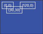
You can position elements in a canvas by using its two attachable properties: Canvas.Left and Canvas.Top. Canvas.Left represents the distance between the left edge of the canvas and the left edge of the child element, and Canvas.Top represents the distance between the two top edges. When not specified, a value of 0 is assumed, so an element placed in a canvas without any explicit positioning gets rendered in the top-left corner of the canvas. Figure 5.1 demonstrates how the following three buttons render inside the following blue canvas:
<Canvas Background="Blue">
<Button Content="(0,0)"/>
<Button Canvas.Left="120" Content="(120,0)"/>
<Button Canvas.Left="30" Canvas.Top="30" Content="(30,30)"/>
</Canvas>
Figure 5.1 Three buttons placed in a blue canvas.
As with the other panels, you can use Canvas.ZIndex to override the natural ordering of which elements get placed on top of others.
Setting Canvas.Left and/or Canvas.Top is no different than giving each element an equivalent margin. For example, the following XAML produces the exact same result as seen in Figure 5.1:
<Canvas Background="Blue">
<Button Content="(0,0)"/>
<Button Margin="120,0,0,0" Content="(120,0)"/>
<Button Margin="30,30,0,0" Content="(30,30)"/>
</Canvas>
If you use Canvas.Left and/or Canvas.Top and set a margin, the values are added together to produce a combined offset from the top-left corner.
Elements in a canvas are given the exact amount of space they need, so the alignment properties (including any default stretching behavior) never have any effect on such elements. And unlike in a stack panel and grid, elements in a canvas have no layout interaction; one element can never “push” another element. Therefore, putting a right and/or bottom margin on such an element has no effect.
Apps usually use a canvas for arranging images or vector graphics in specific locations. Due to the static layout inside a canvas, such apps also tend to only support one orientation unless the use of canvas is restricted to a small portion of the whole page.
Although the behavior of canvas described so far is straightforward, it has two subtle behaviors related to its size and hit testing, examined next.
Canvas Size
The size of a canvas is irrelevant when it comes to rendering its children. If there is room on the screen, child elements are happily rendered outside of the canvas’s bounds. Figure 5.2 demonstrates this for the following updated blue canvas XAML:
<Canvas Background="Blue" Width="50" Height="50">
<Button Content="(0,0)"/>
<Button Canvas.Left="120" Content="(120,0)"/>
<Button Canvas.Left="30" Canvas.Top="30" Content="(30,30)"/>
</Canvas>
Figure 5.2 The blue canvas from Figure 5.1, constrained to 50×50 pixels.
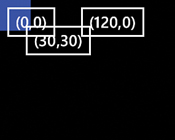
Keep in mind that buttons have 12 pixels of space around their border, which is why each one appears to be shifted down and to the right 12 pixels too far.
Furthermore, the default size of a canvas is effectively 0 pixels tall and 0 pixels wide! This detail normally doesn’t matter—if you place a canvas directly inside a page or a grid, it gets stretched to fill the space given to it (as long as it doesn’t have explicit width/height values). But if you place it inside a stack panel, you see the subtle behavior caused by this fact. Figure 5.3 shows the rendered result of the following XAML, which places the canvas from Figure 5.1 between two buttons in a stack panel:
<StackPanel>
<Button Content="above" Background="Orange"/>
<Canvas Background="Blue">
<Button Content="(0,0)"/>
<Button Margin="120,0,0,0" Content="(120,0)"/>
<Button Margin="30,30,0,0" Content="(30,30)"/>
</Canvas>
<Button Content="below" Background="Red" Opacity=".5"/>
</StackPanel>
Figure 5.3 The blue canvas from Figure 5.1, stacked between two buttons.
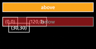
Most people would expect to see the “above” button above the canvas and the “below” button below it. But because the canvas has a height of 0, the “below” button gets stacked immediately below the “above” button, overlapping the canvas and its contents. (The “below” button is given a reduced opacity so you can see the two buttons that are completely obscured.) You also see none of the canvas’s blue background because of its size.
To avoid the overlapping behavior, the canvas needs to be given an explicit height, for example:
<StackPanel>
<Button Content="above" Background="Orange"/>
<Canvas Background="Blue" Height="100">
<Button Content="(0,0)"/>
<Button Margin="120,0,0,0" Content="(120,0)"/>
<Button Margin="30,30,0,0" Content="(30,30)"/>
</Canvas>
<Button Content="below" Background="Red" Opacity=".5"/>
</StackPanel>
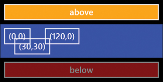
The result of doing this is shown in Figure 5.4. Notice that we didn’t need to give the canvas an explicit width. That’s because the vertical stack panel is stretching it horizontally, as with the buttons.
Figure 5.4 The blue canvas from Figure 5.1, stacked between two buttons and given an explicit height of 100 pixels.
Hit Testing
Hit testing refers to the detection of taps, drags, and other gestures on an element. A canvas can detect gestures (e.g. raise MouseLeftButtonDown and other events) within its own area as well as within the area of its children, even when these children are outside of the canvas’s bounds. Because the size of the canvas is not always intuitive, the resulting hit testing area can be just as unintuitive when the canvas does not have a visible background color.
A canvas must have an explicit transparent background in order to respond to taps on its surface!
Another subtlety is that the default background for canvas is not transparent, but rather null. A null background looks no different than a transparent background, but it does not detect any gestures. (Gestures on its children are still detected.) An explicit transparent background, on the other hand, detects taps on its surface.
Vector Graphics
Both Silverlight and XNA support using images in your user interface, but Silverlight also supports vector graphics. Vector graphics bring a number of benefits, such as the ability to stay crisp at any zoom level and the ability to easily make dynamic tweaks to the content. Such tweaks can include morphing the shapes, changing the thickness of strokes, and changing colors.
For Windows Phone apps, the ability to change colors in vector graphics is extremely helpful for having graphical content that can match the current theme colors. The Ruler app takes advantage of this: Its ruler lines are rendered with the current theme’s foreground brush, and the marker line is rendered with the current theme’s accent brush. The end of this chapter shows the Ruler app under the light theme, which gives it more of a real-world ruler look compared to its dark-theme appearance.
You can create vector graphics based on six different shapes (usually precisely placed within a canvas):
→ Ellipse
→ Line
→ Polyline
→ Polygon
→ Path
These shapes have many of the members that other elements have, such as the width/height properties, alignment properties, and all the mouse events. Instead of Foreground and Background properties, however, these shapes have Fill and Stroke properties, which can also be set to any brush. They also have a StrokeThickness property, a double value that is 1 by default.
Rectangle
The Rectangle element can be used to draw a rectangle, whether you give it an explicit width and height or allow it to stretch and fill an area. Interestingly, you can set RadiusX and RadiusY properties (of type double) on a rectangle to give it rounded corners. Figure 5.5 shows the following stacked rectangles with various values of RadiusX and RadiusY:
<StackPanel>
<Rectangle Height="100" Fill="Orange" Margin="4"
Stroke="{StaticResource PhoneForegroundBrush}" StrokeThickness="10"/>
<Rectangle Width="200" Height="100" RadiusX="10" RadiusY="30"
Fill="Orange" Stroke="{StaticResource PhoneForegroundBrush}"
StrokeThickness="10" Margin="4"/>
<Rectangle Height="100" RadiusY="50" RadiusX="50"
Fill="Orange" Stroke="{StaticResource PhoneForegroundBrush}"
StrokeThickness="10" Margin="4"/>
<Rectangle Width="200" Height="100" RadiusX="100" RadiusY="50"
Fill="Orange" Stroke="{StaticResource PhoneForegroundBrush}"
StrokeThickness="10" Margin="4"/>
</StackPanel>
Figure 5.5 Four rectangles with different values for RadiusX and RadiusY.

The first and third rectangles are allowed to stretch to fill the stack panel’s width because they are not given an explicit width. RadiusX can be at most half the Width of the Rectangle, and RadiusY can be at most half the Height. Setting them any higher makes no difference. Both RadiusX and RadiusY must be nonzero for either one to have an effect.
You must explicitly set Stroke or Fill for a shape to be seen!
Ellipse
After discovering the flexibility of the Rectangle element and realizing that it can be made to look like an ellipse (or circle), you’d think that a separate Ellipse element would be redundant. And you’d be right! All Ellipse does is make it easier to get an elliptical shape. It simply fills its rectangular region with the largest possible elliptical shape.
The following ellipse could replace the last rectangle in the previous XAML snippet, and Figure 5.5 would look identical:
<Ellipse Width="200" Height="100" StrokeThickness="10" Margin="4"
Fill="Orange" Stroke="{StaticResource PhoneForegroundBrush}"/>
The only change is replacing the element name and removing the references to RadiusX and RadiusY.
Line
The Line element, the one shape used by the Ruler app, defines four double properties to represent a line segment connecting points (x1,y1) and (x2,y2). These properties are called X1, Y1, X2, and Y2.
The values of Line’s properties are not absolute coordinates. They are relative to the space given to the Line element by its parent. For example, the following stack panel contains three lines, and is rendered in Figure 5.6:
<StackPanel>
<Line X1="0" Y1="0" X2="100" Y2="100" Margin="4"
Stroke="{StaticResource PhoneForegroundBrush}" StrokeThickness="10"/>
<Line X1="0" Y1="0" X2="100" Y2="0" Margin="4"
Stroke="{StaticResource PhoneForegroundBrush}" StrokeThickness="10"/>
<Line X1="0" Y1="100" X2="100" Y2="0" Margin="4"
Stroke="{StaticResource PhoneForegroundBrush}" StrokeThickness="10"/>
</StackPanel>
Figure 5.6 Three lines in a stack panel, demonstrating that their coordinates are relative.

Notice that each line is given the space needed by its bounding box, so the horizontal line gets only 10 units (for the thickness of its stroke) plus the specified margin. Lines inherit a Fill property from their base Shape class, but it is meaningless because there is never any area to fill.
Of course, when lines or any other shapes are placed in a canvas (as they usually are), they are allowed to overlap. By simply replacing the stack panel in the previous XAML snippet with a canvas, the result in Figure 5.7 is produced.
Figure 5.7 The same three lines in Figure 5.6, but with the parent stack panel replaced by a canvas.

Polyline
A Polyline element represents a sequence of lines, expressed in its Points property. The following four polylines are rendered in Figure 5.8:
<StackPanel>
<Polyline Points="0,0 100,100" Margin="4"
Stroke="{StaticResource PhoneForegroundBrush}" StrokeThickness="10"/>
<Polyline Points="0,0 100,100 200,0" Margin="4"
Stroke="{StaticResource PhoneForegroundBrush}" StrokeThickness="10"/>
<Polyline Points="0,0 100,100 200,0 300,100" Margin="4"
Stroke="{StaticResource PhoneForegroundBrush}" StrokeThickness="10"/>
<Polyline Points="0,0 100,100 200,0 300,100 100,100" Margin="4"
Stroke="{StaticResource PhoneForegroundBrush}" StrokeThickness="10"/>
</StackPanel>
Figure 5.8 Four polylines, ranging from 2 to 5 points.

As with margin and padding syntax, the placement of spaces and commas for value of Points is flexible. (You can place commas between any two values or use no commas at all.)
Figure 5.9 demonstrates what happens when each of the four polylines’ Fill property is set to {StaticResource PhoneAccentBrush}. It’s a neat trick; polylines pretend that a line segment exists to connect the first and last points, and then fills it accordingly.
Figure 5.9 The same polylines from Figure 5.8, but with an explicit fill.

Polygon
Just as Rectangle makes Ellipse redundant, Polyline makes Polygon redundant. The only difference between the Polyline and Polygon elements is that Polygon automatically adds a line segment connecting the first and last points. If you take each polyline from Figure 5.9 and simply change each element name to Polygon, you get the result shown in Figure 5.10.
Figure 5.10 Polygons are just like polylines, except that they always form a closed shape.


Path
The Path element is the most powerful shape. It can do everything done by the previous five shapes and much, much more. When you draw with a pen or pencil in a tool like Expression Blend, it generates corresponding Path elements. The characteristics of a path are determined by its Data property. In XAML, you can set this to a string that you are unlikely to craft by hand but rather let a tool like Expression Blend create for you. For example, the following path is shown in Figure 5.12:
<Path Stroke="{StaticResource PhoneForegroundBrush}" StrokeThickness="10"
Fill="{StaticResource PhoneAccentBrush}"
Data="M0,0 L0,100 C0,100 150,50 150,250 C300,100 50,150 250,250"/>
Figure 5.12 Paths enable the expression of complex shapes.

The information given to Data represents a geometry. The string can be fairly human-readable for people familiar with the syntax. For example, the "M0,0 L0,100" at the beginning means, “move to position (0,0) and draw a line to position (0,100).” Geometries, including this string syntax, are covered in Appendix E, “Geometry Reference.”
Stroke Customization
Besides its brush, thickness, and line join behavior, you can customize a stroke’s edges with custom line caps, and make it a dotted and/or dashed line.
Custom Line Caps
Whereas StrokeLineJoin customizes the appearance of joints, you can customize the endpoints of any open line segment by setting StrokeStartLineCap and/or StrokeEndLineCap to Flat (the default), Square, Round, or Triangle. Figure 5.13 shows each of the values applied to a line’s StartLineCap and EndLineCap properties. The Ruler app makes use of Triangle start and end line caps for the line that marks a precise measurement.
Figure 5.13 Each type of line cap applied to lines.

What’s the difference between applying Flat versus Square to a line cap?
Dotted and Dashed Lines
You can make a shape’s stroke dotted, dashed, or any combination in-between with its StrokeDashArray property. You can set this property to a pattern of numbers where the odd values represent the lengths of the dot/dash (relative to the stroke thickness) and the even values represent the lengths of the space between them (also relative to the stroke thickness). Whatever pattern you choose is then repeated indefinitely.
You can also customize the shape of each dot/dash with the StrokeDashCap property, which works just like StartLineCap and EndLineCap. You can even adjust where the pattern begins by setting the StrokeDashOffset property.
Figure 5.14 demonstrates several StrokeDashArray values applied to ellipses as follows:
<StackPanel Margin="100,100,0,0" >
<Ellipse Width="200" Height="100" StrokeThickness="10" Margin="4"
StrokeDashArray="1,1" Stroke="Red"/>
<Ellipse Width="200" Height="100" StrokeThickness="10" Margin="4"
StrokeDashArray="1,2" Stroke="Orange"/>
<Ellipse Width="200" Height="100" StrokeThickness="10" Margin="4"
StrokeDashArray="2,1" Stroke="Yellow"/>
<Ellipse Width="200" Height="100" StrokeThickness="10" Margin="4"
StrokeDashArray="1,1,4,2" Stroke="Lime"/>
<Ellipse Width="200" Height="100" StrokeThickness="10" Margin="4"
StrokeDashArray="0,1" StrokeDashCap="Round" Stroke="Aqua"/>
<Ellipse Width="200" Height="100" StrokeThickness="10" Margin="4"
StrokeDashArray="0,1" StrokeDashCap="Triangle" Stroke="Magenta"/>
</StackPanel>
Figure 5.14 Various dotted and dashed lines applied to ellipses.

The confusing thing about using a StrokeDashCap other than the default value of Flat is that the cap itself adds 1 to the odd values in StrokeDashArray. This is why the last two values use 0 rather than 1 for the first number in the array.
The User Interface
Listing 5.1 contains the XAML for Ruler’s page. Its root grid contains a single cell with five elements layered on top of each other. These layers are visualized in Figure 5.15. Although Canvas.ZIndex could be used to control what layer is on top of what other layer, this XAML file relies on their natural ordering.
Figure 5.15 Ruler’s user interface is composed of five layers.

Canvas.ZIndex only affects the relative ordering of elements within the same panel!
Listing 5.1 MainPage.xaml—The User Interface for Ruler
<phone:PhoneApplicationPage
x:Class="WindowsPhoneApp.MainPage"
xmlns="http://schemas.microsoft.com/winfx/2006/xaml/presentation"
xmlns:x="http://schemas.microsoft.com/winfx/2006/xaml"
xmlns:phone="clr-namespace:Microsoft.Phone.Controls;assembly=Microsoft.Phone"
xmlns:shell="clr-namespace:Microsoft.Phone.Shell;assembly=Microsoft.Phone"
xmlns:local="clr-namespace:WindowsPhoneApp"
FontFamily="{StaticResource PhoneFontFamilyNormal}"
FontSize="{StaticResource PhoneFontSizeNormal}"
SupportedOrientations="Landscape" Orientation="Landscape">
<!-- The root 1x1 grid holds several overlapping panels in the same cell -->
<Grid x:Name="LayoutRoot">
<!-- Holds the lines and their labels -->
<Canvas x:Name="RulerCanvas"/>
<!-- Interactive canvas listening for taps and drags -->
<Canvas Background="Transparent" MouseMove="InteractiveCanvas_MouseTapOrDrag"
MouseLeftButtonDown="InteractiveCanvas_MouseTapOrDrag">
<!-- The marker line that gets dragged -->
<Line x:Name="ExactMeasurementLine" Y1="7" Y2="473" StrokeThickness="12"
Stroke="{StaticResource PhoneAccentBrush}" Opacity=".8"
StrokeEndLineCap="Triangle" StrokeStartLineCap="Triangle"/>
</Canvas>
<!-- Contains buttons (separate so button taps don't move marker line) -->
<Canvas x:Name="ButtonsCanvas">
<!-- right -->
<Button Canvas.Left="698" Canvas.Top="189" Click="LeftOrRightButton_Click"
Padding="12" Background="Black" local:Tilt.IsEnabled="True">
<Image Source="Shared/Images/appbar.right.png"/>
</Button>
<!-- left -->
<RepeatButton x:Name="LeftButton" Canvas.Left="0" Canvas.Top="189"
Padding="12" Click="LeftOrRightButton_Click"
Background="Black" Visibility="Collapsed"
local:Tilt.IsEnabled="True">
<Image Source="Shared/Images/appbar.left.png"/>
</RepeatButton>
<!-- calibrate -->
<Button Canvas.Top="270" Canvas.Left="305" Click="CalibrateButton_Click"
Padding="0" Background="Black" local:Tilt.IsEnabled="True">
<StackPanel Orientation="Horizontal">
<Image Source="Shared/Images/appbar.settings.png"/>
<TextBlock Foreground="White" Text="calibrate" Padding="0,4,12,0"/>
</StackPanel>
</Button>
</Canvas>
<!-- A direct child of the grid so it's easily centered -->
<TextBlock x:Name="ExactMeasurementTextBlock" FontSize="60" Margin="0,0,0,8"
HorizontalAlignment="Center" VerticalAlignment="Center"
IsHitTestVisible="False"
Foreground="{StaticResource PhoneSubtleBrush}"/>
<!-- The UI for "calibration mode" -->
<Grid x:Name="CalibrationPanel" Background="Transparent"
Visibility="Collapsed">
<!-- Explanation of slider -->
<TextBlock Text="Adjust scale" Margin="24" Padding="0,0,0,134"
VerticalAlignment="Center" HorizontalAlignment="Right"
Foreground="{StaticResource PhoneSubtleBrush}"/>
<!-- The slider that adjusts the line spacing -->
<Slider x:Name="SpacingSlider" Minimum="12" Maximum="24" LargeChange=".2"
VerticalAlignment="Center" Margin="{StaticResource PhoneMargin}"
ValueChanged="SpacingSlider_ValueChanged" />
<!-- A pair of done & reset buttons in the bottom-right corner -->
<StackPanel Orientation="Horizontal" Margin="0,0,12,88"
VerticalAlignment="Bottom" HorizontalAlignment="Right">
<Button Content="done" MinWidth="200" local:Tilt.IsEnabled="True"
Background="Black" Foreground="White"
Click="CalibrationDoneButton_Click"/>
<Button Content="reset" MinWidth="200" local:Tilt.IsEnabled="True"
Background="Black" Foreground="White"
Click="CalibrationResetButton_Click"/>
</StackPanel>
</Grid>
</Grid>
</phone:PhoneApplicationPage>
Notes:
→ The Orientation property is set to Landscape in addition to the usual SupportedOrientations property to avoid an annoying design-time behavior. The default value of the design-time Orientation property is Portrait, so if you set SupportedOrientations to Landscape without setting Orientation to match, the Visual Studio designer complains, “This page does not support the current orientation.” So although this setting is not needed at run-time, it is present to improve the design-time experience.
→ This page does not show the status bar, as it is not appropriate for this style of app (and would reduce the on-screen ruler length).
→ The second layer (the canvas with the line) is given an explicit transparent background so it can respond to taps and drags anywhere on its surface. Notice that the events for both tapping (MouseLeftButtonDown) and dragging (MouseMove) are attached to the same event handler.
→ The left button is not a normal button; it is a repeat button. A repeat button is just like a normal button but it has two unique behaviors. It raises its Click event when pressing your finger down (instead of waiting for your finger to be released). Also, after the first Click (and an initial delay), it repeatedly raises more Click events as long as your finger is held down. This matches the behavior of scrollbar buttons typically seen on a PC. The left button uses this behavior because the user might want a quick way to return to the beginning of the ruler after measuring something long. There is no button for going back to the beginning, so instead the user can hold their finger down on the left button. The right button does not act this way because proper measuring involves advancing slowly, one section at a time.
→ Notice that the three buttons in the third layer don’t contain text! The first two contain an image, and the last one contains a stack panel with its own children! There’s a reason that buttons have a Content property rather than a property called Text; it can be set to any object, including a whole tree of elements! You can set Content to an arbitrary object using property element syntax:
<Button ...>
<Button.Content>
<Image Source="Shared/Images/appbar.right.png"/>
</Button.Content>
</Button>
However, because Content is designated as a content property, you can omit the Button.Content tags, as is done in Listing 5.1. Appendix B, “XAML Reference,” discusses property element syntax, content properties, and more.
Buttons get their Content property from a base class called ContentControl, so it is one of many controls referred to as a content control. Other content controls include repeat buttons, check boxes, radio buttons, and even scroll viewers! All content controls can have their content set to arbitrary objects.
Although you can set the content of buttons to something other than text, you rarely should
→ The right, left, and calibrate buttons are given explicit padding for two reasons. One is that it makes sense for the right and left buttons to be a bit larger than normal so they are easier to tap. If the user tries to tap one but misses, they will end up repositioning the marker line instead, and that would be a frustrating experience. The other reason is that buttons have an asymmetrical default padding ("10,3,10,5"). Although this works well for text, it does not look good for other content.
→ ExactMeasurementTextBlock is placed above the canvas with the marker line to ensure its numbers don’t get covered by the line. This centered text suffers from the same jiggling problem described in the preceding chapter, but it seems acceptable in this case because the text only changes while the user is moving the marker line. To prevent it from blocking tapping and dragging on the canvas underneath, it is marked with IsHitTestVisible="False".
→ The topmost layer, CalibrationPanel, is given an explicit transparent background so it blocks the usual tap and drag processing to move the marker line when it is shown. It starts out invisible (Collapsed), and it’s shown when the calibrate button is tapped.
→ CalibrationPanel contains a slider control to enable the user to adjust the spacing of the ruler lines. It is given a vertical alignment of Center to avoid accidental taps. Although it looks no different with its default Stretch vertical alignment, a stretched slider would respond to taps anywhere on the screen.
→ CalibrationPanel’s two buttons are given explicit foreground and background brushes, but not because they need them. This is simply done to match the other buttons used by this app.
Sliders
In Listing 5.1, the slider is used for the exact purpose for which it was designed—adjusting a numeric value within a finite (usually small) range. It looks like a progress bar, but it is interactive. The user can slide the value back and forth, or tap-and-hold to the left or right of the current value to make it repeatedly jump a fixed amount lower or higher.
Like a progress bar, a slider is primarily customized with three properties: Minimum (0 by default), Maximum (10 by default), and Value (0 by default). It has a LargeChange property (1 by default) that determines how much the value moves up or down each time during the tap-and-hold gesture. (It also has a SmallChange property, but it has no effect.)
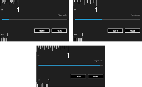
In this Ruler app, the value of the slider represents the number of pixels between each 16th-of-an-inch line, so a smaller value fits more of the ruler on the screen. The minimum value of 12 makes just over 4 inches fit on the screen, and the maximum value of 24 makes just over 2 inches fit on the screen. The default value (set in code-behind) matches the size of my phone’s screen, which fits just under 3 inches. LargeChange is set to .2 because the typical amount of adjustment is typically very small, and tapping a slider to change its value is easier than dragging it. Figure 5.16 shows CalibrationPanel when it is visible, when the slider has three different values. The logic that adjusts the ruler’s lines as a reaction to the slider’s value changing is done in the code-behind, triggered by the ValueChanged event handler (SpacingSlider_ValueChanged).
Figure 5.16 Changing the slider’s value changes the spacing of the ruler lines.
The Code-Behind
Listing 5.2 contains the code-behind for MainPage. Most of the code is related to the main task of drawing the on-screen portion of the ruler.
Listing 5.2 MainPage.xaml.cs—The Code-Behind for Ruler
using System;
using System.ComponentModel;
using System.Windows;
using System.Windows.Controls;
using System.Windows.Input;
using System.Windows.Media;
using System.Windows.Navigation;
using System.Windows.Shapes;
using Microsoft.Phone.Controls;
namespace WindowsPhoneApp
{
public partial class MainPage : PhoneApplicationPage
{
// Remember the calibration setting
Setting<double> inch16thSpacing = new Setting<double>(
"Inch16thSpacing", Constants.DEFAULT_INCH_16TH_SPACING);
// Two more settings to remember the current state
Setting<double> exactMeasurementPosition =
new Setting<double>("ExactMeasurementPosition", 0);
Setting<double> horizontalOffset =
new Setting<double>("HorizontalOffset", 0);
// State to restore after exiting the temporary calibration mode
double preCalibrationScrollOffset;
double preCalibrationSpacing;
public MainPage()
{
InitializeComponent();
}
protected override void OnNavigatedTo(NavigationEventArgs e)
{
base.OnNavigatedTo(e);
// Refresh the UI based on the persisted settings
DrawRuler();
if (this.horizontalOffset.Value > 0)
this.LeftButton.Visibility = Visibility.Visible;
this.ExactMeasurementLine.X1 = this.exactMeasurementPosition.Value;
this.ExactMeasurementLine.X2 = this.exactMeasurementPosition.Value;
UpdateExactMeasurementText();
this.SpacingSlider.Value = this.inch16thSpacing.Value;
}
protected override void OnNavigatedFrom(NavigationEventArgs e)
{
base.OnNavigatedFrom(e);
// Undo the offset change from calibration mode and save the original one
if (this.CalibrationPanel.Visibility == Visibility.Visible)
this.horizontalOffset.Value = this.preCalibrationScrollOffset;
}
// Override the behavior of the hardware Back button
protected override void OnBackKeyPress(CancelEventArgs e)
{
base.OnBackKeyPress(e);
if (this.CalibrationPanel.Visibility == Visibility.Visible)
{
// "Click" the done button
CalibrationDoneButton_Click(null, null);
// Cancel exiting the app
e.Cancel = true;
}
}
void SpacingSlider_ValueChanged(object sender,
RoutedPropertyChangedEventArgs<double> e)
{
// Guard against null when raised from within InitializeComponent
if (this.SpacingSlider != null)
{
this.inch16thSpacing.Value = this.SpacingSlider.Value;
DrawRuler();
}
}
void LeftOrRightButton_Click(object sender, RoutedEventArgs e)
{
double delta;
if (sender == this.LeftButton)
{
// Scroll left, and don't go below 0
delta = -1 * Math.Min(Constants.DEFAULT_SCROLL_AMOUNT,
this.horizontalOffset.Value);
}
else
{
// Scroll right
delta = Constants.DEFAULT_SCROLL_AMOUNT;
// If the line appears to be used, ensure it moves close to the start
if (this.ExactMeasurementLine.X1 > 20)
delta = this.ExactMeasurementLine.X1 - 20;
}
// Perform the virtual scrolling
this.horizontalOffset.Value += delta;
// Keep the line in the correct (now shifted) position
this.ExactMeasurementLine.X1 -= delta;
this.ExactMeasurementLine.X2 -= delta;
this.exactMeasurementPosition.Value -= delta;
if (this.horizontalOffset.Value == 0)
this.LeftButton.Visibility = Visibility.Collapsed;
else
this.LeftButton.Visibility = Visibility.Visible;
DrawRuler();
}
void CalibrateButton_Click(object sender, RoutedEventArgs e)
{
// Hide non-calibration pieces of UI and show the calibration panel
this.ButtonsCanvas.Visibility = Visibility.Collapsed;
this.ExactMeasurementTextBlock.Visibility = Visibility.Collapsed;
this.ExactMeasurementLine.Visibility = Visibility.Collapsed;
this.CalibrationPanel.Visibility = Visibility.Visible;
// Draw the ruler in "calibration mode" with fewer lines & a fixed position
this.LayoutRoot.Background =
Application.Current.Resources["PhoneChromeBrush"] as Brush;
// Save the current position and spacing
this.preCalibrationScrollOffset = this.horizontalOffset.Value;
this.preCalibrationSpacing = this.inch16thSpacing.Value;
this.horizontalOffset.Value = 0;
DrawRuler();
}
void CalibrationDoneButton_Click(object sender, RoutedEventArgs e)
{
// Restore the non-calibration pieces of UI and hide the calibration panel
this.ButtonsCanvas.Visibility = Visibility.Visible;
this.ExactMeasurementTextBlock.Visibility = Visibility.Visible;
this.ExactMeasurementLine.Visibility = Visibility.Visible;
this.CalibrationPanel.Visibility = Visibility.Collapsed;
// Enter "normal mode"
this.LayoutRoot.Background = null;
if (this.inch16thSpacing.Value == this.preCalibrationSpacing)
{
// The spacing hasn't changed, so restore the UI to its previous state
this.horizontalOffset.Value = this.preCalibrationScrollOffset;
}
else
{
// The spacing has changed, so keep the offset at 0 and reset the UI
UpdateExactMeasurementText();
this.LeftButton.Visibility = Visibility.Collapsed;
}
DrawRuler();
}
void CalibrationResetButton_Click(object sender, RoutedEventArgs e)
{
// This invokes CalibrationSlider_ValueChanged,
// which does the rest of the work
this.SpacingSlider.Value = this.inch16thSpacing.DefaultValue;
}
void InteractiveCanvas_MouseTapOrDrag(object sender, MouseEventArgs e)
{
// Get the finger position relative to the landscape-oriented page
double x = e.GetPosition(this).X;
// Move the line and save this position
this.ExactMeasurementLine.X1 = x;
this.ExactMeasurementLine.X2 = x;
this.exactMeasurementPosition.Value = x;
UpdateExactMeasurementText();
}
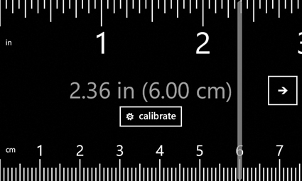
void UpdateExactMeasurementText()
{
double inches = (this.horizontalOffset.Value + this.ExactMeasurementLine.X1)
/ (this.inch16thSpacing.Value * 16);
double cm = inches * Constants.CONVERT_IN_TO_CM;
this.ExactMeasurementTextBlock.Text = inches.ToString("0.00") + " in ("
+ cm.ToString("0.00") + " cm)";
}
void DrawRuler()
{
// Remove all elements and draw everything over again
this.RulerCanvas.Children.Clear();
double mmSpacing = this.inch16thSpacing.Value
* Constants.CONVERT_INCH_16TH_SPACING_TO_MM_SPACING;
// By default, draw until we reach the end of the screen
double inch16thXLimit = Constants.SCREEN_WIDTH + Constants.LINE_WIDTH;
double cmXLimit = Constants.SCREEN_WIDTH + Constants.LINE_WIDTH;
if (this.CalibrationPanel.Visibility == Visibility.Visible)
{
// In "calibration mode", only draw up to 1 inch and 2 cm, which gives
// better performance while dragging the slider
inch16thXLimit = 16 * this.inch16thSpacing.Value - Constants.LINE_WIDTH;
cmXLimit = 10 * mmSpacing - Constants.LINE_WIDTH;
}
// Note: Behaves badly when horizontalOffset becomes unrealistically huge
int inch16thLineIndex = (int)(this.horizontalOffset.Value /
this.inch16thSpacing.Value);
int mmLineIndex = (int)(this.horizontalOffset.Value / mmSpacing);
// Render each inch number label
double x = 0;
int index = inch16thLineIndex;
while (x < inch16thXLimit)
{
x = DrawNumber(index / 16, true);
index += 16;
}
// Render each centimeter number label
x = 0;
index = mmLineIndex;
while (x < cmXLimit)
{
x = DrawNumber(index / 10, false);
index += 10;
}
// Render each 16th-of-an-inch line
double inchLineX = -Constants.LINE_WIDTH;
while (inchLineX <= inch16thXLimit)
{
inchLineX = Draw16thInchLine(inch16thLineIndex);
inch16thLineIndex++;
}
// Render each millimeter line
double mmLineX = -Constants.LINE_WIDTH;
while (mmLineX <= cmXLimit)
{
mmLineX = DrawMillimeterLine(mmLineIndex);
mmLineIndex++;
}
}
double Draw16thInchLine(int lineIndex)
{
// Determine the correct horizontal position from the line index
double x = (lineIndex * this.inch16thSpacing.Value)
- this.horizontalOffset.Value;
// Create and position the line, and add it to the canvas
Line line = new Line {
Stroke = Application.Current.Resources["PhoneForegroundBrush"] as Brush,
StrokeThickness = Constants.LINE_WIDTH };
Canvas.SetLeft(line, x);
this.RulerCanvas.Children.Add(line);
// Vary the length based on whether it's a whole inch, half inch, ...
if (lineIndex % 16 == 0)
line.Y2 = Constants.INCH_LINE_LENGTH;
else if (lineIndex % 8 == 0)
line.Y2 = Constants.INCH_HALF_LINE_LENGTH;
else if (lineIndex % 4 == 0)
line.Y2 = Constants.INCH_4TH_LINE_LENGTH;
else if (lineIndex % 2 == 0)
line.Y2 = Constants.INCH_8TH_LINE_LENGTH;
else
line.Y2 = Constants.INCH_16TH_LINE_LENGTH;
return x;
}
double DrawMillimeterLine(int lineIndex)
{
// Determine the correct horizontal position from the line index
double x = (lineIndex * this.inch16thSpacing.Value *
Constants.CONVERT_INCH_16TH_SPACING_TO_MM_SPACING)
- this.horizontalOffset.Value;
// Create and position the line, and add it to the canvas
Line line = new Line { Y1 = Constants.SCREEN_HEIGHT,
Stroke = Application.Current.Resources["PhoneForegroundBrush"] as Brush,
StrokeThickness = Constants.LINE_WIDTH };
Canvas.SetLeft(line, x);
this.RulerCanvas.Children.Add(line);
// Vary the length based on whether it's a whole cm, half cm, ...
if (lineIndex % 10 == 0)
line.Y2 = Constants.SCREEN_HEIGHT - Constants.CENTIMETER_LINE_LENGTH;
else if (lineIndex % 5 == 0)
line.Y2 = Constants.SCREEN_HEIGHT - Constants.CENTIMETER_HALF_LINE_LENGTH;
else
line.Y2 = Constants.SCREEN_HEIGHT - Constants.MILLIMETER_LINE_LENGTH;
return x;
}
double DrawNumber(int num, bool isInch)
{
// Determine the correct horizontal position of the line
// corresponding to the inch or cm number
double x;
if (isInch)
x = (num * 16 * this.inch16thSpacing.Value)
- this.horizontalOffset.Value;
else
x = (num * 10 * this.inch16thSpacing.Value *
Constants.CONVERT_INCH_16TH_SPACING_TO_MM_SPACING)
- this.horizontalOffset.Value;
if (num == 0)
{
// Don't actually render a "0"... put an "in" or "cm" label instead
TextBlock textBlock = new TextBlock();
textBlock.Text = isInch ? "in" : "cm";
Canvas.SetTop(textBlock, isInch ? 98 : 382);
Canvas.SetLeft(textBlock, x + Constants.LABEL_X);
this.RulerCanvas.Children.Add(textBlock);
}
else
{
// Use a content control to enable centering the number on the line
ContentControl container = new ContentControl {
Width = this.inch16thSpacing.Value * 16, // Wide enough both in and cm
HorizontalContentAlignment = HorizontalAlignment.Center };
// This left position centers the content control on x
Canvas.SetLeft(container, x - container.Width / 2);
Canvas.SetTop(container, isInch ? 56 : Constants.SCREEN_HEIGHT - 110);
this.RulerCanvas.Children.Add(container);
// Add the text block to the content control, which centers its content
TextBlock textBlock = new TextBlock { Text = num.ToString(),
FontSize = isInch ? 80 : 40 };
container.Content = textBlock;
}
return x;
}
}
}
→ To make the calibration mode act like a dialog, it dismisses when the user presses the hardware Back button (and changes the background to use the PhoneChromeBrush resource used by message boxes and other dialogs). In order to accomplish this, we must detect when the button is pressed, then close the dialog and cancel exiting the app, but only when CalibrationPanel is showing. This is done by overriding the page’s OnBackKeyPress method. Yes, this method can be exploited to prevent your app from ever exiting, but don’t think that such an app will get approved by the marketplace! Apps are only meant to provide custom behavior for the hardware Back button in order to dismiss a dialog-like UI, just like in this app.
Can I override the behavior of the other two hardware buttons (Start and Search)?
When setting a slider’s minimum value to greater than 0 in XAML, its ValueChanged event gets raised within InitializeComponent!
→ To move the marker line to the appropriate spot when the screen is tapped/dragged, we must figure out where the finger is making contact. This can be done with the GetPosition method on the MouseEventArgs instance passed to any mouse event handlers (InteractiveCanvas_MouseTapOrDrag, in this case). The returned position is relative to whatever element is passed to the method. In InteractiveCanvas_MouseTapOrDrag, the page (this) is passed to GetPosition to get the page-relative location.
Be careful what you pass to MouseEventArgs.GetPosition!
→ When the calibration slider is moved, the change is applied instantly. This is in accordance with design guidelines, which dictate that settings should take effect instantly and not require any sort of “apply” button.
→ DrawRuler and its helper methods, Draw16thInchLine, DrawMillimeterLine, and DrawNumber, draw the on-screen slice of the ruler according to the current value of horizontalOffset. At any point, only the on-screen elements exist because performance would suffer if too many off-screen elements were kept in memory.
→ Rather than setting the X1 and X2 values of each ruler line created in Draw16thInchLine and DrawMillimeterLine, the code sets Canvas.Left via a call to Canvas.SetLeft. Both approaches are equivalent, but the approach chosen saves one line of code.
→ Although it would appear that the ruler can be infinitely long, the largest supported measurement is 84,546,599.99 inches (22,726,125,279 pixels under the default calibration setting) due to limitations in the math and casting from double to int. Considering that this about half the distance from New York to Los Angeles, and considering that the user can only advance the ruler a few inches at a time, this app doesn’t worry about this limit! (Also, the display of the numbers breaks down far before this limit due to space constraints.)
this.LayoutRoot.Background =
Application.Current.Resources["PhoneChromeBrush"] as Brush;
The code-behind file uses several constants. They are defined as follows in a separate file (Constants.cs):
namespace WindowsPhoneApp
{
public static class Constants
{
// Screen
public const int SCREEN_WIDTH = 800;
public const int SCREEN_HEIGHT = 480;
// Conversions
public const double CONVERT_INCH_16TH_SPACING_TO_MM_SPACING = (50d / 127d)
* (16d / 10d);
public const double CONVERT_IN_TO_CM = 127d / 50d;
// Misc measurements
public const int DEFAULT_SCROLL_AMOUNT = 750;
public const int LABEL_X = 15;
public const int LINE_WIDTH = 3;
public const double DEFAULT_INCH_16TH_SPACING = 16.8;
// Lines on the inches side
public const int INCH_LINE_LENGTH = 70;
public const int INCH_HALF_LINE_LENGTH = 58;
public const int INCH_4TH_LINE_LENGTH = 47;
public const int INCH_8TH_LINE_LENGTH = 35;
public const int INCH_16TH_LINE_LENGTH = 23;
// Lines on the centimeter side
public const int CENTIMETER_LINE_LENGTH = 58;
public const int CENTIMETER_HALF_LINE_LENGTH = 46;
public const int MILLIMETER_LINE_LENGTH = 35;
}
}
The Finished Product
