Chapter 23. Baby Milestones

Baby Milestones informs parents about typical milestones in a baby’s development from birth to the age of 2. This app enables parents to keep track of developmental milestones and ensure that their baby is developing on schedule. It presents month-by-month lists of skills that most babies can accomplish at each age, and enables the parent to record the date that the baby demonstrated each skill. The main page of the app shows a dashboard with the current month-by-month progress.
A little bonus feature in this app happens to be the main reason that it is included in this part of the book. It demonstrates how to store a photo in isolated storage, and later retrieve and display it. Each month’s list in this app (from 1 to 24) supports specifying a custom image as the page’s background. The idea is that the parent can take a photo of their baby at the appropriate age to provide a bit of nostalgic context to each list.
The Main Page
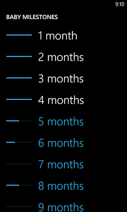
The main page, shown in Figure 23.1, contains a list box that links to each of the 24 monthly lists. Each label in the list is accompanied with a progress bar that reveals the current progress in each month. Completed months are displayed in the phone’s foreground color, whereas incomplete months are displayed in the phone’s accent color.
Figure 23.1 The progress bars turn an otherwise-simple list box into a useful dashboard view.
Listing 23.1 contains the XAML for this main page, and Listing 23.2 contains the code-behind.
Listing 23.1 MainPage.xaml—The User Interface for Baby Milestones’ Main Page
<phone:PhoneApplicationPage x:Class="WindowsPhoneApp.MainPage"
xmlns="http://schemas.microsoft.com/winfx/2006/xaml/presentation"
xmlns:x="http://schemas.microsoft.com/winfx/2006/xaml"
xmlns:phone="clr-namespace:Microsoft.Phone.Controls;assembly=Microsoft.Phone"
xmlns:shell="clr-namespace:Microsoft.Phone.Shell;assembly=Microsoft.Phone"
xmlns:local="clr-namespace:WindowsPhoneApp"
FontSize="{StaticResource PhoneFontSizeNormal}"
Foreground="{StaticResource PhoneForegroundBrush}"
SupportedOrientations="PortraitOrLandscape"
x:Name="Page" shell:SystemTray.IsVisible="True">
<phone:PhoneApplicationPage.Resources>
<!-- A value converter for the binding of each item's foreground -->
<local:PercentageToBrushConverter x:Key="PercentageToBrushConverter"/>
</phone:PhoneApplicationPage.Resources>
<Grid>
<Grid.RowDefinitions>
<RowDefinition Height="Auto"/>
<RowDefinition Height="*"/>
</Grid.RowDefinitions>
<!-- The standard header -->
<StackPanel Style="{StaticResource PhoneTitlePanelStyle}">
<TextBlock Text="BABY MILESTONES"
Style="{StaticResource PhoneTextTitle0Style}"/>
</StackPanel>
<!-- The list box that fills the page -->
<ListBox x:Name="ListBox" Grid.Row="1" ItemsSource="{Binding}"
Margin="{StaticResource PhoneHorizontalMargin}"
SelectionChanged="ListBox_SelectionChanged">
<ListBox.ItemTemplate>
<!-- The data template controls how each item renders -->
<DataTemplate>
<!-- The explicit width is only here for the sake of the tilt effect -->
<StackPanel Orientation="Horizontal" local:Tilt.IsEnabled="True"
Width="{Binding ActualWidth, ElementName=Page}"
Background="Transparent">
<ProgressBar Value="{Binding PercentComplete}" Width="120"/>
<!-- The text block displays the Name property value, colored based
on the % complete -->
<TextBlock Text="{Binding Name}" Margin="{StaticResource PhoneMargin}"
Style="{StaticResource PhoneTextExtraLargeStyle}"
Foreground="{Binding PercentComplete, Converter=
{StaticResource PercentageToBrushConverter}}"/>
</StackPanel>
</DataTemplate>
</ListBox.ItemTemplate>
</ListBox>
</Grid>
</phone:PhoneApplicationPage>
Listing 23.2 MainPage.xaml.cs—The Code-Behind for Baby Milestones’ Main Page
using System;
using System.Windows;
using System.Windows.Controls;
using Microsoft.Phone.Controls;
namespace WindowsPhoneApp
{
public partial class MainPage : PhoneApplicationPage
{
public MainPage()
{
InitializeComponent();
this.Loaded += MainPage_Loaded;
}
void MainPage_Loaded(object sender, RoutedEventArgs e)
{
if (this.ListBox.Items.Count > 0)
return; // We already added the data
// Fill the list box with the ages
this.DataContext = Settings.List.Value;
// Ensure that the most-recently-selected item is scrolled into view.
// Do this delayed to ensure the list box has been filled
this.Dispatcher.BeginInvoke(delegate()
{
if (this.ListBox.Items.Count > Settings.CurrentAgeIndex.Value)
this.ListBox.ScrollIntoView(
this.ListBox.Items[Settings.CurrentAgeIndex.Value]);
});
}
void ListBox_SelectionChanged(object sender, SelectionChangedEventArgs e)
{
if (this.ListBox.SelectedIndex >= 0)
{
Settings.CurrentAgeIndex.Value = this.ListBox.SelectedIndex;
// Navigate to the details page for this age
this.NavigationService.Navigate(new Uri(
"/DetailsPage.xaml", UriKind.Relative));
// Clear the selection so the same item can be selected
// again on subsequent visits to this page
this.ListBox.SelectedIndex = -1;
}
}
}
}
→ This app makes use of the following two settings defined in Settings.cs:
public static class Settings
{
public static readonly Setting<IList<Age>> List =
new Setting<IList<Age>>("List", Data.Ages);
public static readonly Setting<int> CurrentAgeIndex =
new Setting<int>("CurrentAgeIndex", 0);
}
Data.Ages represents the list of 24 ages, each of which contains a list of skills:
public class Data
{
public static readonly Age[] Ages = {
new Age { Name = "1 month",
Skills = new Skill[] { new Skill("lifts head"),
new Skill("stares at faces"), new Skill("responds to sound") }
},
...
};
}
The Age and Skill classes are defined in Listings 23.3 and 23.4.
→ In this page’s XAML, the progress bar inside the data template binds directly to each Age item’s PercentComplete property. To give each text block the appropriate foreground brush, however, a custom value converter is used. This app makes use of three value converters, all shown in the next section.
→ In the code-behind, the MainPage_Loaded method ensures that the most recently selected age is scrolled into view, because it would be annoying to constantly scroll the page down once the baby is older than 9 months. This is done via a BeginInvoke call, because attempting to scroll the list box immediately after setting the data context would not work. You need to let the binding complete before manipulating the list box in this fashion.
→ As with most uses of a list box in a Windows Phone app, the SelectionChanged event’s behavior (only raising when the selection changes rather than on each tap) is undesirable. Therefore, the ListBox_SelectionChanged handler clears the just-selected item, so consecutive taps on the same item work as expected.
Listing 23.3 Age.cs—The Age Class Used to Represent Each List Box Item
using System.Collections.Generic;
using System.ComponentModel;
namespace WindowsPhoneApp
{
public class Age : INotifyPropertyChanged
{
public string Name { get; set; }
public IList<Skill> Skills { get; set; }
public string PhotoFilename { get; set; }
// A readonly property that calculates completion on-the-fly
public double PercentComplete
{
get
{
int total = this.Skills.Count;
int numComplete = 0;
foreach (Skill s in this.Skills)
if (s.Date != null)
numComplete++;
return ((double)numComplete / total) * 100;
}
}
// Enables any consumer to trigger the
// property changed event for PercentComplete
public void RefreshPercentComplete()
{
PropertyChangedEventHandler handler = this.PropertyChanged;
if (handler != null)
handler(this, new PropertyChangedEventArgs("PercentComplete"));
}
public event PropertyChangedEventHandler PropertyChanged;
}
}
Listing 23.4 Skill.cs—The Skill Class Used by Each Age Instance
using System;
using System.ComponentModel;
namespace WindowsPhoneApp
{
public class Skill : INotifyPropertyChanged
{
// A default constructor (normally implicit) is required for serialization
public Skill()
{
}
public Skill(string name)
{
this.Name = name;
}
public string Name { get; set; }
public Age Age { get; set; }
// The only property that raises the PropertyChanged event
DateTime? date;
public DateTime? Date
{
get { return this.date; }
set
{
this.date = value;
PropertyChangedEventHandler handler = this.PropertyChanged;
if (handler != null)
handler(this, new PropertyChangedEventArgs("Date"));
}
}
public event PropertyChangedEventHandler PropertyChanged;
}
}
Notes:
→ Both Age and Skill implement INotifyPropertyChanged and raise PropertyChanged events for their properties used as the source of data binding. This enables the display on the main page and the details page (shown next) to remain up-to-date without any manual work in those pages.
→ Because Age’s PercentComplete property is based on the value of each Date in its Skills list (null means incomplete, whereas any date means complete), raising a PropertyChanged event for PercentComplete at the appropriate time is tricky. The Age class could have subscribed to the PropertyChanged event on each of its Skill instances and raise one for PercentComplete whenever a date has been changed. Instead, this class simply requires its consumer to call RefreshPercentComplete whenever a relevant date has been changed.
→ Skill is given an explicit default constructor because this is required for it to be properly serialized to isolated storage. Normally the default constructor is implicitly generated by the C# compiler. However, when a nondefault constructor is defined, as in Listing 23.4, you must explicitly define a default constructor (if you want one).
Serialization and Isolated Storage Application Settings
Every object that gets placed in the IsolatedStorageSettings.ApplicationSettings dictionary (or assigned to an instance of the Settings class used throughout this book)—including the transitive closure of all of its members—must be serializable. As mentioned in the preceding chapter, the contents of this dictionary get serialized to XML inside a file called __ApplicationSettings. If any piece of data is not serializable, none of the dictionary’s contents get persisted. This failure can appear to happen silently, unless you happen to catch the unhandled exception in the debugger.
Most of the time, this requirement is satisfied without any extra work. None of the apps in this book (until now) had to take any special action to ensure that their settings were serializable, as all the basic data types (string, numeric values, DateTime, and so on), the generic List used with such basic data types, and classes with members of those types are all serializable.
Sometimes, however, you need to go out of your way to ensure that the data you persist is represented with serializable data types. This could be as simple as adding an explicit default constructor, as in Listing 23.4, or it could involve more work such as changing your data types or decorating them with custom attributes. The System.Runtime.Serialization namespace defines a DataContract attribute, along with attributes such as DataMember and IgnoreDataMember that enable you to customize how your classes get serialized. For example, if a class has a member than can’t be serialized (and doesn’t need to be serialized), you can mark it with the IgnoreDataMember attribute to exclude it.
Avoid persisting multiple references to the same object!
The Details Page
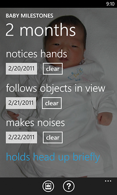
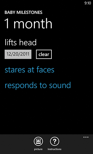
The details page, shown in Figure 23.2, appears when the user taps an age on the main page. This page displays the age-specific list of skills that can be tapped to record the date the skill was acquired. The tap brings up a date picker initialized to today’s date, as shown in Figure 23.3. Listing 23.5 contains this page’s XAML.
Figure 23.2 The details page, shown with the “1 month” list.

Figure 23.3 The details page after the first item is tapped.
Listing 23.5 DetailsPage.xaml—The User Interface for Baby Milestones’ Details Page
<phone:PhoneApplicationPage x:Class="WindowsPhoneApp.DetailsPage"
xmlns="http://schemas.microsoft.com/winfx/2006/xaml/presentation"
xmlns:x="http://schemas.microsoft.com/winfx/2006/xaml"
xmlns:phone="clr-namespace:Microsoft.Phone.Controls;assembly=Microsoft.Phone"
xmlns:shell="clr-namespace:Microsoft.Phone.Shell;assembly=Microsoft.Phone"
xmlns:toolkit="clr-namespace:Microsoft.Phone.Controls; assembly=Microsoft.Phone.Controls.Toolkit"
xmlns:local="clr-namespace:WindowsPhoneApp"
FontSize="{StaticResource PhoneFontSizeNormal}"
Foreground="{StaticResource PhoneForegroundBrush}"
SupportedOrientations="PortraitOrLandscape"
shell:SystemTray.IsVisible="True">
<phone:PhoneApplicationPage.Resources>
<!-- Two value converters -->
<local:NullableObjectToVisibilityConverter
x:Key="NullableObjectToVisibilityConverter"/>
<local:NullableObjectToBrushConverter
x:Key="NullableObjectToBrushConverter"/>
</phone:PhoneApplicationPage.Resources>
<phone:PhoneApplicationPage.ApplicationBar>
<!-- The application bar, with two buttons -->
<shell:ApplicationBar>
<shell:ApplicationBarIconButton Text="picture"
IconUri="/Shared/Images/appbar.picture.png"
Click="PictureButton_Click"/>
<shell:ApplicationBarIconButton Text="instructions"
IconUri="/Shared/Images/appbar.instructions.png"
Click="InstructionsButton_Click"/>
</shell:ApplicationBar>
</phone:PhoneApplicationPage.ApplicationBar>
<Grid>
<Grid.RowDefinitions>
<RowDefinition Height="Auto"/>
<RowDefinition Height="*"/>
</Grid.RowDefinitions>
<!-- The optional background image -->
<Image x:Name="BackgroundImage" Grid.RowSpan="2" Opacity=".5"
Stretch="UniformToFill"/>
<!-- The standard header -->
<StackPanel Style="{StaticResource PhoneTitlePanelStyle}">
<TextBlock Text="BABY MILESTONES"
Style="{StaticResource PhoneTextTitle0Style}"/>
<TextBlock Text="{Binding Name}"
Style="{StaticResource PhoneTextTitle1Style}"/>
</StackPanel>
<!-- The list box that fills the page -->
<ListBox x:Name="ListBox" Grid.Row="1" ItemsSource="{Binding Skills}"
Margin="{StaticResource PhoneHorizontalMargin}"
SelectionChanged="ListBox_SelectionChanged">
<ListBox.ItemTemplate>
<!-- The data template controls how each item renders -->
<DataTemplate>
<!-- The explicit width is only here for the sake of the tilt effect -->
<StackPanel local:Tilt.IsEnabled="True"
Width="{Binding ActualWidth, ElementName=Page}">
<TextBlock Text="{Binding Name}" TextWrapping="Wrap"
Margin="{StaticResource PhoneMargin}"
Style="{StaticResource PhoneTextExtraLargeStyle}"
Foreground="{Binding Date, Converter=
{StaticResource NullableObjectToBrushConverter}}"/>
<StackPanel Orientation="Horizontal" Margin="0,-12,0,0"
Visibility="{Binding Date, Converter=
{StaticResource NullableObjectToVisibilityConverter}}">
<toolkit:DatePicker Value="{Binding Date, Mode=TwoWay}"/>
<Button Content="clear" Click="ClearButton_Click"/>
</StackPanel>
</StackPanel>
</DataTemplate>
</ListBox.ItemTemplate>
</ListBox>
</Grid>
</phone:PhoneApplicationPage>
→ The visibility of each item’s date picker and the color of each item’s text block are based on the value of the Skill instance’s Date property. This is done with two value converters. These two classes, along with the value converter used by the main page, are shown in Listing 23.6.
→ The value for the date picker uses two-way data binding, which is useful for any property whose value can be manipulated by the user. Changes to the Skill’s Date property are not only automatically reflected in the date picker, but also changes that the user makes via the date picker user interface are automatically reflected back to the Date property.
Listing 23.6 ValueConverters.cs—The Three Value Converters Used by Baby Milestones
using System;
using System.Globalization;
using System.Windows;
using System.Windows.Data;
namespace WindowsPhoneApp
{
// Return Collapsed for null and Visible for nonnull
public class NullableObjectToVisibilityConverter : IValueConverter
{
public object Convert(object value, Type targetType, object parameter,
CultureInfo culture)
{
if (value != null)
return Visibility.Visible;
else
return Visibility.Collapsed;
}
public object ConvertBack(object value, Type targetType, object parameter,
CultureInfo culture)
{
return DependencyProperty.UnsetValue;
}
}
// Return the accent brush for null and the foreground brush for nonnull
public class NullableObjectToBrushConverter : IValueConverter
{
public object Convert(object value, Type targetType, object parameter,
CultureInfo culture)
{
if (value != null)
return Application.Current.Resources["PhoneForegroundBrush"];
else
return Application.Current.Resources["PhoneAccentBrush"];
}
public object ConvertBack(object value, Type targetType, object parameter,
CultureInfo culture)
{
return DependencyProperty.UnsetValue;
}
}
// Return the accent brush for any value other than 100 and
// the foreground brush for 100
public class PercentageToBrushConverter : IValueConverter
{
public object Convert(object value, Type targetType, object parameter,
CultureInfo culture)
{
if ((double)value == 100)
return Application.Current.Resources["PhoneForegroundBrush"];
else
return Application.Current.Resources["PhoneAccentBrush"];
}
public object ConvertBack(object value, Type targetType, object parameter,
CultureInfo culture)
{
return DependencyProperty.UnsetValue;
}
}
}
Listing 23.7 contains the code-behind for the details page.
Listing 23.7 DetailsPage.xaml.cs—The Code-Behind for Baby Milestones’ Details Page
using System;
using System.IO;
using System.Windows;
using System.Windows.Controls;
using System.Windows.Navigation;
using Microsoft.Phone;
using Microsoft.Phone.Controls;
using Microsoft.Phone.Tasks;
namespace WindowsPhoneApp
{
public partial class DetailsPage : PhoneApplicationPage
{
public DetailsPage()
{
InitializeComponent();
}
protected override void OnNavigatedTo(NavigationEventArgs e)
{
Age age = Settings.List.Value[Settings.CurrentAgeIndex.Value];
// Update the UI
this.DataContext = age;
if (age.PhotoFilename != null)
this.BackgroundImage.Source =
IsolatedStorageHelper.LoadFile(age.PhotoFilename);
}
void ListBox_SelectionChanged(object sender, SelectionChangedEventArgs e)
{
if (this.ListBox.SelectedIndex >= 0)
{
// Set the date to today
(this.ListBox.SelectedItem as Skill).Date = DateTime.Now;
// Trigger the property changed event that will refresh the UI
Settings.List.Value[
Settings.CurrentAgeIndex.Value].RefreshPercentComplete();
// Clear the selection so the same item can be selected
// multiple times in a row
this.ListBox.SelectedIndex = -1;
}
}
void ClearButton_Click(object sender, RoutedEventArgs e)
{
Skill skill = (sender as Button).DataContext as Skill;
if (MessageBox.Show("Are you sure you want to clear the date for "" +
skill.Name + ""?", "Clear Date", MessageBoxButton.OKCancel)
== MessageBoxResult.OK)
{
skill.Date = null;
Settings.List.Value[
Settings.CurrentAgeIndex.Value].RefreshPercentComplete();
}
}
// Application bar handlers
void PictureButton_Click(object sender, EventArgs e)
{
Microsoft.Phone.Tasks.PhotoChooserTask task = new PhotoChooserTask();
task.ShowCamera = true;
task.Completed += delegate(object s, PhotoResult args)
{
if (args.TaskResult == TaskResult.OK)
{
string filename = Guid.NewGuid().ToString();
IsolatedStorageHelper.SaveFile(filename, args.ChosenPhoto);
Age age = Settings.List.Value[Settings.CurrentAgeIndex.Value];
if (age.PhotoFilename != null)
IsolatedStorageHelper.DeleteFile(age.PhotoFilename);
age.PhotoFilename = filename;
// Seek back to the beginning of the stream
args.ChosenPhoto.Seek(0, SeekOrigin.Begin);
// Set the background image instantly from the stream
// Turn the stream into an ImageSource
this.BackgroundImage.Source = PictureDecoder.DecodeJpeg(
args.ChosenPhoto, (int)this.ActualWidth, (int)this.ActualHeight);
}
};
task.Show();
}
void InstructionsButton_Click(object sender, EventArgs e)
{
this.NavigationService.Navigate(new Uri("/InstructionsPage.xaml",
UriKind.Relative));
}
}
}
This listing uses a custom IsolatedStorageHelper class to load, save, and delete image files. The images originate from the photo chooser, shown in Figure 23.4, which returns the selected photo as a stream.
Figure 23.4 The photo chooser supports choosing a picture from the media library or taking a new photo from the camera.

IsolatedStorageHelper is implemented in Listing 23.8.
Listing 23.8 IsolatedStorageHelper.cs—A Class That Stores and Retrieves Image Files to/from Isolated Storage
using System.Collections.Generic;
using System.IO;
using System.IO.IsolatedStorage;
using System.Windows.Media;
using Microsoft.Phone;
namespace WindowsPhoneApp
{
public static class IsolatedStorageHelper
{
static Dictionary<string, ImageSource> cache =
new Dictionary<string, ImageSource>();
public static void SaveFile(string filename, Stream data)
{
using (IsolatedStorageFile userStore =
IsolatedStorageFile.GetUserStoreForApplication())
using (IsolatedStorageFileStream stream = userStore.CreateFile(filename))
{
// Get the bytes from the input stream
byte[] bytes = new byte[data.Length];
data.Read(bytes, 0, bytes.Length);
// Write the bytes to the new stream
stream.Write(bytes, 0, bytes.Length);
}
}
public static ImageSource LoadFile(string filename)
{
if (cache.ContainsKey(filename))
return cache[filename];
using (IsolatedStorageFile userStore =
IsolatedStorageFile.GetUserStoreForApplication())
using (IsolatedStorageFileStream stream =
userStore.OpenFile(filename, FileMode.Open))
{
// Turn the stream into an ImageSource
ImageSource source = PictureDecoder.DecodeJpeg(stream);
cache[filename] = source;
return source;
}
}
public static void DeleteFile(string filename)
{
using (IsolatedStorageFile userStore =
IsolatedStorageFile.GetUserStoreForApplication())
userStore.DeleteFile(filename);
}
}
}
Notes:
→ The DeleteFile method is identical to the code to delete files in the preceding chapter, and SaveFile is not specific to images but rather generically saves the input stream’s bytes to a new file stream. The picture-specific part is in LoadFile, which calls PictureDecoder.DecodeJpeg (in the Microsoft.Phone namespace) to convert the stream into an ImageSource that can be set as the source to any Image or ImageBrush element.
→ The DecodeJpeg method is fairly slow and must be called on the UI thread, so this class caches each ImageSource it creates so it can be instantly returned the next time its filename is passed to LoadFile. (The same ImageSource instance can be shared by multiple UI elements, so there’s no danger in reusing one.)
PictureDecoder.DecodeJpeg has a bug!
The Finished Product
