
Chapter 1. Fundamentals
For web sites to be functional, their content must be accessible and their functions operable—these are basic requirements. When we consider these requirements within the context of a universal Web, with its diversity of users and access technologies, several fundamental principles emerge to guide our efforts toward universal usability.
The most basic principle is to design simply. This applies to all areas where design is in the service of function. In The Elements of Typographical Design, Robert Bringhurst asserts, “Typography exists to honor content.” On the Web, design exists to enable access to content and functionality. Bringhurst goes on to say, “Typography... aspires to a kind of statuesque transparency.” The same holds true for Web design. A well-designed Web site has just enough emphasis to spark interest and draw attention to important elements, but not so much as to distract the user from content or to hinder functionality. In Web design, the best way to achieve a balance between engaging and overwhelming the user is to apply the simplest solution to any design problem. Simple solutions produce simple, clean pages that load quickly and are easier to maintain (Figure 1.1, next page).

FIGURE 1.1 The Netflix site is simple, clean, and easy on the eye, with no superfluous elements demanding attention. The site features services and content rather than branding and design.
From a construction standpoint, designers are well outfitted for building universally usable Web sites. The Web was designed to support universal access, and access features are integral to the technology. One method for providing universal access is using fallbacks—content presented in alternate formats to meet the needs of different users. In many cases, the provision for fallbacks is built into Web markup, such as alt-text for images.
The Web can accommodate alternate formats, such as PDF, Flash, and Shockwave. In general, these formats are inferior to HTML for providing universal usability. Many alternate formats have tried to accommodate accessibility concerns by adding features such as support for structural markup and keyboard access, but these features are not integral to the format as they are with HTML. Alternate formats should be used only as an alternative to accessible HTML.
From a markup perspective, universal usability relies on three fundamental attributes: keyboard accessibility, flexibility, and user control.
Web pages have controls that users must be able to operate in order for a page to be functional. Interactive interfaces rely on user input to trigger actions. Some users do not use a pointing device, such as a mouse, but provide input either through a keyboard or some other device that activates keyboard controls. For these users, actionable items such as buttons, links, and forms must be workable using the keyboard.
Flexibility is a basic characteristic of Web pages. For example, pages that adapt to fill the browser window are more accessible than pages that are fixed at an “optimal” width. The concept of fixed design makes no sense in the Web context, where “optimal” is influenced by so many variables—text size, browsing device, display size, window size, and so on. On the Web, the optimal design is one that adapts to the user’s environment (Figure 1.2).

FIGURE 1.2 The Wired site uses a flexible layout that keeps its integrity at different window widths.
Flexible design makes sense on the Web because users have a large measure of control over their environment. Users can view pages with or without formatting, with their own preferred colors and fonts, with or without link underlines, in a wide or narrow browser window—the list goes on. The Web environment is unique in that both user and designer share responsibility for the user experience. Designers need to respect this partnership and avoid using elements such as text graphics and fixed-width pages that cannot be modified by the user.
1.1. Basic Principles
1.1.1. Design simply
In Envisioning Information, Edward Tufte says, “Information consists of differences that make a difference” and claims that, in conveying meaning, “the most economical means can yield distinctions that make a difference.” When information is presented in its most basic form, it’s easy to draw attention to aspects that are important. For example, in a block of text, emphasizing a word or phrase is a matter of changing one attribute: color, typeface, or style. In a simple layout, drawing the eye to an important section can be accomplished by changing one attribute: background color, leading, or typeface. If, however, the page already contains elements of emphasis, highlighting what is important becomes difficult since so many elements are already competing for attention. And if more and more emphasis is added in an effort to make each element stand out, the resulting design is chaotic and confusing (Figure 1.3).
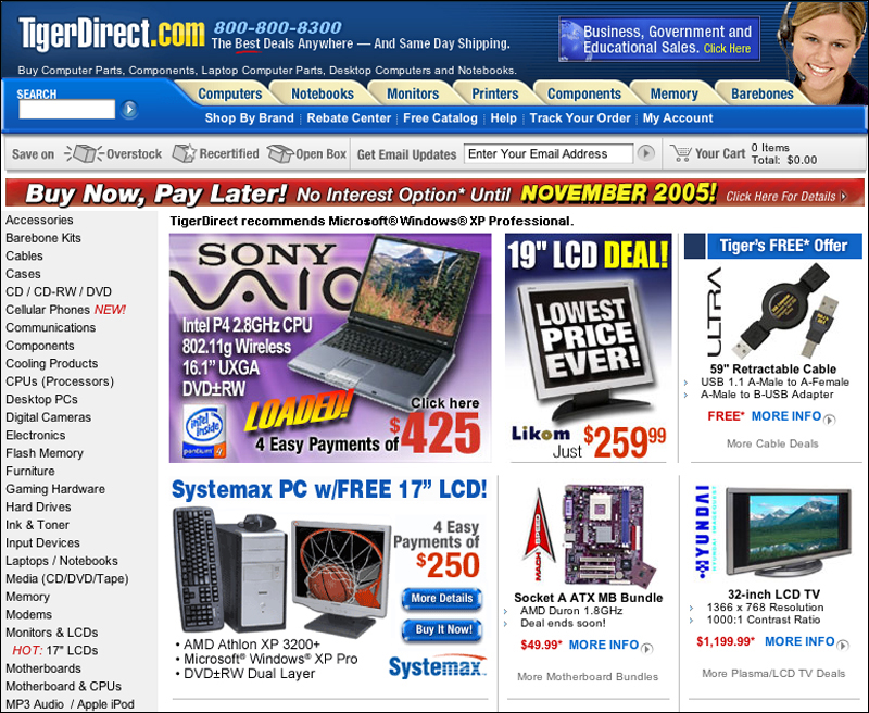
FIGURE 1.3 The home page for TigerDirect.com has so many elements demanding attention that is difficult to focus on the task at hand.
Simple designs are not the norm on the Web. Most designs lack restraint and consequently are difficult to use and often are not functional. Working in such an environment, designers may avoid simple designs for fear of “not being flashy enough.” We should take the risk and design with restraint. Flashy may be impressive but the effect quickly wears off, particularly when a flashy site is not accessible and functional. There may have been a time when people turned to the Web to be wowed, but today’s Web user is looking for results. The best way to impress users is by getting them where they need to go.
Another reason we design complex pages is to gain mastery over the medium. Pixel-perfect designs are reassuring because they afford some consistency across different systems and browsers. The cost, however, is high for both the designer and user. The methods used to guarantee consistency—complex layout tables, needless images—produce pages bloated with unnecessary markup. Maintenance of such pages is painful because simple changes and updates require significant effort and may result in broken pages since one misplaced tag can send the layout into disarray. The result: pages that load slowly and are often out of date because upkeep is too difficult.
On the other hand, simple designs, using only simple structures and clean markup, have many benefits. Without needless markup, pages load much more quickly and are easier to maintain. Users appreciate clean designs that are easy to use and uncluttered. Indeed, the best designs are most noticeable in their effect: enabling users to successfully complete their task. Aim for designs that are effective, easy to maintain, and structurally sound. Ultimately, Web sites are a tool for people to use, not merely to look at. Our success lies in the user’s success.
In a nutshell. Simple designs are easier to use and maintain. Design simple sites, emphasizing important elements and using simple structures and clean, standards-based markup.
1.1.2. Build well
In many ways, good Web design is simply a matter of building well. The Web has built-in elements that, when used properly, allow for user modification and support different access methods. Universal usability requires that we utilize these methods to their best advantage.
One of the Web’s most basic methods for providing universal access is through alternates and fallbacks. When a user encounters content that is inaccessible in a given format, the equivalent information is provided through alternate methods. The ALT and LONGDESC attributes of the IMG tag are intended to provide nonvisual users an accessible text version of information contained in an image. The NOSCRIPT and NOFRAMES tags provide alternate access for users who cannot access JavaScript or frames. The OBJECT tag allows a layered approach to providing alternates. For example, a video might fall back on a slide show, then audio, then an image, and finally text. Effective use of fallbacks is an essential aspect of designing for universal usability (Figure 1.4).
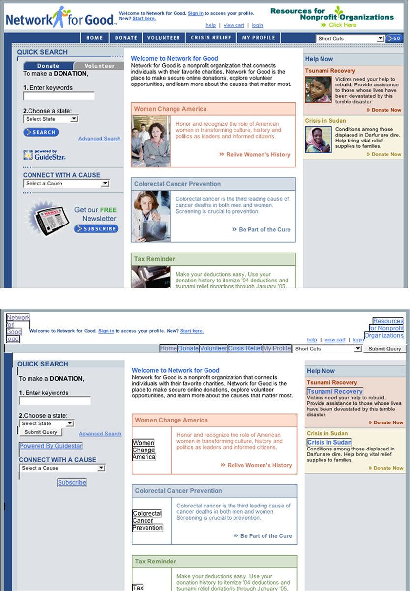
FIGURE 1.4 The Network for Good site uses alt-text effectively; users who do not have access to images can still use the site.
Flexibility and user modification are additional inherent Web properties that enable universal access. Web pages adapt to their environment, so the same page can be viewed on a computer display, printed page, or cell phone. This flexibility allows Web pages to be read by a wide range of devices, from computers to kitchen appliances. Flexibility, coupled with user control, allows users to transform pages to meet their access requirements. Users can choose to view pages with or without styles, with user-defined styles, with large or small text, with images or without. Even the needs of an individual vary depending on many factors. For example, users may need larger text when viewing pages projected in a lecture hall, or want to disable image loading when accessing the Internet from their home computer. Universal usability is possible on the Web when pages are designed for transformation and users are empowered to control their environment.
In a nutshell. The Web has properties that enable universal access. Take full advantage of these inherent properties, such as fallbacks, flexibility, and user control, to construct universally usable Web sites.
1.1.3. Favor HTML over other formats
HTML is the native language of the Web. It contains basic constructs that enable universal access because it was designed specifically for that purpose. Web access software, such as browsers, screen readers, and search engines, were written to read and interpret HTML documents. Web access has been expanded to include other formats—most notably PDF, Flash, and Shockwave. While these formats contain accessibility features, they are inferior to HTML for universal usability because key attributes, such as fallbacks, keyboard accessibility, and structure, are not as integrated as well as they are with HTML.
PDF, or Portable Document Format, allows designers to provide access to documents that exist in other formats, such as word-processing or page-layout software. Converting these documents to PDF is a way of distributing the documents without requiring users to own the originating software. Users can open PDF documents using Acrobat Reader (a free download) and other applications included in operating systems or that are commercially available. Providing documents in PDF reduces distribution overhead by not requiring conversion to HTML. In addition, documents that are saved and distributed as PDFs will retain the appearance of the originating document.
Flash, Java, and Shockwave provide interactivity options beyond HTML’s forms and links. Web designers often want to offer more sophisticated interface options, such as dropdown menus and animated buttons and controls. Most games and animations rely on nonstandard formats, such as Shockwave, since the necessary level of interactivity and feedback cannot be accomplished using standard HTML (Figure 1.5).

FIGURE 1.5 The Lego site provides interactive features that cannot be accomplished using plain HTML.
HTML is not the most powerful or interactive of tools. However, from a universal usability perspective, HTML wins hands down. The Web’s built-in flexibility and fallbacks are not available in other formats because these tools were not explicitly designed to provide access. Accessibility features have been added to PDF, Flash, and Shockwave. On the other hand, features such as keyboard accessibility, flexibility, and user control are inherent to the Web and are therefore addressed more effectively with HTML.
Designers who consider using another document format must carefully weigh the risks and benefits. Does the benefit of increased control or added functionality outweigh the risk of usability barriers? Could the control and functionality be achieved using HTML, even if the design is less streamlined or less elegant?
When an alternate format is deemed necessary, make use of all accessibility features offered by the authoring software. For example, PDF documents can be designed to contain structural markup using the tagged PDF format, and to reflow when the user enlarges text. Flash documents can contain text alternates for images and other nontext elements, and actionable elements can be made keyboard accessible. Utilize these and other accessibility features when designing content using nonstandard formats.
Ultimately, however, for a site to offer universal usability, its content and functionality must be provided using standard Web structures. Any use of nonstandard formats must be offered as an alternative to accessible HTML. For instance, information provided only in a PDF document will be inaccessible to some users, so the equivalent information must also be available on an accessible HTML page. This alternate approach has benefits for all users. For example, some users might prefer a PDF for printing driving directions, whereas driving directions on an accessible HTML page benefit users who cannot or prefer not to work with PDF documents (Figure 1.6).

FIGURE 1.6 Many documents on the Copyright site are available in both HTML (1) and PDF (2) formats. Providing nonstandard formats in addition to accessible HTML enhances usability, as some users may prefer to download a PDF document for printing.
In a nutshell. HTML is the best format for universal usability. Provide documents in nonstandard formats, such as PDF and Flash, only as an alternative to accessible HTML.
1.2. Markup
1.2.1. Design for keyboard access
One of the primary requirements for universal usability is keyboard accessibility. Some users prefer or are required to use the keyboard to operate a computer. Keyboard users include nonvisual users who cannot see the see the screen to point and click, and users who control the computer using alternate input devices, such as a switch device or voice commands. To work with Web pages, these users must be able to accomplish all tasks using the keyboard.
On the most basic level, interactive controls must be operable from the keyboard. Any time a control requires the use of a pointing device, such as a mouse, keyboard-only users are immobilized because they cannot point and click. Users must be able to select menu items, activate links and buttons, and fill in and submit form fields using the keyboard (Figure 1.7, next page).

FIGURE 1.7 The product order page on the OXO site has site links, a search feature, links to other product categories, an order form, and more. For universal usability, all these functional elements must be accessible from the keyboard.
But keyboard accessibility extends beyond functionality. Controls must be logical, self-explanatory, and must function according to user expectations.
Keyboard users can use the tab key to cycle through actionable elements on a Web page. For efficient tabbing, the “tab order” of a Web page must follow a logical sequence. Tab order is generally determined by the order in which elements appear in the code. While it is possible to define tab order using the TABINDEX attribute, the best approach is to construct pages so actionable elements follow a logical sequence in the code. For instance, site links and section links should precede page links, and footer links should appear last in the code. Form fields should follow a logical and customary sequence: for example, first name, last name, and email address (Figure 1.8). In addition, related elements must be grouped: For instance, all section navigation links should be grouped together in the code.

FIGURE 1.8 For keyboard accessibility, links and form elements must be clearly labeled and follow a logical sequence, as on the AnyWho lookup form for businesses and individuals.
Another aspect of designing for keyboard access is the labeling of interactive elements. For keyboard access, these elements must be understandable without the surrounding context of the page, because users may choose to access page controls directly rather than within the page by, for example, tabbing directly to links or form elements. Self-explanatory controls allow keyboard users to understand the purpose and function of each control without having to expand their focus to the surrounding context. Links that are labeled “Click here” are not self-explanatory, whereas links that are labeled to describe the target are. Form fields without labels are not self-explanatory, whereas form fields labeled using the LABEL FOR tag are. Design pages to be usable via links and form elements.
Finally, keyboard accessibility depends on keyboard controls functioning in a manner that is consistent with user expectations. Keyboard control of Web pages is based on a simple functional paradigm: Elements are selected using the tab or arrow key, and selected elements are activated using the return or enter key. Whenever controls use different event triggers—for example, menus that activate when an item is selected or buttons that respond to mouse clicks—keyboard accessibility suffers. Make sure all functional elements respond to the select-activate keyboard interface.
In a nutshell. Some users navigate the Web using the keyboard only. Make sure all functional elements, such as links and forms, can be controlled and activated from the keyboard.
1.2.2. Design for transformation
A common misconception among Web designers is that Web page designs are static in the same way as a poster, book, or billboard, resulting in pages that are designed with one view in mind. These pages are generally designed for a standard screen width, text size, column width, line length, and so on. They do not hold up well when subjected to adaptations, such as enlarged type or a wide or narrow browser window. In fact, Web pages are inherently dynamic, transforming themselves to accommodate different access devices and user needs. This adaptability is what sets the Web apart for universal usability, allowing users to transform content to satisfy their needs and preferences. However, with Web pages that are designed to support only one view—pages that use fixed type sizes and column widths—adaptations are either impossible or not useful because these pages do not adapt well (Figure 1.9). For universal usability, designers need to support the adaptability of the Web by anticipating variation in their page designs and by creating pages that transform gracefully.
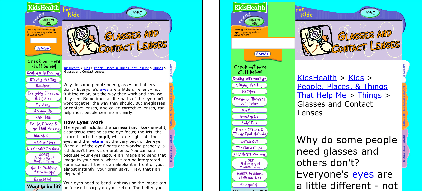
FIGURE 1.9 KidsHealth uses images for navigation and a fixed column width. When users enlarge text, the links do not enlarge (1) and the text column does not expand (2).
While the foundational aspects of a Web page are determined by the designer—for example, the order of elements in the code, the size and content of images—many of the presentational aspects, such as colors, typeface, and text size, are merely suggestions. These attributes change, depending on the device used to access the page and on the preferences of the user (Figure 1.10).

FIGURE 1.10 Users may opt to use their own fonts and colors when browsing the Web, which can dramatically alter the look of a Web page.
Color, for example, is highly unpredictable. On the one hand, users can override color settings and apply their own colors. But even when a page is viewed with its original colors, the color values vary dramatically, depending on whether the page is viewed on a cell phone, laptop, high-resolution display, or via a projector. To design for color transformation, use high-contrast colors that will hold up to variable conditions.
Page width is another common variable. In the early days of the Web, most users accessed Web pages using a desktop computer. Decisions about page width were made based on width of the smallest monitor currently in use. Today, the variety of access devices makes it unrealistic to design for a certain screen width. To design for variable screen dimensions, use flexible layouts that adapt to different window widths.
Variations in text size also influence the page design. Different browsers come with different default text sizes. Users can adjust text size using the zoom feature. In addition, display resolution settings influence the way text displays in the browser. Pages that are designed for transformation respond gracefully to variations in text size. To accommodate different text sizes, use simple, flexible layouts that maintain their integrity with enlarged text (Figure 1.11).

FIGURE 1.11 The IBM Ease of Use site uses a simple, flexible design that can accommodate different window widths and enlarged text.
In a nutshell. Web pages adapt to the user environment and user modifications. Design pages that adapt to different conditions, such as enlarged text or different window widths, while keeping their design integrity.
1.2.3. Allow users to control their environment
On the Web, users have more control over their environment than with any other medium. Users can customize and control their interactions with Web content to an unprecedented degree. The potential for user customization offers an opportunity to redefine the relationship between designer and user.
In product or graphic design, designers make decisions on behalf of users. With user-centered design, decisions are guided by user input, observation, and feedback but the goal remains the same: to determine and implement the optimal design solution. However, even the best-researched user-centered design will inevitably fail since no design can meet the needs and preferences of all users. Each user has different needs depending on his or her environment and access method—for example, whether accessing a Web page on a large monitor or a cell phone.
On the other hand, a customizable interface allows users to control aspects of the interface. Designers are still responsible for providing well-designed pages, but these pages must be built for user adaptation. Users then have the option of changing aspects of the design to better meet their needs and preferences.
Every partnership has boundaries. On the Web, an important boundary exists between the domain of the designer and the user. The designer controls many elements of the user interface, but so does the user. Users can decide whether to open links in a new window or tab, underline links, load images, load styles, or use JavaScript. Users can customize their text settings and background colors. Users can use the style specified by the designer, or apply their own styles. Users can make their viewing window wide or narrow, tall or short. In fact, users can customize their environment to the point where a Web page bears little resemblance to its original design (Figure 1.12).
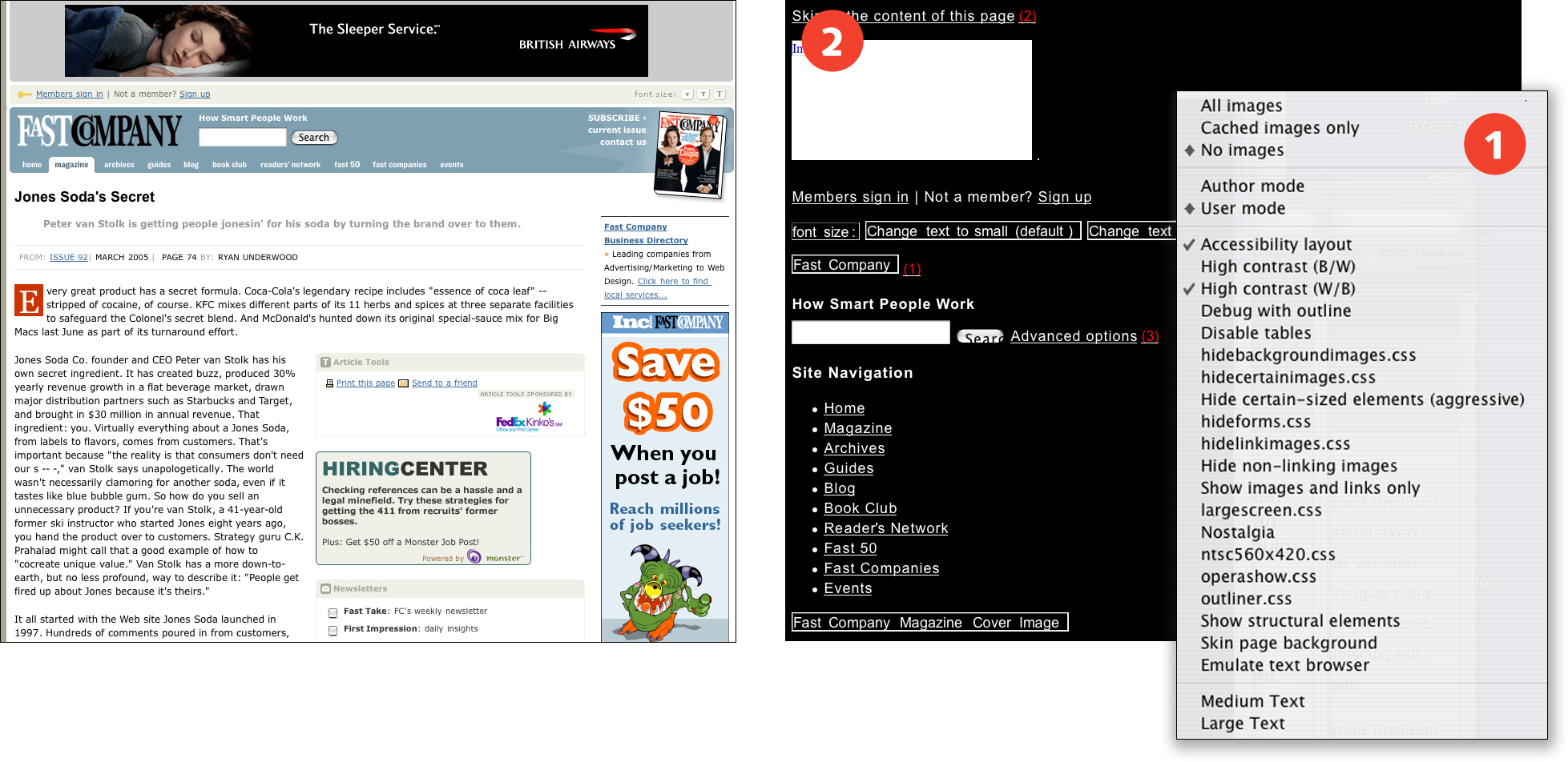
FIGURE 1.12 The Opera browser offers a range of viewing options (1), including the accessibility, high-contrast view shown here (2). Flexible pages, such as those on the Fast Company site, remain usable even with user modification.
Conflicts arise when designers implement decisions that belong in the users’ domain. Decisions made by the designer often take precedence over user settings, and users have little recourse for regaining control of their environment. For example, when a designer targets links to open pages in a new window, users have no way to open the pages in the same window. When a designer removes link underlines, users cannot reinstate them short of overriding style settings altogether. When a designer creates pages that are fixed at a certain width, users cannot make pages wider or narrower.
In general, such design decisions are intended to enhance the user experience: Opening links in a new window allows users to explore related materials without losing contact with the originating site; removing link underlines makes pages cleaner and easier to read because underlines are distracting and interfere with letterforms; and creating fixed-width pages restricts line length so users are not forced to read long lines of text. However, each decision has the potential of causing usability problems for some users: When links open in a new window, users who rely on the back button to navigate the Web will not have access to that functionality; when links are not underlined, users who cannot distinguish colors may not be able to identify links; and when pages are set to a fixed width, users who need to enlarge text will be forced to read narrow text columns.
But most important, the user can control all these parameters. Users who prefer multiple windows can choose to open links in a new window. Users who object to link underlines can turn off underlines in their browser preferences. Users who prefer wide or narrow pages can set page width by resizing the browser window.
Well-intentioned designers make decisions on behalf of users because users do not always make good use of the elements that are under their control. While sometimes effective, this approach can introduce additional usability barriers. Universal usability requires a design partnership, where designers and users work with the elements of the interface that support user control.
In a nutshell. Web users have control over many aspects of their environment. Do not take control of aspects of the user interface, such as text size and link underlines, that belong in the domain of the user.