
Chapter 8. Lists
The web is full of lists, including elements that we might not normally think of as lists, such as navigation. A navbar is essentially a list of links. Indeed, most navigational elements could be considered lists from a structural standpoint. In addition, Web text is peppered with lists because they are easy to scan. Users can form an overview and find information more quickly when it is presented in list format.
Visual users have cues that provide context for lists. Lists are often set off from surrounding text with spacing and indents. Items customarily appear one to a line, preceded by a bullet or number. These markers tell visual users where a list begins and ends, and delimit each item.
These visual attributes can be established without list markup. Spacing and indents can be accomplished using styles or table markup; numbers or bullets can be plain text. In fact, nonstandard lists—such as navigation bars, tabs, or breadcrumbs—are commonly coded using methods other than list markup. In these cases, visual users might not experience usability problems since list items are still visually distinguished. However, nonstructured lists are not as machine-friendly as structured lists, which means nonvisual users may encounter difficulties.
When lists are marked with list markup, nonvisual users have a way to identify them. Screen reader software can announce a list, tell the user how many items are in the list, and read off each list item individually. When lists are coded using other methods, however, this contextual information is not available to the user.
Providing context works best with simple lists. For visual users, it may be possible to effectively communicate multiple levels of information using indents and other visual formatting. For nonvisual users, nested lists may be disorienting.
8.1. Basic Principles
8.1.1. Use list markup for lists
As Web designers, we are asked to define the semantic meaning of elements that we would otherwise take for granted. For example, though we use lists regularly—shopping lists, mailing lists, to-do lists—few of us have ever pondered what a list is. This analysis is important to our work. Well-designed Web sites have properly identified page elements.
So, what is a list? A list is a set of items that share a purpose and/or have common characteristics. For example, a shopping list is set of items to be purchased at the store. A mailing list is a set of email addresses. A to-do list is a set of tasks that need doing. On the Web, the most common list is for navigation. Web navigation design is a primary area of focus for Web designers, and with good reason. To be successful, a Web site must enable users to make their way around the site and quickly locate what they are seeking. This usability requirement places demands on navigation design that, before CSS allowed designers control over structural elements, were not well met using standard list layout. For this reason, Web designers have generally avoided list markup for navigation, preferring such methods as images and tables (Figure 8.1).
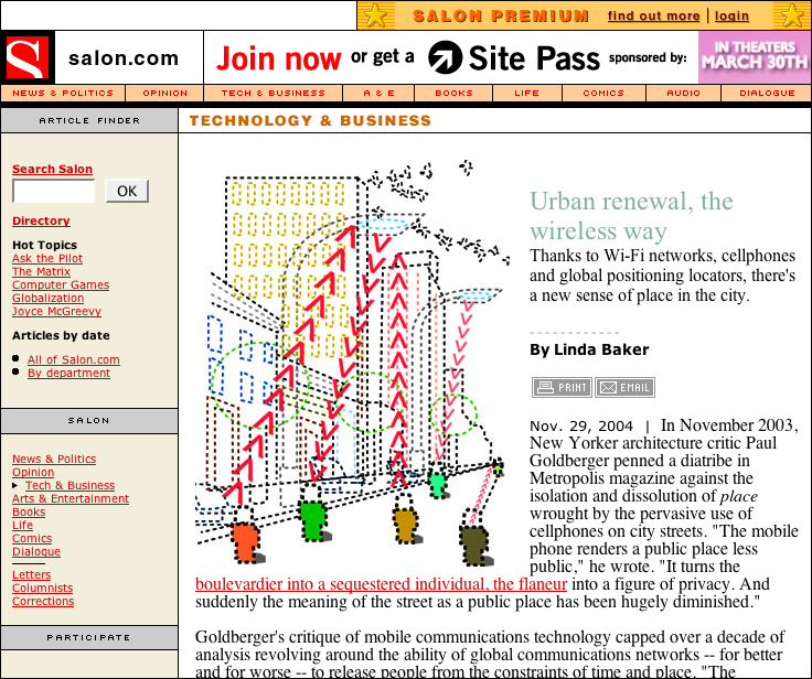
FIGURE 8.1 Salon.com uses images and tables to design the site navigation links across the top of the page.
However, now that CSS text formatting is widely supported, navigation can be well-designed using list markup and styles. With CSS, designers can overlay common navigation styles, such as tabs and button bars, onto standard HTML lists. The list styling options are many, which means designers can use a variety of style attributes to differentiate types of navigation (Figure 8.2). Styles even accommodate behaviors such as rollover effects—visual highlights that occur when the cursor is positioned over a link. Styles make it easy to create a link highlight that would otherwise require convoluted methods, such as images and JavaScript.
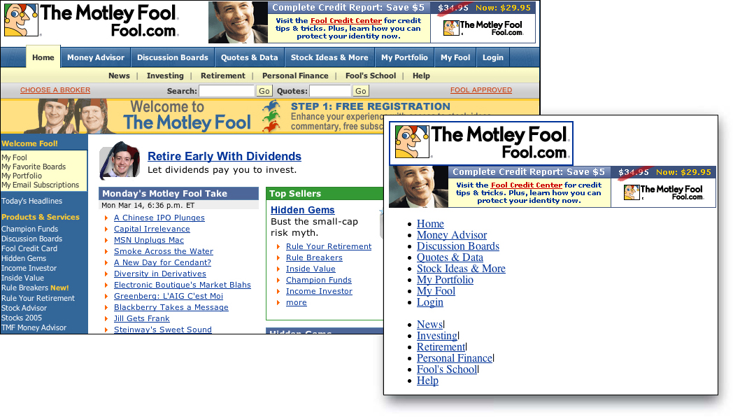
FIGURE 8.2 The Motley Fool uses lists to mark up its navigation links, and styles to design them as tabs. The inset shows the unstyled list.
In a nutshell. Lists are a common element in Web page designs—most notably, navigation is a list of links. Use list mark-up for lists and use style sheets to control their visual properties.
8.1.2. Avoid compound lists
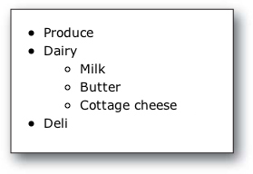
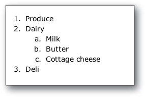
Compound lists contain multiple levels of classification. For example, a compound shopping list has items organized by category: deli, dairy, produce, etc. With compound lists, relationships are shown visually using indents and different item markers (bullets, discs, etc.).
Compound lists may be difficult for visual users to decipher if the visual cues are insufficient. Also, compound lists may be disorienting for nonvisual users. Nested lists are coded so child lists are contained within the associated list item of the parent. On our shopping list, the parent list dairy contains a child list of milk, butter, and cottage cheese:
<ul>
<li>Produce</li>
<li>Dairy
<ul>
<li>Milk</li>
<li>Butter</li>
<li>Cottage cheese</li>
</ul>
</li>
<li>Deli</li>
</ul>
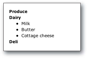
With all items coded as list items, it may be difficult for nonvisual users to differentiate between parent and child items. A better approach might be to define relationships between items using a combination of structural elements. One approach is to break the compound list into sections and mark each section with a heading:
<h2>Produce</h2>
<h2>Dairy</h2>
<ul>
<li>Milk</li>
<li>Butter</li>
<li>Cottage cheese</li>
</ul>
<h2>Deli</h2>
Another approach is to use ordered lists to indicate the relationship between elements:
<ol>
<li>Produce</li>
<li>Dairy
<ol>
<li>Milk</li>
<li>Butter</li>
<li>Cottage cheese</li>
</ol>
</li>
</ol>
In a nutshell. Compound lists can be disorienting and difficult to decipher, particularly for nonvisual users. Break compound lists into sections marked by headings, or use numbering to indicate the relationships between list items.