
Chapter 15. Page Layout
Web designers have multiple layers to attend to. The visual layer is likely the one that gets the most attention and care, but Web design does not stop at the screen. To produce effective and functional designs that enable visual and nonvisual access, we must consider the visual characteristics of a page along with its underlying structure. The ultimate test of a Web page is how well it performs when read by software. This readability is influenced by the methods used to lay out pages.
Nonvisual access is contingent on the order in which elements appear in the code. Software reads Web pages from beginning to end. For pages to read well, elements must appear in logical sequence in the code. Related elements should be in close proximity and important content should appear at the beginning of the page. Pages that begin with layers of advertising, branding, and navigation links, or with content embedded within layout tables, do not read well.
When laying out a page visually, we use various design and typographic devices to identify and differentiate page elements, thereby revealing information structure. These cues must also be present for nonvisual access. When grouping related elements visually, make sure they are also grouped in the code. Use headings instead of visual text formatting to communicate information structure. Structural markup is the most effective way to communicate page structure to nonvisual users. Navigation links that are coded as a list are differentiated from other page elements by virtue of their enclosed markup.
Design simplicity and consistency are attributes that benefit all users. Too often Web sites are composed of pages that are overladen with navigation links and extraneous elements that get in the way of access. The elements used to establish the purpose and tenor of a Web site (logo, graphics), along with the elements used to operate it (navigation, search), must be balanced with the site content. Once a balanced design approach is established, the design should be applied consistently throughout so users learn the workings of a site once and can apply what they’ve learned to all pages.
Very often Web pages are designed to “optimal” dimensions based on the most common display resolution—800 × 600 or 1024 × 768. As more and more users access Web pages on a growing number of devices, this approach has become obsolete. For universal usability, page layouts must adapt to different viewing conditions. Building flexible pages using techniques that allow pages to adapt to different resolutions, zoom levels, colors, and so on, is the way to provide an optimal solution.
In creating a layout, style sheets offer the best solution for flexibility and device independence. As we have noted elsewhere, separating content and presentation allows users access to page content that is not tied to its presentation. This method holds true for page layout as well as content markup. Layouts that are designed using style sheets can be viewed on different devices using different style sheets.
15.1. Basic Principles
15.1.1. Design pages for linear access
Nonvisual access to Web pages is defined by the sequence in which elements appear in the underlying code. Software reads Web pages from top to bottom. For visual users, this linearity is of little consequence. Visual users can skim through a rendered page to locate the information they are seeking. Nonvisual users can also move around a Web page using software features such as link or heading lists, but generally the information at the beginning of the code will be the first to be “seen” by software. Keyboard access is also affected by the order of page elements, as the action of keys (such as the tab and arrow keys) begins at the top of the page—for example, the tab key cycles sequentially through links and form elements. Indexing software is also influenced by the order of elements in code, giving more weight to content that appears toward the beginning of the page.
Web page design is only partially concerned with the way a page displays in the browser, though this aspect is perhaps the one that gets the most focus. The integrity and usability of the underlying structure is a large part of what defines the user experience. As designers, we need to attend to what displays on the screen, as well as the code that is responsible for the display, to design pages that are universally usable. And since the code defines the display, we cannot address these aspects of Web design independently.
Designing for linear access requires that we consider simultaneously the visual display and the code that is needed to create the display, with the goal of providing quick and easy access to content. Many of today’s Web pages are not designed for linear access; the most common designs begin with advertising, branding, and extensive navigation (Figure 15.1). Users who are seeking content must skip over these elements to locate the main content of the page. For visual users, visual design may aid this process if the main content area of the page is set off from other page elements. For nonvisual users, the process can be akin to finding a needle in a haystack. If the main content is not somehow identified in the code—for example, marked with a heading—nonvisual users must scan each element to determine where the page content begins.
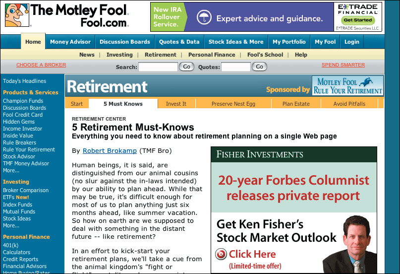
FIGURE 15.1 Many Web pages begin with ads, branding, and links, such as this page from the Motley Fool site. While visual users can readily locate the article title and content, nonvisual users must hunt for the beginning of the article.
One method for addressing this need is to provide nonvisual and keyboard users with a link that allows them to skip from the top of the page to the main content. However, the “skip navigation” or “skip to main content” link is a workaround. It allows us to maintain the design status quo without addressing the underlying problem: When we design pages that are top-heavy with nonessential content, the sequence of the code does not model user expectations. Given that code is accessed linearly, it makes sense to begin with important elements. For the majority of users, that most important element is content.
To optimize pages for linear access, begin with primary page content as opposed to advertising and navigation links; at minimum, put content as close as possible to the beginning of the page (Figure 15.2). Front-loading pages has many benefits, including better search indexing and improved access for screen reader and keyboard users.
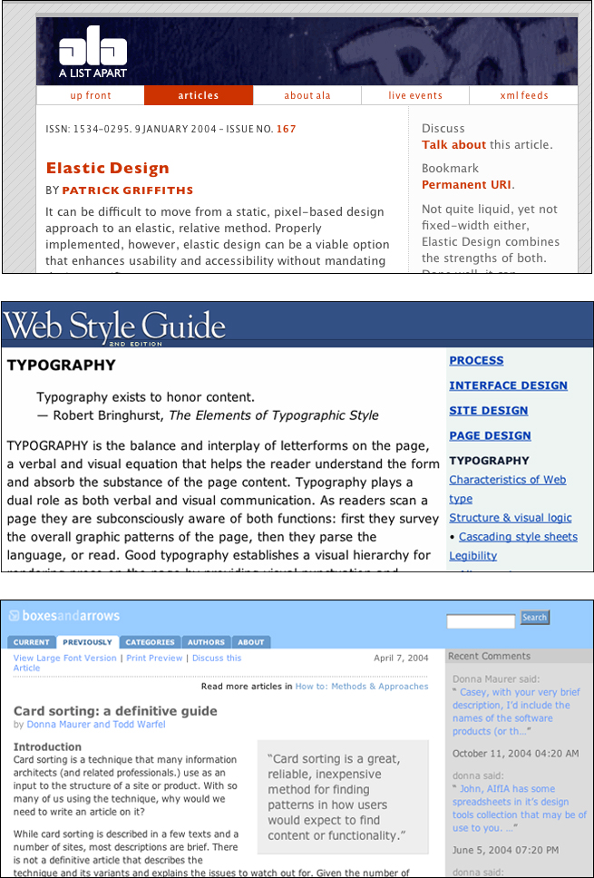
FIGURE 15.2 A List Apart, Web Style Guide, and Boxes and Arrows put content close to the top of the page. Additionally, since the article headings are marked with heading tags, nonvisual users can use structure to locate the beginning of the articles.
In addition, pay close attention to the sequence of elements in the code. Related elements can be grouped visually on the rendered page but unconnected in code. This disconnect is common with layout tables, where related elements can be split into different table rows. We cannot rely solely on visual design to communicate relationships between elements. For universal usability, we must design using proximity and logical sequencing both visually and in the underlying code.
In a nutshell. Software reads the code of Web pages from top to bottom. Make sure the sequence of content is logical in the code. Put important content first, and group related content.
15.1.2. Communicate visual information to nonvisual users
Web design is concerned with both visual and nonvisual aspects of Web pages. One of the primary challenges is to make documents communicate both visually and nonvisually. Similar to building a structure, we need to attend to both the underlying structural components as well as the visual, surface elements, making sure information conveyed on the visual layer is also available in the document structure.
HTML has elements that may not display on screen but are nonetheless “visible” to software: alt-text for images; table elements, such as summary, cells, and rows; and title attributes for various page elements, such as images, frames, and links; among others. These built-in elements allow software to make sense of a page by identifying the purpose and content of visual elements.
Visual design helps communication. For instance, proximity reveals relationships between elements on a page. Related items are grouped together and set off from other elements by space or borders. Headings and labels are near the content they describe, such as section headings and table captions and legends. Typography and spacing provides additional information, such as bolded headings and indented paragraphs. These design features help users understand page structure, which, in turn, leads to better understanding of the content (Figure 15.3).
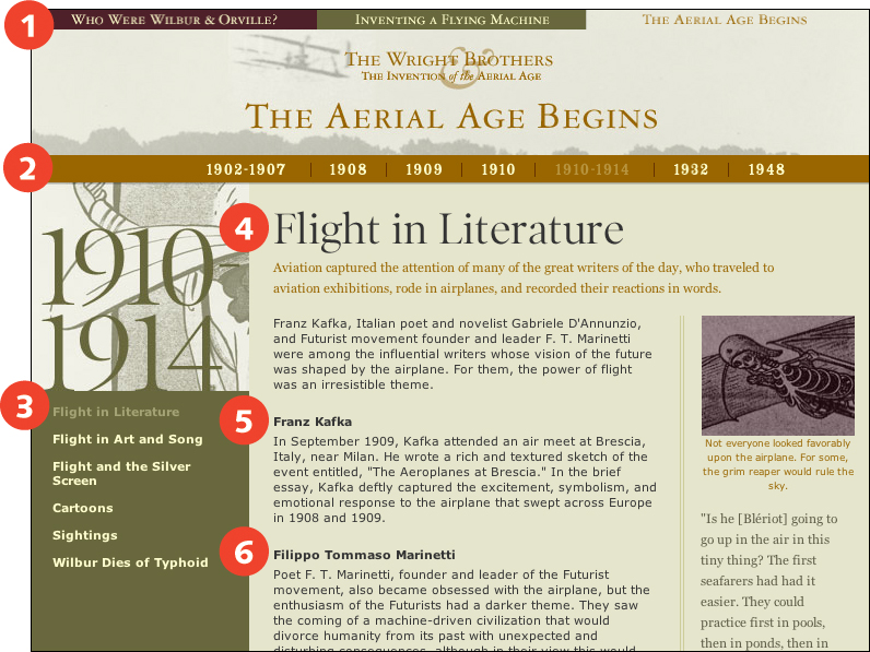
FIGURE 15.3 On the Wright Brothers online exhibition, site and section links are differentiated using proximity and contrast—serif text is used for site links (1, 2) and sans serif text for section links (3). Headings are differentiated from main text using contrast—the page heading is bold and serif (4), and the section headings are bold (5, 6).
For universal usability, Web documents must contain information about document structure in the code. When structure can be interpreted without the aid of visual design, documents can be read effectively by software. This requires that we consider our pages without visual cues and visual emphasis, without columns and proximity for grouping related content, without spacing and indents for communicating information hierarchy. We need to ensure that all information communicated via visual design is somehow represented in the underlying code.
Considering that Web pages are read in sequence, one way to communicate relatedness is to group related elements in the code. With complex designs using multiple layout tables, related content can easily get spread across different rows, creating a disjointed presentation when read by software. Pay attention to the sequencing of content in the code. Make sure the sequence is logical, and that related elements are grouped (Figure 15.4).
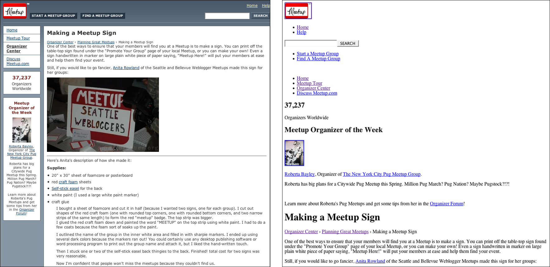
FIGURE 15.4 Proximity is a way of communicating the relatedness of page elements. The Meetup pages have different navigational elements grouped and located in different areas on the page. Since the links are similarly grouped within the page code, nonvisual users can also differentiate functional areas.
The best way to communicate information structure to nonvisual users is to use structural markup. Headings, paragraphs, lists, tables, and quotes can all be well described using structural markup.
Other elements are more difficult to communicate since no structural tags are available to describe them. For example, Web page navigation is easy to identify visually because it appears along the left or right margin as a list of links. However, HTML does not provide a structural tag for identifying navigation. Where HTML markup falls short, provide context through content—use page content to describe what is conveyed visually. For example, use titles to identify page links (such as, “On this page”) and site links (such as, “In this site”).
At times we need to communicate as little as possible about elements. For example, when layout tables are used, software will inform users that there is a table with x number of columns and rows, and will convey any additional information provided, such as summaries, headers, and captions. In this case, the less said, the better—in a layout table, a summary is unnecessary, as are structural tags such as TH and CAPTION. The same holds true for icons that are used to reinforce text. A right-facing arrow next to a “next page” link does not need to be described as “Right-facing arrow” in the image alt-text because its function is already described in the link. In this case, using alt="" in the image tag makes the image invisible to screen reader software (Figure 15.5).
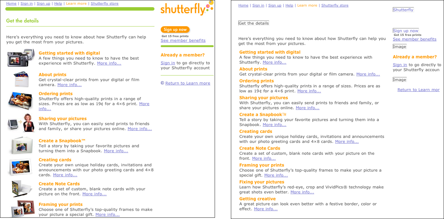
FIGURE 15.5 This Shutterfly page uses images to visually reinforce text links. Providing the equivalent information via alternate text would be irrelevant and redundant for nonvisual users. In this case, blank alt-text (alt="") makes the image essentially invisible to nonvisual users.
In short, for visual and nonvisual Web page access, we must identify the essential elements in a design—the images, links, columns, and groupings that communicate the content and functional areas of a page—and make sure that these elements are represented both visually and in the code of the page.
In a nutshell. Some users cannot access information communicated via visual design. Make sure all relevant information that is communicated visually—through indents, spacing, proximity, and so on—is also conveyed in the code.
15.1.3. Apply a consistent design
Unlike other communication mediums, the Web has few, if any, design standards. Designers have no Chicago Manual of Style to advise them of best practices in Web design. Consequently, users have no consistent design conventions that they can rely upon to help them navigate the Web. Users must learn and relearn how to use the Web as the design and functional elements change from site to site and page to page.
All users benefit from the consistency that results from applied design conventions. Consider the common objects and devices that are part of everyday life. Consistent design of light switches, shovels, books, envelopes, potato peelers, elevators, doors, and so on, makes it possible for these items to be used without deliberation. Users approach these devices with an understanding of how they work, and can apply this understanding to all like devices. In short, design conventions allow users to focus on the task, not the medium.
As the Web matures, design conventions are evolving naturally. Pages generally begin with site identification via a logo and perhaps a tagline. The search function is often placed in the upper right corner. Site navigation is often displayed across the top, and section navigation along the left or right column (Figure 15.6).
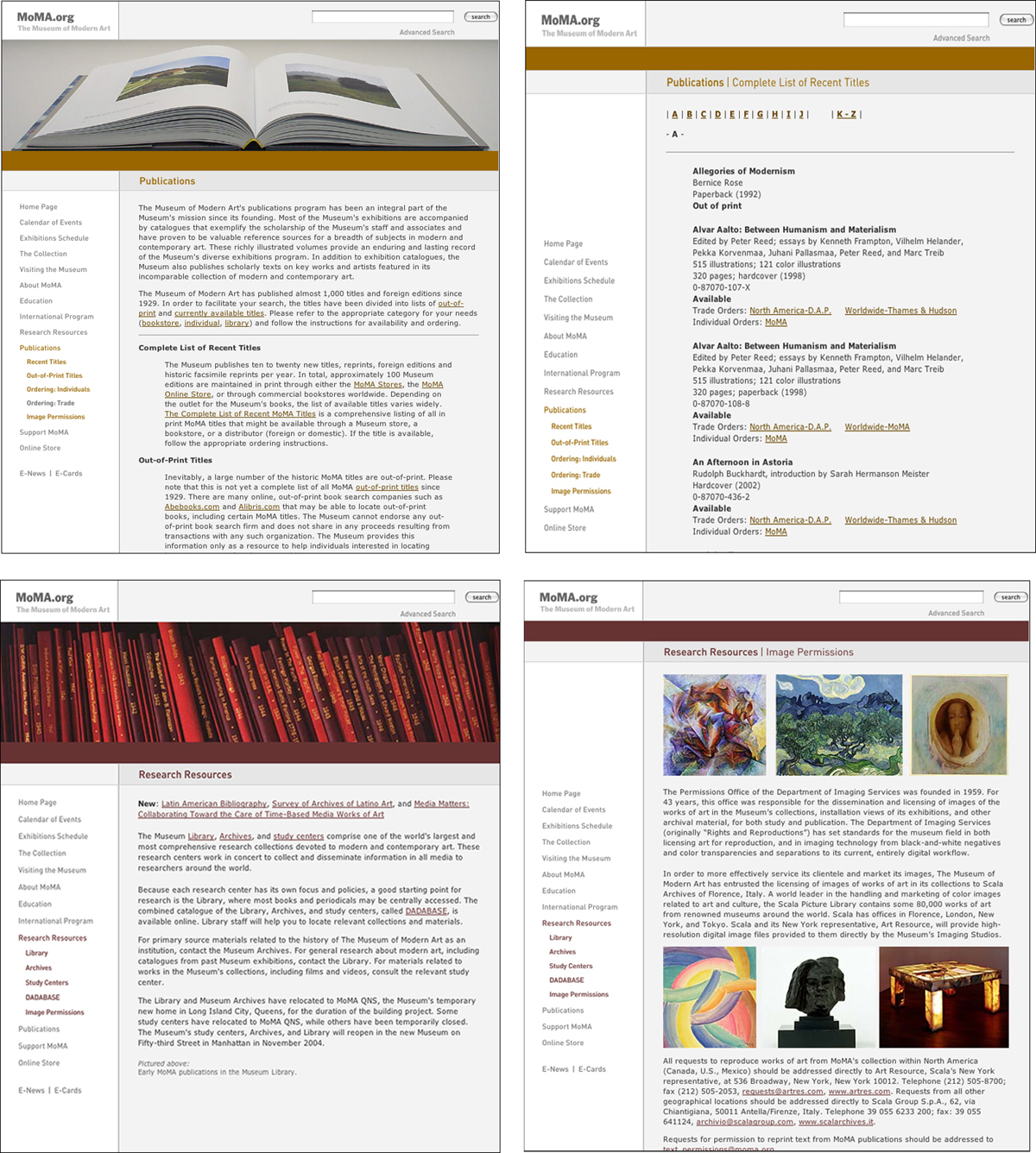
FIGURE 15.6 The MoMA site applies a consistent design to all its Web pages—navigation links in the left column, the search field in the upper right corner, and the section heading at the top of the page. Design consistency allows users to quickly form a model of the workings of a site and successfully apply it throughout the site.
Usability is improved for all users when we apply conventions derived from communication and interface design. Constructing a model is far more difficult with a Web page than with a light switch or door. Upon arriving at a new Web site, users need to determine where they are, what they can expect to accomplish, what controls are available, where the content is located, and what other sections and pages are available. When we use standard conventions, users can use what they know as a point of reference and become oriented more quickly and effectively. If we apply conventions consistently, users need only orient themselves once—their model of a site can be applied to all pages.
The consistent application of design conventions is of particular benefit to nonvisual users. Nonvisual access to Web pages is in large part a linear process, which makes the type of overview required for mental modeling difficult to accomplish. The more these users can apply what they know about Web pages in general, the less they need to learn in order to use a specific Web page. Nonvisual users benefit when functional areas—content, navigation, search—are in consistent and therefore predictable locations.
In a nutshell. Users must learn how to use the Web at each site, and often within a single site, as the design and functional elements change from page to page. Adopt design conventions and a consistent navigation scheme for improved usability.
15.1.4. Balance content and navigation
Because the Web is both communication medium and software application, Web designers are challenged with the task of providing both meaningful content and a functional interface—all in the small window of a Web page. With well-designed pages, design decisions are made in support of achieving an appropriate balance between content and navigation, based on the nature of the site and the needs of its users.
Current Web pages tend to emphasize interface over content. Page designs often contain four or more navigation systems: global navigation for quick access to the main sections of the site, local navigation for access to the pages or subsections within the current section, page navigation for access to the sections on the current page, and breadcrumb navigation to show where the current page lies in the overall structure of the site, just to name a few. The purpose of navigation systems is to reveal possible destinations and, at the same time, to allow users to easily traverse from section to section, and page to page.
The primary rationale for navigation systems is that they minimize the number of clicks needed for users to reach their destination. For example, a clothing site might offer navigation links to all clothing categories, allowing users to go from “Shorts” to “Sweaters” in one click without having to backtrack to the home page (Figure 15.7).
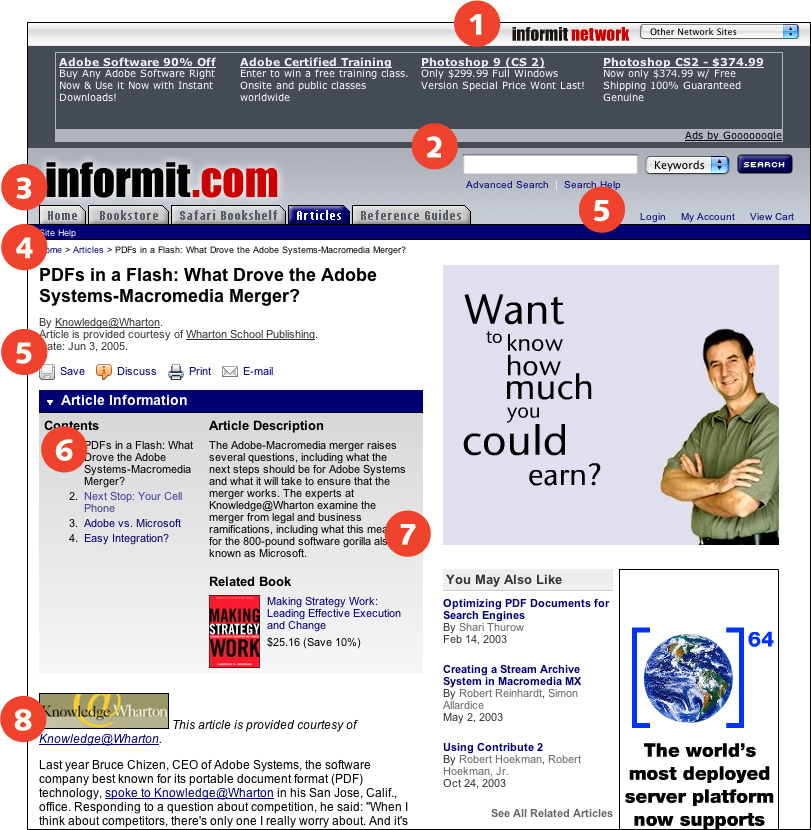
FIGURE 15.7 Many sites provide extensive navigation options on every page so that users can easily move between sections. Here, InformIT provides links to other sites in its network (1), site search (2), global navigation (3), breadcrumb navigation (4), utility links (5), local navigation (6), and links to related content (7). However, many of these options are extraneous for users who have reached their destination and want to focus on reading the article (8).
Pages with extensive navigation options suffer the same disease as many of today’s devices—feature creep. Feature creep occurs when features are added to a design because technically they can be added, and because they might be useful. The net result is a complex, multilayered device that is difficult to use. Link creep works the same way. When multiple links are added to a page just in case a user might want to go from a to b, the many users who don’t find those links relevant and useful are forced to work through a cluttered page to find the relevant link or information.
Navigation is certainly useful, but must be designed intelligently. Chances are a user shopping for shorts is not also shopping for sweaters, but instead sandals or swimsuits. Shoppers need ready access to account information and a shopping cart, but perhaps not information about the company or store locations. Navigation systems that are context-sensitive—that provide appropriate links based on content and available tasks—are more effective than extensive link lists covering every possible eventuality. Some backtracking is reasonable, particularly given that many users use the back button as their primary navigation device. Users who do want to go from “Shorts” to “Sweaters” can backtrack to “Men’s clothing” and go from there.
Minimizing navigation helps all users. Visual users aren’t overwhelmed or disoriented by unnecessary page elements. Nonvisual users do not have to work through elements that are irrelevant to the content of the page. And with contextual navigation, users have appropriate options on hand when they need them (Figure 15.8, next page).
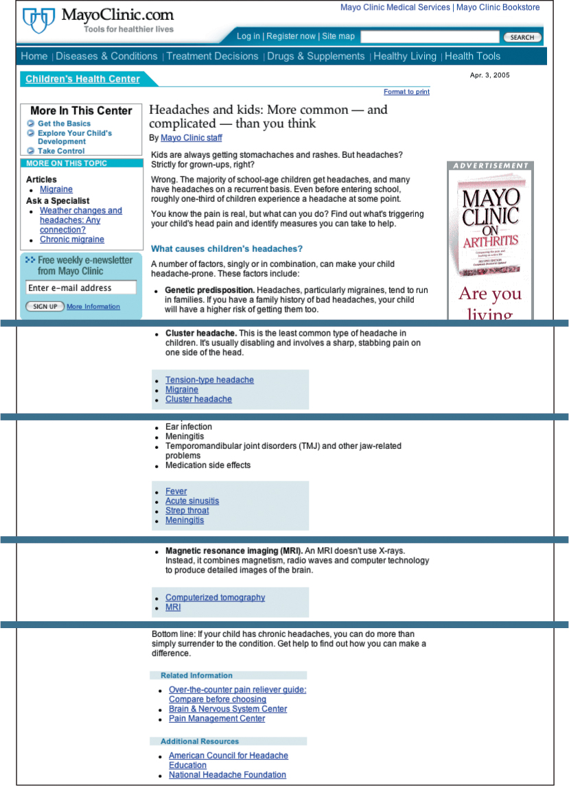
FIGURE 15.8 MayoClinic.com makes good use of contextual linking on its articles pages. In this article, each section is followed by links to other MayoClinic.com articles that relate to the information covered in the section.
In a nutshell. Many links make for busy, overwhelming pages. Rather than overload pages with navigation options, focus on presenting content and context-sensitive navigation.
15.1.5. Provide navigation tools
One of the greatest challenges facing Web users is finding the page that contains the information or functionality they are seeking. Navigation systems can point the way, but even a well-structured, user-centered navigation design is bound to fail at times. Questions will arise about a site’s information architecture and labeling system: for example, is location information under “About us” or “Contact us”? Is pricing information under “Products” or “Buy online”? Some ambiguity is unavoidable—designing an information architecture and labeling system that maps perfectly to all user expectations is impossible. When users cannot locate what they are seeking using page-based navigation systems, specialized navigation tools can be of use.
A number of navigation tools will work for different types of users and for different types of tasks. A reliable search function is useful for goal-oriented users who know what they are looking for. These same users also benefit from a site index that lists all site content alphabetically. A hierarchical outline of site categories, sometimes called a “site map,” provides a site overview to help users determine where the page they are seeking lies within the overall site architecture (Figure 15.9, previous page). Another useful navigation tool is a quick links menu with links to commonly sought-after pages. This allows users to bypass navigation altogether and go directly to the page they are seeking.
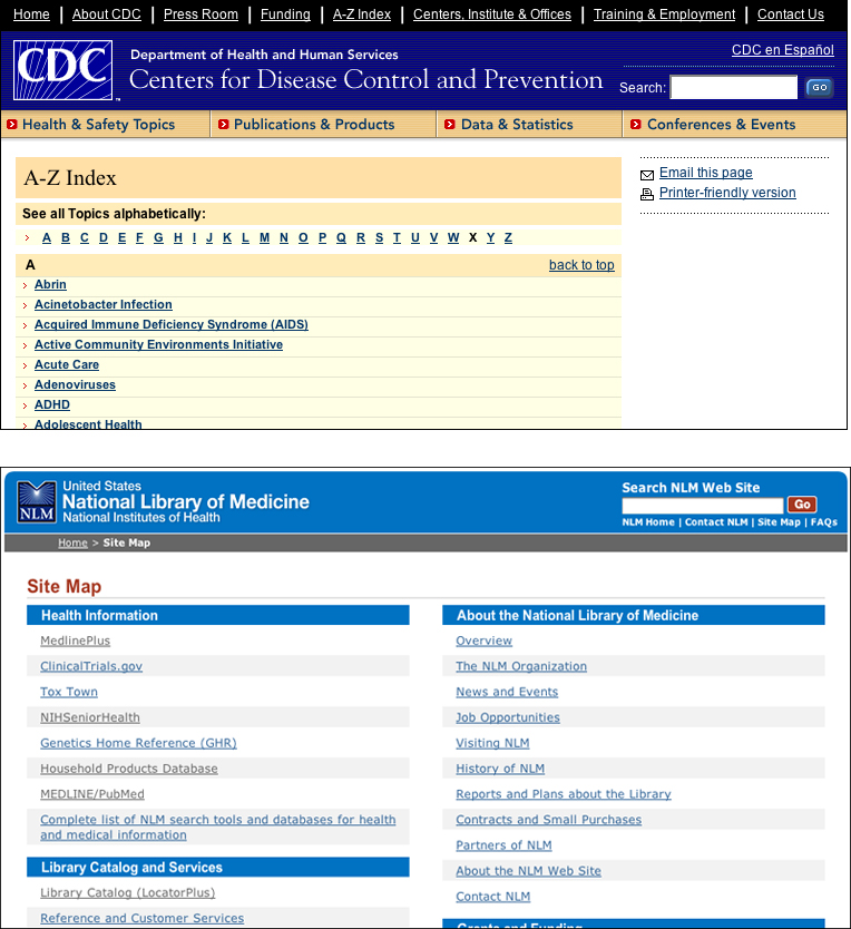
FIGURE 15.9 The CDC A-Z Index is useful for users who want information about a specific topic. The National Library of Medicine Site Map provides an overview of the site contents, as well as direct access to specific topics.
In a nutshell. Users often have difficulty finding what they are seeking. Provide tools to help users locate content, such as search, site index, site map, and quick links.
15.2. Markup
15.2.1. Design flexible page layouts
Web pages are inherently accommodating. Left to their own devices, page layouts adapt to fit the browser window. The flexibility of Web layouts worked relatively well in the early days of the Web, when pages were mostly single-column text documents that could hold their design at different widths. Once graphics made their way onto Web pages, size began to matter. A 600-pixel-wide image needs 600 pixels of width to render, whereas a line of text can reflow to adapt the window width. Layout tables were then “invented,” making true page layout possible, and fixed designs of a certain optimal width became the norm. A fixed-width design approach works well for complex, multicolumn layouts because it offers control over column widths and line wrapping. A complex layout is difficult to design with moving elements—for example, a button bar that wraps at a narrow window width. Fixed design forces a minimum width to preserve the integrity of the design.
A flexible, or “liquid,” approach to page layout attempts to accommodate the diversity of display environments. Rather than serving only the “most common” display dimensions and the “typical” user, a flexible layout adapts to different viewing conditions and different user requirements. Flexible layouts are far more difficult to design than fixed layouts because elements need to be able to change shape and position without jeopardizing the integrity of the overall page design.
Design is often about compromise. In the case of fixed layout, the main compromise is that users cannot “unfix” a fixed layout—users cannot somehow extract page content and place it into a flexible wrapper that allows them to scale the text or to change the window width to better accommodate their needs or viewing conditions. With a fixed-width, multicolumn layout, users who enlarge text may have to contend with columns containing three or four words per line. Users viewing a fixed-width layout on a small display may have to use the horizontal scroll to access a full line of text (Figure 15.10). Both of these circumstances present significant usability challenges that cannot be resolved by the user.
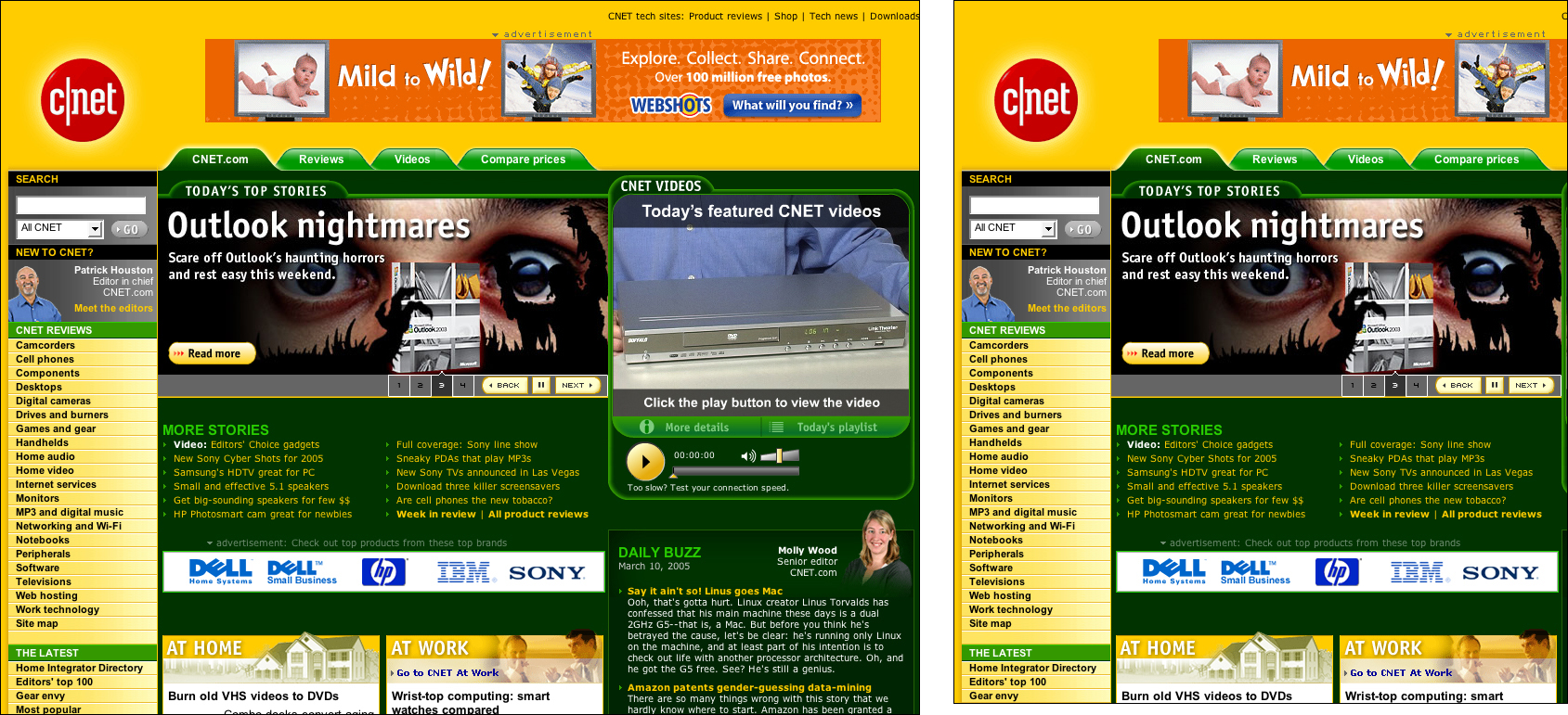
FIGURE 15.10 CNET uses a fixed-width design intended for 1024-pixel-wide displays. Users with smaller monitors will be forced to scroll horizontally to see the full extent on the page.
In the case of flexible design, the main compromise is that users are sometimes presented with long lines of text that are difficult to read. Typographic conventions suggest that a column width that produces approximately 66 characters per line is a comfortable line length, or measure. Long lines affect readability—the greater the distance from right margin to left, the more difficult it is to locate the next line when reading. When text is displayed in a flexible layout, line length is determined by the width of the browser window. A large display with a maximized browser window will likely result in long lines (unless the user has enlarged text), in which case, the user must either deal with long lines or narrow the browser window to a more comfortable measure.
The fundamental difference between the compromises that accompany these two layout methods is user control. With fixed design, users who need a different page width have no recourse, whereas with flexible design, users set page width by adjusting the width of the browser window. Moreover, it is important to note that conventions such as line length are meaningful in a fixed medium such as book design, where type size and line length cannot be altered. However, these conventions do not hold up in the Web environment, where users control type size, typeface, and column width, and are using a growing multitude of devices to access the Web, each with different screen dimensions and resolutions. On the Web, design is a moving target. A 66-character line on one display, resolution, and text size may be a 20-character line on another. A designer can only “suggest” attributes such as type size and line length. Besides, enforcing conventions using fixed design methods prevents access for users who may not fit the “average” profile.
Flexible layouts are the best page design approach for universal usability. Flexible pages adapt to different viewing conditions and respond to user control. To create a flexible layout, use relative measurements, such as percentages, to define the attributes of page elements—for example, set the banner width to 100%, the navigation column width to 20%, the main content column to 80%, and the footer width to 100%.
Watch out for page elements that require a width window to display properly, such as a banner graphic or navigation tabs. Favor small images that do not require a wide page to display properly.
In a nutshell. Users who enlarge type or view pages on a small display need a flexible layout that will adapt to their viewing environment. Design flexible layouts using relative measurements.
15.2.2. Use style sheets for layout whenever possible
Flexibility is what sets the Web apart from other communication and information technologies as a medium for universal usability. Information contained in a fixed medium—such as a newspaper, book, television program, or street sign—cannot adapt to the requirements of the user. The designer of a book must make decisions about aspects of the book. Inevitably, the decisions will interfere with access. For example, some users will find the text size too small for reading. The designer of a Web page must also make design decisions, and the decisions may also affect access for some users. However, because the Web is a flexible medium, users can adapt designs to meet their access requirements—if the text is too small, the user can enlarge it. Transformations need not be limited to altering text size. When style sheets are used for layout, almost all aspects of a Web page design can be transformed.
Maximum flexibility comes from a total separation of content and presentation—when content is contained in a structured HTML document and presentation is handled via style sheets. Pages cannot be easily transformed when styles are not used to define page layout. Layout features, such as columns and positioning, must be defined along with content in the HTML document. In this case, content and presentation are bound together, and transformations are difficult, if not impossible, to achieve. On the other hand, layouts that are defined using structural markup and style sheets are highly adaptable. Since the layout information is separate from the content, pages can be easily transformed by applying different style settings. Users can access pages without any styling, or by using their own custom style sheet (Figure 15.11). Pages can have different layouts depending on the access device used—a PDA may use one layout and a computer display another. Sites can offer different views—print, large text, text only, and high contrast—simply by switching style sheets.
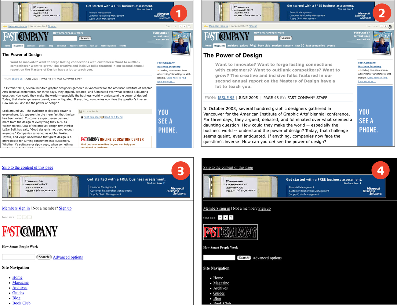
FIGURE 15.11 Fast Company uses style sheets for layout, making pages easy to adapt by applying different styles. Users can choose different font sizes (1, 2) using the built-in font-size switcher, or choose to view pages without styles (3) or with a custom style sheet (4).
In a nutshell. Flexibility is best achieved when content and presentation are separate. Design pages using structural markup, and use style sheets to control page layout.
15.2.3. Provide direct access to page content
Linear access to Web pages can be cumbersome when Web pages are top-heavy with nonessential elements, such as branding and advertising. Nonvisual users and keyboard users cannot easily move the cursor to different functional areas of a Web page, but instead must work through page elements in sequence. Users who are after the main content of the page must work though the branding and navigational elements to locate the content, and must repeat this process as they move from page to page.
The best way to reduce the tedium of linear access is to put the important information close to the top of the page. Content that appears at or close to the beginning of the code is easier to locate and has the added benefit of increasing search quality. Search engine software uses location as a measure for determining the subject of a page—content that appears at the beginning of a page is considered to be the most relevant. Users who want direct access to navigation, not content, have options because links are easier to locate than content. Nonvisual and keyboard users can locate links more easily than content because links are actionable and can be accessed directly via the tab key or through software features such as the link list. “Content” is not an HTML structure; software therefore cannot provide a “jump to content” feature since it cannot locate anything tagged as “content” on the page.
HTML does provide heading tags. Specialized software, such as screen reader software, often provides heading navigation and a headings list. When the main content area of a page begins with an H1 heading describing the content of the page, users can move to the content area by navigating to the heading. Providing direct access to content via heading tags is a good and practical use of document structure. However, users of most standard browser software currently do not have access to this feature.
Sometimes visual design calls for page elements—such as navigation—to appear before page content. When styles are used for layout, the visual order of elements need not interfere with the sequence of elements in the code. Good linear access can be maintained because styles determine the order of elements on the screen. For example, the sequence of elements in the code may be banner, content, navigation, and footer, but on screen the navigation may appear in the left column before the content area (Figure 15.12).
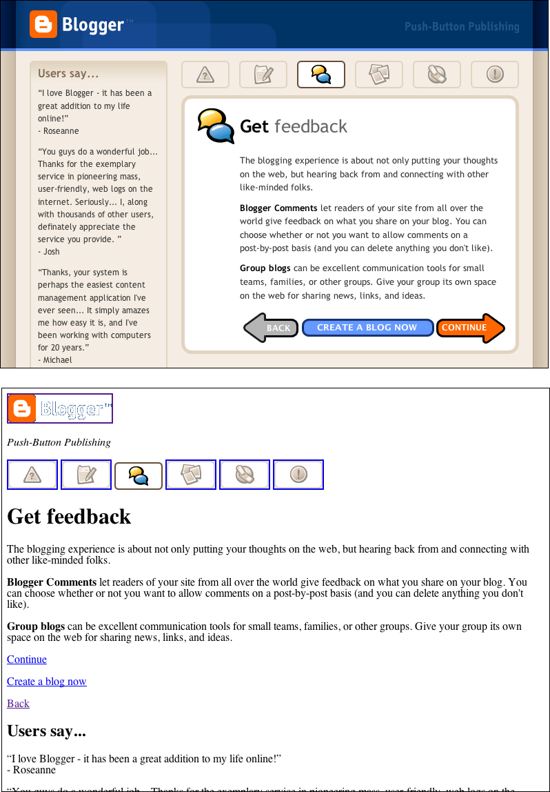
FIGURE 15.12 Style sheet positioning can be used to arrange elements on screen in a different order than they appear in the code. Blogger uses styles to position the main content of the page to the right of customer feedback. However, in the code of the page, the content appears before the feedback.
Some designs may not allow for quick access to content in the code—for instance, designs that require layout tables, or that require elements to appear in a certain order (for example, advertising first), or legacy designs that cannot be altered. Whenever content may be difficult to access from the code, provide a link to allow users to skip directly to the content area. The “Skip to main content” or “Skip navigation” link is a convention that has evolved as designs become more top-heavy, making it challenging for keyboard users to arrive at the main content area of a page. The skip link is placed at the beginning of the page and links to an anchor that is located at the main content area. When a user activates the link, the cursor focus moves from the link to the anchor. Page access resumes from the main content area location.
In order to be usable by both visual and nonvisual keyboard users, the skip link must display on the page. Skip links are often coded so they are not visible on screen—the link is sometimes attached to a transparent image, or made “invisible” through styling or by placing the link off screen. A nondisplaying skip link is accessible to screen reader software since it appears in the code. However, visual keyboard users may not realize the link is available and will have to cycle through all the elements at the beginning of the page to access the content. A visible skip link provides the means for both visual and nonvisual users to skip directly to the main content area.
In a nutshell. Pages that begin with nonessential content can prove cumbersome for some users. Place content close to the top of each page, marked by a heading. Alternatively, provide a visible “Skip to main content” link at the beginning of each page.