
Chapter 10. Links
Links are to the web as a steering wheel is to a car: they enable users to navigate their course through hypertext documents. Like a car without a steering wheel, a Web page without links is of little service. When using the Web, we spend much—even most—of our time following links. Therefore, links must be functional and usable.
Links are best displayed as text. Although images can be used for links, they are not flexible, which means that people who need a customized view may not be able to access image links. Additionally, image links without alt-text are virtually useless to nonvisual users because they do not provide descriptive information in a format that is machine-readable (Figure 10.1). Given that text is the most accessible form of content, links displayed as text are the most likely to be usable by all.

FIGURE 10.1 Alt-text makes images “visible” to nonvisual users. When sites, such as KidsHealth, do not provide alt-text with their image links, nonvisual users have no way of knowing how to navigate the site.
From an editorial perspective, links can be made more accessible and usable when we carefully consider the text we use to describe them. Links that are not descriptive require users to read the surrounding text—or worse, to follow the link to determine its destination. Link text should describe the target of the link, beginning with descriptive keywords to facilitate scanning. For example, “Learn more about reading tea leaves” is easier to scan than “Learn more about reading tea leaves.”
From a design perspective, links must be visually differentiated from other page elements so that users can identify them. Inline text links should be colored and underlined. Navigation links should be set off by their design and location—for example, by marking them with borders or tabs and placing them along the top or left column of the page. In terms of color, visited links should be colored differently from regular links so that users know which pages they have already visited. Links to the current page should be identified using color or some other visible highlight that tells the user “You are here” (Figure 10.2).
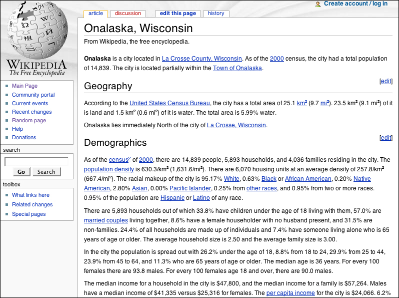
FIGURE 10.2 Wikipedia does a good job of differentiating different types of links. Inline links are colored and underlined, and visited and unvisited links are distinct. The current page is clearly identified, as are links to other sections, the search feature, and the toolbox links.
10.1. Basic Principles
10.1.1. Use text for links
Using the Web is largely a process of moving from page to page. Links are the controls that we use to power and control that process. Without access to links, our Web use is significantly compromised. Links should therefore be presented as text in order to be universally usable.
Web pages often incorporate navigation links into an overall page design—for example, into a page header that includes other elements such a logo or photograph. Sometimes navigation links and design elements are tightly integrated, as in the common navigation interface that provides links to different sections through tabs (Figure 10.3). When navigation is tied tightly to other design elements, the overall design is generally less amenable to change. Integrated designs that contain links and other design elements may not adapt gracefully to enlarged type, for example, or different window widths.

FIGURE 10.3 Audible.com uses a tab interface to provide access to the main sections of the site. The tabs are designed using images, which ensures a stable design even with different text sizes and window widths. However, users who need a customized view cannot modify these essential links.
One way to ensure design integrity is to use images for navigation links. Tab navigation that is presented as an image will not resize to accommodate different text settings, or wrap to adapt to different window widths. Image-based navigation also allows for typographic effects and treatments, such as specialized fonts and drop-shadows.
Images can be problematic for some users. Navigation presented as images cannot be modified, so users who need large type or certain color combinations may not be able to access navigation links when they are provided as images. Nonvisual users cannot access information presented in image format unless alt-text is provided. Each image link must have descriptive alt-text for image-based navigation to be accessible to nonvisual users.
On the other hand, links that are presented in text format can be accessed and customized as needed—enlarged, recolored, read by software. Text downloads much more quickly than images, which means that navigation options are readily available, even over a slow modem connection. Unlike images, text is not resolution-dependent, which means that it displays more consistently across devices. Given that links are the most basic requirement for functioning Web pages, text is undoubtedly the most effective medium for providing universal access to links.
Text-based navigation need not be visually bereft. A list of links can be styled most gracefully using CSS, which provides options for text formatting, coloring, and borders. Each new version of CSS introduces additional text formatting properties. When text and CSS are used instead of images to design navigation, pages are attractive and usable, adapting gracefully to user modifications, such as enlarged type (Figure 10.4).
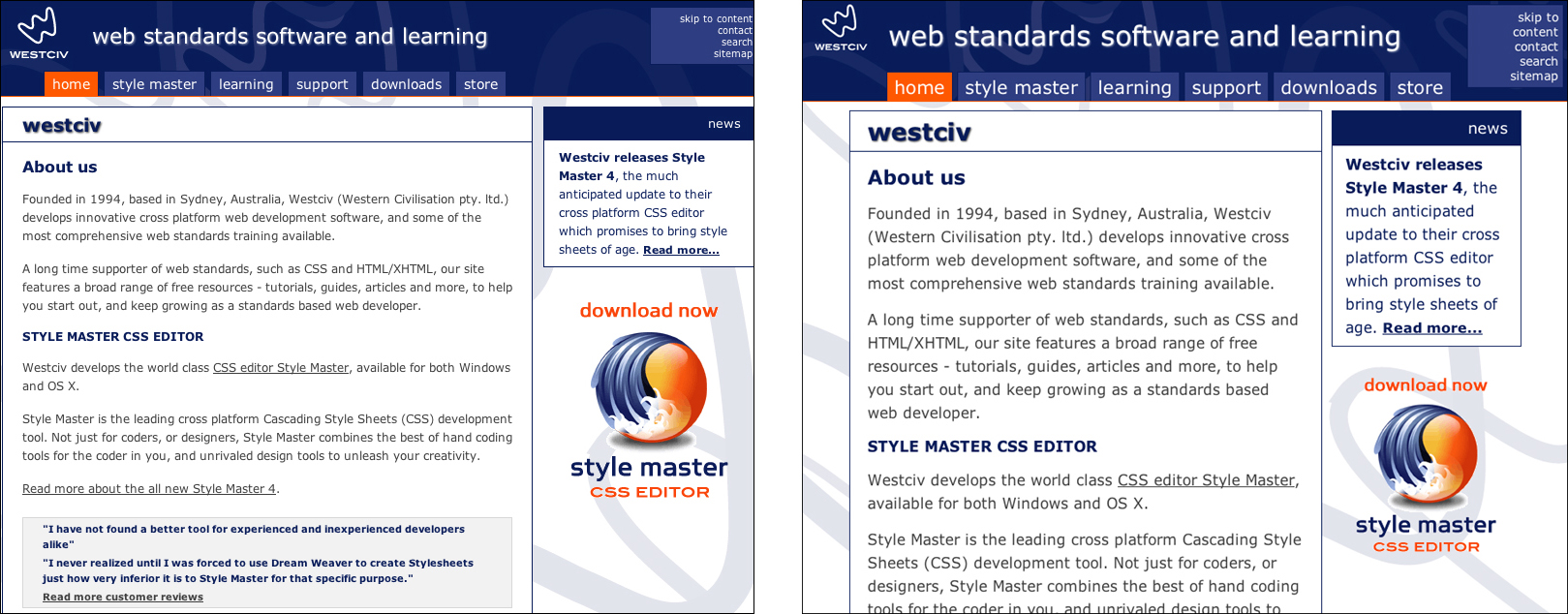
FIGURE 10.4 Westciv provides tab navigation on its Web site using list markup and CSS styling. Since the tabs are text-based, they adapt to user modification without compromising the integrity of the design.
In a nutshell. Access to links is essential for Web usability. Use text for links, and style them using style sheets.
10.1.2. Use descriptive link text
When we arrive at a Web page, our first task is often to skim the page for links. Visually, text links are easy to identify since they are normally colored and underlined, and so stand out from the other information on the page. Nonvisual users can easily identify links since links are tagged and therefore identifiable by software—for instance, search engine software scans pages for links and follows them to create an index of Web pages, and screen reader software offers a “links list” with the available links on the page.
For effective skimming, both visual and nonvisual users benefit from link text that can stand on its own without the surrounding context of the page. Good link text provides a clear description of the page that will load when following a link. With good link text, users can skim links and make quick, informed decisions about the path to take to accomplish their task. With bad link text, users cannot ascertain the target of the link from the link text alone. Common examples of bad link text are the “click here” and “more” links that proliferate on the Web. This type of link text offers no explanation; it requires that users expand their focus to the surrounding context or follow the link to discover its destination. Nondescriptive link text slows progress and often sends users down the wrong path.
When skimming links, the first words in the link text are the ones most likely to grab the user’s attention. Link text that begins with keywords is easier to skim efficiently and works better with software features such as link lists that provide an alphabetized list of links on a page. When links begin with nondescriptive words—such as “All about bear hibernation” or “Learn more about squirrel-proof birdhouses”—skimming is slowed and the alphabetized links list is not useful. A better approach is to use only the keywords for link text: “All about bear hibernation” and “Learn more about squirrel-proof birdhouses” (Figure 10.5).

FIGURE 10.5 Nondescriptive links, such as the “More info...” links on the Shutterfly details page, require users to expand their focus to determine the target of the link. They also undermine features such as the Links List shown here.
In a nutshell. Descriptive link text makes navigation easier and more efficient because descriptive links are easier to skim and allow users to make informed choices. Make link text clear and self-explanatory to support quick and effective navigation.
10.2. Markup
10.2.1. Underline links that are not otherwise identifiable as links
Links are the primary means for navigating the Web. To make use of links, users must be able to identify them. Browser software addresses this requirement by coloring and underlining links so they stand out from other page elements. This method has built-in redundancy—coloring and underlining—so that people who cannot access color information will still be able to identify links.
In design terms, underlining is a typographical faux pas carried over from the days of the typewriter. Before computers, people wrote by hand or on a typewriter, where italic and bold formatting are not readily available. In these mediums, underlining is a convention used to indicate a book title, a section heading, and other forms of emphasis. With the advent of computers and word-processing, bold and italic formatting is just a click away, though some people continue to use underlining for emphasis. (On the Web, underlining should never be used for typographic emphasis. Since Web links are underlined, underlined text that is not a link will confuse users.)
The reason underlines are seen as a typographic blemish is that they draw the eye and intersect with letterforms in a way that is ungainly in comparison with other methods of emphasis. Web designers concerned about typographic integrity have long objected to link underlines but, before CSS, had little control over their display.
Link underlining is a user-defined setting; users can choose whether or not to underline links via browser preferences. However, CSS allows Web designers to remove link underlines, and this style attribute takes precedence over user preferences. If a designer uses CSS to remove link underlines, users who depend on underlines to identify links have only one option: to tell their browser not to load author-defined styles.
For Web pages to be universally usable, links must be identifiable in a way that is accessible with or without color information. Underlining is the most standard method, but there are other methods for marking links. Placement on the page—such as in button bars and navigation columns—or visual attributes—such as bevels, outlines, or icons—can be used in place of underlines to denote links as long as the links are clearly identifiable. However, do not remove underlining from links that have no other identifier, such as links within body text (Figure 10.6).

FIGURE 10.6 The site navigation links on the Hubble site are not underlined or colored because their placement and visual formatting identify them as links. However, links within the body text are underlined and colored.
In a nutshell. Some users cannot distinguish colors and rely on other visual cues to identify links. Do not rely on color alone to identify links; use underlines or other visual indicators—such as borders or buttons—to mark links.
10.2.2. Differentiate visited and unvisited links
Browsers keep track of Web use by saving identifying information about the pages that have been visited. This stored “history” is what enables users to use the History menu to backtrack to pages they visited days ago, or to use the back button to retrace their most recent steps. The history also allows the browser to identify links on a page that have already been visited.
When navigating a body of information as vast as the Web, it becomes extremely important to recognize the pages that have already been visited. Very often Web use is a quest for information—a phone number, a name, a price—and without some means to identify the places they have already looked, the users’ route can quickly become circuitous. When visited and unvisited links are not differentiated, the only way to determine whether a page has been visited may be to visit it again (and again, and again). When links are visually differentiated, users can proceed more efficiently by avoiding pages that did not prove fruitful.
The standard browser default is to color unvisited links blue and visited links purple. This combination is the most universal and will be generally recognizable, even with some variation in saturation and brightness (perhaps slate blue and violet). However, since this combination is so universal, designers should avoid using its opposite: purple text for unvisited links and blue text for visited. Another approach is to use a saturated color for unvisited links and a less bright, less saturated version of the same color for visited links (such as slate blue for unvisited links, dark slate blue for visited links) (Figure 10.7).
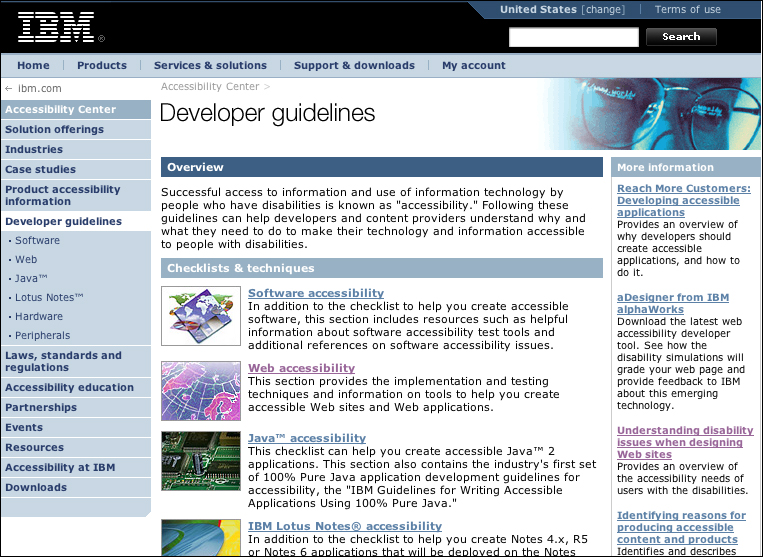
FIGURE 10.7 The IBM Accessibility Center uses a less-saturated version of the standard blue and purple link colors to clearly mark visited and unvisited links.
In a nutshell. The ability to distinguish between visited and unvisited links helps keep users from revisiting pages that did not prove successful. Differentiate unvisited and visited links so that users can identify the pages that they have already visited.
10.2.3. Provide “you are here” orientation cues
Orientation is the first stage in wayfinding—the process of using information devices such as maps and signs to find the way to a destination. Used on maps in zoos, malls, museums, parks, and so on, the “you are here” indicator orients users as to where they are in the overall context. A map without orientation cues requires that users attempt to identify their location on a map by looking for landmarks.
For Web users, disorientation is a common condition. Simply following a few link paths can cause users to lose track of their location within the overall organization of a site. Designers can help users stay on track by using wayfinding orientation cues to tell users where they are in the overall context of the site.
If we think of navigation as the map of a site, the “you are here” indicator can be easily incorporated into navigation design. One method for providing navigation and orientation is to use what are commonly referred to as “breadcrumb” navigation links. Breadcrumbs have the benefit of showing the current page as well as where the page lies in the overall site hierarchy (Figure 10.8). Another method is to provide a visual marker that makes the current page link stand out from the other navigation links. The link may be a different color, different weight, or different background color. The link may be disabled so users won’t click on a link to the current page. Often a marker is added next to the link to visually tell users “you are here” (Figure 10.9).
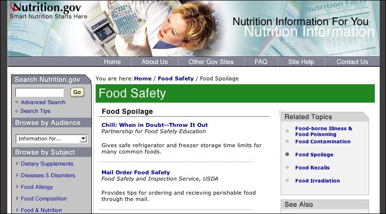
FIGURE 10.8 Nutrition.gov uses breadcrumb navigation marked by a “You are here” heading to inform users where they are in the site and to provide a means to navigate back through the site hierarchy.
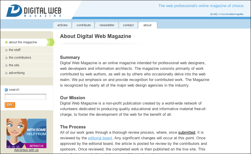
FIGURE 10.9 Digital Web Magazine displays a prominent “You are here” indicator in the site’s section navigation links. A stylized green arrow points from the navigation link to the page content area.
If the “you are here” marker is achieved visually—through color or typographic emphasis—non-visual users will not have access to orientation information. For nonvisual users to access orientation information, the indicator must be somehow represented in the code. A breadcrumb path, preceded by a “you are here” heading, conveys orientation information both visually and in the code. Another option is to combine a visible marker with the alt-text “current page” into the current page link.
In a nutshell. Users can easily become disoriented when navigating the Web. Use orientation cues—such as an arrow marker next to the current page link—to identify the current page.
10.2.4. Use alt-text for image links
When using images as links, alt-text becomes the link text for nonvisual users. When software encounters an image that is used as a link, it cannot “read” the image of, for example, the word Home or Products or Support. If descriptive text is provided in the image tag (alt="Home", alt="Products", alt="Support"), then software can use the alt-text to describe the link to the user. If no alt-text is provided, software has little information to go on. Some software will read the target of the link, which might suffice if the file names are descriptive: “home.html”, “products.html”, “support.html”. However, many file names are not readily identifiable; a products page on large-scale site might be one of many, with a file name like “products/electronic/fall2004/14359035.asp”.
Generally, text is the best way to provide the essential functionality of links. Text is flexible and machine-friendly; as such, it is the most universally accessible and usable format for providing basic navigation control to all users. That said, when using images as links, be sure to provide alt-text in the image tag using a self-explanatory link label. With image maps, provide alt-text for each area of the map. Without alternative text for image links, people who cannot access images may be unable to navigate the site (Figure 10.10).

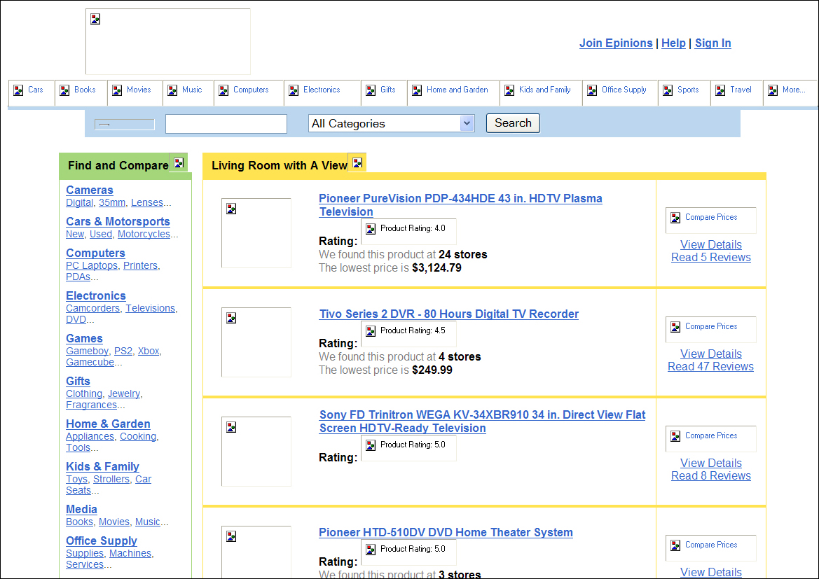
FIGURE 10.10 Epinions provides equivalent alt-text for its image-based site navigation links. The alternate text makes the site navigation accessible to nonvisual users.
In a nutshell. Without alt-text, image-based navigation is virtually inaccessible to nonvisual users. Provide descriptive alternate text for image links, including links in image maps, for users who cannot access images.