
Chapter 9. Forms
We regularly encounter and fill out forms—to apply, register, enroll, order things, and the list goes on. Forms are often poorly designed: overly complicated, nonintuitive, and redundant. As a result, we often make mistakes in completing them. We overlook important elements or mis-enter information and we generally do not enjoy the task. This holds true both on paper and on the Web.
Form design is clearly an area where functionality wins the day. Forms do not need to be visually appealing or cleverly worded; users do not expect to be delighted or entertained. Forms are a device for collecting information, and any enjoyment comes from ease of use and successful completion.
Forms should follow a logical and predictable flow, by beginning with personal information—first name, last name, birth date, gender, marital status—followed by contact information—address, phone number, email address. Users should not have to enter the same information more than once. Form fields should be clearly labeled, and fields that require information to be entered in a certain format should be clearly indicated.
Forms can have many different elements: labels, input fields, checkboxes, radio buttons, and dropdown menus. Each element in isolation does not have much use or meaning: what use is a form field without a label, or a label without a form field? The relationship between elements is what provides meaning and logic to a form and helps guide the user through to completion. For visual logic, we generally group related elements. Using proper HTML form tags, we can explicitly code the relationships between elements so nonvisual users can understand and complete forms.
But even a well-designed form built using good, solid HTML may sometimes be inadequate. Forms should not be the sole means for users to communicate with companies, individuals, and organizations represented on the Web. Users should be given an alternate mode of contact for the times when forms fail or do not meet user needs.
9.1. Basic Principles
9.1.1. Design simple and clear forms
After links, forms are the controls we use most frequently to interact with the Web. As with links, forms need, above all else, to be operable. An operable form is one that can be completed successfully without error, with ease and minimal frustration. If a user can successfully place an order, apply for an account, or request information, then the form design is successful.
An important aspect of form design is labeling. Form elements must be clearly labeled so users know what information is required. Good labels help users understand what information to provide and reduce the margin for error. Appropriate use of form elements is also an important factor. Designers often use form elements such as dropdown menus to ensure data integrity, such as by having users choose their country from a menu rather than typing it into a text field. However, dropdown menus can become unwieldy when there are more than 10 items in the list. In the case of providing country information, users can more easily type in a country code than choose their country from a long list (Figure 9.1).
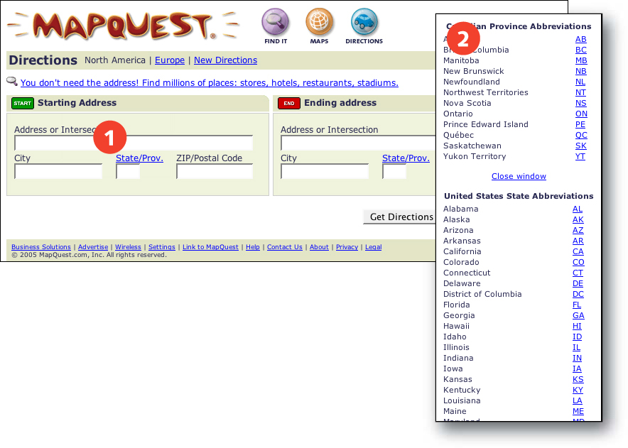
FIGURE 9.1 MapQuest allows users to enter state and province codes directly rather than choose them from a dropdown menu. Users who need a code can reference a code list (1) from a popup window (2).
In general, good form design is a process of simplification and clarification. When designing a Web form, include only the essential elements, and make sure they are clearly described. Use the form element best suited to collecting the necessary information, always from the viewpoint of the user.
Here are some additional suggestions for effective form design:
 Use simple language. Clearly communicate what information is being requested.
Provide full details. If a field requires a lengthy description, don’t skimp on details to conserve screen space.
Use appropriate language. Do not use “surname” or “family name” if “last name” will be more broadly understood.
Provide examples. When information must be entered in a certain format—such as the date format DD/MM/YY for day, month, year—explain the requirements and provide an example for users to follow. If users enter data in an incorrect format—for example, 3/1/2004 instead of 03/01/04—parse the data into the required format rather than ask users to renter the information.
Mark required fields. Clearly indicate which fields are required for form submission. Make sure required fields are truly necessary to the task.
Follow a logical flow. Follow established conventions for gathering information, such as title, first name, last name, company, street address, city, state/province, and so on. For keyboard-only users, make sure the tab order is the same as the visual order of form elements.
Group related elements. Create sections of elements that relate to the same category, such as personal information, contact information, billing information, and so on.
Avoid redundancy. Do not ask users to enter the same information more than once. If the same information might apply in multiple contexts, such as an address for shipping and billing, allow users to indicate that the same information applies (Figure 9.2).

FIGURE 9.2 Good order forms minimize data entry. Here, Peet’s Coffee and Tea provides a “Use billing address” checkbox (1) that allows users to enter address information only once when the shipping and billing address are the same.
In a nutshell. Forms are often difficult to complete because of needless complexity and unclear instructions. Design for clarity and simplicity so users can complete forms successfully.
9.1.2. Provide an alternate to forms
Forms should not be the only way for users to communicate and interact with the individuals, companies, and organizations represented on the Web. A Web site with only forms—no email address, street address, or phone number—is unwelcoming to users who cannot use forms or who prefer to communicate some other way. Forms come with enough technical complexity that some users will inevitably have problems submitting information or ordering items using forms. A phone conversation may be a more effective means of communication than submitting a query over the Web. Web sites that rely solely on forms risk losing users who cannot or choose not to use forms.
Always include alternate methods for making contact, such as a street address, phone number, and email address.
In a nutshell. Web forms may not satisfy the needs of all users. At minimum, provide an email address as an alternate method to communicate and interact with users who cannot or choose not to use forms.
9.2. Markup
9.2.1. Label form fields
Labels describe the purpose and function of form elements: for example, the label “month” next to a dropdown menu listing the months of the year, or the label “first name” next to a text input field. Labels are critical because they tell the user what information to provide in the form element.
Designers have other methods to communicate the purpose and function of form fields. Location on the page can offer clues. For example, an unlabeled field in the upper right corner of a Web page is likely to be a search field, while a dropdown menu on the home page is likely to offer quick access to commonly used pages within a site. By following such conventions, designers can save precious screen space by providing form functionality without the necessity of a label. However, when we rely on clues and conventions to communicate the function of such elements, users must decipher the design to use it effectively. Our desire to conserve screen space puts usability at risk because, without an explicit label, users may misinterpret the function of these elements (Figure 9.3, next page).

FIGURE 9.3 InfoSpace uses default text (1) to label the form fields “Type of Business,” “City,” and “State.” The label disappears from “Type of Business” and “City” when the fields are activated by the cursor.
A better approach is to label form elements so their purpose is obvious. A label placed near the field it describes lets users know what is expected. Users will therefore be more likely to use the element successfully. Nonvisual users do not see the rendered page, but also benefit from proximity: Text that immediately precedes a form field is likely to be its label.
Proximity alone is sometimes insufficient. Nonvisual users often use the tab key to cycle through actionable elements, such as links and form fields. When encountering a form field that is not explicitly labeled, the user knows nothing about the purpose of the field without using other keyboard commands to browse the surrounding text in search of a label. Another possible problem arises when a label does not directly precede its form element in the code. For instance, a disconnect between label and element may occur when forms are embedded within layout tables.
Fortunately, HTML provides the means to explicitly link labels to the form elements that they describe. The purpose and function of form elements is therefore clear regardless of where the elements appear in the code. The LABEL FOR tag associates a form label with its form element using the ID attribute:
<label for="search">Search:</label><br />
<input type="text" id="search" name="search" />
When labels and elements are linked using the LABEL FOR tag, the function of form fields is clearly identified and can be communicated to nonvisual users.
In a nutshell. Field labels tell users what information to supply in form elements. Label all form fields with self-explanatory labels, and use the LABEL FOR tag to make explicit associations between form elements and their labels.
9.2.2. Associate related form fields
Forms often have different sections for requesting information related to certain categories. For example, an order form may have sections for personal information, shipping information, and billing information. In designing the visual appearance of such a form, we might use headings, borders, color, and proximity to associate the labels, fields, and other form elements that belong within each section, and to differentiate between sections. However, nonvisual users may not be able to discriminate easily between sections without access to these visual cues.
Once again, HTML provides the means to code these relationships so they are available to visual and nonvisual users. Forms can be divided into sections by wrapping the related form elements in the FIELDSET tag and assigning the fieldset a heading using the LEGEND tag. With labeled fieldsets, form controls are grouped into labeled sections that are visually differentiated and can be communicated to the nonvisual user (Figure 9.4, next page).

FIGURE 9.4 The My Yahoo! sign-up form is divided into logical sections that are marked by headings (1, 2). The same visual effect could be achieved using the fieldset tag, which would explicitly group the form elements in each section.
In a nutshell. Form elements are often divided into sections based on the type of information that is being requested, such as contact or shipping information. Use the FIELDSET and LEGEND tags to explicitly associate related form elements.
9.2.3. Design forms for keyboard accessibility
Many people operate the computer using the keyboard or other input methods that activate keyboard commands. For some people, keyboard accessibility is a preference; for others, a necessity. People who cannot work a pointing device such as a mouse cannot manage point-and-click computer interaction. Interfaces whose controls can only be activated by a pointing device are not accessible to these users. Links and forms are the two primary controls we use to “work” Web sites. For universal usability, these elements must be designed to be operable from the keyboard, in a fashion that is intuitive and meets user expectations.
Keyboard access to forms includes selecting a form element using the tab or arrow key, entering information, perhaps selecting a checkbox, radio button, or menu item, and submitting the form information. People who use a pointing device such as a mouse may choose to point and click to select form elements, but, when designed properly, all these functions are accessible using the keyboard alone.
To design an accessible form it is useful to understand the fundamentals of keyboard access. When using the keyboard, “actionable” elements—such as form elements and links—must first be selected, then activated. For example, pressing the tab or arrow keys moves focus between elements, such as buttons or items on a select menu. Once the desired item has focus, or is selected, pressing the enter key activates the selection. Pressing the enter key on a submit button activates form submission. Specialized software such as screen reader software may provide slightly different controls, but the basic premise of select, then activate, still applies.
Forms can be designed using technologies such as JavaScript and Flash. These add-ons allow designers to have more control over how forms behave and provide more options for interactivity. For example, using JavaScript, a select menu can be coded to activate when a menu item is selected (Figure 9.5). This approach may be more economical for mouse users since it requires only one action—selection—to trigger an event, such as loading a page. However, keyboard users will be unable to access such an interface since they need to explicitly select, then activate, to make a menu selection. If selecting a menu item activates it as well, keyboard users will be unable to move past the first menu item.
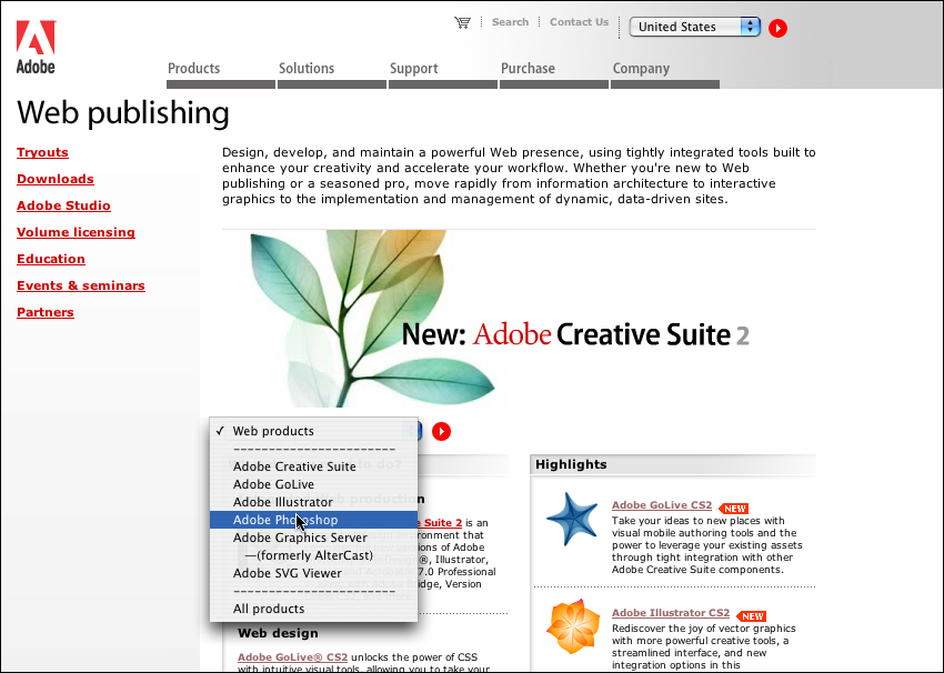
FIGURE 9.5 Adobe uses a dropdown menu to provide quick access to product pages. The menu uses the onChange JavaScript action to load the selected page when a menu item is selected. For keyboard accessibility, a better approach would be to use the supplied arrow button to activate the menu selection.
In a nutshell. Some users navigate and complete forms using the keyboard. Make all form elements operable from the keyboard, and ensure that their behavior is consistent with user expectations.
9.2.4. Apply a logical sequence to form elements
Keyboard users use the tab key to move the cursor through form elements. The tabbing sequence is governed by the order in which elements appear in the code. For visual keyboard users, a logical tab order is convenient, though not essential, since visual users can scan the page to determine which elements are in the form. A form that is out of sequence will be disorienting, but not impossible, to use. On the other hand, usability for nonvisual users suffers when form elements are not in a logical sequence because nonvisual users cannot easily scan the page. Take, for example, a search interface that includes a search field and submit button, followed by radio buttons that allow users to refine their search criteria. Nonvisual users may submit a search without realizing that additional options are available (Figure 9.6).

FIGURE 9.6 Amazon’s advanced search page displays the “Search Now” button after the “Author” field, even though there are many more search options. For better usability and keyboard accessibility, the submit button should appear after all input fields.
For universal usability, design forms so the elements follow a logical sequence: first name, last name, address, phone number, email address, submit. The information flow is predictable because it mirrors standard practices; anytime a user can successfully predict what comes next, usability is enhanced. Also, be sure that all necessary information appears before the opportunity to submit the form, so users will be less likely to inadvertently submit an incomplete form.
In a nutshell. Keyboard users access Web form elements in the sequence that they appear in the code. Ensure that form elements follow a logical sequence when accessed via the keyboard, and that all essential elements precede the control that submits the form.
9.2.5. Don’t auto-populate form fields with text
Form input fields can be coded to contain text that appears by default in the text field. Designers often use this technique in place of a field label to supply information about the purpose of the field. For example, the default text search is common in a search field. Generally this technique is used to conserve screen real estate: a single search field and submit button takes up less space than a search label, search field, and submit button (Figure 9.7, next page).


FIGURE 9.7 Field labels explain the purpose of a field to visual and nonvisual users. In order to conserve screen space, labels are often left off (1) or supplied using default field text (2), which can cause usability problems. The best approach is to use a text label (3) marked with the LABEL FOR tag to explicitly bind label and field.
When users encounter a field that contains default text, the text must be removed before they can enter their own text. JavaScript can be used to automatically remove default text from a text input field. With this method, when a user clicks or tabs to the field, the default content disappears and the user can begin typing. Otherwise, the user needs to delete the text manually before entering information in the field.
Default content causes problems for all users. When JavaScript is not used or not enabled, the user is responsible for removing the default text, which may or may not be successful. Designers who use this technique may see search listed as one of their site’s top search queries, as some users may neglect to remove the default text before submitting a search. When JavaScript is used to eliminate the problem by removing the default text, the field loses its label because the default text that serves as field label disappears when the field is activated. This is less of a problem for visual users than for nonvisual users. Visual users can see the field contents and understand its purpose before activating the field. Nonvisual don’t “see” the field until it’s activated, at which time the label describing its purpose is gone.
The best way, by far, to label form fields is to use a field label, as described above. Properly labeled fields work for all users and do not present usability challenges. Create designs that can accommodate the additional space required for field labels rather than using a workaround, such as default text.
In a nutshell. Using default text to label text input fields creates usability problems for visual and nonvisual users. Use a label rather than default content to indicate the purpose of a text input field.
9.2.6. Use form elements correctly
The basic form elements are text input fields, radio buttons, checkboxes, and select menus. Text input fields are used to collect information that cannot be anticipated by the designer, such as name and address, whereas menu-style elements, such as radio buttons, checkboxes, and select menus, are used for fields where the possible input values can be predicted—gender, title, country, state, and so on. These menu-style form elements can cause usability problems when used incorrectly.
Here are guidelines for designing usable menus:
Use radio buttons and select menus for menus that support one choice among two or more options. (Select menus can support multiple choices. However, this approach is not recommended because of the usability challenges it presents. For fields with more than one possible choice, checkboxes are more usable than multiple-selection menus.)
Use checkboxes for menus that support multiple choices.
Use a single checkbox for binary selections, such as yes/no choices, where checked means “yes” and unchecked means “no” (Figure 9.8).
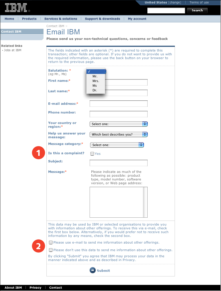
FIGURE 9.8 The IBM Contact form uses a checkbox to pose the question “Is this a complaint?” as a binary choice with the default response of “no” since the checkbox is unchecked (1). However, the question about receiving email about other offerings is presented incorrectly as two checkboxes (2), allowing users to elect both to receive and not receive the information. “Please use e-mail to send me information about other offerings” should be a single checkbox that is unchecked by default.
Do not set the default value of a single checkbox to “checked.” Otherwise, users may inadvertently say “yes” to receiving an email newsletter or saving an account name and password.
When appropriate, provide a null or “no response” option for menus and radio buttons. For example, begin a Title menu with “one” or “No title” and then list the possible title choices (Dr., Mrs., Ms., Mr., and so on) or get feedback using radio buttons for Excellent, Good, Poor, No Opinion. Otherwise, users may submit inaccurate information because their accurate or preferred choice is not listed in the menu.
In a nutshell. When used properly, menu fields, such as checkboxes, radio buttons, and select menus, can enhance usability and facilitate data collection. Choose the appropriate menu type, and make item selection an explicit user choice.