
Chapter 3. Text
Setting type on the web is fundamentally different from setting type in print. In print typography, established guidelines help us to design readable documents. Printed text is normally set to between 10 and 12 points and is black on a white background. On the Web there is no such thing as 12-point type. Factors such as monitor resolution and browser settings influence the size at which Web type displays, and most of these variables are controlled by the user, not the designer.
Web documents are flexible, particularly text-based ones. While the Web designer creates a page with a certain look and feel, the Web user has the means to adapt that view to fit his or her needs and preferences. The extent to which the user can customize the page is directly related to the degree to which the designer relinquishes control over the look of the site. Designers must embrace the variability of Web text as opposed to trying to hold it in place—for example, by fixing its size or by using graphic text. When a designer takes inappropriate measures to retain control, Web access is compromised. Web typography is not about providing one optimal view of a document; its goal is to accommodate transformation.
The Web offers a one-size-fits-all solution to text documents. But unlike the ill-fitting “unisize” shirt or sweater, the Web can actually fulfill its promise because the Web designer does not have to divine some size that will miraculously fit all people. On the Web it is the user, not the designer, who determines the fit.
3.1. Basic Principles
3.1.1. Use plain text for text
Graphic text differs from plain text because it is composed of pixels as opposed to distinct, recognizable characters. We use graphic text for several reasons: to create visual effects, such as drop shadows or bevels; to use a nonstandard typeface; to create image rollover effects using JavaScript; or to create text that cannot be copied or resized. Graphic text is often used for site navigation, particularly on pages with fixed layouts that do not adapt well to text size changes (Figure 3.1).

FIGURE 3.1 Audible uses graphic text for navigation and content. Since graphic text cannot be customized, some users may have trouble using the Audible site.
Graphic text, however, is not customizable; users cannot resize or recolor it. A user-defined style sheet will have no effect on graphic text. If site navigation is image-based, there will be people who cannot use it, and a site without navigation is like a car without a steering wheel—you can’t take it anywhere.
Graphic text has no meaning beyond its visual representation. An image of a word is nothing more than colored pixels. A graphic heading, for example, cannot be tagged as the main descriptor of content—which means that pages will not index well for searching and will not read well with screen reader software.
On the other hand, text that is really text can be sized, colored, styled, copied, pasted, indexed and searched. Text is the most powerful and accessible element on the Web. With the text styling options available using CSS, there is little need to use graphic text, particularly for essential elements such as navigation and content.
In a nutshell. Text has many benefits over other content formats: it can be read by software, it adapts to different user environments, and text supports user customization. Whenever possible, favor text over other content formats.
3.1.2. Use CSS for styling text
CSS styles contain all the details about the visual characteristics of Web pages. Designers have different methods for applying styles to pages. Embedded and inline styles are style declarations included within HTML documents. An external style sheet is a file containing style declarations that is referenced by HTML documents and used to render pages.
When external style sheets are used, content is stored in the HTML document, and presentation information is stored in the style sheet document. This separation of content and presentation makes it easy to customize the visual display—for example, by allowing users to apply their own styles. To use the Web, a user might require a high-contrast view (for instance, white or yellow text on a black background), or really large type, or some combination of color, size, and typeface. When all visual information is contained in a style sheet, the user can create a custom style sheet specific to his or her requirements and apply it to all Web pages (Figure 3.2, next page).

FIGURE 3.2 Blogger uses style sheets for visual formatting. Users who need a custom view can apply their own formatting to Blogger pages, such as the large type, high-contrast view shown here.
In a nutshell. Style sheets provide the greatest flexibility for styling and customizing text display. Use style sheets to define text’s visual properties—font, size, color, and so on.
3.2. Size
3.2.1. Allow user settings to define base text size
Typographic conventions tell us that the optimal text size for readability is somewhere between 10 and 12 points. Printed documents generally follow these conventions and satisfy the average reader under typical reading conditions. For the nonaverage reader, there are reading aids, such as glasses and document enlargers, or large-print editions.
The Web is different. Web users can set their browser to display text at an optimal size, based on their needs and environment. Some users require type that is larger than average for reading. Some may need to enlarge text so a Web page is readable in a group setting. Others might want the text as small as possible so they can read it on a PDA or cell phone display.
In designing text, the base text size should be a decision left to the user. All other text elements should be sized relative to the user-specified default. This approach allows users to establish optimal settings in their browser preferences and to have those settings apply on all sites that they visit. If each site has a different base text size, users must continually adjust their text settings as they move from site to site (Figure 3.3).

FIGURE 3.3 Ed.gov uses small text, whereas Medline Plus uses average-sized text. When pages have different base text sizes, users must adjust their text zoom for consistent readability.
In a nutshell. Users should define their optimal text size setting. Allow the main text of a page to size according to the user-defined setting.
3.2.2. Size other text elements relative to the user-defined text size
Designers use size and position to convey information about the structure of a document. Headings are usually larger than the main text. Supplementary text, such as captions and footnotes, is generally smaller than the main text. These visual cues help readers negotiate the structure of the information on the page.
On the Web we can use size to define relationships between page elements without having to require specific sizes, such as 12-point type for body text and 14-point type for headings. When we use relative measurements—such as keywords (smaller, larger), percentages (90%, 110%), or ems (.8 em, 1.2 em)—to set text size variants, the main text is sized at the user-specified setting and all other text elements are sized relative to it. For example, if the user-specified text size is 16 points and we define headings using the keyword “larger,” then the headings will display at approximately 18 points. This method reveals the information hierarchy on the page while allowing users to view the text at a size that is readable.
In a nutshell. Relative measurements—such as percentages and ems—size elements relative to their parent element. Use relative measurements for type variants—such as headings and links—so they size relative to the user-defined text setting.
3.2.3. Design pages that can accommodate different text sizes
Designing a Web page that is flexible and allows for customization is far more challenging than designing a static page. Fluidity is one of the most obvious differences: Print offers one view of a document; the Web offers any number of views.
When we design page layouts that require pixel-level precision, and a user requires large text, we create a point of friction between the tool and the user. If we resolve this conflict by setting type so it cannot be resized, or by using graphic text, then some users will not be able to use the site. If text can be enlarged, but doing so sends the layout into disarray, then our design suffers, and users may not be able to make sense of the site (Figure 3.4). On the other hand, a well-crafted, flexible page can accommodate different text sizes while keeping its overall integrity. When users resize text, the page and column widths expand or collapse accordingly, but the overall design—the positioning of elements, and the relationships between elements—remains intact (Figure 3.5, next page).
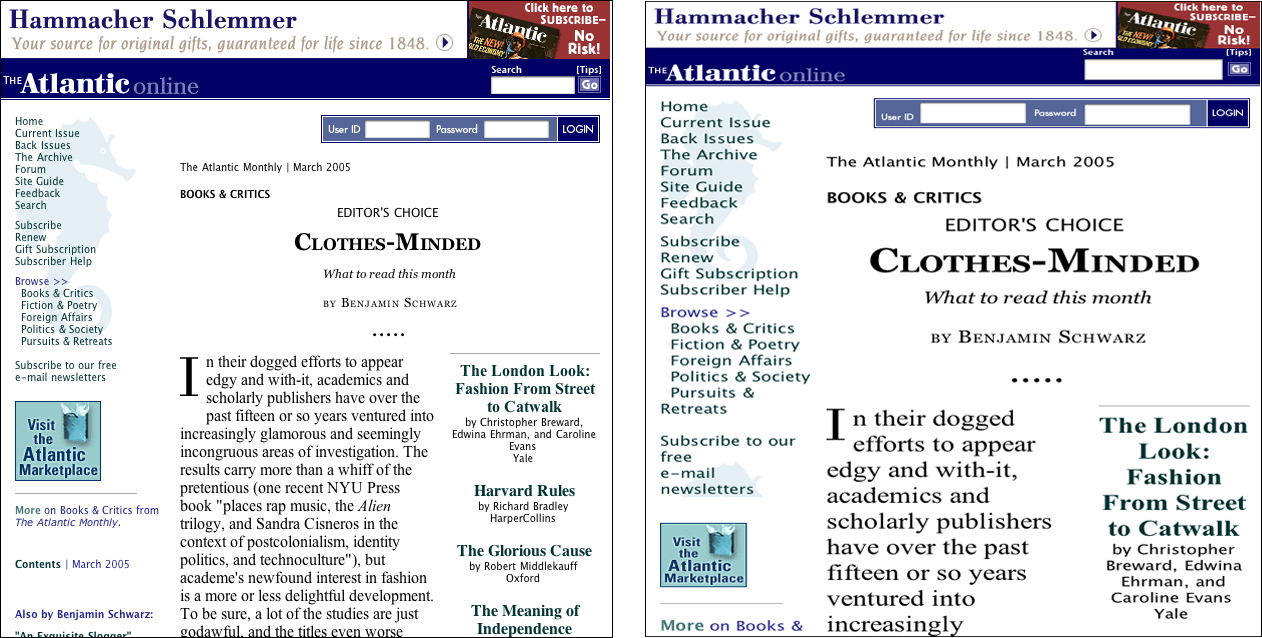
FIGURE 3.4 Fixed-width layouts, such as those on the Atlantic, do not adapt well because the text columns do not adjust to accommodate text size changes.
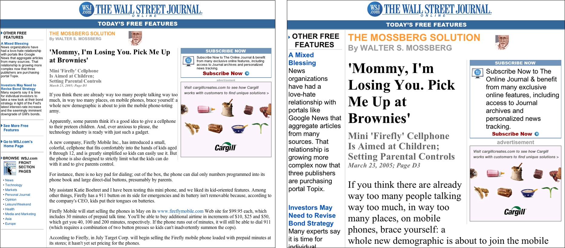
FIGURE 3.5 Flexible layouts, such as those on the Wall Street Journal, adapt to adjustments in type size. The columns resize and reflow when text is enlarged.
In a nutshell. Users must be able to resize text and still have a functional page. Design flexible pages so users can resize text without breaking the layout.
3.3. Color
3.3.1. Maintain contrast between text and background
One of the advantages of designing for the Web is that we can use color without dealing with high printing costs and the complexities of color reproduction. On the Web, colored text and backgrounds are easy to achieve using styles and other color settings. However, choosing the wrong colors is also easy and can reduce readability. For example, contrast between text and background is necessary for the reader to be able to distinguish letterforms. Pages with insufficient contrast can be tiring, even impossible, for people to read (Figure 3.6).
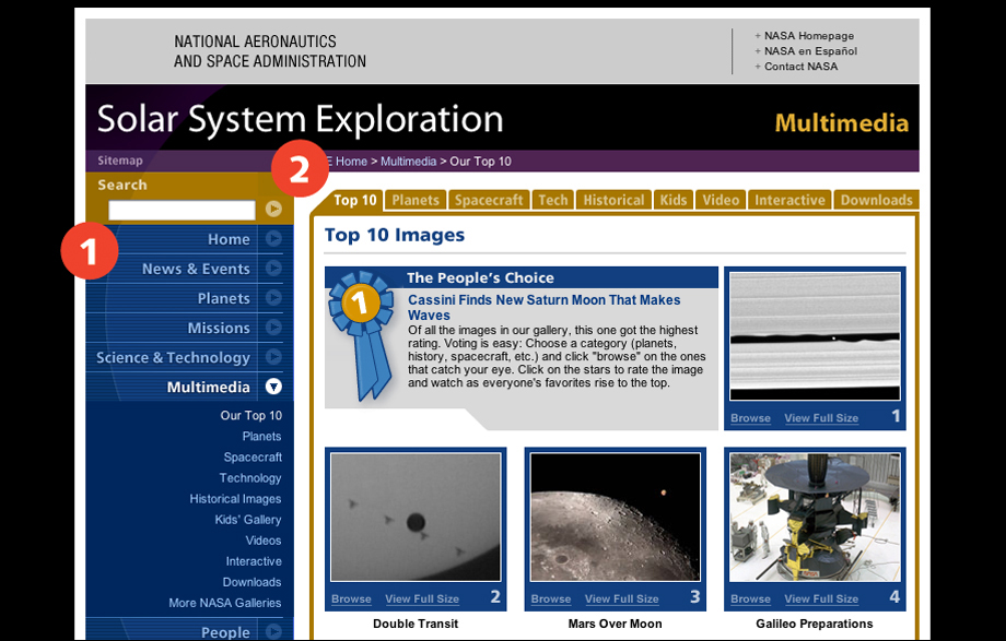
FIGURE 3.6 Some of the navigation links on the Solar System Exploration pages may be difficult to read because there is insufficient contrast between background and foreground colors. The links that are a lighter shade of the background color (1, 2) are particularly difficult to make out.
The biggest determiner of contrast is the brightness of a color. Black text on a white background is the ultimate high-contrast color combination because black has a 0% brightness value, whereas white has a 100% brightness value. Hue also affects legibility, with complementary hues—black and white, dark purple and light yellow—producing the highest contrast.
In a nutshell. Low-contrast color combinations interfere with readability. Use complementary colors and brightness values—such as black and white or purple and yellow—to produce the highest contrast between text and background.
3.3.2. Use style sheets for setting text color
Some people have certain color requirements for reading text. For example, older people might find that they read best in a high-contrast view, with white or yellow text against a black background. Others may have difficulty perceiving specific hues, or distinguishing the difference between colors of a similar hue. With Web pages, users can customize their environment so color does not get in the way.
One method for applying custom color combinations is for users to create a style sheet containing their requirements for viewing, and instruct the browser to use that style sheet on all Web pages. This method allows users to override author-defined styles and to apply style settings that reflect their viewing requirements. Of course, this method only works on pages that use style sheets and are marked up using proper HTML code. It does no good to have a user-defined style that sets all paragraphs at 42-point type if the Web page it is applied to has no paragraphs defined, or if the background color is defined the old-fashioned way in the HTML code. On the other hand, pages that are marked up using standard structural markup will honor user-specified settings.
In a nutshell. Not all color combinations work for all users. Define colors using style sheets so people who need certain color combinations—such as white on black or yellow on black—can apply a custom style sheet.
3.3.3. Do not use text color alone to convey information
Color is a common communication device. For example, traffic signals use color to direct the flow of traffic: a red signal says stop, a green signal says go, and a yellow signal is, well, open to interpretation. However, color is a nonuniversal communication device. For color to communicate effectively, the recipient must have vision and the ability to distinguish between colors.
When color is used on Web pages for visual emphasis or as part of a directive, nonvisual users and some visual users will not see it and will miss its significance. For example, if red text identifies required fields on a Web form, then people who cannot see the colored text, or cannot distinguish it from the other field labels, may not enter the required data.
Color can be used as a way to communicate information, but it should be paired with other communication methods. For visual users, pair color with other methods—such as a different typeface or bold text for section headings—to produce typographic emphasis. For visual and nonvisual users, reinforce color with context to draw attention to specific words or fields, such as marking required fields with an asterisk or with the word required (Figure 3.7).

FIGURE 3.7 Network for Good uses a colored asterisk to mark required form fields. The asterisk is a graphic containing the alt-text “required,” which makes it accessible to visual and nonvisual users.
In a nutshell. Color is not universally accessible and therefore cannot be relied upon as the sole means of conveying information. Pair other methods—such as typography or text—with color to convey emphasis or information.
3.4. Markup
3.4.1. Mark up text using structural tags
The Web offers a means to describe the function of text as opposed to simply defining its physical properties. A well-tagged Web document has layers of information beyond the printed page. When a printed paragraph contains a line of italicized text, the reader must determine the rationale: Are the italics intended for emphasis, to indicate a defined term, or to mark a foreign word or a citation? On the Web that same text can be tagged as EM for emphasis or CITE for citation. Basic HTML provides tags to identify structural elements such as lists, headings, tables, emphasis, acronyms, citations, and much more.
Structural markup creates machine-friendly text that can be put to many uses. For example, search engines can read heading tags, determine what a page is about, and index it accurately. Screen reader software can use markup to convey emphasis to the listener or to provide a page overview by reading only page headings. With structured documents, software could be designed to extract all occurrences of citations to generate a Works Cited document, or all occurrences of headings to create a table of contents. The potential uses for structurally encoded Web documents are limitless. However, for this potential to be realized, designers must employ correct, consistent use of standard Web markup.
When designing Web documents, designers should favor structural tags, such as H1–H6 for headings and EM for emphasis, over tags that only define the physical properties of a word or phrase, such as B for bold and I for italics. For instance, rather than tag a section heading as big and bold, determine what level the heading is in the information structure of the page—the main heading or some level of subheading—and mark it accordingly. Then style the heading as big and bold using style sheets.
In a nutshell. Structural markup adds meaning to documents. Use structural tags—H1–H6, P, EM, STRONG, and so on—to describe the meaning and function of text elements.
3.4.2. Use structural markup appropriately
Faced with the limited palette of HTML, designers have long been misappropriating structural HTML tags to achieve visual effects. For example, table tags are commonly put to use as a tool for Web page layout. By using invisible tables (tables without visible borders), designers can create the multicolumn layouts common in print. Site navigation links are often placed in the left cell of an invisible layout table, and page content in the right cell. Another common practice is to use the BLOCKQUOTE tag to create margins.
Then there are elements that are tagged improperly because designers object to the way the browser renders the element. For example, lists are often not tagged as lists because the designer does not want an indent, or wants to use a custom bullet, or wants no bullet at all. In these instances the solution is often to use nonstructural markup, such as line breaks, or to misuse markup, such as using tables to format a list.
These techniques undermine the power of machine-readable structural markup. When text is coded properly, software can do useful things with the embedded information. If, however, text marked as BLOCKQUOTE is not a quoted passage, or tables are used for both layout and data, then software can find no accurate way to make use of these elements.
Today’s browsers allow designers much more control over the visual formatting of elements. With style sheets, we can control the appearance of such elements as headings, paragraphs, lists, and form fields, and create multicolumn layouts. Designers no longer need to rely on workarounds and hacks to design attractive and usable Web pages.
When marking up a text document, do not think about what the various elements should look like when displayed in the browser. Think about what each element is and tag it accordingly. Then use style sheets to define the visual properties (Figure 3.8).
In a nutshell. Structural integrity requires that tags be used appropriately and consistently. When marking up text using structural markup, use the tag that accurately describes the element.